Modern Gray
The warm greige builders reach for when Agreeable Gray tests too dark, reviewed honestly: where it opens a room up, where it goes flat, and what to pick instead.

Jessica has spec'd whites and neutrals for more than 300 rooms and keeps a sample wall of painted drawdowns in her studio. Every color review is checked against real reader rooms in the comments and re-tested when a formula changes. About the testing process →
- 1Mindful Gray48
- 2Revere Pewter55
- 3Modern Gray62
- 4Pale Oak69
- 5Shoji White74
The Fast Verdict
Modern Gray is a warm greige built from almost the exact same undertone recipe as Sherwin-Williams's own Agreeable Gray, just carried two points lighter on the LRV scale. That small gap is the whole story: it opens up a dimmer or smaller room that Agreeable Gray would flatten, while keeping the same safe, warm-but-not-tan character that made its sibling a bestseller. It is not chasing a trend and it is not a designer icon on its own — it is the dependable answer when a builder or a homeowner needs a whole-house neutral that won't fight the light.
Whole-house walls in an open-plan home · rooms where Agreeable Gray tested a shade too dark or too gray · kitchens with white cabinets · exteriors with white trim
You specifically want a cool, blue-leaning true gray · your room is small and north-facing with no supplemental light · you want a color with its own strong identity rather than a safe backdrop
- Warm, safe greige that flows from room to room without clashing
- Two points lighter than Agreeable Gray — opens up a dimmer room a little more
- Pairs cleanly with white cabinets, warm wood, and most trim whites
- A common, tested exterior body color with white trim
- Predictable, well-documented undertone — few surprise-color stories
- Not a true cool gray, despite the name — disappoints buyers who wanted blue-gray
- Close enough to Agreeable Gray that it reads as a variation, not its own identity
- Goes flat and slightly muddy in a dim, north-facing room with no warm light
- Looks dingy next to a stark, cool-white trim — needs a warm-white partner
What Color Is Modern Gray, Really?
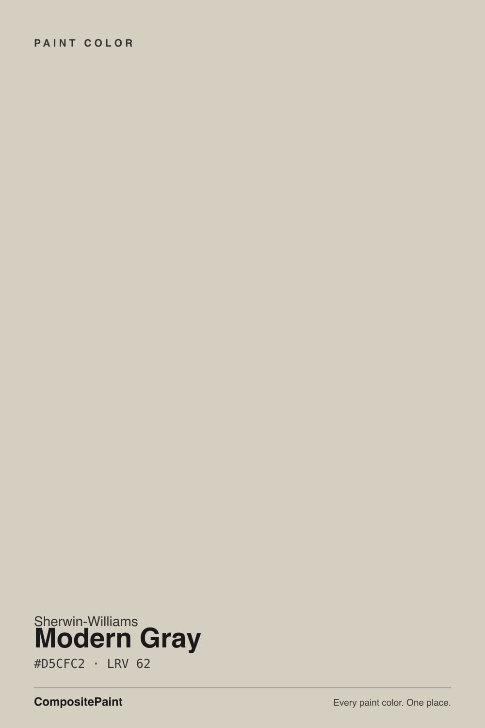
A warm greige built on the same beige-taupe undertone as Agreeable Gray — pull the deck hex values side by side (Modern Gray #D5CFC2, Agreeable Gray #D1CABC) and the ratio between the red, green and blue channels barely moves. The practical result: on a paint chip in a store, most people cannot tell them apart. The real difference is value, not hue — Modern Gray sits at LRV 62 against Agreeable Gray's 60, a gap small enough to miss on paper and large enough to matter on a wall that only gets afternoon light for two hours.
That two-point LRV gap is why Modern Gray exists as its own color rather than a footnote. Painters and builders reach for it specifically in rooms where a client loved Agreeable Gray's warmth but found the sample looking a shade too gray or too dim once it went up over more than a poster-sized swatch — depth always reads darker across four walls than it does on a chip, and Modern Gray gives the same warm-neutral formula a small margin of extra light back.
Undertone in one line: warm greige, beige leaning slightly ahead of gray — never blue, never pink on its own. Like every color in this family, it will borrow a cast from whatever light and flooring surround it; a cool LED bulb or a blue-grey floor can nudge it colder than the can suggests, which is the normal behavior of a warm neutral, not a flaw specific to this one.
Where It Shines
Give it real daylight — south or east, or a bright open-plan main floor — and it does exactly what a whole-house neutral is supposed to do: carry from the living room into the kitchen into the hallway without a single wall looking like it belongs to a different house. It is at its best as connective tissue, not a star color. Against white or cream trim and warm wood floors it reads calm and current; on an exterior body with white trim it is one of the most common repaints in the modern-farmhouse style, precisely because it is warm enough to avoid looking sterile and light enough to avoid looking heavy under full sun.
Where It Fails
Almost every disappointed review of Modern Gray comes from one of three predictable mismatches, and none of them are a defect in the paint — they are the paint being an honest warm greige in a situation that needed something else.
"Gray" in the name gets people's hopes up for something closer to charcoal-cool. On the wall it reads warm greige-beige, not a cool designer gray. If your inspiration photo was a crisp blue-gray, this color will look tan next to it — look at Repose Gray or Light French Gray instead.
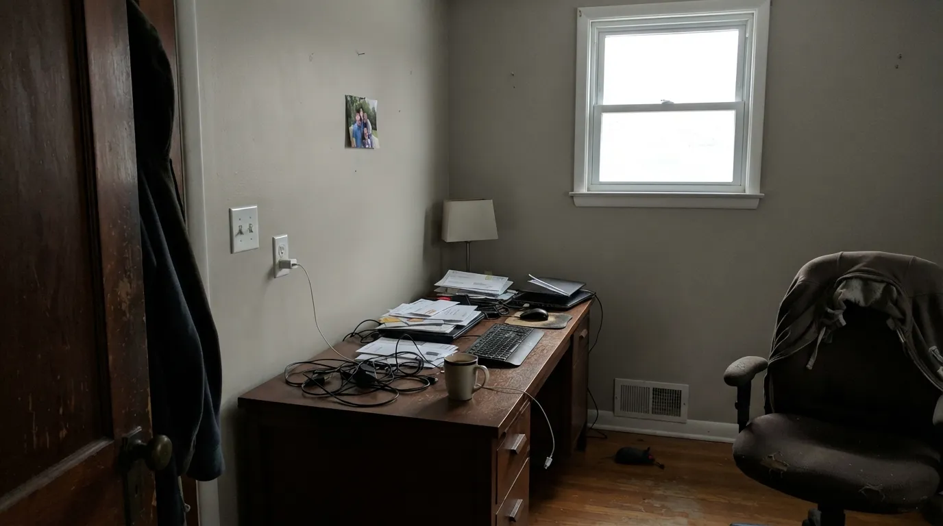
Cool, indirect daylight strips the warmth out of any greige and can leave Modern Gray reading flat, slightly muddy, or a touch cooler than the can. It is not going wrong, it is a light-starved room exposing a color that needs some warmth to work with. Add warm 2700K lamps or size up to a lighter neutral if the room stays dim all day.
Pairing this warm greige with an icy blue-white trim (the coolest end of the SW white deck) makes the wall look dingy by contrast — the trim wins the temperature fight and the wall reads dirty. Keep the trim warm-white or cream, not clinical bright white, and the wall goes back to reading clean.
Room by Room
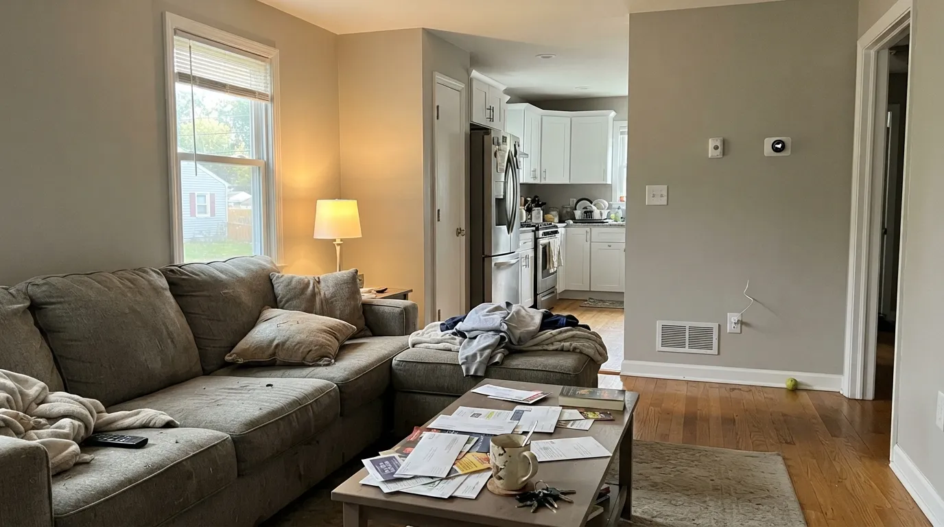
In real daylight it is a calm, warm backdrop that lets furniture and art carry the room. Eggshell on the walls, semi-gloss trim in a warm white, not a cool one.
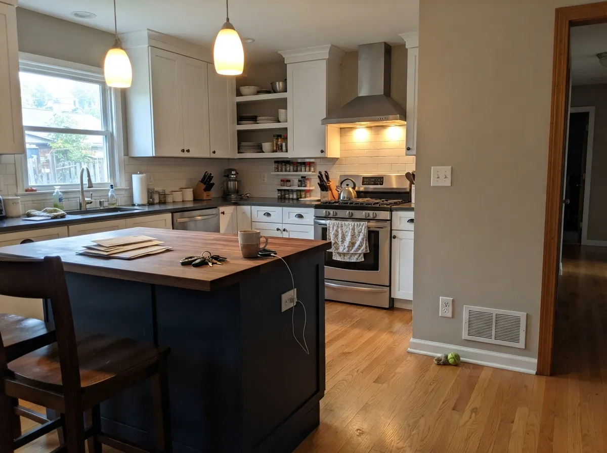
With white shaker cabinets it is the classic contemporary-farmhouse wall color; with a dark island (charcoal or black) it grounds the room without competing for attention. It plays a supporting role well.
Under 2700K lamplight it goes soft and warm at night. In a north-facing bedroom with only cool overhead LEDs, it can feel flatter than expected — swap the bulbs before you swap the paint.
Warm-toned counters and wood vanities agree with it easily. Cool grey or blue-toned tile pulls it colder and duller — sample against your actual tile before committing.
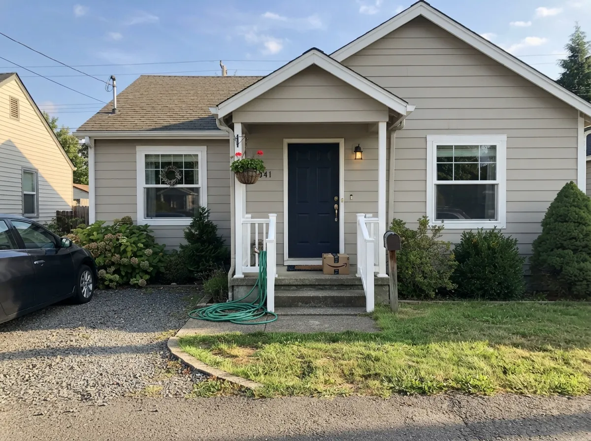
Full sun reads it lighter and a touch more neutral than indoors. With white trim and a black or navy front door it is one of the most repeated exterior formulas in new-build and renovation photos for exactly that reason — it is safe, not showy.
The two extra points of LRV over Agreeable Gray make it a slightly more forgiving one-color-everywhere pick for houses with a mix of bright and dim rooms — it won't feel as heavy in the darker ones.
Your Light Is the Risk
Warm and even all day, the greige holds its balance without tipping tan or cold. Whole-house safe.
Cool, indirect daylight drains the warmth and can leave it reading flat or slightly muddy. Test a large sample first.
Warmer and more golden at the sun hours, quieter and more neutral the rest of the day — a gentle shift, not a color change.
2700K lamps keep it warm and cozy after dark. Cool white LEDs flatten it toward grey — swap the bulb before you second-guess the paint.
Most complaints about Modern Gray are a light mismatch. Upload a photo of your actual room and see it on your walls — then ask for the same wall in north light or evening lamps before you buy a single sample.
Need It From Another Brand?
Any paint counter can custom-tint Sherwin-Williams SW 7632 directly. If you would rather stay in one brand's own deck, these are the closest stock matches, measured as ΔE2000. Under 2 is a difference you will not see on the wall.
| Brand | Closest color | ΔE | LRV | |
|---|---|---|---|---|
| Behr | Granite DustMQ3-06 · Behr | 0.8 | 63 | Color page → |
| Benjamin Moore | Sea SaltCSP-95 · Benjamin Moore | 1.7 | 63 | Color page → |
| Valspar | Secluded BeachV146-1 · Valspar | 2.5 | 62.4 | Color page → |
| PPG / Glidden | Cool ConcretePPG1023-2 · PPG / Glidden | 1.3 | 63 | Color page → |
| Glidden | River RockPPG18-02 · Glidden | 2.1 | 62 | Color page → |
| Dutch Boy | Warmed Silver440-1DB · Dutch Boy | 0.2 | 63 | Color page → |
Similar Sherwin-Williams Colors
The nearest shades to Modern Gray within Sherwin-Williams's own range, ranked by perceptual color distance — useful when you want the same look a touch lighter, darker, or warmer.
WCAG 2.1: AA is 4.5 : 1 for normal text, 3 : 1 for large text, AAA is 7 : 1.
Modern Gray vs the Colors You're Also Considering
Every Modern Gray sample board has the same rivals on it. The numbers show the real lightness gap — then it comes down to which risk you would rather live with.
Pick this in a smaller or dimmer room where you need the extra two points of LRV to keep the walls from going heavy.
Sherwin-Williams SW 7029 · LRV 60Agreeable GrayPick this if you want the same warm greige carried two points darker — Agreeable Gray is the more famous sibling and behaves identically in good light.
Side-by-side comparison →Pick this when warm and beige-leaning is what you actually want, not a color that argues about whether it's gray.
Sherwin-Williams SW 7015 · LRV 58Repose GrayPick this if you actually want a truer, cooler gray rather than a warm greige — just know it has its own famous flash toward lavender in cool light.
Pick this if you're already committed to a Sherwin-Williams palette and want to keep the formula in-brand.
Benjamin Moore HC-173 · LRV 63Edgecomb GrayPick this if your painter works in Benjamin Moore — nearly the same light warm greige, one point brighter, but goes dim in a dark room too.
Agreeable Gray SW 7029 at LRV 60 is the comparison most people are making. It is slightly darker, and its hex #D1CABC carries a touch more green, which is why Agreeable Gray reads as a steadier greige while Modern Gray leans warmer and is the one more likely to flash pink. If a north-facing room worries you, Agreeable Gray is the safer bet.
Within the line, Gossamer Veil SW 9165 at LRV 62 holds more blue at #D3CEC4 and reads cooler, while Grecian Ivory SW 7541 at LRV 63 goes warmer and creamier.
Across brands, Benjamin Moore Sea Salt CSP-95 at LRV 63 has a deltaE of 0.55 and Farrow and Ball Shaded White No. 201 at LRV 63 is 0.86, so both are close enough to swap without noticing. Behr Aged Beige PPU7-09 at LRV 63 and Valspar Secluded Beach V146-1 at LRV 62.4 land near 1.0, which looks visually identical in normal room light. Magnolia Home Stoneware Pieces JG-55 at LRV 63 measures 2.91, so it is very close but worth sampling first.
Modern Gray Coordinating Colors
The rule for coordinating with Modern Gray is the same as for any warm greige: stay warm, avoid stark cool whites and icy blues, and let it play a supporting role rather than compete for attention. These are the partners that keep it looking clean instead of dingy:
Modern Gray vs. Agreeable Gray: Same Family, Different Job
These two colors are close enough that comparing their deck hex values tells the real story: Modern Gray is #D5CFC2, Agreeable Gray is #D1CABC. The relationship between red, green and blue in each barely changes — the undertone is the same warm greige. What moves is lightness: Modern Gray sits at LRV 62, Agreeable Gray at 60.
In practice that means Agreeable Gray earned the bigger reputation first — it has been on more best-seller lists longer — and Modern Gray functions as its quieter, slightly lighter alternative for the exact rooms where Agreeable Gray tests a shade too dim: smaller rooms, rooms with less daylight, hallways with no windows at all. Neither is the "better" color; they solve the same problem at two adjacent points on the value scale.
Modern Gray With Wood Tones and Floors
Warm wood is the easy pairing: oak, walnut and butcher block all sit comfortably next to Modern Gray because the wood's warmth and the paint's warmth agree with each other. Builder-grade honey oak looks calmer next to it than it does next to a cooler, blue-leaning gray.
Cool-toned flooring is the one combination that needs a sample first. Grey-washed LVP or cool grey tile pulls the warmth out of the wall in the same way north light does, and the two together can make the room read colder and flatter than expected. If the floor is staying and it leans cool, warm rugs and warm-toned trim do most of the correcting.
Three Ready Palettes Built on Modern Gray
A color is never alone on the wall. These are complete combinations in the 60-30-10 pattern, with the reason each one holds together. Every one opens in the visualizer.
A warm-white trim keeps the greige from reading cold, and the black door supplies the one sharp note the scheme needs so the whole house doesn't blur into sameness.
Try this palette in your roomThe classic contemporary-farmhouse formula: warm greige walls stay quiet behind soft-white cabinets, and the near-black island gives the room its one grounding weight.
Try this palette in your roomWhite trim keeps the body reading light and current under full sun; the navy door is the safer, softer alternative to black and still reads crisp from the street.
Try this palette in your roomModern Gray FAQ
Is modern gray warm or cool?
Warm — it is a greige with a beige-taupe base, not a true blue-gray. The name suggests something cooler than what actually goes on the wall; if you want a cooler, truer gray, look at Repose Gray or Light French Gray instead.
What is the real difference between modern gray and agreeable gray?
Almost none in hue — both are the same warm greige family from Sherwin-Williams. The difference is two points of LRV (62 versus 60), which is a value gap, not a color-temperature gap. In good daylight most people cannot tell them apart on a wall; the extra light helps most in a dimmer or smaller room.
What trim white goes with modern gray?
A warm or soft white, not a stark blue-white. Pure White or a similarly warm trim white keeps the wall reading clean; pairing it with the coolest end of the white deck makes the wall look dingy by contrast.
Does modern gray work on kitchen cabinets, or just walls?
It is used far more often on walls than cabinets — it reads best as the backdrop behind white or navy cabinetry rather than as the cabinet color itself. If you want it on cabinets, satin urethane-fortified enamel and warm-wood or brass hardware are the safer bet.
Is modern gray good for an exterior?
Yes — it is a common, well-tested exterior body color, especially with white trim in a modern-farmhouse formula. Full sun reads it lighter and more neutral than it looks indoors, so sample it on the actual siding, not just a chip against a bright sky.
How many coats does it take?
Two coats over a similar light color is standard. Going over a darker or more saturated existing color, prime first with a grey-tinted primer — skipping that step is the most common reason people end up needing a third coat.
Have you painted with Modern Gray?
Rate it — one tap helps the next reader decide.
Ask a Question