Mindful Gray
The greige people order expecting Agreeable Gray and get something a full step deeper — reviewed honestly, including the two lights that turn it green.

Jessica has spec'd whites and neutrals for more than 300 rooms and keeps a sample wall of painted drawdowns in her studio. Every color review is checked against real reader rooms in the comments and re-tested when a formula changes. About the testing process →
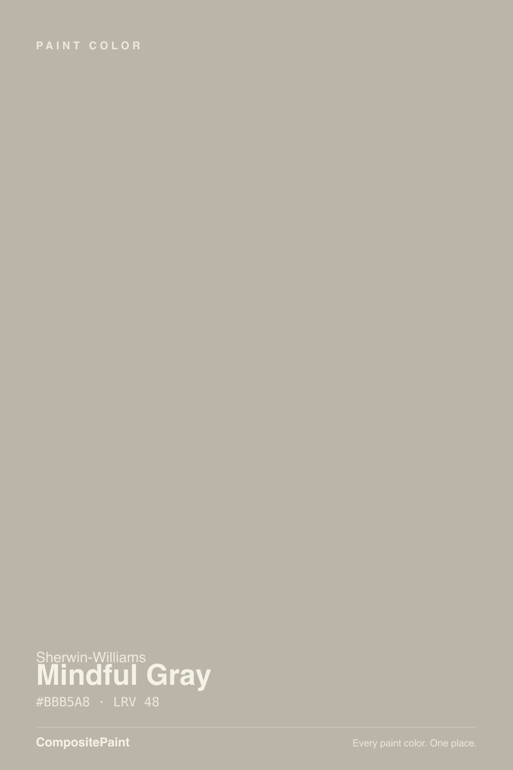
- 1Anonymous20
- 2Dorian Gray39
- 3Mindful Gray48
- 4Agreeable Gray60
- 5Pale Oak69
The Fast Verdict
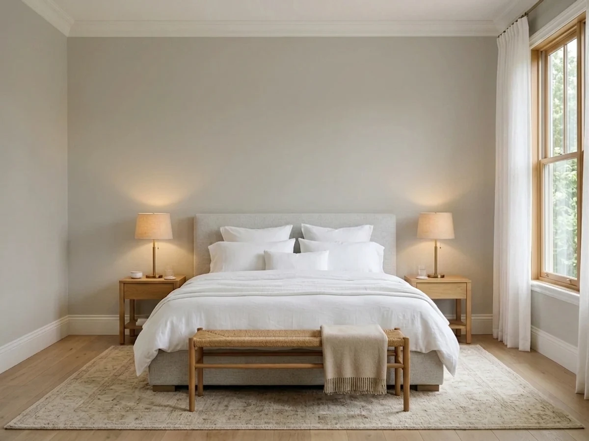
Mindful Gray is the grown-up middle of the Sherwin-Williams greige family: warm enough that it never reads cold, gray enough that it never reads beige. The color itself is excellent. The mistake is the depth — at LRV 48 it covers a wall with real weight, and most complaints come from people who picked it off a chip expecting the airy look of Repose or Agreeable Gray. Give it windows and it is one of the best mid-tone neutrals in the deck. Give it one small north window and it turns into a different color entirely.
Living rooms and bedrooms with two or more windows · kitchen and bathroom cabinets · a main floor you want grounded rather than airy · exterior siding with white or bronze trim
Your room is small, dim and north-facing · you actually wanted a light, airy greige · your floors and counters are cool gray · you want a true gray with no brown in it
- Real depth — walls look decided instead of builder-blank
- Warm enough to flatter oak and walnut, gray enough to stay modern
- Hides scuffs, handprints and pan marks far better than a pale greige
- Sits in a family that steps up and down cleanly — Repose lighter, Dorian darker
- Excellent on cabinets and built-ins, where light colors look flimsy
- Reads a full step darker on the wall than it does on the chip
- Flashes sage-taupe in rooms that look onto a lawn or trees
- Goes brown and flat under warm 2700K bulbs at night
- Looks muddy against cool gray floors and gray-veined quartz
What Color Is Mindful Gray, Really?
A warm gray — a greige — but the warmth is dialed way down. Saturation sits at about 12 percent, which in plain terms means there is barely any color in it at all; what little there is leans tan and earthy rather than blue. That is why it looks like an honest gray in the room instead of a beige pretending to be one. Put it beside a true cool gray and its softness jumps out. Put it beside a real beige and it looks positively steely. It lives right on the fence, which is exactly why so many people land on it.
The number that matters is LRV 48, and it is the number people ignore. Repose Gray sits at 58 and Agreeable Gray at 60 — ten to twelve points lighter. That does not sound like much on paper, but on four walls it is the difference between a room that feels bright and a room that feels held. Mindful Gray never darkens a space the way a true charcoal does, and it never washes out either. It just has body. If you have been looking at Instagram photos of airy greige rooms and assuming this is that color, it is not.
Undertone in one line: warm gray with a taupe base and a faint green shoulder — never blue, never pink. The green is the one to watch, and it only shows up when the light hands it to the paint.
Where It Shines
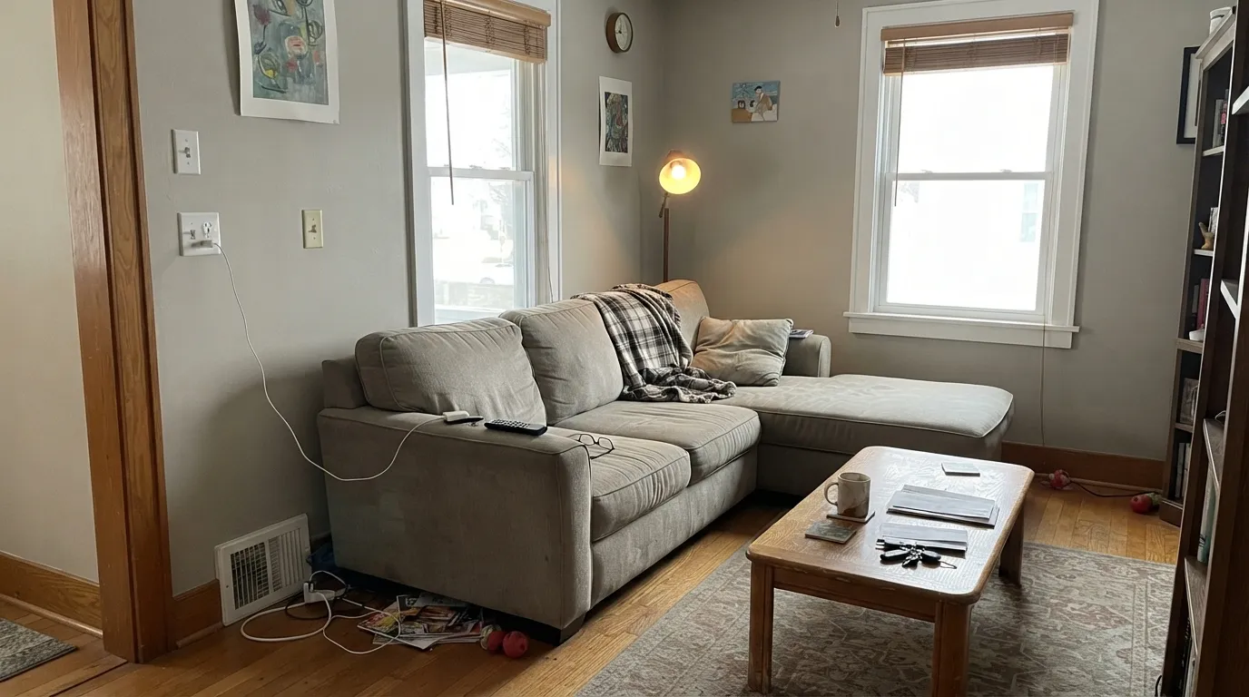
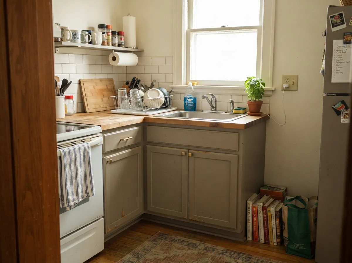
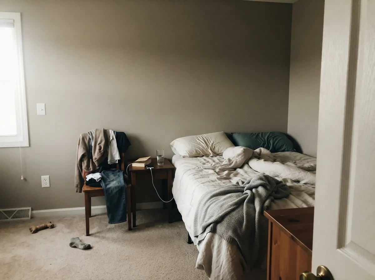
Give it daylight from more than one direction and Mindful Gray does the thing expensive rooms do: it makes furniture, wood and art look chosen rather than placed. Cabinets are its quiet second career — at LRV 48 it has enough depth to look deliberate and enough gray to keep fingerprints and pan scuffs from announcing themselves.
Where It Fails
Nearly every bad Mindful Gray story traces back to three situations, and all three are predictable before you open the can. If your room matches one of them, this is not the color for you — a second coat will not fix any of it.
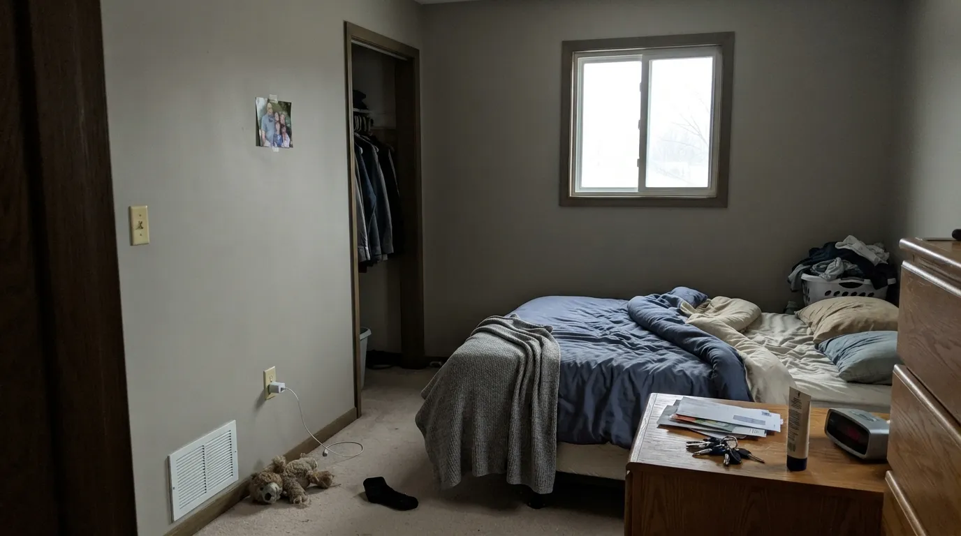
This is the single most common regret. North light is cool and flat, and it takes the warmth out of a color that only had a little to start with. What is left is a heavy, drab gray that closes the room in — people describe it as depressing, and they are not wrong. The fix is not a lamp, it is ten LRV points: Repose Gray (SW 7015) at LRV 58 gives you the same family with room to breathe.
Green light bounces off grass and leaves, comes through the window, and lands on your walls all summer. Mindful Gray already carries a faint green shoulder in its taupe base, so that reflected light pushes it fully into sage-taupe territory. Homeowners tape up a sample in March and repaint in July. If you have a green view, pick Amazing Gray (SW 7044) instead — same LRV 47 depth, but it leans purple-taupe and shrugs the green off.
Gray LVP, gray-washed wood and cool quartz all sit on the blue side of neutral. Next to them Mindful Gray's brown base gets exposed and the walls read muddy or dirty rather than warm. If your hard surfaces are cool, match them: Gray Clouds (SW 7658) holds almost the identical LRV of 47 with a genuinely neutral, non-brown cast.
Room by Room
With two windows or a slider it is superb: grounded, calm, and flattering to oak, walnut and leather. Eggshell on the walls, Pure White (SW 7005) trim in semi-gloss for clean separation. One window only? Sample it big and live with it for a week.
On cabinets the depth reads as intentional and the gray hides everyday wear far better than a pale greige. Use satin. Pair with Alabaster (SW 7008) walls above and an Urbane Bronze (SW 7048) island if you want a dark anchor.
It goes quiet and cocooning at night, which is the point of a bedroom. Just know that 2700K bulbs pull it toward taupe after dark. If you want it to stay gray in the evening, run 3000K bulbs instead of repainting.
Beautiful with warm marble, wood vanities and brass. It argues with cool gray tile and blue-gray quartz, where it looks brown by comparison. Small windowless bathrooms are too dim for LRV 48 — step up to Repose Gray (SW 7015).
It carries room to room well because the whole SW greige family lines up with it, but windowless hallways at LRV 48 feel like tunnels. The common fix is Mindful Gray in the daylit rooms and Repose Gray (SW 7015) in the hallways and stairwell.
Full sun lightens it a step and kills the green risk, so outside it behaves better than in. Pure White (SW 7005) trim for a crisp look, Urbane Bronze (SW 7048) or Iron Ore (SW 7069) for a modern one. Details in the exterior section below.
Your Light Is the Risk
Strong warm sun brings the greige forward and the room feels soft and grounded all day.
Cool flat daylight strips the warmth out and leaves a heavy gray. The number-one regret.
2700K bulbs push it to taupe; 3000K keeps it gray. Change bulbs before you change paint.
A lawn or trees outside the window bounce green in and tip it toward sage. Test in summer.
Most complaints about Mindful Gray are a light mismatch. Upload a photo of your actual room and see it on your walls — then ask for the same wall in north light or evening lamps before you buy a single sample.
Need It From Another Brand?
Any paint counter can custom-tint Sherwin-Williams SW 7016 directly. If you would rather stay in one brand's own deck, these are the closest stock matches, measured as ΔE2000. Under 2 is a difference you will not see on the wall.
| Brand | Closest color | ΔE | LRV | |
|---|---|---|---|---|
| Behr | Glasgow FogHDC-NT-06G · Behr | 0.3 | 48 | Color page → |
| Benjamin Moore | ThunderAF-685 · Benjamin Moore | 0.5 | 48 | Color page → |
| Valspar | Frappe6003-1B · Valspar | 1.1 | 47.1 | Color page → |
| PPG / Glidden | Ghost WriterPPG1007-3 · PPG / Glidden | 0.8 | 47 | Color page → |
| Glidden | Ghost WriterPPG1007-3 · Glidden | 0.0 | 48 | Color page → |
| Dutch Boy | Comfortable Gray443-2DB · Dutch Boy | 1.9 | 47 | Color page → |
Similar Sherwin-Williams Colors
The nearest shades to Mindful Gray within Sherwin-Williams's own range, ranked by perceptual color distance — useful when you want the same look a touch lighter, darker, or warmer.
WCAG 2.1: AA is 4.5 : 1 for normal text, 3 : 1 for large text, AAA is 7 : 1.
Mindful Gray vs the Colors You're Also Considering
Every Mindful Gray sample board has the same rivals on it. The numbers show the real lightness gap — then it comes down to which risk you would rather live with.
Pick this when the room has real daylight and you want weight.
Sherwin-Williams SW 7015 · LRV 58Repose GrayPick this for small, dim or north-facing rooms that need more light.
Side-by-side comparison →Pick this if you would rather risk green than risk purple.
Sherwin-Williams SW 7044 · LRV 47Amazing GrayPick this when trees fill the window and green worries you.
The closest match is Amazing Gray (SW 7044) at LRV 47, almost identical in depth. In practice Amazing Gray reads a touch cooler and more purple-gray, while Mindful Gray stays warmer and softer. If you want the slightly warmer, calmer of the two, choose Mindful Gray.
Repose Gray (SW 7015) at LRV 58 is the lighter cousin. It is noticeably paler and cooler, so it works better in darker rooms or when you want an airy, light-neutral wall. Pick Repose if Mindful feels too heavy for your light.
Dorian Gray (SW 7017) at LRV 39 is the darker step in the same family. It carries clear depth and reads as a genuine mid-to-deep gray, good for a moody room or contrast walls. Choose Dorian when Mindful Gray does not feel dark enough, and Mindful when you want that same warm character with more light left in the room.
Mindful Gray Coordinating Colors
The rule with Mindful Gray is to pick partners that agree with its warmth without doubling down on it. It handles crisp whites, deeper warm neutrals, muted greens and warm-based darks. It gets into trouble with anything cool and blue-based — icy whites, blue-grays, cool stone — which push its brown base forward and make the walls look dirty rather than warm.
The most useful coordinating decision is the trim white. Pure White gives you a clean, obvious line between wall and woodwork, which is what most people want with a mid-tone. Alabaster softens that line and suits bedrooms and older houses. Both are clearly lighter than the walls, which is the part that matters — a trim white with less than about thirty LRV points of separation from Mindful Gray will look like a mistake rather than a choice.
Mindful Gray on Cabinets and Built-Ins
This is where Mindful Gray quietly outperforms its lighter cousins. The same LRV 48 that makes a dim room feel closed in makes a run of cabinets look substantial, and it does the practical job too — knuckle marks around handles, splashes near the range and shoe scuffs on a mudroom bench all disappear into it in a way they never do on a pale greige. Use a urethane-fortified cabinet enamel in satin, not wall paint.
The pairing that works most often is Mindful Gray on the lower cabinets with a lighter white above, either on upper cabinets or on the wall. That keeps the weight at the bottom of the room where it belongs. On a kitchen island, Urbane Bronze shares the same warm base and reads as a deliberate step down rather than a clash; Naval is the cooler, sharper alternative if the rest of the room is leaning too brown. Avoid pairing it with cool gray-veined quartz — that is the one countertop combination people consistently regret.
Mindful Gray Outside: Siding, Trim and Doors
Outside is where this color is easiest to live with, because the two things that cause problems indoors both go away. Full sun lifts it about a step, so the depth that overwhelms a dim room reads as a comfortable mid-gray on siding. And direct daylight is strong enough to overpower the reflected green that trips it up next to an interior window, so the sage flash mostly stops being an issue.
The trim decides the personality. Pure White gives the clean, current farmhouse look and keeps everything crisp. Urbane Bronze or Iron Ore on trim, shutters and gutters produces the darker, quieter version that has become the default on new builds. Tricorn Black on window frames and the front door is the highest-contrast option and suits square, modern shapes better than traditional ones. One practical note: walk the whole house with the sample. The shaded north elevation will read a clear step heavier and grayer than the sunny south side, and on a big facade that difference is easy to see.
Three Ready Palettes Built on Mindful Gray
A color is never alone on the wall. These are complete combinations in the 60-30-10 pattern, with the reason each one holds together. Every one opens in the visualizer.
Mindful Gray takes the 60 percent, Pure White handles trim and ceilings at about 30, and Naval is the 10 percent that keeps the scheme from going sleepy. The crisp white is deliberate — a creamy trim white next to a warm mid-gray blurs the line where you want it sharp.
Try this palette in your roomFlipping the usual order puts the gray on the cabinets, where its depth earns its keep and hides wear, and lets the softer Alabaster open the walls back up. Urbane Bronze on the island shares the same warm base, so the dark note reads intentional rather than bolted on.
Try this palette in your roomThis scheme works with the green shoulder in Mindful Gray instead of fighting it, so what looks like a flaw in a north room becomes deliberate here. Alabaster softens the trim line for a bedroom, and Evergreen Fog gives one muted color note that reads restful rather than decorated.
Try this palette in your roomMindful Gray FAQ
Does Mindful Gray look green?
Sometimes, and it is the complaint that catches people out. The taupe base carries a faint green shoulder that stays invisible in most rooms, then shows up clearly when green light is reflected in — a lawn, a hedge, or trees right outside the window. Cool white LED bulbs make it worse. If your window frames a yard, tape a large sample up in leaf season, not in winter.
Is Mindful Gray too dark for a small room?
In a small room with good light, no. In a small room with one north window, yes — that is where nearly every regret comes from. At LRV 48 it reflects about half the light it gets, so a room that is already short on light has nothing to give it. Repose Gray (SW 7015) at LRV 58 is the same idea with breathing space.
Mindful Gray or Amazing Gray?
They are almost the same depth — LRV 48 versus 47 — so the choice is entirely about which undertone you would rather live with. Mindful Gray leans warm taupe and can flash green; Amazing Gray leans warm taupe and can flash purple-violet. Green view outside the window means Amazing Gray; lots of cool gray and violet in your furnishings means Mindful Gray.
Does Mindful Gray work with honey oak or orange floors?
Yes, and it is one of the better options for them. Its gray is strong enough to calm the orange down instead of echoing it, while its warmth keeps the two from arguing. It is a much safer bet over honey oak than a cool blue-gray, which makes the floor look louder and more orange every time.
Why does it look brown at night?
Warm 2700K bulbs add yellow to everything they touch, and a color with a taupe base absorbs that shift readily. Under those bulbs Mindful Gray drops most of its gray and reads taupe or soft brown. Switching to 3000K bulbs holds it much closer to what you saw in daylight, and it costs about fifteen dollars instead of a repaint.
Can I use it through the whole house?
In the daylit rooms, yes — it flows well because the entire Sherwin-Williams greige family lines up around it. Windowless hallways, stairwells and interior baths are where LRV 48 stops working and starts feeling like a tunnel. The usual solution is Mindful Gray in the rooms and Repose Gray (SW 7015) in the circulation space, so nothing reads as a different color, only a lighter one.
What color should the ceiling be?
A clean white in flat sheen — Pure White (SW 7005) is the standard answer and keeps the ceiling reading as a ceiling. Do not paint the ceiling Mindful Gray unless you are deliberately after a low, enclosed feel; at LRV 48 overhead the room gets noticeably heavier. Alabaster (SW 7008) works if you want the ceiling to blend rather than contrast.
Have you painted with Mindful Gray?
Rate it — one tap helps the next reader decide.
Ask a Question