Amazing Gray
The taupe-greige everyone cross-shops against its own twin, reviewed honestly: the rooms where it earns its keep, the light that turns it murky, and why the paint store keeps steering people to Anew Gray instead.

Jessica has spec'd whites and neutrals for more than 300 rooms and keeps a sample wall of painted drawdowns in her studio. Every color review is checked against real reader rooms in the comments and re-tested when a formula changes. About the testing process →
- 1Anonymous20
- 2Dorian Gray39
- 3Amazing Gray47
- 4Agreeable Gray60
- 5Pale Oak69
The Fast Verdict
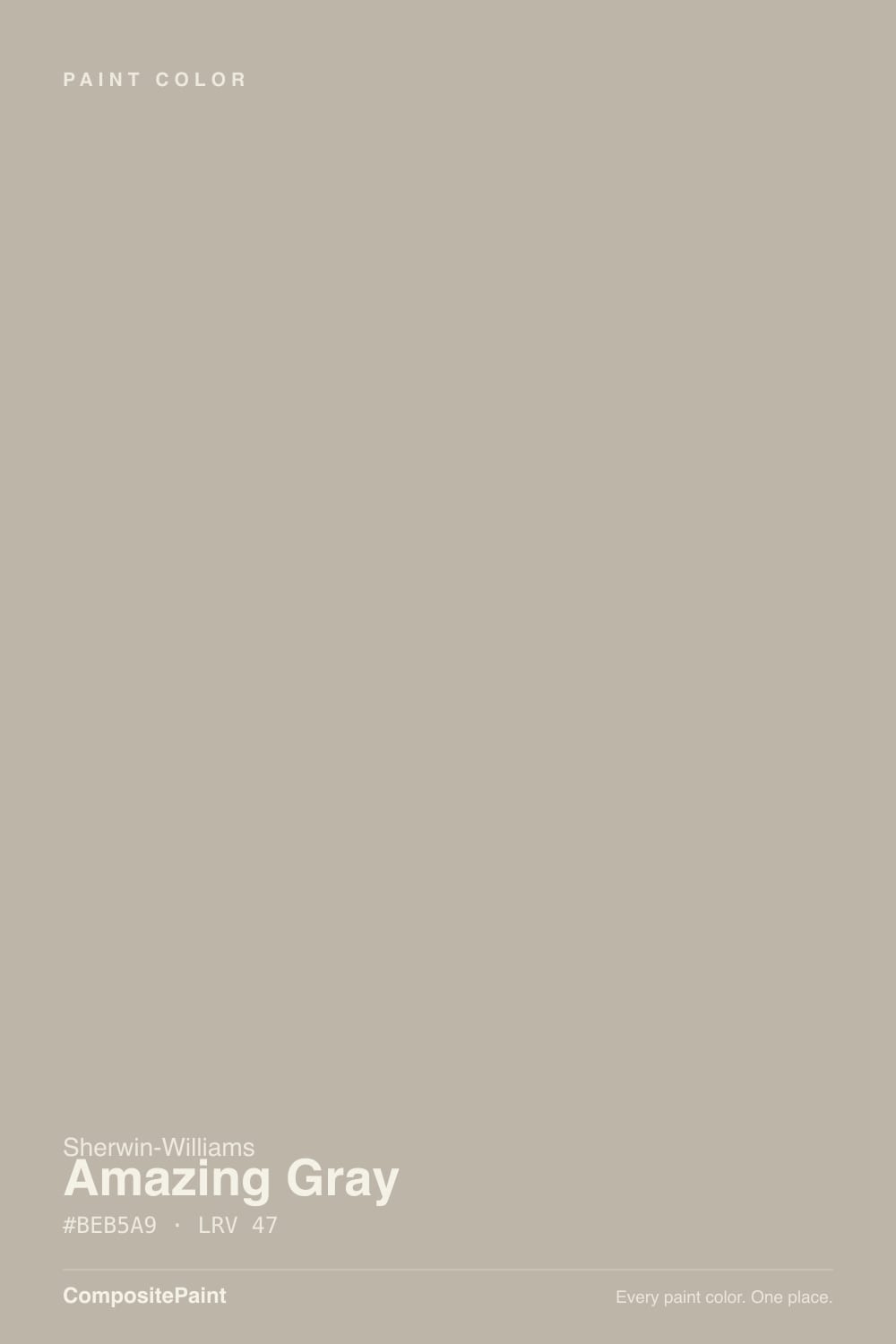
Amazing Gray is a taupe-greige at LRV 47 — noticeably deeper and warmer than its name suggests, with a subtle undertone that can slip toward green the moment the light turns cool. Sherwin-Williams files it right next to Anew Gray, an almost identical color at the same LRV, and the two get cross-shopped constantly; Amazing Gray is the slightly greener, more particular half of that pair. It shines hardest in a single warm-lit room — a kitchen with wood and brass, a bathroom vanity — and struggles the moment you ask it to run the whole house or sit next to cool grey quartz. Treat it as a considered accent, not a default, and it earns the compliment.
Kitchen cabinets and bathroom vanities · one accent room with warm wood and brass · pairing with White Dove, Pure White, or Alabaster trim · homeowners who found Agreeable Gray too pale
You want a single color for the whole house · your room is dim and faces north · your countertops are cool grey quartz · you're choosing between this and Anew Gray and can't tell them apart in the can
- Genuine taupe-greige depth (LRV 47) that reads richer than most greiges
- Flatters warm wood, brass, and butcher block in kitchens and vanities
- Pairs cleanly with White Dove, Pure White, or Alabaster trim
- Deep enough to hold its color and hide scuffs in a busy kitchen
- A real alternative when Agreeable Gray feels too pale for a single room
- Can flash green in cool north light or under cool-white LEDs
- Reads muddy rather than warm in a dim, low-light room
- Fights cool grey quartz and blue-based countertops
- Not built for whole-house duty — Agreeable Gray and Anew Gray both do that job better
What Color Is Amazing Gray, Really?
A taupe-greige with more warmth than its gray-sounding name lets on. Sherwin-Williams places it in the neutral family between beige and gray, and in practice the undertone is genuinely hard to pin down — most rooms read it as a settled, organic neutral, but push it into cool light and a faint green cast can surface. That instability is not a flaw so much as the whole character of the color: it is the "it depends" answer to "is it warm or cool," and an honest review has to say so instead of picking a side for it.
At LRV 47 it sits at real mid-depth — deep enough to give a kitchen or bathroom actual color, not just a tint, and to hold real contrast against white trim without washing out. That depth is also why it is not built for whole-house duty: run it down a hallway that sees three different light sources and it starts to look like a slightly different color room to room, in a way a lighter, steadier greige like Agreeable Gray (LRV 60) does not. Sherwin-Williams lists it right beside Anew Gray, which sits at the identical LRV 47 — the two are close enough that paint counters field this exact comparison more than almost any other pair in the deck, and Anew Gray usually wins the recommendation for its lower green-flash risk.
Undertone in one line: warm taupe with a green tell in cool light — never a true gray, never a clean beige. If your sample looks muddy instead of warm, that is a dim or north-facing room talking, not a bad batch; if it looks faintly green, that is the same undertone showing its other face.
Where It Shines
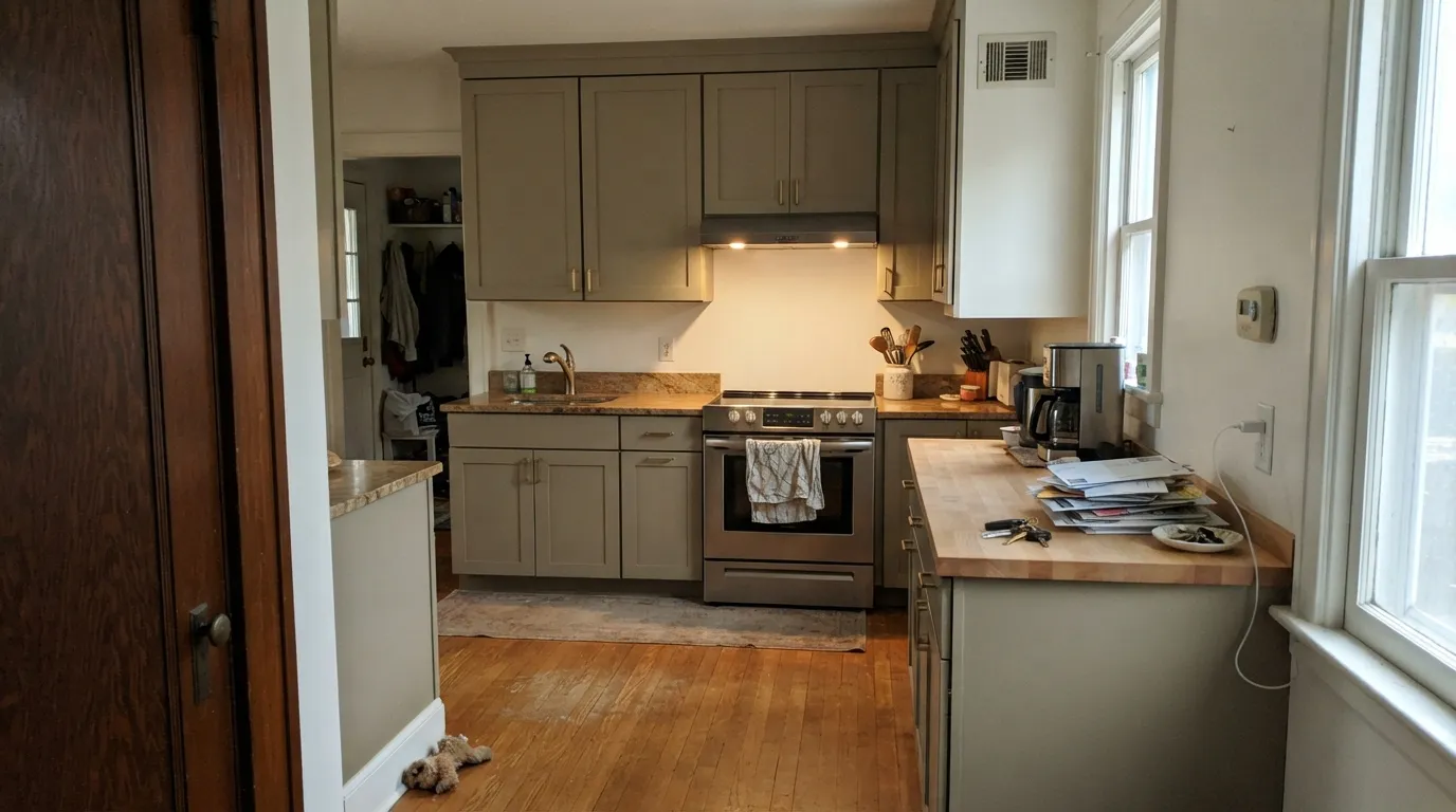
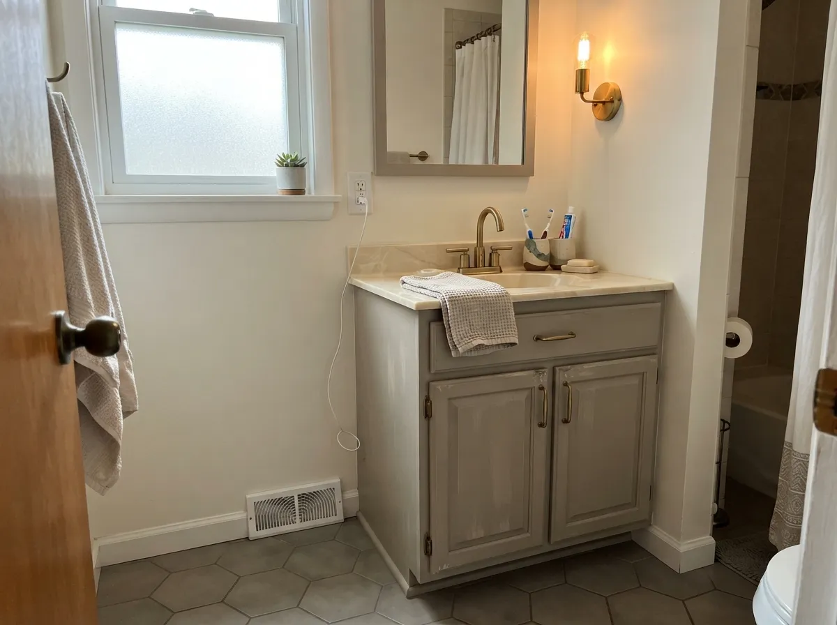
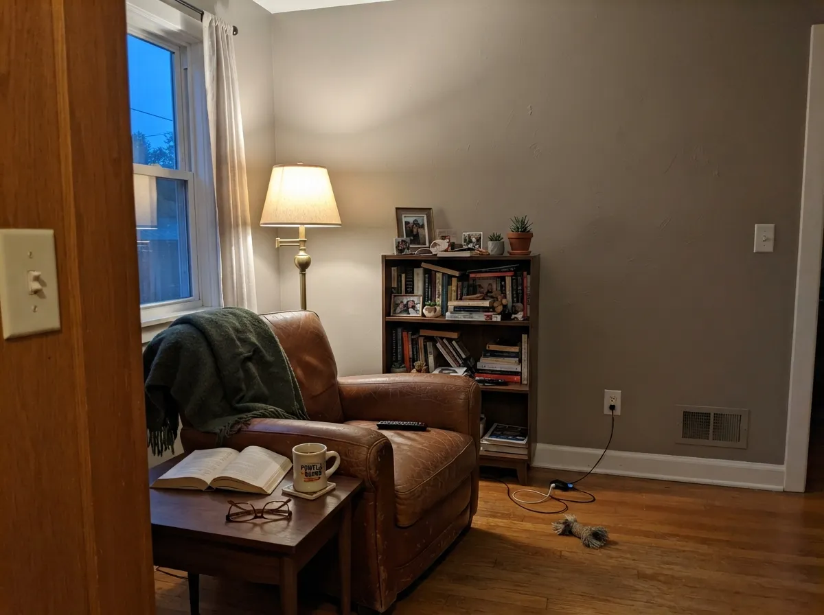
Give it a kitchen or bathroom with warm wood, brass, and real daylight and it looks considered rather than accidental — the greige a designer chose on purpose, not the one that was on sale. It is at its best in doses: cabinets, an island, a vanity, a single den or powder room, where the depth reads as intentional and the color doesn't have to reconcile itself with three different light sources down the hall.
Where It Fails
Almost every regret story about Amazing Gray comes from asking it to do a job it was never built for — usually painting too much of the house, or ignoring the light and the countertops it will actually sit next to. None of these are the paint failing; they are the wrong room getting the right color.
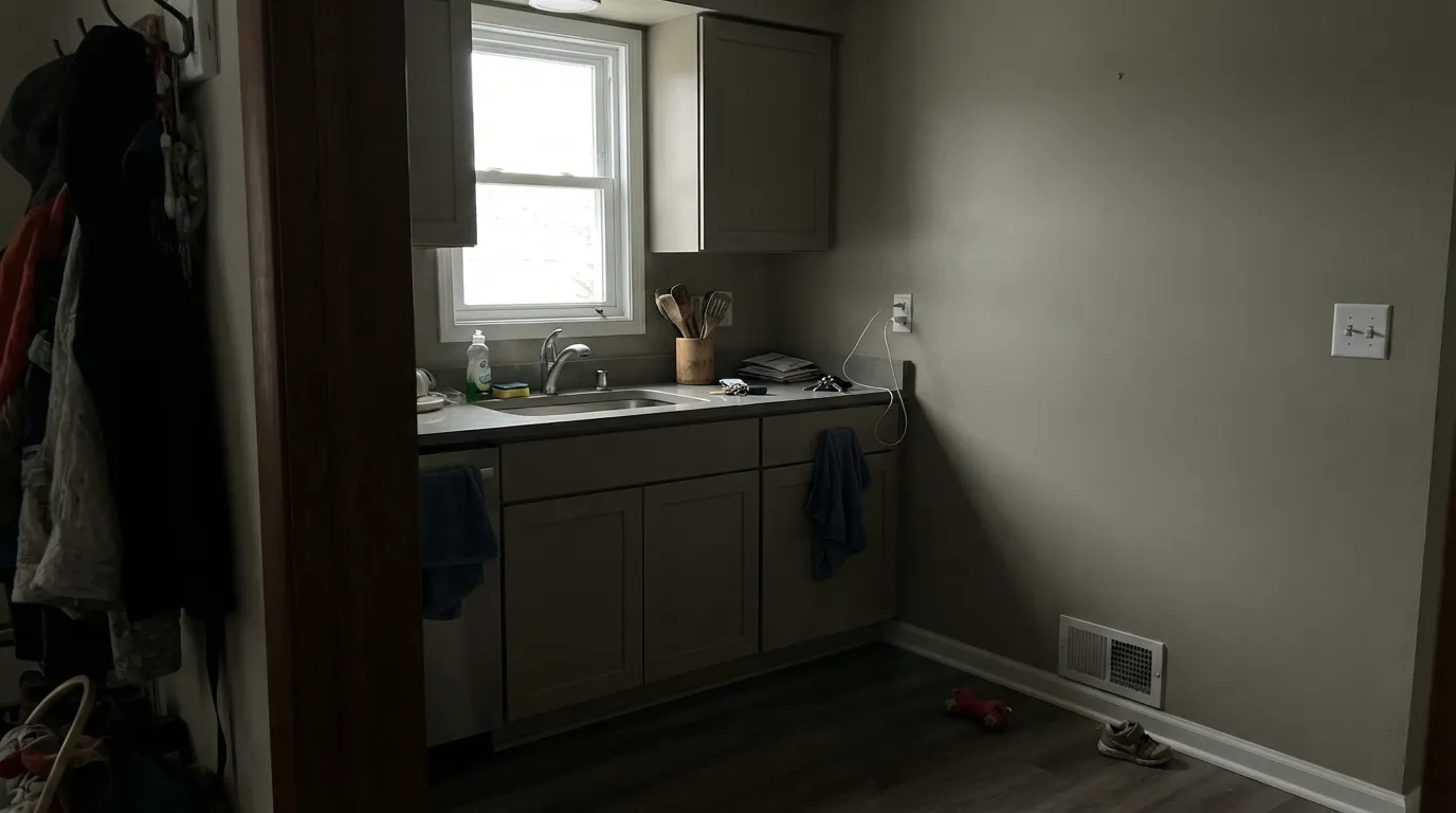
North light is already cool, and Amazing Gray's undertone has a green streak waiting for exactly that kind of light. Owners describe the result as murky or muddy rather than warm. Sample big on the actual wall before committing — this is not a color to trust from the chip alone.
The taupe base wants warm company — wood, brass, cream-toned stone. Blue-grey or icy quartz pulls the opposite direction, and the two start to argue instead of pairing. If the counters are already in, hold a big sample against them before painting the cabinets.
It is a genuinely good single-room color and a genuinely risky whole-house one: carry it through a hallway that sees three different light sources and it stops reading as one consistent color. Agreeable Gray and Anew Gray both do the whole-house job more reliably — save Amazing Gray for the room where you control the light.
Room by Room
Warm wood stains, butcher block, and brass hardware all flatter it, and it holds enough depth that scuffs and fingerprints don't broadcast. White Dove, Pure White, or Alabaster on the walls or trim keep it from looking heavy.
A satin Amazing Gray vanity under a warm-toned counter and brass fixtures is a small, high-payoff commitment. Skip it if the counter is a cool grey stone — that fight shows up fast in a small room.
A closed room with warm lamp light, leather, and wood shelving is where the color gets to be exactly as complex as it wants without a hallway questioning it. This is how most happy owners actually use it.
North-facing walls read cooler and can flash green; south-facing walls read warmer but can go muddy in the corners on an overcast day. Sample both exposures before deciding, not just the brightest wall.
A lighter, steadier greige carries mixed light through a whole floor plan better than Amazing Gray's deeper, more particular undertone can. Use it as the accent, not the base.
Outdoor light shifts constantly through the day, and that is exactly the condition that exposes Amazing Gray's green-flash risk. Agreeable Gray and Anew Gray are the more dependable exterior choices at similar depth; save this one for an interior room you control.
Your Light Is the Risk
Away from harsh north or direct south glare, the taupe settles and reads clean. This is the light every good kitchen or vanity photo of it was taken in.
Cool daylight exposes the green in the undertone and the color can look murky rather than warm. Test a large sample before committing a whole room.
Brighter and warmer through the day, but the organic warmth can tip muddy in shadowed corners on an overcast afternoon.
2700K bulbs lean into the warm taupe. Cool-white LEDs pull the green back out — same paint, opposite report, depending on the bulb.
Most complaints about Amazing Gray are a light mismatch. Upload a photo of your actual room and see it on your walls — then ask for the same wall in north light or evening lamps before you buy a single sample.
Need It From Another Brand?
Any paint counter can custom-tint Sherwin-Williams SW 7044 directly. If you would rather stay in one brand's own deck, these are the closest stock matches, measured as ΔE2000. Under 2 is a difference you will not see on the wall.
| Brand | Closest color | ΔE | LRV | |
|---|---|---|---|---|
| Behr | Graceful GrayPPU18-12 · Behr | 1.9 | 47 | Color page → |
| Benjamin Moore | CosmopolitanCSP-100 · Benjamin Moore | 2.3 | 47 | Color page → |
| Valspar | Frappe6003-1B · Valspar | 1.0 | 47.1 | Color page → |
| PPG / Glidden | Ghost WriterPPG1007-3 · PPG / Glidden | 1.7 | 47 | Color page → |
| Glidden | Ghost WriterPPG1007-3 · Glidden | 2.0 | 48 | Color page → |
| Dutch Boy | Rhino-ed Gray440-2DB · Dutch Boy | 0.0 | 47 | Color page → |
Similar Sherwin-Williams Colors
The nearest shades to Amazing Gray within Sherwin-Williams's own range, ranked by perceptual color distance — useful when you want the same look a touch lighter, darker, or warmer.
WCAG 2.1: AA is 4.5 : 1 for normal text, 3 : 1 for large text, AAA is 7 : 1.
Amazing Gray vs the Colors You're Also Considering
Every Amazing Gray sample board has the same rivals on it. The numbers show the real lightness gap — then it comes down to which risk you would rather live with.
Pick this if you've seen both in person and prefer Amazing Gray's slightly more taupe-green complexity.
Sherwin-Williams SW 7030 · LRV 47Anew GrayPick this if you want the same LRV 47 depth with less green-flash risk — it's the twin most paint counters actually recommend.
Pick this for a single room with real depth — Agreeable Gray at LRV 60 can look pale by comparison.
Sherwin-Williams SW 7029 · LRV 60Agreeable GrayPick this for a whole-house color that doesn't argue with mixed light — lighter, steadier, and famously safe.
Side-by-side comparison →The pairing people ask about most is Amazing Gray against Agreeable Gray (SW 7029), which is #D1CABC at LRV 60. Thirteen points lighter, it is the airier greige for whole-house use. Amazing Gray at #BEB5A9 and LRV 47 is the same family with real depth, so it holds walls better in bright rooms and reads too heavy in dark ones.
Its closest Sherwin-Williams neighbors are almost interchangeable: Anew Gray (SW 7030) is #BFB6AA at LRV 47 and Analytical Gray (SW 7051) is #BFB6A7 at LRV 47. Pachyderm (SW 9596), #BAB3A6 at LRV 45, is the one meaningful step darker.
Across brands, Dutch Boy Rhino-ed Gray (440-2DB) has a deltaE of 0 and HGTV Home by Sherwin-Williams Anew Gray (HGSW 3466) is 0.27, both exact matches. Behr Smokestack (N220-3) at 1.55 and PPG Ghost Writer (PPG1007-3) at 1.67 are visually identical in normal room light. Benjamin Moore Cosmopolitan (CSP-100) at 2.28 and Farrow and Ball Jitney (No. 293) at 2.79 are very close but worth sampling first. Clare Greige (PNT100-LT-13) at 3.4 is close but visibly different side by side.
Amazing Gray Coordinating Colors
The rule for coordinating with Amazing Gray: keep the trim warm and light, and give the taupe one dark, confident note rather than several competing grays. It flatters warm woods and brass, and pairs best with whites that lean soft rather than stark. These are the partners that keep showing up in rooms that work:
Amazing Gray vs. Anew Gray: The Twin Everyone Confuses It With
Sherwin-Williams put these two side by side in the deck at the identical LRV 47, and it is not an accident that they get asked about together constantly. Both are warm taupe-greiges with a green streak lurking in cool light. The difference is a matter of degree, not kind: Anew Gray leans slightly more neutral and is less prone to the green flash, which is why it is the color most paint counters steer undecided customers toward when they ask for "something like Amazing Gray, but safer."
That does not make Amazing Gray the wrong choice — it makes it the more particular one. If you have stood in front of both chips and genuinely preferred Amazing Gray's extra taupe complexity, trust your eyes over the safer recommendation. Just sample both on the actual wall in the actual light before buying either one; on paper they are close enough that the difference only shows up in person.
Amazing Gray With Wood Tones and Countertops
Wood is the easy half of this decision. Oak, walnut, and butcher block all read warmer and richer against Amazing Gray, and it is one of the few greiges deep enough to sit next to dark walnut cabinetry without disappearing. Unlike some cooler grays, it does not fight orange-leaning honey oak the way a blue-based gray would — the taupe base gives both the wood and the wall something warm in common.
Countertops are the real decision point. Warm quartz, soft cream stone, and butcher block all pair easily. Cool grey or icy-white quartz is the honest exception: it sits at the opposite temperature from the taupe base, and the two can read as mismatched rather than intentional. If the counters are already installed and lean cool, hold a large sample against them in the room's actual light before painting the cabinets — this is the single most common regret with this color, more than the green-flash issue itself.
Three Ready Palettes Built on Amazing Gray
A color is never alone on the wall. These are complete combinations in the 60-30-10 pattern, with the reason each one holds together. Every one opens in the visualizer.
White Dove keeps the room bright and warm enough that Amazing Gray's taupe never tips green; Kendall Charcoal gives one dark note so the kitchen doesn't read as a single flat block of greige.
Try this palette in your roomAlabaster keeps a small bathroom feeling open while the vanity carries the color; Peppercorn on the mirror frame and fixtures gives the room one confident dark line instead of a gray-on-gray blur.
Try this palette in your roomThis is the fix for the color's one real limitation: let Agreeable Gray carry the mixed light of the main floor, and give Amazing Gray the single closed room where its extra depth and warmth can shine without a hallway arguing with it.
Try this palette in your roomAmazing Gray FAQ
Is Amazing Gray warm or cool?
Warm at heart — it is a taupe-greige, not a true gray — but the undertone is subtle enough to slip cool. In north light or under cool LEDs it can flash a faint green; in warm light and lamps it reads as a settled, organic taupe. Sample both before deciding which one you got.
What is the difference between Amazing Gray and Anew Gray?
Both sit at LRV 47, and paint counters cross-shop them constantly. Anew Gray is the safer, less green-leaning of the two and gets recommended more often for that reason. Amazing Gray has a touch more taupe complexity — pick it if you've seen both on the wall and specifically prefer that extra character.
Is Amazing Gray good for a whole house?
Not usually. Its depth and undertone make it look slightly different under a hallway's mixed light sources than it does in one steady room. For whole-house coverage, Agreeable Gray or Anew Gray are the more dependable picks; save Amazing Gray for a single kitchen, bath, or den.
Does Amazing Gray look green?
It can, specifically in cool north light or under cool-white LED bulbs — the undertone has a genuine green streak waiting for that condition. Warm 2700K bulbs and any real daylight that isn't due north keep it reading as taupe, not green.
What trim white goes with Amazing Gray?
White Dove, Pure White, or Alabaster all work — soft, warm-leaning whites that don't fight the taupe base. A stark, blue-white trim will make the walls look muddier by contrast.
Is Amazing Gray good for kitchen cabinets?
Yes — it is arguably its best job, especially with warm wood, butcher block, and brass hardware. The one thing to check first is the countertop: cool grey quartz can clash with the taupe base, so sample a large chip against the actual counter before committing the whole run.
Have you painted with Amazing Gray?
Rate it — one tap helps the next reader decide.
Ask a Question