Graceful Gray
Behr's mid-tone greige, reviewed honestly: the rooms where it reads expensive, the light that turns it brown, and why the word Gray in the name causes most of the regret.

Jessica has spec'd whites and neutrals for more than 300 rooms and keeps a sample wall of painted drawdowns in her studio. Every color review is checked against real reader rooms in the comments and re-tested when a formula changes. About the testing process →
- 1Anonymous20
- 2Dorian Gray39
- 3Graceful Gray47
- 4Agreeable Gray60
- 5Pale Oak69
The Fast Verdict
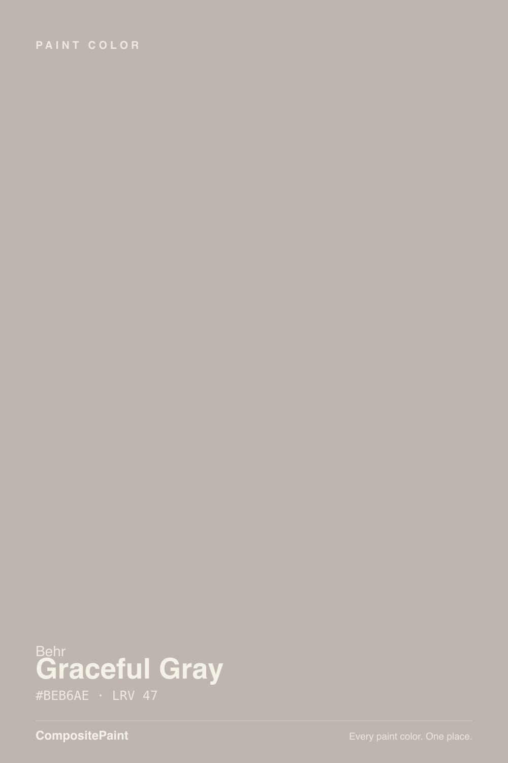
Graceful Gray is a warm mid-tone greige that behaves much more like a taupe than a gray — Behr's own color card describes it as a taupe, and the wall agrees. At LRV 47 it is a real color, not a soft neutral: it grounds a room, hides scuffs, and looks costly next to cream and walnut. Buy it for the warmth and you will be happy. Buy it expecting gray and you will be repainting.
Living and family rooms with real daylight · bedrooms that should feel warm · closets and dressing rooms with good lighting · hallways and offices that take a beating · exterior siding
You actually want gray · the room is small, dim, or windowless · your floors are cool gray LVP · your trim will stay builder bright-white with nothing else warm in the room
- Real mid-tone depth — holds its color instead of washing out at noon
- Warm enough to flatter oak, walnut, leather and brass
- Hides scuffs, handprints and chair marks far better than a pale greige
- Makes ordinary white trim look crisp and intentional
- Behr availability: mixed in nearly every line at Home Depot, exterior included
- Reads taupe, not gray — the name sets the wrong expectation
- LRV 47 is too heavy for small, dim or windowless rooms
- Goes muddy gray-brown in cool north light with no lamps
- Fights cool gray floors and blue-gray tile
What Color Is Graceful Gray, Really?
A greige built on the brown side of the fence. Gray and beige are mixed here at a ratio that lands closer to taupe than to gray, which is why Behr's own description reaches for the word taupe rather than gray on a color it named Graceful Gray. On the chip, under fluorescent store lights, it looks like a safe warm gray. On four walls in a real room it reads soft brown-taupe most of the day. That gap between chip and wall is the single most important thing to know about this color.
At LRV 47 it sits right at the midpoint of the scale, and mid-tone is a different job than light neutral. Compare it to the greiges people usually shop against — Agreeable Gray at LRV 60, Silver Drop at LRV 60 — and Graceful Gray is a full step deeper. It will not brighten a room. It will absorb about half the light that hits it, hold its color at noon instead of washing out, and make the trim next to it look genuinely white. In a bright room that is exactly the point. In a dim one it is the problem.
Undertone in one line: warm brown-taupe first, gray second — never blue. In cool north light the brown steps back and a faint green-gray cast can surface, especially if there is a lawn or foliage outside the window bouncing light in. That is your room editing the paint, and it is predictable enough to test for before you commit.
Where It Shines
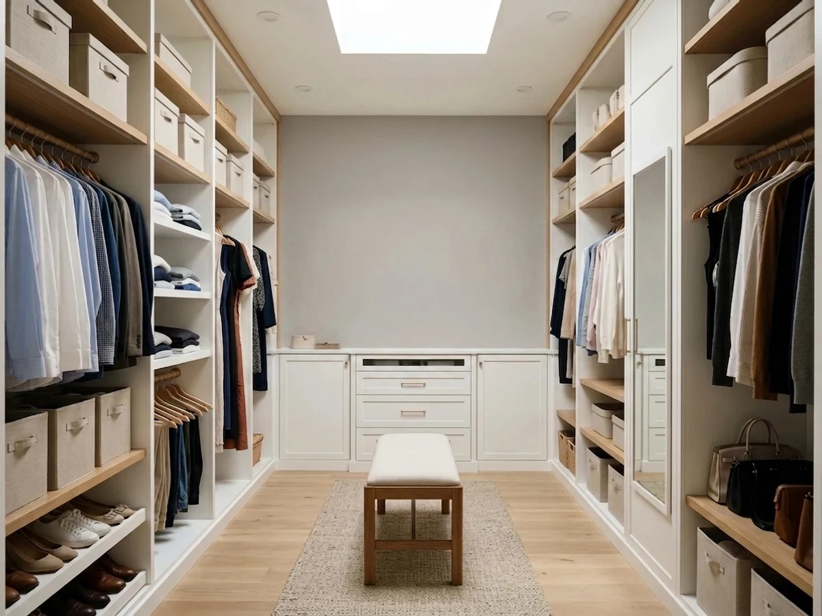
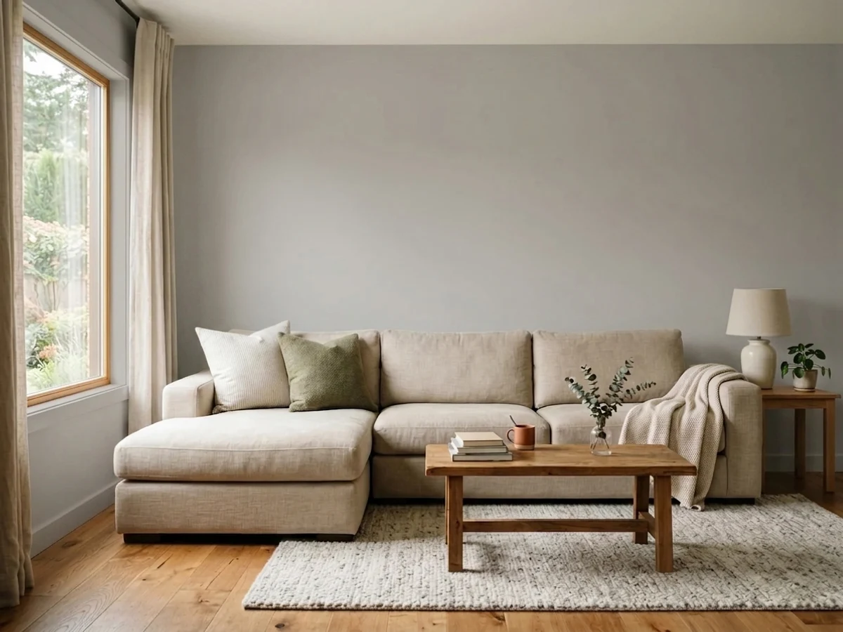
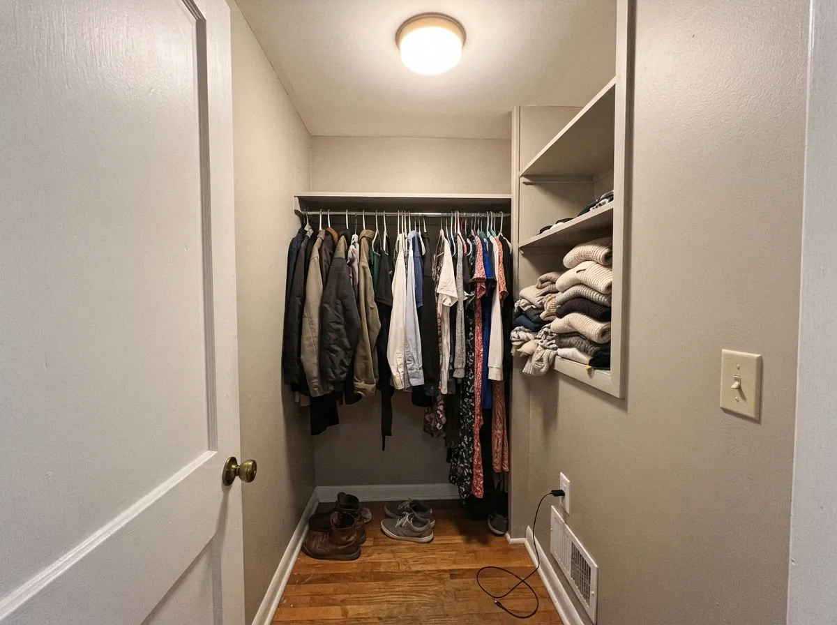
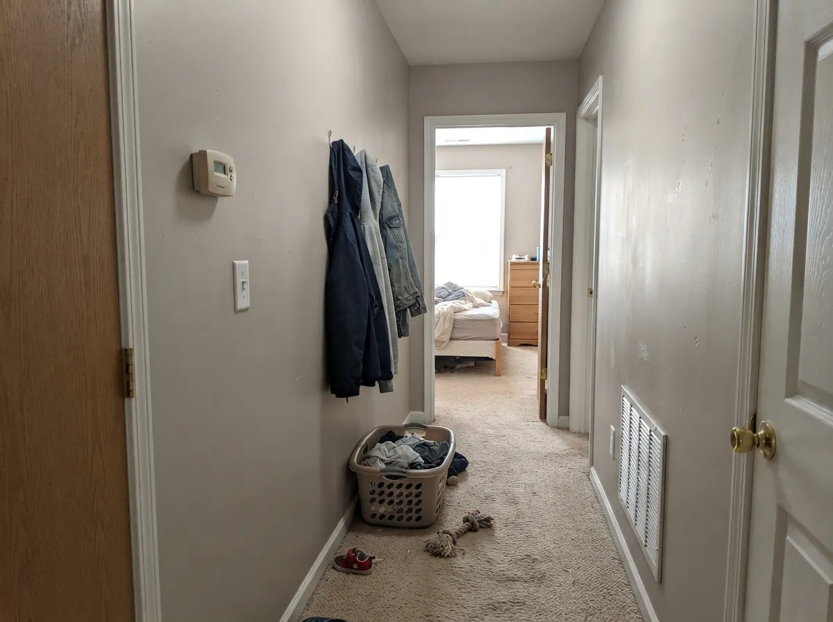
Give it daylight and warm materials and it stops looking like a builder neutral and starts looking like a decision. It is at its best on a main floor with oak floors, cream upholstery and brass — the depth is what makes cheap furniture look intentional and white trim look crisp instead of dingy. Its underrated second life is in the small enclosed rooms: closets, dressing rooms, powder rooms and offices, where a mid-tone warm neutral reads like a boutique fitting room and hides the handprints that a pale greige broadcasts.
Where It Fails
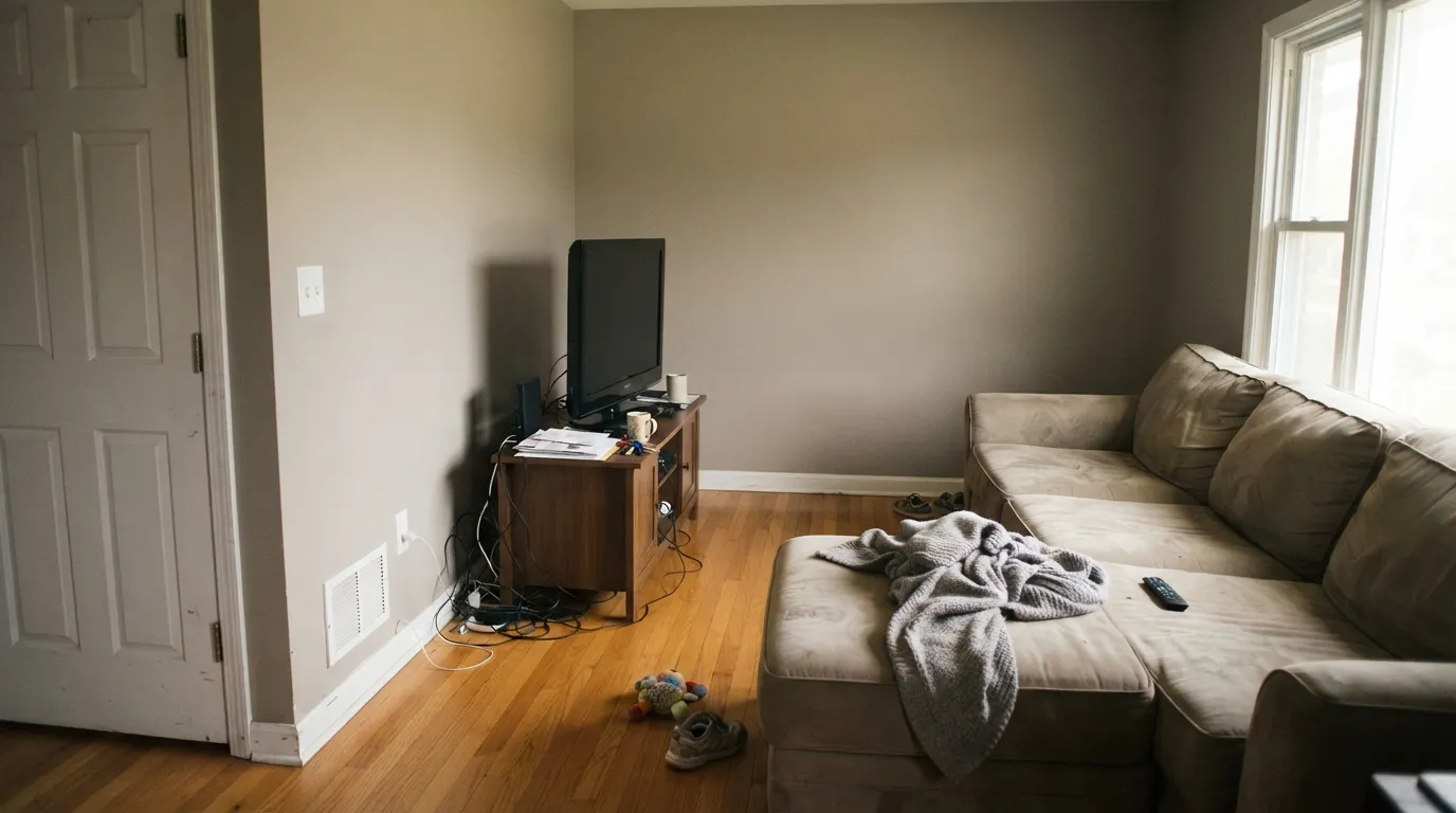
The complaint pattern with this color is remarkably consistent, and every version of it is predictable before you open the can. None of these are defects in the paint — but if your room matches one, buy a different color rather than a third coat.
This is the number-one regret, and the name causes it. On the wall the brown is obvious, and in south or west sun it goes full warm taupe. If you want a genuine gray in the same depth from the same Behr strip, that is Classic Silver (PPU18-11, LRV 48) — one number away on the fan deck and a completely different temperature.
LRV 47 means the walls give back about half the light. In a north-facing bedroom on an overcast day, or a hallway with no window, the warmth drains out and what is left is a heavy muddy gray-brown that makes the room feel smaller and older. Either add real lamp light as part of the paint job, or step up to Silver Drop (LRV 60) for the same family with air in it.
Gray-washed LVP, cool gray tile and blue-gray carpet sit at the opposite temperature and drag the brown out of hiding — the wall suddenly looks dirty rather than warm. The same thing happens when Graceful Gray walls meet stark builder white trim with nothing else warm in the room. Warm the trim to Polar Bear (LRV 86), or pick a cooler neutral and stop fighting the floor.
Room by Room
With side or south windows it is genuinely handsome: deep enough to frame a TV wall without an accent color, warm enough that oak, leather and brass all look deliberate. Eggshell on walls; keep at least one lamp on after dark and the room stays warm instead of going flat.
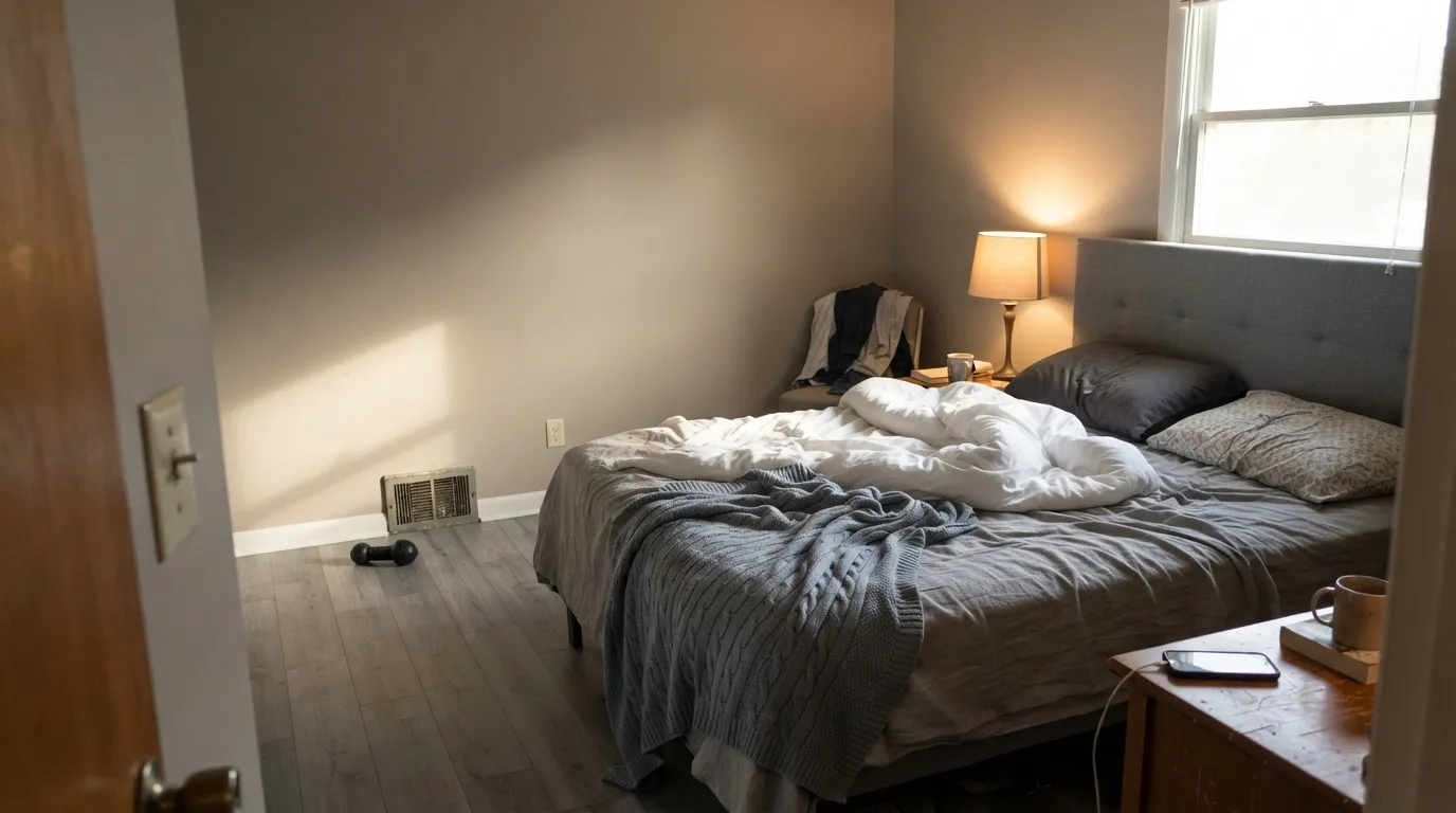
The mid-tone depth is the whole appeal here — it makes a bedroom feel enclosed and calm rather than bright and blank. Pair with cream bedding, not white, and warm 2700K bulbs. A dim north bedroom with no lamps is the one version to avoid.
Color-drench it: walls, shelving and the inside of the door, all in eggshell. The depth reads like a fitting room, and unlike a pale greige it does not show every knuckle mark around the rod and the shelf edges. The condition is light — a closet running on one weak bulb will look like a cave, so put a decent warm LED fixture in before you paint.
As a wall color behind white or cream cabinets it is excellent, and it takes granite and quartz with warm flecks without arguing. On the cabinets themselves it is a bigger bet: satin enamel, and only in a kitchen with real daylight, because at LRV 47 a full run of these cabinets can close a small kitchen in. An island alone is the safer version.
These are the rooms where the mid-tone actually earns money: it hides bag scuffs, shoe marks and chair rub far better than a light neutral, and behind a monitor it cuts glare. Semi-gloss on the door casings so the wipe-downs do not burnish the wall.
Behr sells this color across its exterior, masonry and stucco lines, and full sun does it a favor: outdoors it reads a step lighter and cleaner than it does inside, landing as a warm mid-tone greige siding. With near-black trim it is the standard modern look; with cream trim it goes traditional. Avoid cool blue-gray accents, which make the brown look like discoloration.
Your Light Is the Risk
Bright warm daylight brings the taupe forward and the wall looks rich rather than heavy. This is the room to buy it for.
Cool flat daylight strips the brown and leaves a muddy gray, sometimes with a faint green edge. Sample here before you commit.
Quiet greige in the shade hours, distinctly warm taupe when the sun swings around. The golden-hour version is the brownest it gets.
2700K bulbs deepen it into a cozy warm taupe. Cool 4000K LEDs flatten it toward drab gray — swap the bulbs, not the paint.
Most complaints about Graceful Gray are a light mismatch. Upload a photo of your actual room and see it on your walls — then ask for the same wall in north light or evening lamps before you buy a single sample.
Need It From Another Brand?
Any paint counter can custom-tint Behr PPU18-12 directly. If you would rather stay in one brand's own deck, these are the closest stock matches, measured as ΔE2000. Under 2 is a difference you will not see on the wall.
| Brand | Closest color | ΔE | LRV | |
|---|---|---|---|---|
| Sherwin-Williams | Mindful GraySW 7016 · Sherwin-Williams | 2.1 | 48 | Color page → |
| Benjamin Moore | Himalayan Trek1542 · Benjamin Moore | 1.7 | 47 | Color page → |
| Valspar | Luxe Gray8005-4C · Valspar | 1.8 | 47 | Color page → |
| PPG / Glidden | Ghost WriterPPG1007-3 · PPG / Glidden | 1.3 | 47 | Color page → |
| Glidden | Silver DollarPPG1022-3 · Glidden | 0.5 | 47 | Color page → |
| Dutch Boy | Comfortable Gray443-2DB · Dutch Boy | 1.8 | 47 | Color page → |
Similar Behr Colors
The nearest shades to Graceful Gray within Behr's own range, ranked by perceptual color distance — useful when you want the same look a touch lighter, darker, or warmer.
WCAG 2.1: AA is 4.5 : 1 for normal text, 3 : 1 for large text, AAA is 7 : 1.
Graceful Gray vs the Colors You're Also Considering
Every Graceful Gray sample board has the same rivals on it. The numbers show the real lightness gap — then it comes down to which risk you would rather live with.
Pick this when you want the warmth and do not want a gray that goes cold on a cloudy day.
Behr PPU18-11 · LRV 48Classic SilverPick this if you genuinely want gray — same strip, same depth, none of the brown.
Pick this when LRV 42 would close the room in and you still want the same warm family.
Behr PPU18-13 · LRV 42Perfect TaupePick this for one step deeper and more openly taupe — better in a bright room that can take the weight.
Graceful Gray Coordinating Colors
The rule for coordinating with Graceful Gray is to stay warm and change the depth, not the temperature. It layers beautifully with the rest of Behr's neutral strips, takes a warm white on the trim, and needs one dark note somewhere in the room so the mid-tone does not read as the whole story. What it does not want next to it is anything blue-gray. These are the partners that keep working:
Why It Says Gray and Behaves Like Taupe
Look at where this color sits in Behr's deck and the confusion explains itself. The PPU18 strip runs from Cracked Pepper at the black end up through a run of neutrals, and the numbers on either side of Graceful Gray point in two different directions: Classic Silver at PPU18-11 is a genuine gray that leans whichever way your windows do, and Perfect Taupe at PPU18-13 is openly a taupe. Graceful Gray sits between them at LRV 47 and has more in common with the taupe side — which is exactly how Behr's own color description reads, taupe rather than gray.
That mismatch is not a marketing trick so much as a leftover from the gray decade, when almost every warm neutral got a gray name because that is what people were searching for. The practical takeaway is simple and it saves a repaint: ignore the word Gray on the label, sample a large card on the wall you actually plan to paint, and look at it at three in the afternoon. What you see then is what you are buying.
Graceful Gray With Wood Tones and Floors
This is where the brown lean turns into an advantage. Honey oak and orange-leaning builder oak — the floors that fight cool grays until the whole room looks yellow — sit comfortably against Graceful Gray, because the wall already carries some of that warmth and meets the floor partway instead of arguing with it. Walnut, hickory and warm engineered oak are all easy. Cream carpet is easy. If your house came with oak floors you are not replacing, this is one of the more forgiving mid-tone neutrals you can put above them.
The floor that needs a real sample first is cool gray: gray-washed wood, gray LVP, gray porcelain tile. Against a cool gray plank the wall's brown becomes obvious in a way that reads dingy rather than warm, and the more light the room has, the more visible it gets. A large warm rug fixes it in some rooms; in a small room with gray floors edge to edge, pick a cooler neutral instead of hoping.
Metals follow the same logic. Brass, bronze, matte black and warm nickel all sit well against it. Polished chrome is the one that looks slightly out of place — not a dealbreaker in a bathroom, but do not build a whole room of it around these walls.
Three Ready Palettes Built on Graceful Gray
A color is never alone on the wall. These are complete combinations in the 60-30-10 pattern, with the reason each one holds together. Every one opens in the visualizer.
Polar Bear is the right trim partner because it is warm enough not to make the walls look dirty and light enough at LRV 86 to still read as white. Cracked Pepper comes off the same PPU18 strip and is Behr's default near-black, dark enough that the doors read as punctuation rather than as another color in the room.
Try this palette in your roomDrenching the walls and the built-ins in one mid-tone hides the seams between shelving and drywall, which is what makes a closet look built rather than assembled. Ultra Pure White overhead at LRV 92 bounces the fixture light back down so the depth never turns into gloom, and Black Mocha is a warm-brown black — it grounds the door without going cold against the taupe.
Try this palette in your roomThree warm neutrals at three depths is the quietest way to give a bedroom structure without adding a color. Behr's Swiss Coffee is a soft cream rather than a bright white, so the trim line stays gentle, and Toasty Gray behind the bed at LRV 33 gives the room a focal wall that still disappears when the lights go out.
Try this palette in your roomGraceful Gray FAQ
Is Graceful Gray a gray or a beige?
Neither, really — it is a greige that lands on the taupe side. Behr's own color description calls it a taupe, and on the wall the brown is the first thing most people see. It only passes for gray in cool north light or under cool LEDs. If a true gray is the goal, Classic Silver (PPU18-11, LRV 48) is the same depth on the same strip without the brown.
Is it too dark for a small room?
Often, yes. At LRV 47 it reflects roughly half the light that hits it, so a small bedroom, a windowless hallway or a north-facing bath will feel noticeably closed in. In small rooms it works when you want that enclosed effect on purpose — a closet, a powder room, a den — and when there is decent warm lighting. Otherwise use Silver Drop (LRV 60) and keep the family.
What trim color goes with Graceful Gray?
A warm white is the safe answer: Polar Bear (LRV 86) or Behr's Swiss Coffee (LRV 80) both keep the edge soft. Ultra Pure White (LRV 92) works too and gives crisper contrast, but it is a stark white — use it only when the room has other warm materials, because on its own it can make the walls read a shade dirty. Semi-gloss on trim, eggshell on walls.
Is it the same as Sherwin-Williams Anew Gray?
Close, not identical. Both sit at LRV 47 and both are warm mid-tone greiges, which is why the swap comes up constantly when someone wants the Sherwin look from Home Depot. Anew Gray leans slightly more green-tan in cool light; Graceful Gray leans a touch more brown. Sample both on the same wall before you decide the substitution is free.
Does it work in a closet or dressing room?
It is one of its best uses, with one condition. Painted on walls, shelving and the inside of the door, the mid-tone depth makes a closet read like a fitting room and hides the marks that collect around rods and shelf edges. The condition is lighting — a closet with a single dim bulb will look like a cave at LRV 47. Add a warm LED fixture first, keep the ceiling in a bright white, and it looks expensive.
Can I use it on the outside of my house?
Yes — Behr mixes it in exterior, masonry and stucco lines, and it behaves better outdoors than its indoor reputation suggests. Full sun lifts it, so expect the siding to read a step lighter and cleaner than the interior sample. Pair with near-black or charcoal trim for the modern look, or cream trim for a traditional one, and keep cool blue-gray accents away from it — they make the brown look like a stain rather than a color.
Have you painted with Graceful Gray?
Rate it — one tap helps the next reader decide.
Ask a Question