Creamy Mushroom
Behr's most-asked-about taupe, reviewed honestly: the rooms where it looks expensive, the light that turns it pink, and what to buy instead.

Jessica has spec'd whites and neutrals for more than 300 rooms and keeps a sample wall of painted drawdowns in her studio. Every color review is checked against real reader rooms in the comments and re-tested when a formula changes. About the testing process →
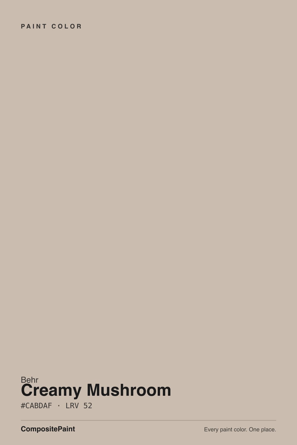
- 1Dorian Gray39
- 2Pashmina44
- 3Creamy Mushroom52
- 4Agreeable Gray60
- 5Pale Oak69
The Fast Verdict
Creamy Mushroom is the color people picture when they say taupe: warm, soft, and heavy enough to look like a decision instead of a builder default. At LRV 52 it gives walls real presence, which is exactly why it flatters oak, leather, and brass and exactly why it can feel closed-in in a small dark room.
The catch is the red side of its warmth — in hard afternoon sun or under 2700K bulbs a big wall can go pinkish. Sample it on your sunniest wall, look at it after dark, and you will know in a day whether this is your color.
Living and dining rooms with warm wood floors · bedrooms that want depth, not brightness · kitchen islands and bathroom vanities · hallways and stairwells that take a beating
Your floors are cool gray LVP · the room is small and barely gets daylight · your trim is a bright blue-white · you hate anything that can read pink
- Real taupe depth — walls look chosen, not defaulted
- Flatters oak, walnut, leather, brass and natural stone
- Hides scuffs and handprints in hallways and stairwells
- Works on islands and vanities as a warm alternative to white
- Has an exact Benjamin Moore twin, so your painter can match it either way
- Turns pinkish-mauve in strong afternoon sun and under 2700K bulbs
- LRV 52 makes small, dim rooms feel heavier and muddier
- Fights cool gray floors and blue-white trim
- Flat-sheen Behr in a busy hallway burnishes where it gets wiped
What Color Is Creamy Mushroom, Really?
This is a taupe, not a beige and not a greige, and the difference is the red in it. The hue sits at 31 degrees — pushed further toward red than the sandy beiges most people compare it to — with just enough saturation for the warmth to be visible on a wall. That is what makes it read as mushroom: soft, slightly dusty, with a brown-gray body instead of the yellow glow of a 1990s tan.
At LRV 52 it reflects a little over half the light that hits it, and that number matters more here than the undertone. Put it beside Sherwin-Williams Agreeable Gray at LRV 60 and Creamy Mushroom looks noticeably heavier and browner; beside Behr Dove HDC-MD-21 at LRV 67 it looks like a different color entirely. It sits at the bottom edge of what most people call light, so it darkens a room instead of opening it up.
Undertone in one line: warm red-orange, taupe not tan — never green, never gray-blue. If your sample looks pink, that is the red base meeting warm light, and it is the one thing worth testing before you buy a gallon.
Where It Shines
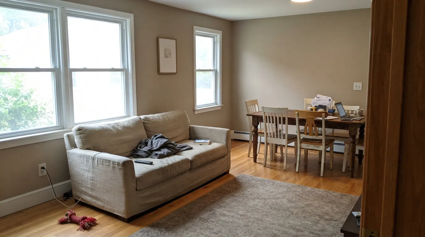
Give it daylight and warm materials — oak, walnut, leather, brass, natural stone — and it does the thing very few mid-tone neutrals manage: it looks quiet and expensive at the same time. It is at its best on big surfaces in rooms that felt washed out in a lighter neutral, and on hallways where a light greige shows every handprint.
Where It Fails
The bad stories about this color are always the same three rooms, and all three are predictable before you open the can. If your room matches one of them, no second coat and no different sheen will fix it.
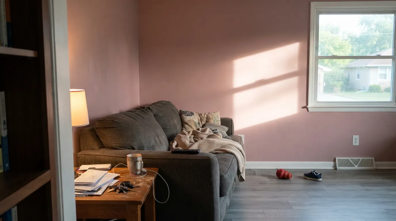
Strong warm light lands on a red-based color and pulls the red forward. On a small chip it stays taupe; on a full wall at three in the afternoon it can read pinkish-mauve, and people describe it as looking like an old bathroom. If you love the depth but not the pink, use Behr Matrix T13-8 — same LRV 52, sitting more toward yellow.
LRV 52 does not brighten anything. In a windowless powder room, an interior hallway, or a north bedroom with one small window, the warmth mutes and the walls go heavy and slightly muddy. Step up 15 points to Behr Dove HDC-MD-21 at LRV 67 and you keep the same warm red-orange base with air around it.
This is the pairing that produces most of the regret. Gray LVP, blue-gray tile, or a stark blue-white trim sits at the opposite temperature and shoves the pink into relief, so the walls stop reading neutral and start reading dusty rose. In a gray-floor house pick a gray-based neutral like Sherwin-Williams Agreeable Gray SW 7029 instead.
Room by Room
Enough depth to make a table and chairs look framed, without going dark. Eggshell on walls, Behr White 52 on trim in semi-gloss, and it loves brass lighting and a walnut table.
Fills a large open wall the way a light greige cannot, and warms up oak flooring instead of fighting it. If the room is south-facing, test on the sunniest wall first — that is where the pink shows.
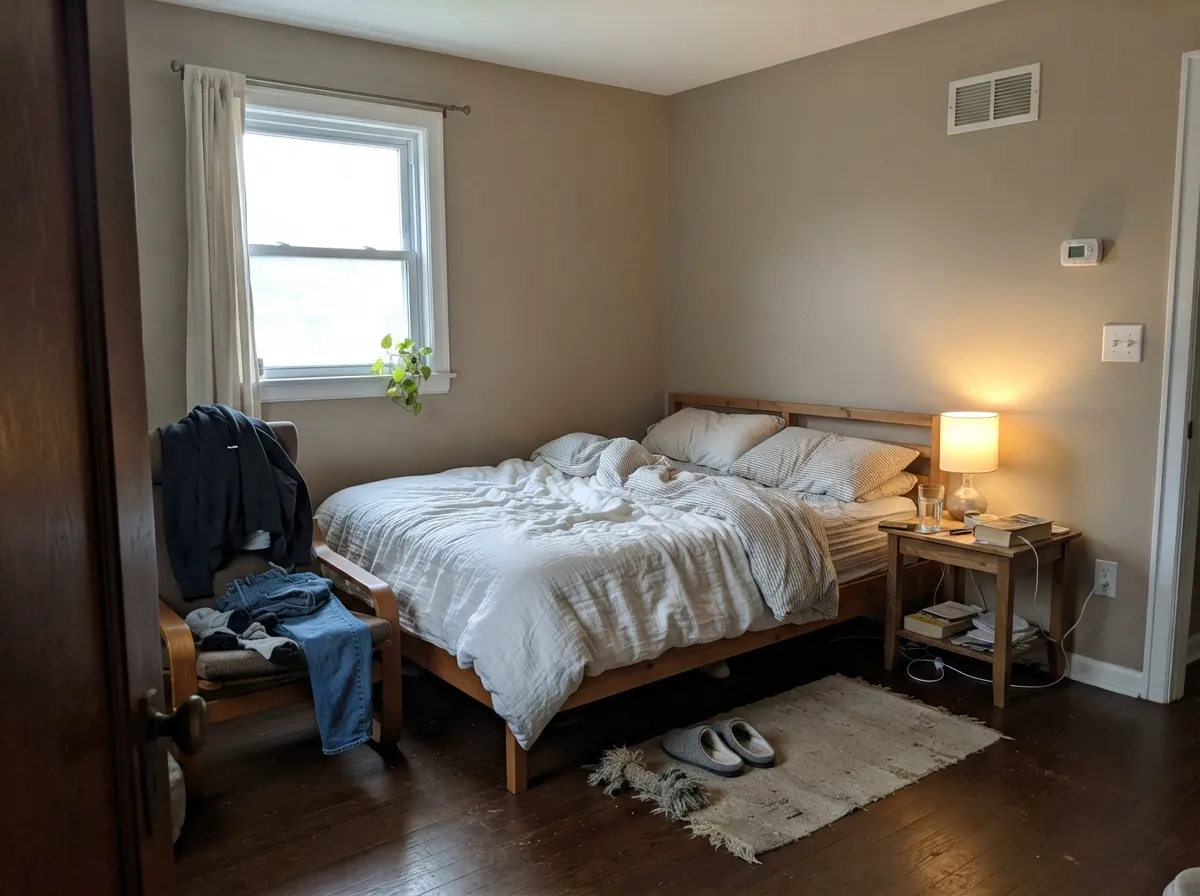
Under 2700K lamps it turns soft and slightly rosy at night, which most people read as cozy. Pair with Behr White 52 on ceiling and trim so the walls do not close in.
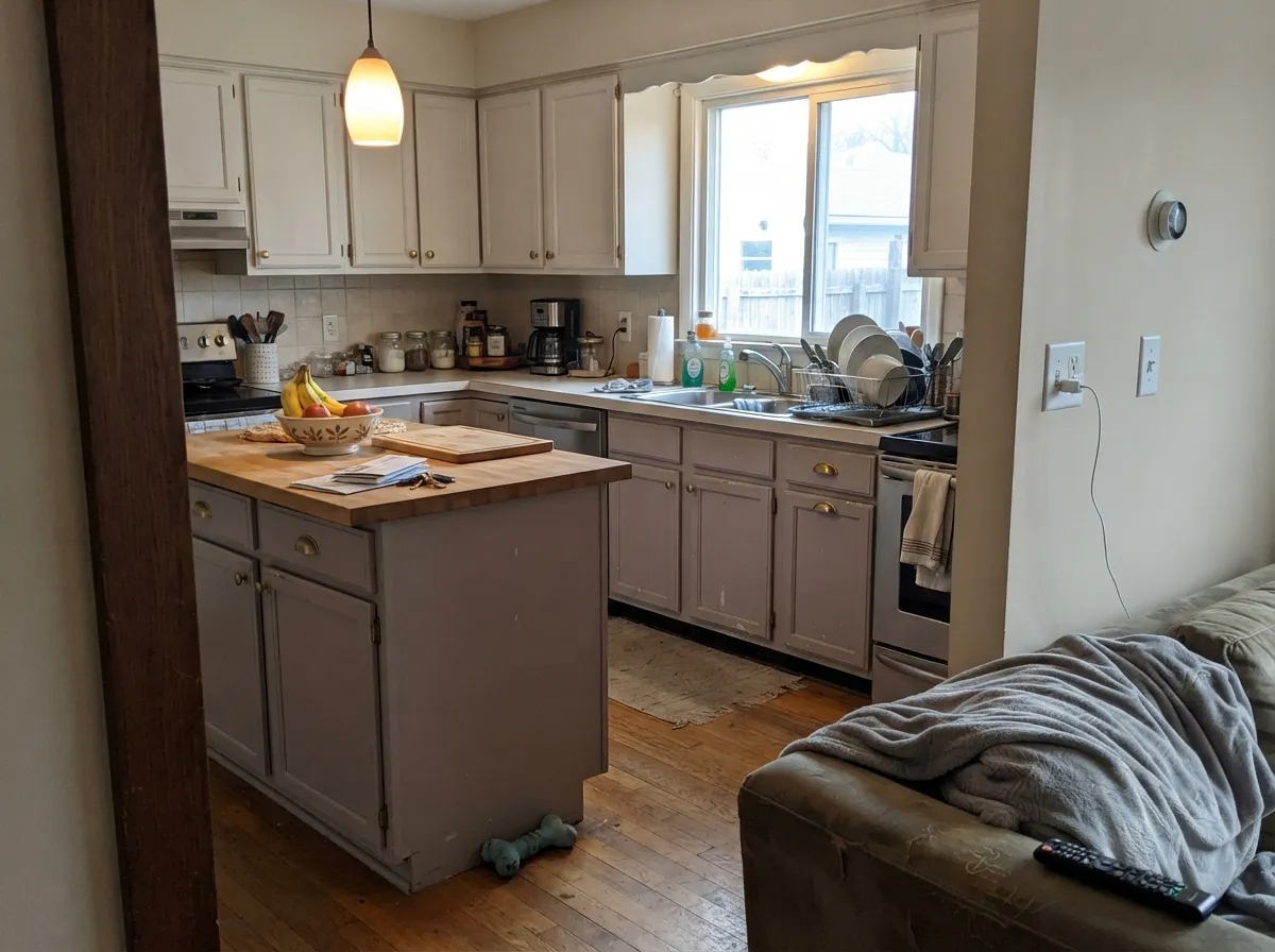
On an island or lower cabinets in satin it reads as a considered neutral, not a color statement. Keep uppers lighter — Behr Dove HDC-MD-21 — and add Behr Sage Green ICC-77 if you want a green note to cancel the red.
At LRV 52 it hides scuffs, shoe marks, and handprints far better than a light neutral. Use satin here, not eggshell, and make sure there is a window or a lamp at each end.
Full sun flattens the pink and it reads as a clean warm stone color on siding. Pair with a bright trim and a dark door; the exterior section below has the pairings.
Your Light Is the Risk
Cool even light cancels the red and it reads as a proper grayed taupe. Needs a decent window.
Warm midday sun pulls the red forward; big walls can go soft pink. Test here first.
Quiet taupe most of the day, warmer and rosier during its own sun hours.
2700K lamps make it richer and pinker. 3500K keeps it gray — swap bulbs, not paint.
Most complaints about Creamy Mushroom are a light mismatch. Upload a photo of your actual room and see it on your walls — then ask for the same wall in north light or evening lamps before you buy a single sample.
Need It From Another Brand?
Any paint counter can custom-tint Behr PPU5-13 directly. If you would rather stay in one brand's own deck, these are the closest stock matches, measured as ΔE2000. Under 2 is a difference you will not see on the wall.
| Brand | Closest color | ΔE | LRV | |
|---|---|---|---|---|
| Sherwin-Williams | MinimalistSW 9611 · Sherwin-Williams | 1.6 | 52 | Color page → |
| Benjamin Moore | Hampshire Taupe990 · Benjamin Moore | 0.0 | 51 | Color page → |
| Valspar | Dust Bunny2005-10B · Valspar | 3.1 | 50.7 | Color page → |
| PPG / Glidden | AshenPPG1023-3 · PPG / Glidden | 1.9 | 53 | Color page → |
| Glidden | AshenPPG1023-3 · Glidden | 1.4 | 53 | Color page → |
| Dutch Boy | Crumcake411-2DB · Dutch Boy | 2.0 | 52 | Color page → |
Similar Behr Colors
The nearest shades to Creamy Mushroom within Behr's own range, ranked by perceptual color distance — useful when you want the same look a touch lighter, darker, or warmer.
WCAG 2.1: AA is 4.5 : 1 for normal text, 3 : 1 for large text, AAA is 7 : 1.
Creamy Mushroom vs the Colors You're Also Considering
Every Creamy Mushroom sample board has the same rivals on it. The numbers show the real lightness gap — then it comes down to which risk you would rather live with.
Pick this if Home Depot is your store — the color is identical.
Benjamin Moore 990 · LRV 32Hampshire TaupePick this if your painter buys Benjamin Moore; same hex, LRV 51 versus 52.
Pick this if you want the softer, dustier taupe with visible red warmth.
Behr T13-8 · LRV 52MatrixPick this if the pink worries you — same LRV, leaning yellow instead.
Benjamin Moore Hampshire Taupe 990 measures deltaE 0 against Creamy Mushroom, sharing the same hex of #CABDAF with an LRV of 51 versus 52. That is an exact match, so the two are interchangeable on a wall. HGTV Home Bungalow Beige HGSW 2496 at deltaE 0.73 and Rodda Malt CA069 at deltaE 0.85 are also true matches.
The next group is visually identical in normal room light: C2 Cappuccino Froth C2-784 at deltaE 1.22, Dunn-Edwards Moonbeam DEGR03 at deltaE 1.33, Glidden Ashen PPG1023-3 at deltaE 1.4, Sherwin-Williams Minimalist SW 9611 at deltaE 1.63, and Farrow and Ball Elephant's Breath No. 229 at deltaE 1.88.
Dutch Boy Crumcake 411-2DB at deltaE 2.02 and Valspar Dust Bunny 2005-10B at deltaE 3.08 are very close but worth sampling first, with Dust Bunny leaning pinker at LRV 50.7. Clare Greige at deltaE 3.85 is close but visibly different side by side, reading cooler and deeper at LRV 49.
Creamy Mushroom Coordinating Colors
The rule with this color is to keep its partners warm or green, never cool. Warm whites and creams let it settle; a green accent cancels the red push and keeps the walls reading taupe instead of rose; cool grays and blue-whites do the opposite and expose the pink. These are the partners that hold up in a real room:
Creamy Mushroom With Floors, Counters and Wood Tones
Warm floors are where this color earns its price. Red oak, honey oak, walnut, and hickory all meet its red-orange base halfway, so the room reads pulled together instead of two different temperatures stacked on each other. The same goes for leather, rattan, brass, and warm-toned travertine or granite with brown and tan flecks.
The problem materials are all cool. Gray LVP, gray-washed engineered wood, blue-gray porcelain tile, and white marble with cool gray veining all sit on the other side of the fence, and next to them the walls stop looking neutral and start looking mauve. Stainless appliances alone are not enough to cause it, but a gray floor plus a cool counter plus a bright white trim almost always is. Tape a large sample to the wall directly above the actual floor, not on a desk, and look at it at the time of day you use the room most.
Creamy Mushroom on Exteriors
Outside it behaves better than its indoor reputation suggests. Full sun and open sky flatten the red that causes trouble on an interior wall, so on siding it reads as a warm stone or mushroom color rather than a pink one. It suits traditional and transitional houses, and it hides dust and pollen far better than a light body color.
Contrast is what makes it work. Behr White 52 on trim and a soft black door give it the crisp frame it needs; a dark charcoal or a deep green door does the same job with more character. Avoid pairing it with cool gray stone or a blue-gray roof, and check the shaded north elevation before you commit — that side will read a full step grayer and heavier than the sunny wall you sampled.
Three Ready Palettes Built on Creamy Mushroom
A color is never alone on the wall. These are complete combinations in the 60-30-10 pattern, with the reason each one holds together. Every one opens in the visualizer.
Behr White at LRV 88 opens a 36 point gap, so millwork stays crisp and the walls cannot look dingy next to it. The soft black door gives the scheme one dark anchor and keeps the taupe from reading sweet.
Try this palette in your roomDove shares the same warm red-orange base 15 points lighter, so the wall-to-cabinet handoff looks intentional rather than mismatched. The grayed green island is the counterweight that stops the walls from drifting pink.
Try this palette in your roomA ceiling at LRV 60 keeps the plane warm and soft instead of dropping a cold white lid on a warm room. The crisp trim white supplies the contrast the scheme needs so the whole thing does not blur together.
Try this palette in your roomCreamy Mushroom FAQ
Does Creamy Mushroom really look pink?
Sometimes, and it depends on your light. In north light it settles into a plain grayed taupe. In direct afternoon sun or under 2700K bulbs the red base comes forward and a large wall can read soft pink. Paint a two-foot sample on the sunniest wall and look at it at 3 p.m. and again at 9 p.m.
Creamy Mushroom or Benjamin Moore Hampshire Taupe?
They are the same color. Hampshire Taupe 990 shares the hex value and measures LRV 51 against 52, which is inside the margin of a normal tint job. Pick by store, price, and which product line you want — Behr Dynasty or Marquee versus Benjamin Moore Regal Select.
What trim white goes with it?
Behr White 52 at LRV 88. That 36 point gap keeps doors and baseboards reading crisp. Avoid a blue-leaning bright white like Ultra Pure White PPU18-6 on trim here — the cool white makes the walls look pinker by comparison.
Will it work with gray floors?
Usually not. Cool gray LVP and gray-washed wood sit at the opposite temperature and push the red forward, so the walls read dusty rose against the floor. If the floors are staying, go to a gray-based neutral like Sherwin-Williams Agreeable Gray SW 7029.
Is it too dark for a small bedroom?
It is borderline. With one decent window and light bedding it is cozy rather than dark. With one small north window and no lamps on, LRV 52 will feel heavy and the color goes muddy. Behr Dove HDC-MD-21 is the safe substitute at LRV 67.
Can I use it on kitchen cabinets?
Yes, and it is one of the better uses for it — on an island or lower cabinets in satin it reads as a warm neutral, not a color. Use a cabinet-grade enamel, not wall paint. Keep uppers lighter so the kitchen does not get bottom-heavy.
How many coats does it take?
Two over any existing light or mid-tone wall. Going over a dark or saturated color, prime first with a gray-tinted primer. In hallways choose satin over eggshell — the extra sheen wipes clean without polishing shiny spots where hands land.
Have you painted with Creamy Mushroom?
Rate it — one tap helps the next reader decide.
Ask a Question