Pashmina
Benjamin Moore's heavyweight greige, reviewed honestly: the rooms where it grounds everything, the light and the floors that turn it drab, and what to pick instead.

Jessica has spec'd whites and neutrals for more than 300 rooms and keeps a sample wall of painted drawdowns in her studio. Every color review is checked against real reader rooms in the comments and re-tested when a formula changes. About the testing process →
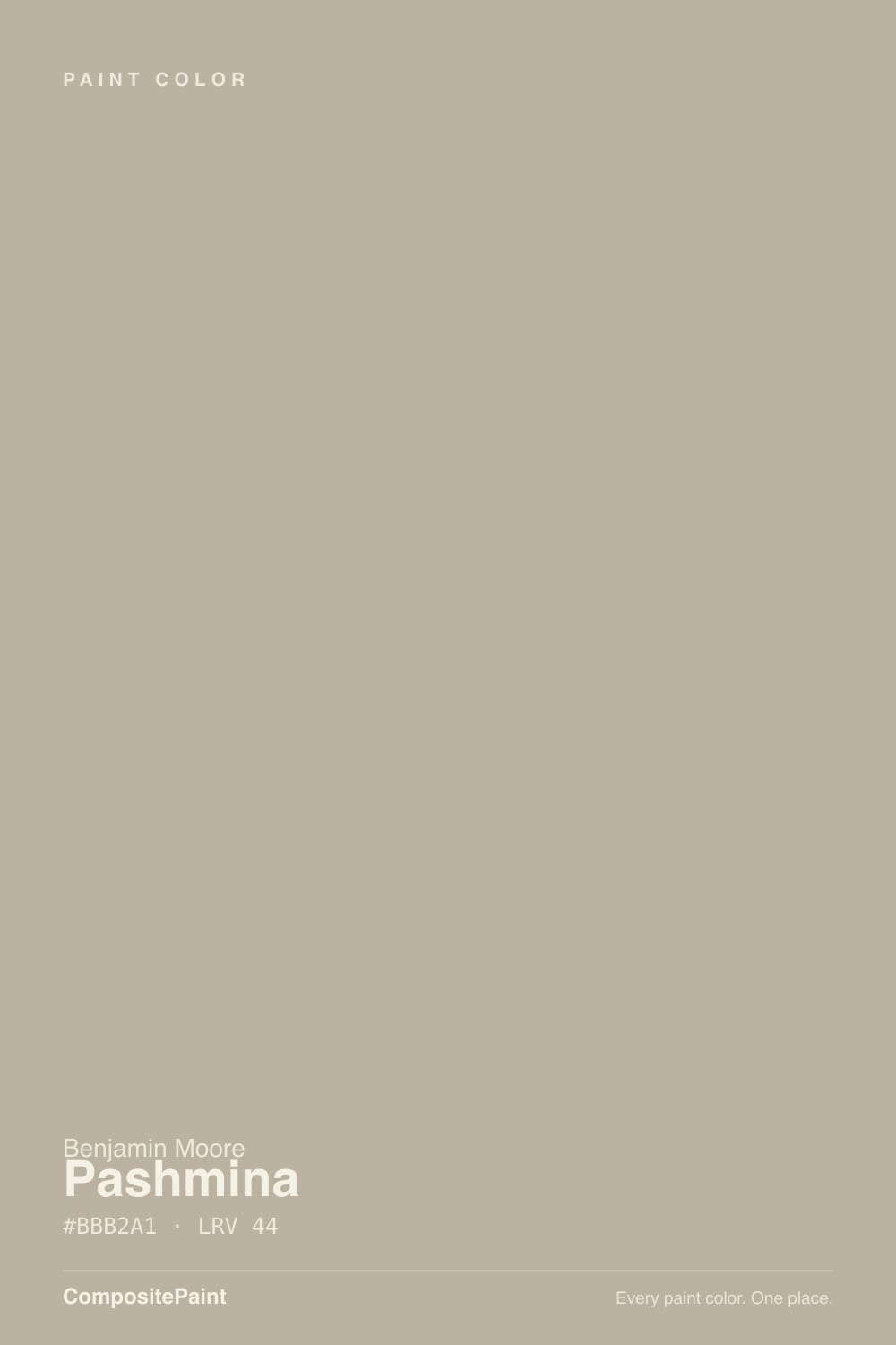
- 1Anonymous20
- 2Dorian Gray39
- 3Pashmina44
- 4Agreeable Gray60
- 5Pale Oak69
The Fast Verdict
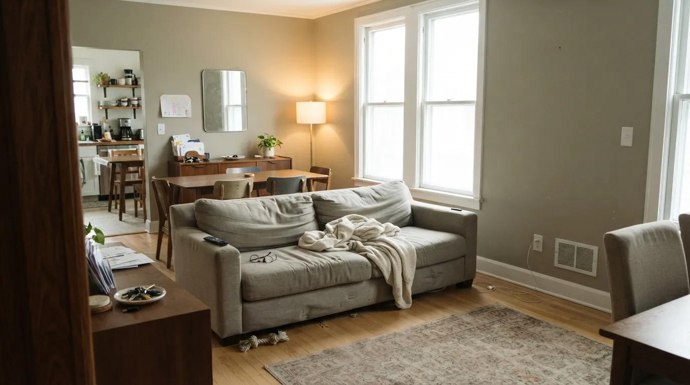
Pashmina is the greige people choose when Revere Pewter feels too pale to do anything. At LRV 44 it holds actual color on the wall, grounds wood floors, and hides scuffs the way light neutrals never will.
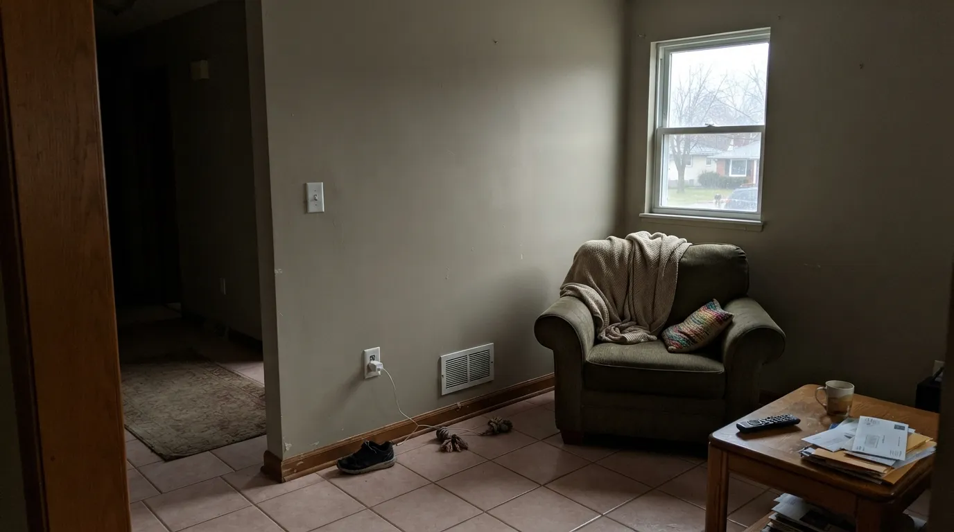
The catch is that same depth: take the daylight away and it slumps into a drab gray-brown, and against pink-based tile or flooring a quiet green whisper walks out of it. Give it windows and warm wood and it is one of the best mid-tone neutrals Benjamin Moore sells.
Rooms with real daylight that need a neutral with weight · warm wood floors, white oak, walnut · painted islands and lower cabinets · exteriors on stucco, siding and shingle
The room faces north and stays dim · your floors or tile are pink-beige · your trim is a yellow-cream white · you want a light, airy whole-house neutral
- Deep enough at LRV 44 to hold real color on a wall, not a whisper
- Grounds warm wood, white oak, walnut and rattan better than any pale greige
- Hides scuffs, handprints and hallway wear
- Reads as a genuine cabinet and island color next to a white perimeter
- Holds an open floor plan together without going washed out at the far end
- Goes drab and muddy in dim north rooms and basements
- Flashes green against pink or purple-based floors and tile
- Too heavy for most whole-house palettes — it wants light rooms only
- Looks dirty beside a creamy yellow trim white
What Color Is Pashmina, Really?
A taupe-greige built on a warm base that the deck keeps almost entirely under wraps. Saturation is low enough that the eye does not register "beige" — it registers soft mushroom. What it does register, and what the designer reviews keep circling back to, is a faint green-olive cast that sits underneath the warmth. It is not a green paint. It is a warm neutral that has enough gray in it to flash green when the thing next to it is pink or purple based, and that single behavior explains most of the arguments people have about this color.
LRV 44 is the number that decides whether you should buy it. Put it beside Revere Pewter HC-172 at LRV 55 and the gap is obvious: Pashmina is a full step darker and reads as an actual wall color rather than a soft backdrop. That depth is why it grounds a room, hides handprints, and makes white trim look deliberate. It is also why a room with one small window feels closed in with it. Revere Pewter forgives weak light. Pashmina does not.
Undertone in one line: warm taupe on top, gray in the middle, a whisper of green underneath — never yellow, never truly pink. If your sample looks green on the wall, look at your floor before you blame the paint.
Where It Shines
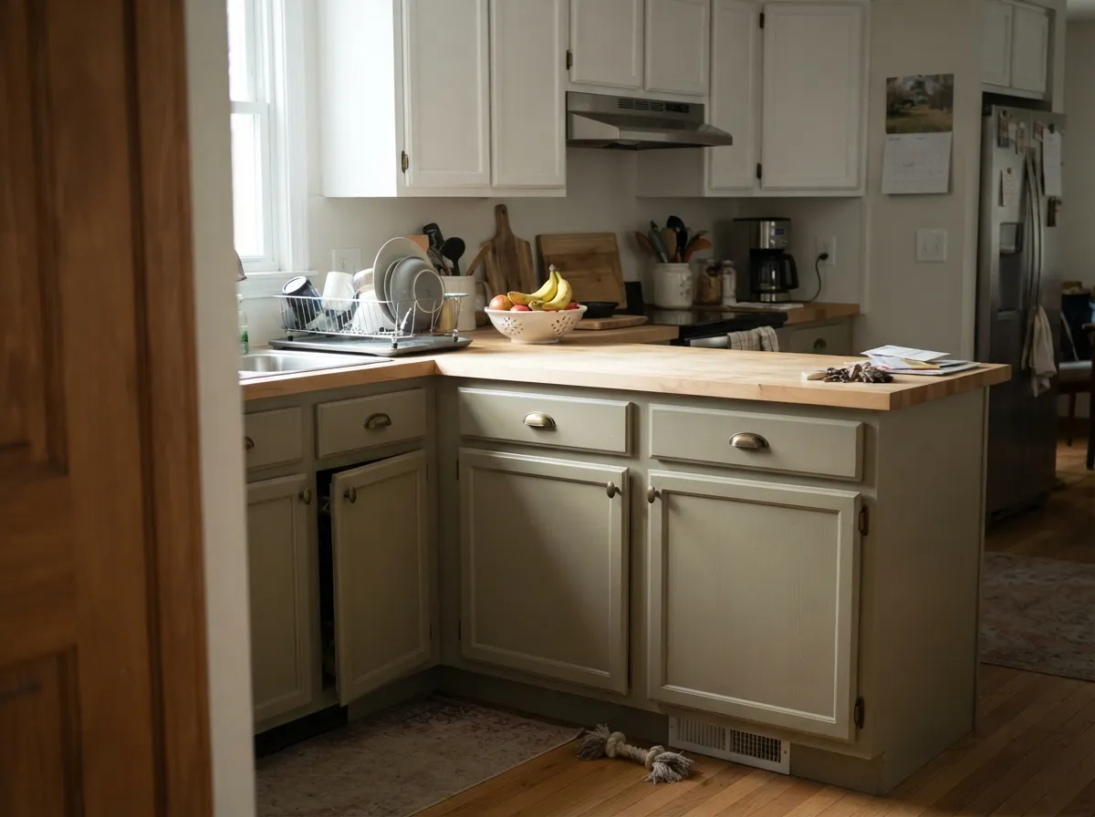
Give it daylight and wood and it does exactly what a mid-tone neutral should: it stops the room from floating. Open main floors are where it earns its money — the color is deep enough to carry a long sightline without going washed out at the far end — and painted islands and lower cabinets are its second home, because at LRV 44 it reads as a real cabinet color next to a white perimeter.
Where It Fails
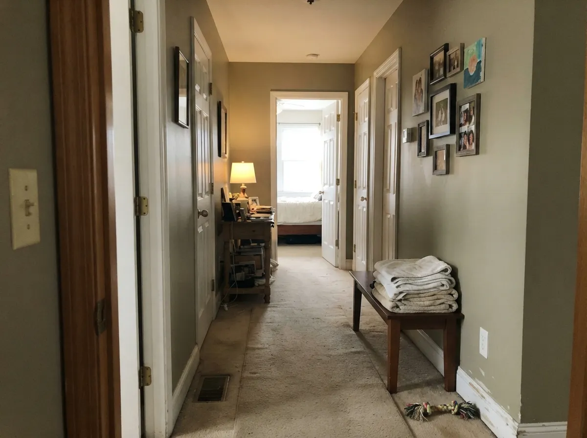
The complaints about Pashmina are remarkably consistent, and none of them are about the paint being badly made. All three come down to the same thing: LRV 44 has no margin for error. Match one of these situations and no number of coats will save it.
Cool indirect light neutralizes the warm base and leaves the gray and the green exposed. People describe the result as drab, dingy, or muddy — and in a basement with no daylight at all it just reads brown. Step up in the same family: Smokey Taupe 983 at LRV 55 keeps the character and gives back real light, or go further to Edgecomb Gray HC-173 at LRV 63.
This is the number one "why does it look green" story. Pink and purple-based flooring sits opposite Pashmina's green whisper on the wheel, and the two push each other forward until the wall looks olive. Nothing on the wall fixes it. If your floor is pink-beige, use Silver Fox 2108-50 — same LRV 44, cleaner gray, no green to expose.
Navajo White or a builder cream next to Pashmina makes the wall look dirty rather than warm — the yellow in the trim throws the gray in the wall into relief. Use a soft warm white that is still a white: White Dove OC-17 or Cloud White OC-130. If you want crisp, Chantilly Lace OC-65 works; a yellow cream does not.
Room by Room
With two windows or more it is calm, grounded, and flattering to oak and walnut. Eggshell on walls, White Dove OC-17 trim in semi-gloss. One window facing north and it goes sober fast — sample before you commit.
A Pashmina island under a White Dove OC-17 perimeter is one of the most requested cabinet looks in the Affinity line. Satin finish, aged brass or oil-rubbed bronze hardware. Skip chrome; it reads cold against the warm base.
Under 2700K bulbs it turns genuinely cozy at night and holds enough color to make white bedding look intentional. In a north bedroom with a single window it feels heavy by evening; Smokey Taupe 983 gives the same mood with more light back.
This is where the depth is an advantage: mid-tone walls cut screen glare and make a small room feel deliberate rather than dim. Pair with Cushing Green HC-125 shelving or Kendall Charcoal HC-166 built-ins.
Scuffs and hand marks disappear on an LRV 44 wall in a way they never do on a pale neutral. Use a scrubbable matte. Keep the doors and trim White Dove OC-17 so the run does not read as one heavy tunnel.
Full sun lifts it a full step and it reads as warm sand rather than gray. It suits stucco, siding, and shingle, and it stays clean-looking longer than a pale body color. Details and pairings in the sections below.
Your Light Is the Risk
Steady warm daylight lifts the taupe and softens the gray. Reads sandy and calm all day.
Cool light strips the warmth and the green comes forward. Drab is the usual verdict.
East is warm at breakfast, gray by three. West stays muted until the late sun turns it tan.
2700K lamps make it cozy taupe. 4000K LEDs pull the warmth out and leave cold greige.
Most complaints about Pashmina are a light mismatch. Upload a photo of your actual room and see it on your walls — then ask for the same wall in north light or evening lamps before you buy a single sample.
Need It From Another Brand?
Any paint counter can custom-tint Benjamin Moore AF-100 directly. If you would rather stay in one brand's own deck, these are the closest stock matches, measured as ΔE2000. Under 2 is a difference you will not see on the wall.
| Brand | Closest color | ΔE | LRV | |
|---|---|---|---|---|
| Sherwin-Williams | OutriggerSW 9517 · Sherwin-Williams | 0.4 | 45 | Color page → |
| Behr | SmokestackN220-3 · Behr | 2.8 | 46 | Color page → |
| Valspar | Patrick's EyesT690 · Valspar | 1.7 | 46.3 | Color page → |
| PPG / Glidden | DiscoverPPG1021-3 · PPG / Glidden | 1.8 | 44 | Color page → |
| Glidden | Dry Goods Neutral40YY 44/095 · Glidden | 0.4 | 44 | Color page → |
| Dutch Boy | Grayed Pebble441-3DB · Dutch Boy | 2.5 | 46 | Color page → |
Similar Benjamin Moore Colors
The nearest shades to Pashmina within Benjamin Moore's own range, ranked by perceptual color distance — useful when you want the same look a touch lighter, darker, or warmer.
WCAG 2.1: AA is 4.5 : 1 for normal text, 3 : 1 for large text, AAA is 7 : 1.
Pashmina vs the Colors You're Also Considering
Every Pashmina sample board has the same rivals on it. The numbers show the real lightness gap — then it comes down to which risk you would rather live with.
Pick this when Revere Pewter looks washed out and you want actual weight.
Benjamin Moore HC-172 · LRV 56Revere PewterPick this for dim rooms and whole-house use — eleven LRV points of forgiveness.
Pick this in rooms with good daylight that need the deeper, more grounded version.
Benjamin Moore 983 · LRV 55Smokey TaupePick this for the same warm family in a north room, a hallway, or a small bedroom.
Inside Benjamin Moore, the closest neighbors are Urban Sophisticate CSP-160 at #BCB5A1 and LRV 46 and Northern Cliffs 1536 at #BAB5A7 and LRV 46. Both are a shade lighter, and Northern Cliffs is the grayer of the two. Silver Fox 2108-50 shares Pashmina's LRV of 44 but at #B8B1A7 carries less warmth, so it reads as the safer choice in a room that already has warm wood. Kangaroo AF-145, also LRV 44 at #BFB198, goes the other way and looks clearly more yellow. Plymouth Rock 1543 at LRV 43 is the deepest of the set.
Across brands, Sherwin-Williams Outrigger SW 9517 at LRV 45 has a deltaE of 0.42 and Glidden Dry Goods Neutral 40YY 44/095 at LRV 44 sits at 0.43, so both are effectively the same color. Valspar Patrick's Eyes T690 at deltaE 1.66 is visually identical in normal room light. Behr Rushmore Gray HDC-CL-27G at deltaE 2.42 and Farrow and Ball Jitney No. 293 at deltaE 3.23 are very close but worth sampling first.
Pashmina Coordinating Colors
Pashmina coordinates by depth, not by hue. Because it sits at LRV 44, anything you put beside it either needs to be clearly lighter (a trim white, a step-up neutral for the next room) or clearly darker (an island, a door, shutters). Colors that land within a few points of it just look like a mistake in the mix.
The other rule is temperature. Stay on the warm-neutral side and add greens rather than blues — Pashmina's quiet green base makes sage and olive look planned. These are the partners that show up again and again in real installs:
Pashmina on Cabinets and Islands
This is where Pashmina has quietly overtaken its own wall use. On a kitchen island, a bathroom vanity, or a run of lower cabinets it does the thing a true gray cannot: it reads as a warm painted furniture color rather than a shade of primer. Under a white perimeter the contrast is soft enough to feel considered and strong enough to actually see from across the room.
Two practical notes. Use a urethane-fortified cabinet enamel in satin — flat and eggshell will not survive a kitchen, and semi-gloss on a mid-tone shows every brush mark. And check your counter first: warm quartz, butcher block, and honed soapstone all sit beautifully against it, while a cool white quartz with gray veining pushes Pashmina toward brown. Sample a door front, not a card, and look at it at night.
Pashmina With Floors and Wood Tones
Your floor decides this color. White oak, walnut, honey oak, rattan, and cane all sit naturally against Pashmina because the warmth in the wood meets the warmth in the paint — this is the pairing that makes the color look expensive, and it is why so many of the good photos of it have wood in frame.
The floor to test hard is anything pink-beige: the mauve-leaning LVP that filled builder homes for a decade, pink-toned travertine, and older beige carpet with a purple base. Against those, Pashmina's green underlayer comes out and the walls read olive. If that is your floor and you cannot change it, Silver Fox 2108-50 gives you the same LRV 44 depth without the green, and Accessible Beige SW 7036 gives you a warmer, lighter alternative that leans clearly beige instead.
Three Ready Palettes Built on Pashmina
A color is never alone on the wall. These are complete combinations in the 60-30-10 pattern, with the reason each one holds together. Every one opens in the visualizer.
Pashmina takes the 60 percent because at LRV 44 it can carry a whole floor without needing an accent wall to stay interesting. White Dove is the 30 percent that separates trim from wall without the yellow-cream problem, and the navy door is the single dark note that keeps the scheme from reading beige.
Try this palette in your roomPashmina's green whisper is a liability against pink tile and an asset next to a real sage, so Cushing Green makes the wall look intentional instead of accidental. White Dove cabinets sit between them at 30 percent and give the eye somewhere light to land.
Try this palette in your roomFull sun lifts Pashmina a step, so the body reads warm sand and the near-black trim gives it the edge it loses outdoors. Caliente is the 10 percent — a warm red that agrees with Pashmina's base instead of fighting it, which a cool blue door would.
Try this palette in your roomPashmina FAQ
Does Pashmina look green?
Sometimes, and it depends entirely on what is next to it. On its own it reads as a warm mushroom taupe. Put it against pink-beige tile, purple-based carpet, or a mauve LVP floor and the green underneath comes straight forward. Hold a large sample flat on the actual floor before you decide.
Is Pashmina too dark for a whole house?
For most houses, yes. At LRV 44 it sits at the heavy end of the mid-tones, so it only works everywhere if every room has good daylight. The usual fix is to run Pashmina in the well-lit main rooms and step up to Smokey Taupe 983 or Edgecomb Gray HC-173 in the dim ones — they share the family, so the transitions still read as one house.
Pashmina or Revere Pewter?
Revere Pewter is the safe one and Pashmina is the one with something to say. Eleven LRV points separate them, which in a real room is the difference between a soft backdrop and a color you notice. Choose Pashmina if you sampled Revere Pewter and it disappeared on your wall; choose Revere Pewter if your rooms are dim or you want one color everywhere.
Is Pashmina good for kitchen cabinets?
It is one of its best uses. As a painted island or a run of lowers under a White Dove OC-17 perimeter it looks custom rather than builder-grade, and the depth means fingerprints around the handles do not show. Use a urethane-fortified cabinet paint in satin, and pair it with aged brass or oil-rubbed bronze — chrome reads cold against it.
What sheen should I use on Pashmina walls?
Eggshell for living rooms and bedrooms, and a scrubbable matte for hallways and stairwells. Mid-tone colors show roller lap marks and sheen flashing more than pale ones, so keep a wet edge and do not touch up with a brush over a rolled wall. Trim goes semi-gloss, cabinets satin.
How many coats does Pashmina need?
Two over an existing light or mid-tone wall in almost every case. Going over a white with cheap paint you may see patchiness in the second coat around corners — that is coverage, not the color. Over anything dark or saturated, prime with a gray-tinted primer first.
Does Pashmina work in a small bathroom?
Only if there is a window or genuinely good lighting. A windowless powder room in Pashmina goes brown and cave-like at night. If the vanity and tile are warm and there is a window, it is excellent — deep, spa-like, and forgiving of water marks.
Have you painted with Pashmina?
Rate it — one tap helps the next reader decide.
Ask a Question