Smokey Taupe
The warm taupe people either love for years or repaint in a week — reviewed honestly, including the pink problem nobody warns you about.

Jessica has spec'd whites and neutrals for more than 300 rooms and keeps a sample wall of painted drawdowns in her studio. Every color review is checked against real reader rooms in the comments and re-tested when a formula changes. About the testing process →
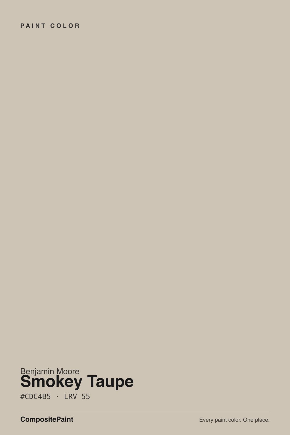
- 1Dorian Gray39
- 2Mindful Gray48
- 3Smokey Taupe55
- 4Agreeable Gray60
- 5Pale Oak69
The Fast Verdict
Smokey Taupe is the warm taupe that makes a room feel settled instead of decorated — soft, grounded, and easy to live with on long open-plan walls.
But it is built on a red base, and that base does show: on a big sunlit wall it can tip pinkish, and the most common complaint online is a blunt "Smokey Taupe is VERY pink." In good daylight with warm white trim it is one of the best mid-tone neutrals Benjamin Moore makes. Sample it big, on more than one wall, and look at it at 4 p.m. before you commit.
Open-plan main floors that need one warm color · homes with honey or orange oak floors · bedrooms and hallways that feel cold in gray · anyone done with gray but scared of yellow beige
Your trim is a bright cool white like Chantilly Lace · the room is dim with one small window · you have sage green tile or a green sofa · you actually want gray, not beige
- Warm without ever tipping yellow or builder-beige
- LRV 55 carries an open floor plan without going flat in corners
- One of the best neutrals for honey or orange oak floors
- Looks expensive on cabinets against black or warm stone
- Works as an exterior body color as easily as an interior wall
- Reads pinkish on big walls in late-afternoon sun
- Goes muddy and drab in dim, low-light rooms
- The red base jumps out next to greens and green-based neutrals
- Bright cool white trim turns it dusty rose
What Color Is Smokey Taupe, Really?
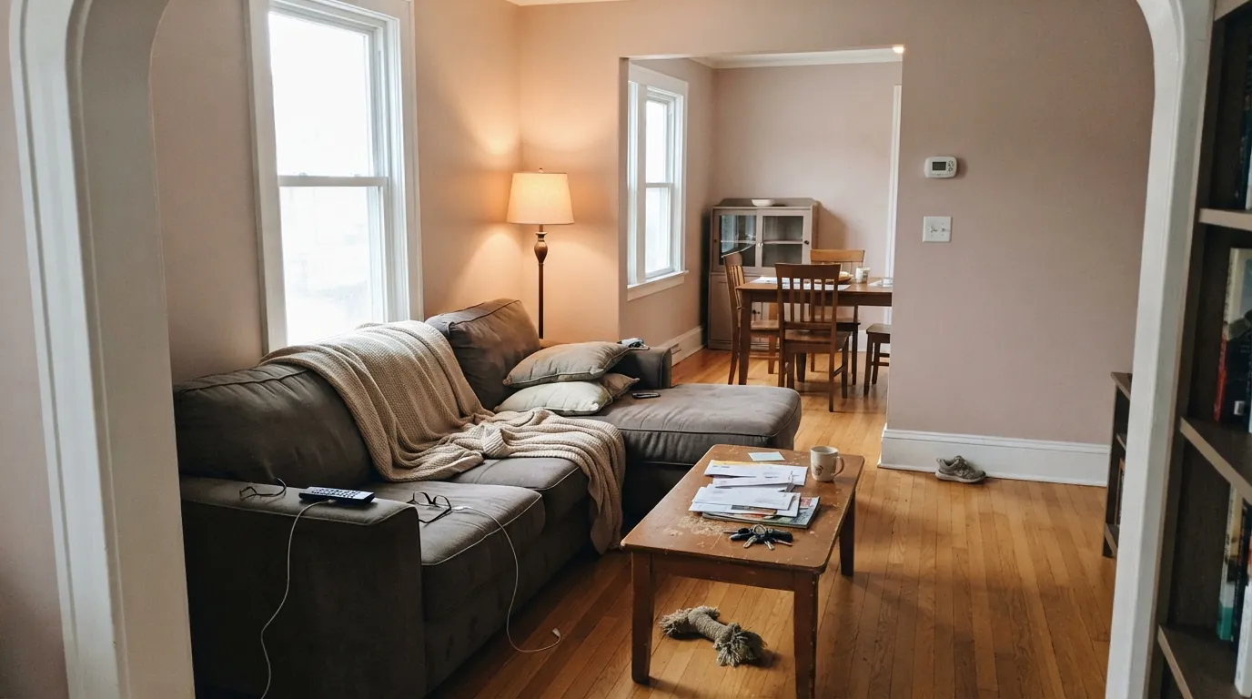
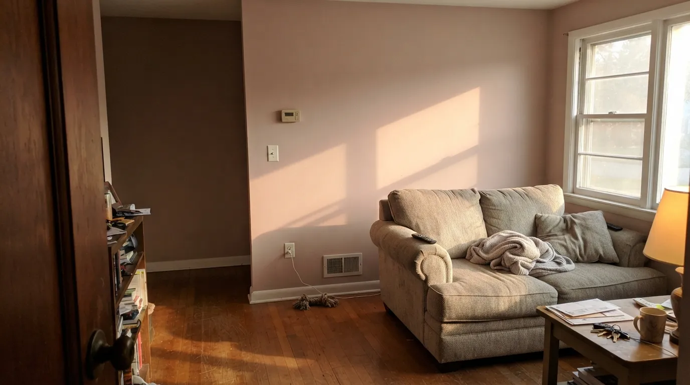
It is called a taupe, but be honest about what that means here: Smokey Taupe is a warm beige-brown sitting on a red base. The hue reads at 38 degrees with 19 percent saturation, which is genuinely warm — enough that on a chip it looks like soft mushroom, and enough that on a full wall the red can surface as a faint rose. That is not a defect, it is the color. It is also why the loudest review you will find online is a homeowner writing "Smokey Taupe is VERY pink," and why another posted mid-project that after one coat "it is pulling purple." Both are describing the same red base doing what red bases do on 400 square feet of drywall.
At LRV 55 it reflects a little more light than it absorbs — light enough to keep a room open, dark enough that the walls clearly read as a color. The useful comparison is Revere Pewter HC-172, which sits at exactly the same LRV 55. Same lightness, completely different temperature: Revere Pewter is cool and slightly green, Smokey Taupe is warm and slightly pink. Put them side by side and nobody argues about which is which. Against Accessible Beige SW 7036 at LRV 58, Smokey Taupe is a hair deeper and, as one color consultant puts it, a touch pinker.
Undertone in one line: warm brown-beige over a red base — never yellow, never green, and pink only when the light pushes it.
Where It Shines
Give it real daylight, warm wood, and a warm white trim and it does exactly what people hire a taupe to do: the room stops looking empty and starts looking finished. It is at its best carrying an open main floor or softening honey oak floors that a gray would have fought with.
Where It Fails
The bad Smokey Taupe stories are remarkably consistent. Three situations produce almost all of them, and every one is predictable from a sample board before a drop of paint goes on a wall.
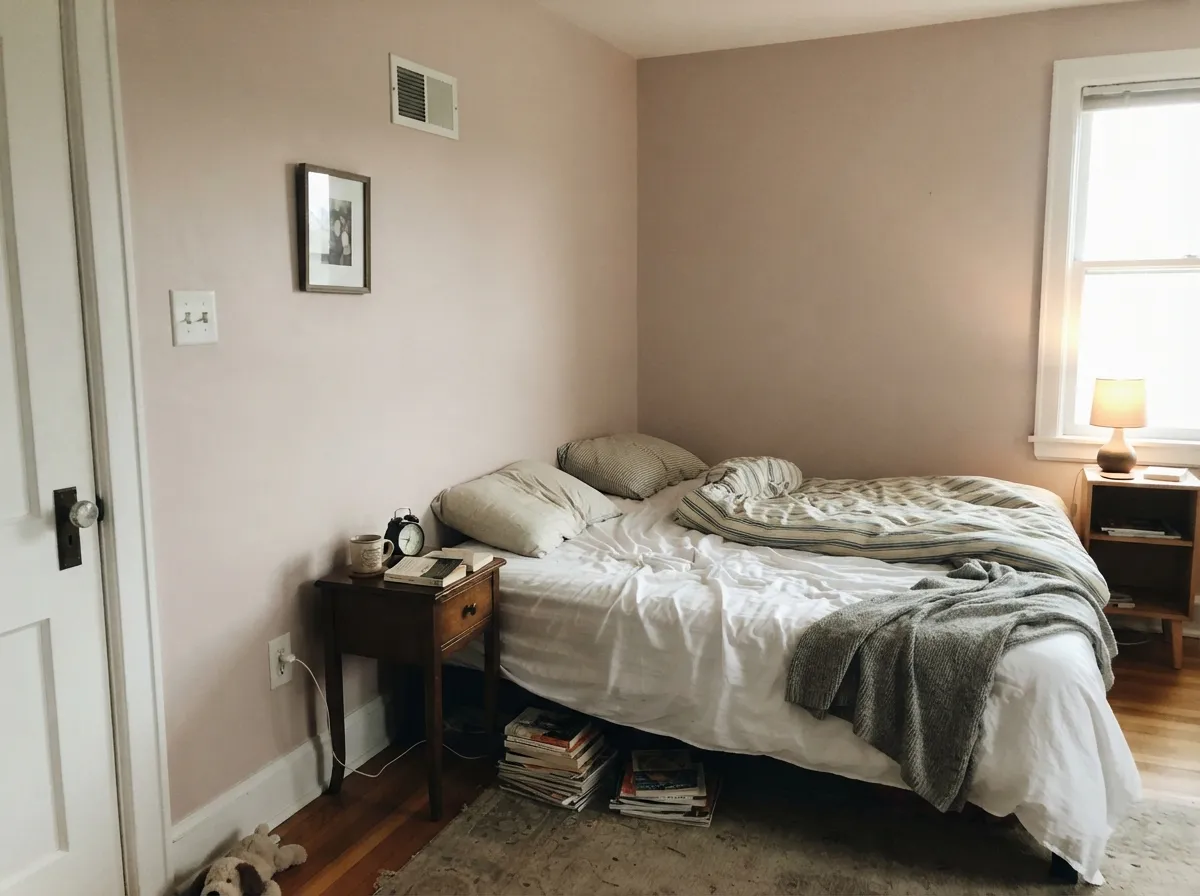
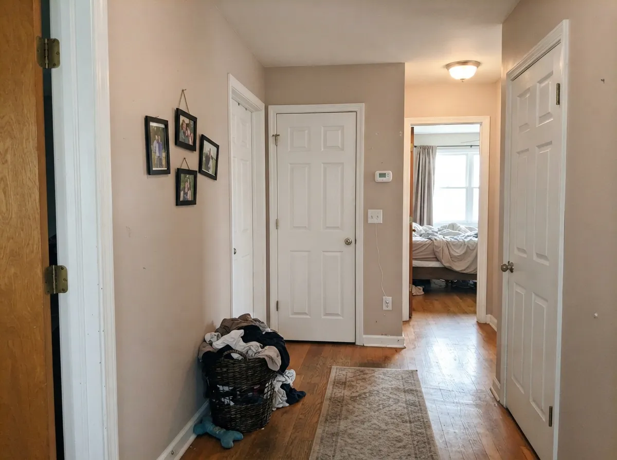
West and strong south light drive the red base forward, and on a large uninterrupted wall that registers as pinkish beige — the single most repeated complaint about this color. If you love the taupe idea but not the rose, Accessible Beige SW 7036 is a hair lighter and measurably less pink for the same job.
Homeowners describe it going "drab and muddy" in low-light rooms, and one Reddit user with a cool-lit kitchen said colors like this just read "gray, muddy, murky." At LRV 55 there is not enough light coming back to keep the warmth alive. Step up to Edgecomb Gray HC-173 at LRV 63, which stays warm without needing sun to prove it.
Pair it with a blue-based white like Chantilly Lace OC-65 and the temperature clash exaggerates the red — the wall stops reading taupe and starts reading dusty rose. Keep trim warm: Cloud White OC-130 or White Dove OC-17. This is a pairing mistake, not a paint problem, and it is the easiest of the three to avoid.
Room by Room
This is where it earns its reputation: warm enough to flatter wood and leather, quiet enough to leave the art alone. Eggshell on walls, White Dove OC-17 trim in semi-gloss. Check the wall that gets late sun before you buy five gallons.
It holds color in dark corners and never goes flat over a long run, which is why it turns up so often as a whole-house pick. Hallways and stairwells stay welcoming instead of tunnel-like. Keep the same eggshell throughout so the sheen does not shift room to room.
Under 2700K lamps it deepens into a soft, enveloping warm neutral. Pair with Dove Wing OC-18 trim and ceiling for a gentle step up rather than a hard white line. A darker accent wall in Briarwood HC-175 gives it depth without changing temperature.
Designers use it on islands, wet bars, and perimeter cabinets and it looks expensive against black soapstone or a warm marble. The counter-report is real too: one homeowner found it "waaaay too dark" on cabinets in a cool-lit kitchen. Satin, and test a full door, not a chip.
With travertine, warm marble, brushed nickel, or brass it is spa-quiet and lovely. With cool blue-gray tile or gray-veined porcelain it turns pink fast. Look at the sample flat against the tile, not on the opposite wall.
LRV 55 is right in the safe band for siding or stucco, and outdoors the extra sun reads it warmer than it looks inside. Ground it with dark trim or shutters in Kendall Charcoal HC-166 and a Hale Navy HC-154 door. It also sits comfortably next to most warm brick and stone.
Your Light Is the Risk
Full, steady daylight holds it as a proper warm taupe all day. This is the room it was made for.
Cool light drains the beige and leaves the red base exposed — soft, mushroomy, slightly rosy. Test it.
The hour that makes people repaint. Warm low sun pushes the wall toward pink beige for two hours a day.
2700K lamps deepen it into a cozy brown-taupe. Cool 4000K LEDs kill it — it goes gray and muddy.
Most complaints about Smokey Taupe are a light mismatch. Upload a photo of your actual room and see it on your walls — then ask for the same wall in north light or evening lamps before you buy a single sample.
Need It From Another Brand?
Any paint counter can custom-tint Benjamin Moore 983 directly. If you would rather stay in one brand's own deck, these are the closest stock matches, measured as ΔE2000. Under 2 is a difference you will not see on the wall.
| Brand | Closest color | ΔE | LRV | |
|---|---|---|---|---|
| Sherwin-Williams | Slumber SlothSW 9606 · Sherwin-Williams | 0.3 | 56 | Color page → |
| Behr | Wheat Bread720C-3 · Behr | 0.9 | 56 | Color page → |
| Valspar | Mushroom RisottoM243 · Valspar | 1.8 | 55.1 | Color page → |
| PPG / Glidden | SynchronicityPPG1021-2 · PPG / Glidden | 0.3 | 56 | Color page → |
| Glidden | SynchronicityPPG1021-2 · Glidden | 0.6 | 57 | Color page → |
| Dutch Boy | Centuryed Gray442-2DB · Dutch Boy | 3.0 | 57 | Color page → |
Similar Benjamin Moore Colors
The nearest shades to Smokey Taupe within Benjamin Moore's own range, ranked by perceptual color distance — useful when you want the same look a touch lighter, darker, or warmer.
WCAG 2.1: AA is 4.5 : 1 for normal text, 3 : 1 for large text, AAA is 7 : 1.
Smokey Taupe vs the Colors You're Also Considering
Every Smokey Taupe sample board has the same rivals on it. The numbers show the real lightness gap — then it comes down to which risk you would rather live with.
Pick this for warmth — this is the browner, pinker one at the same lightness.
Benjamin Moore HC-172 · LRV 56Revere PewterPick this if you want the neutral cooler and slightly green next to gray stone.
Pick this when you want a touch more depth on the wall.
Sherwin-Williams SW 7036 · LRV 58Accessible BeigePick this if the pink worries you — it is lighter and less rosy.
Within Benjamin Moore, Inukshuk CC-460 shares the same hex of #CDC4B5 and the same LRV of 55, so the two are interchangeable on a wall. Alphano Beige 989 at #CFC4B7 and LRV 55 is a fraction warmer. Ice Formations 973 and Revere Pewter HC-172 both sit at #CBC6B8 and LRV 55, and both read cooler and greener than Smokey Taupe, which is the main decision point for anyone weighing the two. Seattle Mist 1535 at LRV 55 is grayer still, and Grant Beige HC-83 at LRV 56 is the most yellow of the group.
Across brands, Sherwin-Williams Slumber Sloth SW 9606 and PPG Synchronicity PPG1021-2 both land at deltaE 0.25, meaning they are the same color for practical purposes. Behr Vintage Pewter DC-009 at deltaE 1.06 and Magnolia Home Southern Grown JG-104 at 1.07 are visually identical in normal room light. Farrow and Ball Oxford Stone No. 264 at deltaE 2.56 is very close but worth sampling, and Dunn-Edwards Silver Mining DESS45 at 3.88 is close but visibly different side by side.
Smokey Taupe Coordinating Colors
The rule with Smokey Taupe is to stay warm and stay in its family. It is generous with warm whites, deeper taupes, charcoal, and navy — and it gets difficult with cool blue-whites, gray-green neutrals, and icy blues, all of which drag the red base into view. Benjamin Moore's own suggested pairings for it lean the same way, which is a rare case of the brand card and the real-world advice agreeing.
These are the partners that come up again and again in real projects:
Smokey Taupe on Cabinets and Built-Ins
This is the use designers defend hardest. On a wet bar, a laundry room, a bathroom vanity, or a kitchen island, Smokey Taupe reads as a soft painted wood tone rather than a color statement — which is exactly what you want when the counter and hardware are supposed to be the interesting part. It is at its best against black stone: soapstone, honed black granite, or a warm-veined marble all make the taupe look deliberate and expensive.
The honest counterweight is the kitchen where it fails. Cabinets get less light than walls — they sit under overhangs, inside shadow, and often under cool LED task lighting — so the same LRV 55 that feels light on a wall can land heavy on a run of doors. One homeowner sampling it for kitchen cabinets called it "waaaay too dark for the space." Buy a sample, paint an actual door or a full-size board, and leave it standing in the kitchen through a whole day before you order.
For perimeter cabinets above the taupe, Cloud White OC-130 keeps everything in the same warm family. If you want the two-tone kitchen, put Kendall Charcoal HC-166 on the island and leave Smokey Taupe on the perimeter — that direction reads better than the reverse.
Smokey Taupe With Wood Tones and Floors
Honey oak and orange-toned builder oak are where this color quietly wins. The gray-brown body meets the floor's warmth halfway and takes the orange down a notch instead of amplifying it, which is more than most greiges manage — a lot of them go green over an orange floor and make the whole room look sour. Walnut, rattan, and linen all sit comfortably against it too.
Cool gray LVP and gray-washed wood need a sample first. The contrast is not automatically bad — a warm wall over a cool floor is a legitimate look, and Smokey Taupe keeps a gray floor from feeling cold. But if your flooring has a blue or green cast, that is precisely the condition that pulls the red base to the surface and turns the wall rosy. Tape a large sample low on the wall, directly above the floor, and look at it in daylight rather than under lamps.
For hardware and metals: aged brass, unlacquered brass, and matte black all belong here. Polished chrome and blue-gray stone are the two finishes most likely to make people say the walls look pink.
Three Ready Palettes Built on Smokey Taupe
A color is never alone on the wall. These are complete combinations in the 60-30-10 pattern, with the reason each one holds together. Every one opens in the visualizer.
Smokey Taupe takes the 60 percent as the wall color that runs the whole floor, and White Dove sits 28 LRV points above it so the trim reads crisp without going cool and turning the walls pink. Hale Navy supplies the single dark note the scheme needs, and navy is the one strong color that never fights a red-based taupe.
Try this palette in your roomHere the cabinets are the 60 percent, so the taupe does the heavy lifting and the warm Cloud White walls stay out of its way instead of competing. Kendall Charcoal on the island is the 10 percent anchor, and it is dark enough that black soapstone or honed granite counters read as part of the plan rather than an accident.
Try this palette in your roomBriarwood is the same warm taupe family two steps darker, so the accent wall adds weight without introducing a second undertone to argue with. Dove Wing at LRV 78 is a softer trim white than most, which keeps the contrast gentle — the whole room quiets down under warm bulbs instead of splitting into stripes.
Try this palette in your roomSmokey Taupe FAQ
Is Smokey Taupe warm or cool?
Warm, clearly. The hue sits at 38 degrees with 19 percent saturation, which is real, visible warmth on a wall. It never behaves like a cool gray — in cool north light it softens toward a grayed mushroom, but it stays on the warm side of the fence.
Does Smokey Taupe look pink?
Sometimes, yes, and it is the single most common complaint about it. The red base comes forward in strong afternoon and west light, on large uninterrupted walls, and next to anything green or cool-white. In flat or north light it stays a soft mushroom instead. Paint a two-foot sample on two different walls and look at it at 4 p.m.
Smokey Taupe or Revere Pewter?
They are the same lightness at LRV 55, so this is purely a temperature choice. Smokey Taupe is warmer, browner, and can go pink; Revere Pewter is cooler and pulls slightly green. Pick Smokey Taupe with warm wood floors and brass, and Revere Pewter with gray stone, chrome, or cool tile.
What trim white goes with Smokey Taupe?
A warm white with a clear jump in lightness. White Dove OC-17 at LRV 83 and Cloud White OC-130 at LRV 85 are the two most-recommended partners, and Dove Wing OC-18 works when you want softer contrast. Avoid bright cool whites like Chantilly Lace OC-65 — the cold trim makes the walls look dusty rose.
Is it good for kitchen cabinets?
Yes, and designers use it on islands and wet bars regularly — it looks especially good against black soapstone or a warm marble. The one real warning comes from homeowners in cool-lit kitchens who found it too dark and murky on doors. Paint a full sample door, stand it in the kitchen for a day, then decide. Satin finish.
Will it work in a dark basement or north-facing den?
It is a gamble. LRV 55 is decent, but with only one small window the warmth flattens and people describe the result as drab and muddy. If the room has to be taupe, go lighter with Edgecomb Gray HC-173 or Litchfield Gray HC-78, and put warm 2700K bulbs in every fixture.
Is Smokey Taupe dated?
No. It is not 2000s builder beige — that was flat yellow-tan with nothing underneath it. Smokey Taupe has a red-brown complexity that reads custom, and as the gray era winds down it is one of the colors people are moving back toward. It has been in the Benjamin Moore Classics collection for decades for a reason.
Have you painted with Smokey Taupe?
Rate it — one tap helps the next reader decide.
Ask a Question