Wheat Bread
Behr's quiet warm neutral, reviewed honestly: the light that flatters it, the Behr sibling it gets mistaken for, and what to buy instead.

Jessica has spec'd whites and neutrals for more than 300 rooms and keeps a sample wall of painted drawdowns in her studio. Every color review is checked against real reader rooms in the comments and re-tested when a formula changes. About the testing process →
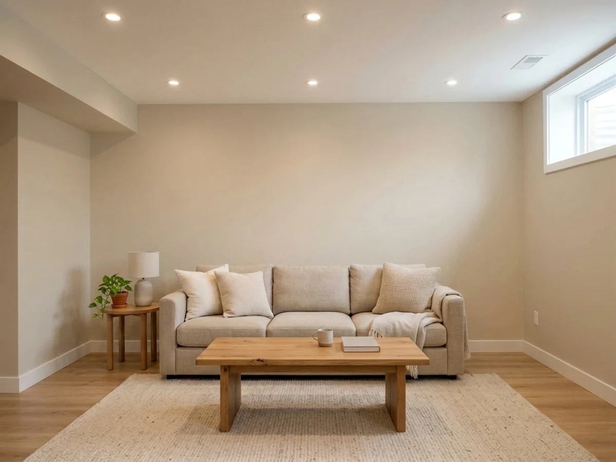
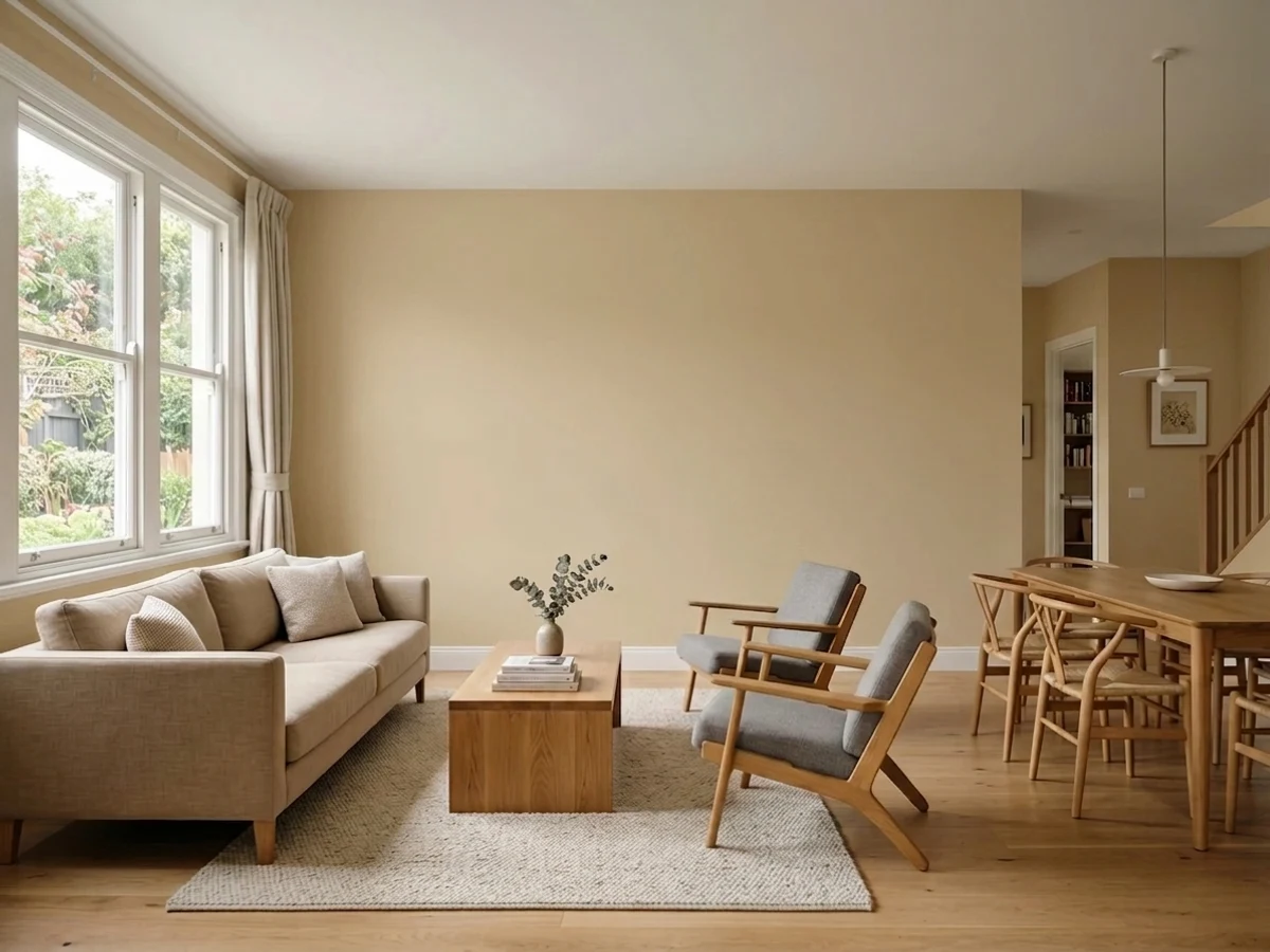
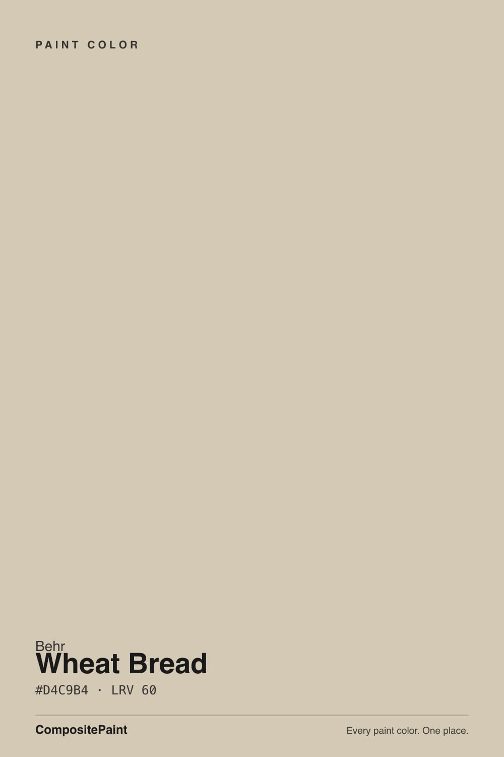
- 1Dorian Gray39
- 2Mindful Gray48
- 3Wheat Bread56
- 4Pale Oak69
- 5Shoji White74
The Fast Verdict
Wheat Bread is a genuine hybrid: enough gray to keep it from reading tan, enough warmth to keep it from reading cold. At LRV 56 it lights a room without washing it out, and it does the job on walls, cabinets, and exteriors without asking for attention. Nobody names it a Color of the Year and nobody writes it a love letter — it just works, in the specific rooms warm neutrals always work, and goes muddy in the specific light they always go muddy in. The one thing to watch for is Behr's own strip: Even Better Beige sits right next to it and looks nearly the same until you paint a wall.
Whole-house walls with decent daylight · kitchens with oak, walnut or brass · exteriors paired with white or dark trim · anyone who wants a warm neutral without paying a premium name
Your room is north-facing and dim · your counters or floor are cool gray · you already own a can of Even Better Beige and can't tell them apart · you want a documented, well-reviewed color with a long online track record
- Genuinely warm without ever tipping yellow — the gray keeps it grounded
- LRV 56 keeps rooms bright while still reading as a real, considered color
- Works past walls: cabinets, doors and exteriors all take it well
- Flatters oak, walnut and brass without competing for attention
- An easy, inexpensive Behr color for a whole-house repaint
- Goes flat and muddy in cool, dim north-facing light
- Reads almost identical to Behr's own Even Better Beige on the chip
- Fights cool gray countertops and flooring instead of complementing them
- Little online track record — few reviews or room photos to check before you buy
What Color Is Wheat Bread, Really?
A warm neutral built as a genuine cross between beige and greige — Behr's own language for it, and an accurate one. The base is a muted red-orange, the same family every warm neutral in this LRV range draws from, but a real dose of gray is mixed in, enough that the color reads more "greige" than "tan" on the wall. That is the whole trick: it is warm enough to feel homey, gray enough to stay quiet, and it never tips into the mustard-yellow or peachy-orange territory that dates a beige fast.
At LRV 56 it sits in exactly the same brightness band as the most-searched neutrals in the country — Sherwin-Williams Agreeable Gray is also LRV 56, and Accessible Beige is LRV 58 — so none of them will make a room feel darker than the others. The difference is temperature and gray content, not light output. Put Wheat Bread next to Agreeable Gray and it reads a touch warmer and browner; put it next to a true beige like Even Better Beige and it reads noticeably grayer and quieter.
Undertone in one line: warm beige grayed down toward greige — a red-orange base with enough gray mixed in that it never tips yellow, orange, or green. If your sample looks flat or slightly muddy, that is cool daylight stripping the warmth out, not a hidden pink or green undertone showing through.
Where It Shines
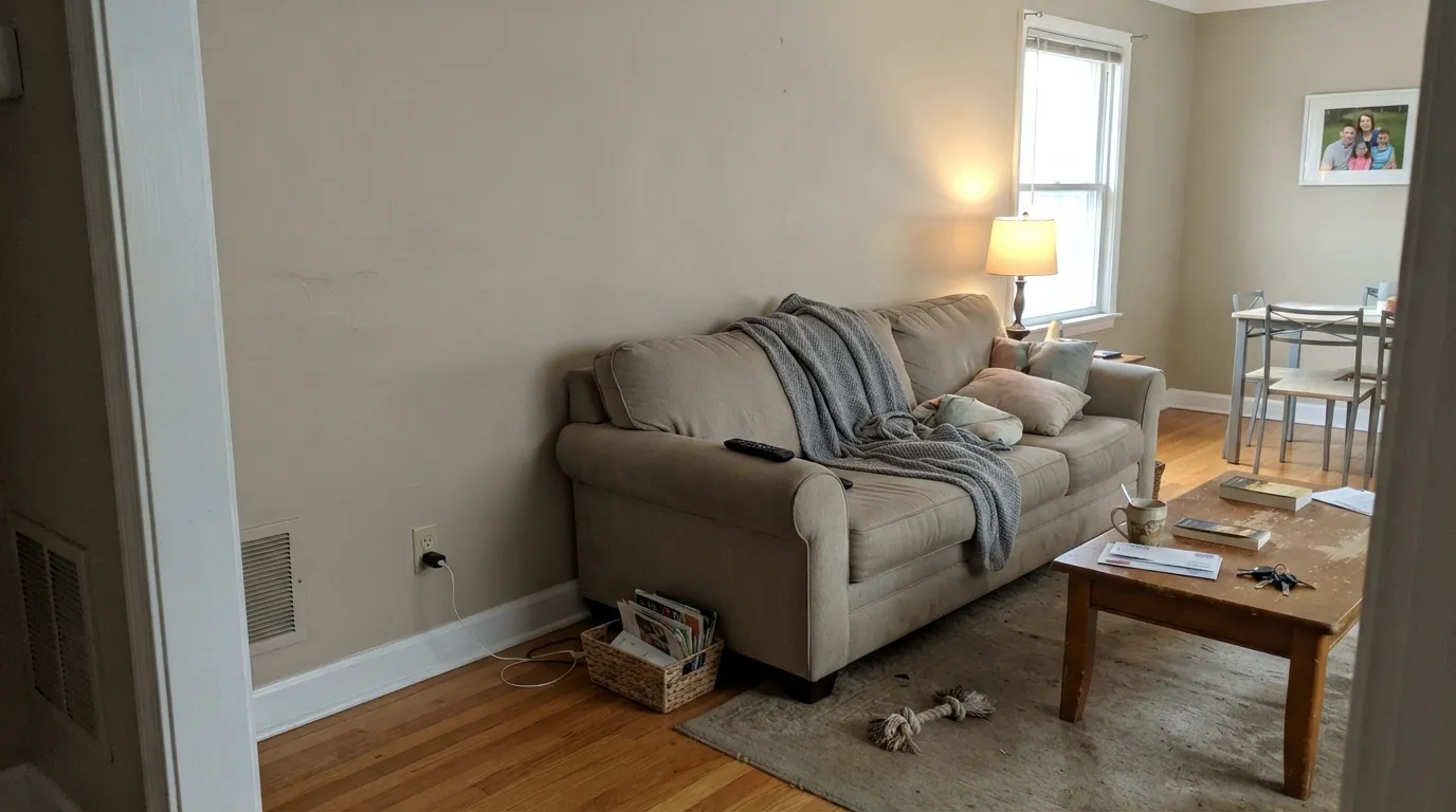
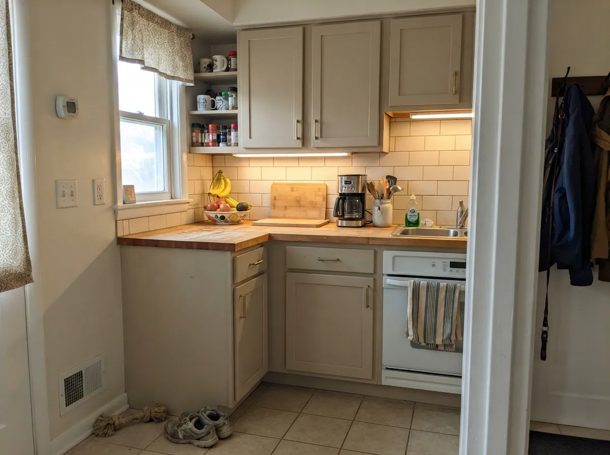
Give it real daylight and warm materials and it disappears into the room the way a good neutral should. It is genuinely at home on more than walls: Behr sells it for cabinets and exterior trim as well as interior paint, and reviewers who have used it describe exactly what you would want from a background color — "comfortable," "homey," a warm neutral that lets oak floors, brass hardware, and walnut furniture do the talking instead of competing with the wall.
Where It Fails
Wheat Bread does not have a long trail of one-star stories — it is too quiet a color to generate them — but the regrets that do show up follow one of three patterns, and all three are avoidable before you open the can.
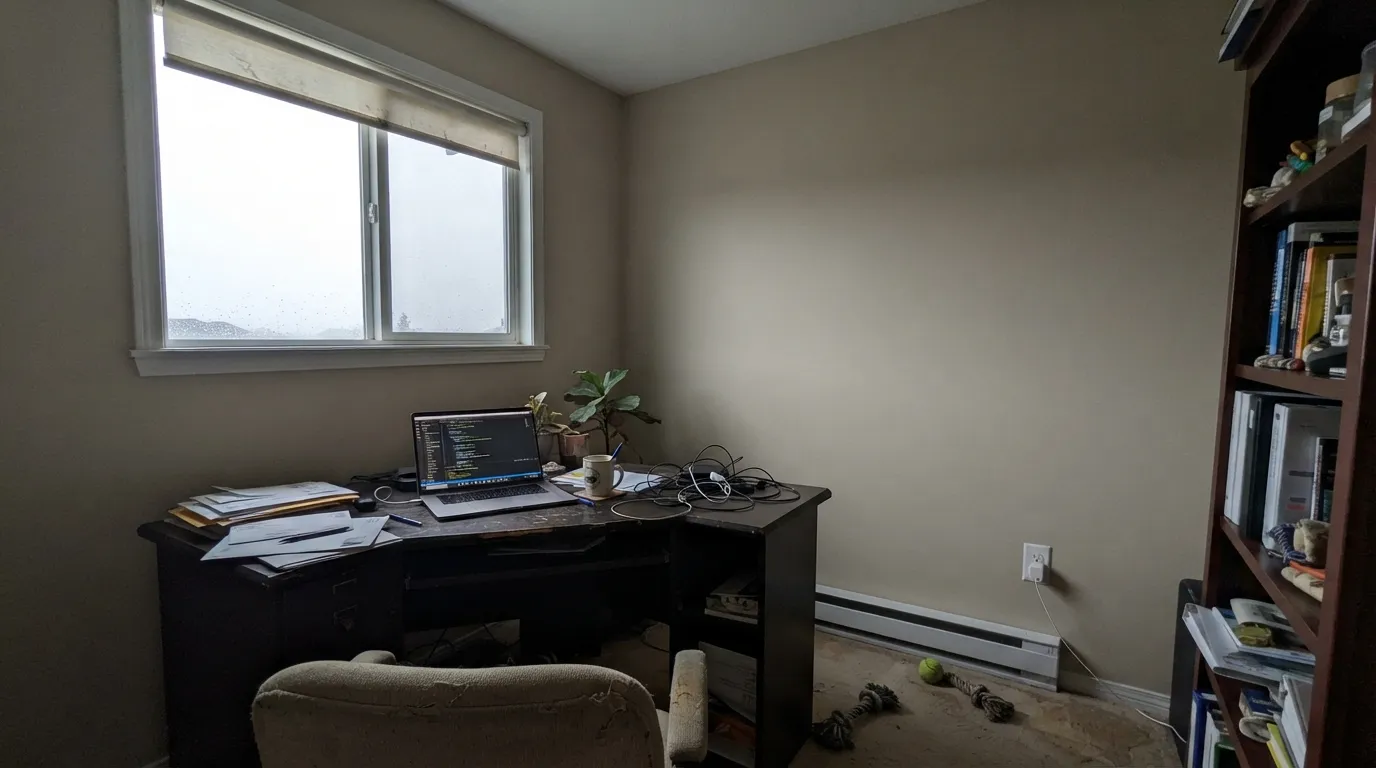
Like every warm neutral in this LRV range, Wheat Bread depends on some warmth in the room to hold its color. In a north-facing room on an overcast day, the red-orange base goes quiet and the gray takes over, leaving a flat, slightly muddy taupe-gray instead of the warm greige on the chip. The paint did not change; the light did.
Behr's own Even Better Beige (DC-010) sits at the same LRV 56 and reads almost identical to Wheat Bread on a paint chip in store lighting. The difference only shows up at wall scale: Even Better Beige is the cleaner, truer sand beige, Wheat Bread carries more gray. Buyers who eyeball two chips side by side under fluorescent store light have gone home with the wrong can more than once. Sample both on the actual wall before you commit to either.
A warm neutral needs warm company. Set Wheat Bread against cool gray quartz or gray-washed LVP flooring and the mismatch reads as dated rather than deliberate — the wall looks slightly dirty, the floor looks slightly cold. If your fixed materials are already cool-toned, a true gray from the Gray family will pair better than any warm neutral, this one included.
Room by Room
In any room with real daylight it is an easy, forgiving background for furniture and art. Eggshell on the walls; keep it flowing hallway to hallway rather than switching neutrals room to room.
Satin or semi-gloss cabinet enamel, brass or aged-bronze pulls, and it reads warm without going tan-heavy. Pairs comfortably with oak or walnut counters; test first against white or gray quartz.
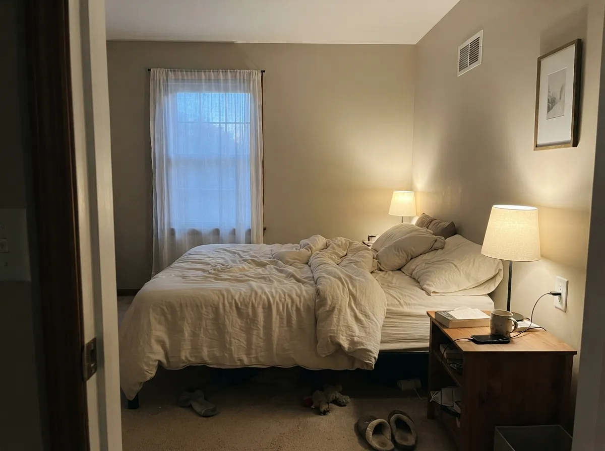
Warm 2700K bulbs bring out the beige side at night and it turns genuinely cozy. If the room stays dim and north-facing all day, expect it to look grayer than the can promised.
With a warm-veined marble or wood vanity it is a comfortable, spa-adjacent neutral. Against cool gray quartz or blue-gray tile, the warmth starts to look like dirt rather than depth.
Full sun reads it brighter and a step warmer than indoors. White trim keeps it crisp and modern-farmhouse; dark bronze or charcoal trim pushes it toward a warmer, more traditional look.
At LRV 56 it is a wall and cabinet color, not a trim color — it reads as a real neutral rather than a near-white. Save it for the field and let a dedicated white carry the trim.
Your Light Is the Risk
Morning light with no direct sun shows the beige-greige balance evenly, all day. The most flattering light it gets.
Cool, overcast daylight drains the warmth and leaves a flat, muddy taupe-gray. Test on the actual wall first.
Warmer and beige-forward at sunrise or sunset, quieter and grayer through the middle of the day. A gentle shift, not a color change.
2700K lamps bring the beige forward for a cozy night read. Cool white LEDs flatten it back toward gray — swap the bulbs before you swap the paint.
Most complaints about Wheat Bread are a light mismatch. Upload a photo of your actual room and see it on your walls — then ask for the same wall in north light or evening lamps before you buy a single sample.
Need It From Another Brand?
Any paint counter can custom-tint Behr 720C-3 directly. If you would rather stay in one brand's own deck, these are the closest stock matches, measured as ΔE2000. Under 2 is a difference you will not see on the wall.
| Brand | Closest color | ΔE | LRV | |
|---|---|---|---|---|
| Sherwin-Williams | Slumber SlothSW 9606 · Sherwin-Williams | 0.9 | 56 | Color page → |
| Benjamin Moore | Smokey Taupe983 · Benjamin Moore | 0.9 | 55 | Color page → |
| Valspar | Mushroom RisottoM243 · Valspar | 1.4 | 55.1 | Color page → |
| PPG / Glidden | SynchronicityPPG1021-2 · PPG / Glidden | 0.9 | 56 | Color page → |
| Glidden | SynchronicityPPG1021-2 · Glidden | 0.9 | 57 | Color page → |
| Dutch Boy | Centuryed Gray442-2DB · Dutch Boy | 2.2 | 57 | Color page → |
Similar Behr Colors
The nearest shades to Wheat Bread within Behr's own range, ranked by perceptual color distance — useful when you want the same look a touch lighter, darker, or warmer.
WCAG 2.1: AA is 4.5 : 1 for normal text, 3 : 1 for large text, AAA is 7 : 1.
Wheat Bread vs the Colors You're Also Considering
Every Wheat Bread sample board has the same rivals on it. The numbers show the real lightness gap — then it comes down to which risk you would rather live with.
Pick this if you're already buying Behr, or want a touch more warmth than Agreeable Gray's grayer lean.
Sherwin-Williams SW 7029 · LRV 60Agreeable GrayPick this if you want the single most-searched version of this exact idea — Sherwin-Williams' famous greige, with a longer track record.
Pick this for the same brightness with more gray mixed in — less tan, more greige.
Sherwin-Williams SW 7036 · LRV 58Accessible BeigePick this for a cleaner, more famous warm neutral with a much bigger review history to check against.
Pick this if you want the quieter, grayer sibling that's less likely to flash pink on a big wall.
Behr DC-010 · LRV 60Even Better BeigePick this if you want the true sand-beige version of this exact hue — less gray, more pigment, and a bigger chance of pink in strong afternoon sun.
Behr Studio Clay (MQ2-27) matches Wheat Bread's LRV of 60 almost exactly and looks nearly identical on a chip. The difference is direction: Studio Clay carries a touch more red, so in warm light it reads slightly pinker and softer, while Wheat Bread stays more golden and khaki. Pick Studio Clay if your room skews cool and you want extra warmth; pick Wheat Bread if your light is already warm.
Parachute Silk (UL160-16), at LRV 58, is a half-step deeper and a little more yellow. On a large wall it looks slightly richer and more saturated than Wheat Bread. It suits bright, high-window rooms where Wheat Bread might wash out; in dimmer rooms it can tip toward gold.
Prairie House (PPU9-12), also LRV 58, leans more green-khaki. Next to Wheat Bread it looks earthier and a bit muddier, which is a plus with olive or sage schemes and a minus next to pink-toned stone. When in doubt among the three, Wheat Bread is the middle path.
Wheat Bread Coordinating Colors
The rule for coordinating with Wheat Bread is the same as any warm neutral: stay warm, and keep cool grays at arm's length unless you're deliberately contrasting. It pairs easily with other warm greiges and taupes, loves a warm white trim, and takes a near-black accent well without a lot of fuss. These are the partners that keep showing up together:
Why You've Never Heard of Wheat Bread
Wheat Bread has never been a Color of the Year and has no viral room, no celebrity kitchen, no headline moment — it is the honest opposite of that story. Behr's actual Color of the Year picks (Hidden Gem for 2026) get the marketing budget; Wheat Bread sits quietly in the standard deck, recommended in roundup blog posts and paint-color-database sites rather than design magazines, and turns up in ordinary homeowner questions like whether to go darker or lighter on an accent wall next to it.
That obscurity is not a defect. Warm neutrals in this LRV band are the workhorse tier of every deck — Behr, Sherwin-Williams, and Benjamin Moore each field several nearly interchangeable options, and most homeowners never need the famous one. Wheat Bread does the job the famous ones do, at the same brightness, for less searching and less hype. The real cost is the one this review keeps returning to: because so few people have posted rooms painted in it, you are doing more of the sampling work yourself than you would with Agreeable Gray or Accessible Beige.
Wheat Bread With Wood Tones and Floors
Warm wood is this color's best company. Oak, walnut, and butcher block all sit comfortably against Wheat Bread because their warmth and its warmth are pulling in the same direction — even orange-leaning builder-grade oak looks calmer next to it than it does next to a true gray.
Cool flooring is the one combination to sample before committing. Gray-washed engineered wood or cool gray LVP will pull against Wheat Bread's warmth and can leave the wall reading slightly dingy rather than complementary. It is not an automatic dealbreaker — a warm rug and warm lighting can bridge the gap in most rooms — but test a large sample against the actual floor first, the same advice that applies to every warm neutral in this family.
Three Ready Palettes Built on Wheat Bread
A color is never alone on the wall. These are complete combinations in the 60-30-10 pattern, with the reason each one holds together. Every one opens in the visualizer.
A warm, undemanding wall color, a dependable white for trim, and one near-black note at the door — the whole house flows without any two colors fighting for attention.
Try this palette in your roomAlabaster keeps the walls soft and warm, Wheat Bread carries the cabinets without going tan-heavy, and the charcoal island gives the room one real dark note. Brass hardware ties all three together.
Try this palette in your roomSwiss Coffee trim keeps the edges soft instead of cutting, and the muted sage accent gives the room one restful color note without fighting the wall's warmth. Warm 2700K lamps finish the mood.
Try this palette in your roomWheat Bread FAQ
Is Wheat Bread beige or gray?
Both, deliberately. Behr describes it as a cross between beige and greige, and that is exactly how it reads on a wall — warm enough to avoid feeling cold, gray enough to avoid feeling tan. In cool light the gray side takes over; in warm light the beige side comes forward.
Is Wheat Bread the same as Even Better Beige?
No, but they are close enough to confuse in the store. Both are Behr, both sit at LRV 56, and both chips read as a soft warm neutral. Wheat Bread carries more gray and is the quieter of the two; Even Better Beige is the cleaner true sand beige and more prone to a pink flash in strong afternoon sun. Sample both on the wall before choosing.
Is it good for kitchen cabinets?
Yes. Behr sells it specifically for cabinets and trim as well as walls, and it flatters oak, walnut, and brass hardware without reading dated. Use a satin or semi-gloss cabinet enamel and test it against your actual counter before committing.
What white trim goes with Wheat Bread walls?
A soft warm white rather than a stark bright one — something in the Polar Bear or Swiss Coffee range. A cold, blue-white trim will make the walls look slightly dirty by comparison, the same trap every warm neutral falls into.
Does it work on exteriors?
Yes — Behr markets it for exterior use, and full sun reads it a step brighter and warmer than it does indoors. White trim keeps it crisp; dark bronze or charcoal trim leans it more traditional. Either way, walk the house at different times of day before committing to a full exterior repaint.
Will it clash with gray countertops or flooring?
It can. Wheat Bread is a warm color at heart, and cool gray quartz or gray-washed flooring pulls against that warmth, leaving the wall looking slightly dingy rather than complementary. If your fixed materials are already cool-toned, a true gray will pair better than this or any other warm neutral.
Have you painted with Wheat Bread?
Rate it — one tap helps the next reader decide.
Ask a Question