Portola Paints & Glazes: The Brand Hub (2026)
Portola Paints reviewed for 2026 — the Los Angeles family brand behind the designer-favorite Lime Wash and Roman Clay finishes, plus its zero-VOC New Standard acrylic line. The earthy, plaster-leaning palette, what the mineral finishes actually do, where to buy, and the learning curve to know before you commit.

Disclosure: Affiliate links. We earn a commission if you buy through them, at no extra cost to you. Picks reflect what we’d actually put on a wall we care about, not the one with the fattest margin.
The 30-Second Take
Portola is the brand you reach for when you want a wall to feel like something, not just be a color. It is a Los Angeles family operation, founded in 1998 by brothers Jamie and Casey Davis, and its reputation rests almost entirely on two specialty finishes: Lime Wash and Roman Clay. These are mineral finishes — built up by hand in layers — and they give a wall the soft movement, depth, and old-world warmth that flat paint can only imitate in a photograph.
Alongside the textured finishes sits New Standard, a clean zero-VOC acrylic line in the usual sheens. It is good paint. But it is not why anyone falls for Portola.
Buy Portola when the surface is the design. A plastered dining room, a lime-washed fireplace wall, a powder room that feels carved out of stone. Know going in that the finishes carry a learning curve and a price above mass-market, and that the palette leans earthy and Mediterranean rather than cool and crisp. If you want a perfectly even wall in a safe greige, a national brand does that for less.
What Portola Actually Is
Portola started small and stayed small in spirit. The Davis brothers grew up around a custom-home builder and a family of artists in Los Angeles, and the brand still hand-blends its finishes in small batches there. That origin matters, because Portola is not a chemistry company chasing scrub-cycle numbers. It is a finishes company. The whole proposition is how a wall looks and feels once the material has cured and the light moves across it.
What made the brand take off is timing. As interiors swung warm, tactile, and lived-in — away from flat gray and toward plaster, clay, and natural texture — Portola already had the two finishes everyone suddenly wanted. Designers started specifying Roman Clay by color name, and colors like Patagonia and Washi became something close to a shorthand for the look. For its 25th anniversary the brand even released designer-led color curations, which tells you where its center of gravity sits: it is a designer’s brand that homeowners discovered, not the other way around.
The honest framing is this. Portola sells a feeling more than a spec sheet. That is its strength and its limit. The mineral finishes deliver something genuinely hard to get elsewhere. The standard acrylic is competent but not remarkable, and you are paying for the brand’s eye, not a durability edge.
The Finishes That Matter
Roman Clay
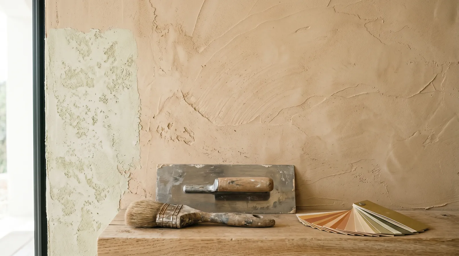
The flagship, and the finish most people picture when they think Portola. Roman Clay is a clay-based plaster troweled onto smooth interior walls with a flexible knife, built up in thin overlapping passes. It cures to a smooth, almost velvety surface with subtle stone-like movement — the kind of wall you instinctively want to touch. It reads refined and contemporary, equally at home in a modern loft or a warm, old-world room.
This is also where the skill lives. Roman Clay rewards a steady, confident hand. Overwork an area and you get burnish marks; rush the overlap and the layers show. Two coats is standard, and the result on a whole room looks meaningfully better from a practiced finish painter than from a first-timer. For interior walls only.
Lime Wash
The breezier, more rustic of the two. Lime Wash is a lime-based, brush-applied finish that goes on in thin, watery coats and dries to a chalky, matte, cloud-like patina. Because it is mineral, it actually seasons over time — the surface softens and variegates as it ages, which is exactly the weathered, sun-faded look people want from it. It works on interior and exterior masonry, drywall, and is a favorite for historic restorations.
Lime Wash is the more forgiving of the two to attempt yourself, because the finished look is mottled by design — small inconsistencies read as character rather than mistakes. A fireplace surround or a single accent wall is a sensible first project.
New Standard (Acrylic)
The conventional paint line, and the easy one. New Standard is a zero-VOC acrylic that rolls and brushes like any premium wall paint, available in Ultra Flat, Eggshell, Low Sheen (a satin), and Semi Gloss. Portola also offers a water-based Hybrid Alkyd enamel in Satin and High Gloss for trim, doors, and cabinets that need a harder, self-leveling film.
This is the line for ceilings, trim, and any room where you want one of Portola’s colors but a flat, even surface rather than texture. It is good, clean, low-odor paint. It is not where the brand’s magic lives, and on a plain wall a mainstream premium will match it for less.
The Quick-Pick Table
| Finish | Best for | Look | DIY-friendly | Price |
|---|---|---|---|---|
| Roman Clay | Feature walls, plastered rooms, modern-rustic | Smooth, velvety, stone-like movement | 🟡 Hard — technique matters | 🟡 $$$ |
| Lime Wash | Fireplaces, accent walls, exterior masonry | Chalky, mottled, weathered patina | 🟢 More forgiving | 🟡 $$$ |
| New Standard (Acrylic) | Whole walls, ceilings, trim, easy color | Flat, even, conventional | 🟢 Easy — rolls like any paint | ⚪ $$ |
Pick the finish for the effect you want, then choose the color. Same color names span the lines, so a hue you love in Roman Clay can also be had as flat acrylic if a room needs the calmer surface.
Colors
Portola’s palette is its own world — earthy, muted, and plaster-leaning, the kind of colors that look like they were lifted straight from a Mediterranean hillside or a Yosemite granite face. This is not a deck of crisp cool grays and stark whites. It runs through warm sandy beiges, soft driftwood neutrals, grounded clays, misty stone-grays, and quiet muted greens and blues — colors built to sit beautifully under the layered, textural finishes the brand is known for.
A few have become near-icons among designers: Patagonia, a soft sandy beige Roman Clay; Washi, a light driftwood-white that gives a textured backdrop without fighting the art on it; Half Dome, a misty, grounded cool gray; and warm neutrals like Piano Room and Highland. The same color names carry across Lime Wash, Roman Clay, and the New Standard acrylic, so you can choose the mood first and the surface second.
Browse the full set on the Portola color pages, organized by family so you can move from the palest plaster-whites down to the deepest clays and see how the deck’s warmth holds together.
Where Portola Wins
A look you can’t fake. Roman Clay and Lime Wash deliver real depth and movement — a surface that shifts with the light and reads as a custom, high-end finish. There is no mass-market shortcut to it, and that is the whole reason to buy the brand.
A coherent, earthy palette. The colors are curated with a strong point of view. Warm, grounded, Mediterranean-leaning tones that relate to one another, so building a calm, collected scheme is almost foolproof. Designers trust it as a vocabulary, not just a chip wall.
Clean materials. Zero-VOC and low-VOC formulas, mineral finishes, hand-blended in small batches. For people who care about what’s going on the wall and into the air, that story is real.
It ships to you. Portola sells direct and ships nationwide, so the look isn’t locked to people who live near a stockist in a design-forward city.
Where Portola Loses
The finish learning curve. This is the honest headline. Roman Clay in particular is a skill, not a roller-and-go. A botched DIY plaster wall looks worse than a botched coat of flat paint, because the technique is part of the finish. Budget for a finish painter on anything ambitious, or start with a small, forgiving Lime Wash patch.
Price. The finishes sit well above mass-market paint, and the standard acrylic carries a premium too. You’re paying for the brand’s eye and its specialty materials. On a plain, even wall in a safe color, that premium buys you little over a national brand.
Texture is the point — and the limit. If you want a perfectly uniform, variation-free wall, the mineral finishes are the wrong tool. Their movement is a feature you either want or you don’t. Choose the acrylic when you need flat and even.
Not a durability play. Portola buys you look and feel, not scrub-cycle bragging rights. For a high-traffic mudroom or a kid’s bathroom that needs to take a sponge daily, a tougher mainstream premium does the wear job as well or better.
Where to Buy
| Channel | Carries | Notes |
|---|---|---|
| portolapaints.com | Full line, samples, fan decks | The primary channel; ships nationwide and internationally |
| Select stockists / specialty paint stores | Varies | Some design-district and specialty stores carry it; call ahead |
Buy direct from portolapaints.com and you’ll find the full line plus the sample workflow that matters most here: sample jars, smaller drawdowns, and made-to-order larger sample boards. At this price, and with finishes whose whole character is texture and movement, do not skip the sample step. A flat chip on a screen tells you almost nothing about how Roman Clay will catch the light in your room. Order a board, live with it on the actual wall across a couple of days, and only then commit to material for the room.
It is not a big-box brand — you won’t grab it at Home Depot or Lowe’s on the way home — so plan ahead. West Coast orders arrive in a couple of days; East Coast can take the better part of a week depending on shipping speed.
Where Portola Sits Against Other Brands
Portola doesn’t really have a like-for-like rival, because most paint brands sell flat color and Portola sells a surface. Its closest spiritual neighbors are the color-led boutique brands — Farrow & Ball for the curated, designer-vocabulary approach, and Clare for the clean, direct-to-you experience — but neither makes a troweled plaster the way Portola does. If you’ve fallen for a Portola color and want it as ordinary flat paint, you can match the hue into a national brand at a counter; just know that a flat-color match captures the color, never the texture. For the cleaner side of Portola’s range, the zero-VOC acrylic, see how the category stacks in the best low-VOC paint round-up.
Where Kompozit Fits
Honest framing. Kompozit’s US lineup is residential interior wall and ceiling paint built for value and dependable coverage at a contractor-friendly price. Portola is the opposite kind of purchase — a specialty, look-driven brand whose whole pitch is hand-applied texture. They don’t compete. Pick Kompozit when the job is square footage, budget, and an even finish across a lot of wall. Pick Portola when the surface itself is the design and a single plastered or lime-washed wall is the reason you’re painting the room. In a multi-room project you might even use both: Portola on the one feature wall that earns it, a value line everywhere the eye doesn’t linger.
Frequently asked questions
What is Portola Paints best known for?+
What is the difference between Lime Wash and Roman Clay?+
How is a textured finish different from regular flat paint?+
Is Portola hard to apply yourself?+
Where do I buy Portola paint?+
Is Portola worth the price?+
- Browse all Portola colors
- Farrow & Ball brand hub
- Clare brand hub
- Best low-VOC paint
- Lime wash vs Roman clay