Room Colors · Exterior
6 Best Exterior Paint Colors for 2026
ideas, combinations, and real rooms
6 curated picks from real exteriors — with the exact colors, honest reasons why, and the combinations that hold the room together.

Former interior stylist who can spot a green undertone from across a room. Jessica writes the color and mood pieces — what to choose, what pairs, and why your "white" looks pink.

Top Picks for the Exterior
Pick a color family, tap a shade to see the exterior in it, then try it on your own room.
Exterior Color Trends 2026 — What's In, What's Out


- Cool blue-gray siding — The 2015-era icy gray now reads dated next to today's warm neutrals, and it is the first thing buyers flag as 'needs updating.'
- Stark white with black everything — The hard-contrast modern-farmhouse formula is the combo designers most often call overdone for 2026 — the fix is warming the white and softening the trim.
- All-black head to toe — Black siding plus black trim plus black door absorbs heat, shows fading fast on sun-facing walls, and makes resale-minded buyers nervous.
- Yellowed builder beige — Tan siding with a yellow cast is the shade real-estate pros keep naming as the one that ages a house — grayer beiges and greiges took its place.
The 6 Best Exterior Paint Colors
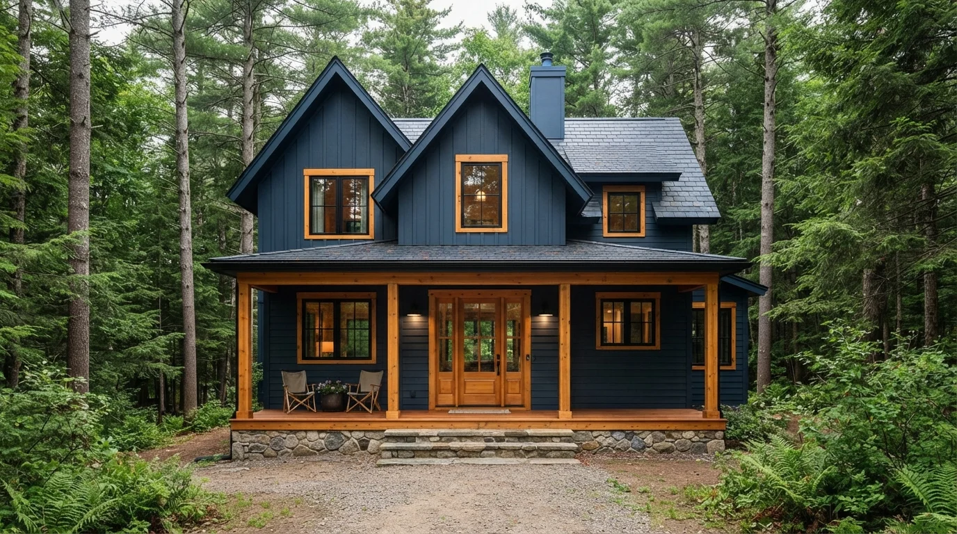
Every pick below is a real rendered exterior, not a chip. The lead color first; the swatches are the full scheme in the photo — walls, furniture, textiles, accent.

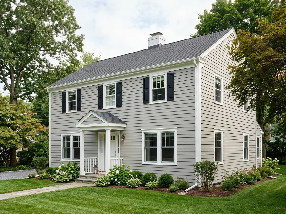
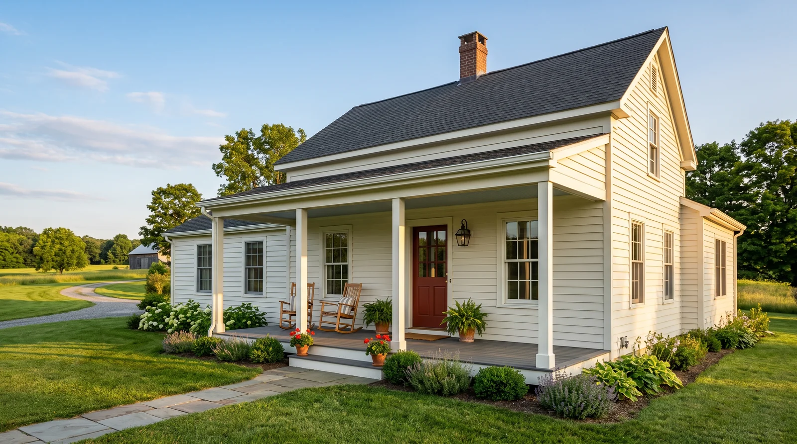
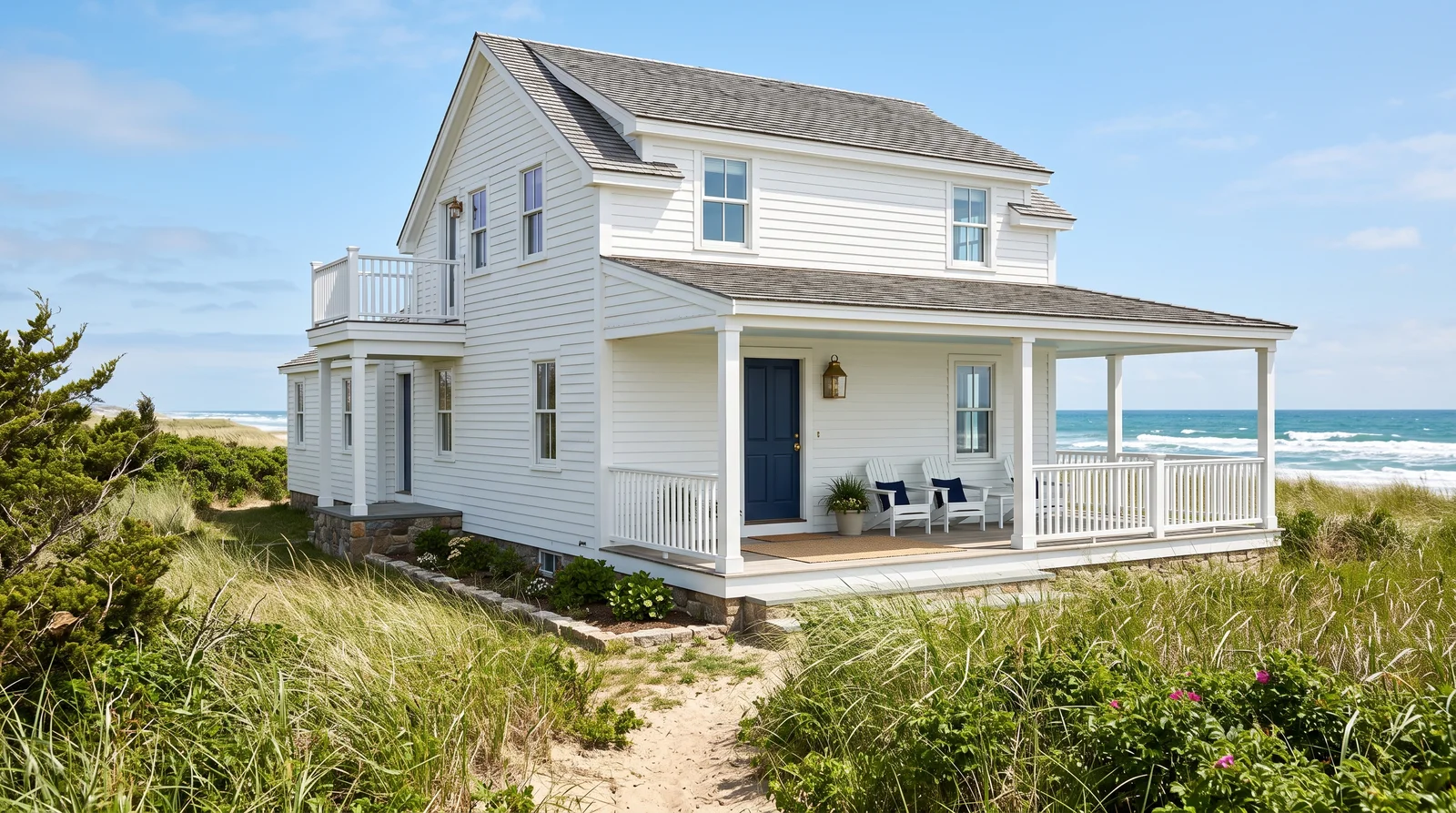
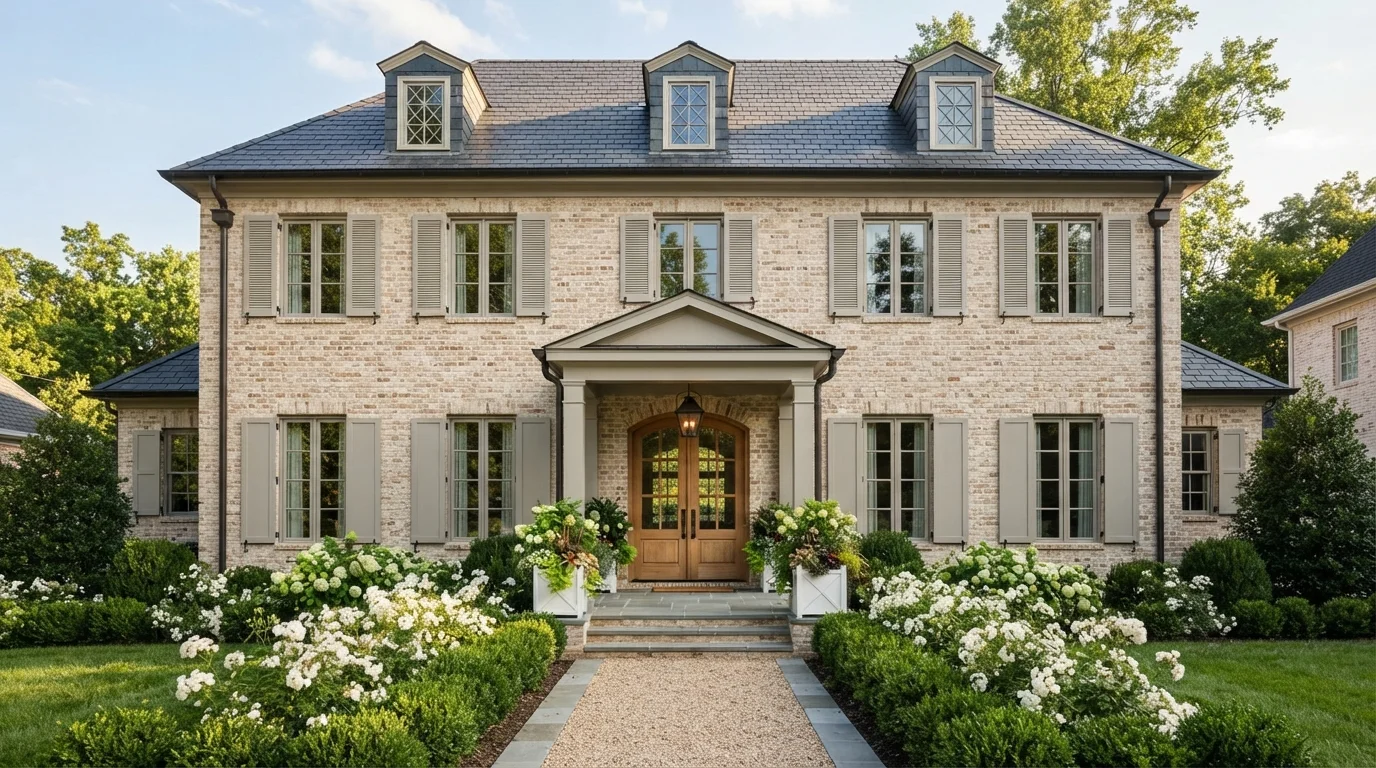
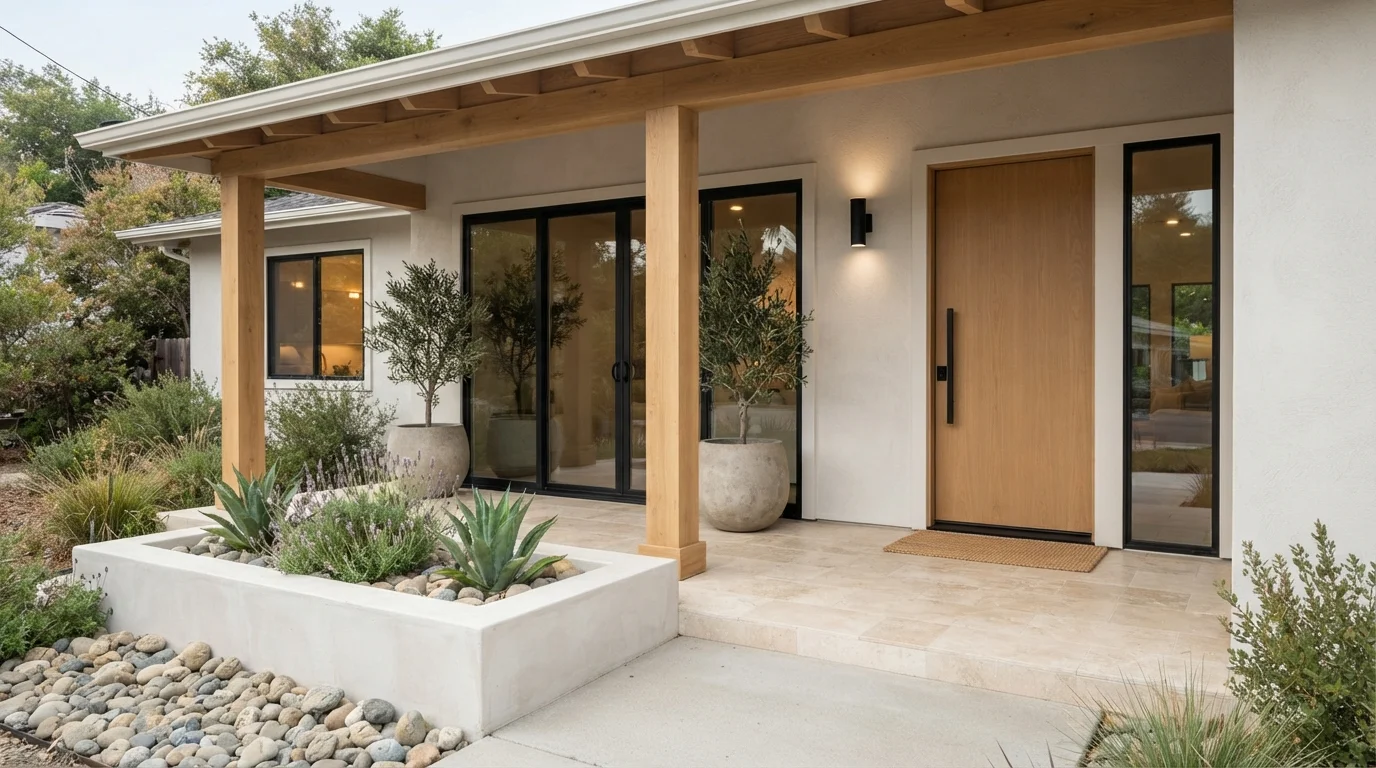
A soft, sun-washed white that glows instead of glares, made for houses that get real afternoon light.
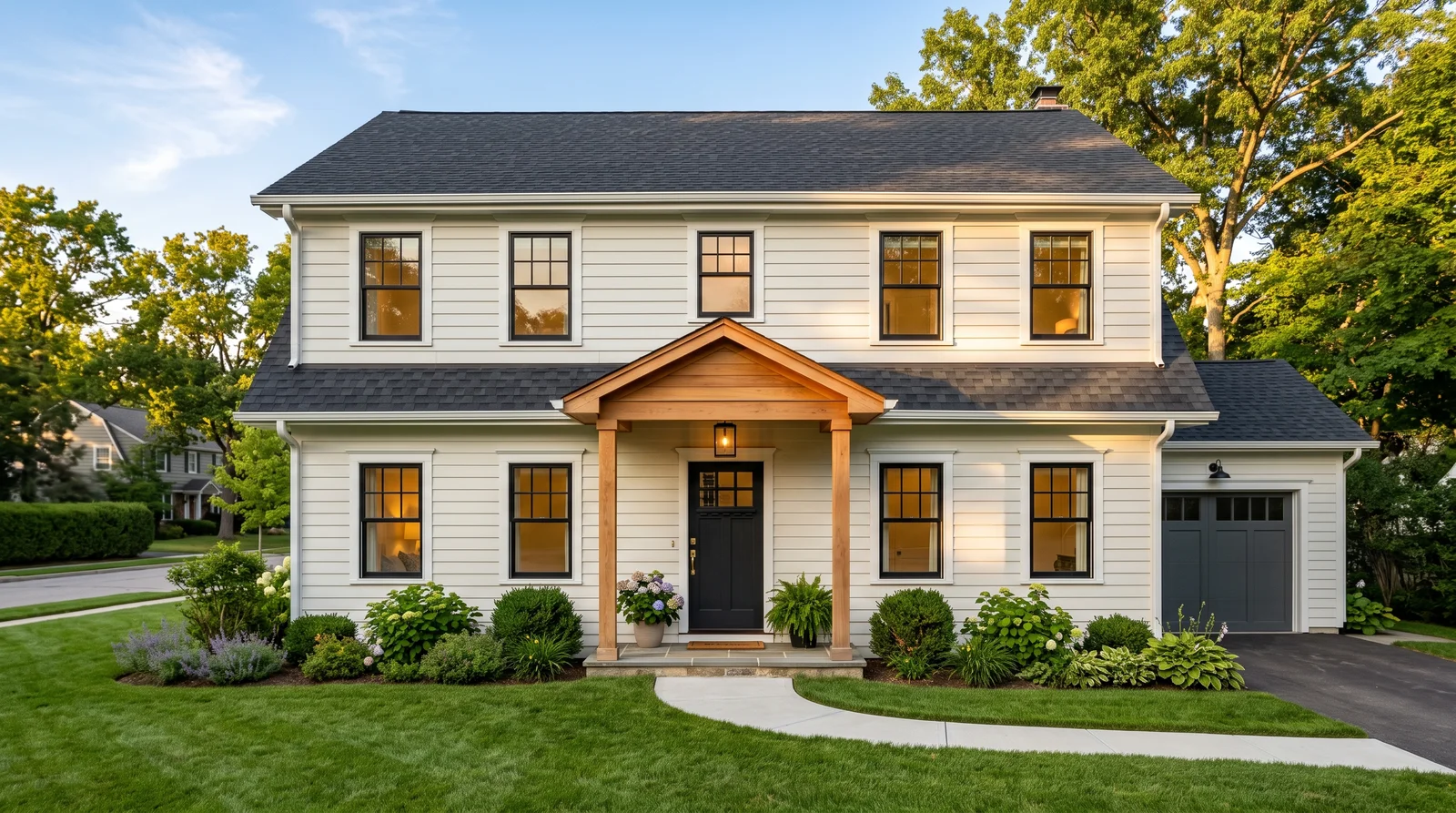
Sherwin-Williams Alabaster is the most-painted exterior white in America for a simple reason: at LRV 82 it stays bright in full sun without the blue glare a stark white throws off. On siding it reads clean and calm, and it flatters everything around it — a charcoal roof, aged brick, concrete walks. Pair it with Pure White trim for a quiet one-two rather than hard contrast, then let an Iron Ore front door and natural cedar accents do the talking. If your house sits in deep tree shade all day, Alabaster can drift creamy-gray; the crisper Snowbound is the neighbor shade to sample first.
SEE ALABASTER ON YOUR WALLS →
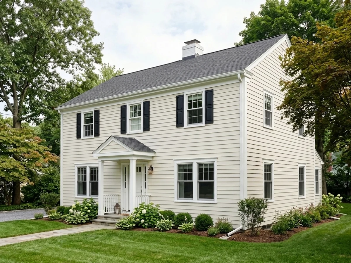
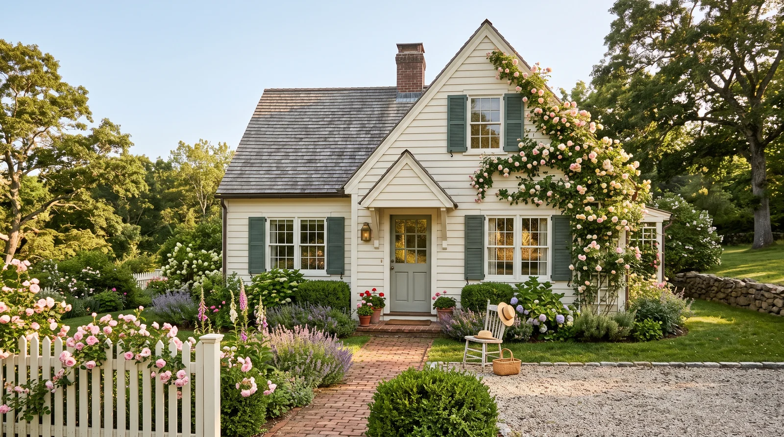
A milky, creamy white that feels friendly and lived-in, at its best on a house that faces the morning sun.
Behr Swiss Coffee is the budget-friendly way into the creamy-white wave that is replacing stark farmhouse white. Its high LRV keeps a small or single-story house looking bright, but the soft yellow-beige base takes the chill off, so the house reads warm even on overcast days. Keep the trim tone-on-tone with White Dove instead of a bright white — hard contrast is exactly what makes creams look dingy — and ground the scheme with a Peppercorn door and warm oak accents. In strong southern sun the cream can lean butter-yellow; if that worries you, Alabaster is the safer, grayer neighbor.
SEE SWISS COFFEE ON YOUR WALLS →
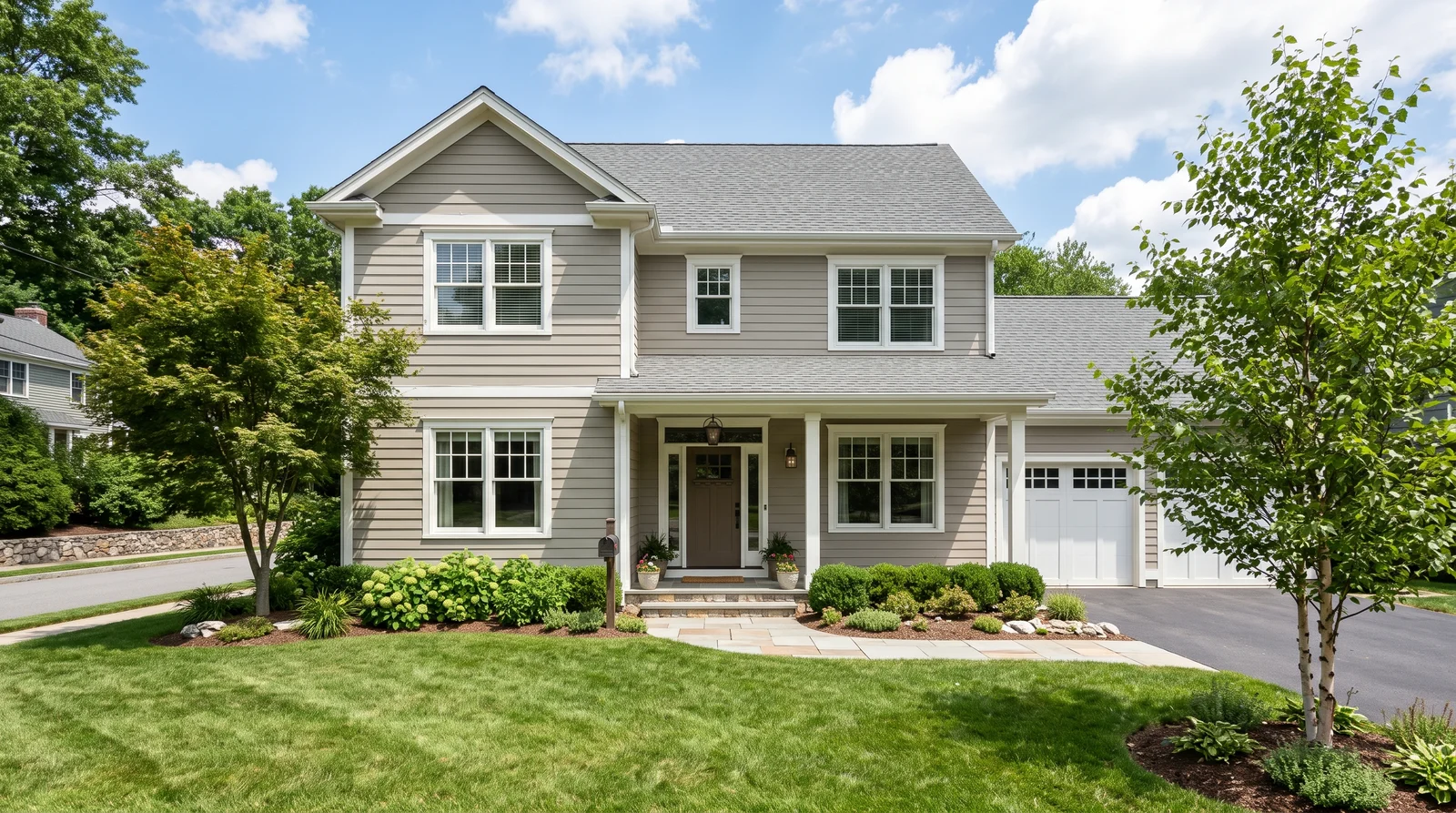
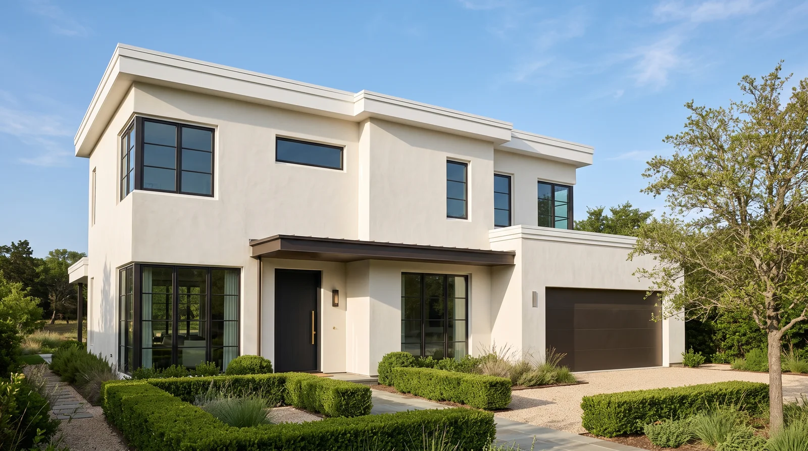
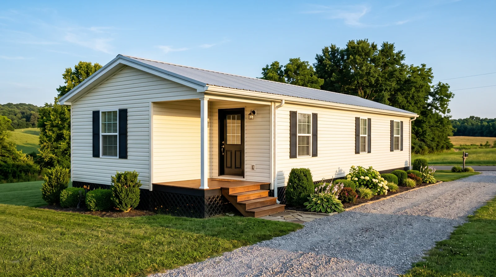
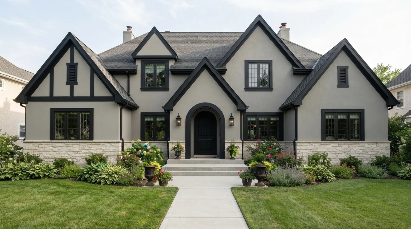
A warm greige that reads expensive and easy in any light, the safe middle between white and dark.
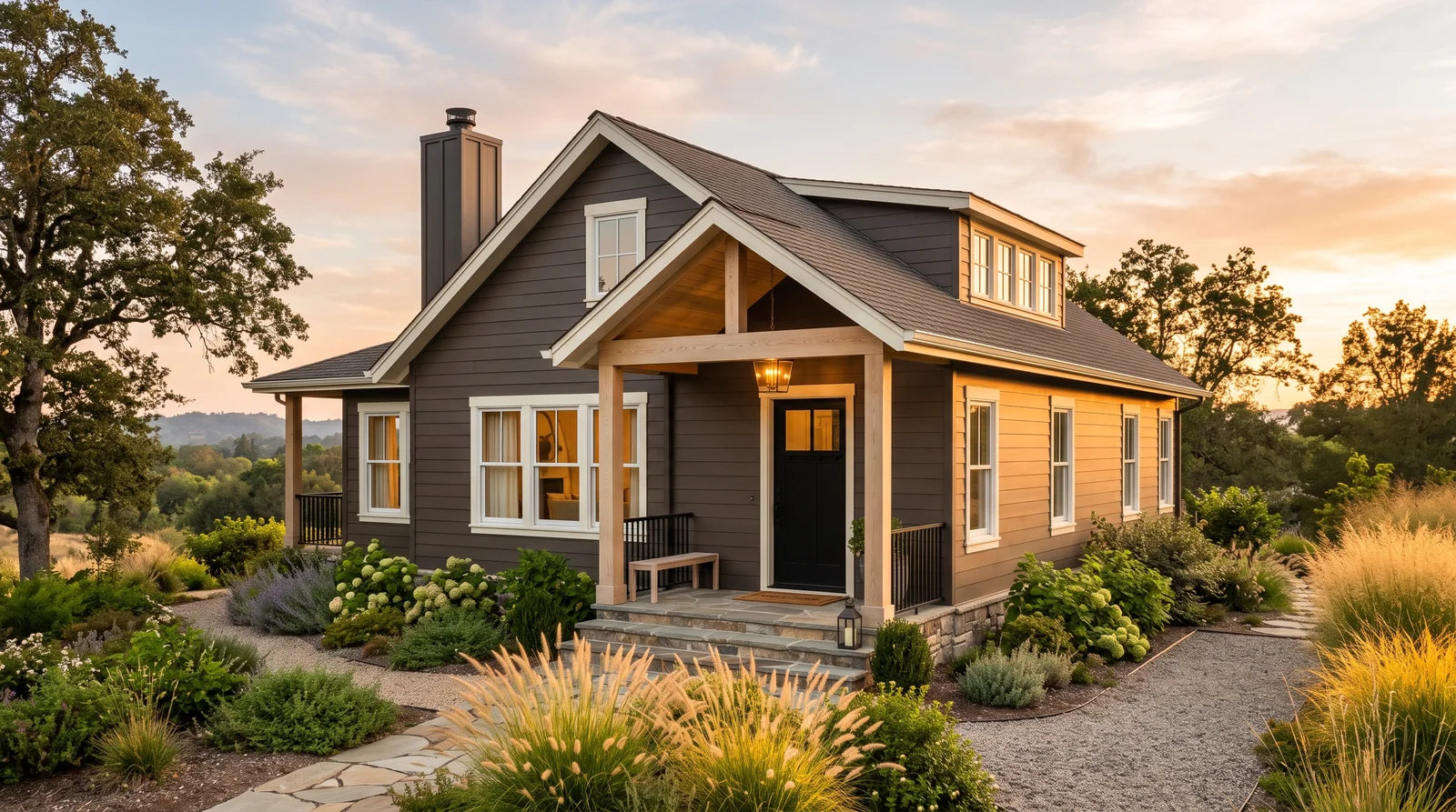
Sherwin-Williams Agreeable Gray at LRV 60 is the mid-tone that photographs light but never washes out — the exact warm-neutral lane the industry moved into when Universal Khaki was named a 2026 color of the year. It hides dust and water spots better than white siding, plays nicely with both cool concrete and warm brick, and gives Pure White trim something real to pop against. An Urbane Bronze front door keeps the scheme earthy instead of builder-basic. If your exterior gets cold northern light and the greige turns violet-gray on the sample board, warm up one step to Accessible Beige.
SEE AGREEABLE GRAY ON YOUR WALLS →
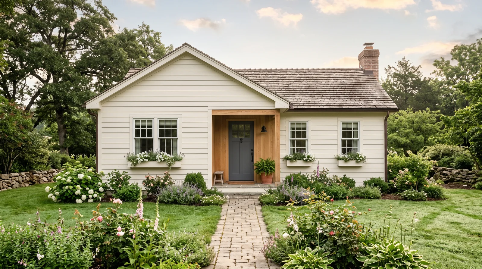
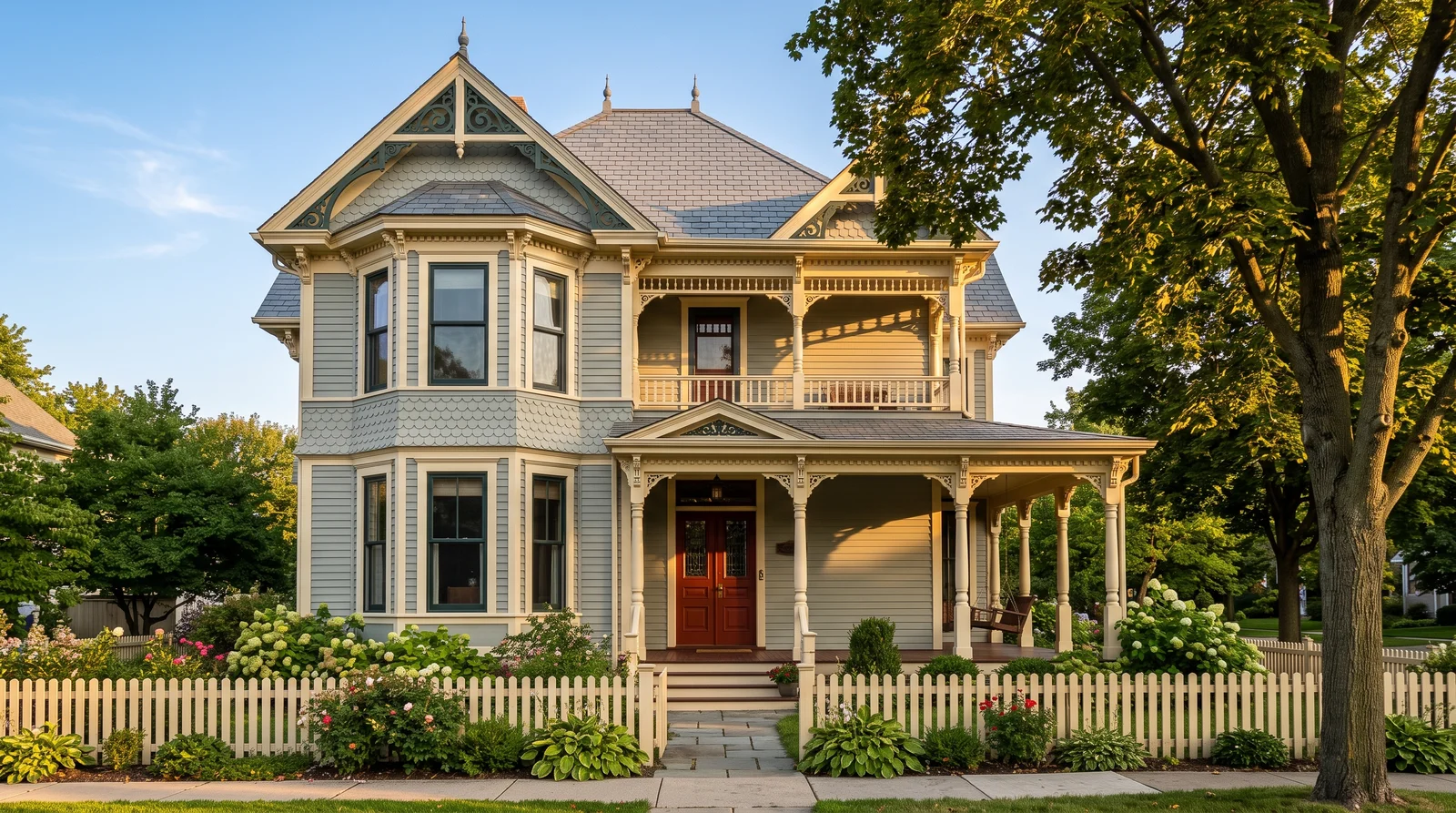
A stone-like warm gray that settles a house into its landscape, best where trees filter the light.
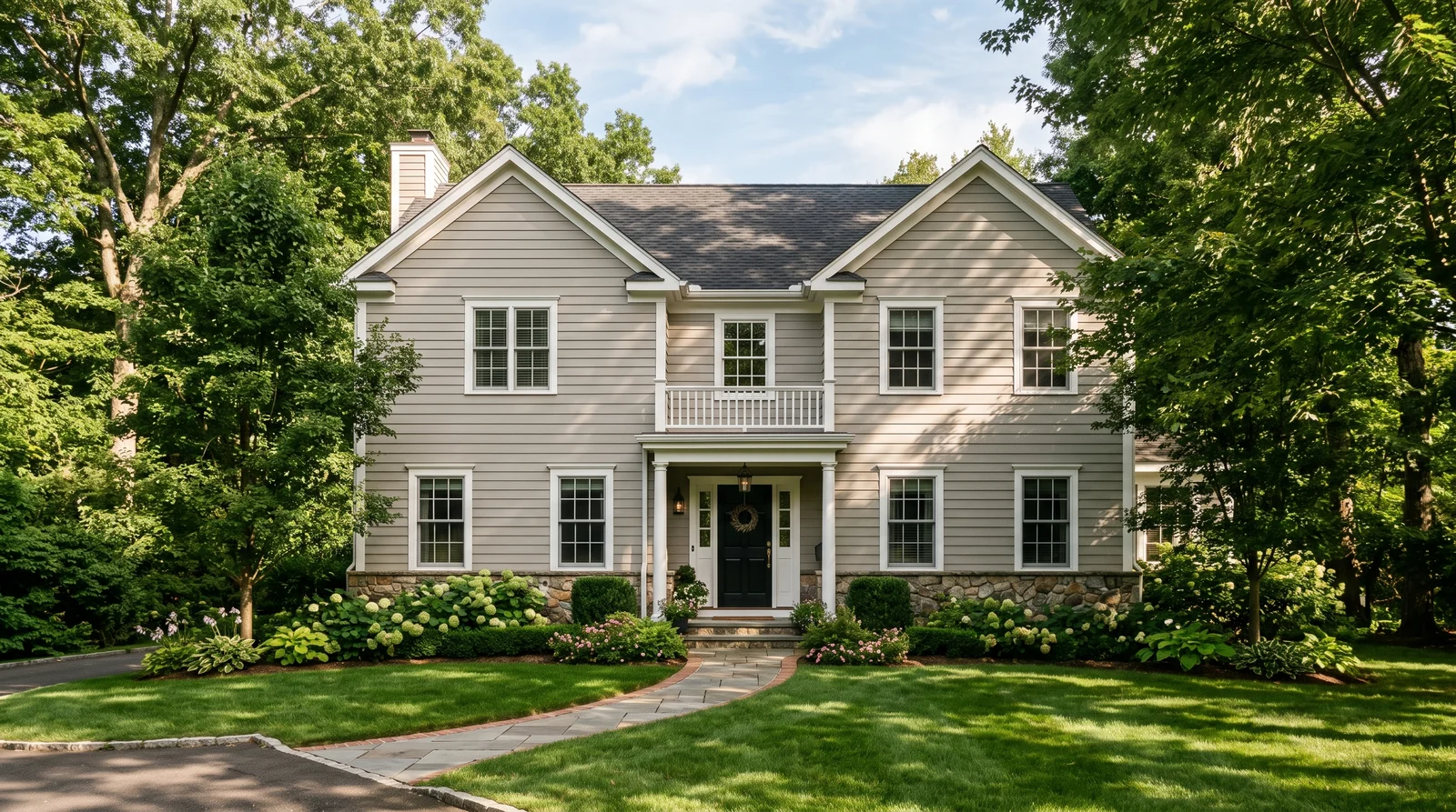
Benjamin Moore Revere Pewter has been the transitional favorite for a decade because it behaves like natural stone — warm enough for traditional houses, gray enough for modern ones. At LRV 55 it holds visible depth in bright sun where lighter greiges bleach out, and it is one of the few mid-tones that flatters both red-brown brick and cool stone at the foundation. White Dove trim keeps the contrast soft and classic, and a Tricorn Black door gives the entry weight. Under heavy tree canopy Revere Pewter can flash green; sample Accessible Beige next to it if your lot is shaded.
SEE REVERE PEWTER ON YOUR WALLS →
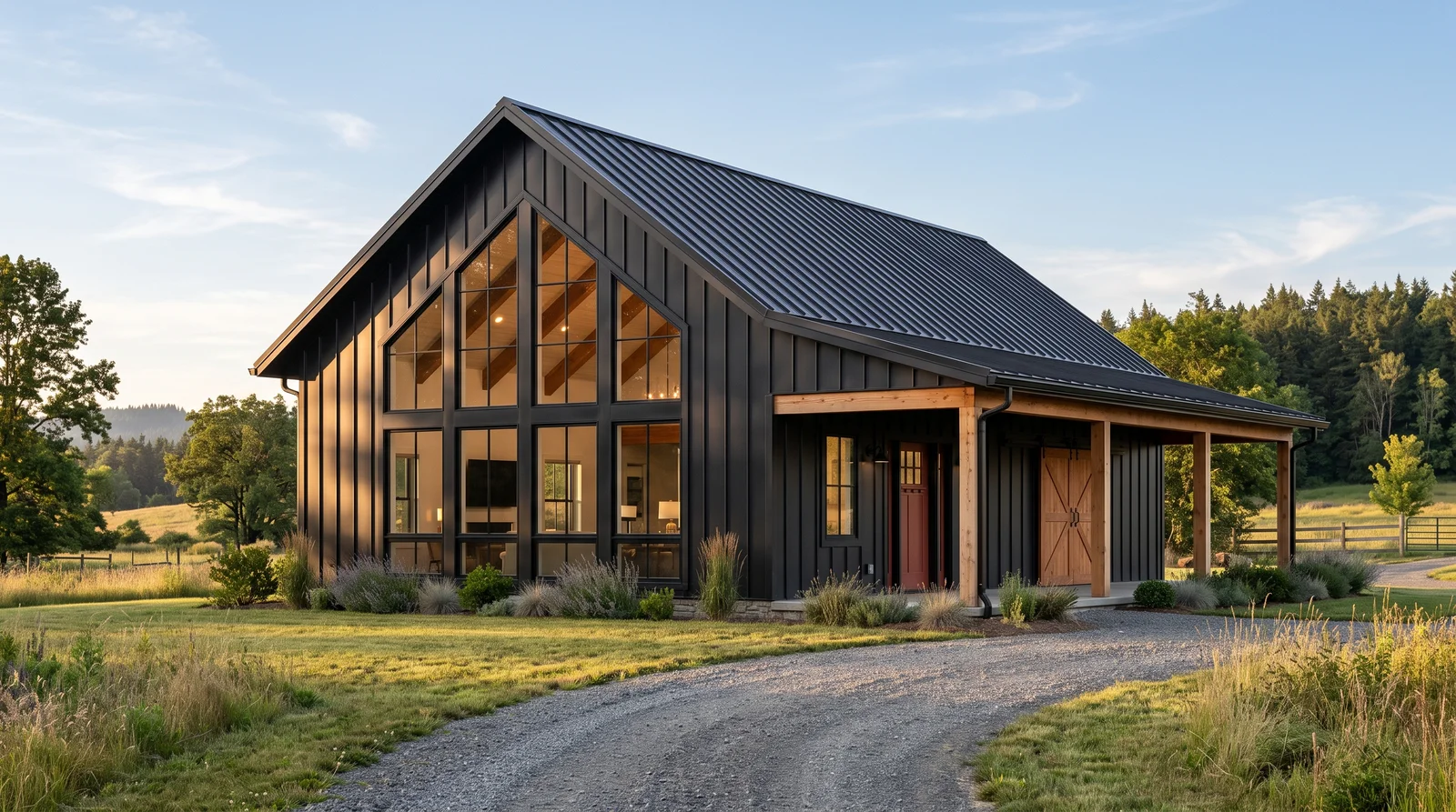
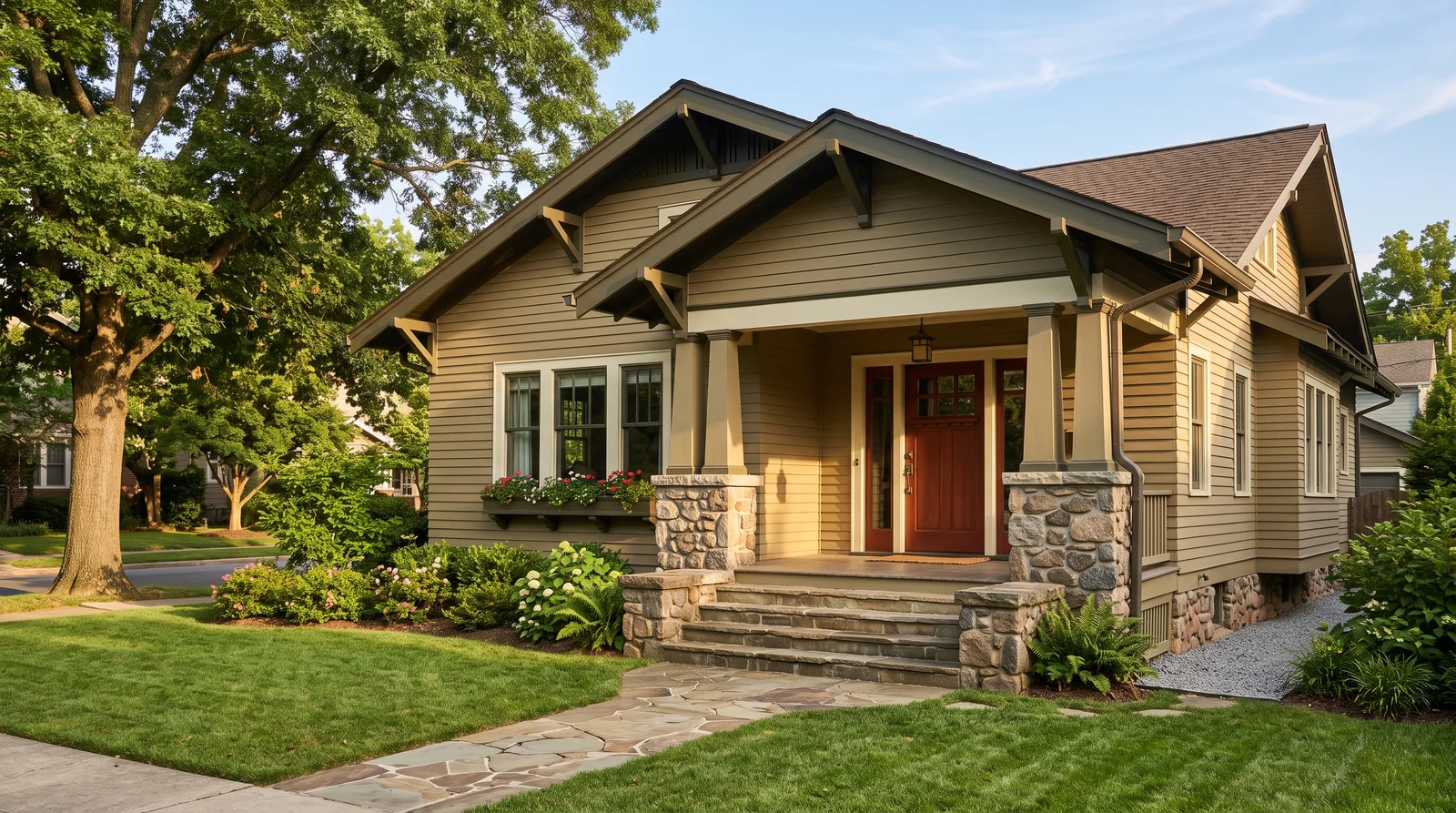
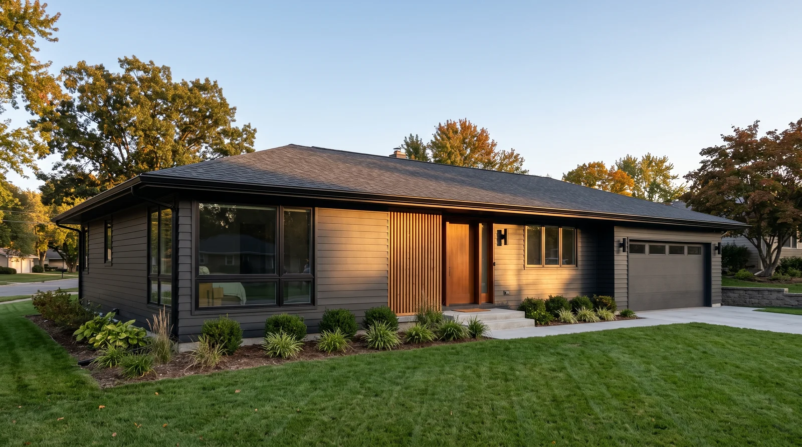
A soft near-black that turns a plain house into architecture, and it needs open sky and greenery to breathe.
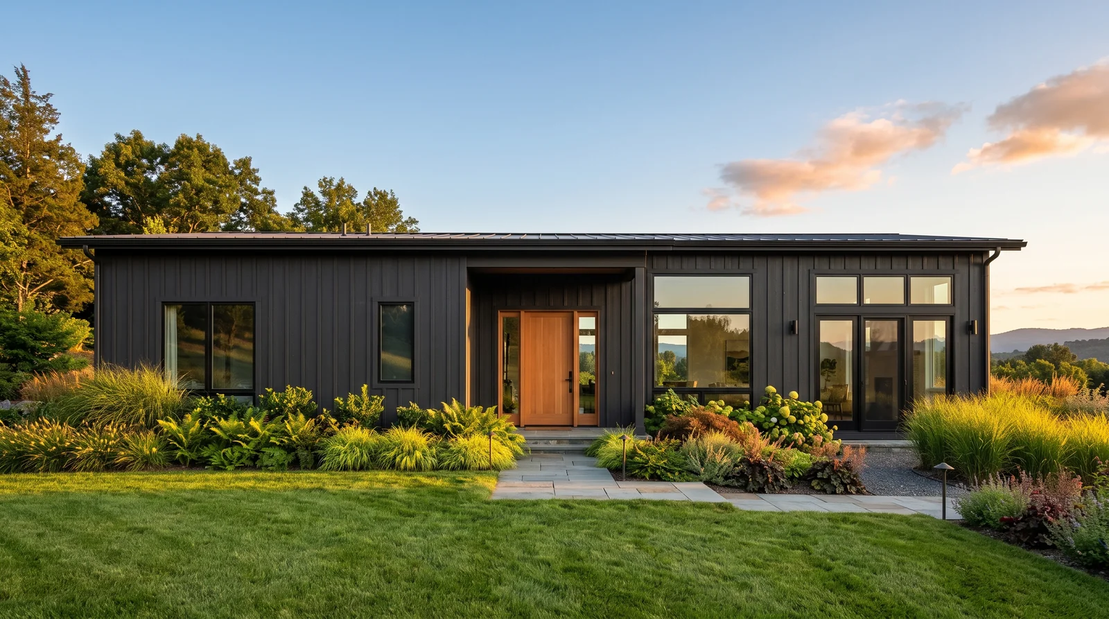
Sherwin-Williams Iron Ore is the modern-black-house color because it is not actually black — at LRV 6 it keeps a whisper of charcoal warmth, so the siding shows its texture instead of collapsing into a silhouette. It is the same charcoal lane James Hardie just crowned for 2026, and it looks sharpest run nearly monochrome: Tricorn Black on windows and trim, then a natural cedar door to break the darkness with warmth. Know the trade-offs before you commit — dark siding absorbs heat and shows fading sooner on hard southern exposures. If a full black house feels like too much, Peppercorn is the softer charcoal that keeps the mood.
SEE IRON ORE ON YOUR WALLS →
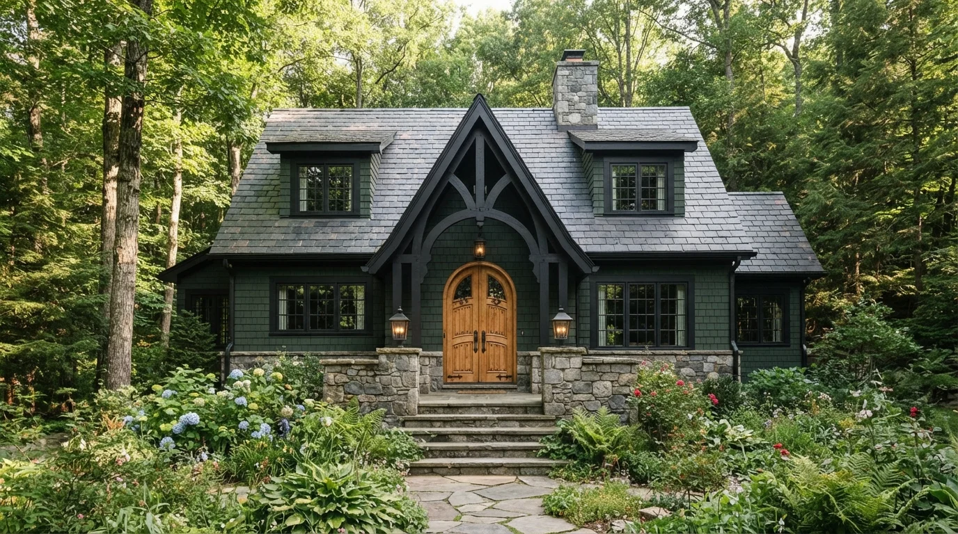
A deep bronze-brown that feels rooted and organic, glowing warm at golden hour instead of going flat.
Sherwin-Williams Urbane Bronze is the earthy answer for people who want a dark house without the severity of black — its brown base keeps the siding alive in sunlight where true grays go dull. At LRV 8 it demands real contrast, and creamy Alabaster trim does it better than a stark white, which can look clinical against bronze. A Tricorn Black door and white-oak porch accents finish the natural, grounded scheme that dominates 2026 exterior forecasts. On a heavily shaded lot Urbane Bronze can read close to black; Kendall Charcoal is the slightly lighter gray-brown neighbor worth sampling there.
SEE URBANE BRONZE ON YOUR WALLS →Exterior Wall Color Combinations
A wall color never works alone. These are the full schemes from the rooms above — the lead color first, then the supporting colors that make the photo work.
A soft, sun-washed white that glows instead of glares, made for houses that get real afternoon light.
TRY THIS PALETTE →A milky, creamy white that feels friendly and lived-in, at its best on a house that faces the morning sun.
TRY THIS PALETTE →A warm greige that reads expensive and easy in any light, the safe middle between white and dark.
TRY THIS PALETTE →A stone-like warm gray that settles a house into its landscape, best where trees filter the light.
TRY THIS PALETTE →Start with what you can't change: your roof, brick, stone, and any permanent paving. Those have undertones, and your paint either agrees with them or fights them. A warm-toned roof loves warm neutrals like Dirty Chai or a greige like Repose Gray, while a cool gray roof pairs cleanly with Dove Gray or a true gray body.
For trim, most houses look best with a clean white like Alabaster framing a colored body, which is why white trim over Sage or Hale Navy is such a reliable combination. Keep it to two or three colors total: body, trim, and one accent for the door or shutters. Match metal fixtures, house numbers, and lighting to that accent so the whole front of the house feels pulled together instead of busy.
Exterior Color Ideas by Color
Set on a color family already? Each page has its own real rooms and picks.


Light or Dark Exterior Colors?
Go Light (LRV 60+) If…
The room is small, faces north, or has to work at every hour. Light warm colors make it feel bigger and stay calm in evening light — the light you actually live in.
Go Dark (LRV Under 20) If…
You want the cocoon effect and the room has real daylight. Dark works best on one feature wall — or fully color-drenched in a large room with good windows.
Exterior color shifts more than any interior color because the sun moves all day. A shade that looks soft and warm at 9 a.m. can look bright and washed out at noon and almost gray at dusk, so always test on the actual wall and look at it morning, midday, and evening. North-facing walls and shaded, tree-heavy lots stay cooler and dimmer, which can push grays toward blue and make dark colors feel heavy; warmer shades like Alabaster or Dirty Chai hold up better there.
Full-sun, south-facing fronts wash colors lighter, so a gray like Repose Gray will look paler outside than it did on the chip, and you may want to go a step deeper. Also look at your neighbors and your surroundings: a green like Sage sings next to greenery, while a navy like Hale Navy pops against snow or pale stone.
LRV (Light Reflectance Value) runs from 0 (black) to 100 (pure white) and tells you how much light a color bounces back. Outside, higher-LRV colors like Alabaster and Dove Gray keep a house feeling light, fresh, and larger, and they stay cooler in hot sun. Lower-LRV colors like Hale Navy and Dirty Chai add drama and make a house feel solid and substantial, but they absorb heat and show fading sooner.
A practical rule: a smaller house or one in heavy shade usually looks best lighter, while a larger house or one with great light can carry a deeper color. Sage and Repose Gray sit in the comfortable middle, giving you color and depth without going so dark that the house disappears at dusk.
See It. Love It.
Paint It.
Upload one photo of your exterior and try every color on this page on your own walls — in your own light, before you buy a drop of paint.

AlabasterBeforeThe Best Color Directions for a Home Exterior
Whites and warm off-whites like Alabaster make a house feel clean, classic, and bigger, and they sit comfortably on everything from farmhouses to colonials. Grays such as Repose Gray and Dove Gray read modern and calm without going cold, and they hide dirt and weathering better than pure white. Greens like Sage feel grounded and natural, blending a house into trees and landscaping instead of fighting it.
Blues are the easiest way to add real personality. A deep navy like Hale Navy on the body or the front door looks confident and timeless, while a soft warm neutral like Dirty Chai gives you the depth of a darker color with a cozier, earthier mood. When in doubt, pick the direction that flatters your roof and stone, then choose the exact shade second.
The Right Finish for Exterior Paint
For the main body of the house, a flat or low-sheen exterior paint is the standard choice because it hides surface flaws, lap marks, and the small dings every wall has. Modern exterior flats are formulated to resist dirt and fading, so you don't sacrifice durability to avoid shine. Glossier finishes on a big wall in direct sun will spotlight every bump and waviness, which is rarely what you want.
Save the shine for the parts that take abuse and benefit from contrast. Trim, doors, and shutters look great and clean up easier in satin or semi-gloss, and that little step up in sheen makes white trim like Alabaster crisp against a body color. A front door in Hale Navy with a satin or gloss finish reads intentional and wipes clean after a season of hands and weather.
The Most Common Exterior Color Mistakes
The biggest mistake is judging color from a tiny chip indoors. Exterior color always looks lighter and brighter outside, so people end up surprised when their soft gray turns nearly white in the sun; buy a sample, paint a large board or section, and live with it for a few days. The second mistake is ignoring fixed materials and ending up with a body color that clashes with the roof or brick.
Going too dark without thinking about heat and fading is another trap, especially with bold colors like Hale Navy on a large sunny wall. And using too many colors makes even a nice house look chaotic, so resist the urge to give every architectural detail its own shade. Pick a clear direction, keep the palette tight, and remember any of these colors can be cross-matched between brands if your favorite store carries a different line.
About Exterior Paint Colors
Picking exterior paint colors is the highest-stakes color choice you'll make, because the whole world sees it and you live with it for a decade or more. The good news: a small set of color directions look right on almost any house, and the rest comes down to your light, your fixed materials, and your finish. This page walks you through whites, grays, greens, blues, and warm neutrals so you can land on a color you'll still like in five years.
Every color shown here is mixed to order at a paint counter, so a shade you love from one brand can usually be cross-matched into another. That means you can chase the exact look you want without being locked to a single label.
We'll lean on a few real examples along the way so the advice stays concrete: Alabaster, Repose Gray, Sage, Hale Navy, Dirty Chai, and Dove Gray. Use them as anchors, not rules.
The Questions Everyone Asks
What color should I paint my exterior?
If you want one answer, start with the safe picks above — Alabaster, Repose Gray, Hale Navy, Dark Night. They read well in any light and survive furniture changes. Then check the light: strong afternoon sun wants a step cooler, a north-facing room wants a step warmer.
How many colors should an exterior have?
For most houses, three is the sweet spot: a body color, a trim color, and one accent for the door or shutters. A two-color scheme (body plus trim) looks clean and classic, while four or more usually starts to feel busy. Keep details like fascia and gutters tied to the trim or body so they don't read as extra colors.
Will a gray like Repose Gray look the same outside as on the chip?
No. Outdoor light is far brighter than indoor light, so a gray like Repose Gray will look noticeably lighter and sometimes cooler on the actual wall. Always test a large painted sample on the house and check it in morning, midday, and evening light before committing. If it looks too pale outside, step down to the next deeper shade.
What sheen is best for exterior walls?
A flat or low-sheen finish is best for the main body because it hides surface flaws and resists glare on big sunlit walls. Modern exterior flats are still durable and washable, so you don't lose protection. Step up to satin or semi-gloss only on trim, doors, and shutters, where the extra shine adds crispness and cleans up easily.
Is a dark exterior color a bad idea?
Not at all, but use it with eyes open. Deep colors like Hale Navy or Dirty Chai look striking and substantial, especially on a larger house with good light. The trade-offs are more absorbed heat and faster fading on sun-baked walls, so they often work best as an accent, on a shaded elevation, or on a home that can carry the weight visually.
How do I pick a color that works with my roof and brick?
Treat the roof, brick, and stone as fixed colors with their own undertones, then choose paint that agrees with them. Warm-toned materials pair with warm neutrals or greige like Repose Gray and Dirty Chai, while cool gray materials pair with true grays like Dove Gray. Hold large samples up next to the actual material in daylight to confirm they don't clash.
Can I match an exterior color across different paint brands?
Yes. Every color shown here is mixed to order at the paint counter, and a shade you love from one brand can usually be cross-matched into another brand's line. Bring the color name or a sample to the store and ask them to match it. This lets you keep the exact look while using whatever paint your store carries.
Which color makes a small house look bigger?
Lighter, higher-LRV colors like Alabaster or Dove Gray make a small house feel larger and more open because they reflect more light. Pairing a light body with crisp white trim and keeping the palette simple adds to that effect. Very dark colors can make a small house feel more compact, so save those for accents like the front door.
What two-color combination works best in a exterior?
The reliable pattern is a quiet main color plus one deep accent on a single wall. Keep trim and ceiling in one warm white so the two colors are the only event in the room — the combination cards above show complete schemes from real rooms.
What colors make a exterior look bigger?
High-LRV, slightly warm colors — LRV 60–75 is the sweet spot. Paint the walls and trim close to the same light color so the corners blur, and keep the ceiling white. Stark cool white actually works against you; it creates hard shadows that show the room's edges.

Ask a Question