Room Colors · Craftsman Exterior
5 Best Craftsman Exterior Paint Colors for 2026
ideas, combinations, and real rooms
5 curated picks from real craftsman exteriors — with the exact colors, honest reasons why, and the combinations that hold the room together.

Former interior stylist who can spot a green undertone from across a room. Jessica writes the color and mood pieces — what to choose, what pairs, and why your "white" looks pink.
The Fast Answer
Don't want to read 5 picks? These four are the safe answers.

Top Picks for the Craftsman Exterior
Pick a color family, tap a shade to see the craftsman exterior in it, then try it on your own room.
The 5 Best Craftsman Exterior Paint Colors
Every pick below is a real rendered craftsman exterior, not a chip. The lead color first; the swatches are the full scheme in the photo — walls, furniture, textiles, accent.

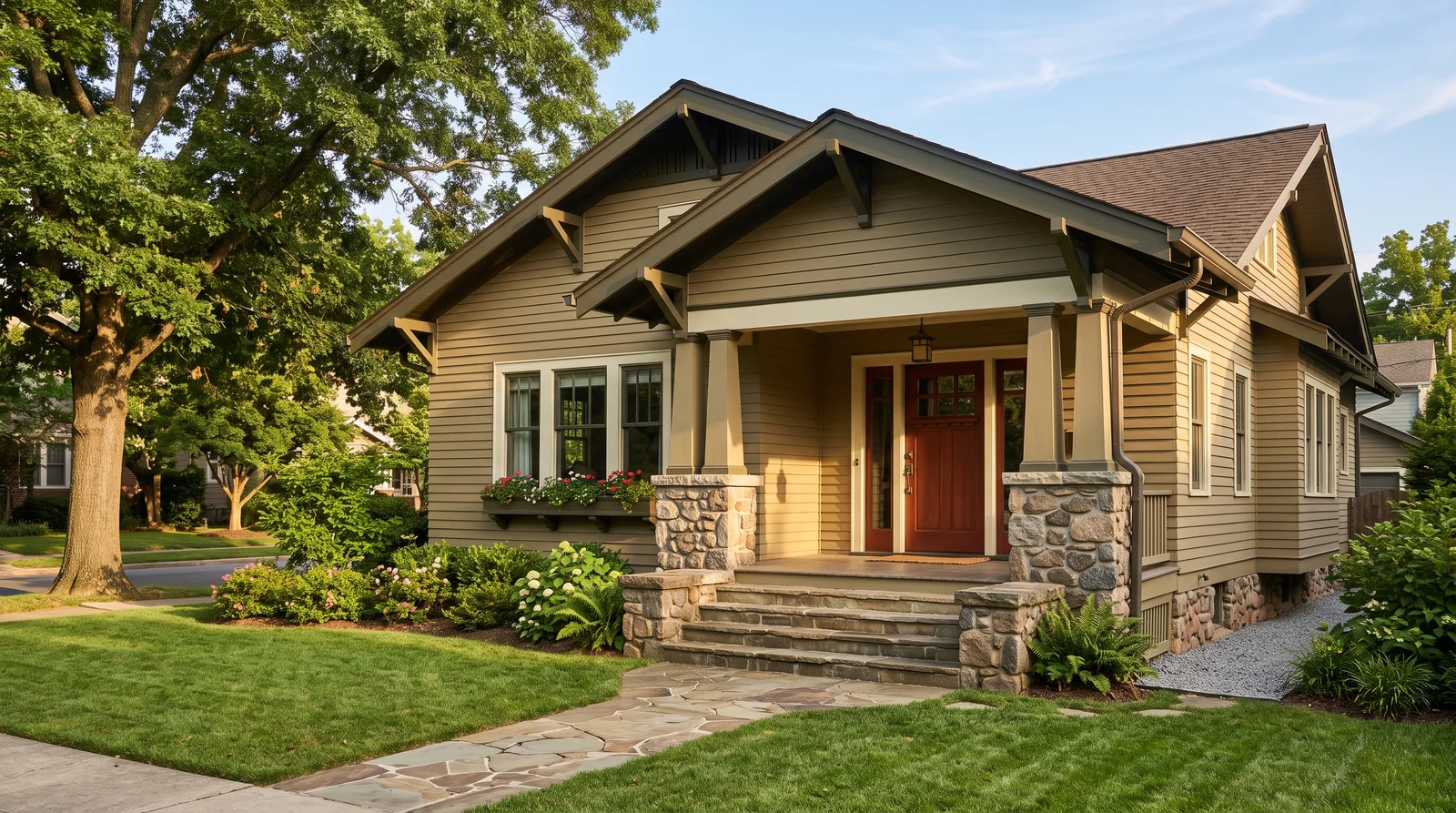
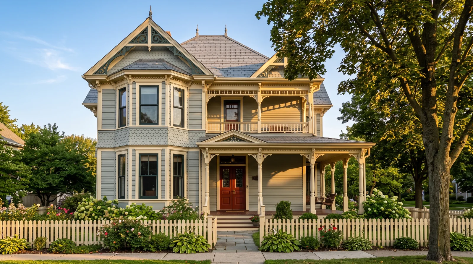
The textbook 1910s bungalow scheme: an olive-tan body, cream trim, and a dark green sash that makes the eaves pop.
Roycroft Suede is Sherwin-Williams' reissue of a real Arts and Crafts body color, a tan with enough olive in it to sit quietly against grass and stone. At LRV 31 it is dark enough to show off cream trim without turning the house into a shadow. The move that makes this look period-correct is the sash: paint the window frames, rafter tails and porch beam in Rookwood Dark Green so the deep eaves read as a hard line. Rookwood Red on the door is the one warm note. On a small bungalow the olive can go muddy in full shade, so sample it on the shaded side first.
SEE ROYCROFT SUEDE ON YOUR WALLS →
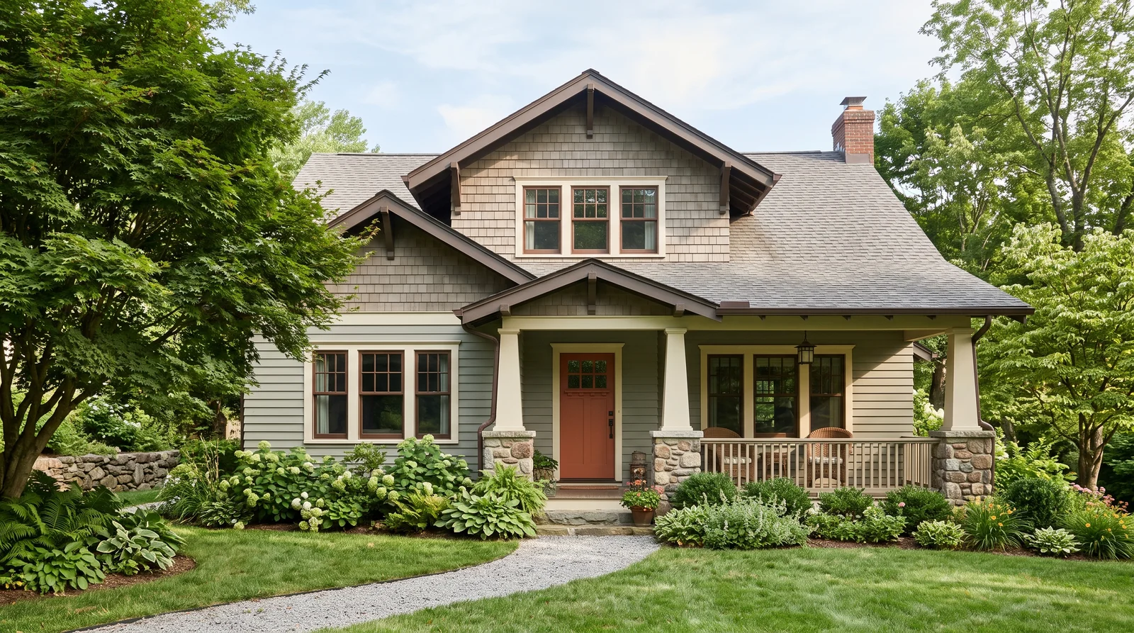
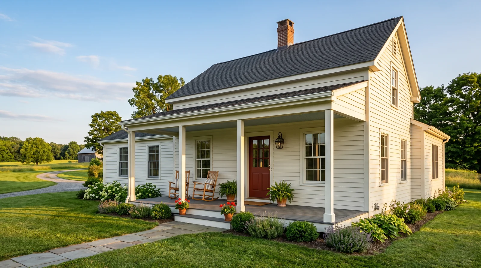
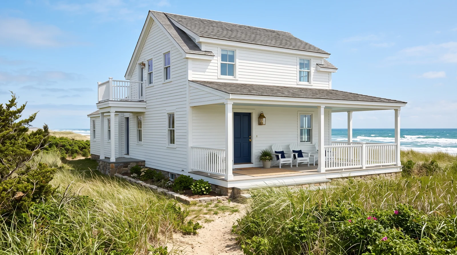
Soft grayed sage with creamy trim and a rust door, the most requested Craftsman scheme of the last ten years.
Saybrook Sage is the safe way into a green house. It is grayed enough that it never looks minty, and at LRV 45 it holds its color on a shingled second story instead of washing out. Keep the trim creamy rather than bright white; Elmira White has the same warm base, so the two look related instead of fighting. The rust door is the period touch, because 1920s builders paired moss green with clay red constantly. Paint the window sash and rafter tails in Rookwood Dark Brown so the deep eaves still cast a visible shadow line at midday.
SEE SAYBROOK SAGE ON YOUR WALLS →
A deep oxblood-brown body with warm cream trim, straight out of a 1920s paint card.
Roycroft Copper Red is a real Arts and Crafts body color, and it is darker than most people expect: an oxblood brown that turns almost chocolate on a cloudy day. It belongs on a shingled bungalow with a lot of trim, because the cream lines are what keep it from reading heavy. PPG Antique White is a warm cream that suits it better than any bright white. Dard Hunter Green on the door is the historically correct partner, and antique gold on the porch beam and sash picks up the wood tones. Dark bodies fade fastest, so buy the best exterior paint you can.
SEE IT ON YOUR WALLS →
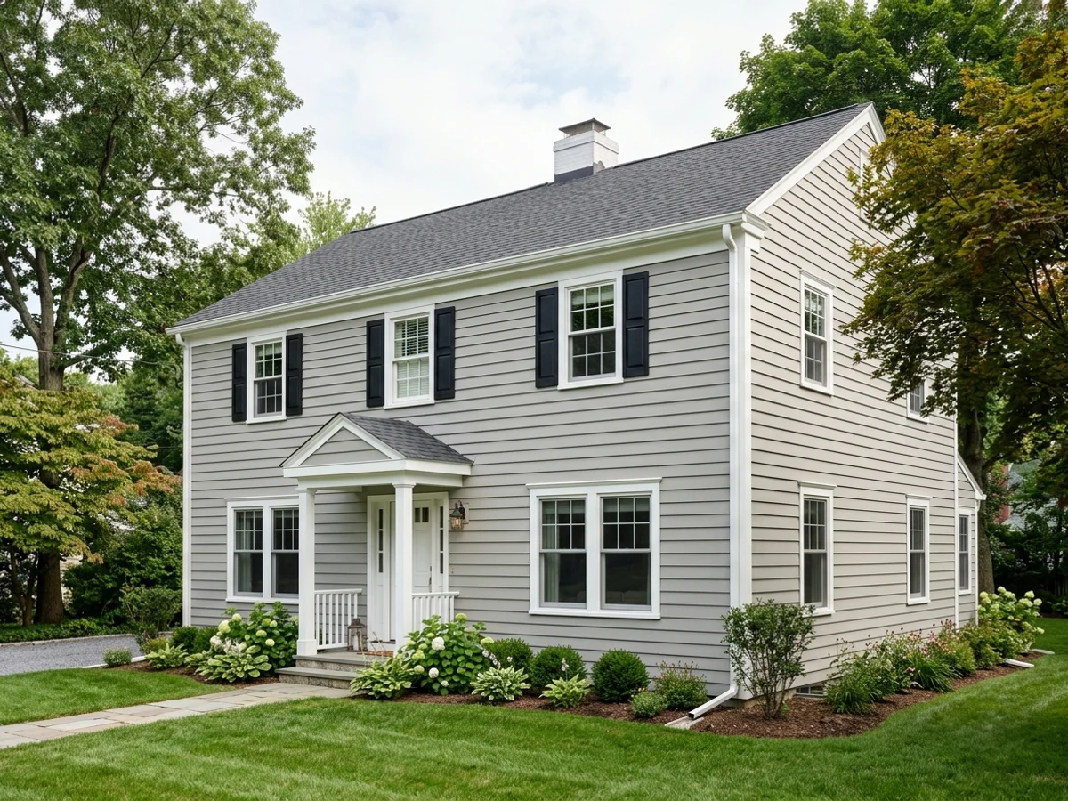
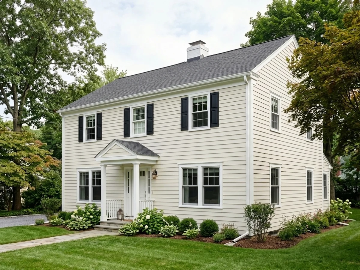
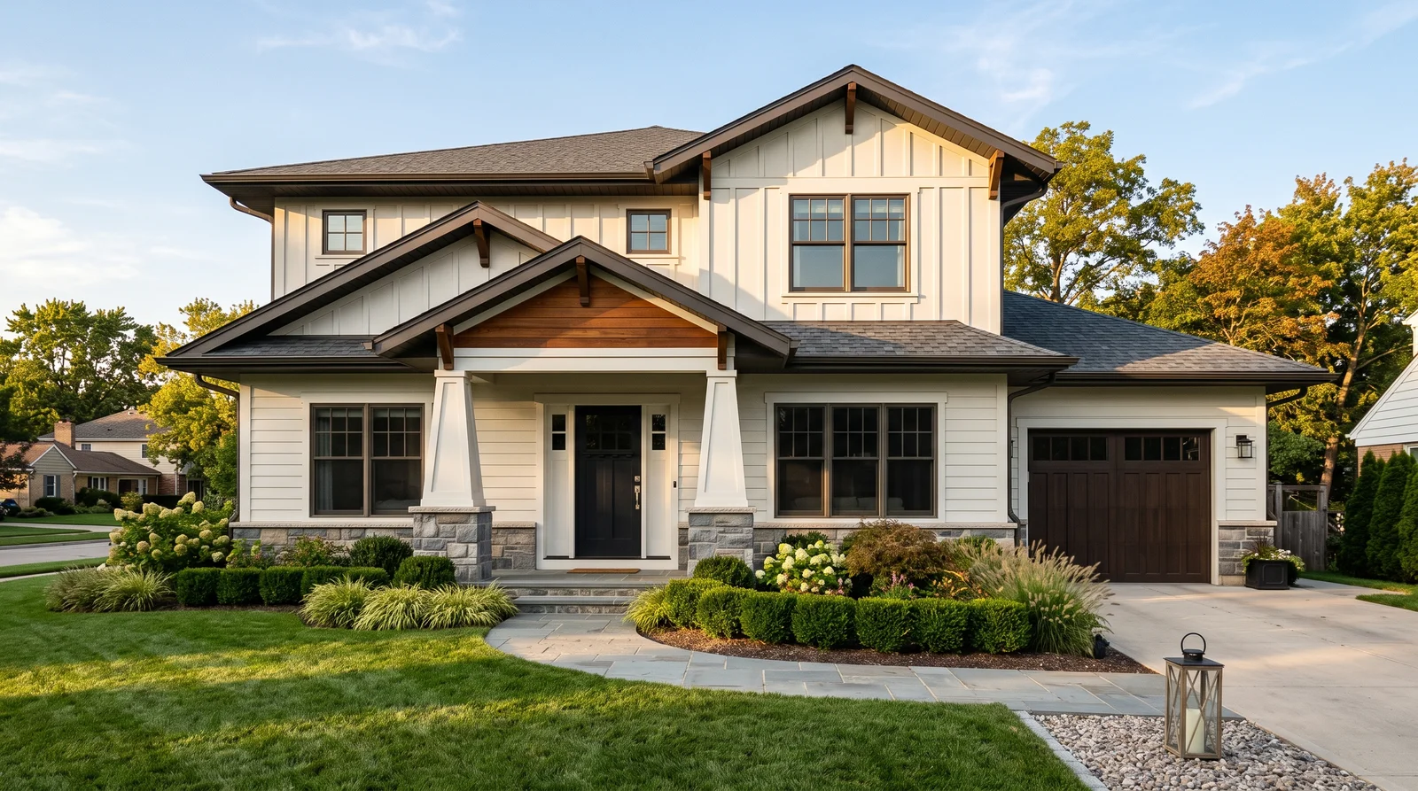
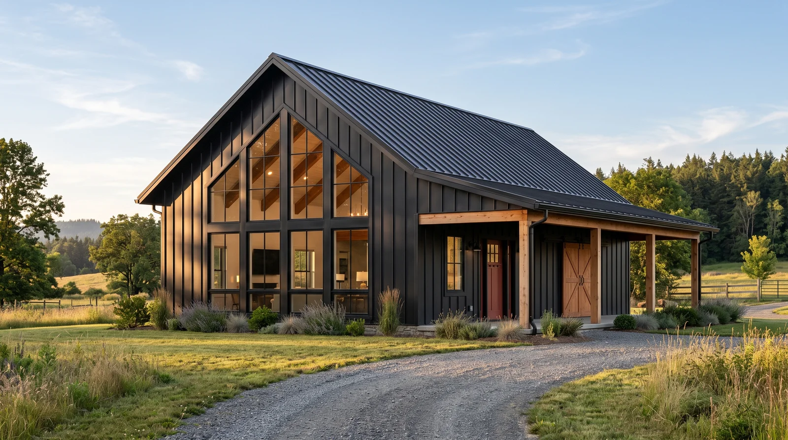
The new-build Craftsman look: a warm white body, crisper white trim, charcoal door and bronze structural details.
This is the scheme most 2020s Craftsman-style builders use, and it works as long as you keep the dark details. White Dove is warm enough that the house does not glare, and PPG Delicate White on the trim is a half step crisper, so the casings still read. The part people skip is Urbane Bronze on the rafter tails, porch beam and garage door. Without it, a white Craftsman loses the shadow lines that define the style and starts to look like a plain farmhouse. Add a stained wood door or column caps if you can afford real wood.
SEE WHITE DOVE ON YOUR WALLS →
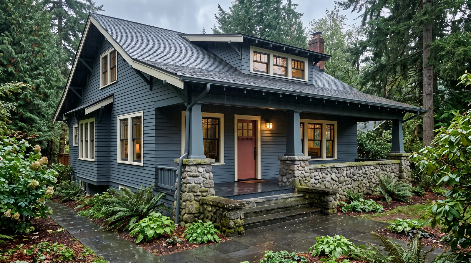
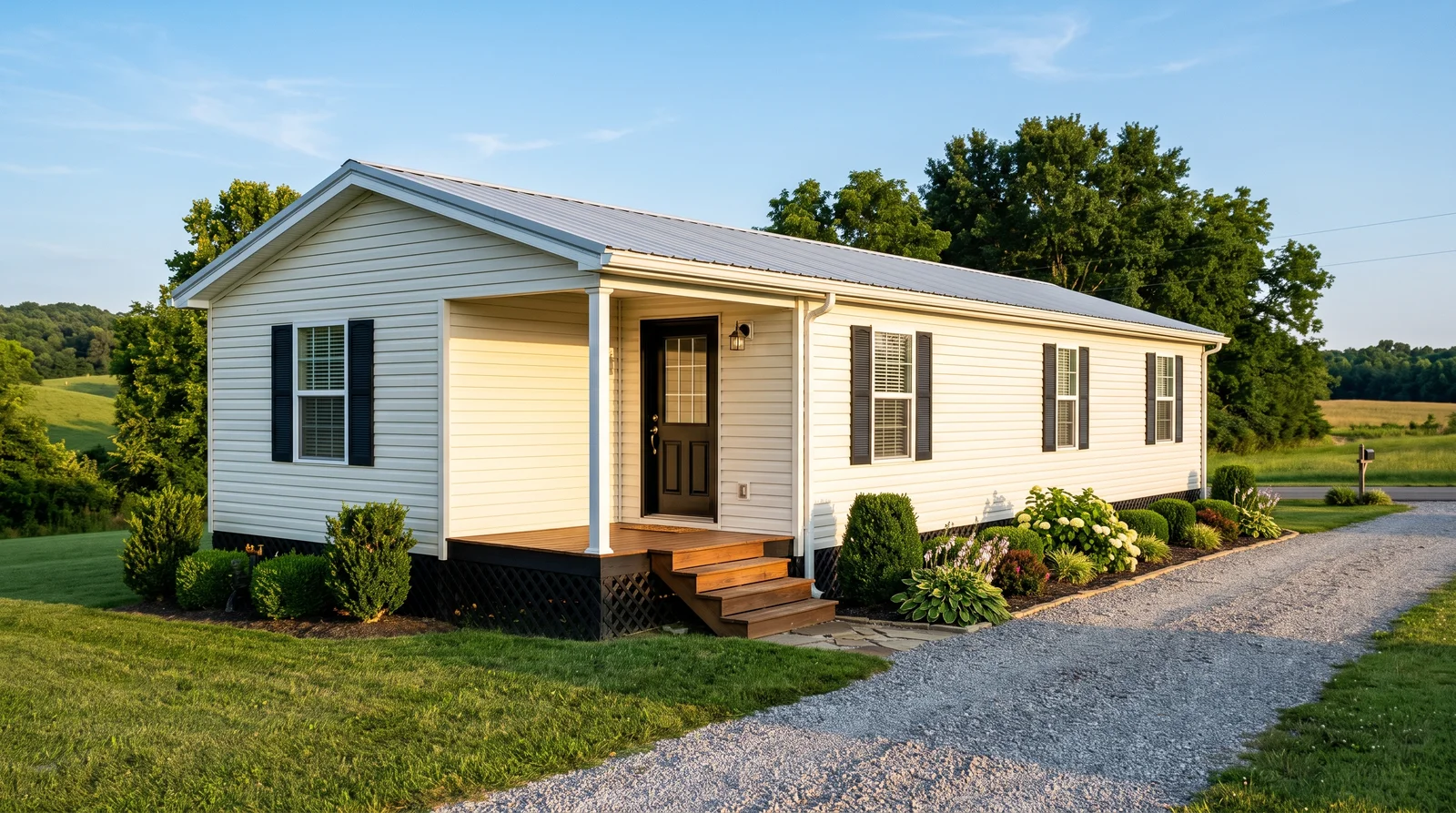
A deep historic blue-gray body with warm white trim and a clay-red door, quiet from the street and sharp up close.
Knoxville Gray is in Benjamin Moore's Historical Collection for a reason: it is the grayed blue-green that shows up on early 1900s houses, and at LRV 16 it is genuinely dark. On a Craftsman it works because the deep eaves already put half the wall in shadow, so a dark body reads rich rather than flat. Alabaster trim keeps it warm; a cool white would turn the whole house steel blue. The Deep Clay Red door is the earth tone that stops it feeling cold, and Iron Ore sash keeps the windows from disappearing into the siding.
SEE KNOXVILLE GRAY ON YOUR WALLS →Craftsman Exterior Wall Color Combinations
A wall color never works alone. These are the full schemes from the rooms above — the lead color first, then the supporting colors that make the photo work.
The textbook 1910s bungalow scheme: an olive-tan body, cream trim, and a dark green sash that makes the eaves pop.
TRY THIS PALETTE →Soft grayed sage with creamy trim and a rust door, the most requested Craftsman scheme of the last ten years.
TRY THIS PALETTE →A deep oxblood-brown body with warm cream trim, straight out of a 1920s paint card.
TRY THIS PALETTE →The new-build Craftsman look: a warm white body, crisper white trim, charcoal door and bronze structural details.
TRY THIS PALETTE →More Exterior Color Ideas
Set on a color family already? Each page has its own real rooms and picks.


Light or Dark Craftsman Exterior Colors?
Go Light (LRV 60+) If…
The room is small, faces north, or has to work at every hour. Light warm colors make it feel bigger and stay calm in evening light — the light you actually live in.
Go Dark (LRV Under 20) If…
You want the cocoon effect and the room has real daylight. Dark works best on one feature wall — or fully color-drenched in a large room with good windows.
See It. Love It.
Paint It.
Upload one photo of your craftsman exterior and try every color on this page on your own walls — in your own light, before you buy a drop of paint.

AlabasterBeforeAbout Craftsman Exterior Paint Colors
Craftsman color is not one shade, it is a way of grouping shades. The style was built to look like it grew out of the ground, so the body color is almost always an earth tone: olive, moss, tan, clay, brown, or a gray that leans green or blue. The drama comes from contrast, not from a bright body color. A Craftsman gets a mid-tone body, a lighter cream or white trim, and then a much darker color on the window sash, the exposed rafter tails and the porch beams. That dark line is what makes the deep eaves throw a real shadow and the windows read as pieces of furniture.
The 1910s and 1920s palette is easy to copy because it still sells. Sherwin-Williams keeps the actual Arts and Crafts colors in print as the Rookwood and Roycroft ranges, and Benjamin Moore's Historical Collection holds the same browns, creams and grayed greens. Reds were brick and oxblood, greens were bottle and moss, golds were mustard rather than yellow. One honest tip before you commit: exterior color goes up two to three steps lighter in open daylight than it looks on the chip, so brush two coats on a poster board, hang it under the porch and out in the sun, and look at it at noon and again at 6 p.m.
The Questions Everyone Asks
What color should I paint my craftsman exterior?
If you want one answer, start with the safe picks above — White Dove, Saybrook Sage, Knoxville Gray, Roycroft Copper Red. They read well in any light and survive furniture changes. Then check the light: strong afternoon sun wants a step cooler, a north-facing room wants a step warmer.
What colors are authentic on a 1920s craftsman house?
The real 1910s and 1920s bungalow palette was earth pigments: olive and moss greens, tans, clay reds, oxblood browns, mustard golds and warm creams. Sherwin-Williams still sells the actual Arts and Crafts colors, so Roycroft Suede (SW 2842), Rookwood Dark Green (SW 2816) and Roycroft Copper Red (SW 2839) are period-correct out of the can. Benjamin Moore's Historical Collection covers the same ground with Hasbrouck Brown (HC-71) for bodies and Philadelphia Cream (HC-30) for trim. What you will not find on an original house is a pure white body, a pastel, or a cool gray.
What is the three-color rule for a craftsman exterior?
Craftsman houses were painted with three jobs in mind: body, trim and sash. The body is the mid-tone earth color, the trim is a lighter cream or white on the casings, fascia and column shafts, and the sash color is the darkest of the three, used on the window frames, exposed rafter tails and porch beams. A typical set is Benjamin Moore Saybrook Sage (HC-114) body, Elmira White (HC-84) trim, Sherwin-Williams Rookwood Dark Brown (SW 2808) sash. The front door is a fourth accent, not part of the three, and it is the only place a bright color belongs.
Why is sage green so popular on craftsman houses?
Sage sits right in the middle of the original bungalow palette, so it looks correct without anyone having to research it, and it flatters the stone, cedar shingle and brown roofs these houses already have. It also hides dirt and pollen better than a light neutral, which matters on a house with deep porches. Benjamin Moore Saybrook Sage (HC-114) is the most-used version, Sherwin-Williams Svelte Sage (SW 6164) is a slightly lighter neighbor, and Valspar Lush Sage (5003-2B) goes much deeper if you want a dramatic body. All three want a creamy trim, not a stark white one.
Can you paint a craftsman house white?
You can, but be honest about the trade-off: white erases the shadow lines that make the style readable, and a Craftsman is mostly shadow lines. The rafter tails, knee braces, tapered columns and heavy window casings all disappear when body and trim are the same value. If you want white, keep the details dark, for example Benjamin Moore White Dove (OC-17) siding with rafter tails and porch beams in Sherwin-Williams Urbane Bronze (SW 7048) and a Behr Cracked Pepper (PPU18-01) door. Skip the dark details and the house reads as a plain farmhouse, not a Craftsman.
What door color works with a stained wood craftsman door?
If your door is stained fir or oak, treat the wood itself as the accent color and do not paint anything else warm-bright near it. A stained door needs a body color that contrasts in value: deep blue-gray like Benjamin Moore Knoxville Gray (HC-160) or a sage like Saybrook Sage (HC-114) both make honey-toned wood glow. If the door is painted instead, the historic pairings are Sherwin-Williams Dard Hunter Green (SW 41) or Rookwood Red (SW 2802) against an earth-tone body, or Behr Deep Terra Cotta (PPF-30) against green siding. Match the stain undertone to your porch ceiling and column caps so the wood reads as one deliberate material.
What two-color combination works best in a craftsman exterior?
The reliable pattern is a quiet main color plus one deep accent on a single wall. Keep trim and ceiling in one warm white so the two colors are the only event in the room — the combination cards above show complete schemes from real rooms.
What colors make a craftsman exterior look bigger?
High-LRV, slightly warm colors — LRV 60–75 is the sweet spot. Paint the walls and trim close to the same light color so the corners blur, and keep the ceiling white. Stark cool white actually works against you; it creates hard shadows that show the room's edges.

Ask a Question