Antique White
PPG and Glidden's take on the most-reused name in the paint aisle, reviewed honestly: where the warm cream works, the exact rooms where it reads dated, and what to pick instead.

Jessica has spec'd whites and neutrals for more than 300 rooms and keeps a sample wall of painted drawdowns in her studio. Every color review is checked against real reader rooms in the comments and re-tested when a formula changes. About the testing process →
- 1Revere Pewter55
- 2Agreeable Gray60
- 3Antique White70
- 4Pearly White77
- 5Dover White83
The Fast Verdict
PPG/Glidden's Antique White is a warm, dependable cream — the kind of white a paint counter hands you, not the kind a design blog obsesses over. At LRV 70 it's bright enough to run a whole house and warm enough to soften old brick, honey oak, and colonial trim, but it carries an unmistakable tan-cream base that reads dated the moment you pair it with anything cool. The one thing nobody warns you about: half a dozen brands sell a color with this exact name, and none of them match.
Traditional and colonial-style homes · kitchens with butcher block and brass · exterior trim and siding on brick or stone houses · rentals and older homes that want "freshly painted," not "designer white"
You want a true white or a gray-leaning neutral · your floors, counters or fixtures are cool-toned · you're trying to match another brand's "Antique White" by name alone · you want maximum brightness on the wall
- Genuinely warm, forgiving cream that hides scuffs and shadow lines better than a bright white
- Reads historic and traditional on colonial trim, siding, and older brick homes
- Flatters oak, walnut, brass, and warm stone
- Bright enough (LRV 70) to run as a whole-house neutral, not just an accent
- Inexpensive and widely available through PPG's Glidden retail line
- Not a true white or a neutral — the tan-cream base is unmistakable up close
- Clashes with cool gray floors, chrome, and cool-white quartz
- Easy to confuse with other brands' differently-formulated "Antique White" colors
- Can look dated rather than "antique" in a modern, high-contrast room
What Color Is Antique White, Really?
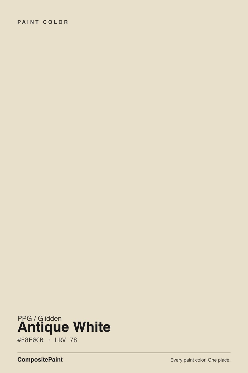
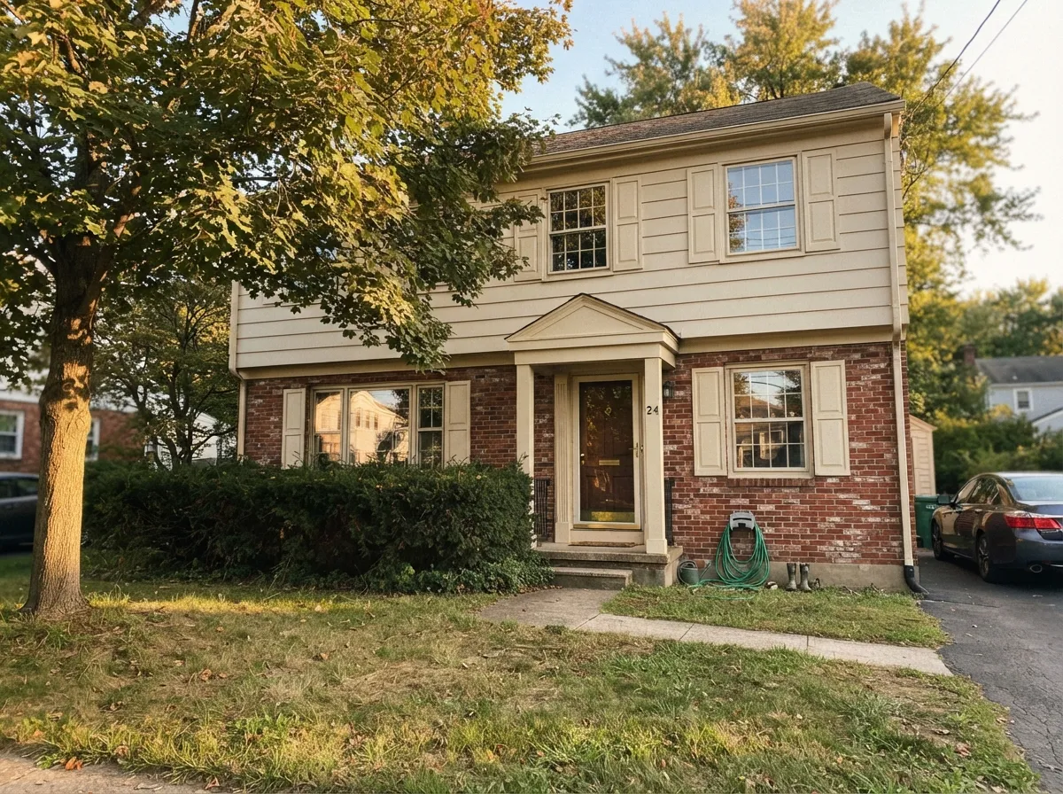
Antique White is one of the most reused names in the paint aisle — nearly every major brand sells a version of it, and no two are identical. PPG and Glidden's, at LRV 70, is a warm, creamy off-white built on a yellow-tan base rather than a gray one: on the wall it reads like weathered linen or old vanilla, softer and more historic than a crisp modern white. It is the color painters reach for on colonial trim, farmhouse siding, and rentals that need to look freshly painted without looking stark.
The undertone is straightforwardly warm — more tan than pink, more cream than butter-yellow — and at LRV 70 it sits in the same bright-but-not-blinding bracket as Benjamin Moore Navajo White, also LRV 70, and just a shade deeper than Sherwin-Williams Pearly White (LRV 79) or Behr Blank Canvas (LRV 79) — three colors close enough in hex value that a painter could pour them into the same can and nobody would notice on a swatch. That company tells you exactly what this color is for: dependable, forgiving, slightly old-fashioned cream, not a design statement.
Undertone in one line: warm tan-cream, never gray, never pink. If your sample looks flat or slightly dingy, that's cool light or cool floors fighting it — see the fails section below. If it looks almost yellow, that's strong afternoon sun doing exactly what a warm-based white does in direct light.
Where It Shines
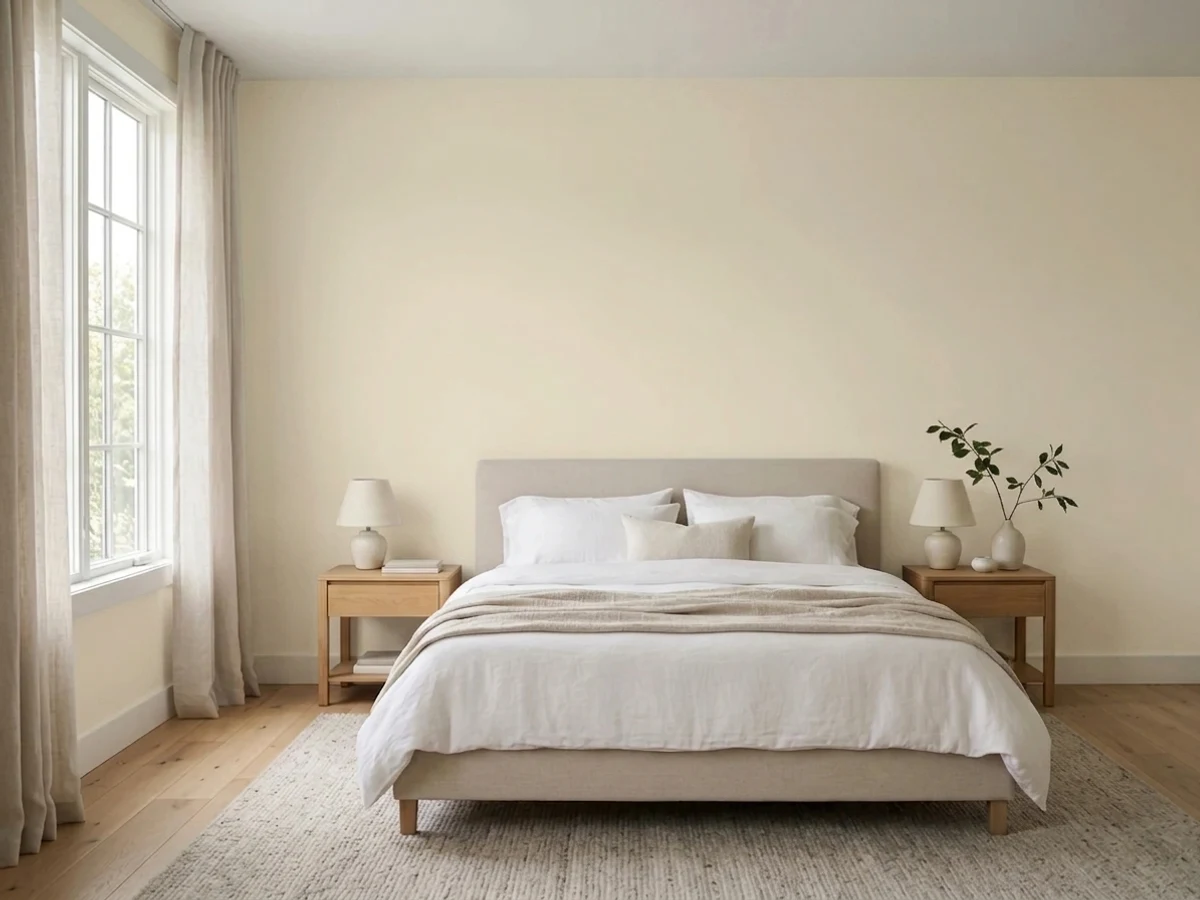
Give it warm wood, brass, and real daylight and it disappears into the room the way a good all-purpose white should — quietly finished, never sterile. It's at its best in traditional and colonial-style homes where a stark modern white would look out of place, on kitchen cabinets over butcher block and oak, and on exteriors with brick, stone, or aged wood siding, where the cream softens hard material lines instead of fighting them.
Where It Fails
Most complaints about this Antique White trace back to one of three predictable mismatches. None of them are the paint's fault, but if your room or your assumptions match one of these, this is not your white.
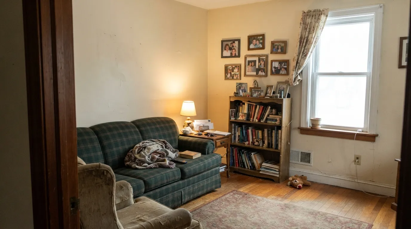
At LRV 70 with a clear tan-cream base, this is not a bright, neutral, or cool white. Next to a crisper white trim or a gray-toned wall, it reads yellowed and dated rather than "antique." If gray-neutral is the goal, look at a true white like PPG Delicate White instead.
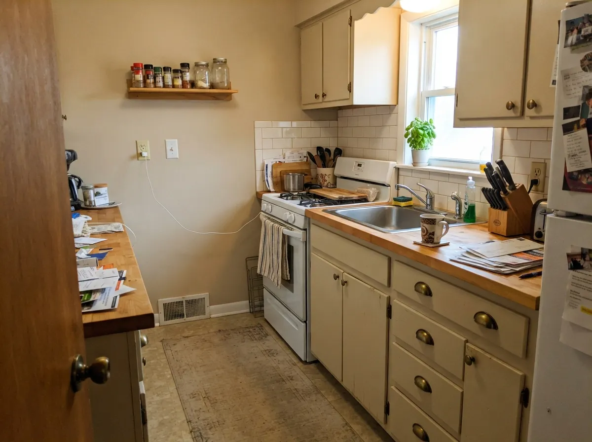
Gray LVP, cool white quartz, and chrome pull the cream forward until it looks slightly dirty by contrast. This color wants warm company — oak, walnut, brass, bronze. Give it cool-toned neighbors and it will look like the wrong choice even though the paint itself never changed.
It isn't. Sherwin-Williams' Antique White (SW 6119) is a noticeably deeper, more tan-beige color at LRV 67; PPG/Glidden's version here is brighter and creamier at LRV 70. Matching paint across brands by name alone is one of the most common paint-store mistakes — always match by the actual chip, never the label.
Room by Room
With oak or walnut furniture and real daylight it's a calm, historic backdrop that never looks cold. Eggshell on the walls; the same color in semi-gloss on trim keeps the room from feeling patchy.
Butcher block, brass hardware, and warm quartz all sit comfortably next to it. Cool white quartz or gray subway tile will fight it — check the counters before the cabinets.
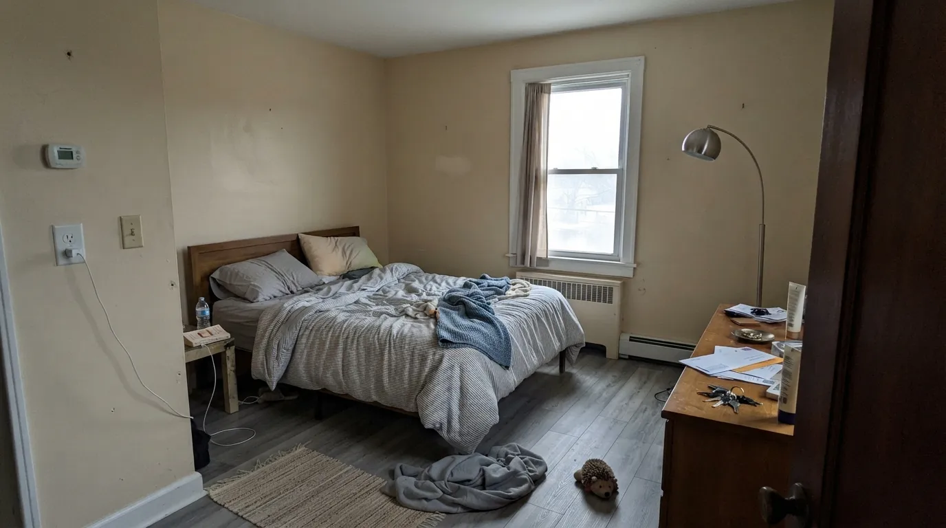
Warm 2700K bulbs push it gently toward cozy at night. In a dim, north-facing bedroom it can go flat during the day; step up to a creamier white if the room never sees direct sun.
With brass or bronze fixtures and warm-toned tile it's a soft, spa-adjacent cream. Cool gray marble or chrome makes it look tired fast — pick a true white there instead.
It reads as traditional painted woodwork under mid-tone warm walls, the way builders have used it for decades. It won't give you the crisp modern-white contrast some rooms want.
On older brick, stone, or wood-sided homes it softens the facade instead of glaring against it, and it's inexpensive and widely available through the Glidden retail line. On a stark modern build it will read yellowed next to true-white accents.
Your Light Is the Risk
Direct warm daylight makes the cream glow softly without tipping into full yellow. This is the light it was built for.
Cool, flat daylight strips the warmth out and leaves a dull, slightly dingy cream. Test a large sample before committing a dim room to it.
Warmest and creamiest at the sun hours, quieter and more neutral the rest of the day — a gentle shift most owners don't mind.
2700K lamps deepen the cream and make it feel cozier. Cool LEDs flatten it toward gray-beige — swap the bulbs before you blame the paint.
Most complaints about Antique White are a light mismatch. Upload a photo of your actual room and see it on your walls — then ask for the same wall in north light or evening lamps before you buy a single sample.
Need It From Another Brand?
Any paint counter can custom-tint PPG / Glidden PPG1024-2 directly. If you would rather stay in one brand's own deck, these are the closest stock matches, measured as ΔE2000. Under 2 is a difference you will not see on the wall.
| Brand | Closest color | ΔE | LRV | |
|---|---|---|---|---|
| Sherwin-Williams | Neutral GroundSW 7568 · Sherwin-Williams | 0.8 | 70 | Color page → |
| Behr | Varnished IvoryMQ3-40 · Behr | 1.2 | 71 | Color page → |
| Benjamin Moore | Wind's Breath981 · Benjamin Moore | 1.6 | 70 | Color page → |
| Valspar | Bare MarketT670 · Valspar | 0.5 | 70.4 | Color page → |
| Glidden | Cozy CreamPPG1112-2 · Glidden | 1.7 | 71 | Color page → |
| Dutch Boy | Dust Flats414-1DB · Dutch Boy | 2.1 | 72 | Color page → |
Similar PPG / Glidden Colors
The nearest shades to Antique White within PPG / Glidden's own range, ranked by perceptual color distance — useful when you want the same look a touch lighter, darker, or warmer.
WCAG 2.1: AA is 4.5 : 1 for normal text, 3 : 1 for large text, AAA is 7 : 1.
Antique White vs the Colors You're Also Considering
Every Antique White sample board has the same rivals on it. The numbers show the real lightness gap — then it comes down to which risk you would rather live with.
Pick this for the PPG/Glidden version without Blank Canvas's occasional peach flash in strong sun.
Behr DC-003 · LRV 79Blank CanvasPick this if you're painting with Behr instead of PPG — nearly the identical cream, one LRV point brighter.
Pick this if you're already buying PPG/Glidden and don't need a Benjamin Moore match.
Benjamin Moore 947 · LRV 78Navajo WhitePick this for the Benjamin Moore version at the exact same LRV — the same warm-white logic, the same north-room warning.
Antique White (LRV 78) is one of the lightest and cleanest options in its neighborhood, so it stays brighter on the wall than most of its cousins.
Navajo White (1101-2) at LRV 73 is the closest famous comparison. It is a shade deeper and a touch more golden, so it reads slightly more like a warm beige than a white. If you want the color to feel more like a soft neutral than a light off-white, Navajo White is the pick; if you want it to still read as white, Antique White wins.
Vanilla Love (PPG1099-2) at LRV 74 is a hair darker and creamier, good when Antique White feels too light for a large sunny room. Morocco Sand (PPG1096-2) at LRV 76 is very close in depth but leans a little sandier. In practice, sample all three side by side, because the differences only show up against each other and next to your trim.
Antique White Coordinating Colors
The rule for coordinating with this Antique White is simple: stay warm. It pairs cleanly with other PPG/Glidden neutrals, deep near-blacks for contrast, and warm wood tones — and it argues with anything cool-gray or blue-leaning. These are the partners that keep it looking deliberate rather than dated:
"Antique White" Across Brands: Why the Name Doesn't Guarantee the Color
Almost every major paint line carries a color called "Antique White," and none of the formulas are identical. That's the single biggest source of confusion around this color: a homeowner samples one brand's version, loves it, then buys a different brand's can with the same name expecting a match and gets a visibly different wall.
PPG and Glidden's Antique White, reviewed here, is a bright, creamy warm white at LRV 70. Sherwin-Williams' Antique White (SW 6119) runs deeper and more tan-beige, closer to LRV 67 — a noticeably heavier color on the wall. The lesson isn't which brand is "right"; it's that the name on the fan deck is marketing, not a spec. If you're switching brands or stores mid-project, match by the physical chip or a real sample on your wall, never by the label alone.
Antique White With Wood Tones and Floors
Warm wood is this color's best friend. Oak, walnut, and butcher block all sit comfortably against it because the wood's warmth meets the paint's warmth halfway — this is a color built to sit next to honey and amber tones without amplifying them the way a starker white would.
The floor that argues with it is cool gray — gray-washed hardwood or gray LVP. Against a cool floor the cream can start to look slightly yellowed rather than warm. It isn't always a dealbreaker; a warm rug and brass hardware close the gap in most rooms, but test a large sample above the actual floor before committing a whole house to it.
Three Ready Palettes Built on Antique White
A color is never alone on the wall. These are complete combinations in the 60-30-10 pattern, with the reason each one holds together. Every one opens in the visualizer.
Staying inside the same PPG deck keeps the color match exact from room to room — Whiskers is the deck's grayer, quieter cousin, so the handoff between the main color and an accent room feels deliberate instead of accidental.
Try this palette in your roomBest Beige and Antique White share the same warm PPG base, so cabinets and walls read like one considered decision instead of two separate purchases; Wrought Iron's soft near-black gives the kitchen its one dark note without going stark.
Try this palette in your roomA warm cream body reads historic instead of stark against brick or stone; charcoal shutters give the facade its contrast, and the brighter, neutral porch ceiling keeps the underside of the porch from looking dingy in shade.
Try this palette in your roomAntique White FAQ
Is PPG Antique White warm or cool?
Warm — a clear tan-cream base, never gray, never pink. In cool north light it can go slightly flat, but it never reads icy or blue.
Is PPG's Antique White the same as Sherwin-Williams' or Valspar's Antique White?
No. "Antique White" is one of the most reused color names in the industry. PPG/Glidden's version here sits at LRV 70; Sherwin-Williams' Antique White (SW 6119) is a deeper, more tan-beige color at LRV 67. Never assume two brands' cans with the same name will match — always compare the actual chip.
Is it good for kitchen cabinets?
Yes, with warm-toned counters and hardware — butcher block, brass, warm quartz. Cool white quartz or gray subway tile will make it look slightly dirty by comparison, so check your counters and backsplash before committing the cabinets.
What trim color goes with Antique White walls?
The same color in a higher sheen is the classic move. If you want a crisper contrast, PPG Delicate White is the brighter, neutral trim and ceiling partner in the same deck — a stark cool white will make the walls look yellowed by comparison.
Does it work on exteriors?
Yes, especially on older brick, stone, or wood-sided homes, where the warm cream softens the facade instead of glaring against it. On a stark modern build with true-white accents it can read yellowed, so sample it against your actual trim and roofline.
How many coats does it take?
Two coats over any existing light color is standard. Over a dark or saturated wall, prime first with a tinted primer — going straight to Antique White over navy or red usually means an expensive third coat.
Have you painted with Antique White?
Rate it — one tap helps the next reader decide.
Ask a Question