Whiskers
PPG's most-used warm gray, reviewed honestly: the light that turns it taupe, the light that turns it mauve, and what to buy instead.

Jessica has spec'd whites and neutrals for more than 300 rooms and keeps a sample wall of painted drawdowns in her studio. Every color review is checked against real reader rooms in the comments and re-tested when a formula changes. About the testing process →
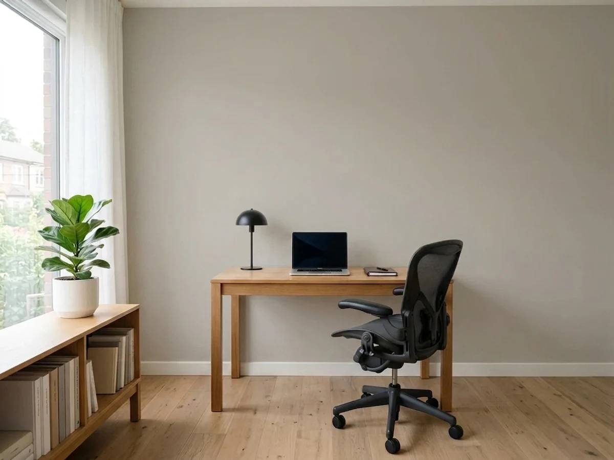
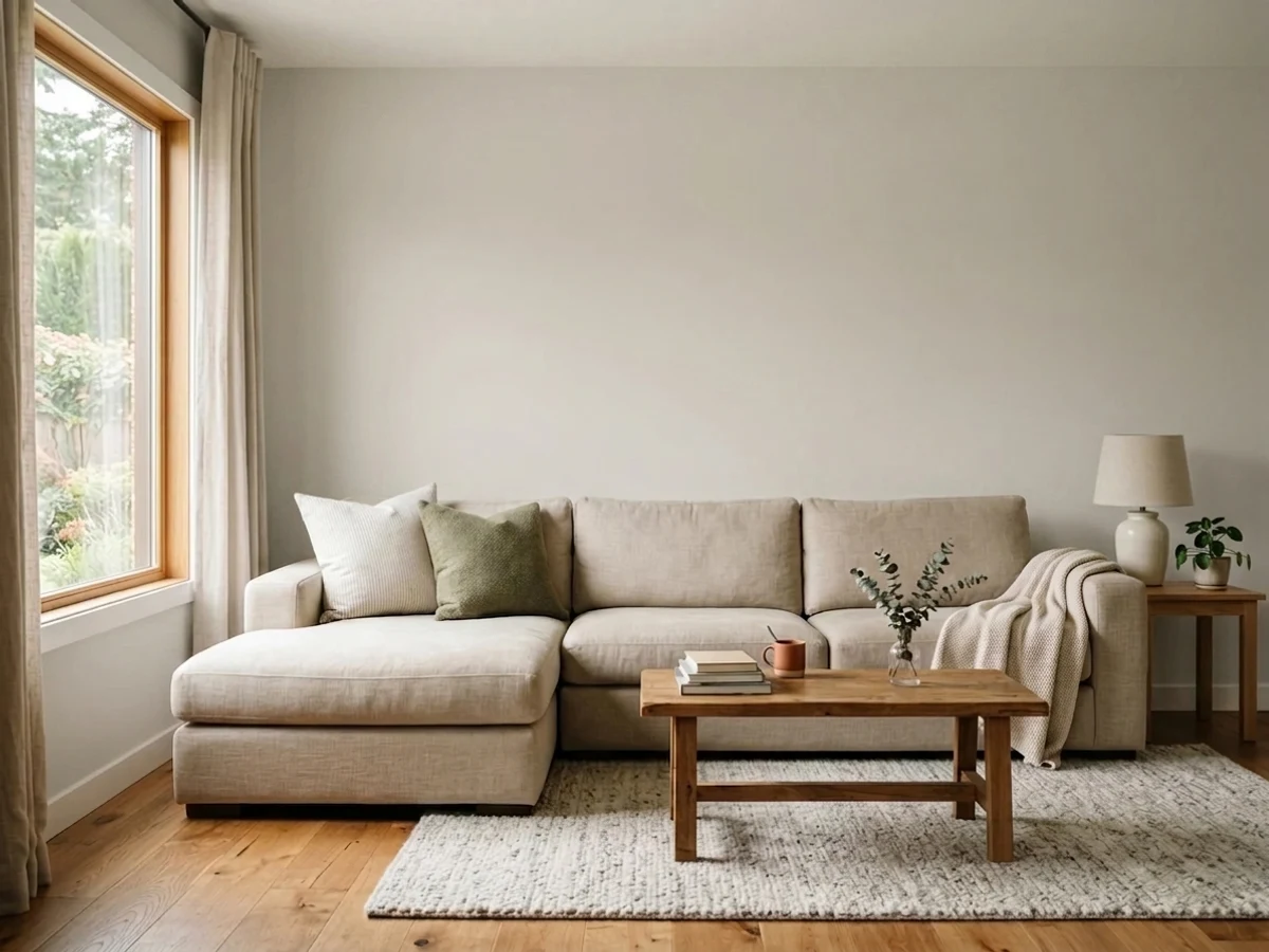
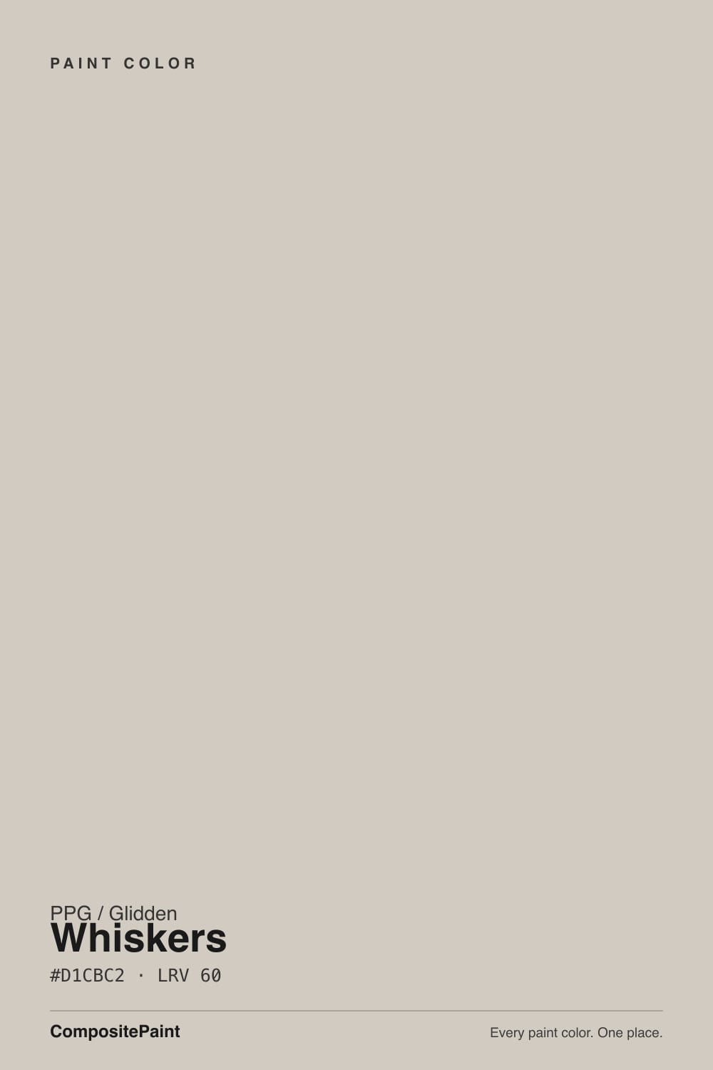
- 1Mindful Gray48
- 2Revere Pewter55
- 3Whiskers60
- 4Pale Oak69
- 5Shoji White74
The Fast Verdict
Whiskers is the warm gray you pick when every popular greige has started to look too beige. It carries real warmth — a soft sepia-umber, never yellow — but it holds far less color than Agreeable Gray or Accessible Beige, so it stays gray-side neutral across a whole main floor. Give it decent daylight and warm bulbs and it is one of the most useful neutrals at Home Depot. Take the warmth away and it goes putty, and a few owners see mauve in it.
Family rooms and open main floors · hallways and entries that need one color everywhere · bedrooms with warm lamps · anyone who tried Agreeable Gray and found it too beige
Your room is dim and north-facing with no lamps · you want a true cool gray · the next room is painted a warmer beige · you need a light, bright neutral (LRV 60 is mid)
- Warm without being beige — the fix for greiges that turned yellow
- Low pigment means it stays neutral across a whole main floor
- Reads gray in one corner and taupe in another, which flatters mixed furniture
- No green or blue flash — the two undertones that ruin most greiges
- Sold at Home Depot in Glidden and PPG lines, so it is easy and cheap to get
- Goes flat putty in dim north light and under cool LEDs
- A minority of owners see mauve in it once the warmth is gone
- Looks gray and dingy beside a warmer beige in the next room
- LRV 60 is mid — it will not brighten a dark room
What Color Is Whiskers, Really?
A warm gray with a sepia-umber base — the brown kind of warmth, not the yellow kind. That distinction is the whole color. Most best-selling greiges are built on a yellow oxide base, which is why Accessible Beige reads beige the moment sun hits it and why Agreeable Gray drifts creamy in a south room. Whiskers takes the warmth from the brown side of the wheel instead, so it stays quietly gray while still feeling warm. Owners describe it the same way over and over: a very warm gray, almost taupe, that looks pale gray in one corner and taupe in another.
It is also genuinely less colorful than its competition. Compare our hex values and Whiskers carries roughly two-thirds the warmth of Agreeable Gray and about half of Accessible Beige. That is why it survives rooms where those two look yellow, and equally why it looks flat in rooms where they still look cozy. At LRV 60 it sits exactly where the popular greiges sit — light-medium, not light. It will not brighten a dark room, and anyone shopping it as a soft white will be disappointed by the second wall.
Undertone in one line: warm brown-gray, a hair toward red rather than yellow — no green, no blue. The one shift to know about is that hair of red: strip the warmth out with cold light and a small number of owners see it as mauve or putty rather than gray. Nobody has ever accused this color of going green.
Where It Shines
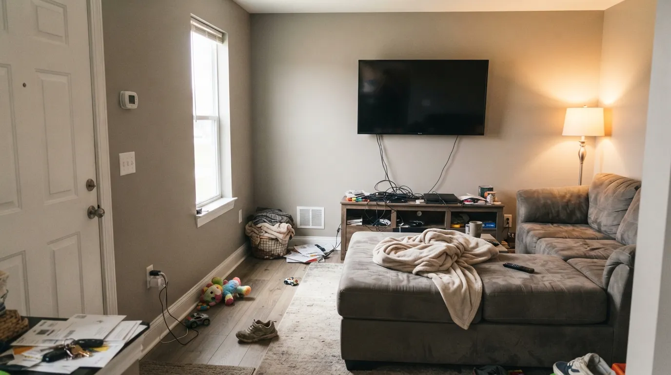
This is a whole-floor workhorse. In a family room with real daylight it does the thing greige is supposed to do — reads finished and warm without ever announcing a color — and because it holds so little pigment it does not fight a TV wall, a stone fireplace, or whatever the sectional turned out to be. Its second strength is continuity: hallways, stairwells and entries painted Whiskers carry from room to room without the beige-to-gray handoff problem that makes open plans look patched. Give it wood, brass or matte black and it looks deliberate rather than default.
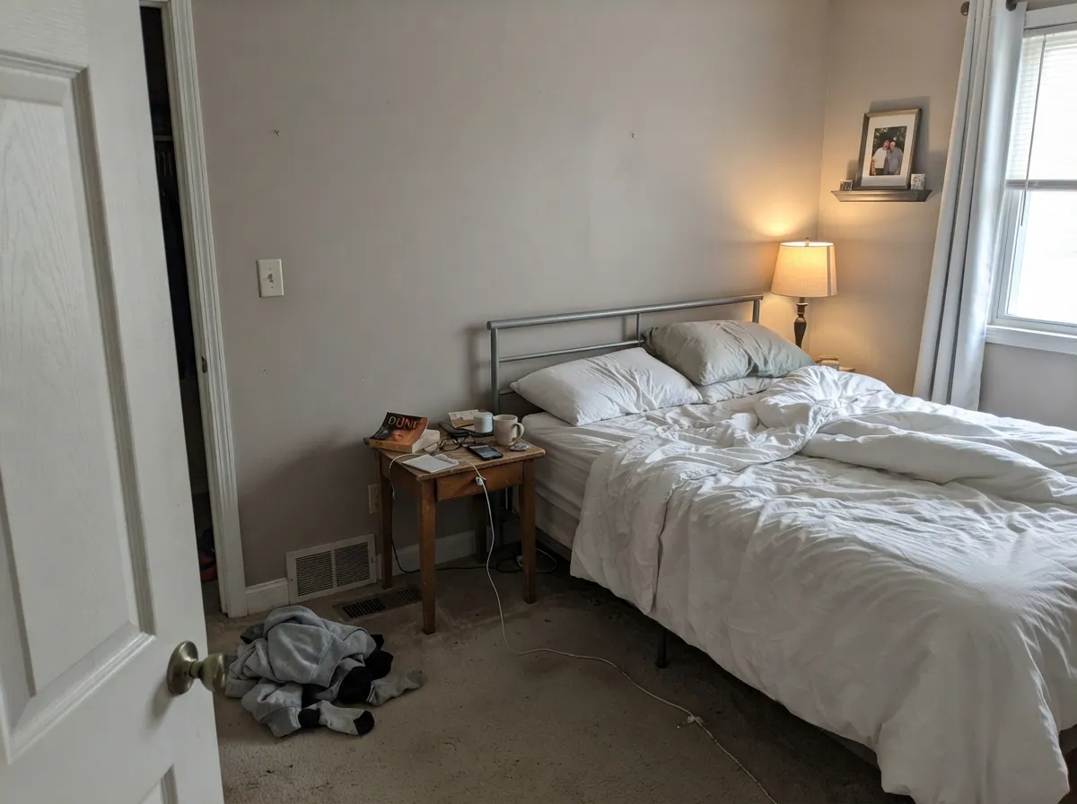
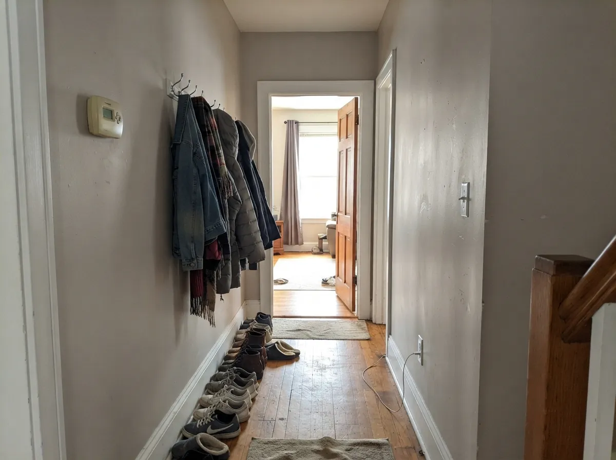
Where It Fails
The complaints about Whiskers are consistent and all three are predictable before you open the can. None of them are defects in the paint — but if your room matches one, buy something else instead of buying more coats.
This color has very little pigment to lose. Cool north daylight and 4000K LEDs cancel the warm brown and what is left reads as flat putty, with a faint mauve cast a few owners call out directly in reviews ("too much purple tone in the gray"). It is not a bad batch, it is a low-chroma neutral being honest about your light. Warm bulbs are part of this paint job.
On the chip it looks like a modern gray. On four walls it is warm — taupe-warm in afternoon sun, and clearly on the brown side of neutral. If you want gray that stays gray, this is the wrong lane; SW Repose Gray sits at LRV 58 and behaves like an actual gray.
The most common regret is a pairing mistake, not a color mistake. Put Whiskers beside a room still wearing Accessible Beige (LRV 58) or a golden builder beige and the warmer neighbor wins — Whiskers reads gray, cold and slightly dirty by comparison. Either repaint the neighbor or step up to a beigier greige.
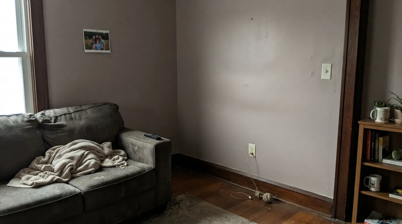
Room by Room
Enough warmth to feel lived-in, little enough pigment to stay out of the way of a television, a fireplace surround and mismatched furniture. Satin or eggshell so kid handprints wipe off; keep the lamps at 2700K and it stays warm after dark.
One of the safer choices for a floor where the kitchen, dining and living areas all see each other, because it does not change personality between a sunny window wall and a shaded corner as loudly as beigier greiges do. Sample on both the bright and the dark wall before committing.
Late-day west light is where this color is at its best, which suits a bedroom perfectly. Eggshell walls, warm lamps, cream or white bedding rather than yellow-beige linens, which make the wall look gray next to them.
Hallways get borrowed light and no windows, and Whiskers holds a recognizable color there instead of collapsing to gray. Satin on the walls survives shoulders and vacuum cleaners; white doors and trim give it the crispness the space needs.
As a wall color around white or wood cabinets it is excellent, and it flatters brass and matte black hardware equally. As a cabinet color it is a strange middle: too pale to read as a designed gray cabinet, too warm to read as crisp. Paint the walls, keep the boxes white or wood.
PPG sells the color in exterior and porch lines, and full sun will read it lighter and grayer than the interior sections above describe. It is a plausible soft-warm-gray body color with charcoal trim, but it was designed and is bought as an interior neutral — sample a full board on the actual wall before betting a facade on it.
Your Light Is the Risk
Low warm sun brings the umber forward and the walls go softly taupe. This is the light people fall in love with.
Cool gray daylight strips the brown and leaves flat putty — the version of this color the bad reviews describe. Test here first.
Golden in the morning, warmest and most taupe by mid-afternoon, quietly gray in between. The swing is real but gentle.
2700K lamps keep it warm and grounded. 4000K LEDs drain it toward gray-mauve — change bulbs before you change paint.
Most complaints about Whiskers are a light mismatch. Upload a photo of your actual room and see it on your walls — then ask for the same wall in north light or evening lamps before you buy a single sample.
Need It From Another Brand?
Any paint counter can custom-tint PPG / Glidden PPG1025-3 directly. If you would rather stay in one brand's own deck, these are the closest stock matches, measured as ΔE2000. Under 2 is a difference you will not see on the wall.
| Brand | Closest color | ΔE | LRV | |
|---|---|---|---|---|
| Sherwin-Williams | Agreeable GraySW 7029 · Sherwin-Williams | 0.5 | 60 | Color page → |
| Behr | Tranquil GrayDC-007 · Behr | 1.2 | 60 | Color page → |
| Benjamin Moore | Nimbus1465 · Benjamin Moore | 1.5 | 59 | Color page → |
| Valspar | Heritage Gray7007-24 · Valspar | 0.5 | 60 | Color page → |
| Glidden | WhiskersPPG1025-3 · Glidden | 0.8 | 61 | Color page → |
| Dutch Boy | Doves Wings443-1DB · Dutch Boy | 0.5 | 60 | Color page → |
Similar PPG / Glidden Colors
The nearest shades to Whiskers within PPG / Glidden's own range, ranked by perceptual color distance — useful when you want the same look a touch lighter, darker, or warmer.
WCAG 2.1: AA is 4.5 : 1 for normal text, 3 : 1 for large text, AAA is 7 : 1.
Whiskers vs the Colors You're Also Considering
Every Whiskers sample board has the same rivals on it. The numbers show the real lightness gap — then it comes down to which risk you would rather live with.
Pick this when Agreeable Gray sampled too yellow — identical LRV 60, meaningfully less color.
Sherwin-Williams SW 7029 · LRV 60Agreeable GrayPick this if you want the same idea with more beige in it, and your painter works in Sherwin-Williams.
Side-by-side comparison →Pick this for a touch more brown in the base, and if you are buying at Home Depot rather than a Sherwin-Williams store.
Sherwin-Williams SW 9165 · LRV 62Gossamer VeilPick this for a slightly lighter, cleaner version of the same low-pigment greige — the closest cross-brand match to Whiskers.
Whiskers Coordinating Colors
The rule with Whiskers is to partner it by brightness, not by temperature. It is so low in pigment that anything strongly warm placed next to it will make it look gray, and anything strongly cool will make it look dirty. Whites that are close to neutral, darks that are warm, and one muted green are the combinations that keep showing up in rooms that work:
The PPG and Glidden Double Life
Whiskers confuses shoppers more than it should, and the reason is the code on the chip. You will see it written three ways — PPG1025-3, 1025-3, and simply "Whiskers" — because PPG runs the same core color deck across several brands it owns. At Home Depot the color shows up in Glidden Premium and in PPG Timeless. At a PPG dealer or an independent store it shows up in Speedhide and the PPG retail lines, and it also sits in PPG's Modern Farmhouse collection, which is where a lot of people meet it in the first place.
What that means practically: the shade is the same everywhere, so a chip picked up at a dealer will mix correctly at Home Depot. What changes is the paint itself — coverage, scrub resistance and price all differ by line, and a builder-grade flat in Whiskers over a darker existing wall will need a third coat that a better line would not. Pick the line for the room's wear, then hand over the code.
Whiskers With Wood Tones and Floors
Walnut, espresso and pale white oak are the easy wins. The gray-brown base sits in the same family as those woods without copying them, so the floor reads rich and the wall stays quiet. Cool gray LVP also works better here than with a beigier greige, because Whiskers does not have enough yellow to argue with it.
Honey oak is the case to sample. Blogs list Whiskers as honey-oak-friendly and in warm afternoon light that is true — the umber base meets the orange halfway instead of amplifying it, which is more than most grays manage. But in a cool or dim room the same pairing goes the other way: the floor looks more orange and the wall looks like cold putty next to it. If your oak is strongly orange and your light is northern, put a large rug in the room or pick a warmer neutral.
Metals are simple: brass, matte black and oil-rubbed bronze all belong with it. Polished chrome and brushed nickel are fine but neutral — they add nothing, so let the wood and the hardware carry the warmth.
Three Ready Palettes Built on Whiskers
A color is never alone on the wall. These are complete combinations in the 60-30-10 pattern, with the reason each one holds together. Every one opens in the visualizer.
Whiskers is too low in pigment to fight a big black screen, so the room stays calm; Delicate White at LRV 88 is neutral enough to keep the edges crisp without making the walls look dirty. Kendall Charcoal gives the one dark anchor a family room needs, and its warm base keeps the scheme on the same side of the fence.
Try this palette in your roomAlabaster is a soft warm white, so it steps forward from Whiskers by brightness rather than by temperature — no cold trim line across the room. Urbane Bronze is a warm dark that grounds the island and loves brass pulls; in a dim kitchen it will read close to black, which is fine on one piece of cabinetry.
Try this palette in your roomWhite Dove is the warm-white version of this scheme — softer than Delicate White and better in a bedroom, where crispness is not the goal. Evergreen Fog at LRV 30 is muted enough to sit against a low-pigment warm gray without either color looking louder than the other.
Try this palette in your roomWhiskers FAQ
Is Whiskers warm or cool?
Warm — but a brown kind of warm, not a yellow one. That is why it reads gray in photos and taupe in person. In cool north light the warmth mostly disappears and the wall goes putty; in west afternoon light it is clearly a soft taupe. Both are the same paint.
Is Whiskers the same as Agreeable Gray?
Very close, and it is the comparison every blog makes. Same LRV 60, same job. The difference is pigment: Whiskers carries roughly two-thirds the warmth, so it stays gray-side where Agreeable Gray drifts beige in sun. If Agreeable Gray sampled too yellow on your wall, Whiskers is the fix — and it is at Home Depot.
Does Whiskers look purple?
For most people, no — it never goes green or blue, which is its main selling point. But it holds so little pigment that when cool light cancels the warm brown, the small red lean in the base can show as mauve or putty; a handful of reviewers say exactly that. Warm 2700K bulbs and any real daylight prevent it.
What trim white goes with Whiskers?
PPG Delicate White (LRV 88) is the same-brand answer and keeps things crisp and modern. For a softer, more traditional look go warm — White Dove or SW Alabaster (LRV 82). Avoid a bright builder white in a dim room: the contrast makes the walls read gray and tired.
Is it dark? Will it work in a small room?
At LRV 60 it is light-medium — the same weight as Agreeable Gray. In a small room with a window it works and feels cozy rather than tight. In a small room with no real daylight it will read noticeably darker and duller than the chip, so add lamps or step lighter to Gossamer Veil at LRV 62.
Where do I buy Whiskers, and does the Glidden version match?
The color code PPG1025-3 is shared across the family: Home Depot mixes it in Glidden Premium and PPG Timeless, and PPG dealer stores mix it in Speedhide and the PPG retail lines. The color is the same formula — what changes is the paint quality, coverage and price, not the shade. Buy the line that suits the room, not the one with the prettier chip.
Have you painted with Whiskers?
Rate it — one tap helps the next reader decide.
Ask a Question