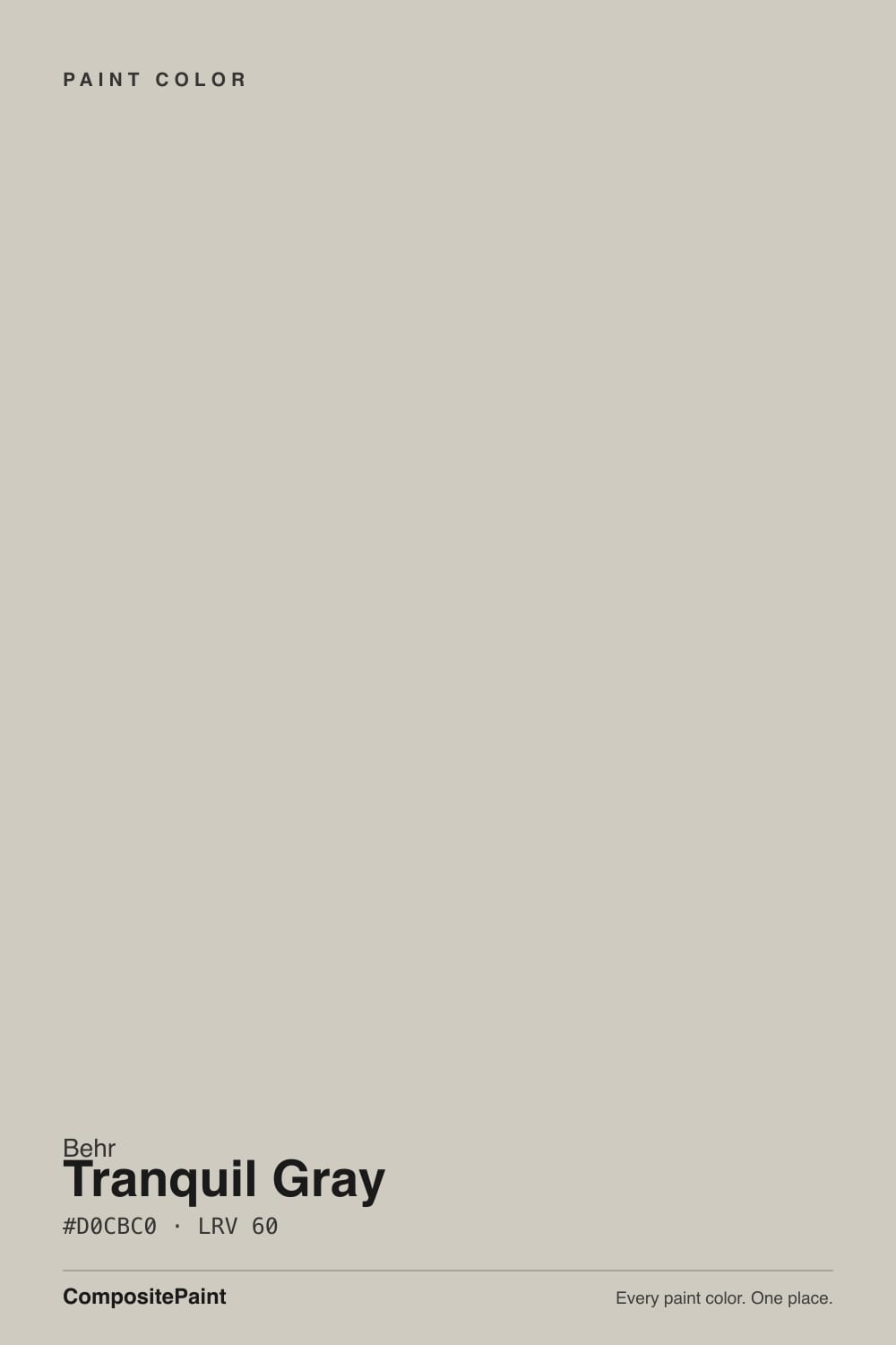
Tranquil Gray
Behr's warm taupe-gray reviewed honestly: the light that brings out its warmth, the stone it fights, and the one thing this color does that almost nothing else in the deck does.

Jessica has spec'd whites and neutrals for more than 300 rooms and keeps a sample wall of painted drawdowns in her studio. Every color review is checked against real reader rooms in the comments and re-tested when a formula changes. About the testing process →
- 1Mindful Gray48
- 2Revere Pewter55
- 3Tranquil Gray60
- 4Pale Oak69
- 5Shoji White74
The Fast Verdict
Tranquil Gray is the color you get when "greige" gets rebranded gray for the Home Depot aisle: a genuine warm taupe undertone sitting under a name that promises something cooler. It never became a household name the way Agreeable Gray did, and it never won a Color of the Year — but it does the same job at the same LRV, for less money, without drama. The one real surprise: Behr sells this exact color as a gloss porch-and-patio floor enamel, which almost no wall color gets.
Whole-house walls with warm wood and decent daylight · living rooms and bedrooms that want gray without going cold · covered porches and patio floors · anyone who wants the Agreeable Gray look from the Behr aisle at Home Depot
You want a true cool gray with zero tan in it · your counters or backsplash are stark white quartz · your room is dim and north-facing with no lamps · you're chasing a specific viral or Color-of-the-Year name
- Genuine warm taupe undertone — reads gray without going cold
- Same LRV as Agreeable Gray, at Behr/Home Depot pricing and stock
- Stable in both directions: warms in sun, goes plain (not weird) in shade
- One of the few colors also sold as a dedicated porch and patio floor enamel
- Flatters oak, walnut and brass without any real fuss
- Not a true cool gray — the taupe is there no matter what the name implies
- Fights stark white quartz and icy marble
- Goes noticeably plainer, not just darker, in a dim north room
- No Color of the Year fame or big design-blog following to lean on for inspiration photos
What Color Is Tranquil Gray, Really?
A warm taupe wearing a gray name. Behr's own material calls out "warm taupe undertones," and that is the honest read: this is not a blue-gray or a true neutral, it is a greige that leans tan the moment real light hits it. At LRV 60 it sits in the same light band as Sherwin-Williams Agreeable Gray — same reflectance, same whole-house ambition, different company selling it.
The light behavior is two-sided rather than risky: in bright, south-facing rooms the taupe notes come forward and the wall reads warm and grounded; in darker, north-facing rooms it settles into a plainer, more neutral gray. Neither version is a disaster the way some greiges go blotchy-blue or dingy-green in the wrong light — Tranquil Gray just quietly changes which half of its name it earns. The one genuinely unusual fact about this color: Behr sells it not only as wall paint but as a gloss enamel interior/exterior porch-and-patio floor paint, a product line most colors in the deck never get.
Undertone in one line: warm taupe, never blue, never green. Behr Canada's Colourfully Behr blog has featured it as a monthly color pick, but there is no Color of the Year badge here and no viral design-blog moment — this is a dependable seller, not a famous one, and it is worth being honest about that going in.
Where It Shines
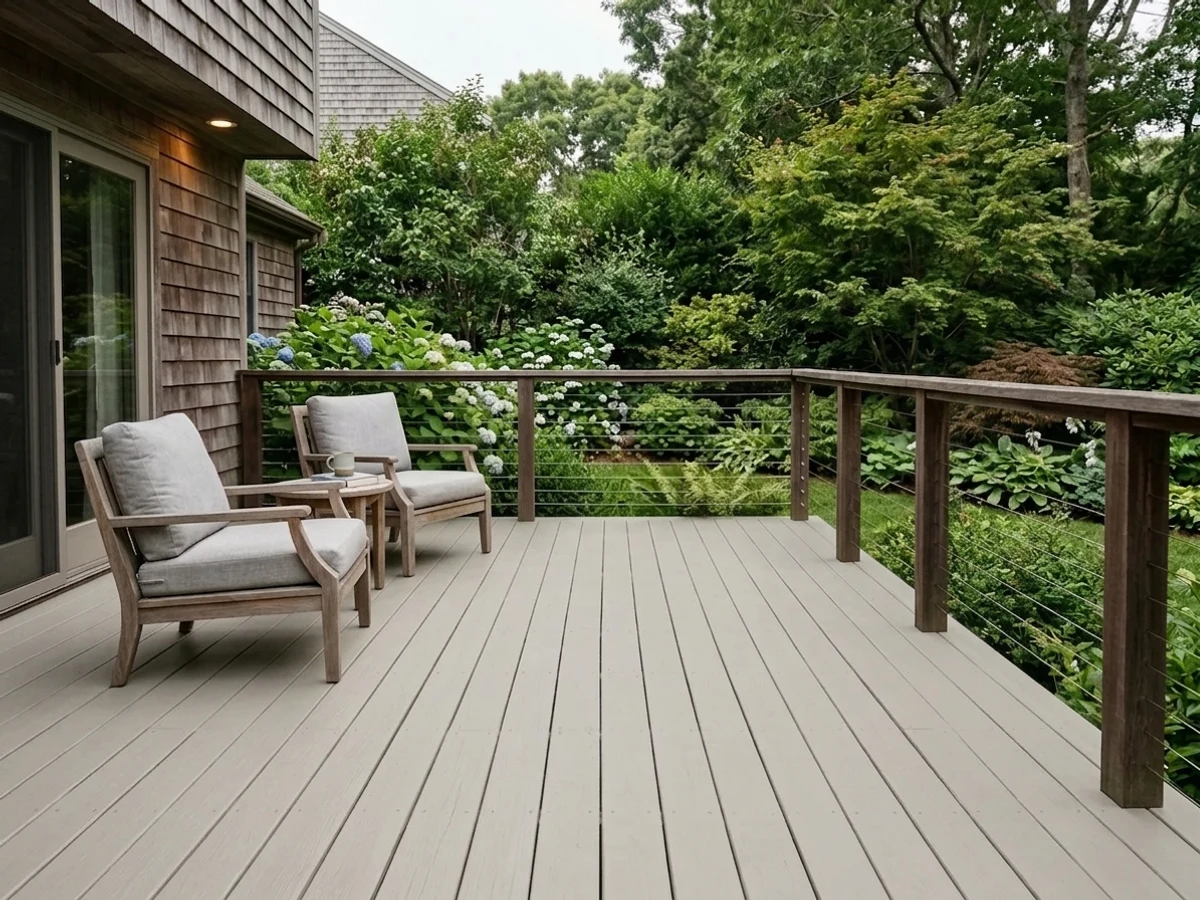
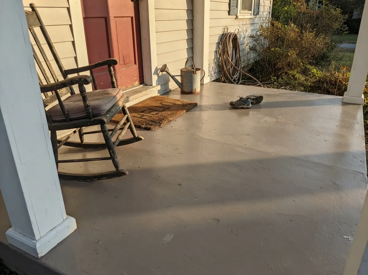
Give it real daylight and it does exactly what a workhorse greige should: whole-house walls that flow room to room without a single wall feeling like a mistake, living rooms and bedrooms where oak floors and brass hardware look intentional instead of accidental. Its more unusual strength is outdoors — as a porch and patio floor enamel it turns a gray concrete slab into something that reads finished, and on siding it takes on the same warm-in-sun, calm-in-shade behavior it has indoors.
Where It Fails
The complaints about Tranquil Gray follow three predictable scripts, and none of them are the paint failing — they are the paint being exactly what it is, in a room that wanted something else.
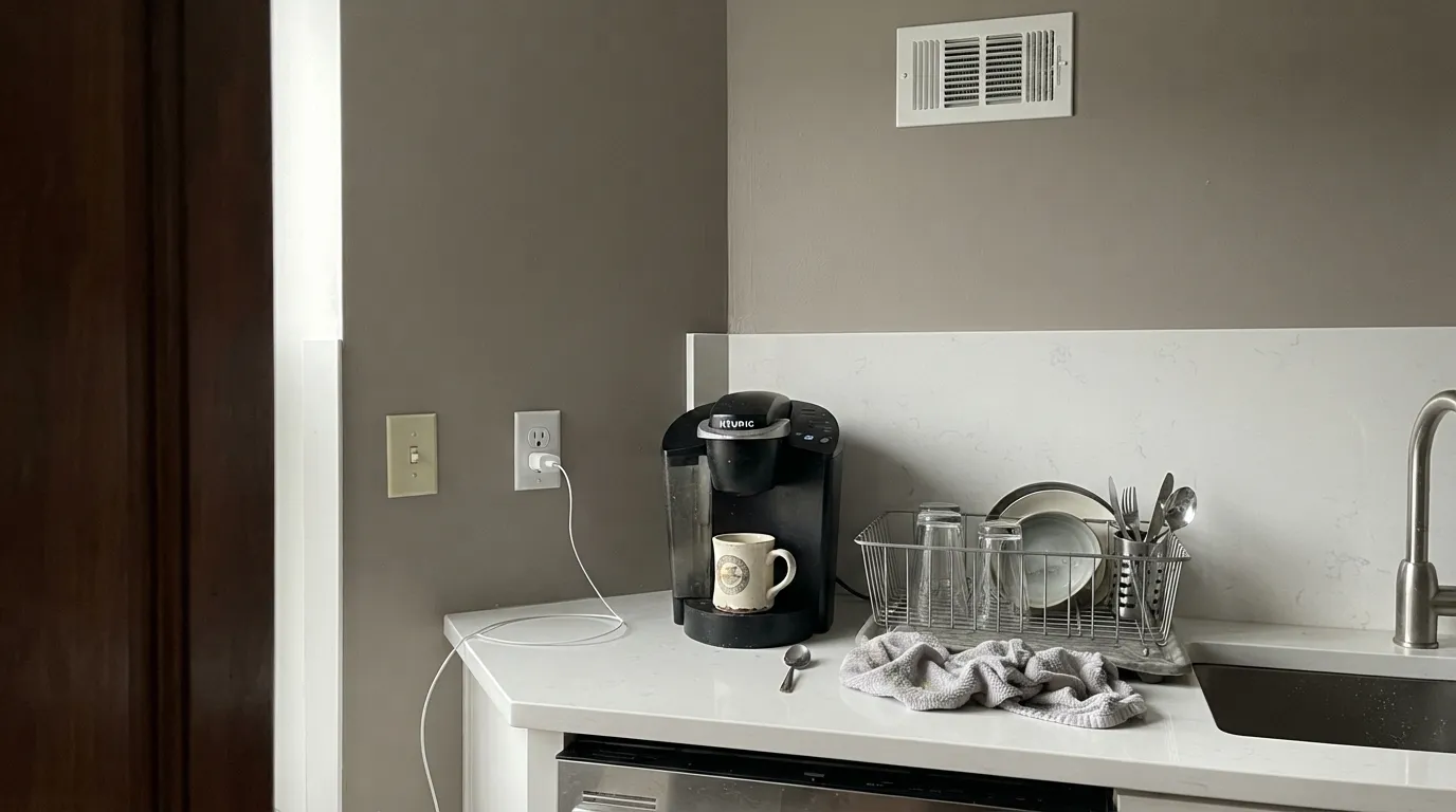
Warm taupe and icy-white stone sit at opposite temperatures. Next to a cool white quartz counter or a blue-white marble surround, the greige can look dingy rather than warm. Bridge it with a warmer white counter or a cream backsplash, or pick a genuinely cool gray instead.
The name says "gray," the paint says taupe. If you're after a color with zero warmth — the kind that photographs blue-gray in every light — this is the wrong can. Sherwin-Williams Light French Gray is the truer gray; Tranquil Gray will always read a step warmer, whatever the swatch looked like at the store.
Cool north daylight is the one condition that strips the taupe out. The color doesn't go blotchy or strange, it just goes plain — a flatter, less interesting gray than the sample promised. Warm 2700K lamps bring most of the character back after dark.
Room by Room
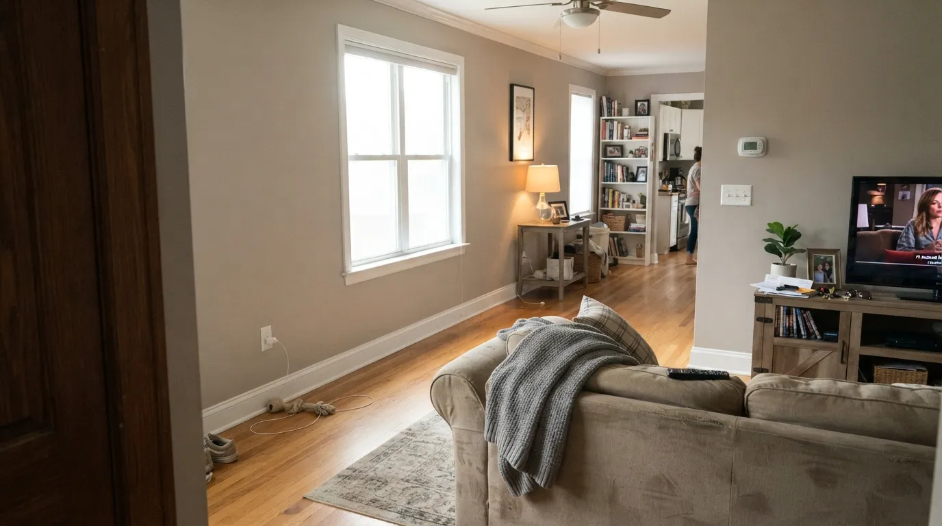
In a south- or east-facing room the taupe warms the space without tipping into beige. Eggshell finish; a warm white trim keeps the edges from looking dirty.
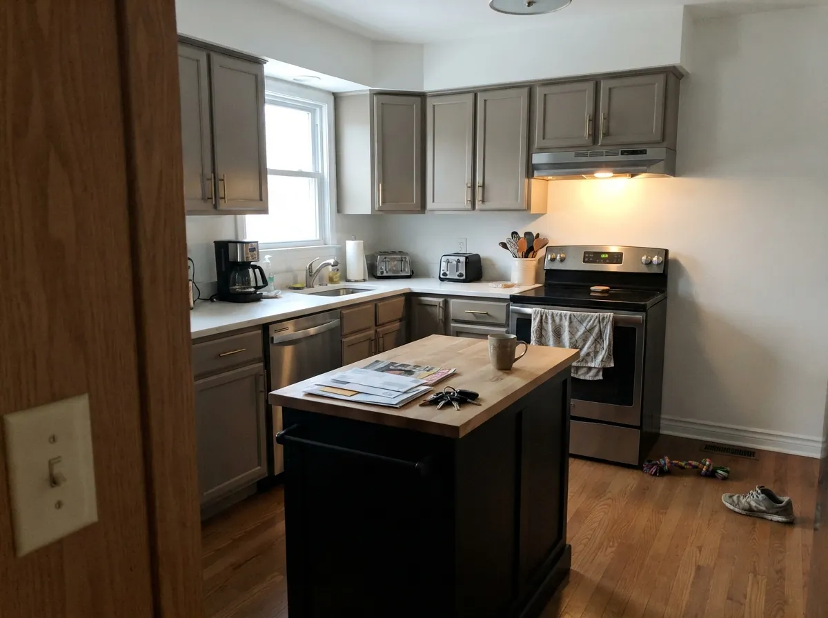
On walls with oak cabinetry and brass it is calm and grounded. As a cabinet color under a bright white wall it reads current without chasing a specific trend name. Avoid pairing it directly against stark white quartz.
Matte or eggshell, warm 2700K bulbs. The taupe deepens at night the same way it warms in daylight — it is a genuinely restful color once the lamps are on.
With a warm-white or cream vanity top and brass fixtures it is easy. With a cool white quartz or icy marble counter, the greige can look muddy by comparison — sample against the actual stone first.
Full sun reads warmer and more taupe than the shaded side of the house, exactly like its indoor behavior. Pairs cleanly with a dependable white trim or a single dark accent door.
Behr sells Tranquil Gray as a gloss enamel interior/exterior porch-and-patio floor paint, which is a real product distinction most wall colors don't have. A painted concrete porch or patio floor in this color reads finished rather than "we painted the concrete."
Your Light Is the Risk
The taupe comes forward and the wall reads warm and grounded — the color at its most flattering.
Cool daylight strips the taupe out and leaves a flatter, plainer neutral gray. Not a disaster, just less interesting.
Warmer and more taupe through the sun hours, calmer and grayer the rest of the day. A gentle shift, not a mood swing.
2700K lamps deepen the taupe into something cozy. Cool white LEDs flatten it back toward plain gray.
Most complaints about Tranquil Gray are a light mismatch. Upload a photo of your actual room and see it on your walls — then ask for the same wall in north light or evening lamps before you buy a single sample.
Need It From Another Brand?
Any paint counter can custom-tint Behr DC-007 directly. If you would rather stay in one brand's own deck, these are the closest stock matches, measured as ΔE2000. Under 2 is a difference you will not see on the wall.
| Brand | Closest color | ΔE | LRV | |
|---|---|---|---|---|
| Sherwin-Williams | Agreeable GraySW 7029 · Sherwin-Williams | 0.8 | 60 | Color page → |
| Benjamin Moore | WishAF-680 · Benjamin Moore | 1.4 | 59 | Color page → |
| Valspar | Heritage Gray7007-24 · Valspar | 0.8 | 60 | Color page → |
| PPG / Glidden | WhiskersPPG1025-3 · PPG / Glidden | 1.2 | 60 | Color page → |
| Glidden | Dust BunnyPPG1000-1 · Glidden | 1.0 | 60 | Color page → |
| Dutch Boy | Doves Wings443-1DB · Dutch Boy | 0.8 | 60 | Color page → |
Similar Behr Colors
The nearest shades to Tranquil Gray within Behr's own range, ranked by perceptual color distance — useful when you want the same look a touch lighter, darker, or warmer.
WCAG 2.1: AA is 4.5 : 1 for normal text, 3 : 1 for large text, AAA is 7 : 1.
Tranquil Gray vs the Colors You're Also Considering
Every Tranquil Gray sample board has the same rivals on it. The numbers show the real lightness gap — then it comes down to which risk you would rather live with.
Pick this for the Home Depot aisle version at the same reflectance — warmer, more muted, and usually the cheaper can.
Sherwin-Williams SW 7029 · LRV 60Agreeable GrayPick this if your painter already works in Sherwin-Williams — same LRV, same warm-greige idea, a shade cooler and more saturated.
Pick this for the calmer, steadier read within the same Behr light band — no color-shifting surprises.
Behr PPU18-19 · LRV 60Silver DropPick this if you want more movement — Silver Drop can flash silvery, even blue-green, in cool light, where Tranquil Gray just stays taupe.
Inside Behr, Porch Swing Beige PPF-21 at #D2CABE is a touch warmer, Toasty Gray N320-2 at #D2CCC3 is slightly lighter at LRV 61, and Paving Stones PPF-16 at #CBCCC4 leans a shade greener. Burnished Clay PPU18-09 at #D2CCC5 is the softest and least tan of the group. Across brands the closest is Dunn-Edwards Petrichor DEGR29 at LRV 59 with a deltaE of 0.25, which is the same color for practical purposes. Sherwin-Williams Agreeable Gray SW 7029, Valspar Heritage Gray 7007-24, and Dutch Boy Doves Wings 443-1DB all share the hex #D1CBC1 at LRV 60 and a deltaE of 0.81, so Tranquil Gray is effectively the Behr version of that same well-known greige. Benjamin Moore Wish AF-680 at LRV 59 and deltaE 1.43 is visually identical in normal room light. Portola Paints High Cliff at deltaE 3.47 is close but visibly different side by side.
Tranquil Gray Coordinating Colors
The rule with Tranquil Gray is the same as any warm greige: keep the whites warm, not stark, and let one dark accent do the contrast work. It sits close enough to Behr's own Silver Drop and Even Better Beige to move between them room to room, and it takes a near-black accent well without fighting it.
Tranquil Gray as a Porch, Patio and Exterior Color
This is the fact that separates Tranquil Gray from almost every other greige in the deck: Behr sells it as a gloss enamel interior/exterior porch-and-patio floor paint, on top of the standard wall product. That's a real, checkable product distinction — most colors in this review series are wall paint only, and this one has a second life on concrete.
On siding, it follows the same rule it does indoors: full sun on the sunny side of the house reads noticeably warmer and more taupe than the shaded side, which will read flatter and grayer. Walk the house with a sample before committing to trim. A dependable white trim keeps it classic; a single dark door or shutters in navy or near-black gives it the contrast a plain greige exterior can lack.
Tranquil Gray With Wood Tones and Stone
Warm wood is easy: oak, walnut and honey-toned floors all sit comfortably with the taupe in this color, and brass hardware reads intentional rather than mismatched. It's the stone decision that needs a sample first — a warm-white or cream-veined counter lets the greige stay calm, while a stark white or icy-blue quartz will make it look dingier than it is.
If the counters or backsplash are already cool white and staying, bridge the gap with warm-toned fixtures, a wood cutting board left out, or brass hardware, rather than fighting the mismatch with paint alone.
Three Ready Palettes Built on Tranquil Gray
A color is never alone on the wall. These are complete combinations in the 60-30-10 pattern, with the reason each one holds together. Every one opens in the visualizer.
Two dependable Behr workhorses at opposite ends of the light scale, with one navy door supplying the single dark note the scheme needs. Nothing here is famous — everything here behaves.
Try this palette in your roomTaupe-gray cabinets under a bright, dependable white keep the kitchen light without going stark; the near-black island grounds the room and loves brass hardware. Keep the counters warm-white, not icy quartz.
Try this palette in your roomA warm white trim keeps the greige from reading dirty, and one near-black accent wall gives the room a single dramatic note without fighting the taupe. Warm lamps at night finish the mood.
Try this palette in your roomTranquil Gray FAQ
Is Tranquil Gray warm or cool?
Warm. Behr's own material describes a genuine warm taupe undertone, and that's the honest read on the wall — despite the "gray" in the name, this is not a cool, blue-leaning color. It stays warm in bright rooms and settles toward a plainer neutral gray in dim, north-facing ones.
How does Tranquil Gray compare to Agreeable Gray?
They share the same LRV 60, so the two colors reflect the same amount of light and read at a similar depth. Tranquil Gray leans a shade warmer and more muted; Agreeable Gray is slightly cooler and a touch more saturated. If your painter already stocks one brand, either does the same whole-house job.
What trim color goes with Tranquil Gray?
A dependable warm white — Behr Polar Bear or Benjamin Moore White Dove both work — in semi-gloss. Avoid a very stark, blue-white trim; it will make the greige walls look dingy by contrast rather than calm.
Can Tranquil Gray be used on a porch or patio floor?
Yes — and this is the color's real specialty. Behr sells this exact shade as a gloss enamel interior/exterior porch-and-patio floor paint, not just a wall color. A painted concrete porch or patio in Tranquil Gray reads like a finished surface instead of painted-over concrete.
Does it work in a north-facing room?
It's usable, just less interesting. Cool north daylight strips out the taupe warmth and leaves a plainer, more neutral gray — not blotchy or strange, just flatter than the sample suggested. Warm lamps in the evening bring most of the character back.
Is Tranquil Gray a well-known or trending color?
Honestly, no. It has none of Agreeable Gray's fame or a Color of the Year badge — Behr Canada's blog has given it a modest "color of the month" nod, and that's about the extent of its spotlight. It's a dependable, well-priced greige at Home Depot, not a color with a following. Judge it on what it does, not on buzz.
Have you painted with Tranquil Gray?
Rate it — one tap helps the next reader decide.
Ask a Question