Chic Gray
Behr's quiet answer to Agreeable Gray, reviewed honestly: the warm gray that holds its color in real daylight, the cool light that flashes it faintly violet, and what to pick instead.

Jessica has spec'd whites and neutrals for more than 300 rooms and keeps a sample wall of painted drawdowns in her studio. Every color review is checked against real reader rooms in the comments and re-tested when a formula changes. About the testing process →
- 1Mindful Gray48
- 2Revere Pewter55
- 3Chic Gray60
- 4Pale Oak69
- 5Shoji White74
The Fast Verdict
Chic Gray is a light, warm-leaning gray with just enough beige in it to avoid feeling clinical — a soft, dependable neutral that Behr sells not just as a wall color but as its own cabinet, door and exterior line. At LRV 60 it holds real body against a bright white, and in decent daylight it reads exactly as advertised: quiet, sophisticated, easy to live with. Its one honest weakness shows up the moment the light turns cold — the same lavender flash that trips up Sherwin-Williams' Repose Gray shows up here too.
Whole-house walls in decent daylight · kitchen cabinets and trim · exteriors that want a soft gray body instead of a stark one · anyone who likes Agreeable Gray but is standing in a Behr aisle
Your room is dim, north-facing, and lamp-free · your bathroom has cool blue-gray tile or icy marble · you want a true cool gray with zero warmth · your trim is already a stark, bright white
- A genuinely warm-leaning neutral gray — beige undertone keeps it from feeling cold in decent light
- Sold in Behr's own semi-gloss and satin cabinet, door and trim enamel, not just a wall flat
- LRV 60 holds real color without going dark or busy
- Close enough to Agreeable Gray to work as a Behr-aisle substitute
- Part of Behr's Marquee exterior line — reads soft and warm on a full facade
- Cool north light and cool white LEDs can push it toward a faint icy violet
- Reads dingy next to a stark, bright-white trim
- Very orange honey-oak floors fight the beige undertone instead of flattering it
- Not a true cool gray — buyers wanting zero warmth will notice the beige
What Color Is Chic Gray, Really?
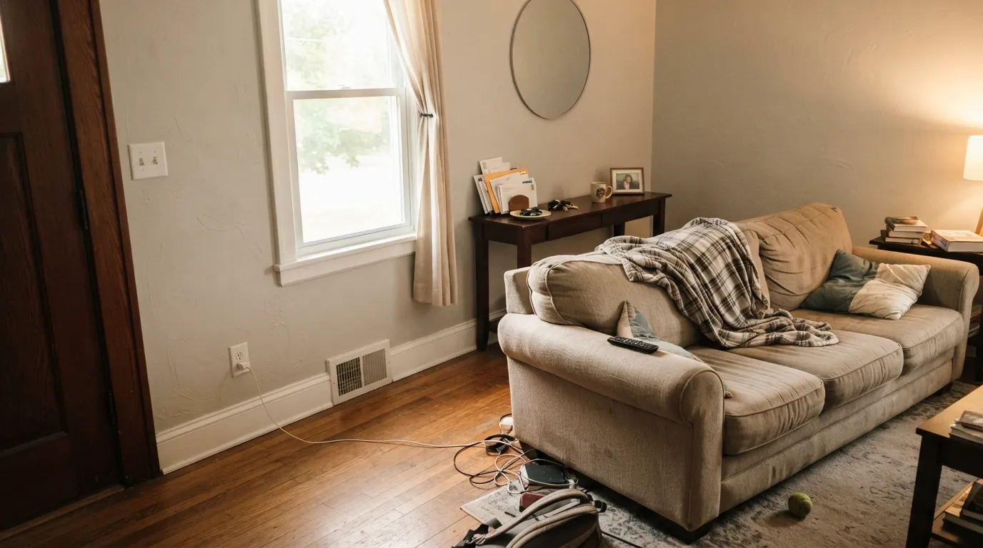
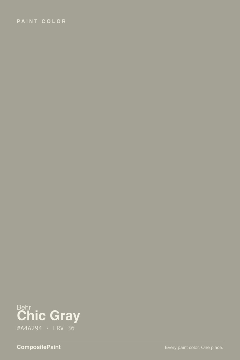
A light, low-chroma gray with a soft beige undertone — the kind of color Behr's own marketing calls a neutral that balances earth and sky, and for once the description is honest. At hex #CFCCC5 and LRV 60, Chic Gray sits almost on top of Sherwin-Williams' Agreeable Gray in value and hue, which is exactly why the two get compared side by side constantly: Agreeable Gray runs a little more saturated, Chic Gray reads a hair quieter, and most rooms would need a fan deck held to the wall to tell them apart.
LRV 60 puts it in the same lightness range as SW Repose Gray (58) and BM Collingwood (62) — light enough to brighten a room, dark enough to still register as a color rather than an off-white. Put it next to a near-white like Behr Polar Bear (LRV 94) and Chic Gray suddenly shows its full grey-beige body; that contrast is what makes it read as a deliberate wall color instead of a compromise, and why it does real work as a cabinet or trim color, not just a backdrop.
Undertone in one line: warm beige first, gray second — never a true cool gray. Behr sells it in the same interior/exterior semi-gloss and satin enamel line it uses for cabinets, doors and trim, and in a Marquee exterior finish, which tells you the company treats it as a workhorse neutral, not a niche accent.
Where It Shines
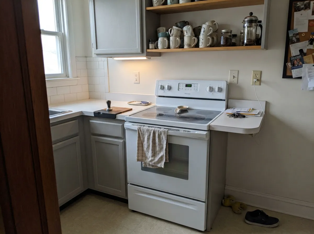
Give it real daylight — south or west exposure, or a room that just gets decent light most of the day — and it does exactly what a safe warm gray is supposed to do: recede without disappearing, flatter warm wood and brass, and stay calm next to almost anything. Its second life is as a product, not just a paint chip: Behr sells the identical color as a semi-gloss and satin cabinet-door-trim enamel and as a Marquee exterior finish, so the wall color, the cabinets, and the front door can all be the exact same undertone if you want them to be.
Where It Fails
Almost every disappointed review of Chic Gray comes down to one of three predictable situations, and none of them are really the paint's fault — but if your room matches one, sample it big before you commit a whole house to it.
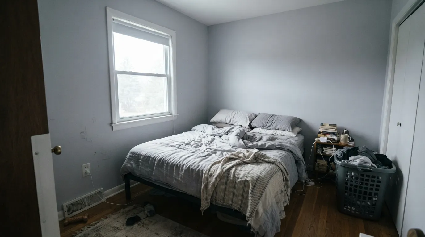
Cold daylight strips the beige out and can leave a faint icy, almost lavender cast on the wall — the exact failure mode SW Repose Gray is famous for, and Chic Gray sits close enough in the same family to inherit it. The paint did not change; the light did. Add warm 2700K lamps or size up to a warmer Behr neutral for a room that stays dim most of the day.
A cool builder-white trim wins the temperature fight and makes Chic Gray walls look faintly dingy by comparison — the same mistake that trips up every soft warm neutral. Pair it with a soft white like Behr White or Swiss Coffee instead, or go one shade darker on the trim if you want real contrast.
The beige undertone that reads so calm against walnut or pale white oak has nothing to work with against strongly orange builder oak — the floor and the wall end up fighting instead of pairing, and the wall can look flatter and grayer than the chip promised. A large rug or a floor refinish closes the gap; painting alone will not.
Room by Room
With any real daylight it is a calm, warm-leaning backdrop for wood furniture and art, holding its color instead of washing out. Eggshell on the walls, the same color repeated on trim in semi-gloss if you want the one-color-room look.
Behr sells Chic Gray in a semi-gloss and satin enamel built for cabinets, doors and trim, with a one-coat hide guarantee over a similar existing color. It reads elegant against a soft white counter or backsplash and takes brass or black hardware equally well.
Under 2700K lamps it stays cozy and warm at night. If the room faces north and rarely sees direct sun, expect the same cool-light fade the fails section describes — step up to a warmer Behr neutral if you refuse to run lamps.
With warm-toned tile, a wood vanity or brass fixtures it is a genuinely sophisticated bathroom neutral. Cool blue-gray or icy white marble pushes it toward the same violet flash as a north-facing room — use a warmer neutral there instead.
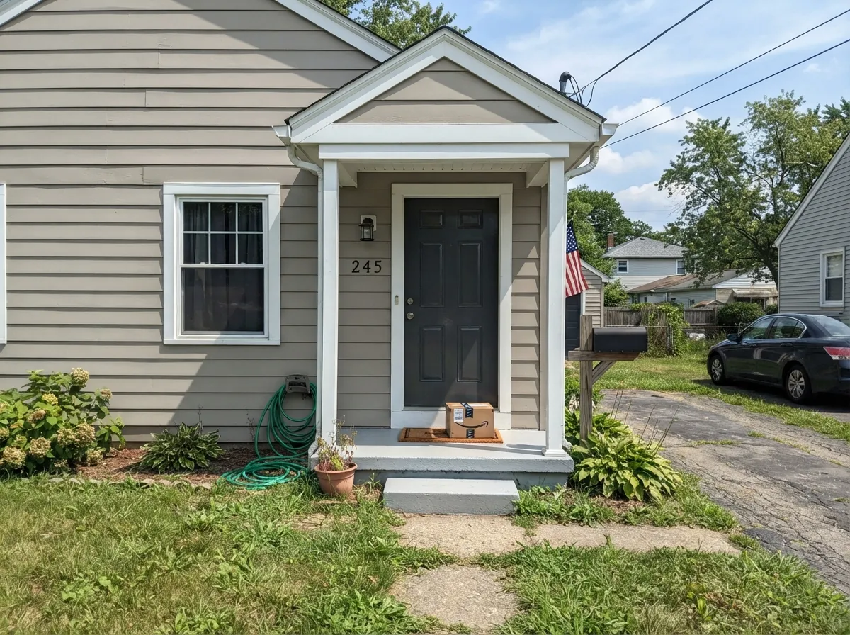
Chic Gray is part of Behr's Marquee exterior lineup, and full sun reads it warmer and softer than a true cool gray facade. White trim and a dark front door is the classic, dependable pairing.
Light enough to run wall-to-wall through a house the way SW Agreeable Gray does, or used as a mid-tone accent against a lighter neutral. Either way it stays quiet enough to not fight whatever room comes next.
Your Light Is the Risk
Real sun brings the beige forward and the gray reads warm and settled, exactly the calm neutral Behr sells it as.
Cool cloudy daylight strips the warmth and can leave a faint icy, almost lavender cast — the same weakness SW Repose Gray is known for.
Warmer and more beige at the sun hours, quieter gray in between. Most rooms read it as one steady color through the day.
2700K bulbs keep the beige alive and cozy. Cool white LEDs flatten it toward the same icy cast a north room shows — change the bulb before you change the paint.
Most complaints about Chic Gray are a light mismatch. Upload a photo of your actual room and see it on your walls — then ask for the same wall in north light or evening lamps before you buy a single sample.
Need It From Another Brand?
Any paint counter can custom-tint Behr PPU26-10 directly. If you would rather stay in one brand's own deck, these are the closest stock matches, measured as ΔE2000. Under 2 is a difference you will not see on the wall.
| Brand | Closest color | ΔE | LRV | |
|---|---|---|---|---|
| Sherwin-Williams | MercurialSW 9550 · Sherwin-Williams | 1.3 | 61 | Color page → |
| Benjamin Moore | Nimbus1465 · Benjamin Moore | 0.5 | 59 | Color page → |
| Valspar | Gravel DriveT561 · Valspar | 1.0 | 61.2 | Color page → |
| PPG / Glidden | Cool SlatePPG1002-3 · PPG / Glidden | 0.8 | 60 | Color page → |
| Glidden | Cool SlatePPG1002-3 · Glidden | 0.5 | 61 | Color page → |
| Dutch Boy | Doves Wings443-1DB · Dutch Boy | 1.7 | 60 | Color page → |
Similar Behr Colors
The nearest shades to Chic Gray within Behr's own range, ranked by perceptual color distance — useful when you want the same look a touch lighter, darker, or warmer.
WCAG 2.1: AA is 4.5 : 1 for normal text, 3 : 1 for large text, AAA is 7 : 1.
Chic Gray vs the Colors You're Also Considering
Every Chic Gray sample board has the same rivals on it. The numbers show the real lightness gap — then it comes down to which risk you would rather live with.
Pick this when you're already buying Behr at Home Depot and want the same territory without a special order.
Sherwin-Williams SW 7029 · LRV 60Agreeable GrayPick this if your painter only stocks Sherwin-Williams — it's the most-copied warm greige in the business, and Chic Gray sits almost exactly on top of it.
Pick this for a touch more warmth and a touch less of that lavender risk in a dim room.
Sherwin-Williams SW 7015 · LRV 58Repose GrayPick this for a slightly cooler, slightly lighter read of the same warm-into-violet story — Repose Gray's own famous flaw is the same cool-light cast.
Pick this when you want the beige lean; Collingwood can read flat and cold in the same dim room that just makes Chic Gray quiet.
Benjamin Moore 859 · LRV 62CollingwoodPick this if you want a true gray that refuses to warm up — Collingwood holds its cool line where Chic Gray drifts beige.
Dunn-Edwards Whale Watching DET512 at LRV 37 is the nearest match at 0.89, close enough to call the same color on a wall. Sherwin-Williams Downing Stone SW 2821 at LRV 36 measures 1.21, and C2 Quahog C2-908 and Valspar Sprig of Sage 8004-28D, both LRV 36, come in at 1.72 and 1.87. All three look visually identical in normal room light.
PPG Smoky Slate PPG1028-4 at LRV 36 is 2.1 away and Benjamin Moore Rockport Gray HC-105 at LRV 37 is 2.3, so both are very close but worth sampling first. Rockport Gray is the slightly lighter and marginally warmer of the two.
Farrow and Ball Pigeon No. 25 at LRV 34 sits at 3.68, close but visibly different side by side. It is darker and clearly greener, so it reads as a soft sage where Chic Gray still reads as a gray. Within Behr, Warm Stone BXC-10 at LRV 35 moves in that same green direction.
Chic Gray Coordinating Colors
The rule for coordinating with Chic Gray is the same rule that keeps any warm gray honest: stay on the warm side for trim and whites, save true cool grays for a deliberate contrast, and keep an eye on anything that shares its violet risk. These are the partners that keep showing up where it works:
Chic Gray vs. Agreeable Gray: Behr's Answer to a Famous Greige
The comparison exists because the two colors are genuinely close, not because one copied the other: same LRV 60, the same warm-gray family, close enough that a fan deck held against a wall is often the only way to tell them apart in person. Agreeable Gray runs a shade more saturated; Chic Gray reads a hair quieter and softer, which is the small difference most people actually notice once the paint is dry.
Practically, the choice usually comes down to where you're buying, not which color is better. Behr sells Chic Gray at Home Depot in the same cabinet-and-trim enamel and Marquee exterior lines it uses for its whites, so a Behr-only project can stay in one brand's undertone family from walls to cabinets to the front door — something Agreeable Gray can't offer without crossing brands.
Chic Gray With Wood Tones and Floors
Warm wood is this color's best company: walnut, honey-toned white oak, and butcher block all sit comfortably against Chic Gray because the beige undertone meets the wood halfway instead of fighting it. The same goes for brass and matte black hardware, which both read intentional against the soft gray.
The one flooring that argues with it is strongly orange, honey-toned builder oak. Yellow-orange floors have nothing warm left to trade with Chic Gray's already-quiet beige, and the wall can end up looking flatter and grayer than the chip promised while the floor looks more orange by comparison. A large rug or a warmer Behr neutral solves it faster than a second coat will.
Three Ready Palettes Built on Chic Gray
A color is never alone on the wall. These are complete combinations in the 60-30-10 pattern, with the reason each one holds together. Every one opens in the visualizer.
A soft warm gray needs a soft warm trim white to avoid the dingy-next-to-bright-white trap — Behr White keeps the same easy undertone from room to room, and Cracked Pepper supplies the one dark note the scheme needs at the door.
Try this palette in your roomBehr sells Chic Gray in the same semi-gloss cabinet-and-trim enamel it sells its whites in, so the wall-to-cabinet handoff shares one brand's undertone. The dark island gives the kitchen its single anchor without fighting the gray.
Try this palette in your roomChic Gray is sold in Behr's Marquee exterior line for exactly this job — a soft gray body that reads warmer than a true cool gray in full sun. Polar Bear trim keeps the edges crisp, and Cracked Pepper on the door and shutters finishes the classic dark-accent look without a special order.
Try this palette in your roomChic Gray FAQ
Is Chic Gray warm or cool?
Warm-leaning — it carries a soft beige undertone that reads as a settled, quiet gray in decent light. In cool daylight or under cool white LEDs it can flash a faint icy violet, but it never reads as a true cool gray once the light is on its side.
Is Behr Chic Gray the same as Sherwin-Williams Agreeable Gray?
Close, not identical. Both sit at LRV 60 in a similar warm-gray hue, but Agreeable Gray runs a little more saturated. If your painter only stocks Behr, Chic Gray is the honest substitute; side by side, a careful eye can tell them apart.
Can I use it on kitchen cabinets?
Yes — Behr sells Chic Gray in a semi-gloss and satin enamel built for cabinets, doors and trim, not just as a wall flat, backed by a one-coat hide guarantee over a similar color. Pair it with a soft white counter or backsplash rather than stark white to avoid the dingy-by-comparison look.
Does Chic Gray work on exteriors?
Yes — it is part of Behr's Marquee exterior lineup. In full sun it reads warmer and softer than a true gray facade; white trim with a dark front door is the classic pairing.
What trim white goes with Chic Gray walls?
A soft warm white like Behr White or Swiss Coffee, not a stark bright white. A very cool trim white makes the warm gray look faintly dingy by comparison, the same mistake that trips up most soft warm neutrals.
How many coats does it take?
Behr backs Chic Gray with a one-coat hide guarantee over a similar existing color. Going over a dark or saturated wall still needs a primer and a second finish coat — skipping it is the expensive way to learn that lesson.
Have you painted with Chic Gray?
Rate it — one tap helps the next reader decide.
Ask a Question