Repose Gray
America's default light greige, reviewed honestly: the rooms where it glows, the three rooms where it turns lavender or baby blue, and what to paint instead.

Jessica has spec'd whites and neutrals for more than 300 rooms and keeps a sample wall of painted drawdowns in her studio. Every color review is checked against real reader rooms in the comments and re-tested when a formula changes. About the testing process →
- 1Mindful Gray48
- 2Light French Gray53
- 3Repose Gray58
- 4Pale Oak69
- 5Shoji White74
The Fast Verdict
Repose Gray is the gray people pick when Agreeable Gray feels too tan. At LRV 58 it stays light and open, and the faint warmth keeps it from going cold or clinical. In good daylight it is close to foolproof — which is why it has been a top-three Sherwin-Williams seller for a decade.
But it has one genuine weakness: strip the warm light away and the violet sitting under the gray comes out, and that is where the bad reviews come from.
South- and west-facing living rooms · open-plan main floors that need one calm neutral · walls beside warm wood, brass, or matte black · anyone who found Agreeable Gray too beige
Your room faces north and stays dim · your cabinets or counters are cream, ivory, or champagne · your bulbs are 4000K daylight LEDs · you want a gray that reads clearly gray, not greige
- Light and open at LRV 58 without going white or clinical
- Modern gray look that never turns cold or steel-blue in good light
- Sits happily with oak, walnut, brass, and matte black in the same room
- The go-to answer when Agreeable Gray reads too tan
- Works on walls, cabinets, and light siding — one color for a whole house
- Turns lavender or baby blue in dim north-facing rooms
- Pulls purple where it meets cream or ivory cabinets
- Reads noticeably darker on four walls than on the sample card
- Too soft to satisfy anyone who actually wants a true gray
What Color Is Repose Gray, Really?
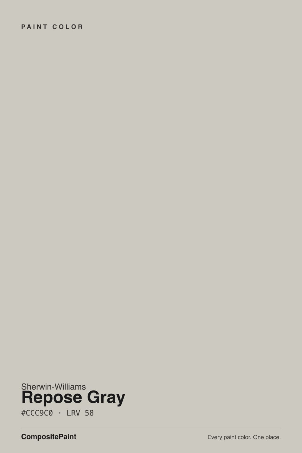
A light greige built on a violet base. That last part is the whole story. Most warm grays get their softness from yellow or brown pigment; Repose Gray gets a good share of its from a whisper of purple, with a faint green thread underneath it. In warm light the purple reads as "soft" and "not cold," which is exactly the effect people are after. Take the warm light away and the same pigment reads as what it is. Nothing about the mix changes room to room — only what the light lets you see.
At LRV 58 it sits almost exactly where Agreeable Gray does at 60, so the two are not a light-versus-dark decision — they are a temperature decision. Repose leans slightly cool and clean; Agreeable leans slightly tan. That two-point gap also tells you something people miss: 58 is mid-light, not pale. It is a real, visible color on the wall, roughly halfway between a white ceiling and a mid-tone gray sofa, and it will read as gray from across the room rather than disappearing like an off-white.
Undertone in one line: cool-leaning greige with violet first and a trace of green — never yellow, never beige. If your wall looks tan, you are looking at Agreeable Gray or at a lamp; if it looks lavender, you are looking at Repose in cool light.
Where It Shines
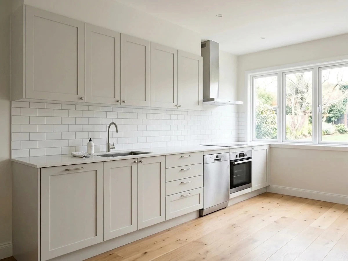
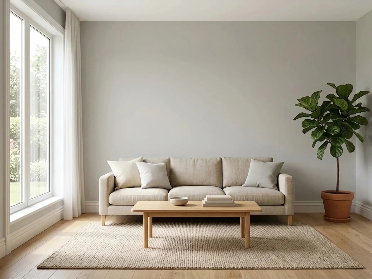
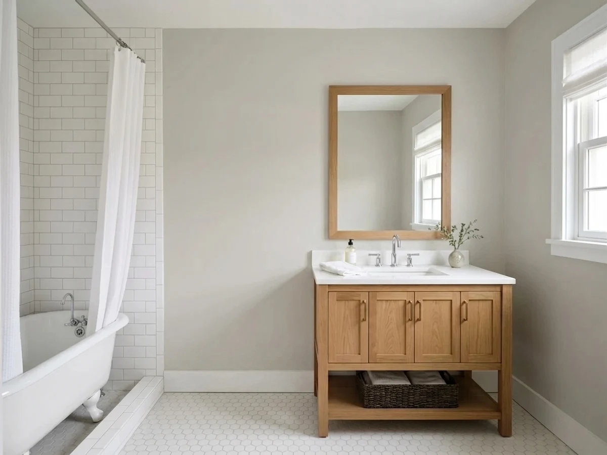
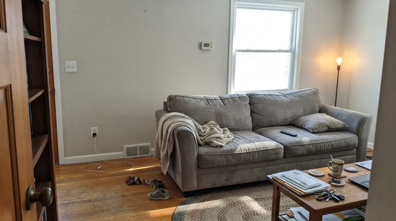
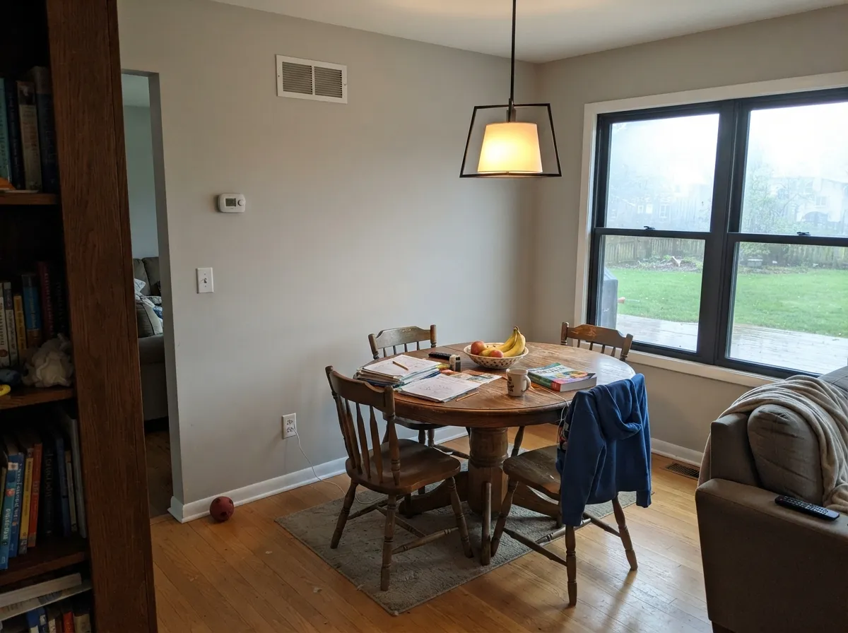
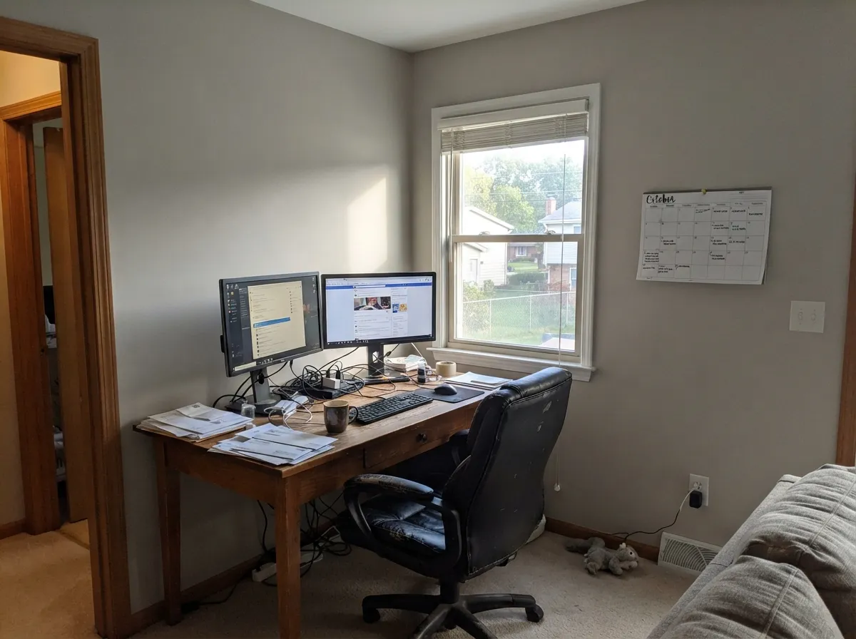
Repose Gray is at its best in south- and west-facing rooms, where warm daylight holds the greige in balance and keeps the violet base out of sight. Look for it on open main floors beside oak, walnut, brass, or matte black — that is where it does the quiet, modern job people buy it for.
Where It Fails
Repose Gray gets recommended everywhere, so the disappointed posts are easy to find — and they are strikingly repetitive. Three situations produce almost all of them, and all three are predictable before you open the can.
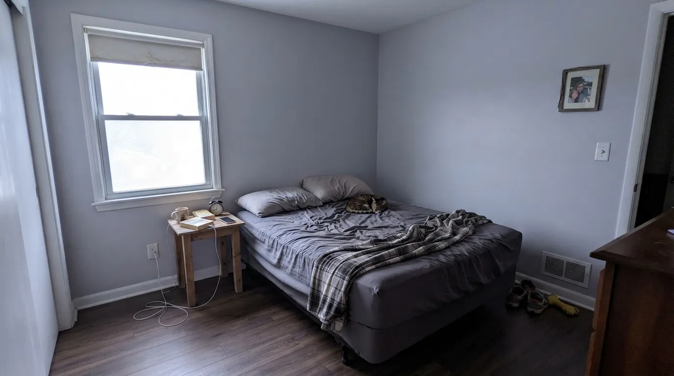
This is the big one. North light is cool and blue, and it cancels out the small amount of warmth Repose has. What is left is the violet under the gray. Homeowners post the same sentence over and over — the walls read lavender, or flat-out "baby blue." One Houzz poster loved it in a sunny apartment, repainted the same color in a north-facing house, and got baby blue walls. If your main light is north, go warmer: Accessible Beige (SW 7036) at the same LRV 58, or Benjamin Moore Edgecomb Gray (HC-173), which holds its warmth in cool light.
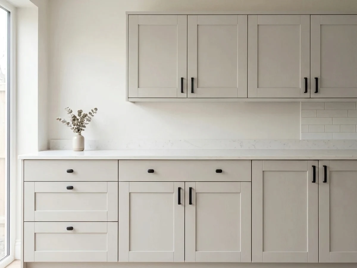
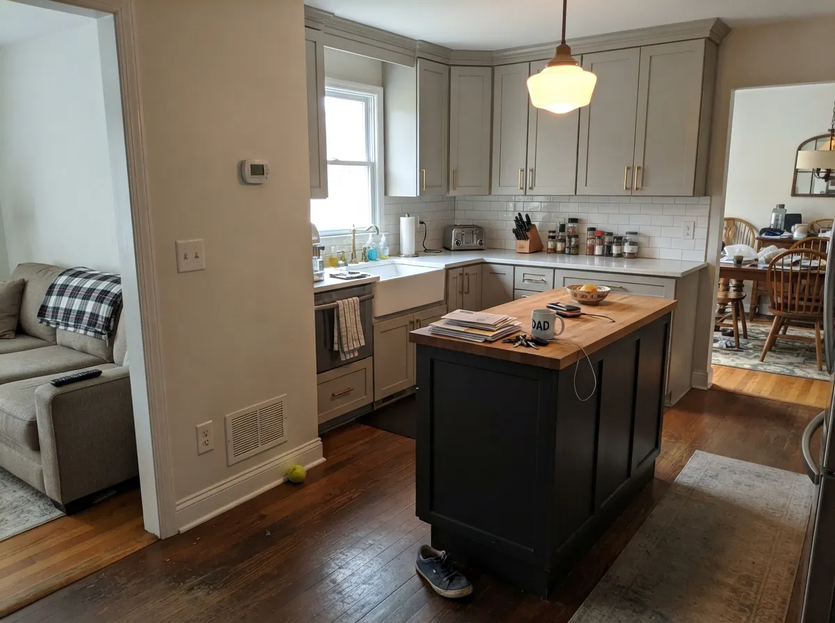
Repose looks fine on its own, then turns purple where it meets warm cream. A Houzz thread about ivory "champagne" cabinets describes it exactly — the walls looked great everywhere except the two feet next to the cabinet run. The yellow and pink in the cream push Repose the opposite way on the color wheel, and violet is what you see. With cream cabinets, stop fighting it and pick a warm greige: Agreeable Gray (SW 7029) or Accessible Beige (SW 7036).
A 2-inch chip at LRV 58 looks light. Four walls of it, especially with limited windows, read a full step darker and colder than people expect — "a lot darker than I was expecting" is a real thread title. Nothing is wrong with the paint; small samples always lie light. If you want the same character but brighter, use Silverpointe (SW 7653) at LRV 64, or have the store mix Repose Gray at 50 percent strength — a common fix painters suggest.
Room by Room
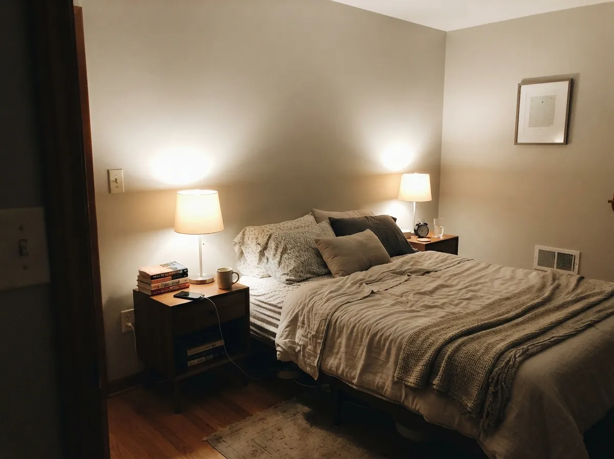
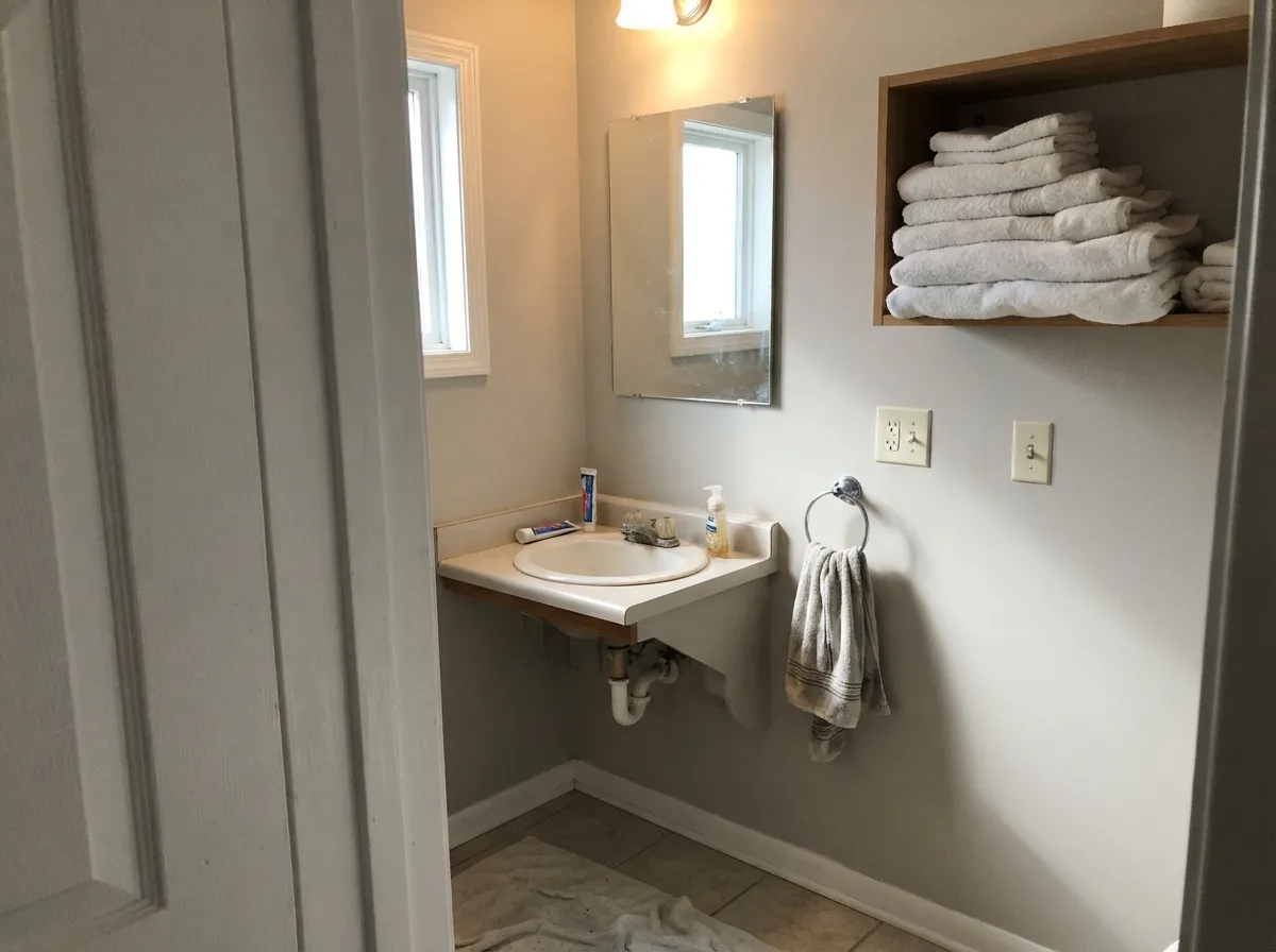
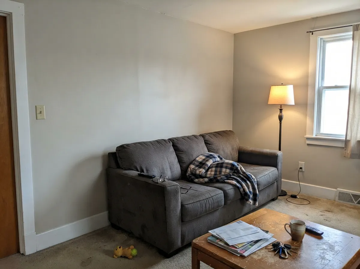
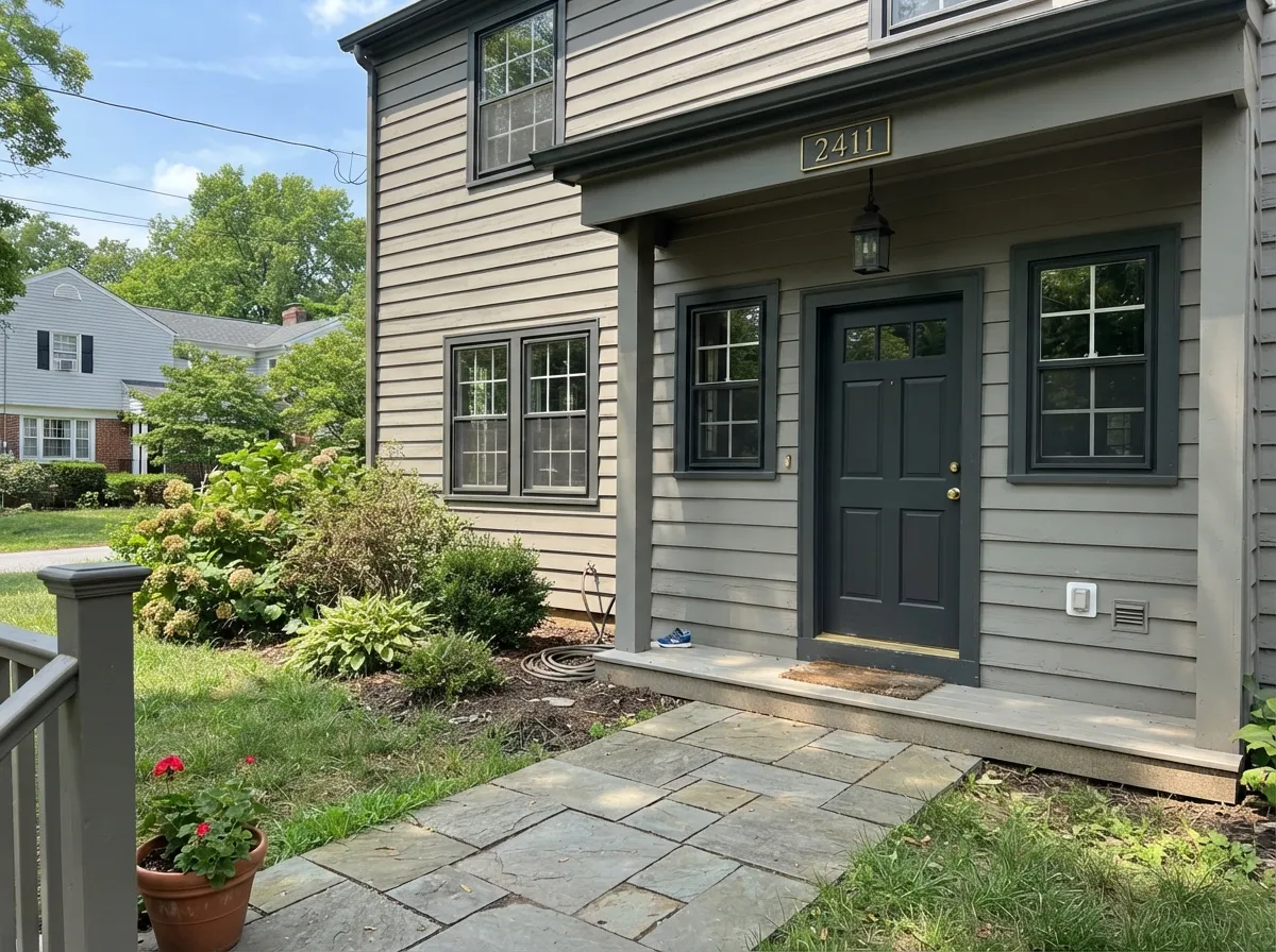
Your Light Is the Risk
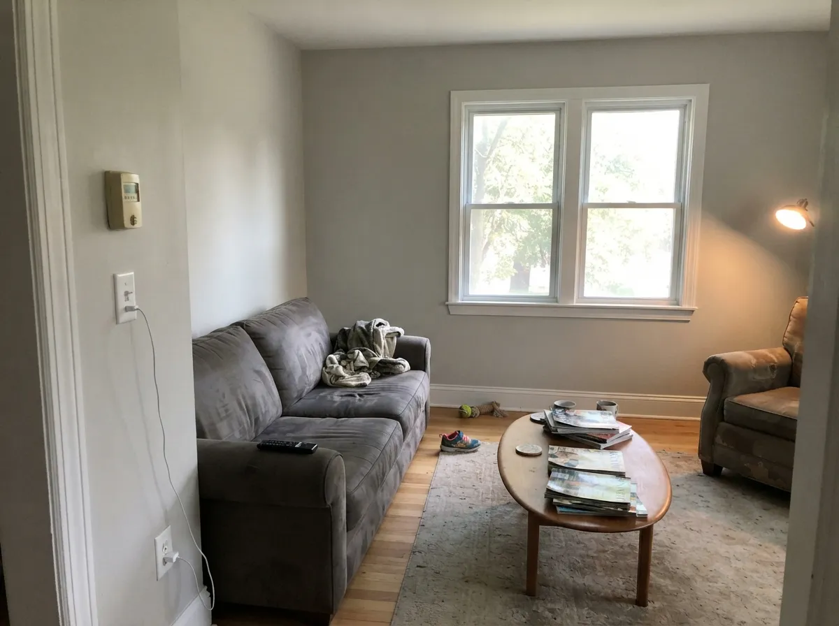
Warm daylight all day keeps the greige balanced and soft. This is the room it was made for.
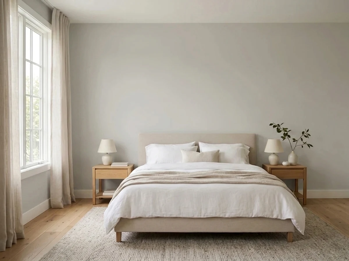
Cool light kills the warmth and the violet base surfaces. Expect lavender or baby blue. Sample large, or go warmer.
4000K LEDs push it blue-gray and lifeless after dark. Swap to 2700K bulbs before you blame the paint — it usually fixes it outright.
West windows at 4pm bleach it close to an off-white. Fine on a big wall, disappointing if you wanted visible gray.
Most complaints about Repose Gray are a light mismatch. Upload a photo of your actual room and see it on your walls — then ask for the same wall in north light or evening lamps before you buy a single sample.
Need It From Another Brand?
Any paint counter can custom-tint Sherwin-Williams SW 7015 directly. If you would rather stay in one brand's own deck, these are the closest stock matches, measured as ΔE2000. Under 2 is a difference you will not see on the wall.
| Brand | Closest color | ΔE | LRV | |
|---|---|---|---|---|
| Behr | Gratifying GrayDC-008 · Behr | 0.5 | 58 | Color page → |
| Benjamin Moore | Apparition860 · Benjamin Moore | 0.6 | 58 | Color page → |
| Valspar | Filtered Shade4003-1B · Valspar | 1.9 | 58.4 | Color page → |
| PPG / Glidden | Swirling SmokePPG1007-2 · PPG / Glidden | 1.3 | 59 | Color page → |
| Glidden | Swirling SmokePPG1007-2 · Glidden | 0.6 | 59 | Color page → |
| Dutch Boy | Misted Silver445-1DB · Dutch Boy | 2.2 | 58 | Color page → |
Similar Sherwin-Williams Colors
The nearest shades to Repose Gray within Sherwin-Williams's own range, ranked by perceptual color distance — useful when you want the same look a touch lighter, darker, or warmer.
WCAG 2.1: AA is 4.5 : 1 for normal text, 3 : 1 for large text, AAA is 7 : 1.
Repose Gray vs the Colors You're Also Considering
Every Repose Gray sample board has the same rivals on it. The numbers show the real lightness gap — then it comes down to which risk you would rather live with.
Pick this in a warm, sunny room where Agreeable would tip too tan.
Sherwin-Williams SW 7029 · LRV 60Agreeable GrayPick this for north-facing or cream-cabinet rooms — the extra warmth blocks the purple.
Side-by-side comparison →Pick this when you want a hint of warmth and a bit more depth on the wall.
Sherwin-Williams SW 7653 · LRV 64SilverpointePick this when Repose came out too dark — LRV 64, cleaner and lighter.
Repose Gray is often compared to Agreeable Gray (SW 7029), LRV 60. Agreeable is the warmer, slightly beige-leaning sibling, while Repose stays a touch cooler and grayer. In a warm, sunny room Repose keeps things from feeling too tan; in a cooler room Agreeable adds welcome warmth.
Mindful Gray (SW 7016), LRV 48, is the deeper step in the same range. It is noticeably darker and more clearly gray, so it works when you want more contrast or a moodier wall, whereas Repose keeps a room light and open.
Passive (SW 7064), LRV 60, is the cooler point of comparison. Passive has a true cool, blue-leaning gray character, so it can feel crisp or clinical in the wrong light. If you want gray without the cold, Repose is the safer pick; if you specifically want a cool modern gray, Passive delivers that.
Repose Gray Coordinating Colors
The rule with Repose Gray is the opposite of the rule with a creamy white: keep the partners clean or cool, not buttery. Anything with visible yellow in it sitting right beside Repose will push the violet forward, which is why crisp whites, muted blue-greens, navy, and true blacks all work while cream, ivory, and honey tones fight it.
These are the partners that hold up in real rooms. Pure White and Snowbound are the two trim answers — Pure White for a clean line, Snowbound when you want the trim softer without going creamy. Sea Salt is the low-contrast color break for bedrooms and baths. Naval, Urbane Bronze, and Iron Ore are the three dark notes, and each one changes the mood: navy for classic, bronze for warm and current, Iron Ore for graphic and modern. Mindful Gray is the same-family step down when you want a deeper version of the same idea on cabinets, an island, or a lower level.
Lighter and Darker Versions of Repose Gray
Repose Gray is the second color on Sherwin-Williams strip 244, and the rest of that strip is the fastest fix when Repose is close but not right. Everything on it shares the same violet-based recipe, so the character stays consistent as you move up and down — only the depth changes. Going lighter, Eider White at LRV 73 is Repose with most of the weight removed, useful when four walls came out heavier than you wanted but you liked the tone. Going darker, Mindful Gray at 48 and Dorian Gray at 39 are the mid-tone steps, and Dovetail at 26 and Gauntlet Gray at 17 are the deep ones people use on islands, exterior siding, and front doors.
The strip is also the easiest way to build a house that looks intentional instead of pieced together: Repose on the main walls, Eider White in the darkest interior room, and Dovetail or Gauntlet Gray on the cabinets or exterior. One caution — the violet base gets easier to see as the color gets darker and the room gets dimmer, so the same north-light test applies to every step down the strip.
If you want lighter without staying on this strip, Silverpointe is the other common move; if you want darker but warmer, step off 244 entirely rather than fighting the family recipe.
Repose Gray With Floors and Wood Tones
Floors decide more of this color's outcome than most people expect, because they are the largest warm or cool surface in the room. Mid-tone oak with brown in it is the easy win — enough warmth to settle the violet, not so much orange that it fights. Walnut and darker stains are equally safe. Where Repose gets tricky is the current white oak trend: pale, raw-looking floors carry a lot of yellow and very little contrast, so the wall can look faintly lavender against them and the whole room reads washed out. That combination needs a big sample laid on the actual floor, not a chip held in the air.
Gray LVP is a coin flip that depends entirely on the plank's undertone. Cool gray planks with a blue cast reinforce everything cool about Repose and can make a room feel flat and chilly. Warm gray or greige planks work well and are the safer buy if you are choosing both at once. Orange-leaning builder oak is the other hard case — orange sits opposite the violet, so instead of neutralizing it, the two exaggerate each other. In that room, a warm greige such as Accessible Beige will look calmer than Repose ever will.
Three Ready Palettes Built on Repose Gray
A color is never alone on the wall. These are complete combinations in the 60-30-10 pattern, with the reason each one holds together. Every one opens in the visualizer.
Repose carries 60 percent of an open floor as one calm neutral, and Pure White at LRV 84 is bright enough to make it look crisp instead of dull. Urbane Bronze is the 10 percent dark note — warm enough that it reinforces the greige rather than exposing the violet under it.
Try this palette in your roomFlipping Repose onto the cabinets and keeping the walls a clean white sidesteps the color's one real trap, because there is no cream anywhere to pull it purple. Naval on the island grounds the room, loves brass hardware, and gives the light greige something to sit against.
Try this palette in your roomSea Salt at LRV 63 is only a shade lighter than Repose, so the accent wall adds a green-gray whisper instead of a contrast line — both colors are muted and low-saturation, and they quiet down together under warm lamps. Pure White trim keeps the edges clean so the two soft tones never blur into each other.
Try this palette in your roomRepose Gray FAQ
Why does Repose Gray look purple in some rooms and not others?
The paint never changes — the light does. Warm light (south sun, 2700K bulbs, warm wood, brass) adds back the yellow that keeps the violet quiet. Cool light (north windows, 4000K LEDs, gray stone, an overcast day) subtracts it and leaves the violet exposed. Before you commit, tape a large painted board on the wall you worry about and look at it at 8am, 3pm, and again at night with the lamps on.
Is Repose Gray warm or cool?
Technically warm, practically neutral, and it behaves cool more often than the label suggests. It has enough warmth to avoid the steel-blue look of a true gray, but far less than Agreeable Gray or Accessible Beige. In a room with plenty of warm daylight it lands right in the middle; in dim or cool light it tips to the cool side of neutral every time.
Is Repose Gray a good cabinet color?
Yes, and it is one of the color's strongest uses — a calm alternative to white cabinets that still looks light. Two conditions: nothing cream or ivory in the counters, backsplash, or hardware, and enough light in the kitchen that the doors do not read dull. Use a satin cabinet enamel, and give the island or the perimeter a dark anchor so the room does not float.
Repose Gray or Agreeable Gray — how do I decide?
Look at two things: which way the main windows face, and whether anything in the room is cream. North windows or cream cabinets, counters, or tile mean Agreeable Gray. South or west windows with white or cool finishes mean Repose Gray. Brightness is not the tiebreaker — they are two points apart in LRV and look nearly identical on a chip.
What trim white goes with Repose Gray?
Pure White (SW 7005) is the default, and Extra White (SW 7006) if you want the sharpest edge. Do not use Alabaster (SW 7008) or any creamy white — warm trim next to Repose pulls the violet forward and both colors end up looking muddy. This pairing is one of the most common regrets with this color, and it costs nothing to avoid.
Can I use Repose Gray through the whole house?
It is one of the better whole-house candidates, but audit the dark spots first. Interior hallways, windowless baths, and basements with only recessed cans are exactly where owners report a purple cast that never showed on the samples. Either warm those bulbs to 2700K, or run Repose in the light rooms and let a warmer neutral handle the closed-in ones.
Is Repose Gray dated in 2026?
No, but it is no longer the automatic choice it was ten years ago. It is still a top-five seller for Sherwin-Williams and still specified constantly in new builds and cabinet work, while the broader trend has moved toward warmer beiges and earthy tones. For resale it stays safely middle-of-the-road, which is most of the reason builders keep reaching for it.
Have you painted with Repose Gray?
Rate it — one tap helps the next reader decide.
Ask a Question