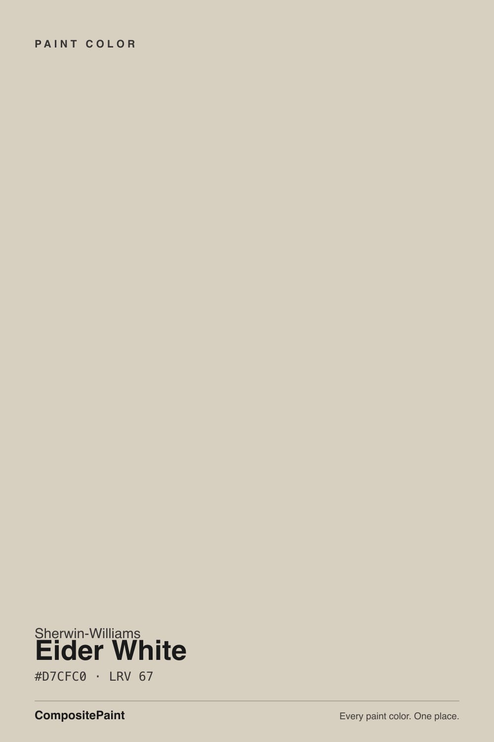
Eider White
The light greige with a white name, reviewed honestly: where it looks expensive, the rooms where it turns mauve, and what to paint instead.

Jessica has spec'd whites and neutrals for more than 300 rooms and keeps a sample wall of painted drawdowns in her studio. Every color review is checked against real reader rooms in the comments and re-tested when a formula changes. About the testing process →
- 1Heirloom Shade63
- 2Titanium68
- 3Eider White73
- 4Alabaster82
- 5Chantilly Lace91
The Fast Verdict
Eider White is not a white. At LRV 73 with a warm red-based body, it is a light greige that behaves like a soft, expensive neutral when the room has real daylight and warm materials.
The catch is famous: in cool light, or against gray floors and gray stone, that red base tips and people see pink, mauve, or purple on their walls. Sample a big patch on the wall that worries you, not a chip in your hand.
Whole-house walls in south or west light · warm oak and walnut floors · kitchen cabinets and built-ins with brass · exterior body color under dark trim
Your room faces north and stays dim · you actually wanted a white · your floors and counters are cool gray · it is a basement with one small window
- Soft, expensive-looking light greige with real depth
- LRV 73 keeps rooms open without the glare of a true white
- Flatters oak, walnut, cane, brass, and cream
- Cabinets and trim: hides scuffs and handprints better than bright whites
- Carries a whole house without getting boring room to room
- Goes pink, mauve, or purple in north and east light
- Reads flat and dingy in basements and dim rooms
- The name promises a white it cannot deliver — it is a greige
- Fights cool gray floors, gray quartz, and chrome
What Color Is Eider White, Really?
A light greige with a red-based warmth, not an off-white. The color has real body in it — enough that on a full wall it behaves like a soft taupe-gray rather than a white with a hint of something. The warmth sits on the red-orange side of warm, and that single fact explains almost every story people tell about this color. Put a red-leaning neutral in cool, gray daylight and the eye stops calling it beige and starts calling it mauve. That is why homeowners who love it call it the most expensive-looking neutral they have used, and the ones who hate it say their living room came out pink.
At LRV 73 it reflects a good amount of light, but the gap to a real white is bigger than the name suggests. Alabaster (SW 7008) sits at LRV 82 and Pure White (SW 7005) at 84 — stand a sample of either next to Eider White and the difference is not subtle, it is a full step of color. Going the other direction, Repose Gray (SW 7015) at LRV 58 is the deeper color on the same strip, so Eider White is essentially its lighter, warmer sibling. Think of it as the lightest usable greige, not the heaviest white.
Undertone in one line: warm gray with a red base — reads soft taupe in warm light, mauve in cool light, and never truly white against real white trim.
Where It Shines
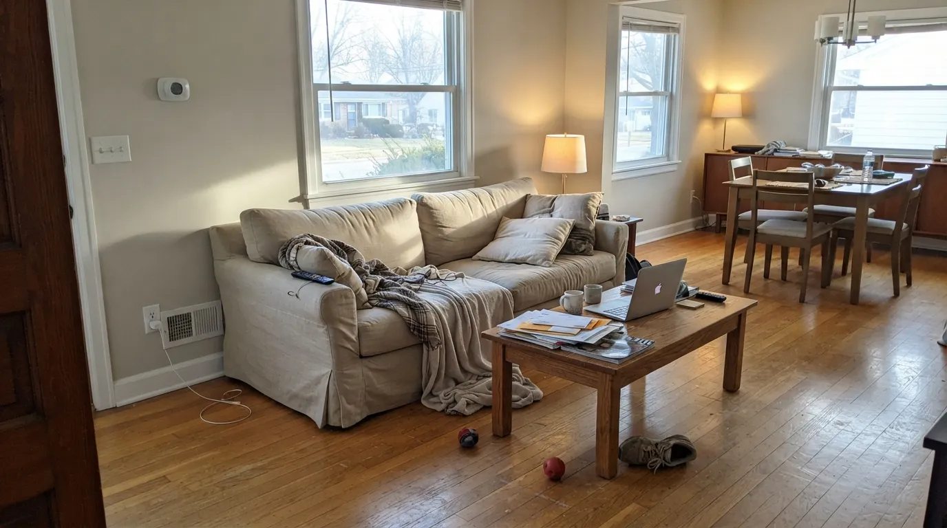
Give it afternoon sun, warm wood, and a brighter trim white and it does something few light neutrals manage: it looks quiet and expensive at the same time. It is at its best running through connected rooms in a south- or west-facing house, and on cabinets, where the softness reads as age rather than as dirt.
Where It Fails
The bad reviews on Eider White are unusually consistent, and they cluster into three situations. If your room matches one of them, no primer, sheen, or second coat is going to save it — the light and the materials are doing the damage, not the paint.
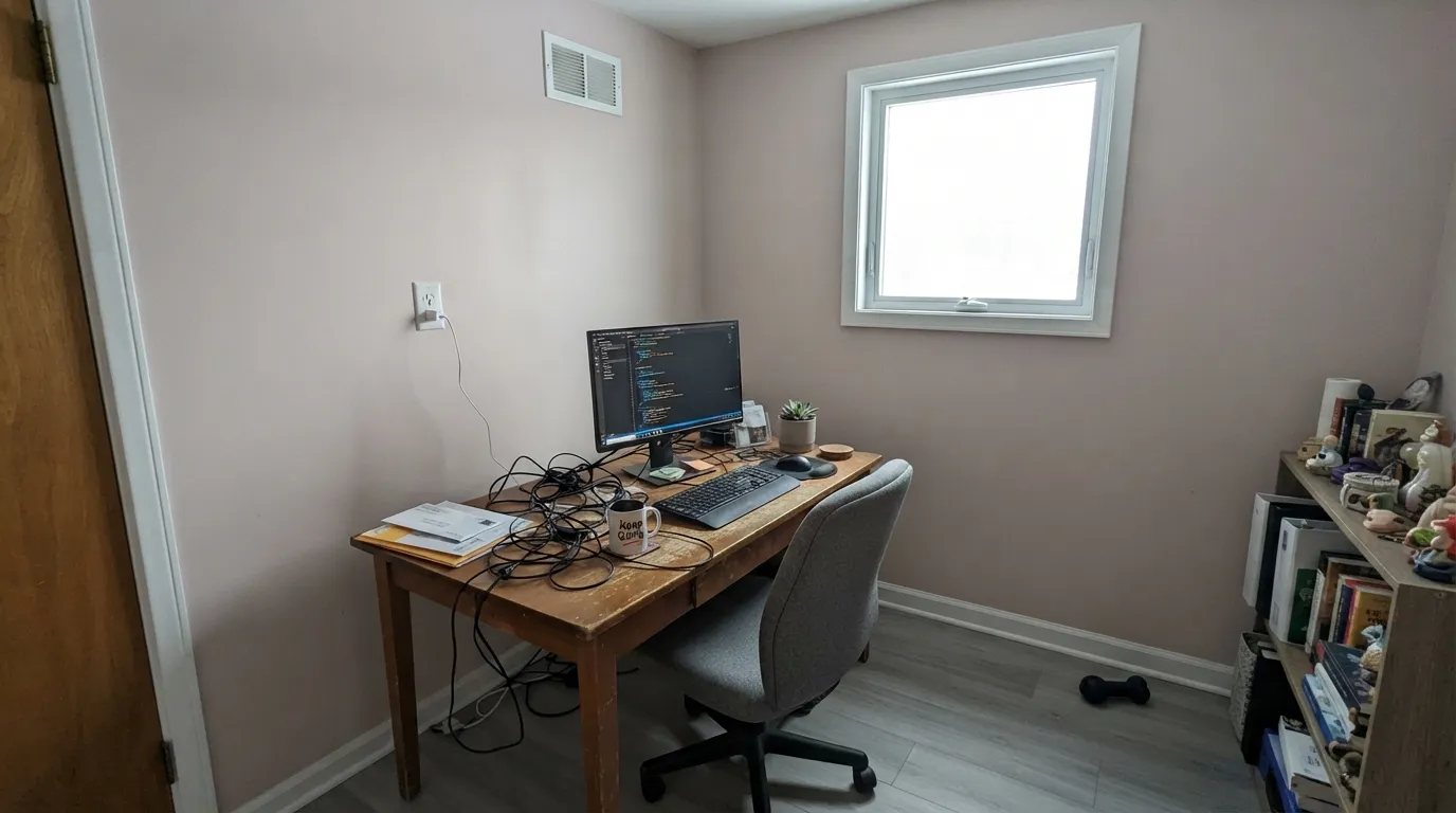
This is the number one complaint by a wide margin. Cool blue-gray daylight lands on a red-based neutral and the walls read pink, mauve, or straight purple — people describe painting seven gallons and standing in a lavender living room. If your main light is north or east, use Shoji White (SW 7042) instead; its green-yellow lean cannot go pink.
LRV 73 is light, but it is not bright enough to carry a dark room on its own. Without daylight the gray in it takes over and the walls go flat and muddy — the word that comes up over and over is dingy. In a basement, step up to Alabaster (SW 7008) at LRV 82 and add warm lamps.
Cool gray materials sit on the opposite side of the color wheel from Eider White's red base, and side by side they push each other apart — the floor looks bluer and the wall looks pinker. It is the fastest way to turn a nice neutral into a pink one. With gray LVP or gray-veined quartz, pick Repose Gray (SW 7015) or Agreeable Gray (SW 7029).
Room by Room
In a south- or west-facing main floor it is genuinely lovely: soft, warm, low-contrast, and it never fights art or wood. Eggshell on the walls, Pure White (SW 7005) on the trim so the millwork actually separates. In a north-facing living room, sample first — this is where the mauve stories come from.
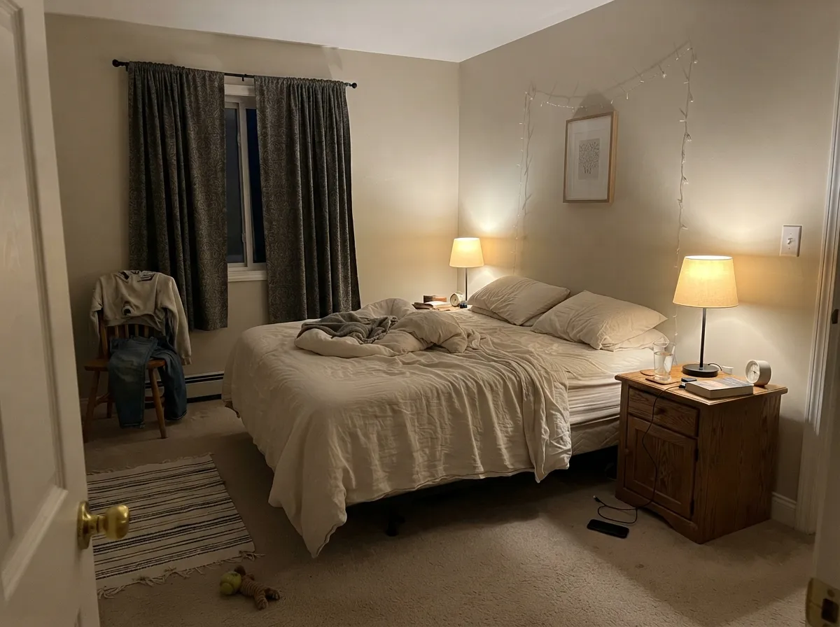
At night under 2700K to 3000K lamps it settles into a warm taupe-cream that reads restful. Cool 4000K LEDs strip the warmth and leave a gray-lilac wall. Pair with oak, cane, and cream bedding rather than cool gray textiles.
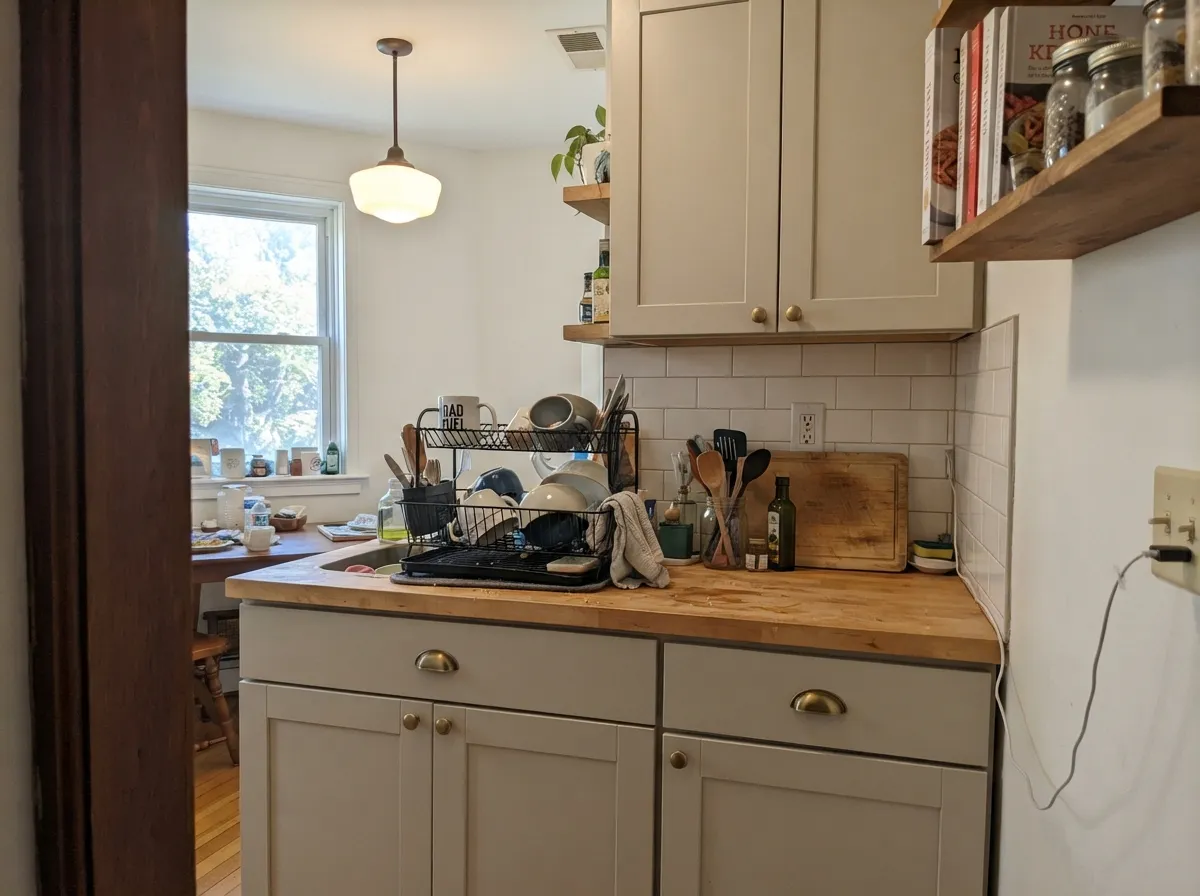
In satin it gives cabinets a settled, slightly aged look that suits transitional and traditional kitchens, and it hides knuckle marks far better than a bright white. Brass and butcher block flatter it; white quartz with cool gray veining does not — hold a door sample against the slab first.
With warm marble, wood vanities, and brass it is excellent. With gray porcelain tile, chrome fixtures, and a cool vanity light it is the single riskiest room in the house for the pink flash. Swap to a 3000K bulb before you blame the paint.
This is what it is built for. Quiet enough to run through several connected rooms without becoming tiring, and light enough that windowless hallways still feel open if the rooms feeding them have daylight. Keep one trim white — Pure White (SW 7005) — through the whole run.
Outside, full sun burns off much of the pink risk and it reads as a warm, soft light body color. Frame it with Iron Ore (SW 7069) or Urbane Bronze (SW 7048) on trim, shutters, or the door; avoid cool blue-gray roofs, which pull the mauve back out on the shaded side of the house.
Your Light Is the Risk
Cool daylight tips the red base and walls read mauve or gray-purple. Always sample.
Warm sun holds it as a soft taupe-greige all day. This is the exposure it was made for.
East mornings can flash pink; west afternoons go warm and rich. It moves a lot.
2700–3000K: warm taupe-cream, cozy. 4000K+ LEDs: gray-lilac. Change bulbs, not paint.
Most complaints about Eider White are a light mismatch. Upload a photo of your actual room and see it on your walls — then ask for the same wall in north light or evening lamps before you buy a single sample.
Need It From Another Brand?
Any paint counter can custom-tint Sherwin-Williams SW 7014 directly. If you would rather stay in one brand's own deck, these are the closest stock matches, measured as ΔE2000. Under 2 is a difference you will not see on the wall.
| Brand | Closest color | ΔE | LRV | |
|---|---|---|---|---|
| Behr | Abalone ShellPWN-63 · Behr | 0.6 | 73 | Color page → |
| Benjamin Moore | Sheep's Wool857 · Benjamin Moore | 2.0 | 73 | Color page → |
| Valspar | Ballroom Belle7001-9 · Valspar | 0.9 | 73.6 | Color page → |
| PPG / Glidden | SeagullPPG14-03 · PPG / Glidden | 1.3 | 73 | Color page → |
| Glidden | Silver Birch70YY 72/041 · Glidden | 0.8 | 72 | Color page → |
| Dutch Boy | Blanched Fuchsia347-1DB · Dutch Boy | 1.9 | 72 | Color page → |
Similar Sherwin-Williams Colors
The nearest shades to Eider White within Sherwin-Williams's own range, ranked by perceptual color distance — useful when you want the same look a touch lighter, darker, or warmer.
WCAG 2.1: AA is 4.5 : 1 for normal text, 3 : 1 for large text, AAA is 7 : 1.
Eider White vs the Colors You're Also Considering
Every Eider White sample board has the same rivals on it. The numbers show the real lightness gap — then it comes down to which risk you would rather live with.
Pick this when you want the same family lighter and warmer, with more glow.
Sherwin-Williams SW 7015 · LRV 58Repose GrayPick this for a deeper, grayer wall that stands up to cool floors and gray stone.
Pick this when the room has warm light and you want a cleaner, cooler neutral.
Sherwin-Williams SW 7042 · LRV 74Shoji WhitePick this in north-facing rooms — its green-yellow lean simply cannot turn pink.
Inside the brand, Modern Gray (SW 7632) at LRV 62 is the closest alternative when you want less color and more gray, and Warm Oats (SW 9511) at LRV 63 goes the other way with a clearly warmer, more yellow-cream lean. Dumpling (SW 9616) at LRV 64 sits closest to Eider White in feel, and Accolade (SW 9516) at LRV 62 is slightly deeper if you want more presence on a wall.
Across brands the matches are unusually tight. Behr Aged Beige (PPU7-09) at deltaE 0.43, C2 Paint Gimlet (C2-945) at deltaE 0.48, Benjamin Moore Cedar Key (982) at deltaE 0.54, and Dunn-Edwards Heather (DEC773) at deltaE 0.77 are all the same color for practical purposes. Farrow and Ball Shaded White (No. 201) at deltaE 1.01 and Valspar Gentle Shadows (8005-5A) at deltaE 1.49 will look visually identical in normal room light.
Further out, Clare Flatiron (PNT100-LT-17) at deltaE 2.22 is very close but worth sampling first, and Magnolia Home Stoneware Pieces (JG-55) at deltaE 3.82 is close but visibly different side by side, with a cooler, greener cast.
Eider White Coordinating Colors
Coordinating with Eider White has one rule: keep the partners warm or genuinely dark, and keep the trim clearly brighter. Warm woods, brass, cream, muted green, and charcoal all sit comfortably beside it. Cool blue-grays and silver finishes are the ones that turn it pink. These are the partners that do the most work:
Why Eider White Turns Purple, and How to Stop It
The mauve problem is not random and it is not a bad batch. The color's warmth leans red rather than yellow, and red-based neutrals are the ones that read pink or lilac the moment the light around them turns cool. Three things trigger it: north or east daylight, LED bulbs at 4000K and above, and cool gray materials in the room bouncing their own color onto the wall.
Two of those you can fix cheaply. Swap the bulbs to 2700K or 3000K and half the complaints go away overnight, because warm light meets the red base halfway and the wall settles into taupe. Then look at what is reflecting up: gray LVP, a blue-gray rug, silver curtain rods, chrome lighting. Warm the floor with a cream or jute rug and switch to brass or matte black hardware, and the same paint reads completely differently.
What you cannot fix is a dim north room. If the sample looks lilac on an overcast afternoon with the lamps off, that is the truth of the color in that space — move to a green-based neutral like Shoji White (SW 7042) or go brighter with Alabaster (SW 7008) rather than fighting it.
Eider White With Wood Tones and Floors
Warm wood is where this color earns its price. Honey oak, white oak, walnut, cane, and rattan all share its warm base, so nothing has to compete — and unlike a bright white, Eider White softens orange-leaning builder oak instead of shouting about it. Cherry and mahogany work too, though the red in the wood plus the red in the paint means you want a cool accent somewhere in the room to break it up.
Gray-washed and cool LVP floors are the honest exception, and it is worth repeating because it is the most common disappointment: the floor makes the wall look pink and the wall makes the floor look blue. Warm rugs and brass hardware rescue some rooms, but if you are choosing floors and paint at the same time, choose warm floors or choose a different wall color.
Three Ready Palettes Built on Eider White
A color is never alone on the wall. These are complete combinations in the 60-30-10 pattern, with the reason each one holds together. Every one opens in the visualizer.
Eider White at LRV 73 needs a trim white well above it, and Pure White at 84 gives that separation without going icy. Urbane Bronze supplies the one dark, warm note that keeps a quiet scheme from reading unfinished.
Try this palette in your roomAlabaster cabinets sit a clear step brighter than the walls, so the kitchen reads layered instead of tone-on-tone. Iron Ore on the island anchors the room and stops the warm neutrals from drifting pink.
Try this palette in your roomMuted green sits opposite Eider White's red base, so an Evergreen Fog wall quietly cancels the mauve flash instead of feeding it. Pure White trim keeps the edges crisp and the room from going soft-focus.
Try this palette in your roomEider White FAQ
Why does my Eider White look pink or purple?
Because its warmth is red-based, and cool light exaggerates it. North and east daylight, 4000K+ LED bulbs, and gray flooring all push it toward mauve. Warm 2700–3000K bulbs, warm wood, and cream or green accents pull it back. If it happens in daylight with no fix available, the color is wrong for that room.
Eider White or Repose Gray?
They are on the same strip, so it is a lightness question. Eider White at LRV 73 keeps a room airy and warm; Repose Gray at LRV 58 gives a real gray wall with more presence. Repose Gray also handles cool gray floors and countertops better, since it has less red in it.
Is Pure White or Alabaster the better trim with it?
Pure White (SW 7005), for most rooms. At LRV 84 it is far enough above Eider White's 67 to read as crisp trim while staying warm enough not to clash. Alabaster at LRV 82 also works, but it is warmer and softer, so the trim line will look gentler and slightly creamier.
Is Eider White good for kitchen cabinets?
Yes, and it is one of its strongest uses. In satin it gives a warm, settled cabinet that hides fingerprints far better than a bright white and looks right with brass, oak, and butcher block. The one thing to check is your countertop: cool gray-veined quartz will pull the pink forward.
Will it work in a basement or a dark room?
No. Below about LRV 70 a neutral stops carrying a room with little daylight, and Eider White specifically goes flat and muddy there. Use Alabaster (SW 7008) at LRV 82 or Pure White (SW 7005) at 84, and add warm lamps at eye level rather than relying on ceiling cans.
Does it go with gray floors?
It is the pairing most likely to disappoint you. Cool gray LVP and gray-washed wood sit opposite its red base, so the wall looks pinker and the floor looks bluer. If the floors are staying, Agreeable Gray (SW 7029) or Repose Gray (SW 7015) is the safer wall.
Can I use Eider White on trim over greige walls?
Not really. At LRV 73 it is too close to most greiges to register as trim, so the millwork disappears into the wall. Keep it on the walls or the cabinets and give the trim a separate, clearly brighter white.
Have you painted with Eider White?
Rate it — one tap helps the next reader decide.
Ask a Question