Incredible White
The Sherwin-Williams off-white with a name that oversells it, reviewed honestly: the real violet-pink undertone underneath, the rooms it flatters, and the trim pairing that turns against it.

Jessica has spec'd whites and neutrals for more than 300 rooms and keeps a sample wall of painted drawdowns in her studio. Every color review is checked against real reader rooms in the comments and re-tested when a formula changes. About the testing process →

- 1Heirloom Shade63
- 2First Star69
- 3Incredible White74
- 4Alabaster82
- 5Chantilly Lace91
The Fast Verdict
Incredible White is a case of the name outrunning the paint chip: it promises a clean white and delivers a soft greige with a genuine violet-pink undertone, closer in spirit to a pale mauve-gray than to Alabaster or Pure White. That undertone is the whole story. Give it real daylight, black iron accents, or a stone fireplace and it reads warm, dusty, and a little expensive. Put it under cool LEDs next to a brighter trim white and the same undertone reads like a mistake. It is a good color — just not the color its name is selling.
Living rooms with black accents or stone · bedrooms with east or south light · kitchens with granite, stainless, or warm quartz · anyone who wants a greige with real depth, not another flat gray
You want a crisp, bright white for trim or ceilings · your room is dim and north-facing · you're painting an exterior for the moody indoor look · you're pairing it against stark white counters or trim
- A real, documented violet-pink undertone that gives it more depth than a flat gray
- Warm without tipping yellow or beige — a genuinely different lane from most off-whites
- Beautiful against black accents, stone, and stainless steel
- Bedrooms with real daylight are outstanding
- LRV 74 hides scuffs and shadows better than a brighter white
- The name oversells it — buyers expecting a true white get a greige
- Violet undertone reads as a dingy lavender cast under cool LEDs or next to brighter trim
- Not a safe trim, ceiling, or ultra-bright-white pairing
- Loses its character in full exterior sun — reads as a plain off-white outdoors
What Color Is Incredible White, Really?
Sherwin-Williams files Incredible White in its White Paint Colors family — but sit with a real sample and the color argues with its own name. Independent colorimetry consistently turns up violet and pink undertones underneath a gray-taupe base, which is unusual for a color this light; most soft whites carry yellow, beige, or blue undertones, not violet. The name was never really about the color on the wall. It reads closer to a pale, quiet greige with a blush of mauve than to a true wall white.
At LRV 74 it sits at the darker end of what most brands would even call an off-white — Alabaster (82) and Pure White (84) both read noticeably brighter and more like true whites standing next to it. That gap in brightness is exactly why the undertone shows: a lighter white reflects too much light for a subtle violet cast to register, but Incredible White holds enough body that the pink-purple base is visible once you know to look, especially in flat or cool light.
Undertone in one line: gray-taupe base with a real pink-violet cast, strongest in south and east daylight, quietest in flat overcast light. If your sample reads plain, flat gray with no warmth at all, that's a north room or a cool bulb muting it — not a different paint.
Where It Shines
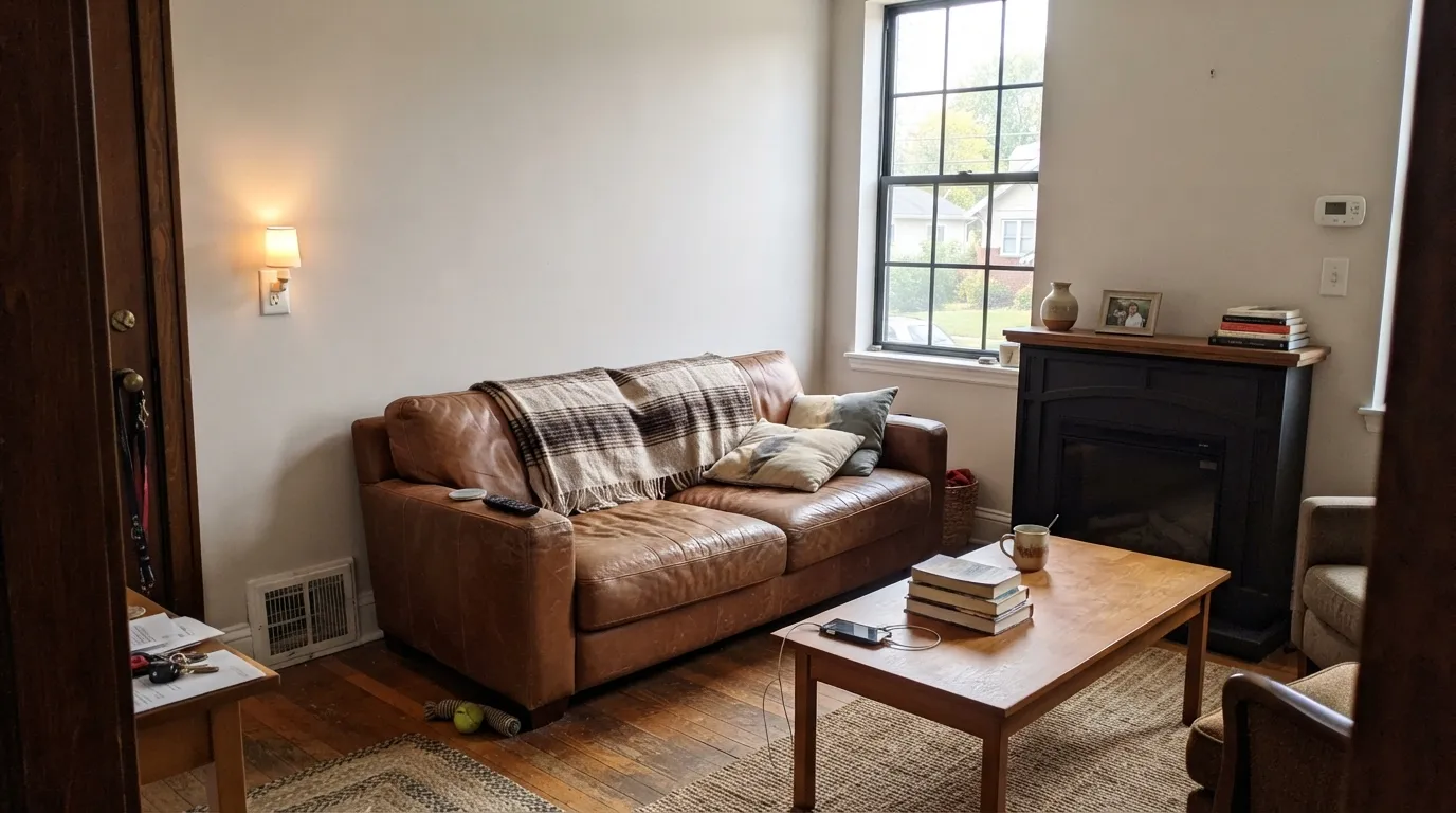
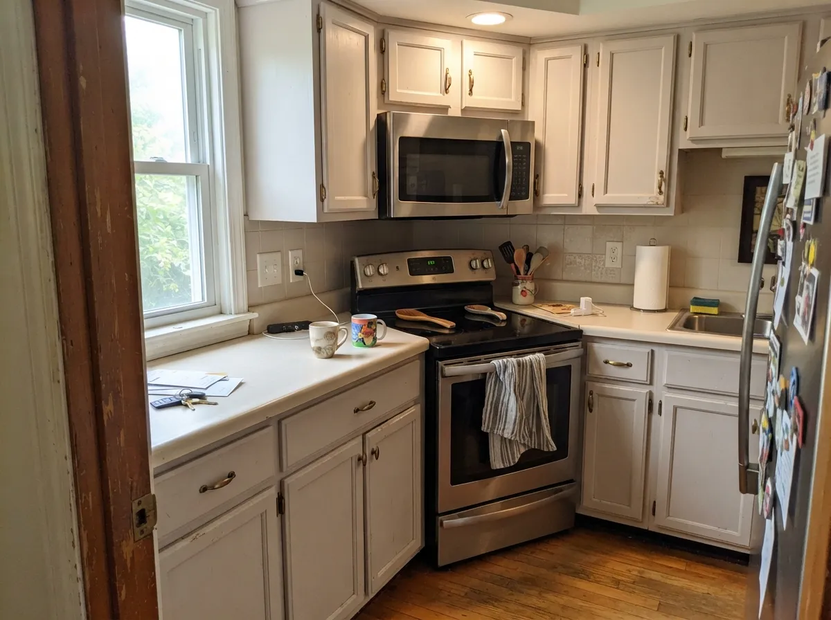
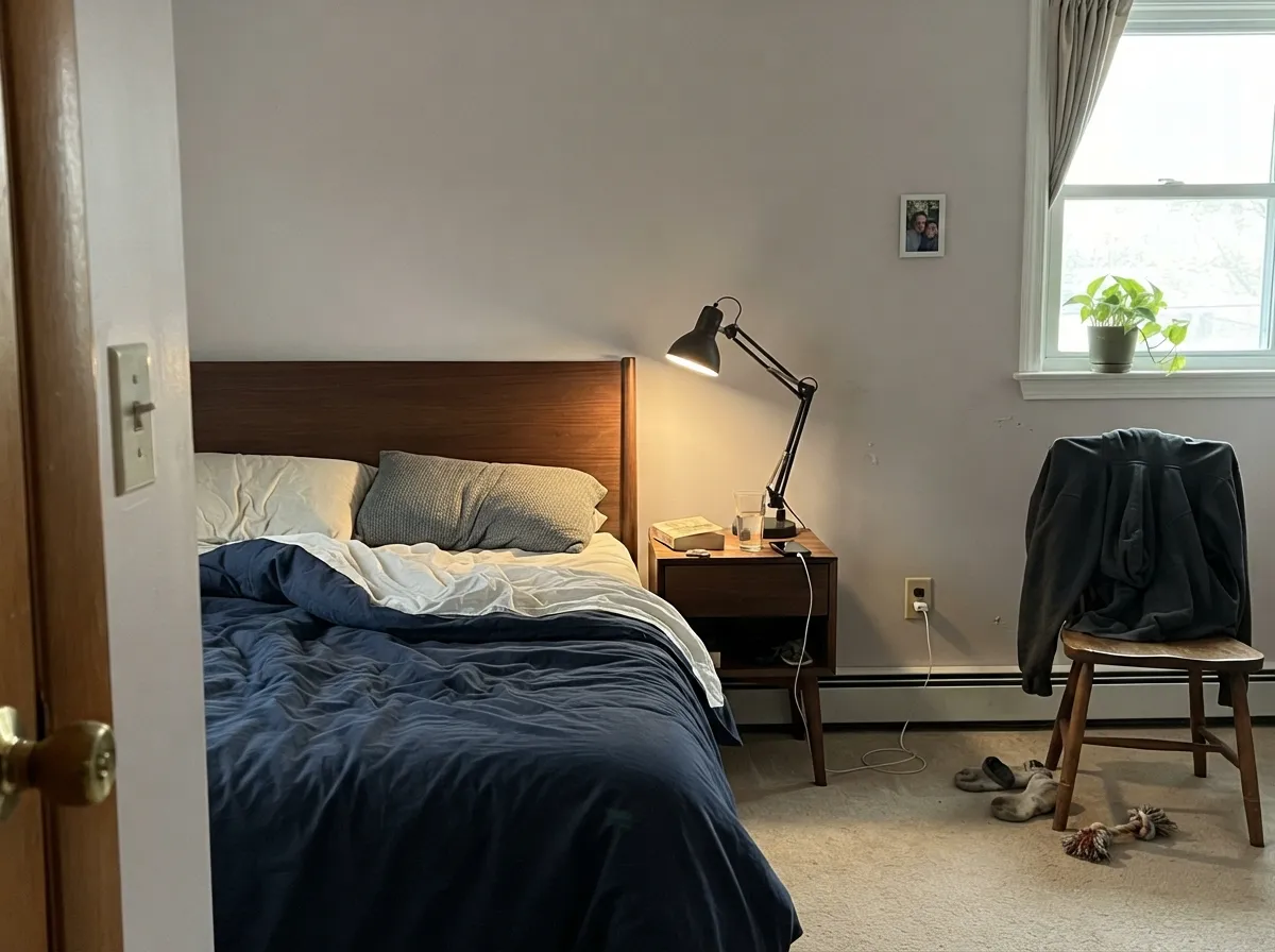
Give it real daylight and the right materials and the violet-pink stops being a liability and starts being the point. Living rooms with black iron accents or a stone fireplace let the undertone read as intentional depth rather than an accident. Kitchens with granite, stainless steel, or warm quartz treat it as a quiet neutral instead of fighting it. Bedrooms with morning or afternoon sun are its best room by a wide margin — the pink comes forward just enough to feel cozy instead of purple.
Where It Fails
Almost every regret story about Incredible White traces back to one of three things, and all three are avoidable once you know the undertone is real and not a fluke. None of them are a paint defect — they're a mismatch between what the name promises and what the can actually holds.
"Incredible White" sounds like it should sit next to Alabaster and Pure White. It doesn't — it's a genuine greige with a documented pink-violet undertone, and buyers who sample it expecting a bright trim white end up calling it "dirty" or "purple" once it's on the wall. Sample it as the greige it is, and the surprise disappears.
Put stark white trim or a 4000K-plus bulb beside it and the violet cast reads as a faint lavender-gray film rather than a clean handoff — the wall can look unwashed instead of intentional. Match the trim's depth, or go with a warm white like Snowbound, and keep bulbs at 2700K.
Outdoors, bright daylight washes the subtle undertone almost flat, and the moody, personality-rich color you picked indoors reads as a plain, characterless off-white on a facade. It's a safe exterior choice precisely because the thing that makes it interesting doesn't survive outside — know that going in.
Room by Room
Black iron fixtures, a stone fireplace, or dark wood furniture give the pink-violet undertone somewhere to land instead of floating alone on a bare wall. Eggshell finish, and give it real daylight.
Granite, stainless steel, and warm quartz read well against it; stark white countertops or bright white subway tile will highlight the same violet drift that shows against bright trim. Satin cabinet paint.
East or south light brings the pink forward into a warm, dusty glow instead of a flat gray. Pair it with black or walnut furniture rather than another off-white for the bedding.
With warm stone or wood vanities it's serene. With cool blue-gray tile or bright white subway, the undertone argues the same way it does against bright trim — sample first.
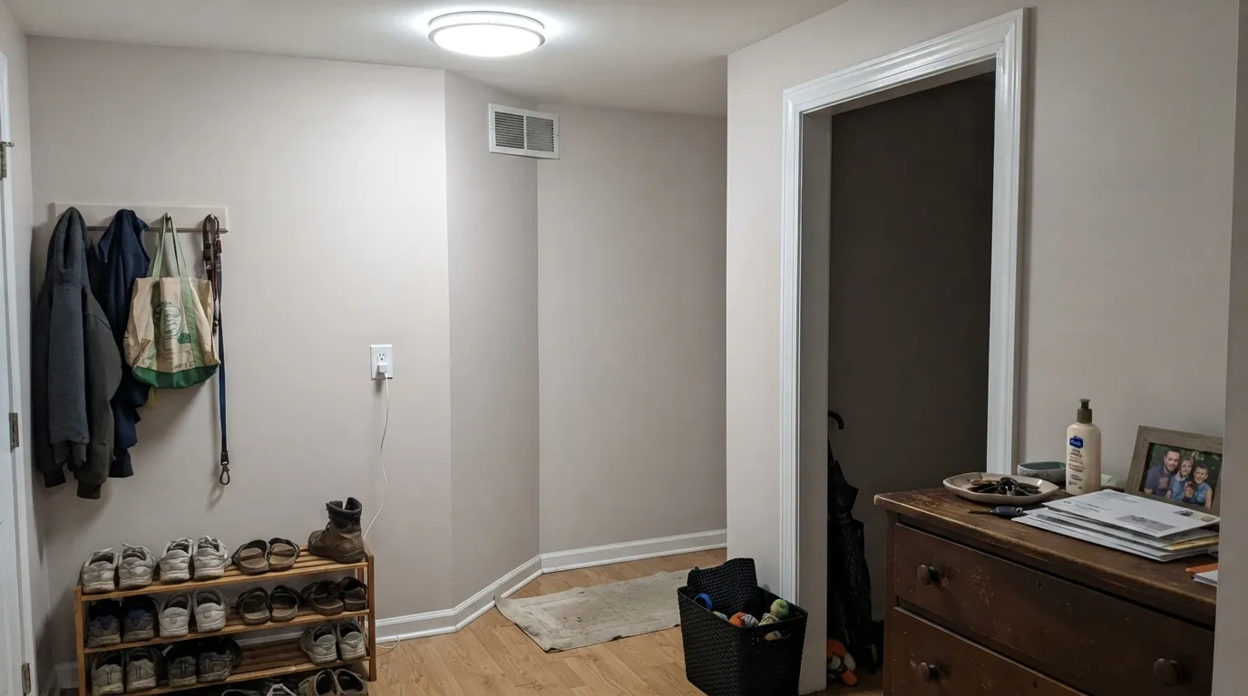
This is a wall color, not a trim white. Its own violet cast against a brighter wall color or a true-white ceiling is the single most common complaint about it; use Extra White or Snowbound for trim instead.
Full sun strips the undertone out and it reads as a plain, quiet off-white on a facade — a reasonable, low-risk exterior color, just not the moody indoor version.
Your Light Is the Risk
Full daylight brings the violet-pink forward just enough to feel intentional — warm, a little dusty, never flat. This is the light the color is built for.
Without direct sun the undertone goes muted and cool, and readers describe a dull lavender-gray cast rather than a warm off-white. Sample on the actual wall before committing a whole room.
Pink in the morning or evening sun hours, quieter and more gray-toned once the direct light passes. The shift is real but gentle — most owners like it.
2700K bulbs keep the warmth and let the pink read as cozy. Cool 4000K-plus LEDs pull out the violet and can make the walls look faintly lavender-gray — swap the bulbs before you blame the paint.
Most complaints about Incredible White are a light mismatch. Upload a photo of your actual room and see it on your walls — then ask for the same wall in north light or evening lamps before you buy a single sample.
Need It From Another Brand?
Any paint counter can custom-tint Sherwin-Williams SW 7028 directly. If you would rather stay in one brand's own deck, these are the closest stock matches, measured as ΔE2000. Under 2 is a difference you will not see on the wall.
| Brand | Closest color | ΔE | LRV | |
|---|---|---|---|---|
| Behr | Shaded HammockPPF-11 · Behr | 1.2 | 73 | Color page → |
| Benjamin Moore | Grandma's ChinaCSP-365 · Benjamin Moore | 1.7 | 72 | Color page → |
| Valspar | Ballroom Belle7001-9 · Valspar | 0.5 | 73.6 | Color page → |
| PPG / Glidden | SeagullPPG14-03 · PPG / Glidden | 1.5 | 73 | Color page → |
| Glidden | Silver Birch70YY 72/041 · Glidden | 1.0 | 72 | Color page → |
| Dutch Boy | Cotton Wood412-1DB · Dutch Boy | 1.8 | 74 | Color page → |
Similar Sherwin-Williams Colors
The nearest shades to Incredible White within Sherwin-Williams's own range, ranked by perceptual color distance — useful when you want the same look a touch lighter, darker, or warmer.
WCAG 2.1: AA is 4.5 : 1 for normal text, 3 : 1 for large text, AAA is 7 : 1.
Incredible White vs the Colors You're Also Considering
Every Incredible White sample board has the same rivals on it. The numbers show the real lightness gap — then it comes down to which risk you would rather live with.
Pick this when you want more depth and a moodier greige — Alabaster can look flat in a room that wants some weight.
Sherwin-Williams SW 7008 · LRV 82AlabasterPick this if you want a brighter, creamier white with none of the violet — Alabaster's one real trap is trim pairing, not undertone drama.
Pick this for walls that need more color and personality than a default white gives.
Sherwin-Williams SW 7005 · LRV 84Pure WhitePick this for trim, ceilings, or a true everyday white with no undertone guessing game.
Its closest Sherwin-Williams neighbor is Eider White SW 7014, hex #E2DED8 at LRV 73, which is a touch darker and slightly cooler and grayer. Mortar SW 9584 at #E3DFD5 and Aesthetic White SW 7035 at #E3DDD3 are warmer and more clearly cream. Nice White SW 6063 and Modest White SW 6084, both at #E6DDD4 and #E6DDD5 with LRV 74, are a little warmer again, and Moderne White SW 6168, hex #E2E0D7, is the coolest of the group.
Across brands, Valspar Ballroom Belle 7001-9 at deltaE 0.5, Behr Castle Beige N230-1 at 0.53, and Rodda Urban Calm R031 at 0.53 are effectively the same color. Glidden Silver Birch 70YY 72/041 at 1.02, Diamond Vogel Venetian Wall 0544 at 1.03, C2 Drabware BD4 at 1.45, PPG Seagull PPG14-03 at 1.53, and Benjamin Moore Grandma's China CSP-365 at 1.67 are visually identical in normal room light. Farrow and Ball Great White No. 2006 at 2.08 and Dunn-Edwards Winter's Edge DESS40 at 2.71 are very close, so sample first. Clare No Filter at 3.41 is close but visibly different side by side.
Incredible White Coordinating Colors
The rule for coordinating with Incredible White: give its violet-pink undertone something to play off, rather than surrounding it with the brightest white you can find. It handles black accents, warm mid-tone greiges, and softer whites well — and it argues with stark bright white the same way it argues with cool light. These are the partners that keep showing up in rooms that work:
The Name Problem: Why "Incredible White" Isn't White
Sherwin-Williams lists this color in its White Paint Colors family alongside Alabaster, Pure White, and Extra White — and that placement is arguably the color's biggest handicap. Colorimetry and independent reviewers keep landing on the same finding: underneath the gray-taupe base sits a real violet and pink undertone, unusual for a color this light and completely absent from the true whites it's filed next to. It isn't a defect or a batch inconsistency; it's just not what the family name implies.
The practical effect is a split in how people describe it. Owners who sampled it knowing it was a greige tend to call it warm, dusty, and a little moody — a compliment. Owners who bought it expecting a bright, clean white call the exact same paint dirty or purple. Same color, same LRV 74, two completely different reviews, and the difference is entirely about expectations set before the first coat went on.
Incredible White With Metals, Stone, and Wood
This color reads best next to materials with some weight of their own. Black iron fixtures, wrought-iron hardware, and dark stone fireplaces give the violet-pink undertone a reason to look intentional rather than accidental — the same logic that makes a plain gray wall come alive next to a black-framed window. Stainless steel and warm quartz counters do the same job in a kitchen.
Wood tones are more forgiving than the trim rule suggests: walnut, dark oak, and other mid-to-deep woods sit comfortably against it, since neither one is fighting for brightness. The one wood pairing to sample first is very pale, cool white oak — next to it, Incredible White's undertone can read slightly more purple than it does against a warmer wood, the same effect it has next to a bright white wall.
Three Ready Palettes Built on Incredible White
A color is never alone on the wall. These are complete combinations in the 60-30-10 pattern, with the reason each one holds together. Every one opens in the visualizer.
The near-black gives the wall's violet undertone something to play off, so it reads as an intentional warm greige instead of an accident. Extra White's extra brightness keeps the trim crisp rather than muddy — the one bright-white pairing that works because the depth gap is wide enough.
Try this palette in your roomTwo warm greiges from the same SW family hand off cleanly between the kitchen and the next room, and Snowbound's softer white trim doesn't fight the cabinets' violet undertone the way a starker white would. Best with granite, stainless steel, or warm quartz countertops.
Try this palette in your roomAnew Gray is a deeper warm greige from the same family, so the accent wall reads as a shade change rather than a new color; the near-black door supplies the one dark, grounding note the room needs. Best with east or south morning light.
Try this palette in your roomIncredible White FAQ
Is Incredible White actually white?
Not really — it's a soft greige with a documented violet-pink undertone underneath a gray-taupe base. At LRV 74 it's also darker than most colors people mean when they say "white." Think of it as a quiet, moody off-white rather than a wall white.
What undertone does Incredible White have?
Violet and pink, sitting on a gray-taupe base. That combination is unusual for a color this light — most soft whites lean yellow, beige, or blue instead. It shows most in south and east daylight and goes quiet and muted in flat, cool light.
Is it a good white for kitchen cabinets?
Yes, with the right countertops. Granite, stainless steel, and warm quartz all read well against it. Stark white counters or bright subway tile will expose the same violet drift that shows against bright trim, so sample it against your actual materials first.
What trim color goes with Incredible White walls?
A soft white with some warmth of its own — Snowbound is the safe match. A stark bright white like Extra White or Pure White can make the wall's violet undertone look like a mistake rather than a color choice, unless the trim sits far enough away (a black accent in between helps).
Does Incredible White work on an exterior?
It's a safe, low-risk exterior color, but not for the reason people expect: full sun washes the subtle violet-pink undertone almost flat, so it just reads as a plain off-white outdoors. If you picked it for its indoor personality, know that personality mostly stays inside.
Incredible White vs Alabaster — which should I pick?
Alabaster (LRV 82) is brighter and creamier with a straightforward warm-beige undertone — the safer, more predictable choice. Incredible White (LRV 74) is darker and moodier, with the violet-pink that either makes a room feel expensive or makes a buyer feel misled, depending on whether they knew what they were getting.
Have you painted with Incredible White?
Rate it — one tap helps the next reader decide.
Ask a Question