Origami White
Sherwin-Williams calls it a cool violet white. On a real wall it is not. Here is what Origami White actually does, and the rooms where it goes wrong.

Jessica has spec'd whites and neutrals for more than 300 rooms and keeps a sample wall of painted drawdowns in her studio. Every color review is checked against real reader rooms in the comments and re-tested when a formula changes. About the testing process →
- 1Heirloom Shade63
- 2First Star69
- 3Origami White76
- 4Alabaster82
- 5Chantilly Lace91
The Fast Verdict
Origami White is a soft, creamy off-white with real body to it — the kind of white that makes a room feel settled instead of sterile. At LRV 80 it still bounces plenty of light, so dim hallways and north bedrooms lift without going cold.
The catch is what you put next to it: beside a bright builder white it looks unwashed, and in strong afternoon sun the cream comes forward hard. Get the trim decision right and it is one of the easiest warm whites in the Sherwin-Williams deck.
North-facing rooms that feel cold · whole-house walls with wood floors · soft monochrome trim-and-wall schemes · exteriors with dark shutters
Your trim stays a bright builder white · your counters are cool gray quartz or Carrara · you want a crisp gallery white · the room already has beige tile you cannot change
- Warms up cold north rooms without ever looking yellow in that light
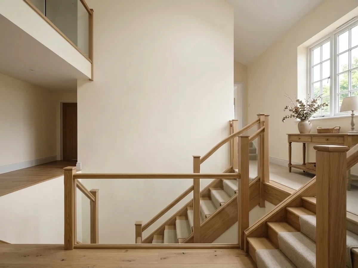
- LRV 80 lifts windowless halls and stairwells that gray whites make flat
- Wall-and-trim monochrome schemes look intentional, not lazy
- Flatters oak, walnut, rattan, brass and aged bronze
- Hides scuffs and handprints far better than a bright white
- Reads dingy next to any brighter white — the most common complaint
- Goes pale butter in strong west and late-afternoon sun
- Sherwin-Williams labels the undertone cool violet, which is misleading
- Disappears into warm beige tile and cream counters
What Color Is Origami White, Really?
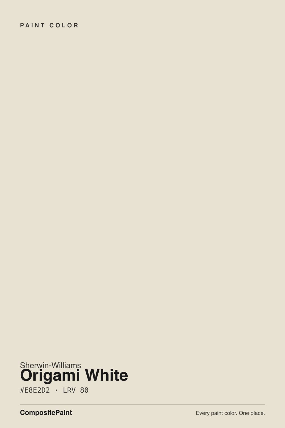
Sherwin-Williams lists Origami White under cool violet undertones, and that description sends people down the wrong path. On a wall it is warm. The base reads as a soft taupe-cream — yellow-leaning, with just enough gray in it to stop the whole thing turning butter. The violet only ever shows up as a faint gray-mauve edge when the color sits beside a strong yellow, and most people will never see it. If you are shopping for a cool white because the fan deck told you this one was cool, keep walking.
At LRV 80 it is genuinely light, but it is an off-white, not a white. Put it next to Pure White SW 7005 and the gap is immediate — Pure White reads clean and slightly cold, Origami White shows its cream and its weight. That weight is the point. On a wall it softens shadows and flatters oak and walnut; on trim it looks like painted woodwork instead of vinyl. It is the difference between a room that feels finished and a room that feels primed.
Undertone in one line: warm cream with a gray backbone — never pink, never green, and only theoretically violet.
Where It Shines
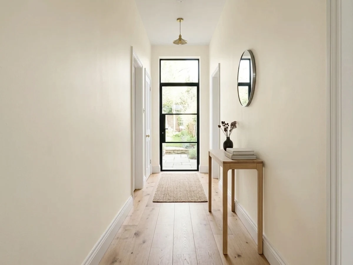
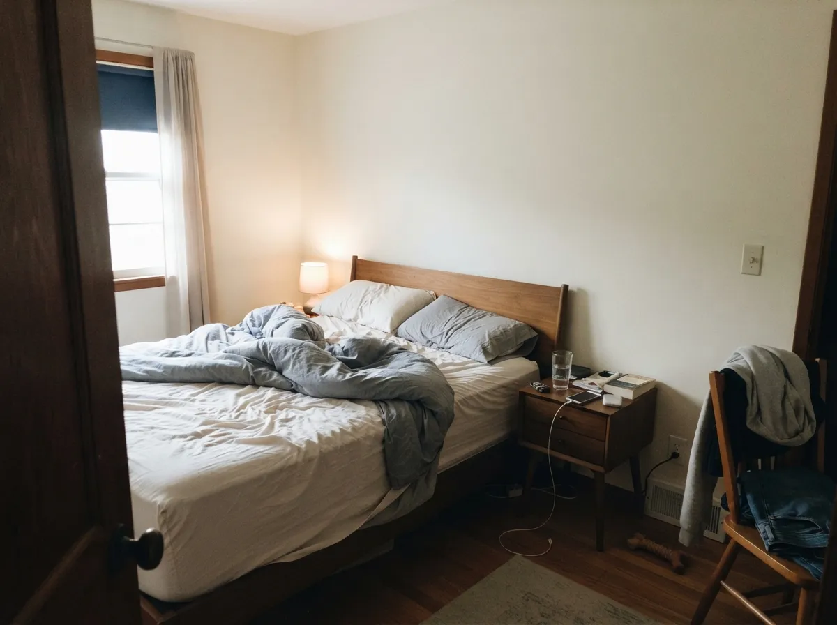
Its best work happens where a cooler white would go gray. North bedrooms, interior hallways, stairwells with one small window — Origami White returns the light without draining the warmth out of the room. Add wood floors and brass or bronze hardware and it stops looking like a paint choice and starts looking like the room was always that color.
Where It Fails
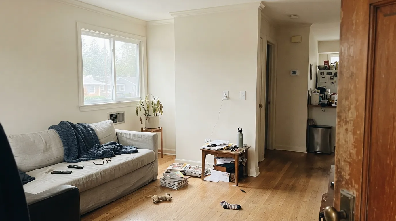
The bad stories about Origami White are almost never about the paint film. They are about what is sitting next to it. Three situations account for nearly every complaint, and all three are visible before you open the can.
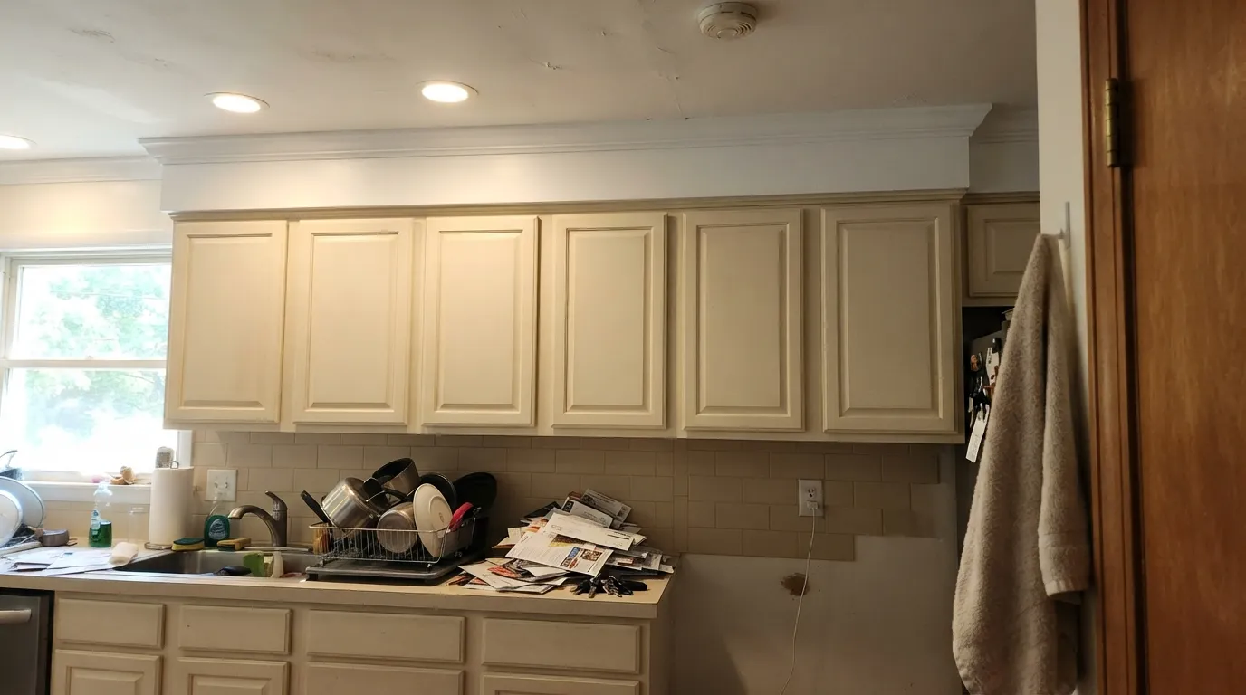
This is the number one regret. Origami White cabinets look warm and soft on their own, but the moment a bright builder white crown or ceiling is above them, the cabinets read dingy — people describe it as looking like white paint that has aged badly. Either run the trim in Origami White too, or use Alabaster SW 7008 on the cabinets, which holds its own against a brighter white.
Late sun is orange, and Origami White has nothing cool in it to push back. Across a big wall the cream turns to pale butter for two hours a day, then settles down. If your main living space faces west and that bothers you, Shoji White SW 7042 does the same job with more gray holding the yellow down.
Against fixed finishes that are already warm, Origami White stops reading as a white at all — it goes muddy and the room looks like one flat beige smear with no edges. Go cleaner with Pure White SW 7005 so the walls separate from the tile, or commit the other direction and put Accessible Beige SW 7036 on the walls on purpose.
Room by Room
Eggshell walls, and let the floors and furniture carry the contrast. It is at its best with white oak, walnut, leather and jute. If the room faces due west, sample the wall that gets the four o'clock sun before you commit.
Satin on the doors, and the trim and ceiling should be Origami White or something equally soft. Pair with Urbane Bronze SW 7048 on an island and unlacquered brass or bronze pulls. Bright white crown above these cabinets is the fastest way to hate them.
North-facing bedrooms are where it earns the money, because the cool daylight cancels most of the cream and leaves a quiet, soft white. Under 2700K lamps at night it warms up and stays cozy. Eggshell or matte.
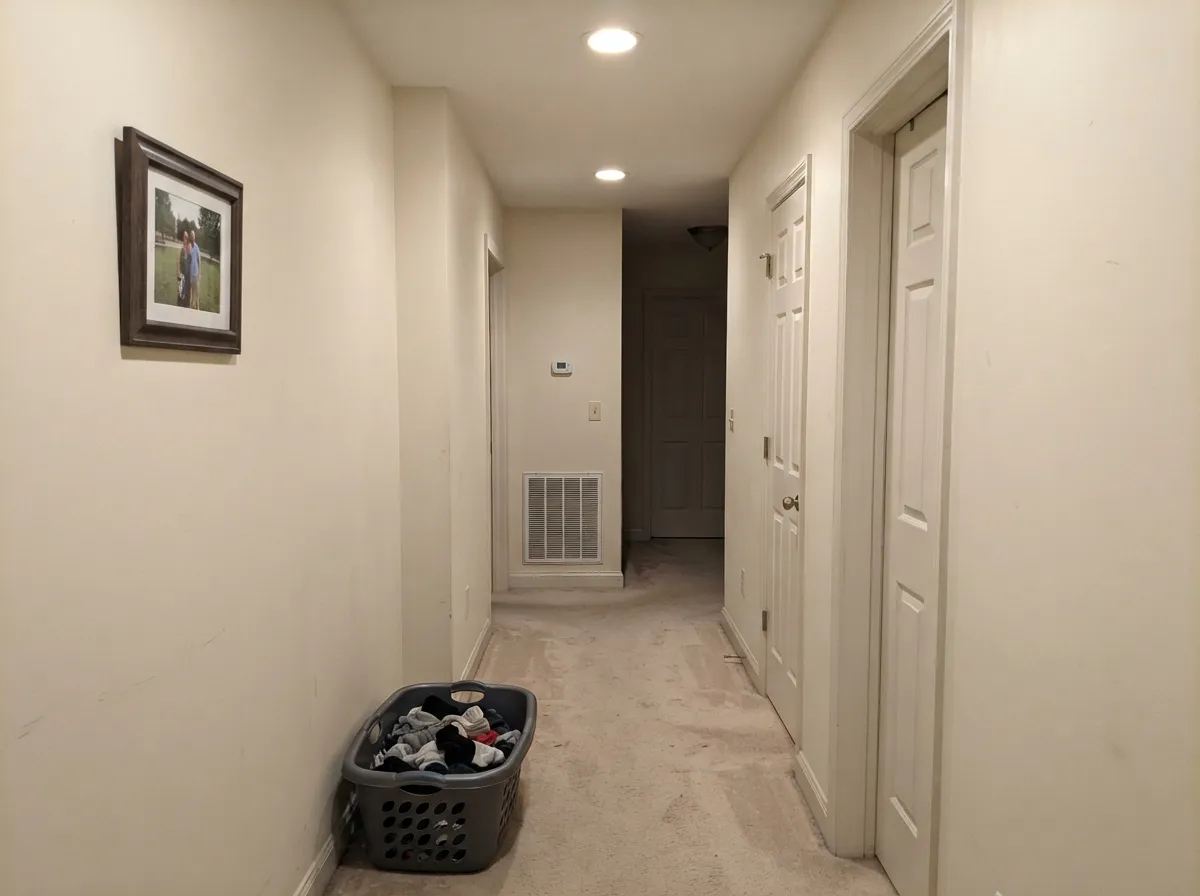
Windowless halls are the classic problem room, and at LRV 80 this bounces enough light to fix them without the blue-gray flatness a cooler white gives you. Run it straight into the adjoining rooms so nothing changes at the doorways.
With warm marble, wood vanities and bronze fixtures it is lovely. With cool gray quartz, Carrara, or blue-gray tile it turns yellow by comparison — use Snowbound SW 7004 in those rooms instead.
In full sun it reads brighter and cleaner than it does indoors, which makes it a forgiving body color. It needs a dark frame: Iron Ore SW 7069 shutters or Urbane Bronze SW 7048 trim. Details in the exterior section below.
Your Light Is the Risk
Cool daylight cancels the cream. You get a soft, quiet white with no chill. Its strongest room.
Direct warm sun pushes the yellow forward across big walls. Test the sunniest wall first.
2700K lamps deepen it to a warm cream. 3500K to 4000K keeps it closer to white.
Halls and interior baths with only LED cans: it stays light and never turns gray.
Most complaints about Origami White are a light mismatch. Upload a photo of your actual room and see it on your walls — then ask for the same wall in north light or evening lamps before you buy a single sample.
Need It From Another Brand?
Any paint counter can custom-tint Sherwin-Williams SW 7636 directly. If you would rather stay in one brand's own deck, these are the closest stock matches, measured as ΔE2000. Under 2 is a difference you will not see on the wall.
| Brand | Closest color | ΔE | LRV | |
|---|---|---|---|---|
| Behr | PolishedUL200-11 · Behr | 0.9 | 76 | Color page → |
| Benjamin Moore | Silver Satin856 · Benjamin Moore | 1.0 | 75 | Color page → |
| Valspar | PermafrostV159 · Valspar | 1.4 | 76 | Color page → |
| PPG / Glidden | Mountain GrayPPG1021-1 · PPG / Glidden | 1.0 | 76 | Color page → |
| Glidden | ParaffinPPG14-31 · Glidden | 0.6 | 75 | Color page → |
| Dutch Boy | Moon Pie406-1DB · Dutch Boy | 0.6 | 75 | Color page → |
Similar Sherwin-Williams Colors
The nearest shades to Origami White within Sherwin-Williams's own range, ranked by perceptual color distance — useful when you want the same look a touch lighter, darker, or warmer.
WCAG 2.1: AA is 4.5 : 1 for normal text, 3 : 1 for large text, AAA is 7 : 1.
Origami White vs the Colors You're Also Considering
Every Origami White sample board has the same rivals on it. The numbers show the real lightness gap — then it comes down to which risk you would rather live with.
Pick this for more warmth and softness, especially in cold north rooms.
Sherwin-Williams SW 7008 · LRV 82AlabasterPick this if bright white trim is staying — Alabaster survives that pairing.
Pick this when you want the lighter, brighter version of the same warmth.
Sherwin-Williams SW 7011 · LRV 73Natural ChoicePick this for a slightly deeper, more forgiving beige-white on big walls.
Origami White's closest neighbors all sit a few points below it. Nacre SW 6154 at LRV 76, Panda White SW 6147 at LRV 77, and Porcelain SW 53 at LRV 76 are slightly less reflective, which in a dark room is the difference between walls that lift and walls that sit still. Panda White at #EAE2D4 is the closest of the three in hex.
Steamed Milk SW 7554 and Casa Blanca SW 7571, both at LRV 76, push further into cream at #ECE1D1 and #EDE1CE. Pick those if you want a creamier room rather than a white one. Radiant Dawn SW 9661 at LRV 75 is the deepest and warmest of the group.
Across brands, C2 Linger C2-899 and Dutch Boy Washed Cotton 014W are a straight match, and Behr Elk Horn ECC-47-2 is close enough to call the same on a wall. Benjamin Moore French Macaroon CSP-335 and Farrow and Ball Dimity No. 2008 are visually identical in normal room light.
Origami White Coordinating Colors
The rule with Origami White is that partners should be either clearly warmer and deeper, or clearly darker — anything that sits half a step away in the same warm-light range will read as a mistake rather than a choice. Muted greens, warm greiges, bronzes and deep navies all flatter it. Cool grays and icy blues make it look yellowed.
These are the colors that come up again and again in real Origami White schemes:
Origami White on Cabinets and Trim
Cabinets are where this color makes people happiest and angriest, and the difference between the two outcomes is one decision: what white is touching them. On their own, Origami White doors look soft, slightly aged, and expensive — the opposite of the flat factory white that dates a kitchen in five years. Put a bright builder-white ceiling or crown directly above them and your eye reads the cabinets as dirty. There is no sheen or extra coat that fixes it.
So pick a lane. Either take the trim, crown and ceiling to Origami White as well and let the sheen change do the separating, or move the cabinets to Alabaster SW 7008 or Snowbound SW 7004, both of which have enough brightness to survive next to a clean white. For hardware, bronze and unlacquered brass sit naturally with it; polished chrome makes it look yellower than it is.
As a trim color under a mid-tone wall — greige, sage, muted blue — Origami White is genuinely good. Semi-gloss, and the contrast stays soft where a stark white would cut a hard line around every door.
Origami White on Exteriors
Outside it behaves better than its soft interior reputation suggests. Full sun washes every white brighter, and in Origami White's case that works in your favor — the cream that can feel heavy on an interior wall reads as warmth on siding, without the blue glare a cheap bright white gives a facade. It sits comfortably against red brick, warm stone, and cedar, which is exactly where cooler whites tend to fight.
It needs a dark frame to look deliberate. Iron Ore SW 7069 or Urbane Bronze SW 7048 on shutters, trim and the garage door gives you the contrast the body color will not supply on its own; Naval SW 6244 is the door color if you want one bright note. Two things to check before you commit: the shaded north elevation will read a full step creamier than the sunny side, and if your roof is a cool blue-gray, hold a large sample against it — that combination is the one that makes the siding look yellowed.
Three Ready Palettes Built on Origami White
A color is never alone on the wall. These are complete combinations in the 60-30-10 pattern, with the reason each one holds together. Every one opens in the visualizer.
One color at two sheens removes the bright-trim problem entirely, so the cream never looks dingy and the millwork still separates. The bronze door supplies the single dark note a 60-30-10 scheme needs when the 60 and the 30 are the same color.
Try this palette in your roomCabinets are the 60 percent surface in a kitchen, and Accessible Beige sits close enough in undertone that the wall-to-cabinet handoff stays soft instead of competing. Iron Ore on the island is the 10 percent that stops the whole room reading as one warm blur.
Try this palette in your roomEvergreen Fog is a muted, gray-green that borrows the same softness, so it adds a color note without waking the room up. Pure White stays overhead only, where the plane change hides the brightness gap that would look dirty on trim.
Try this palette in your roomOrigami White FAQ
Is Origami White warm or cool?
Warm, despite what the Sherwin-Williams description says. The official listing calls it a cool violet white, and that is the single biggest source of confusion around this color. On an actual wall it reads as a soft taupe-cream. The violet only appears as a faint gray edge next to strong yellows.
Does Origami White look yellow?
In north light, no — the cool daylight cancels most of the cream. In direct south or west sun on a large wall, yes, it can tip toward pale butter for a couple of hours. Warm 2700K bulbs do the same thing at night. Sample the sunniest wall in the room, not a chip on a table.
Is it good for kitchen cabinets?
Yes, but only if the trim and ceiling go soft too. Origami White cabinets under bright builder-white crown molding look dingy, and that is the most common regret people post about this color. Use satin in a urethane-fortified cabinet paint, and pair with bronze or unlacquered brass hardware.
What trim white goes with Origami White walls?
Origami White itself in semi-gloss is the safest answer, and it looks intentional in rooms with a lot of millwork. If you want visible contrast, Pure White SW 7005 works but it will make the walls look creamier by comparison. Never use a warmer, creamier trim white — the walls are already the warm element.
Origami White or Alabaster?
Alabaster SW 7008 is the more popular pick and it is slightly brighter and more neutral, so it holds up next to bright white trim and cool counters. Origami White is warmer and heavier, which is what you want in a cold north room or a windowless hall. If your trim is staying bright, choose Alabaster.
Does it work on a whole house?
It is one of the better whole-house whites because it holds its character across different exposures instead of flipping gray in the north rooms and yellow in the south. Run it through halls, bedrooms and living spaces, keep the trim consistent, and give the darker accent job to a door or an island.
How many coats do you need?
Two over any existing light color. Over a dark or saturated wall, use a gray-tinted primer first — an off-white this soft has weak hiding power, and people routinely burn three finish coats trying to cover red or navy without it.
Have you painted with Origami White?
Rate it — one tap helps the next reader decide.
Ask a Question