White Heron
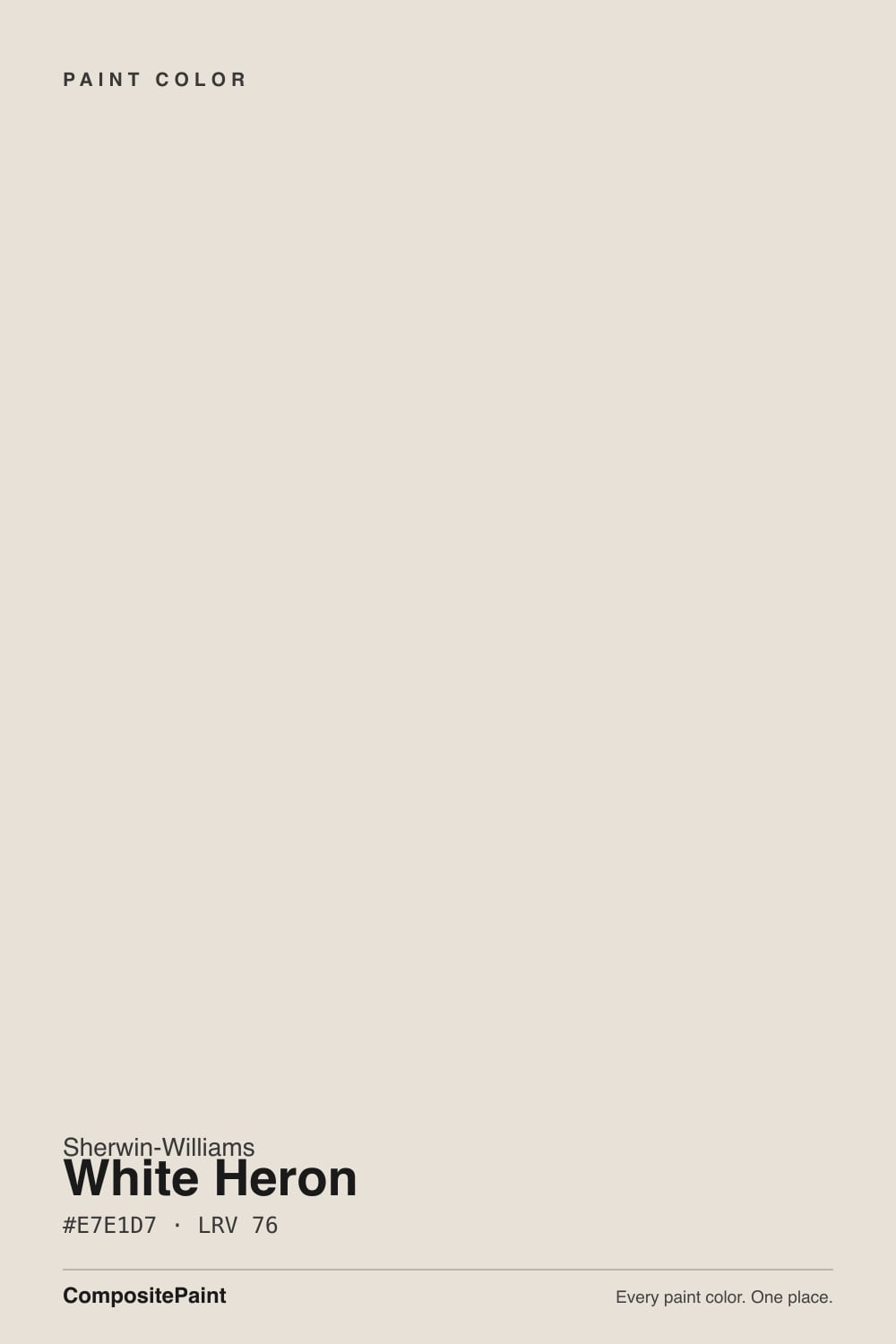
SW 7627 · #E7E1D7 · LRV 76 — warm red-orange tone, very light — near-white, broadens small spaces.
- 1Agreeable Gray60
- 2Pale Oak69
- 3White Heron76
- 4Dover White83
- 5Moonlit Beach88
What Color Is White Heron, Really?
White Heron SW 7627 is a soft warm white. Its hex value is #E7E1D7 and its LRV is 76, near the top of the light range, so it reflects most of what hits it and reads clearly as a white on a wall. The hue sits at 37 degrees with 25 percent saturation, which is a genuine warm red-orange base. That is more warmth than most off-whites carry, and it is what gives the color its soft, slightly creamy character rather than a crisp one.
People choose it when a pure white feels sharp and a beige feels too colored. At LRV 76 it brightens a room the way a white does, but the warmth keeps walls, trim, and cabinetry looking settled instead of clinical. It sits comfortably with oak, stone, linen, and brass, which is why it shows up in traditional and transitional interiors as well as on exteriors.
The catch is that warmth is real, not decorative. In strong south or west light White Heron can look distinctly cream, and next to a cool white or a gray-blue it will look yellow. In cool north light it settles down and reads much closer to a plain white. Sample it beside a true white before you decide how warm you actually want the room.
White Heron leans warm and does not hide it. The hue reads at 37 degrees, squarely in the cream and tan range, and at 25 percent saturation there is more color under the surface than in most off-whites. The very high lightness keeps that warmth gentle, so it looks soft rather than yellow, but it is always there.
What sits next to it decides how loud the warmth reads. Next to a clean, blue-based white it looks obviously creamy. Next to a beige or a greige it flips and can read almost like a plain white. Against warm oak, terracotta, and brass it disappears into the scheme in a good way.
Before committing, put a sample between a true white and a warmer cream at the same time. That three-way comparison is the quickest way to tell whether White Heron is warm enough for the mood you want or already a step past it.
Best Rooms and Uses for White Heron
White Heron is a whole-home warm white. On walls it brightens bedrooms, living rooms, hallways, and dining rooms while keeping them soft, and it is particularly good in north-facing rooms that need warming. In a room that already gets heavy afternoon sun, expect it to read creamier than it does on the chip.
Its other strength is millwork. Trim, doors, baseboards, and crown molding painted in White Heron look settled rather than sharp, and on kitchen and bath cabinetry the warmth reads custom instead of builder-grade while hiding minor surface flaws better than a stark white would.
Outdoors it works as a warm body or trim color, pairing naturally with wood, stone, and brick. Because it is quiet by nature, it is not a contrast color. Use it as the calm field and let a dark door, shutter, or island carry the drama.
How Lighting Changes White Heron
At LRV 76 White Heron stays bright in any room, so light steers its warmth rather than its lightness. North-facing rooms are its easiest home. The cool, flat daylight tames the red-orange base and the color reads as a clean, soft white, which makes it a reliable pick for rooms that usually feel chilly.
South and west light do the opposite. Strong warm sun brings the cream forward, and by late afternoon a west-facing wall can look noticeably yellow. East rooms warm in the morning and settle by midday.
Bulbs push it just as hard. Warm 2700K lamps deepen the cream, which can feel cozy in a bedroom and too yellow in a kitchen. Bulbs around 4000K hold it closer to a neutral white. Because the color has 25 percent saturation to work with, the swing between those two readings is larger than with a near-neutral white, so check it at night.
Most complaints about White Heron are a light mismatch. Upload a photo of your actual room and see it on your walls — then ask for the same wall in north light or evening lamps before you buy a single sample.
Need It From Another Brand?
Any paint counter can custom-tint Sherwin-Williams SW 7627 directly. If you would rather stay in one brand's own deck, these are the closest stock matches, measured as ΔE2000. Under 2 is a difference you will not see on the wall.
| Brand | Closest color | ΔE | LRV | |
|---|---|---|---|---|
| Behr | Cinnamon Cake (w-f-220)W-F-220 · Behr | 0.5 | 76 | Color page → |
| Benjamin Moore | EtiquetteAF-50 · Benjamin Moore | 0.8 | 74 | Color page → |
| Valspar | Over the MoonV181 · Valspar | 1.7 | 76.2 | Color page → |
| PPG / Glidden | Stone HarborPPG1079-2 · PPG / Glidden | 0.8 | 75 | Color page → |
| Glidden | ParaffinPPG14-31 · Glidden | 0.9 | 75 | Color page → |
| Dutch Boy | Moon Pie406-1DB · Dutch Boy | 0.9 | 75 | Color page → |
Similar Sherwin-Williams Colors
The nearest shades to White Heron within Sherwin-Williams's own range, ranked by perceptual color distance — useful when you want the same look a touch lighter, darker, or warmer.
WCAG 2.1: AA is 4.5 : 1 for normal text, 3 : 1 for large text, AAA is 7 : 1.
White Heron vs Similar Colors
Zurich White SW 7626 at LRV 76 and hex #E6E1D9 is the nearest sibling, a shade less golden. Porcelain SW 53 at LRV 76 and #E9E0D5 goes the other way and reads more openly cream. Heron Plume SW 6070 at LRV 75 and #E5E1D8 is slightly softer and greyer, a useful option if White Heron looks too warm in afternoon sun.
Across brands the matches are unusually tight. Behr Cinnamon Cake W-F-220 at LRV 76 is a delta E of 0.5 from White Heron and Diamond Vogel August Moon 0194 at LRV 75 is 0.57, both close enough to call the same color. Benjamin Moore Etiquette AF-50 at LRV 74 is 0.84 away and PPG Stone Harbor PPG1079-2 at LRV 75 is 0.82.
Farrow and Ball Dimity No. 2008 at LRV 76 is 1.84 away, visually identical in normal room light, and Magnolia Home Blanched JG-103 at LRV 76 is 3.03, very close but worth sampling first.
Colors That Go With White Heron
If you want the trim to read crisper than the walls, step to a cleaner white so the contrast comes from temperature rather than brightness. If you want a seamless, millwork-heavy room, run White Heron on walls and trim together and let the profiles do the work.
For a soft tonal scheme, its Sherwin-Williams neighbors sit within a point. Zurich White SW 7626 at LRV 76 and Sanctuary SW 9583 at LRV 76 are close cousins with slightly different leans. Heron Plume SW 6070 at LRV 75 and Sunbleached SW 9585 at LRV 75 are marginally softer, and Porcelain SW 53 at LRV 76 is the creamiest of the group.
Materials matter more than a second paint color here. White oak, walnut, rattan, unlacquered brass, and warm stone all flatter the red-orange base. Polished chrome and cool blue-white marble tend to make it look yellow by comparison, so pair those carefully.
Coordinated palette
Generated by hue-rotating #E7E1D7 in HSL space. Pair White Heron with one accent and one neutral — the swatches below are starting points, not final picks.
White Heron FAQ
Is White Heron warm or cool?
It is a warm white. The base hue is a red-orange at 37 degrees with 25 percent saturation, which is more warmth than most off-whites carry. At LRV 76 that warmth stays soft rather than yellow, but it is real, and it will show against a cool white or a gray-blue.
What LRV is White Heron?
White Heron has an LRV of 76. Light reflectance value runs from 0 for black to 100 for pure white, so at 76 the color reflects most of the light in a room. It brightens small and dark spaces and makes rooms feel more open, without the glare that a near-100 white can throw.
Does White Heron look yellow?
It can in strong warm light. With 25 percent saturation on a red-orange base, White Heron leans cream by nature, and in south or west sun late in the day it will look distinctly yellow-cream. In cool north light or under 4000K bulbs it settles down and reads much closer to a plain soft white.
Does White Heron work in a dark room?
Yes, and north-facing rooms are where it does its best work. At LRV 76 it gives back most of the available light, and the warm base counteracts the cold, flat quality of north daylight rather than amplifying it the way a cool white does. In a windowless space, warm bulbs will push it further toward cream.
What white trim goes with White Heron?
A cleaner, less warm white gives the crispest edge, since the contrast comes from temperature rather than a big jump in brightness. Many people also paint walls and trim both in White Heron for a soft monochrome look, which works well in rooms with a lot of molding. Avoid a bright blue-based white, which will make the walls read yellow.
Is White Heron good for cabinets and exteriors?
Yes to both. On cabinets the soft warmth looks custom rather than builder-grade and hides minor imperfections better than a stark white does. Outdoors it holds up as a warm body or trim color, sitting naturally beside wood, stone, and brick, and it works as the calm field behind a darker door or shutter.
Have you painted with White Heron?
Rate it — one tap helps the next reader decide.
Ask a Question