Sunbleached
A pale driftwood beige-gray from Sherwin-Williams with almost no online reputation, reviewed honestly: where it glows warm, where it flattens to nothing, and what to pick instead.

Jessica has spec'd whites and neutrals for more than 300 rooms and keeps a sample wall of painted drawdowns in her studio. Every color review is checked against real reader rooms in the comments and re-tested when a formula changes. About the testing process →
- 1Agreeable Gray60
- 2Pale Oak69
- 3Sunbleached75
- 4Dover White83
- 5Moonlit Beach88
The Fast Verdict
Sunbleached is a pale, warm-leaning beige-gray that Sherwin-Williams files under its white paint colors even though it reads closer to a soft greige on the wall. There is no Color of the Year moment behind it and almost no reader chatter to draw on — this is an honestly obscure color, not a famous one. What it does well: a calm, driftwood-quiet neutral that stays out of the way of wood, linen and stone. What it risks: at LRV 75 the undertone is faint enough that cool light or the wrong trim can make it read like nothing at all.
Whole-house walls in a home with real daylight · coastal, Scandinavian or modern-minimalist rooms · pairing with light wood, linen and stone · anyone who wants quiet over a statement
Your room runs on cool LEDs with little daylight · you want a neutral with an obvious personality · your trim is a much brighter white · you were hoping for a color with a known track record
- Genuinely calm, low-drama neutral — quiet without going cold
- Pairs cleanly with light wood, linen, jute and unlacquered brass
- Reads warm-sand in real daylight without tipping yellow
- High LRV keeps rooms feeling open and light-filled
- A safe whole-house choice if the house already has good light
- So subtle it can read as no color at all in a bright room
- Cool LEDs and north light flatten it toward chalky gray
- Dulls next to a brighter trim white
- Almost no real-world track record to check your expectations against
What Color Is Sunbleached, Really?
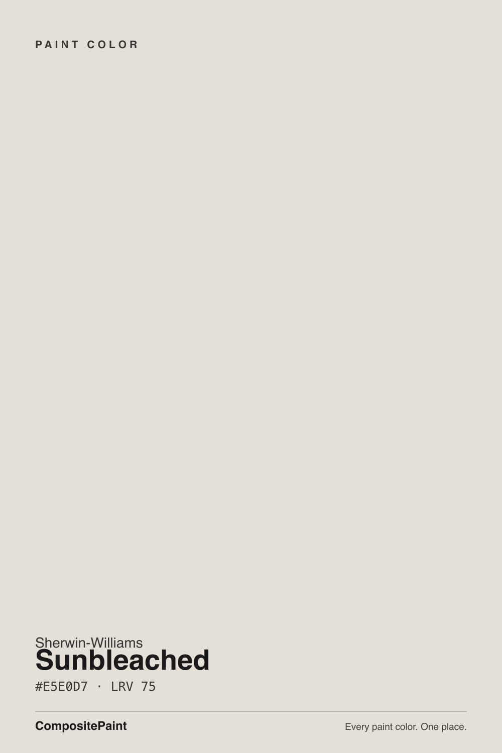
A pale, muted beige-gray — hex #E5E0D7, RGB 229, 224, 215 — with a faint warm cast and almost no saturation. Sherwin-Williams groups it with its white paint colors, which says more about the LRV than the undertone: on the wall this reads as a soft, sandy neutral, closer in spirit to a quiet greige than to a true white. Independent color-blog descriptions converge on the same language without disagreeing — "driftwood," "weathered stone," "sun-dappled" — which lines up with what the numbers show: a warm-neutral with the saturation turned almost all the way down.
At LRV 75 it sits in the same light-reflectance neighborhood as Benjamin Moore Silver Satin and just a step brighter than Sherwin-Williams White Duck and Oyster White — light enough to keep a room feeling airy, but with meaningfully less punch than the LRV 82–92 whites like Alabaster or Extra White. That gap matters: Sunbleached will not read bright-white in a photo, and it will not compete with true whites on trim.
Undertone in one line: faint warm beige with a whisper of gray — never distinctly yellow, never distinctly blue. It is quiet enough that the room's own light does most of the talking; in warm daylight it leans sandy, in cool daylight it leans toward a pale, chalky gray.
Where It Shines
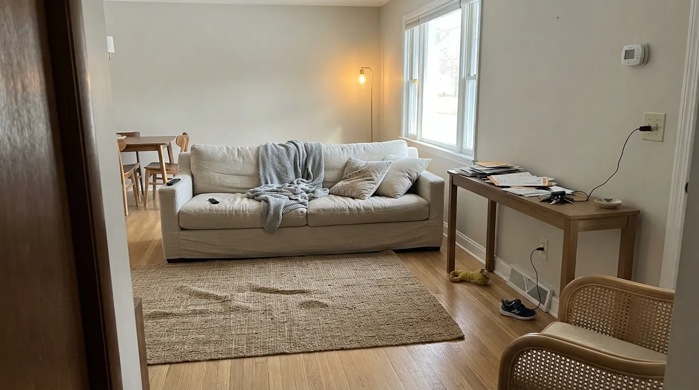
Give it real daylight and natural materials and it disappears in the best way — the wall stops being a color decision and starts being a calm backdrop. It is built for the coastal-minimalist playbook: light oak or white oak floors, linen upholstery, jute and rattan, unlacquered brass. In a sunlit room with those materials it reads exactly like its name — bleached, soft, sun-warmed — without ever tipping into beige-yellow the way older "builder beige" colors do.
Where It Fails
Because this color has almost no public track record — no viral rooms, no Reddit horror stories, no Houzz threads to mine — the honest failure modes here come from the color itself: a very light, very low-saturation neutral behaves in predictable ways, and these are the three that will actually happen in a real house.
At LRV 75 with almost no saturation, Sunbleached is quiet by design. In a bright room with light furniture it can read as close to nothing — a slightly warm off-white rather than a color with its own identity. If you want a wall people notice, this is the wrong pick; it was never built to be noticed.
The faint warmth in this color depends on the light supplying some warmth back. Under cool-white LED bulbs or in a north-facing room with little sun, the beige drains out and what's left is a pale, slightly chalky gray — not unpleasant, but not what the sandy, driftwood description promises.
This is the standard off-white trap, and Sunbleached is not immune: put a much brighter white (Extra White, Chantilly Lace) on the trim and the wall will look dingy by comparison. Keep the trim close in value — Sunbleached itself in semi-gloss, or a soft warm white like Alabaster — rather than reaching for the whitest can on the shelf.
Room by Room
A calm, uncomplicated backdrop for light wood furniture and linen upholstery. Eggshell finish; needs at least one real window to keep the warmth alive.
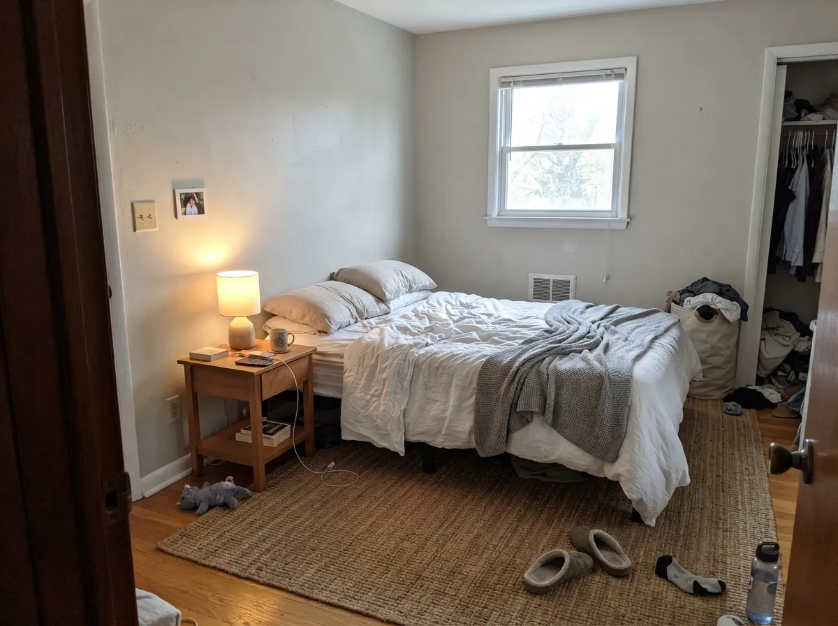
The low-drama profile that works well for a room meant to relax you. Pair with warm 2700K bedside lamps so it doesn't drift chalky after dark.
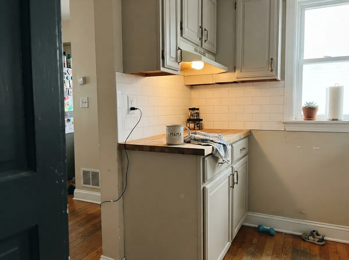
A reasonable cabinet color with brass hardware and butcher block, but it will not carry a kitchen the way a warmer, more saturated off-white does. Satin finish for wipeability.
Fine with warm-toned stone or wood vanities; against cool gray marble or blue-gray tile it will lean toward flat gray rather than warm sand.
Works as a soft trim white under mid-tone greige or sage walls, as long as nothing brighter is competing for attention in the same sightline.
No documented exterior track record turned up in research — treat any exterior use as a genuine test-patch situation, not a known quantity. Full sun should read it lighter and warmer than indoors, consistent with any LRV 75 neutral.
Your Light Is the Risk
Direct warm daylight brings out the sandy, driftwood cast the name promises — the color at its most itself.
Cool, flat daylight drains the warmth and leaves a pale, slightly chalky gray. Sample it on an actual gray day before committing.
East-facing rooms run soft and warm in the morning, more neutral by afternoon; west-facing rooms stay calm and neutral in the morning, then warm up toward sunset.
Warm 2700K bulbs keep the beige alive and cozy after dark. Cool-white LEDs push it crisper and grayer — swap the bulb before you swap the paint.
Most complaints about Sunbleached are a light mismatch. Upload a photo of your actual room and see it on your walls — then ask for the same wall in north light or evening lamps before you buy a single sample.
Need It From Another Brand?
Any paint counter can custom-tint Sherwin-Williams SW 9585 directly. If you would rather stay in one brand's own deck, these are the closest stock matches, measured as ΔE2000. Under 2 is a difference you will not see on the wall.
| Brand | Closest color | ΔE | LRV | |
|---|---|---|---|---|
| Behr | Light SandstoneECC-15-2 · Behr | 0.9 | 75 | Color page → |
| Benjamin Moore | Classic Gray1548 · Benjamin Moore | 1.0 | 74 | Color page → |
| Valspar | Wispy White7006-1 · Valspar | 0.9 | 74.9 | Color page → |
| PPG / Glidden | Stone HarborPPG1079-2 · PPG / Glidden | 1.0 | 75 | Color page → |
| Glidden | ParaffinPPG14-31 · Glidden | 0.5 | 75 | Color page → |
| Dutch Boy | Moon Pie406-1DB · Dutch Boy | 0.5 | 75 | Color page → |
Similar Sherwin-Williams Colors
The nearest shades to Sunbleached within Sherwin-Williams's own range, ranked by perceptual color distance — useful when you want the same look a touch lighter, darker, or warmer.
WCAG 2.1: AA is 4.5 : 1 for normal text, 3 : 1 for large text, AAA is 7 : 1.
Sunbleached vs the Colors You're Also Considering
Every Sunbleached sample board has the same rivals on it. The numbers show the real lightness gap — then it comes down to which risk you would rather live with.
Pick this when you want the quieter, more neutral version with less risk of a green tell.
Sherwin-Williams SW 7010 · LRV 74White DuckPick this if you want more visible warmth and a hint of green in the mix — White Duck commits harder to being a color.
Pick this for the Sherwin-Williams equivalent of the same quiet, near-white territory.
Benjamin Moore 856 · LRV 75Silver SatinPick this for almost the identical LRV in the Benjamin Moore deck — pick by which brand your painter already stocks.
Sunbleached Coordinating Colors
Because the color itself stays so quiet, the coordinating choices carry more of the room's personality than usual. Warm whites keep the trim from fighting the walls, a deeper greige gives the palette weight where Sunbleached alone can't, and a muted green-blue or a near-black supplies the one note of contrast a very pale, very quiet neutral needs somewhere in the room.
A Quiet Color, Not a Famous One
Some colors in this deck arrive with a track record: a Color of the Year title, a viral renovation, years of forum arguments about whether it goes blue or gray. Sunbleached has none of that. It's a newer, low-key entry in Sherwin-Williams's white-paint family — filed there on LRV alone — with a small footprint of coverage online and no documented famous room behind it. That is not a knock on the color; it just means there is less crowd-tested data to lean on than for a color like White Dove or Agreeable Gray.
What that means in practice: the described undertone — sandy, driftwood, warm-with-a-whisper-of-gray — is consistent across the independent sources that cover it, and it matches what the hex value predicts. But specifics like exterior performance, resale reaction, or how it behaves against a dozen different floor tones simply haven't been tested in public the way older, more famous neutrals have. Sample generously and treat your own walls as the real data point.
Sunbleached With Wood Tones and Floors
This color was built to sit next to natural materials, and it shows: light oak, white oak, and driftwood-finished floors all read as a continuous, sun-washed palette with Sunbleached on the walls — the effect the name is going for. Rattan, jute rugs, linen upholstery and unlacquered brass all sit comfortably in the same low-saturation register.
Darker or more orange-leaning wood — honey oak, cherry, mahogany — will read as the more dominant note in the room, since Sunbleached doesn't have enough color of its own to hold its ground against a strongly warm floor. That isn't a clash the way it would be with a true gray, but the floor will do more of the talking than the wall does.
Three Ready Palettes Built on Sunbleached
A color is never alone on the wall. These are complete combinations in the 60-30-10 pattern, with the reason each one holds together. Every one opens in the visualizer.
The sandy walls and a watery green-blue accent are the coastal-minimalist pairing this color was built for; keep the trim only a step brighter than the walls so Sunbleached doesn't read dingy by comparison.
Try this palette in your roomWhite Dove keeps the same warm-quiet register as the walls instead of fighting it, and one near-black door gives the pale scheme the single dark anchor it needs.
Try this palette in your roomWhite Duck cabinets sit one shade warmer than the walls, close enough in value to feel intentional; Peppercorn on the island gives the kitchen the depth Sunbleached alone can't supply.
Try this palette in your roomSunbleached FAQ
Is Sunbleached warm or gray?
Both, quietly. It carries a faint warm beige undertone that shows in real daylight, but the saturation is low enough that cool light or cool bulbs can push it toward a pale gray. It never commits hard to either side — that's the whole character of the color.
Is this color popular or well-reviewed?
Honestly, there isn't much public track record to point to — no Color of the Year status, no viral designer room, and very little reader discussion turned up in research. Treat this review, and your own sample, as the main data you have.
What trim white goes with Sunbleached walls?
Stay close in value. Sunbleached itself in semi-gloss is the safest choice; a soft warm white like Alabaster also works. A much brighter white (Extra White, Chantilly Lace) will make the walls look dingy by comparison.
Will it look too plain?
That's the real risk with a color this quiet. In a bright room with light furniture it can read as almost no color at all. If you want a neutral with a visible personality, look at Natural Linen or Agreeable Gray instead.
Does it work with gray floors?
It can, but the pairing pulls the color toward its cooler, grayer side. If your floors are already cool-toned, expect Sunbleached to read closer to a pale gray than a warm sand — sample it against the actual floor first.
How many coats does it need?
Two coats over any existing light color is standard for a paint at this LRV. Over a dark or saturated wall, prime first — a light color like this one will not reliably cover a dark base in two coats without it.
Have you painted with Sunbleached?
Rate it — one tap helps the next reader decide.
Ask a Question