White Duck
The warm off-white everyone calls foolproof, reviewed honestly: the green flash nobody warns you about, the rooms where it goes dingy, and what to paint instead.

Jessica has spec'd whites and neutrals for more than 300 rooms and keeps a sample wall of painted drawdowns in her studio. Every color review is checked against real reader rooms in the comments and re-tested when a formula changes. About the testing process →
- 1Agreeable Gray60
- 2Pale Oak69
- 3White Duck74
- 4Dover White83
- 5Moonlit Beach88
The Fast Verdict
White Duck is the off-white you pick when plain white feels cold and beige feels dated. It has a warm beige body with a small amount of green-gray stirred in, and that green-gray is both why it looks so settled and why some people hate it. In good daylight it is one of the easiest whole-house colors Sherwin-Williams makes. In a dim north room, or under cool bulbs, the same paint can go flat and faintly green — and that is not a rumor, it is the single most common complaint.
Whole-house walls in south or west daylight · kitchens with white oak, brass and warm stone · cabinets that should not look factory-white · softening a room that has too much bright white in it
Your room faces north and stays dim · your trim is a bright builder white you are keeping · your floors are cool gray LVP · you want a crisp modern gallery white
- Warm without any butter-yellow — the green-gray keeps it honest
- LRV 74 carries a whole open floor without hot spots
- Flatters white oak, walnut, jute, brass and unpolished bronze
- On cabinets it looks like furniture, not builder-grade white
- Hides scuffs and handprints far better than a bright white
- Goes flat and faintly green in dim north light
- Reads dirty next to bright builder white trim
- Cool gray floors and 4000K bulbs pull the green forward
- Can tip to light tan under hard south or west afternoon sun
What Color Is White Duck, Really?
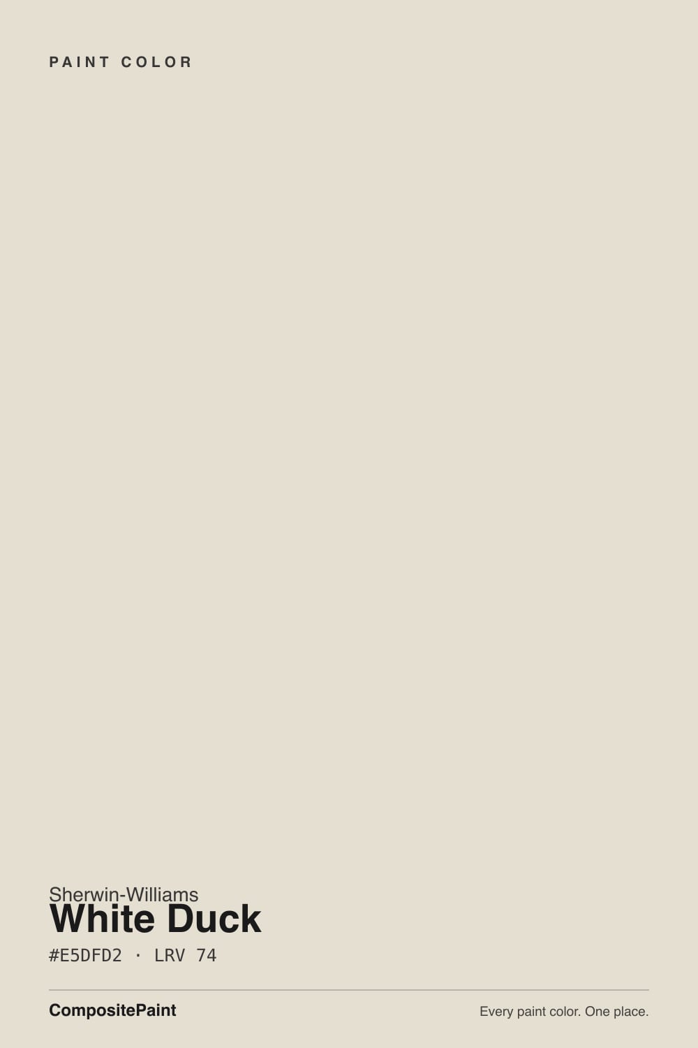
White Duck is a warm off-white built on beige, with a small amount of green-gray mixed in to stop the beige from tipping butter-yellow. That green-gray is the whole story of this color. Most of the time you never notice it — it just makes the warmth read soft and slightly aged instead of creamy, which is exactly why designers hand it to clients who say "warm, but not yellow." It is also why the same paint gets called the perfect warm white by one person and "weirdly green" by the next. Both of them are describing the same can.
At LRV 74 it bounces a lot of light around a room, but it is clearly not a white. Put it beside Alabaster SW 7008 at LRV 82 and the eight-point gap does something useful: Alabaster reads as white, and White Duck suddenly shows its body — a soft tan-greige you cannot quite name. That is the trade. You give up the bright-white look and you get a wall that has some color in it, which is why it holds up so well across an open plan where the light changes room to room.
Undertone in one line: warm beige with a green-gray damper — never pink, never blue. If your sample looks strongly green on the wall, walk to the window. A lawn, a hedge, or a green-tinted roof overhang bouncing light onto that wall does more damage to this color than the paint ever does on its own.
Where It Shines
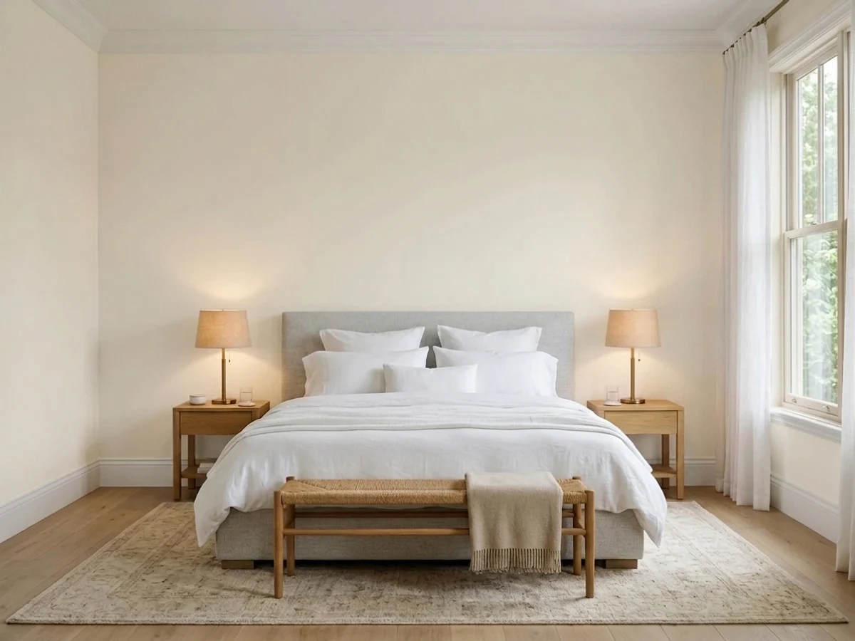
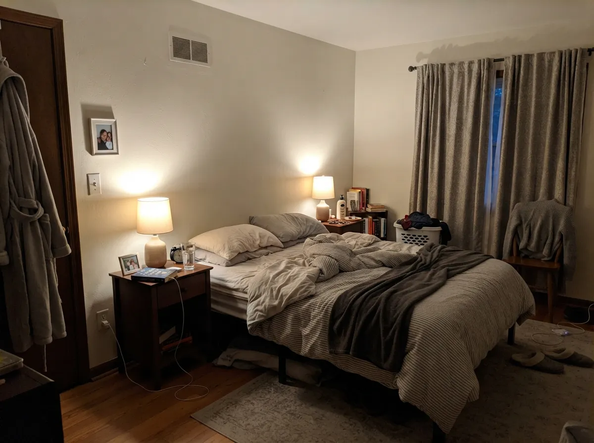
Give it real daylight, warm wood and a warm bulb and it is hard to beat. These are the rooms where White Duck does the job it is famous for — carrying a whole floor, warming up white oak and brass, and looking finished rather than freshly painted.
Where It Fails
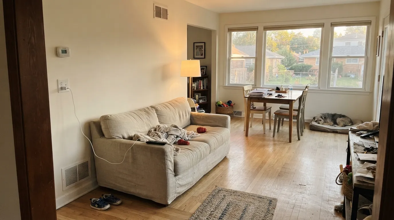
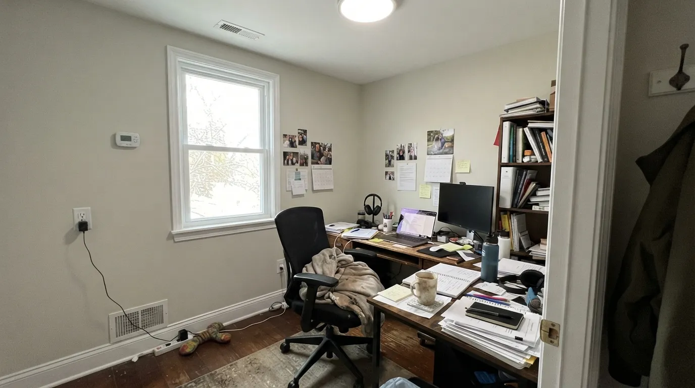
Nearly every bad review of White Duck comes from one of three situations, and all three are predictable before you open the can. None of them are defects. But if your room matches one, this is the wrong color for it, and a third coat will not save you.
North light is cool and flat, and it drains the warm beige out first. What is left is the green-gray, so the walls read dull and slightly sludgy — the word people use is "dingy." This gets worse with 4000K bulbs. If the room faces north and has one small window, go up to Alabaster SW 7008 at LRV 82 or across to Natural Choice SW 7011, which has less green in it to expose.
This is the most common pairing mistake. White Duck walls with Pure White SW 7005 or High Reflective White SW 7757 trim, and the trim wins — the walls stop reading warm and start reading dirty. The fix is to bring the trim down to Alabaster SW 7008, which is only eight LRV points brighter and still reads clean, or to run White Duck itself on the trim in semi-gloss.
The complaint that shows up in the other direction is "it is too yellow on the walls." Strong warm sun through a big window plus 2700K lamps pushes the beige forward until a big room reads as light tan, not off-white. If your room gets hard afternoon sun on a large wall, sample Shoji White SW 7042, which is a hair pinker and holds its off-white read a little better under that light.
Room by Room
This is what White Duck was made for. At LRV 74 it stays light across a whole floor without showing every change from window to window, and the warmth keeps a big room from feeling like an office. Eggshell on the walls, Alabaster SW 7008 on the trim in semi-gloss.
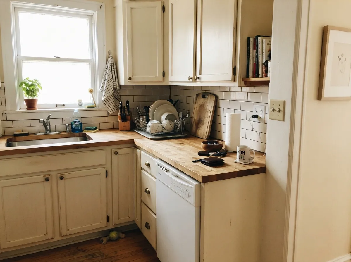
On cabinets it reads like painted furniture rather than a factory white, which is the point. It loves unlacquered brass, butcher block and warm stone. Satin sheen so it wipes clean. Keep the counters warm — cool gray quartz pushes the walls green.
Under 2700K lamps at night it goes quietly creamy and restful. If the bedroom is north-facing and you only ever see it on gray mornings, test a big sample before you commit — this is the room where the flat, dingy version shows up.
With warm marble, wood vanities and brass it is excellent. With cool blue-gray tile or a stark white vanity it argues, and the walls look muddy. Use Natural Choice SW 7011 in cool-tiled baths instead. Satin or semi-gloss for moisture.
Under mid-tone walls like Accessible Beige SW 7036 or Evergreen Fog SW 9130, White Duck trim in semi-gloss softens the edge where a bright white would cut it. On ceilings, flat White Duck over White Duck walls keeps the whole box calm. It will never read crisp — that is not its job.
Full sun reads it lighter and cleaner than it looks indoors, and it sits comfortably against brick, stone and cedar. Give it a dark frame — Urbane Bronze SW 7048 or Iron Ore SW 7069 on shutters and trim. Walk the sample around the whole house; the shaded north wall will read a step greener than the sunny side.
Your Light Is the Risk
Lightest and warmest here, and the green cast is basically invisible. Whole-house safe.
Cool daylight strips the warmth and leaves the green-gray showing. Test big samples first.
Creamy at the sun hours, soft greige the rest of the day. Most people like the swing.
2700K lamps: cozy and creamy. 4000K LEDs: gray and green. Change bulbs before you change paint.
Most complaints about White Duck are a light mismatch. Upload a photo of your actual room and see it on your walls — then ask for the same wall in north light or evening lamps before you buy a single sample.
Need It From Another Brand?
Any paint counter can custom-tint Sherwin-Williams SW 7010 directly. If you would rather stay in one brand's own deck, these are the closest stock matches, measured as ΔE2000. Under 2 is a difference you will not see on the wall.
| Brand | Closest color | ΔE | LRV | |
|---|---|---|---|---|
| Behr | Cotton KnitPPU7-11 · Behr | 0.4 | 74 | Color page → |
| Benjamin Moore | Gray Mist962 · Benjamin Moore | 1.0 | 73 | Color page → |
| Valspar | Wispy White7006-1 · Valspar | 0.9 | 74.9 | Color page → |
| PPG / Glidden | Southern BreezePPG1097-2 · PPG / Glidden | 0.2 | 73 | Color page → |
| Glidden | Southern BreezePPG1097-2 · Glidden | 0.8 | 74 | Color page → |
| Dutch Boy | Worn Pages016W · Dutch Boy | 0.0 | 74 | Color page → |
Similar Sherwin-Williams Colors
The nearest shades to White Duck within Sherwin-Williams's own range, ranked by perceptual color distance — useful when you want the same look a touch lighter, darker, or warmer.
WCAG 2.1: AA is 4.5 : 1 for normal text, 3 : 1 for large text, AAA is 7 : 1.
White Duck vs the Colors You're Also Considering
Every White Duck sample board has the same rivals on it. The numbers show the real lightness gap — then it comes down to which risk you would rather live with.
Pick this if the room's wood and stone lean warm-gold rather than pink.
Sherwin-Williams SW 7042 · LRV 74Shoji WhitePick this if your finishes lean pink — Shoji meets them instead of fighting.
Pick this when you want visible color on the wall, not another white.
Sherwin-Williams SW 7008 · LRV 82AlabasterPick this when the room has to read white, or the room is dim.
Side-by-side comparison →Alabaster SW 7008 at LRV 82 is eight points lighter and reads clearly as a white, which makes White Duck look like a soft tan beside it. Use Alabaster when you want the room to say white, and White Duck when you want a color you cannot quite name. Greek Villa SW 7551 at LRV 84 is lighter still and leans creamier, so it brightens more while keeping the warmth.
Inside the same tonal band the differences get very small. Shoji White SW 7042 shares the same LRV of 74 and a hex one step away at #E6DFD3, so on a wall the two are hard to separate. Natural Choice SW 7011 and Arrowroote SW 9502, both at LRV 73, sit a shade deeper, and Reliable White SW 6091 at LRV 74 is a touch pinker at #E8DED3. Oyster White SW 7637 at LRV 72 is slightly deeper and softer. At this level, sample first; the numbers separate these colors more than your eye does.
White Duck Coordinating Colors
The rule with White Duck is to stay on the warm and muted side. It partners easily with warm greiges, soft muted greens, warm blacks and browned bronzes. What it argues with is anything crisp and cool: bright builder whites, blue-grays, and polished chrome next to cool stone. These are the colors that come up again and again on real White Duck houses:
White Duck on Cabinets and Built-Ins
Cabinets are where White Duck quietly beats the bright whites. A brighter white on a big run of doors shows every seam, every knuckle mark and every bit of grain telegraphing through, and it reads new in a way that fights an older house. White Duck at LRV 74 softens all of that. The green-gray keeps it from looking creamy, so it does not date the way a true cream cabinet does.
Two things decide whether it works. First, the counter: warm quartz, soapstone, butcher block and honed marble all sit well against it, while cool blue-gray quartz drags the doors toward green. Second, the hardware: unlacquered brass, aged bronze and matte black all look deliberate; polished chrome makes the doors look yellowed. If you are painting perimeter cabinets White Duck, a darker island in Iron Ore SW 7069 or Urbane Bronze SW 7048 gives the room the contrast the walls will not.
Spec it in a urethane-fortified cabinet enamel in satin. Do not use wall paint on doors that get opened a hundred times a week.
White Duck Outside
Outdoors White Duck behaves better than its soft indoor reputation suggests. Full sun lifts it, so the whole house reads lighter and cleaner than a chip in your hand — closer to a proper warm white than the greige it can look like in a hallway. It sits comfortably against red brick, fieldstone and cedar, which is why it turns up so often on renovations where some existing masonry has to stay.
The frame is what makes or breaks it. A dark trim and shutter color — Urbane Bronze SW 7048, Iron Ore SW 7069, or Tricorn Black SW 6258 for the hardest edge — gives the body color the contrast it cannot generate on its own. Muted greens like Pewter Green SW 6208 work as a softer alternative on shutters and doors. Avoid cool blue-gray accents, which make the siding look tan by comparison.
One practical note: paint a board, not a swatch, and carry it around the whole house. The north elevation will read a full step greener and grayer than the south, and the north side is usually the one facing the street.
Three Ready Palettes Built on White Duck
A color is never alone on the wall. These are complete combinations in the 60-30-10 pattern, with the reason each one holds together. Every one opens in the visualizer.
White Duck takes the 60 percent as walls, Alabaster takes the 30 as trim and ceilings, and the eight-point LRV gap is just enough to read clean without a hard white line. Urbane Bronze is the 10 percent — one warm dark note on the door that stops the whole floor from turning into oatmeal.
Try this palette in your roomCabinets are the big surface in a kitchen, so White Duck carries the 60 percent and Accessible Beige at LRV 58 sits behind them as a deeper warm backdrop — same family, sixteen points apart, so the handoff is soft. Iron Ore on the island supplies the dark anchor and makes brass hardware look intentional.
Try this palette in your roomWhite Duck's green-gray damper is what makes Evergreen Fog land as a natural relative instead of a decorated accent wall — they share the same muted family, forty-four LRV points apart. Alabaster on trim and ceiling keeps the top of the room lifted so the green never closes the space in.
Try this palette in your roomWhite Duck FAQ
Is White Duck warm or cool?
Warm. The body of the color is beige, and the hue sits at 41 degrees, which is the yellow-tan side of the wheel. The green-gray in it only cuts the sweetness — it never makes the color cool. In a north room it can look neutral, but it will not read icy.
Does White Duck look green?
Sometimes, and this is the honest weak point. In north light, under 4000K or cooler bulbs, and near big windows facing a lawn or hedge, the green-gray steps forward and the walls read faintly sage. In south and west daylight with warm bulbs you will not see it at all. Tape a large sample to two walls in the actual room and look at it after dark.
What trim white goes with White Duck?
Alabaster SW 7008 at LRV 82 is the standard answer — eight points brighter, same warm family, so the trim reads crisp without making the walls look dirty. Greek Villa SW 7551 at LRV 84 works if you want a little more lift. Skip Pure White SW 7005 and High Reflective White SW 7757; they are too bright and they make White Duck look tan.
White Duck or Shoji White?
They are twins. Both are LRV 74 and their hex values are one step apart, so on a finished wall almost nobody can tell them apart. The tiny difference is direction: White Duck leans a shade greener, Shoji White a shade pinker. Match whichever way your wood floors and stone already lean.
Is White Duck good for kitchen cabinets?
Yes, and it is one of its best uses. It gives cabinets a soft, aged look instead of the flat factory white, and it flatters brass, bronze, butcher block and warm stone. Use a urethane-fortified cabinet enamel in satin. The one thing to check first is your counter — cool gray quartz will push the doors green.
Will White Duck work in a dark room?
It can, but it is not the safe choice. LRV 74 reflects plenty of light, so a room with one small window still lifts. The problem is a dim north room specifically, where the warmth drops out and the color goes flat. In that room, Alabaster SW 7008 or Natural Choice SW 7011 will disappoint you less.
How many coats does White Duck need?
Two over any existing light or off-white wall. Over a mid-tone or saturated color, prime first with a gray-tinted primer — going straight over a red, navy or dark beige takes three coats and it still patches at the corners. Roll a full second coat rather than touching up thin spots.
Have you painted with White Duck?
Rate it — one tap helps the next reader decide.
Ask a Question