Cotton Knit
Behr's quiet cabinet-and-trim neutral, reviewed honestly: the light where it earns its keep, the light where it turns flat, and what to pick instead.

Jessica has spec'd whites and neutrals for more than 300 rooms and keeps a sample wall of painted drawdowns in her studio. Every color review is checked against real reader rooms in the comments and re-tested when a formula changes. About the testing process →
- 1Agreeable Gray60
- 2Pale Oak69
- 3Cotton Knit74
- 4Dover White83
- 5Moonlit Beach88
The Fast Verdict
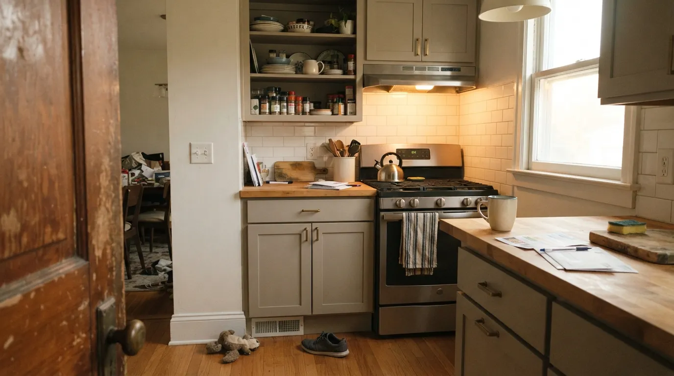
Cotton Knit is what happens when a paint company makes a genuinely good warm greige and never bothers to market it as anything special. It shares Behr's PPU7 strip with three other quiet neutrals, but it's the one Behr also sells as a dedicated Cabinet, Door & Trim Enamel — which tells you its real job. Steady, warm-leaning, never yellow, never pink: not a color anyone falls in love with, but one nobody complains about either, as long as the room has real light.
Kitchen and bath cabinets · whole-house eggshell walls with warm wood and brass · front doors and exterior trim · anyone who wants a safe greige without a trend attached to it
You actually want gray, not beige · your room is dim and north-facing with no lamps · your trim is a brighter, cooler white · you want a color with a story to tell dinner guests
- Steady warm greige that goes with almost any warm wood or metal
- Doubles as a real Cabinet, Door & Trim Enamel color, not just a wall tint
- Near cross-brand twin to Sherwin-Williams White Duck (same hex, same LRV 74)
- Warms nicely under afternoon sun and lamp light without tipping yellow
- Sits in a whole strip of tonal Behr siblings, which makes monochrome schemes easy
- Goes flat gray-taupe in dim, north-facing rooms
- Looks dingy next to a cooler, brighter white trim
- Some owners report the semi-gloss cabinet enamel cracking at panel-and-frame joints
- No design pedigree or fame — it is not a color with a story
What Color Is Cotton Knit, Really?
Cotton Knit sits in Behr's PPU7 strip of warm, low-drama neutrals — Roman Plaster, Cotton Knit, Silky White, and Wheat Bread run PPU7-10 through PPU7-19, and none of them has ever been a Color of the Year or a design-blog darling. What sets Cotton Knit apart from its siblings is its second job: Behr sells it not just as a wall paint (Premium, Premium Plus, Dynasty) but as a named color in its Semi-Gloss Enamel Interior/Exterior Cabinet, Door & Trim line. That is the color's real identity — less a wall shade that occasionally lands on cabinets, more a cabinet-and-trim neutral that also happens to behave on walls.
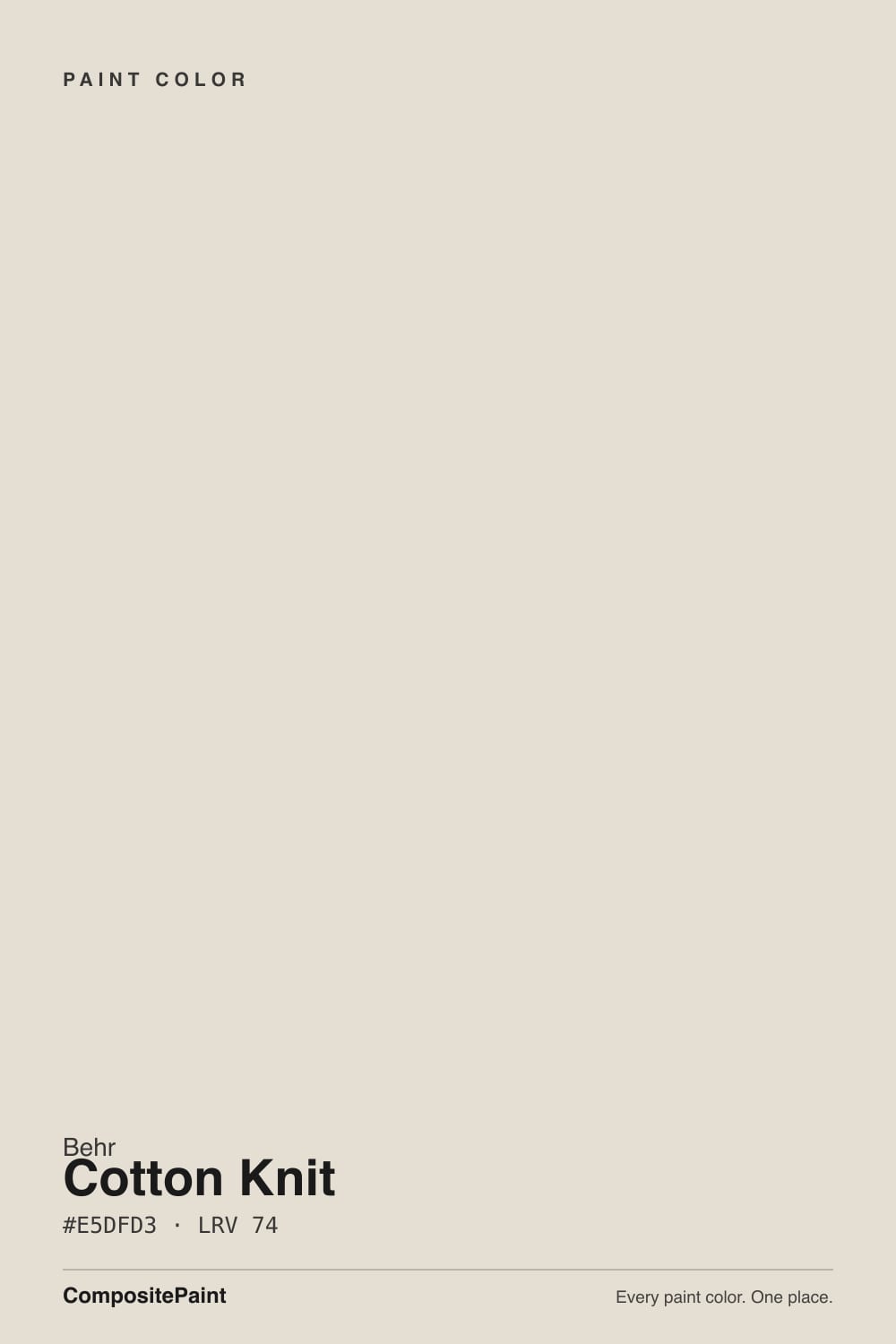
Behr's own marketing calls it "a barely-there cool beige, like fresh laundered sheets," but that description does not hold up against independent measurement or against Behr's own hue data, which places Cotton Knit in the orange-leaning, muted end of the wheel — a warm neutral, not a cool one. At LRV 74 it sits in exactly the same reflectance zone as Sherwin-Williams White Duck (hex #E5DFD2, LRV 74) — the two are close enough to be cross-brand twins in most light, though White Duck carries a faint green tell that Cotton Knit does not share.
Undertone in one line: warm beige-gray with a whisper of orange, never blue, never pink, never truly "cool" no matter what the marketing copy says. In dim or north light the beige recedes and it reads more gray-taupe; in afternoon sun or under warm bulbs the beige comes forward.
Where It Shines
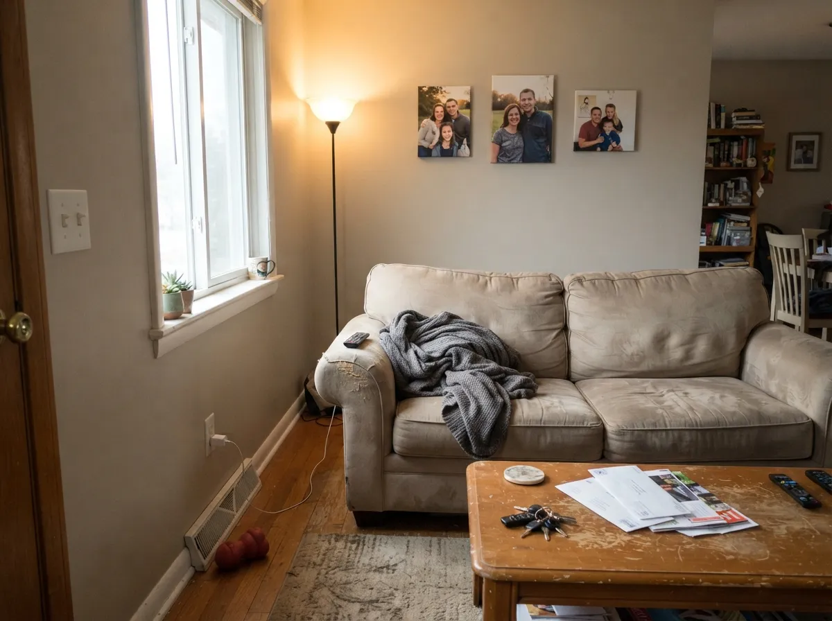
Cabinets are where Cotton Knit was built to work, and it shows: under warm task lighting with brass or matte-black pulls, it reads calm and custom instead of builder-basic. On walls it does the same quiet job Behr's whole PPU7 strip is known for — a safe, warm-leaning neutral that won't fight oak floors, granite with warm flecks, or beige upholstery. Give it real daylight or a lamp at night and the color is dependable in the least dramatic, most useful sense of the word.
Where It Fails
Cotton Knit's problems are the predictable problems of every warm, high-LRV neutral, plus one that is specific to its cabinet-enamel life. None of them are a surprise if you know the light and the finish going in.
Cool, indirect daylight strips the warmth out and leaves a flat gray-taupe that reads dull rather than calm. This is the standard warm-neutral failure, not a Cotton Knit-specific flaw — but it is the single most common regret pattern for this whole family of colors. Add warm 2700K lamps or move to a warmer strip-mate like Behr Roman Plaster.
Put Cotton Knit beside a stark blue-white trim and the pairing makes Cotton Knit look dingy and yellow by comparison, even though it reads perfectly clean on its own. The fix is the one-color rule: keep trim in Cotton Knit itself (semi-gloss) or a similarly warm white, not a cooler one.
Because Cotton Knit is sold as a named Cabinet, Door & Trim Enamel, some owner reviews of that specific product report cracking where raised panels meet the frame and easier-than-expected staining on high-touch areas. That is a product and prep issue with Behr's semi-gloss enamel line, not the color itself — but it means proper prep (light sanding, bonding primer, cure time before use) matters more here than on a standard wall paint.
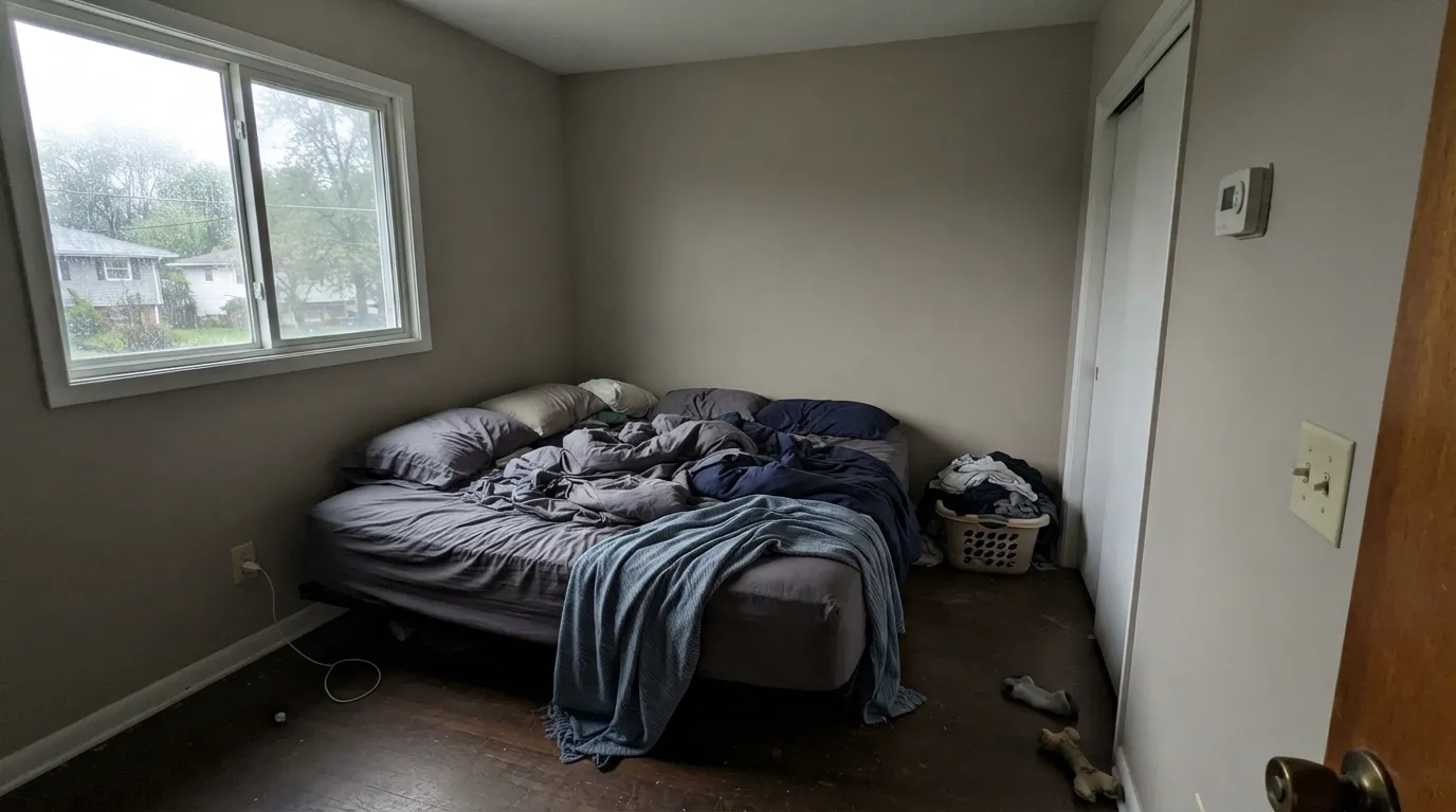
Room by Room
Behr sells Cotton Knit specifically for this job. With warm wood, butcher block, and brass or matte-black hardware it reads calm and finished; semi-gloss enamel wipes clean around handles. Prime and cure properly — this is where the cracking complaints show up if prep is skipped.
Eggshell Cotton Knit carries a main floor the same way its Sherwin-Williams twin, White Duck, does: warm enough to feel finished, quiet enough to disappear into the furniture. Skip it in a genuinely dark, north-only room.
Under 2700K bulbs it turns gently creamy at night. A north-facing bedroom with only overhead cool LEDs is the one setup where it disappoints.
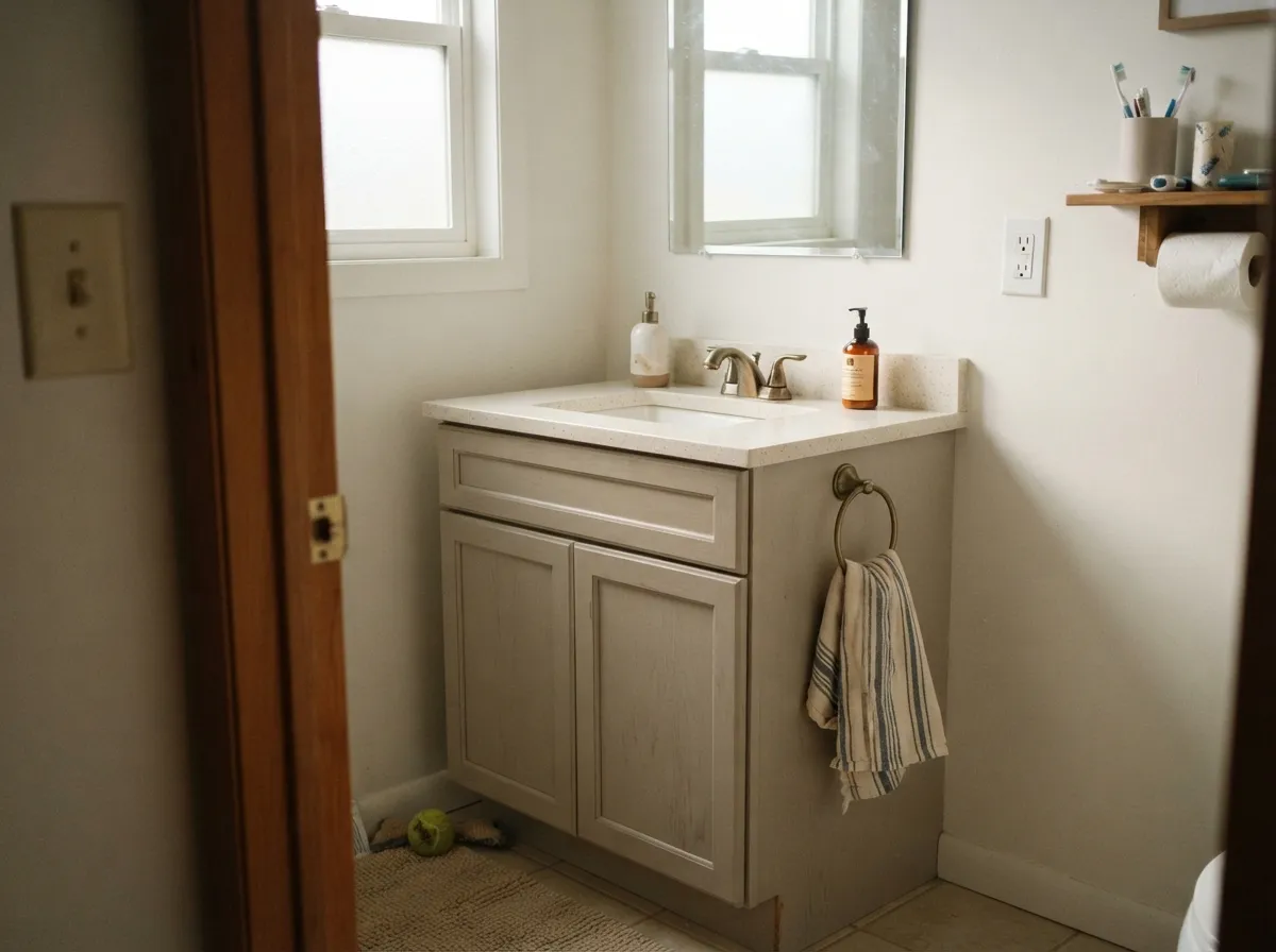
Semi-gloss Cotton Knit on a vanity under a warm-toned counter and brass fixtures reads custom without shouting. With cool gray or blue-white tile, it can look slightly yellow by contrast — sample first.
Semi-gloss Cotton Knit trim softens the edge under mid-tone walls the way any warm off-white trim does. Keep it consistent with the wall temperature; a cooler wall color will make the trim look muddy instead of soft.
Because the enamel is rated Interior/Exterior, Cotton Knit works on a front door or exterior trim run, not just inside. Full sun reads it brighter and slightly more beige than indoors; pair with black or dark bronze hardware for contrast.
Your Light Is the Risk
Direct warm sun pulls the beige forward and the color glows softly without going yellow. The light it was built for.
Cool indirect daylight strips the warmth and leaves a flat gray-taupe. The most common disappointment with this whole neutral family.
Grayer and quieter at breakfast, noticeably warmer and beiger by late afternoon. The shift is gentle, not a color change.
2700K lamps make it creamier and cozier at night. Cool white LEDs flatten it back toward gray — swap the bulb before the paint.
Most complaints about Cotton Knit are a light mismatch. Upload a photo of your actual room and see it on your walls — then ask for the same wall in north light or evening lamps before you buy a single sample.
Need It From Another Brand?
Any paint counter can custom-tint Behr PPU7-11 directly. If you would rather stay in one brand's own deck, these are the closest stock matches, measured as ΔE2000. Under 2 is a difference you will not see on the wall.
| Brand | Closest color | ΔE | LRV | |
|---|---|---|---|---|
| Sherwin-Williams | White DuckSW 7010 · Sherwin-Williams | 0.4 | 74 | Color page → |
| Benjamin Moore | EtiquetteAF-50 · Benjamin Moore | 0.6 | 74 | Color page → |
| Valspar | Wispy White7006-1 · Valspar | 0.6 | 74.9 | Color page → |
| PPG / Glidden | HourglassPPG1022-1 · PPG / Glidden | 1.0 | 75 | Color page → |
| Glidden | Elegant Lace60YY 74/072 · Glidden | 0.8 | 74 | Color page → |
| Dutch Boy | Worn Pages016W · Dutch Boy | 0.4 | 74 | Color page → |
Similar Behr Colors
The nearest shades to Cotton Knit within Behr's own range, ranked by perceptual color distance — useful when you want the same look a touch lighter, darker, or warmer.
WCAG 2.1: AA is 4.5 : 1 for normal text, 3 : 1 for large text, AAA is 7 : 1.
Cotton Knit vs the Colors You're Also Considering
Every Cotton Knit sample board has the same rivals on it. The numbers show the real lightness gap — then it comes down to which risk you would rather live with.
Pick this if you already tested White Duck and saw that green tell — Cotton Knit is the near-identical color without it.
Sherwin-Williams SW 7010 · LRV 74White DuckPick this if your painter works in Sherwin-Williams — the two are close enough to be twins in most light, though White Duck can flash a hint of green where Cotton Knit stays steady beige-gray.
Pick this for a quieter, more gray-leaning neutral that won't tip yellow under strong sun.
Behr 12 · LRV 80Swiss CoffeePick this for more cream and less gray, in the same Behr deck — it's the warmest of Behr's safe off-whites.
Pick this for the warmer, steadier neutral that doesn't need medium light to look right.
Benjamin Moore OC-23 · LRV 74Classic GrayPick this if you want the cooler, more gray-leaning cousin at the same LRV — good in medium light, but it can wash out in a very bright room.
Pick this for a lighter, quieter neutral that keeps a room bright while Agreeable Gray goes moodier.
Sherwin-Williams SW 7029 · LRV 60Agreeable GrayPick this for more depth and definition — a step darker greige that reads deliberately "gray" on the wall instead of barely-there.
Sherwin-Williams White Duck SW 7010 is #E5DFD2 at LRV 74 with a deltaE of 0.44 against Cotton Knit. That is close enough to call the same color on a wall. Benjamin Moore Etiquette AF-50 at #E5E0D5 and LRV 74 sits at 0.58, and Farrow and Ball Slipper Satin No. 2004 at LRV 75 is 0.89, so both are effectively the same tone from a different can.
PPG Hourglass PPG1022-1 at LRV 75 comes in at 1.01 and Clare No Filter PNT100-LT-19 at LRV 72 at 1.63, which makes them visually identical in normal room light even though the numbers differ slightly.
Step further out and the gap opens. Dunn-Edwards Stucco Tan DE6205 at #E8DECE and LRV 68 has a deltaE of 2.07, so it is very close but worth sampling first, and it will look darker on the wall. Backdrop Cookies and Cream at deltaE 4.55 is close but visibly different side by side, reading distinctly more yellow.
Cotton Knit Coordinating Colors
The rule for coordinating with Cotton Knit is the standard warm-neutral rule: stay warm, avoid cool blue-whites, and lean on wood and brass to carry the room. It reads as a near cross-brand twin to Sherwin-Williams White Duck, sits comfortably next to its own Behr PPU7 siblings, and takes a dark near-black accent well for contrast. These are the partners that keep it looking intentional:
The PPU7 Strip: Behr's Most Overlooked Neutral Family
Cotton Knit is not a solo act. It runs alongside Roman Plaster (PPU7-10, LRV 65), Silky White (PPU7-12, LRV 83), and Wheat Bread (PPU7-19, LRV 60) in the same Behr strip — four warm neutrals spaced closely enough that any two of them can trim or shadow each other without a visible seam. None of the four has ever been a Color of the Year, and none shows up on viral before-and-afters. That is the honest story here: this is a workhorse strip, not a headline color.
What makes Cotton Knit the standout of the four is not fame, it is function — Behr chose it, not its siblings, as the named color in its Cabinet, Door & Trim Enamel line. If you like the strip's overall warmth but want the piece built specifically for cabinets and woodwork, Cotton Knit is the one to buy.
Cotton Knit With Wood Tones and Floors
This is an easy pairing because the color was built for it. Honey oak, red oak, walnut, and butcher block all sit comfortably against Cotton Knit — the shared warmth means neither side pushes the other toward orange or gray the way a true cool neutral would with the same floors.
Cool gray-washed or white-oak-washed floors are the one combination worth sampling first: against a cooler floor, Cotton Knit's warmth can read a touch more yellow-beige than it does over warm wood. It is rarely a dealbreaker, but a big sample above the actual floor settles it before a whole kitchen of cabinets goes in.
Three Ready Palettes Built on Cotton Knit
A color is never alone on the wall. These are complete combinations in the 60-30-10 pattern, with the reason each one holds together. Every one opens in the visualizer.
One color at two sheens keeps walls and trim quietly continuous instead of cutting the room into pieces; the near-black door supplies the single dark note the scheme needs to feel finished rather than beige-on-beige.
Try this palette in your roomAccessible Beige is one shade deeper and warmer than the cabinets, so the wall-to-cabinet handoff stays seamless instead of matchy; the navy island grounds the room and loves brass hardware against Cotton Knit's warm neutral.
Try this palette in your roomWhite Dove trim reads brighter than the walls without turning cool, so the room keeps its warmth; Evergreen Fog adds one muted color note that reads restful rather than decorated.
Try this palette in your roomCotton Knit FAQ
Is Cotton Knit warm or cool?
Warm, despite Behr's own "cool beige" marketing language. Every independent measurement and Behr's own hue data place it in the orange-leaning, muted-beige zone. In cool north light it can pass for gray-taupe, but it never turns genuinely blue or cool.
Is it a good cabinet color?
Yes — it is one of the few colors Behr sells as a dedicated Cabinet, Door & Trim Enamel, not just a wall tint. It flatters brass and warm wood. Use proper prep (sand, bond primer, full cure time) since some owners report cracking at panel joints on cabinets when prep is skipped.
What's the closest Sherwin-Williams match to Cotton Knit?
White Duck (SW 7010) — same hex, same LRV 74. The two read as twins in most rooms; White Duck's only quirk is a faint green tell in some light that Cotton Knit does not share.
Will Cotton Knit look gray in a north-facing room?
Likely, yes. Cool indirect daylight is the one light where this whole family of warm neutrals goes flat and gray-taupe. Warm 2700K lamps bring the beige back at night; in daytime, test a real sample before committing a whole room.
Does it work with oak floors?
Yes. The warm undertone sits comfortably with honey oak, walnut, and butcher block — it is one of the safer neutrals for warm wood, the same reason it works on cabinets. Cool gray-washed floors are the one pairing to sample first.
What's the difference between Cotton Knit, Roman Plaster, and Silky White?
All three live in Behr's PPU7 strip of quiet warm neutrals. Roman Plaster (PPU7-10, LRV 65) is a plainer, more straightforwardly beige tone one step darker; Silky White (PPU7-12, LRV 83) is the same family pushed up near white; Cotton Knit (PPU7-11, LRV 74) sits between them and is the one sold specifically as a cabinet and trim enamel color.
Have you painted with Cotton Knit?
Rate it — one tap helps the next reader decide.
Ask a Question