Roman Plaster
Behr's straightforward warm beige, reviewed honestly: the light it needs, the modern-greige buyers it disappoints, and the exterior job it was actually named for.

Jessica has spec'd whites and neutrals for more than 300 rooms and keeps a sample wall of painted drawdowns in her studio. Every color review is checked against real reader rooms in the comments and re-tested when a formula changes. About the testing process →
- 1Revere Pewter55
- 2Agreeable Gray60
- 3Roman Plaster65
- 4Shoji White74
- 5Dover White83
The Fast Verdict
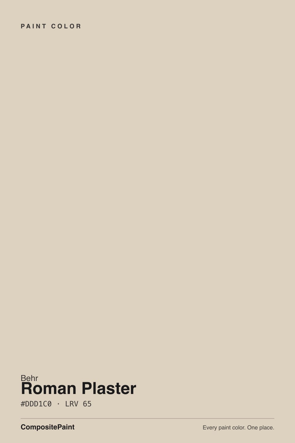
Roman Plaster is Behr's answer to "just give me a warm beige, no games." Named for old lime-plaster and stucco walls, it carries a genuine yellow-and-red warmth at LRV 65 — light enough to open a room, deep enough to hold real color. It does not chase the gray-greige trend and it does not apologize for being beige. It is also, less advertised, formulated for real exterior stucco and masonry, which is the more honest reason the name fits.
Whole-house warm neutral in real daylight · Mediterranean or Tuscan-style stucco exteriors · kitchens with butcher block and warm wood · anyone who actually wants beige and is tired of being sold gray
You want a modern gray-driven greige, not a beige · your fixed finishes are cool — chrome, white quartz, gray tile · your room is dim and north-facing · you want a color with a design-blog paper trail to research first
- A genuine warm beige — no disguised-gray sleight of hand
- Formulated for interior walls AND real exterior stucco, masonry, and brick — unusual dual duty
- LRV 65 opens a room without going stark white
- Loves oak, walnut, brass, and terracotta without a second thought
- Nearly identical to Sherwin-Williams Natural Linen — an easy swap if your painter stocks a different brand
- Not a greige — disappoints anyone actually chasing the current gray-neutral trend
- Dulls to a muddy putty-tan in a dim, north-facing room
- Fights cool white quartz, chrome, and true gray flooring
- Almost no owner reviews or design-blog coverage to sample-check against before buying
What Color Is Roman Plaster, Really?
A warm, sandy beige built on a yellow base with a faint red running underneath it — Behr's own listing leans on ancient-plaster imagery, but the honest read is simpler: this is a traditional tan, not a disguised gray. That red whisper is what separates it from flatter builder beiges; in the right light it reads faintly terracotta, sun-baked, almost adobe-like, which is exactly the mood the name is going for.
At LRV 65 it sits in the same light-mid band as Benjamin Moore's Pale Oak and Edgecomb Gray, but it does not behave like either — those two lean toward gray-taupe, while Roman Plaster keeps its beige fully intact. The closest real match across brands is Sherwin-Williams Natural Linen: independent color-matching sources put the two within a hair of each other (Delta E under 1), so if your painter only stocks one brand, that is the swap that will not surprise you.
Undertone in one line: yellow first, a whisper of red second — never gray, never pink. One outlier source calls it gray-undertoned, and that is worth naming honestly: in cool, overcast light the warmth does recede and the paint can read closer to a flat putty than a beige. That is the light doing it, not a second undertone hiding in the can.
Where It Shines
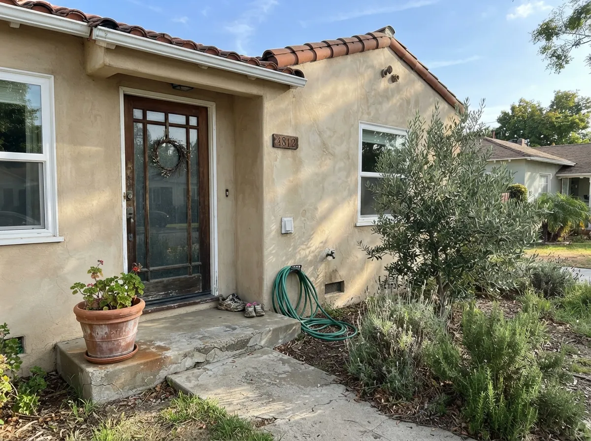
It does its best work exactly where you would expect a traditional warm beige to work: real daylight, warm wood, and — its actual namesake job — real plaster, stucco, and masonry. Behr sells it in an interior flat and chalk finish, but also as an exterior masonry, stucco, and brick paint, which is unusual for a mid-market neutral and tells you where it is genuinely at home. On a stucco ranch or a Tuscan-leaning exterior with a dark door and warm trim, it reads intentional rather than beige-by-default.
Where It Fails
Roman Plaster has almost no online reputation to check against — few reviews, few design-blog write-ups, no Color of the Year moment. That is not a defect, but it means most buyers are sampling blind, and the regrets that do surface follow one of three predictable scripts.
Cool, flat daylight strips the yellow-red warmth out and leaves a muddy, slightly grayish tan that owners call dingy rather than cozy. LRV 65 should keep a room bright, but brightness and warmth are different things — this color needs the warmth to show up. Warm 2700K bulbs help; a genuinely sunless room is better served by a color that does not depend on warm light to look finished.
Roman Plaster is built on yellow and red, and cool materials sit at the opposite end of the wheel. Beside true cool gray tile or bright white quartz, the wall looks dated and slightly dirty by comparison — the same mismatch that trips up nearly every warm beige. If your fixed finishes are already cool, a true gray like Benjamin Moore Stonington Gray will fight less.
This is the honest mismatch behind most of the disappointment: Roman Plaster is a real beige, not a gray with warmth dialed in. If you are chasing the current gray-driven greige look — Agreeable Gray, Edgecomb Gray — this color will read more traditional and more tan than the mood board. Sample it before you commit a whole house to it on the strength of a swatch photo.
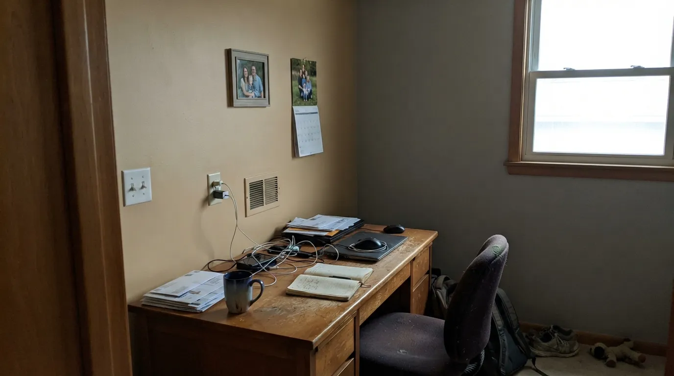
Room by Room
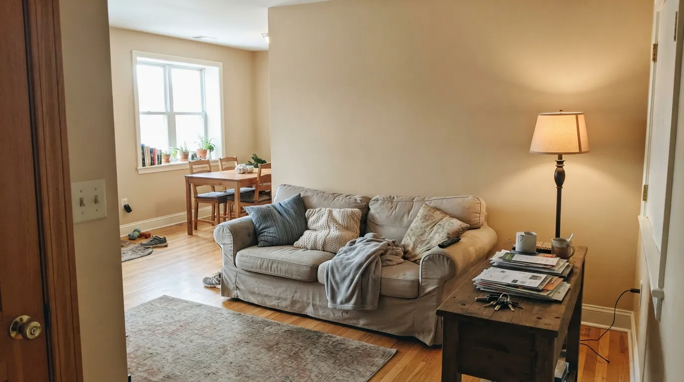
Homeowners who post it online tend to use it everywhere — living room, hallway, bedrooms — and it holds together because the warmth stays consistent room to room. It needs actual daylight somewhere in the house to look intentional rather than tired.
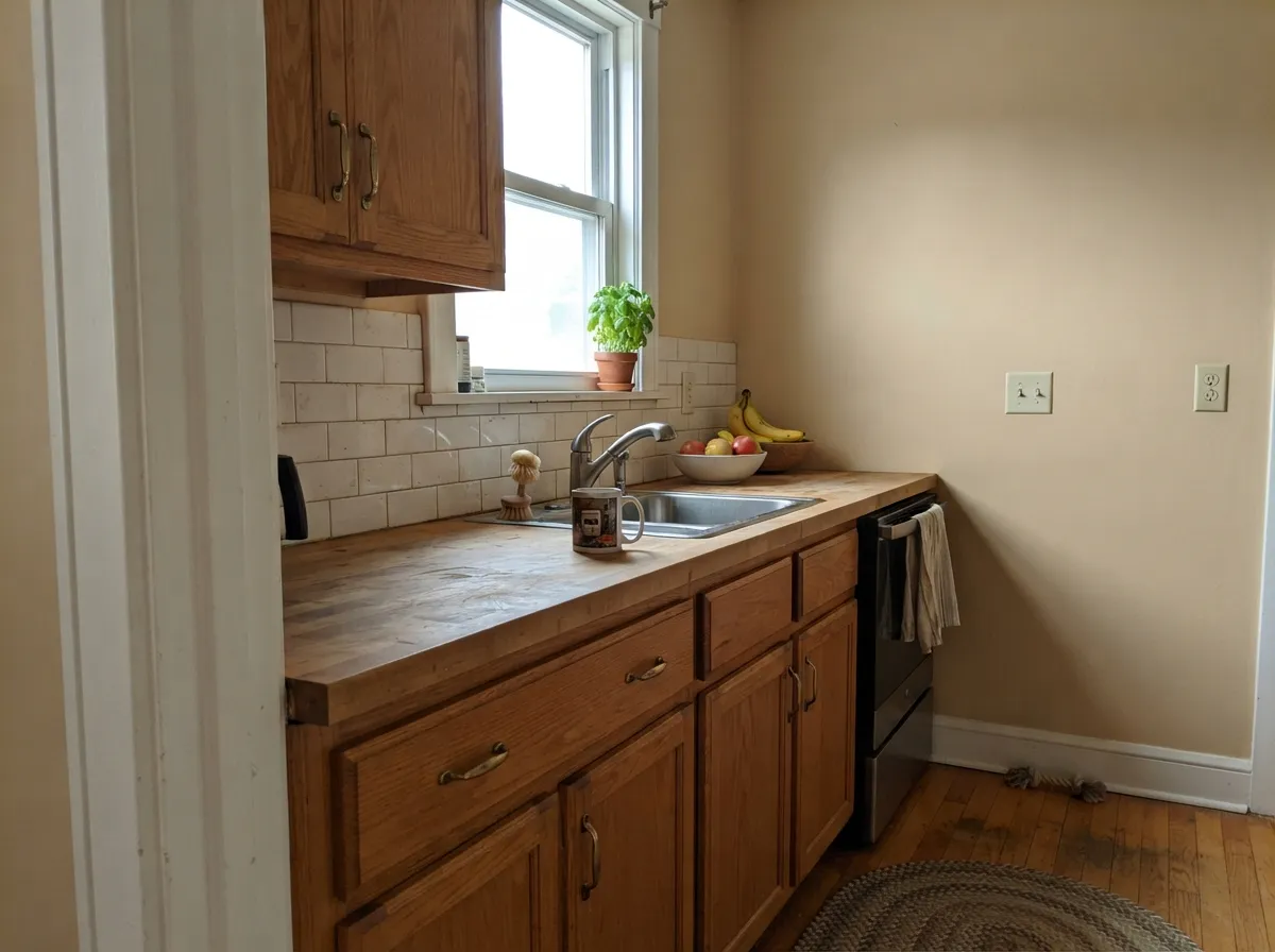
With butcher block, oak, and brass hardware it looks pulled-together and unfussy. With white or gray-veined quartz and chrome faucets, the beige starts to look dated next to the cool counters — pick your countertop first.
Under warm lamps it turns genuinely restful. In flat daytime light without a lamp on, it can read closer to plain tan than "warm and inviting" — pair with cream or white bedding to keep it from going heavy.
Behr sells this exact color as a flat exterior masonry, stucco, and brick paint, not just an interior wall color. On a stucco or plaster-textured exterior with a dark door and warm trim, it earns its name in a way most interior neutrals never get the chance to.
Warm travertine, cream marble, and brass fixtures: genuinely nice. Cool white subway tile and chrome: the beige starts to look like it needs an update. Test a sample against your actual vanity top before painting.
This is where the color has to prove it can carry a whole house without a design plan behind it — most of the real owner photos found online are exactly this: one warm neutral running kitchen to living room to hall, no accent wall in sight.
Your Light Is the Risk
Even, sandy warmth all day — the closest the wall gets to matching the chip in your hand.
The warmth drains out and it settles into a flat, muddy putty-tan. Test on the actual wall first.
Direct late-day sun pushes it warmer still, almost peachy-terracotta for an hour. Most owners like it; sample at 5pm if you are unsure.
2700K bulbs deepen the red-tan note into something cozier. Cool white LEDs flatten it toward gray-putty — swap the bulb before you swap the paint.
Most complaints about Roman Plaster are a light mismatch. Upload a photo of your actual room and see it on your walls — then ask for the same wall in north light or evening lamps before you buy a single sample.
Need It From Another Brand?
Any paint counter can custom-tint Behr PPU7-10 directly. If you would rather stay in one brand's own deck, these are the closest stock matches, measured as ΔE2000. Under 2 is a difference you will not see on the wall.
| Brand | Closest color | ΔE | LRV | |
|---|---|---|---|---|
| Sherwin-Williams | Canvas TanSW 7531 · Sherwin-Williams | 0.8 | 64 | Color page → |
| Benjamin Moore | Dusty Road1017 · Benjamin Moore | 1.2 | 64 | Color page → |
| Valspar | Vanderbilt BeachV134-1 · Valspar | 1.3 | 64.9 | Color page → |
| PPG / Glidden | Gray BeigePPG14-30 · PPG / Glidden | 2.1 | 65 | Color page → |
| Glidden | SourdoughPPG1084-3 · Glidden | 1.1 | 64 | Color page → |
| Dutch Boy | Existence420-1DB · Dutch Boy | 2.4 | 63 | Color page → |
Similar Behr Colors
The nearest shades to Roman Plaster within Behr's own range, ranked by perceptual color distance — useful when you want the same look a touch lighter, darker, or warmer.
WCAG 2.1: AA is 4.5 : 1 for normal text, 3 : 1 for large text, AAA is 7 : 1.
Roman Plaster vs the Colors You're Also Considering
Every Roman Plaster sample board has the same rivals on it. The numbers show the real lightness gap — then it comes down to which risk you would rather live with.
Pick this for the Behr can and a Home Depot pickup — same warmth, same read on the wall.
Sherwin-Williams SW 9109 · LRV 67Natural LinenPick this if your painter only stocks Sherwin-Williams — independent color-matching puts the two within a hair of each other.
Pick this if you want the color to read as a real beige, not a gray wearing a warm coat.
Benjamin Moore HC-173 · LRV 63Edgecomb GrayPick this if you actually want the gray-driven greige look — it is quieter and less tan than Roman Plaster.
Inside the Behr deck the differences are small. Spanish Sand OR-W07 at LRV 64 and hex #DCD0BD is a hair yellower and less pink. Pebbled Courtyard 250E-2 at LRV 65 and hex #E0D0C2 goes the other way with slightly more pink. Gray Envelope DC-011 at LRV 64 and hex #D9D0C1 is the coolest of the group and the closest thing here to a greige.
Across brands, Sherwin-Williams Canvas Tan SW 7531 at LRV 64 has a deltaE of 0.77, which makes it the same color for practical purposes, and Clare Turbinado at LRV 66 sits at 0.87. Glidden Sourdough PPG1084-3 at LRV 64 is at 1.05 and Benjamin Moore Dusty Road 1017 at LRV 64 is at 1.22, both visually identical in normal room light. Dutch Boy Existence 420-1DB at LRV 63 is at 2.38, very close but worth sampling, since it reads slightly grayer.
Roman Plaster Coordinating Colors
The rule with Roman Plaster is the same one that governs every warm beige: stay warm, and let cool materials sit somewhere else in the house. It pairs cleanly with warm whites, deeper warm greiges, and near-black accents, and it is genuinely happy sharing a house with its own brand's other whites. These are the partners that keep it looking intentional rather than plain:
Roman Plaster's Second Job: Real Stucco and Masonry
Most interior neutrals never get formulated for an exterior masonry can, but Roman Plaster is sold that way — as a flat exterior paint for stucco, brick, and masonry, right alongside the interior flat and chalk-finish versions. That is the more literal reason for the name: it is meant to sit on the kind of textured, plaster-like exterior surface the color is describing.
On a stucco ranch, a Tuscan- or Mediterranean-leaning build, or a brick exterior getting a fresh coat, it reads warm and sun-baked rather than the flat builder-beige a lot of production-home exteriors default to. Pair it with a crisp trim white and a dark door — near-black, not navy — and it stops reading generic.
Roman Plaster With Wood Tones and Floors
This is an easy pairing decision, easier than most warm neutrals get. Golden and honey oak, red oak, walnut, and butcher block all sit in the same warm family as the paint, so the usual "does this beige fight my orange floor" worry mostly does not apply here — beige and honey oak are close cousins, not opponents.
The floors that do argue with it are the cool ones: gray-washed engineered wood, cool-toned LVP, and true gray tile all pull in the opposite direction, and the wall can start to look dated next to them rather than warm. If a floor replacement or a cool countertop is already decided, test a real sample against it before committing a whole room — this is the single most common regret with a color this traditionally beige.
Three Ready Palettes Built on Roman Plaster
A color is never alone on the wall. These are complete combinations in the 60-30-10 pattern, with the reason each one holds together. Every one opens in the visualizer.
A warm white trim keeps the beige from looking flat instead of finished — a stark cool white would fight it the same way cool quartz does. Kendall Charcoal supplies one grounding dark note without going full black.
Try this palette in your roomA crisp cabinet white lets Roman Plaster carry the warmth without the room going all-beige; Edgecomb Gray on the island bridges toward gray for anyone nervous about full commitment to tan.
Try this palette in your roomThis is the pairing Roman Plaster was actually formulated for: a warm stucco body, crisp white trim, and a near-black door read Mediterranean-modern instead of plain builder-beige.
Try this palette in your roomRoman Plaster FAQ
Is Roman Plaster warm or cool?
Warm — a yellow base with a whisper of red underneath, never gray and never pink. In cool, overcast light the warmth recedes and it can read closer to a flat putty tan, but that is the light acting on the paint, not a second undertone in the can.
Is it more beige or gray?
Beige. It sits at the same LRV as some of the gray-leaning greiges (Pale Oak, Edgecomb Gray), but it does not borrow their gray base — it stays a genuine warm tan. If you are shopping for the current gray-driven greige look, this is not that color.
Can I use it outside on stucco?
Yes — Behr sells Roman Plaster specifically as an exterior masonry, stucco, and brick paint, not only an interior wall color. It is one of the more genuinely dual-purpose colors in the Behr lineup and reads especially at home on a stucco or Tuscan-leaning exterior.
What's the closest Sherwin-Williams match?
Natural Linen (SW 9109). Independent color-matching puts the two within a hair of each other in both hex and LRV, so switching brands mid-project should not surprise you.
Does it work with honey oak or golden wood floors?
Yes — this is one of the easiest warm neutrals to put over golden or honey-toned oak, since both share the same yellow-red family. It is cool gray flooring and white quartz, not warm wood, that this color argues with.
What trim color goes with Roman Plaster?
A warm white — Behr White or Benjamin Moore White Dove — in semi-gloss. A stark, blue-white trim will make the walls look dingy by comparison, the same clash cool quartz and chrome cause.
Have you painted with Roman Plaster?
Rate it — one tap helps the next reader decide.
Ask a Question