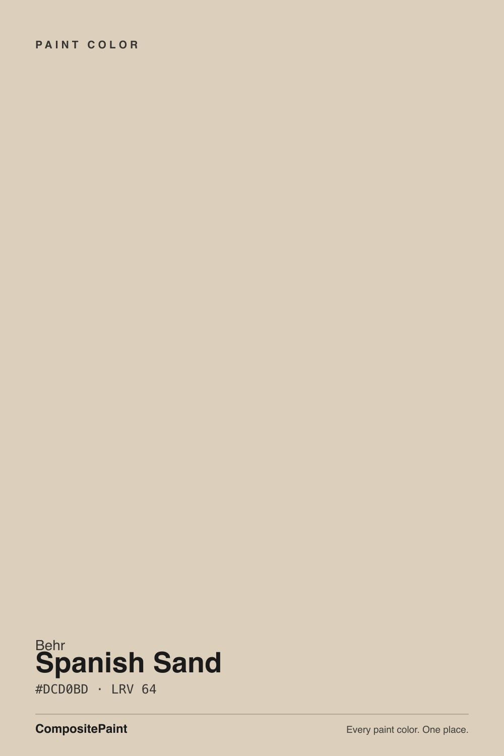
Spanish Sand
The sandy Behr beige that reads three different colors in three different rooms, reviewed honestly: where it glows gold, where it goes flat gray, and what to pick instead.

Jessica has spec'd whites and neutrals for more than 300 rooms and keeps a sample wall of painted drawdowns in her studio. Every color review is checked against real reader rooms in the comments and re-tested when a formula changes. About the testing process →
- 1Light French Gray53
- 2Accessible Beige58
- 3Spanish Sand64
- 4Pale Oak69
- 5Shoji White74
The Fast Verdict
Spanish Sand is not a simple beige, whatever the swatch promises. It layers a warm sandy-tan base with a cooling gray and a whisper of pink, and which one you see depends entirely on your light: south sun pulls it toward a luminous warm cream, north light drags it toward flat gray, and evening lamps sink it into a cozy deep greige. Nobody talks about it online, but it is a genuinely well-built workhorse beige — you just have to test it in your actual room before you commit a whole exterior to it.
South- or west-facing rooms with real daylight · Mediterranean and coastal stucco exteriors · bedrooms and dens under warm lamps · anyone who wants a beige with more depth than a flat tan
Your room is dim and north-facing · you want one flat, predictable tan at every hour of the day · your counters or tile are cool blue-gray · you're pairing it with stark white trim without testing first
- Genuine layered depth — reads as warm sand, cool greige, and soft blush depending on the light, more interesting than a flat builder tan
- A classic, proven choice on Mediterranean and coastal stucco exteriors
- Turns cozy and deep under evening lamplight — a real dusk color at night
- LRV 64 keeps rooms bright without tipping stark or clinical
- Pairs easily with warm wood, black iron, and terracotta accents
- Undertone drift means it is not a pick-once-and-forget color — real light changes it noticeably from room to room
- Goes flat and dull gray in dim, north-facing rooms with no warm light
- The pink whisper can clash with cool gray quartz, subway tile, or cool-white LED lighting
- No Color of the Year fame or online community of owner photos — you are largely testing this one yourself
What Color Is Spanish Sand, Really?
Spanish Sand is Behr's quiet, long-running sandy beige — OR-W07 in Behr's reference numbering, part of the everyday deck rather than a Color of the Year pick or a designer-collection headliner. The brand copy calls it a simple warm beige with a coastal feel, but that undersells what is actually happening on the wall: independent color breakdowns consistently describe three layers working at once — a warm sandy-tan base, a gray that keeps the tan from tipping golden, and a faint pink that surfaces in the right light. That layering is exactly why the same paint gets called "beige," "greige," and "dusty sandy pink" by different people looking at the same wall.
At LRV 64 it sits in the same light-but-not-white band as Behr's own Roman Plaster (LRV 65) and Benjamin Moore's Edgecomb Gray (LRV 63) — light enough to open up a room without going stark. What separates it from those two is how much it moves: Roman Plaster stays a plain, one-note beige across most light, and Edgecomb Gray leans gray-first. Spanish Sand is the more changeable of the three, which is its whole personality — a sand color that photographs warm in the afternoon and gray-cool in the morning, on the same wall.
Undertone in one line: warm sand first, a cooling gray second, and a whisper of pink last — never yellow, never orange. If your sample reads flat gray, your light has gone cold (north exposure, overcast day); if it reads distinctly pink or blush, that is south or west sun bringing the third layer forward, not a defect in the paint.
Where It Shines
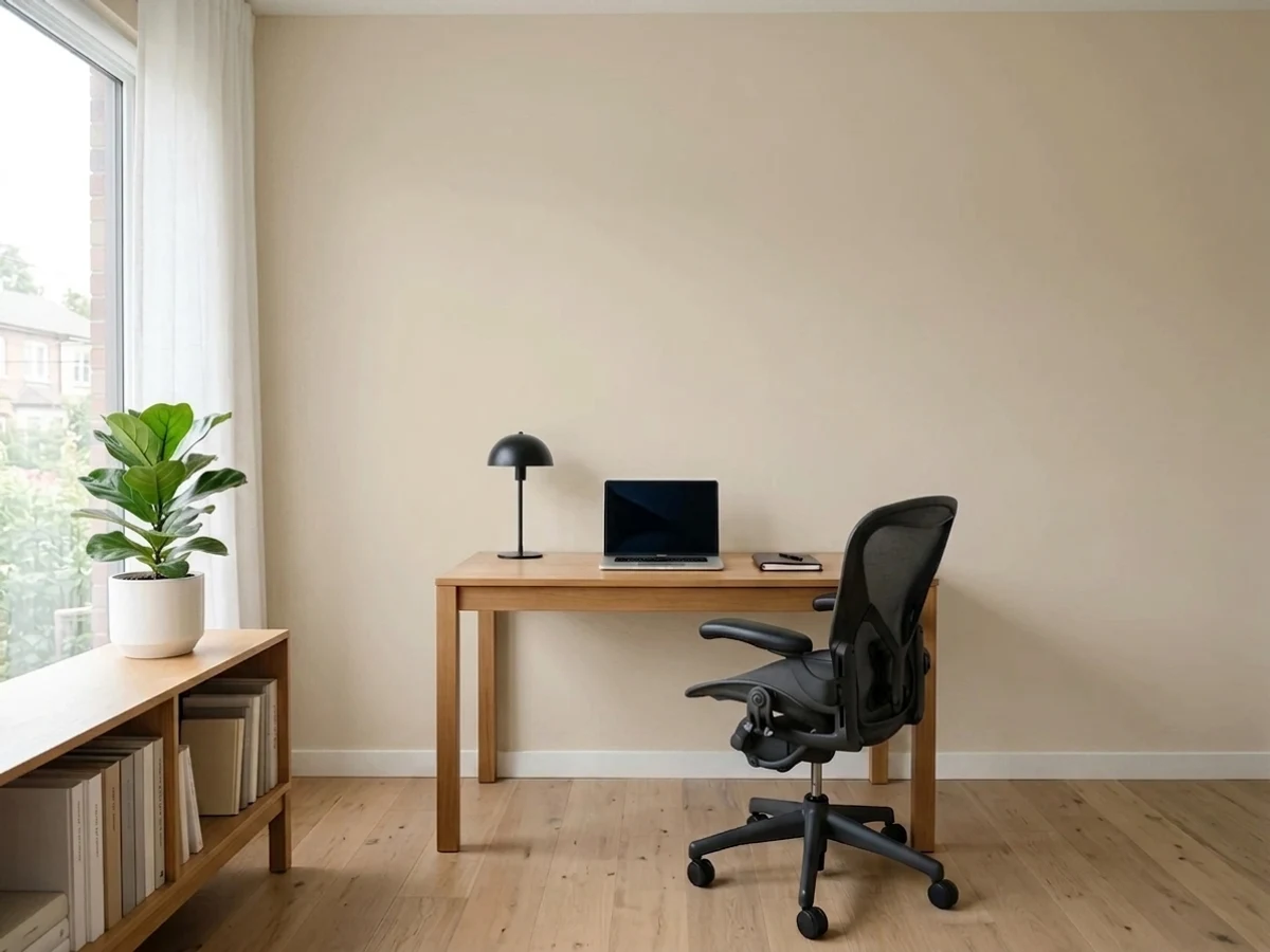
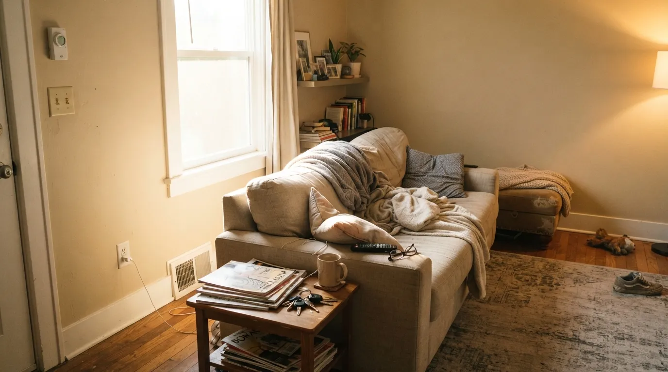
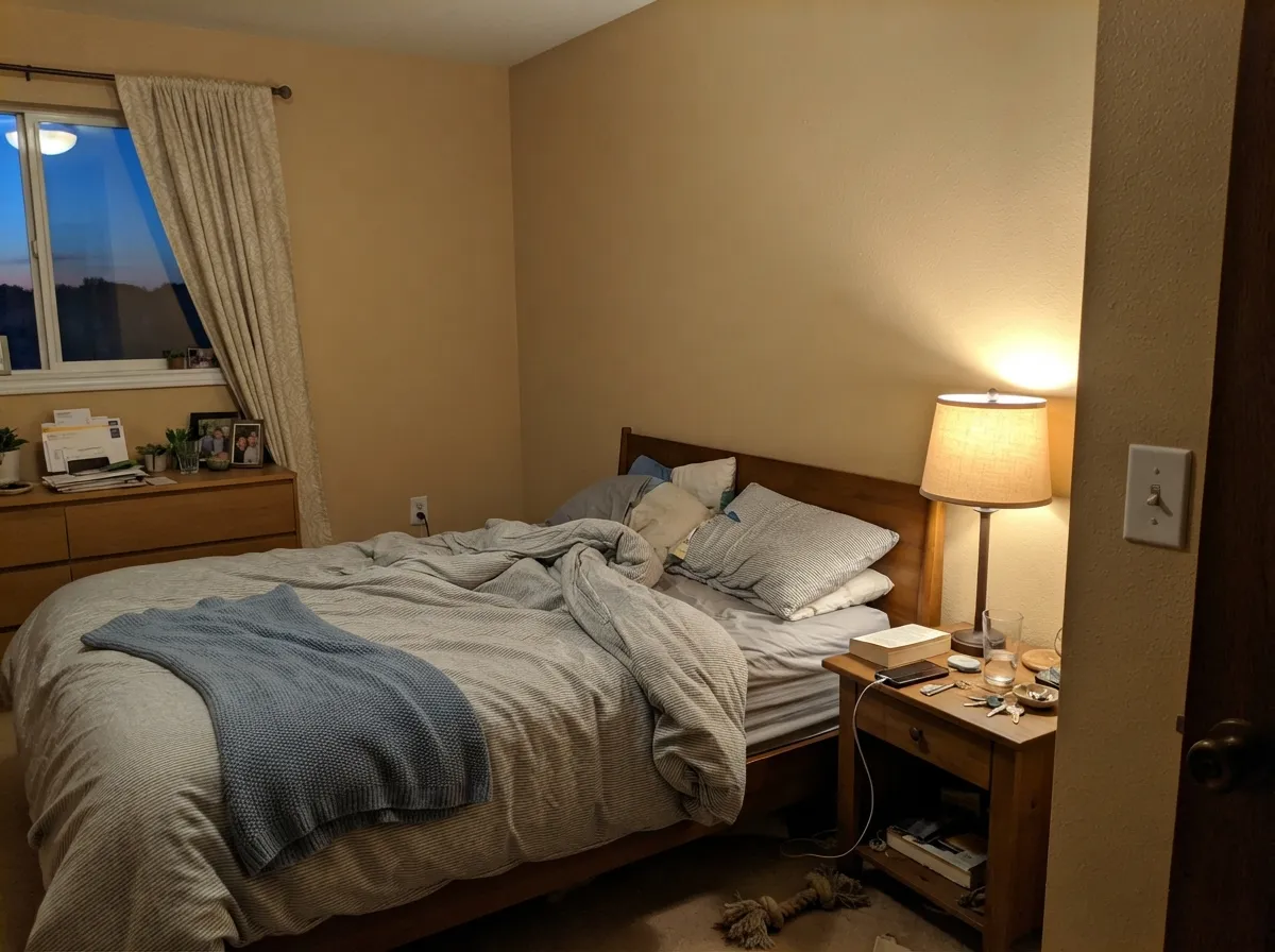
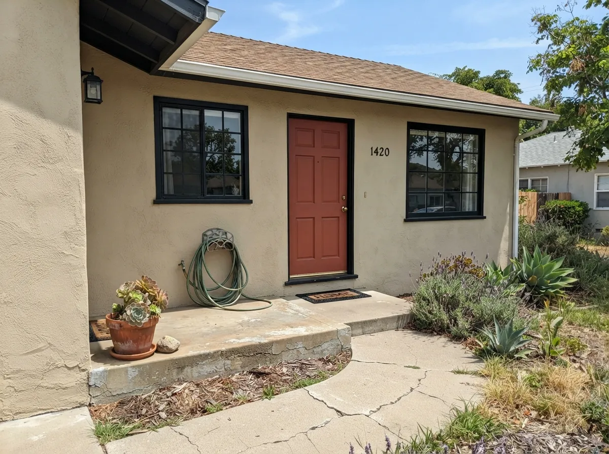
Give it real daylight — south or west exposure — and Spanish Sand turns into a luminous, warm sandy cream that is genuinely flattering, which is exactly why it shows up so often on Mediterranean and coastal stucco exteriors. Indoors, its second home is any room used mostly at night: under 2700K lamplight it sinks into a deep, cozy greige, the kind of color that makes a bedroom or den feel like dusk on purpose. It is also an honest, unfussy beige for anyone who has been burned by a builder-beige that turned orange in the sun — this one stays restrained because the gray never fully lets go.
Where It Fails
Almost every disappointing story with Spanish Sand traces back to one of three predictable mismatches — a dim room, a cool material, or an owner who wanted one flat color and got a paint that changes its mind with the weather. None of these are the paint failing; they are the paint being exactly what it is.
North light is cool and flat, and it strips out both the warmth and the pink, leaving a dull, slightly muddy gray-beige that reads nothing like the warm sand color on the chip. The fix is warm bulbs and real daylight, or picking a color built to hold its warmth in cool light, like Behr's own Even Better Beige.
The pink whisper in Spanish Sand needs warm company — brass, wood, travertine. Set it against cool blue-gray quartz counters or white-and-gray subway tile and the two undertones argue: the wall looks slightly pink-dirty, the tile looks slightly blue-cold. Test a big sample against your actual counter or tile before committing a whole kitchen or bath.
This is not a set-it-and-forget-it beige. If the whole appeal was "just a plain warm tan that looks the same all day," the light-driven drift here will frustrate you — look at a steadier, more one-note beige like Behr's Roman Plaster instead, which holds closer to a single reading across the day.
Room by Room
With south or west sun the warm sand base makes wood furniture and art look deliberate, not accidental. Pair with a soft near-white trim rather than a stark bright white, which can make the wall read slightly dingy by comparison.
Under evening lamplight it settles into a deep, cozy greige — a genuine dusk-at-night color. Eggshell hides texture and keeps the color soft; warm 2700K bulbs are doing half the work here.
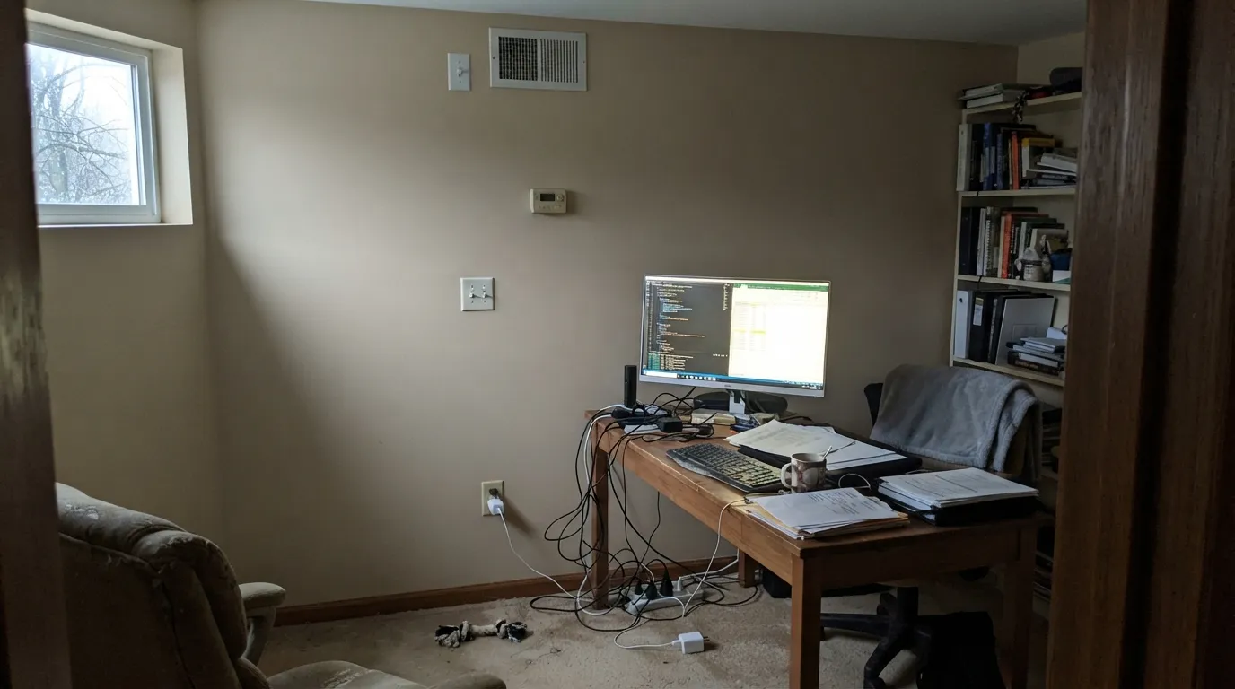
Calm without going sleepy in daylight, but a desk lamp running cool-white LEDs will flatten it toward gray by evening. Swap to a warm bulb before blaming the paint.
With warm travertine, a wood vanity, and brass fixtures it is genuinely handsome. With cool gray quartz or blue-white subway tile, the pink undertone starts a fight it usually loses — sample first.
Butcher block, warm wood cabinets, and brass hardware all sit comfortably with it. Stark white cabinets and cool gray countertops are the one combination that can make the wall look muddy rather than warm.
This is where Spanish Sand earns its keep: sandy stucco on a Mediterranean or coastal-style home, with black or near-black iron trim and a terracotta or warm-red door. Full sun brings out the warm glow; a shaded north elevation on the same house can read noticeably grayer and flatter — walk the whole house with a sample before ordering paint.
Your Light Is the Risk
Turns into a luminous, warm sandy cream with the pink undertone lifting it rather than muddying it. The light this color was made for.
Cool, flat light strips the warmth and the pink out, leaving a dull, slightly muddy gray-beige. Test before committing a north room or a shaded elevation.
Cooler and grayer in early light, warmer and sandier as the sun moves around — the same wall genuinely looks different at 9am and 4pm.
2700K warm bulbs sink it into a deep, cozy greige — the "cocoon" effect owners like at night. Cool-white LEDs flatten it toward dull gray instead.
Most complaints about Spanish Sand are a light mismatch. Upload a photo of your actual room and see it on your walls — then ask for the same wall in north light or evening lamps before you buy a single sample.
Need It From Another Brand?
Any paint counter can custom-tint Behr OR-W07 directly. If you would rather stay in one brand's own deck, these are the closest stock matches, measured as ΔE2000. Under 2 is a difference you will not see on the wall.
| Brand | Closest color | ΔE | LRV | |
|---|---|---|---|---|
| Sherwin-Williams | Canvas TanSW 7531 · Sherwin-Williams | 0.5 | 64 | Color page → |
| Benjamin Moore | Carlisle Cream1031 · Benjamin Moore | 1.0 | 62 | Color page → |
| Valspar | Palest SatinT557 · Valspar | 0.9 | 64.4 | Color page → |
| PPG / Glidden | SourdoughPPG1084-3 · PPG / Glidden | 1.7 | 63 | Color page → |
| Glidden | SourdoughPPG1084-3 · Glidden | 1.0 | 64 | Color page → |
| Dutch Boy | Elemental White421-1DB · Dutch Boy | 2.1 | 63 | Color page → |
Similar Behr Colors
The nearest shades to Spanish Sand within Behr's own range, ranked by perceptual color distance — useful when you want the same look a touch lighter, darker, or warmer.
WCAG 2.1: AA is 4.5 : 1 for normal text, 3 : 1 for large text, AAA is 7 : 1.
Spanish Sand vs the Colors You're Also Considering
Every Spanish Sand sample board has the same rivals on it. The numbers show the real lightness gap — then it comes down to which risk you would rather live with.
Pick this if you want more depth and a color that reacts to daylight instead of sitting flat.
Behr PPU7-10 · LRV 65Roman PlasterPick this if you want one plain, steady warm beige that barely moves with the light — the anti-drift option.
Pick this for the sandier, more coastal-leaning version with more character in good light.
Sherwin-Williams SW 7036 · LRV 58Accessible BeigePick this if your painter works in Sherwin-Williams — a similar warm neutral with less pink to manage.
The Behr neighbors are separated by very small shifts. Roman Plaster PPU7-10 at #DDD1C0 and LRV 65 is a shade cleaner. Gray Envelope DC-011 at #D9D0C1 and LRV 64 is greyer, as the name suggests. Natural Almond PPU4-12 at #DED2BC and LRV 65 is a touch greener, and Haze ICC-22 at #DCCDBD and LRV 63 sits slightly deeper and warmer.
Across brands this color has an unusually large family of true matches. Farrow and Ball Joa's White No. 226 at LRV 63 and deltaE 0.48, Sherwin-Williams Canvas Tan SW 7531 at LRV 64 and deltaE 0.53, Clare Turbinado PNT100-LT-21 at deltaE 0.84, Valspar Palest Satin T557 at deltaE 0.87, Glidden Sourdough PPG1084-3 at deltaE 0.97, and Benjamin Moore Carlisle Cream 1031 at LRV 62 and deltaE 1.03 all land at or under one, so they are true or effectively identical matches. Dutch Boy Elemental White 421-1DB at deltaE 2.15 and Dunn-Edwards Gunnysack DET674 at deltaE 2.55 are very close, so sample first. Portola Paints Figueroa at deltaE 3.62 is close but visibly cooler side by side.
Spanish Sand Coordinating Colors
The rule for coordinating with Spanish Sand: keep the accents warm, and let the paint's own gray do the cooling. It pairs cleanly with near-black iron tones, warm terracotta reds, and deeper taupes from its own beige family — and it does best next to soft near-whites rather than stark bright ones. These are the partners that keep showing up in rooms and exteriors that work:
Spanish Sand On Mediterranean and Coastal Exteriors
This is where the same undertone complexity that causes indoor headaches becomes a genuine asset. Sandy stucco is a defining feature of Mediterranean and coastal architecture, and Spanish Sand's warm-sand-with-a-gray-base reading is exactly the sun-bleached look those styles want — closer to real beach sand than a flatter, more one-note tan would be.
The trade-off carries outside too: full sun brings out the warm glow, but a shaded north elevation on the same house can read noticeably grayer and flatter. Walk the entire perimeter of the house with a large sample before ordering paint for the whole exterior — what looks perfect on the sunny south wall can look dull on the shaded side, and stucco is expensive to repaint twice.
Spanish Sand With Wood Tones and Floors
Warm wood is the easy, safe answer here: oak, walnut, and butcher block all sit comfortably against Spanish Sand because the paint's own warmth meets theirs halfway, and the gray in the paint keeps the pairing from tipping too golden the way a purer tan sometimes does.
Stone and tile are where you actually need to test. Warm travertine, terracotta, and sandstone flatter the color and pull its warmth forward. Cool gray porcelain tile, blue-gray quartz, and chrome fixtures pull the other direction — the pink undertone and the cool material argue rather than agree, and the result can read slightly muddy rather than warm. If your fixed materials are cool-toned, sample a large board against them before committing a whole room.
Three Ready Palettes Built on Spanish Sand
A color is never alone on the wall. These are complete combinations in the 60-30-10 pattern, with the reason each one holds together. Every one opens in the visualizer.
The sandy beige reads like sun-bleached driftwood; the soft near-white trim keeps the room light without the stark contrast a bright white would add; the slate-blue door supplies the one ocean note the palette wants.
Try this palette in your roomThe warm sand wall keeps white cabinets from reading cold and clinical; the near-black island grounds the room and hides fingerprints better than a mid-tone would.
Try this palette in your roomSandy stucco, near-black iron-look trim, and a brick-red door is the classic Mediterranean coastal combination — and it is the one place Spanish Sand's light-driven warmth is a feature, not a risk.
Try this palette in your roomSpanish Sand FAQ
Is spanish sand beige, greige, or pink?
All three, depending on your light. It is built from a warm sandy-tan base, a cooling gray, and a faint pink — south and west sun bring the sand and pink forward, north light and overcast days push it toward flat gray. There is no single "true" reading; the color is genuinely light-dependent.
Does spanish sand work on a stucco exterior?
Yes — this is arguably its best use. It is a classic Mediterranean and coastal stucco color, especially with black or near-black iron trim and a warm-toned door. Check both a full-sun elevation and a shaded one before ordering paint; the same color can look noticeably different on the north and south sides of the same house.
What trim color goes with spanish sand walls?
A soft near-white like Behr Whipped Cream or Whisper White, rather than a stark bright white. A very bright trim white can make Spanish Sand's warmth look slightly dingy by contrast, the same effect that shows up with other warm neutrals paired against cool bright whites.
Will spanish sand clash with gray quartz or tile?
It can. The paint's faint pink undertone needs warm company — wood, brass, travertine. Cool blue-gray quartz or subway tile pulls the opposite direction, and the pairing can read slightly muddy on the wall and slightly cold on the counter. Always test a large sample against the actual material first.
How is spanish sand different from behr's other beiges, like roman plaster or even better beige?
Roman Plaster (LRV 65) is the plainer, steadier beige of the three — it barely shifts with the light. Even Better Beige (LRV 60) skips the pink undertone almost entirely. Spanish Sand is the most complex and the most light-reactive of the group, with the sand-gray-pink layering that makes it read differently morning to evening.
Does spanish sand look different in a north-facing room versus a south-facing one?
Yes, and the difference is significant. South and west light bring out a warm, sandy, slightly pink cream. North light and overcast skies flatten it toward a dull, cooler gray-beige with the warmth largely gone. This is the single biggest thing to test before painting a whole room or house in this color.
Have you painted with Spanish Sand?
Rate it — one tap helps the next reader decide.
Ask a Question