Adobe Sand
N240-2 · #E1D0BE · LRV 65 — warm red-orange tone, light — bounces daylight without going clinical.
- 1Revere Pewter55
- 2Agreeable Gray60
- 3Adobe Sand65
- 4Shoji White74
- 5Dover White83
What Color Is Adobe Sand, Really?
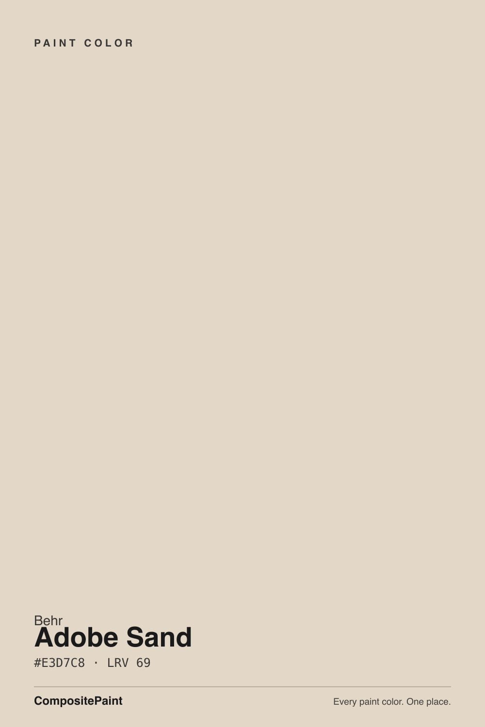
Adobe Sand N240-2 is a light, soft beige with a hex of #E3D7C8 and an LRV of 69. That lightness puts it near the top of the beige range, so it reflects most of the daylight in a room and reads as a warm off-white on a large wall. The hue sits at 33 degrees, in the red-orange band, but the saturation is only 33 percent, so the color is muted rather than sunny.
That combination is why people reach for it. It gives the warmth of a beige without the golden cast that stronger beiges bring, which makes it easy to live with in an open plan where one wall color has to carry a kitchen, a hallway, and a living room. It sits between a warm white and a true greige, and it works with both cream cabinetry and mid-tone wood. Behr is mixed at The Home Depot, so sampling is easy.
The thing to check is how quiet it is. At 33 percent saturation, Adobe Sand can flatten out in bright direct sun and simply look like dirty white. It also picks up whatever is next to it. Against a strong warm floor it can go gray, and against a cool gray floor it can go pink. Sample it against your actual flooring.
The undertone is warm red-orange, but held back. At 33 degrees of hue with only 33 percent saturation, Adobe Sand has the direction of a beige and the restraint of a neutral. Look closely and there is a faint pinkish softness in it, which comes from that red side of the orange range and separates it from yellow-leaning beiges.
Where it shows depends entirely on neighbors. Beside a crisp white it reads clearly beige and slightly warm. Beside a saturated tan or a golden oak floor it retreats and can look almost gray. Next to a cool gray tile the pink edge comes forward and can surprise people who expected a plain neutral.
Because the lean is so gentle, a small chip will not tell you much. Roll a large sample board, stand it against the floor and the countertop, and look in the corner of the room where light is weakest. That is where the undertone shows most honestly.
Best Rooms and Uses for Adobe Sand
This is a whole-home wall color. An LRV of 69 keeps hallways, stairs, and small bedrooms feeling open, and the low saturation means it does not fight artwork, rugs, or furniture. Open-plan living and dining spaces are its natural home, since it reads as a neutral background rather than a color statement.
It is also useful in rooms with a lot of competing material, like a kitchen with busy stone or a bathroom with patterned tile, because it stays quiet.
On trim it is usually too close to the wall value to give a clean line, so pair it with a separate white for baseboards, casings, and doors. On cabinets it can work in a warm, layered scheme, though its softness means it will not deliver contrast against light counters. Outdoors it makes a calm body color for siding or stucco, and it takes a dark front door and dark shutters well, which is where the contrast should come from.
How Lighting Changes Adobe Sand
With an LRV of 69 Adobe Sand stays bright in almost any room, so lighting changes its character rather than its brightness. In north-facing rooms the cool, flat daylight strips out much of the small amount of warmth, and the color leans toward a soft, slightly gray beige. Some people find it a little dull there and want something with more color.
South and west light does the color a favor. Direct sun brings the red-orange forward and Adobe Sand looks creamier and more intentional, especially in late afternoon. East-facing rooms are warm in the morning and quieter after lunch.
Bulbs push it the same way. Warm 2700K lamps add back the warmth that north light removes, which is why the color often looks better at night than at noon. Cooler bulbs near 4000K make it read closer to a plain off-white. Check a sample under your own fixtures after dark before you commit.
Most complaints about Adobe Sand are a light mismatch. Upload a photo of your actual room and see it on your walls — then ask for the same wall in north light or evening lamps before you buy a single sample.
Need It From Another Brand?
Any paint counter can custom-tint Behr N240-2 directly. If you would rather stay in one brand's own deck, these are the closest stock matches, measured as ΔE2000. Under 2 is a difference you will not see on the wall.
| Brand | Closest color | ΔE | LRV | |
|---|---|---|---|---|
| Sherwin-Williams | Maison BlancheSW 7526 · Sherwin-Williams | 2.1 | 66 | Color page → |
| Benjamin Moore | Dusty Road1017 · Benjamin Moore | 1.3 | 64 | Color page → |
| Valspar | Palest SatinT557 · Valspar | 1.9 | 64.4 | Color page → |
| PPG / Glidden | Ice Cream ConePPG1082-3 · PPG / Glidden | 1.5 | 65 | Color page → |
| Glidden | Ice Cream ConePPG1082-3 · Glidden | 1.2 | 65 | Color page → |
| Dutch Boy | Roasted Garlic410-1DB · Dutch Boy | 2.2 | 65 | Color page → |
Similar Behr Colors
The nearest shades to Adobe Sand within Behr's own range, ranked by perceptual color distance — useful when you want the same look a touch lighter, darker, or warmer.
WCAG 2.1: AA is 4.5 : 1 for normal text, 3 : 1 for large text, AAA is 7 : 1.
Adobe Sand vs Similar Colors
Within Behr, Sand Castle ECC-51-2 at #E5D9C6 and LRV 70 is a touch lighter and a touch warmer, while Sheer Scarf PPU2-05 at #E3D5CB and LRV 68 trades some yellow for pink. Chocolate Froth 720C-2 at #DFD6CB and LRV 68 is the most neutral of the set and reads closer to greige on a wall.
Across brands the matches are unusually tight. Valspar Gentle Lamb V177 at #E3D8C8 and LRV 69.7 has a deltaE of 0.8, and Sherwin-Williams Kestrel White SW 7516 at #E0D6C8 and LRV 68 comes in at 0.93. Both are genuine matches. Clare Neutral Territory PNT100-LT-20 at deltaE 0.96 and Glidden Maybe Mushroom PPG1020-2 at deltaE 1.02 are visually identical in normal room light.
Further out the gap opens. Benjamin Moore White Sand 964 at #E0D8C6 and LRV 67 has a deltaE of 2.73, so it is very close but worth sampling first, and it reads slightly yellower. Dutch Boy Sheridan White 415-1DB at deltaE 3.49 is close but visibly different side by side.
Colors That Go With Adobe Sand
Trim comes first. A clean, slightly warm white on casings and doors keeps the edges crisp without making Adobe Sand look muddy. A very blue-white will exaggerate the faint pink in the wall, so it is worth testing before you buy a gallon. Warm oak, walnut, and rattan all sit comfortably with it, and brass, bronze, or matte black hardware all work.
Inside Behr, the near neighbors are quiet variations rather than contrasts. Sand Castle ECC-51-2 at LRV 70 and Varnished Ivory MQ3-40 at LRV 71 are a hair lighter. Sheer Scarf PPU2-05 at LRV 68 and Translucent Silk MQ3-36 at LRV 68 lean slightly cooler and pinker. Chocolate Froth 720C-2 at LRV 68 is the greyest of the group and is a reasonable pick for an adjoining room when you want a barely visible shift.
For contrast, the room needs something well below this range: a deep charcoal, a navy, or a dark green on an island, door, or built-in gives Adobe Sand the anchor it lacks.
Coordinated palette
Generated by hue-rotating #E1D0BE in HSL space. Pair Adobe Sand with one accent and one neutral — the swatches below are starting points, not final picks.
Adobe Sand FAQ
Is Adobe Sand warm or cool?
It is warm, but only mildly. The hue is 33 degrees, in the red-orange range, while saturation is just 33 percent, so the warmth is muted. In cool north light it can pass for a soft gray-beige, and in south light the warmth becomes clearer. There is no green or blue in it.
What LRV is Adobe Sand?
Adobe Sand N240-2 has an LRV of 69, which places it in the light band. It reflects most of the light in a room and behaves close to a warm off-white on a full wall. That makes it useful for small rooms, hallways, and any space where you want brightness without a stark white.
Does Adobe Sand work in a dark room?
Yes. At LRV 69 it returns plenty of light, so it will not make a dim room feel closed in. The one caution is that cool, weak daylight mutes its already low 33 percent saturation, so the color can look a little flat there. Warm bulbs bring the beige back at night.
What white trim goes with Adobe Sand?
Use a clean white with a hint of warmth. Because Adobe Sand sits at LRV 69, the trim needs to be clearly brighter to hold a crisp line. A strongly blue-based white will push the wall's faint pink forward, so test the pairing on a board before committing to both.
Is Adobe Sand good for exteriors or cabinets?
It makes a calm exterior body color for siding or stucco and pairs well with a dark door and dark shutters, which supply the contrast it cannot. On cabinets it is workable in a warm scheme, though at LRV 69 with low saturation it will read close to an off-white rather than as a color.
How is Adobe Sand different from Kestrel White?
Sherwin-Williams Kestrel White SW 7516 is #E0D6C8 at LRV 68, against Adobe Sand at #E3D7C8 and LRV 69. The deltaE is 0.93, so they are a genuine match. Kestrel White is a fraction deeper, but on a finished wall you would not be able to tell them apart.
Have you painted with Adobe Sand?
Rate it — one tap helps the next reader decide.
Ask a Question