Room Colors · Dining Room
18 Best Dining Room Paint Colors for 2026
ideas, combinations, and real rooms
18 curated picks from real dining rooms — with the exact colors, honest reasons why, and the combinations that hold the room together.

Former interior stylist who can spot a green undertone from across a room. Jessica writes the color and mood pieces — what to choose, what pairs, and why your "white" looks pink.
The Fast Answer
Don't want to read 18 picks? These four are the safe answers.

Top Picks for the Dining Room
Pick a color family, tap a shade to see the dining room in it, then try it on your own room.
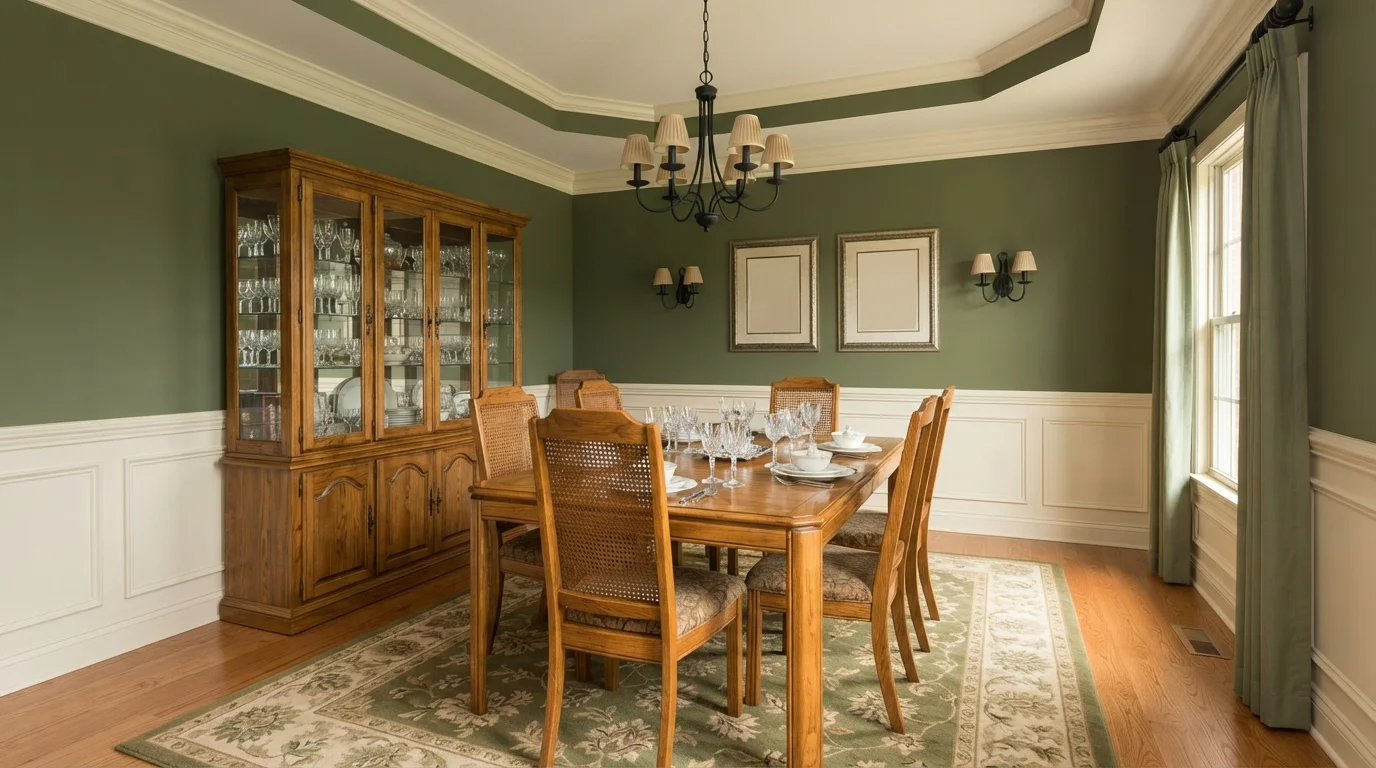
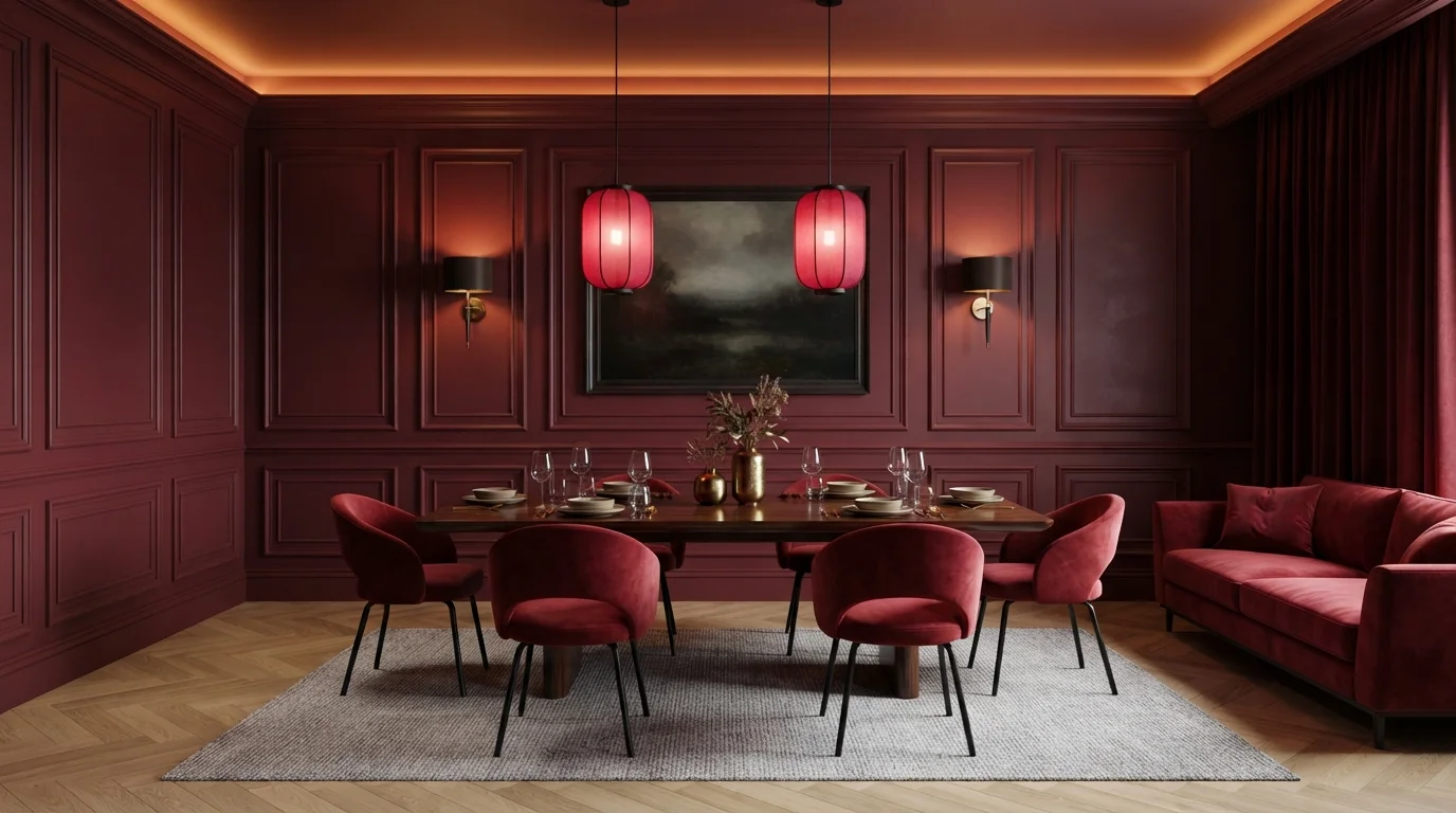
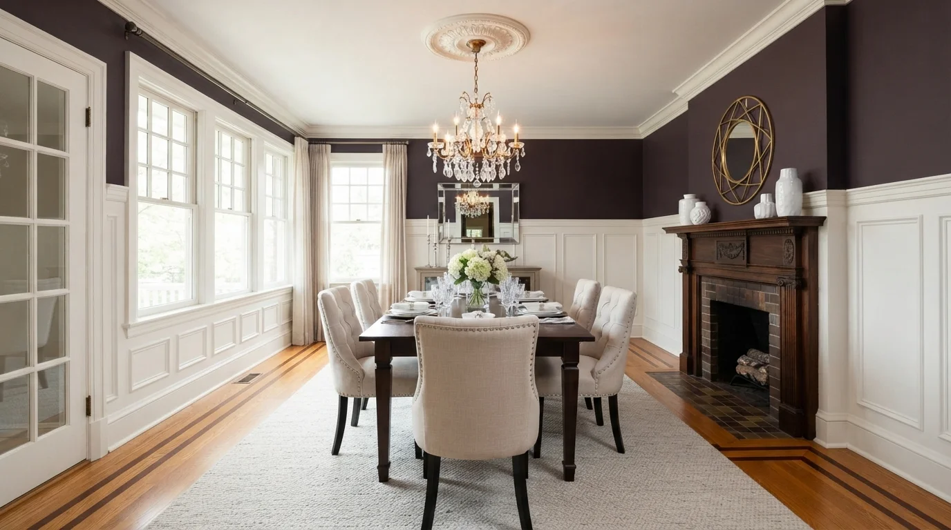
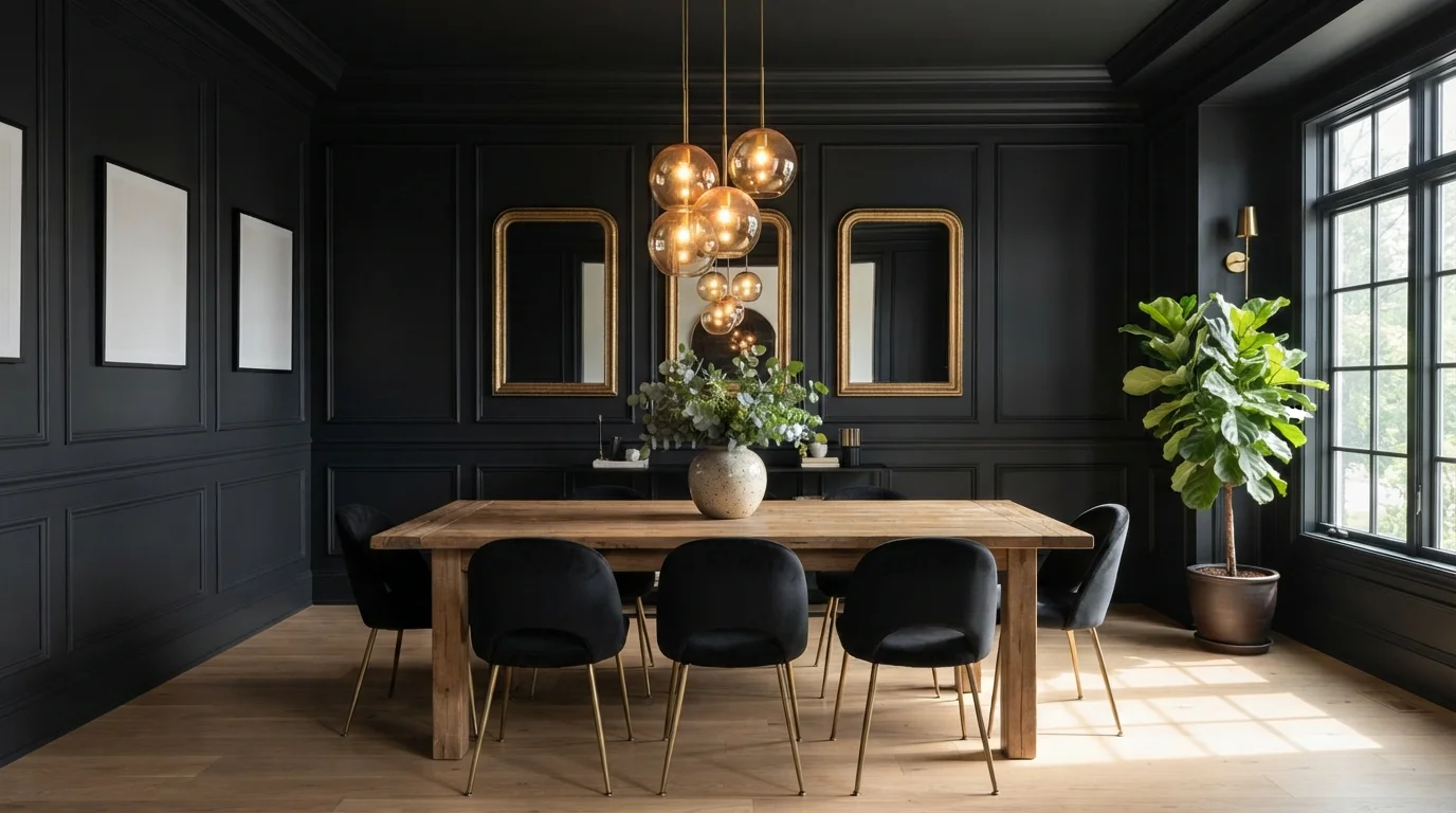
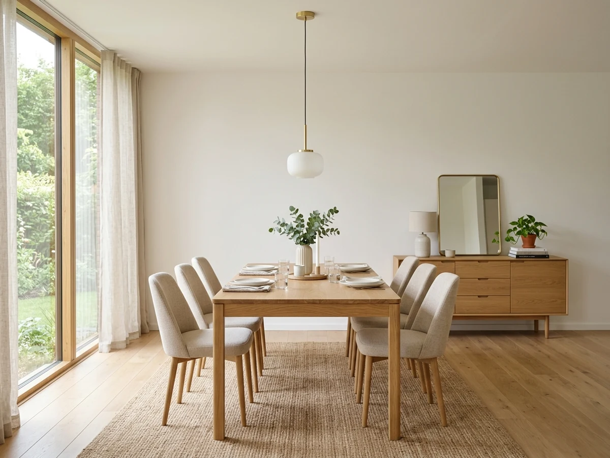
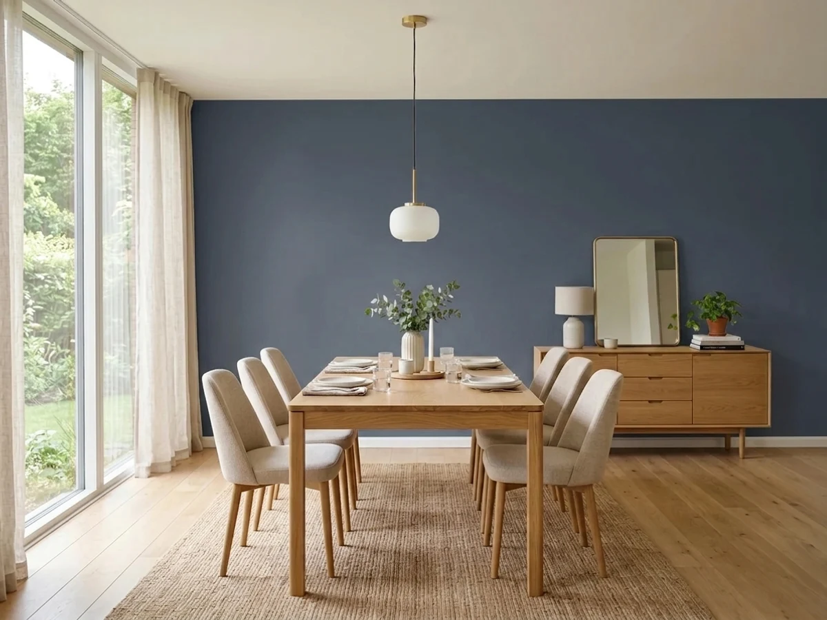
The cult dining-room dark blue — blooms under evening light, photographs beautifully.
Dining Room Color Trends 2026 — What's In, What's Out


- Cool flip-house gray — The gray-on-gray builder scheme reads cold under dinner lighting and dates a dining room instantly.
- Stark bright white — Hospital white lost to warm whites — a dining room needs warmth more than any room in the house.
- Single accent walls — One bold wall against four plain ones lost to drenching the whole room in the color you love.
- All-navy dining rooms — Navy's decade is over here — the 2026 brand picks all moved to browns and greens instead.
The 18 Best Dining Room Paint Colors
Every pick below is a real rendered dining room, not a chip. The lead color first; the swatches are the full scheme in the photo — walls, furniture, textiles, accent.

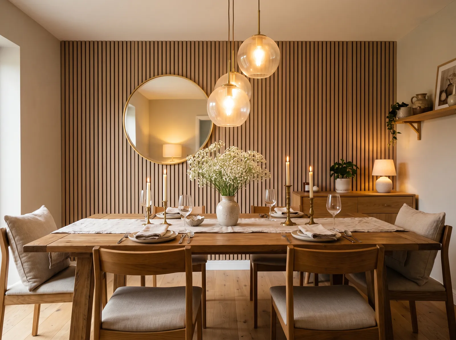
A soft, creamy greige wraps the walls in quiet warmth, so the oak table and candlelight feel cozy and gently lit.
Greige is a soft blend of gray and beige — a warm neutral that's about the easiest wall color you can choose. Here it wraps the walls while honey-toned oak fills the room: a warm wood table, a bronze cabinet, and soft gray-beige cushions on the chairs. The whole space feels calm, settled, and gently lit, especially by candlelight. It works because greige goes with almost any wood tone, so nothing has to match perfectly. Pick this if you want a quiet, cozy room that's very hard to get wrong.
SEE LOGGIA ON YOUR WALLS →
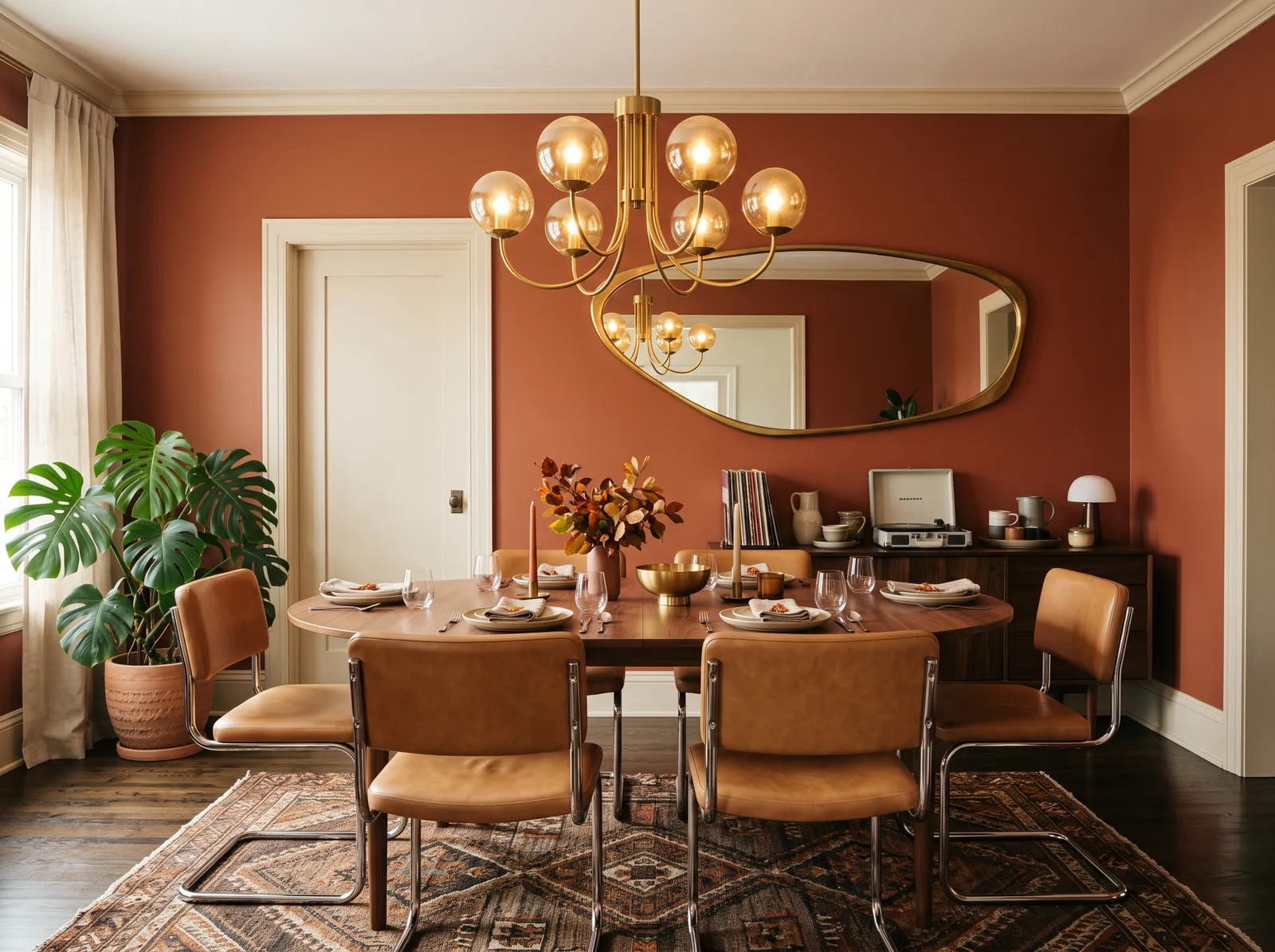
Earthy terracotta walls glow against soft beige trim, giving this room a warm, retro feel that makes you want to linger over dinner.
Terracotta is a warm, clay-orange — earthy and old-world, not bright or loud. In this room it's on the walls, with soft beige trim, tan chairs, and a dark brown table filling out the natural mix. The whole space feels warm and welcoming, the kind of room you linger in long after dinner. It works because these colors all come from nature, so they get along easily — and the single green plant adds just enough cool contrast to keep it from feeling flat. Pick this if you love warm, cozy color but want it grounded, not flashy.
SEE SUN'S RAGE ON YOUR WALLS →
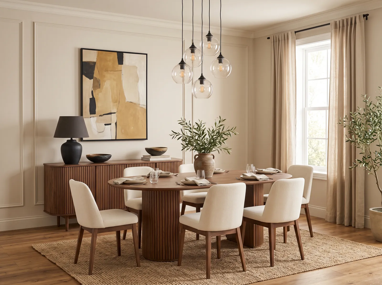
Soft linen walls and a barely-there warm ceiling keep things calm, letting the walnut table and jute rug feel grounded and easy.
Soft linen is a warm off-white — quiet enough to let everything else in the room shine. Here it covers the walls while a dark walnut table, a jute-colored rug, and pale chairs bring in natural texture and warm wood. The room feels relaxed and lived-in, calm without being cold. It works because the soft walls step back and let the wood and woven textures do the talking, so you get richness without any bright color. Choose this if you like a natural, easy look that never feels overdone.
SEE CHERUBIC ON YOUR WALLS →
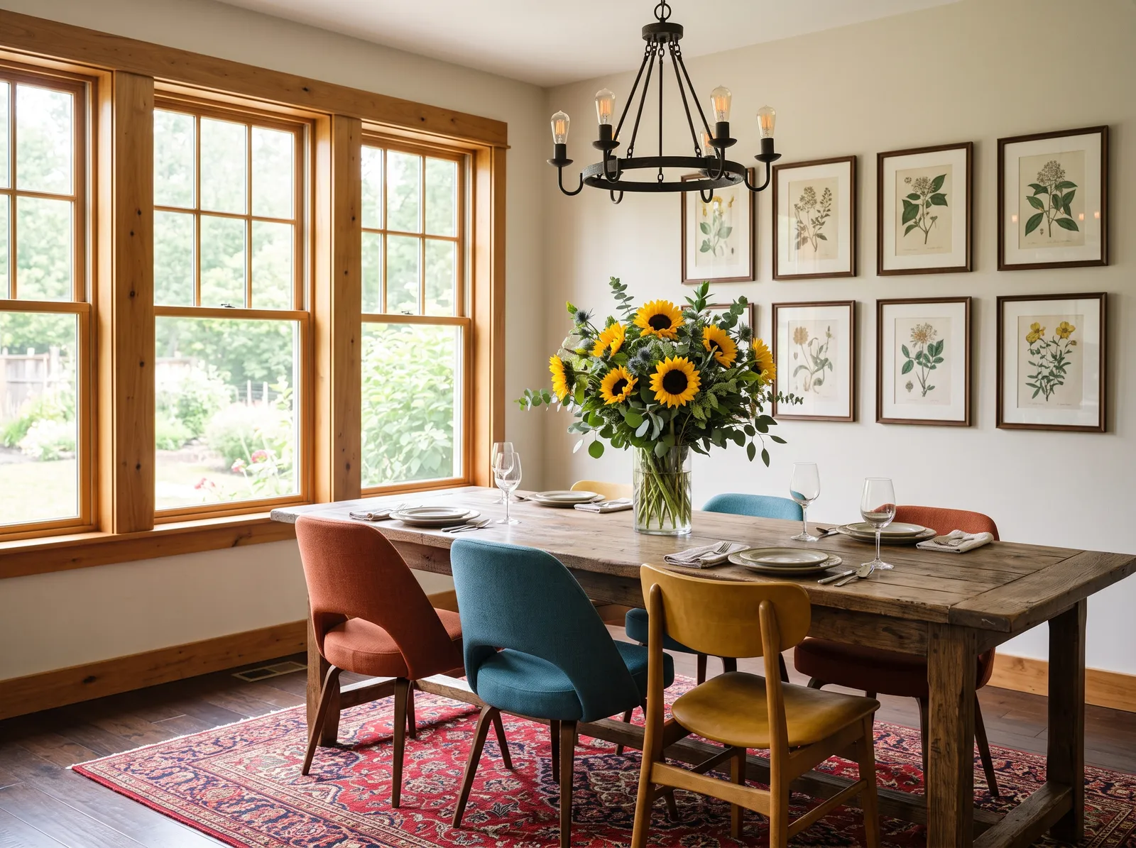
Gentle cream walls catch the afternoon light, a quiet backdrop that lets mismatched chairs and a big bunch of sunflowers shine.
Cream is the friendliest base color there is — it goes with just about anything you put in front of it. That's the whole idea here: plain cream walls let you mix playful chairs, like a teal one and a rusty-red one, without them clashing. A red rug ties the floor together. The room feels cheerful, personal, and a little bit cottage. It works because the calm walls give all those colors room to breathe. Pick this if you want a fun, collected look and don't need everything to match.
SEE PARAFFIN ON YOUR WALLS →
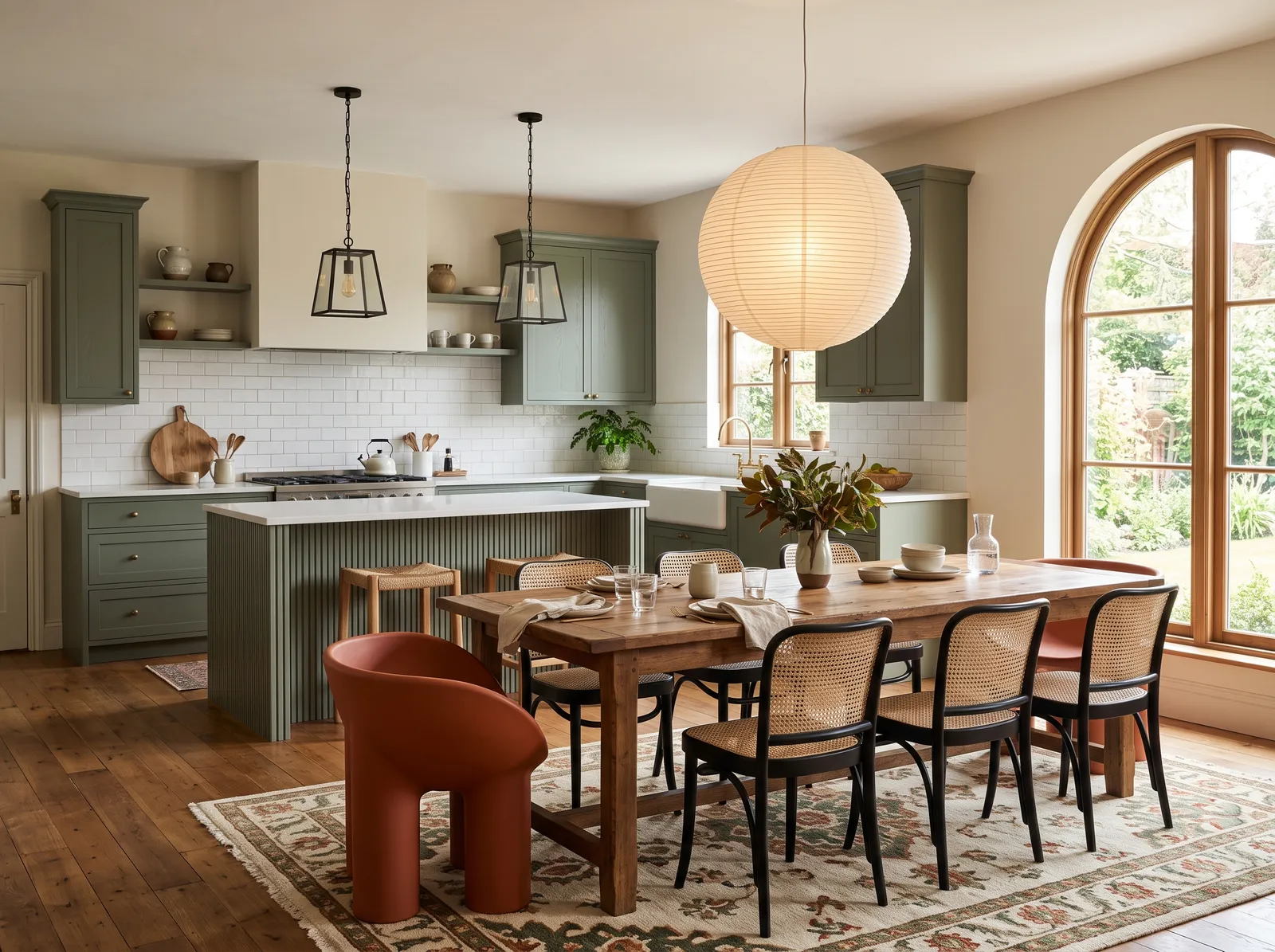
Deep sage cabinets meet soft cream walls, an earthy pairing that feels fresh and grounded around a long, rustic wooden table.
Sage is a soft, grayed green that feels fresh and calm at the same time. Here the deeper sage goes on the cabinets while the walls stay light cream, with a rustic wood table in the middle. The room feels grounded and natural, like a slow Sunday lunch. It works because keeping the green low and the walls light stops the space from feeling dark — you get color without losing brightness. A small touch of terracotta warms it up. Lovely if you want a little color but nothing bold.
SEE EARTHLING ON YOUR WALLS →
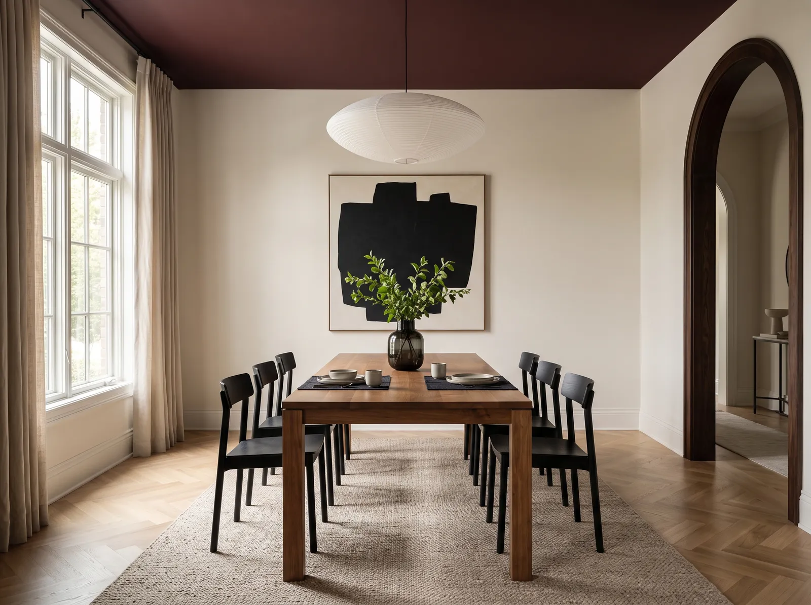
Calm cream walls below and a deep burgundy ceiling above add just enough drama overhead to make dinner feel special.
Burgundy is a deep, brownish red — rich, moody, and a bit dramatic. The clever part here is that the walls stay calm and cream, and the burgundy goes overhead on the ceiling instead. That bit of drama up top makes dinner feel special without turning the whole room dark. It works because the cream walls balance the deep ceiling, so the space still feels warm and open at eye level. Try this if your room feels a little plain and you want one unexpected, cozy surprise.
SEE HINT OF CREAM ON YOUR WALLS →
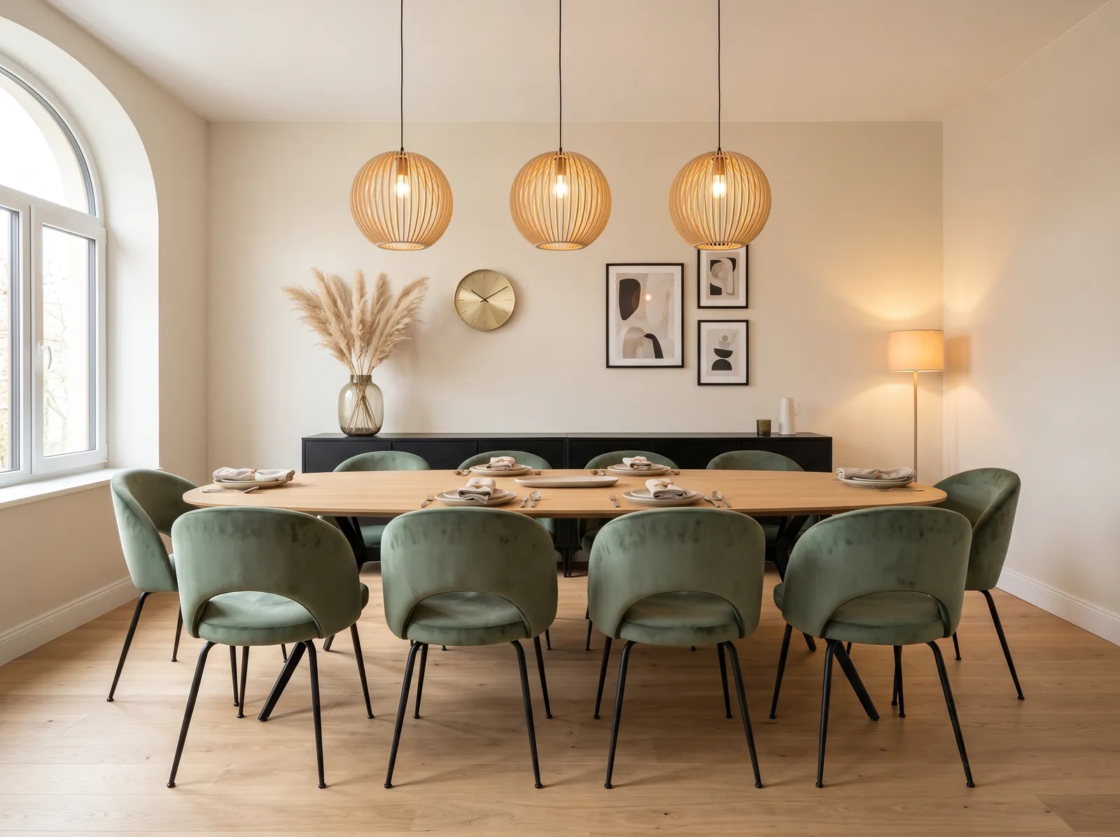
Soft cream walls glow in the lamplight, a warm, quiet backdrop that lets the sage velvet chairs and oak table take the lead.
This is a quiet off-white room that lets the furniture do all the talking. The walls stay soft and warm, so sage velvet chairs and a honey oak table really stand out, with one black cabinet adding a bit of weight in the corner. The room feels soft, calm, and easy to be in. It works because the gentle walls act like a blank backdrop — the color and texture come from the pieces, not the paint. A good pick if you want a restful room that still has something to look at.
SEE SOFT LINEN ON YOUR WALLS →
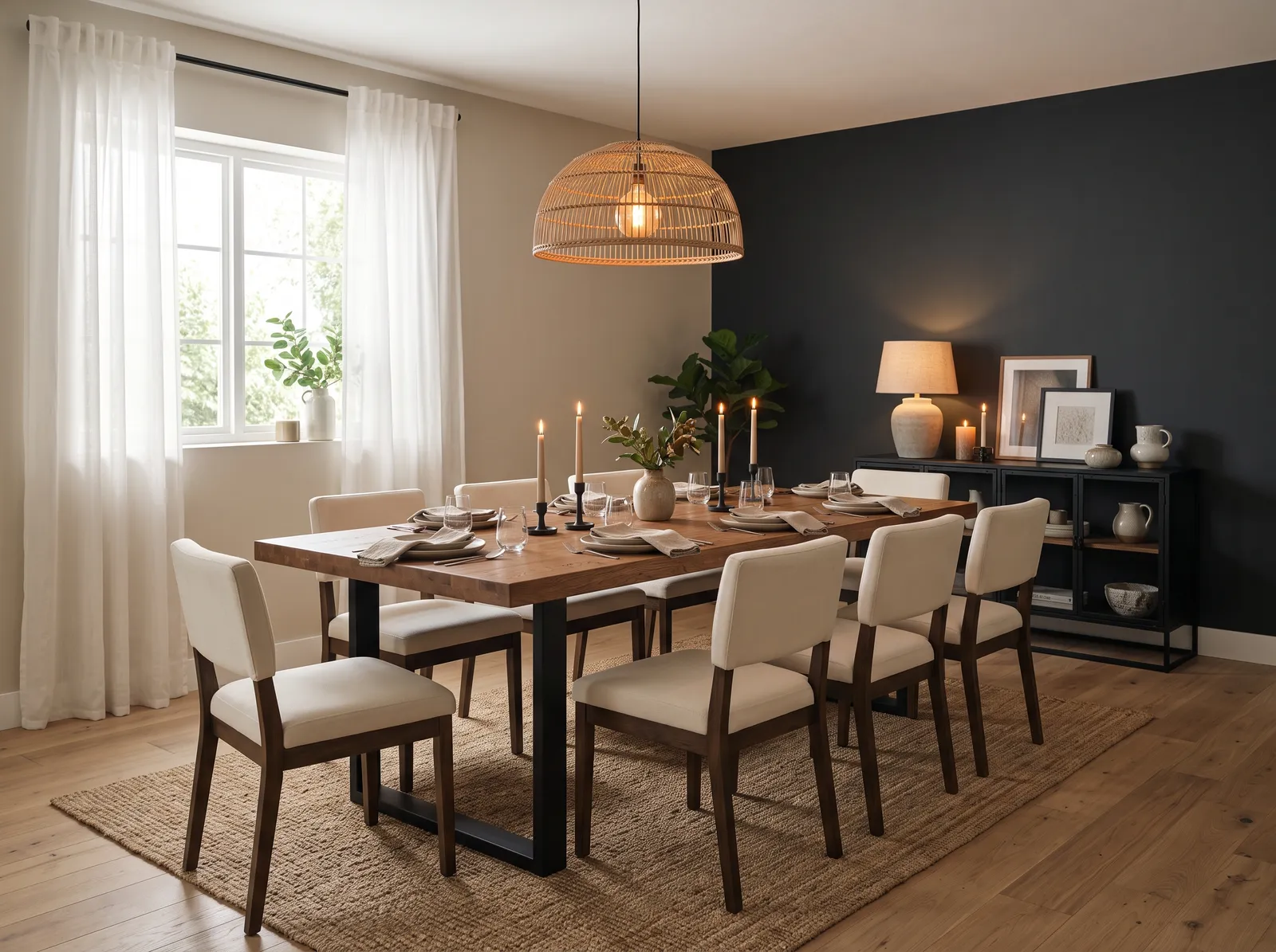
Deep charcoal meets warm cream, a moody two-tone mix that wraps the table in candlelit intimacy for long, slow dinners.
Charcoal is a soft near-black, and pairing it with warm cream keeps it from feeling heavy. Here the dark color lands on just one wall, with cream everywhere else, warm wood furniture, and a soft rug underfoot. The room feels cozy and intimate, made for long, candlelit dinners. It works because the cream balances the charcoal, so you get a moody feel without the room turning into a cave. Choose this if you love a darker look but worry that all-dark might be too much.
SEE IT ON YOUR WALLS →
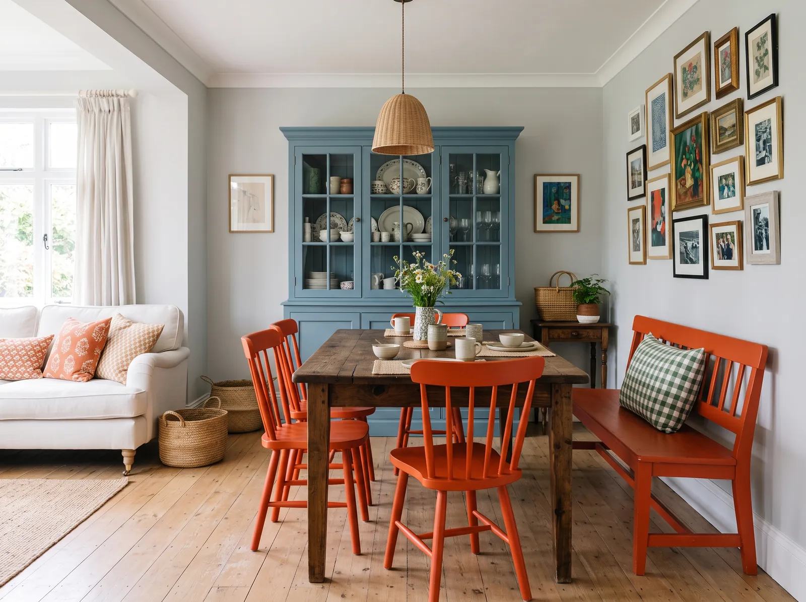
A dusty blue cabinet and bright orange chairs play off soft gray walls for a cheerful, collected look full of personality.
This look keeps the walls a plain, soft gray and lets the furniture bring all the color. The big moves are a dusty blue cabinet and bright orange chairs, with a bronze table and cream sofa keeping everything else calm. The room feels cheerful and full of personality — lively without being chaotic. It works because blue and orange sit opposite on the color wheel, so they make each other pop instead of clash. Choose this if you like a bit of fun and aren't afraid of color.
SEE ELEMENTAL ON YOUR WALLS →
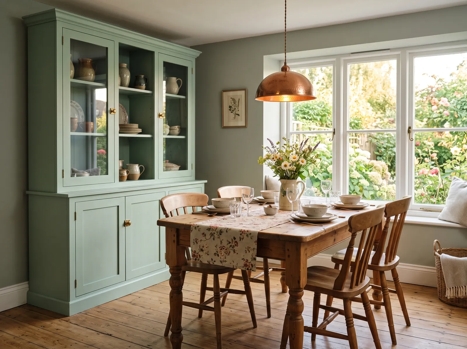
Gentle sage on the hutch and walls melts together for a sun-washed cottage feel that's calm, easy and full of charm.
Sage green is gentle and easy on the eyes, and this room uses two soft shades of it — one on the walls, a slightly lighter one on the hutch. That close match melts the space into a single, calm cottage look, warmed up by a wood table in the middle. The room feels sunny, relaxed, and unfussy. It works because the two greens are so close they blend rather than compete, so nothing feels busy. A relaxing pick if you want a soft, country feel without a lot of contrast.
SEE BALSAM FIR ON YOUR WALLS →
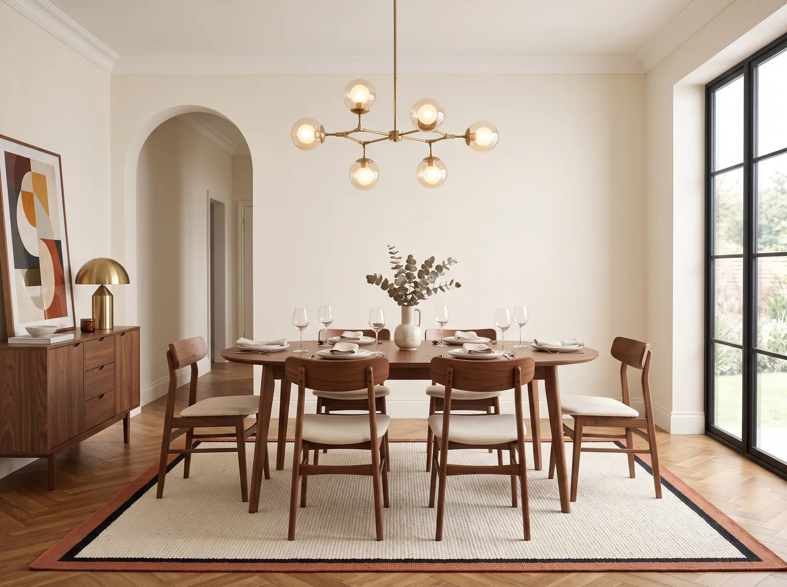
Creamy alabaster walls hold the room in soft, gentle light, the perfect quiet frame for rich walnut wood and glowing brass.
Alabaster is a creamy, warm white — soft, gentle, and timeless. Here it holds the walls in even light, making the perfect backdrop for rich walnut wood and glowing brass. The room feels cozy and a touch elegant, the kind of look that doesn't go out of style. It works because a warm white makes dark wood and metal stand out without any fight for attention. Pick this if you want something classic and inviting that you won't get tired of.
SEE PALE ECRU ON YOUR WALLS →
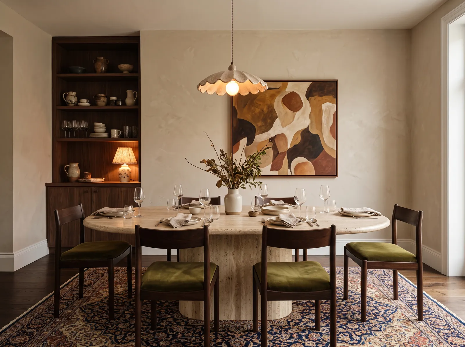
A warm, earthy beige wraps the plaster walls in velvety calm, letting the travertine table and Persian rug feel rich and grounded.
This beige is warm and earthy, almost like soft plaster on the walls. It feels rich but still calm, and the room layers olive-green chairs and deep brown wood on top for depth, with a blue rug adding one cool note. The whole space feels grown-up and grounded, but still easy to relax in. It works because the warm beige ties all the earthy tones together, so even the darker pieces feel cozy rather than heavy. A good choice if you want a refined room that still feels like home.
SEE IT ON YOUR WALLS →
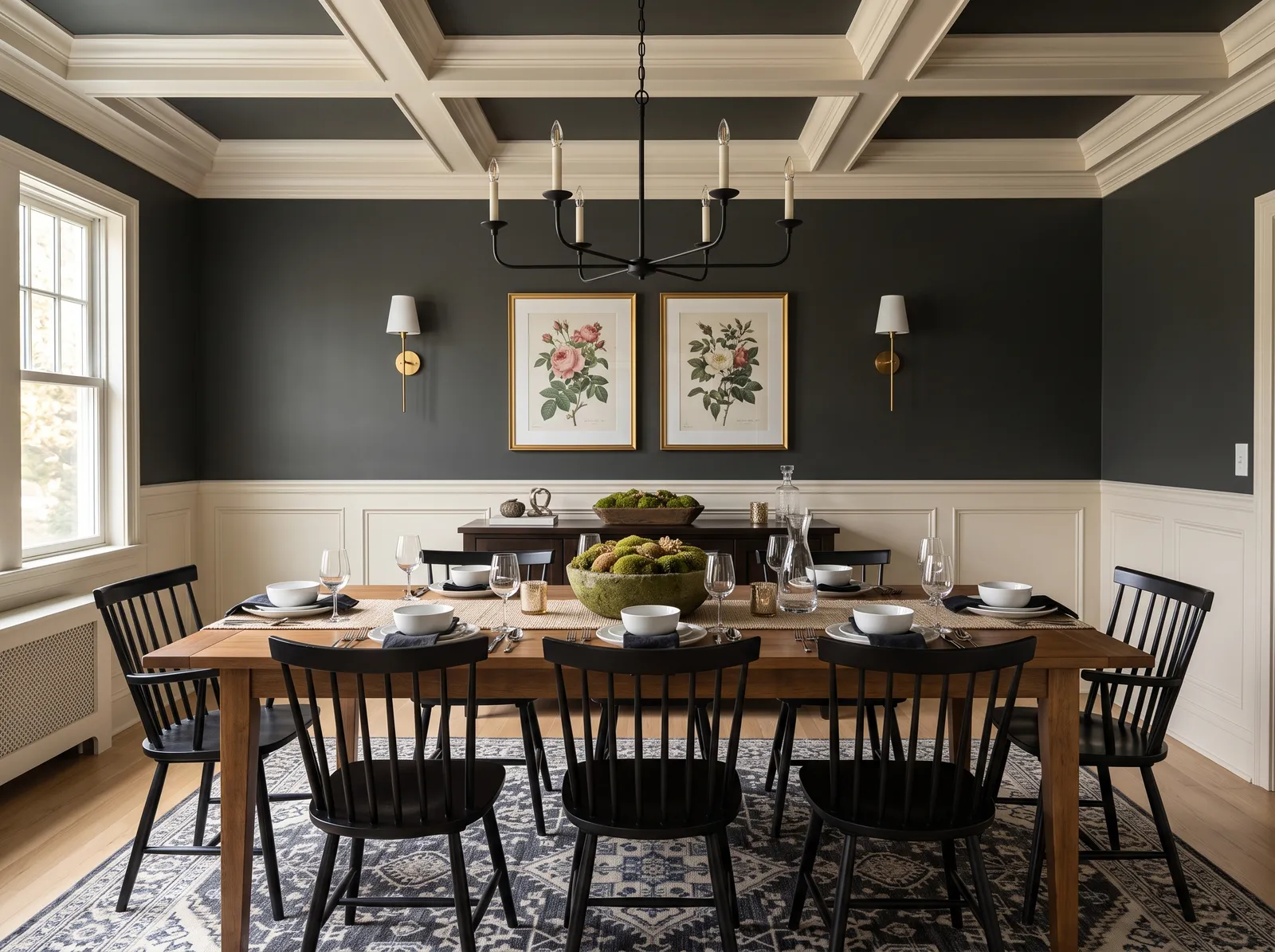
Deep charcoal up top and warm cream wainscoting below make a classic, candlelit room built for long, cozy dinners.
This is the classic two-tone trick: a moody charcoal up top and warm cream wainscoting on the lower half of the wall. The split lets you enjoy a dark, dramatic color while keeping the room bright right where you sit. Warm wood and deep chairs fill it out, with a blue rug to cool things down. The room feels cozy and traditional, like an old dining hall. It works because the cream at table height stops the dark from closing in. Great if you love dark color but don't want a heavy room.
SEE DARK RIVER ON YOUR WALLS →
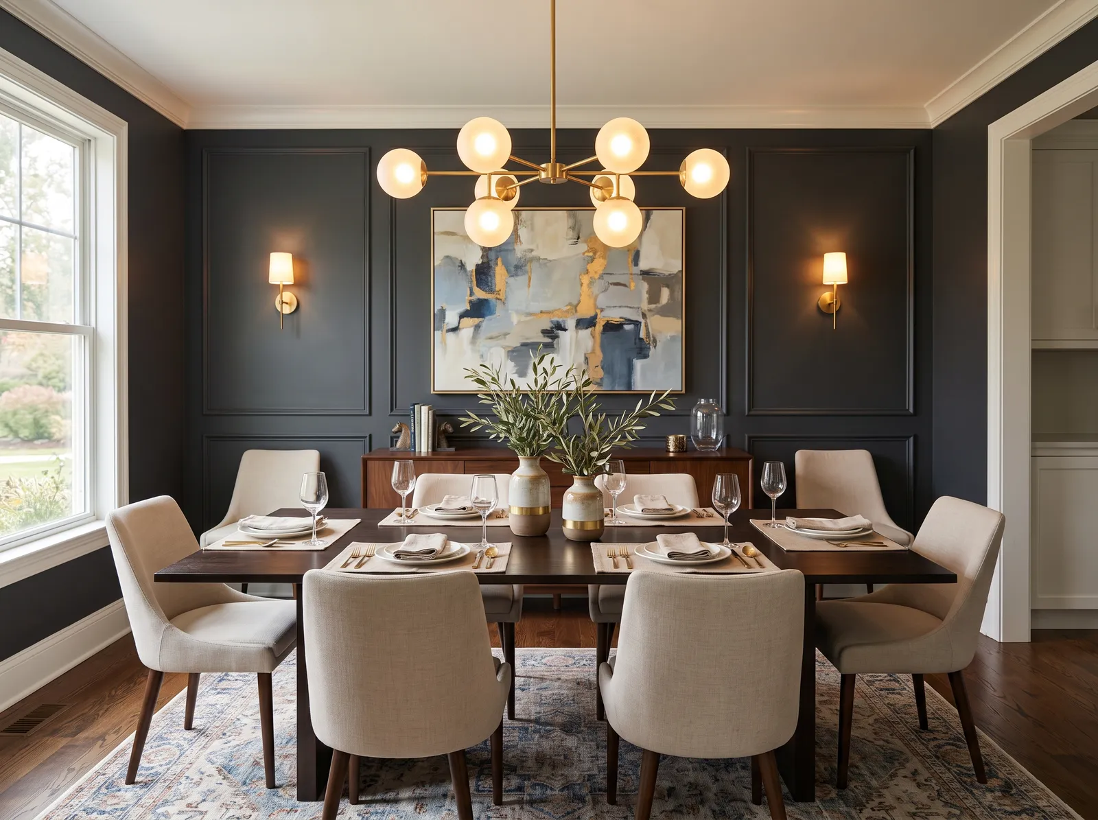
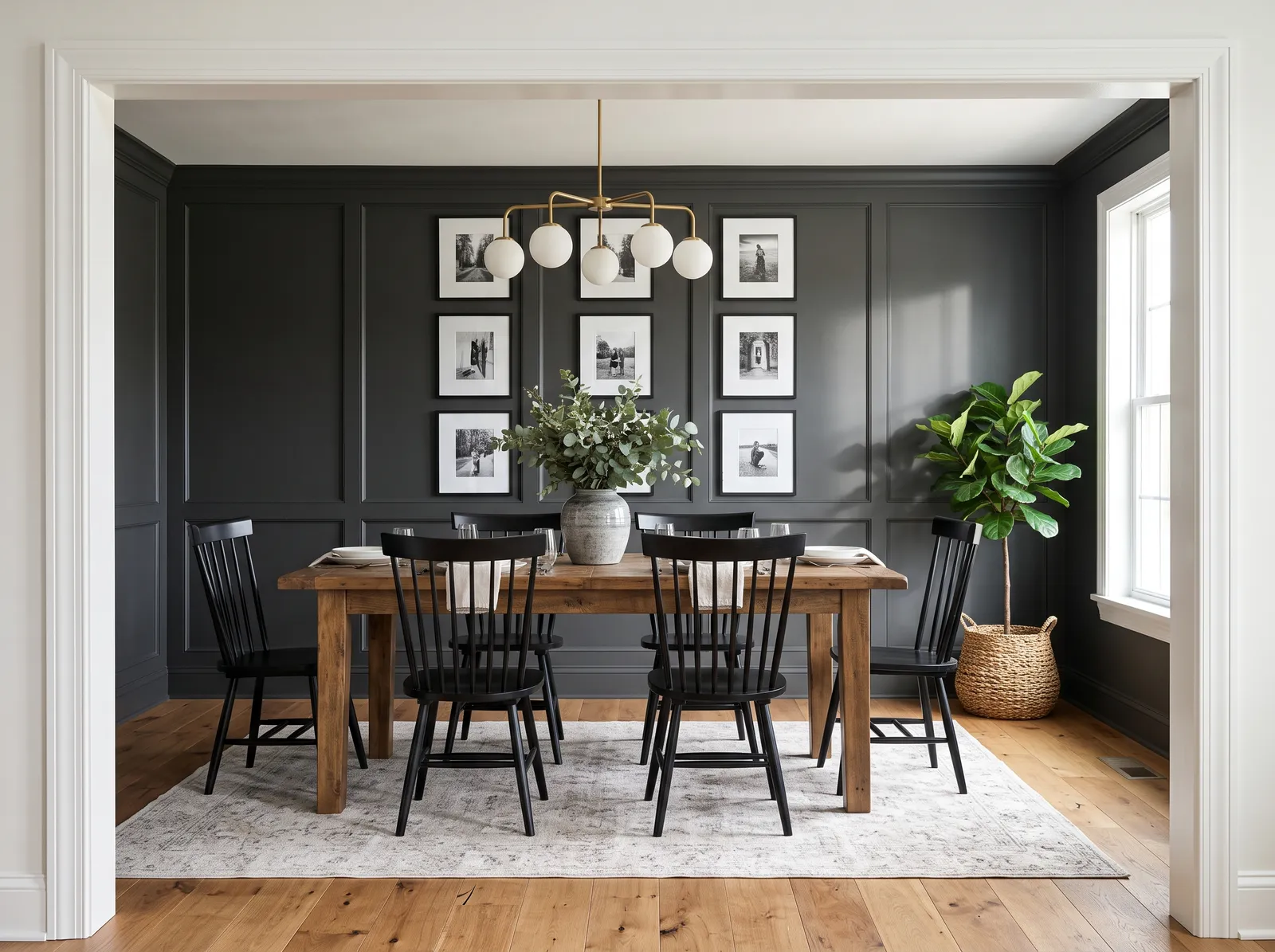
Near-black paneled walls and crisp white trim give a bold, gallery-like backdrop that makes the wood tones and brass really pop.
Chimney Smoke is a near-black charcoal, and against crisp white trim it reads bold and gallery-like. Here it covers paneled walls, so warm wood and brass really jump out against all that dark. The room feels striking and a little glamorous, the kind of space that makes a statement. It works because the white trim outlines the panels and keeps the drama sharp instead of flat. Best in a room with good light or plenty of lamps, so a color this deep still feels rich rather than gloomy.
SEE CHIMNEY SMOKE ON YOUR WALLS →
Moody charcoal panels and soft white trim set a calm, elegant mood, glowing warm under brass globes at dinnertime.
This dark blue-gray sits somewhere between navy and charcoal — calm, but a little fancy. On paneled walls under brass lights, it feels elegant and made for evening dinners, while a light ceiling and soft white trim keep it from closing in. Light, sandy chairs add contrast so the dark doesn't take over. The room feels refined and quietly dramatic. It works because the lighter ceiling and trim balance the deep walls, so the space still breathes. A lovely pick for a grown-up, dinner-by-lamplight room.
SEE ARCHES ON YOUR WALLS →
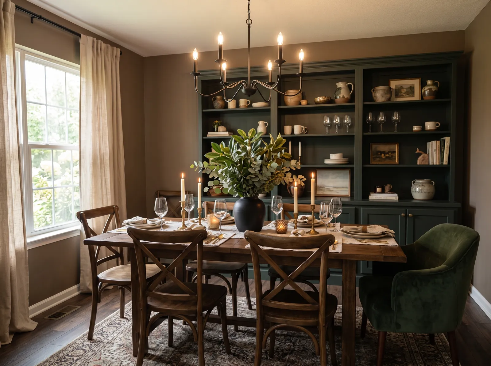
Earthy taupe walls and a deep forest-green hutch feel grounded and snug, made for candlelit nights around the table.
Taupe is a warm brown-gray, and deep forest green is its natural partner. Here taupe covers the walls and the green lands on a big hutch, with warm wood chairs and light curtains filling things out. The room feels snug, grounded, and a bit old-world — perfect for cozy, candlelit nights. It works because brown and green both come from nature, so they settle together easily and feel calm rather than busy. Choose this if you want a warm, enveloping room that wraps around you.
SEE KAFFEE ON YOUR WALLS →
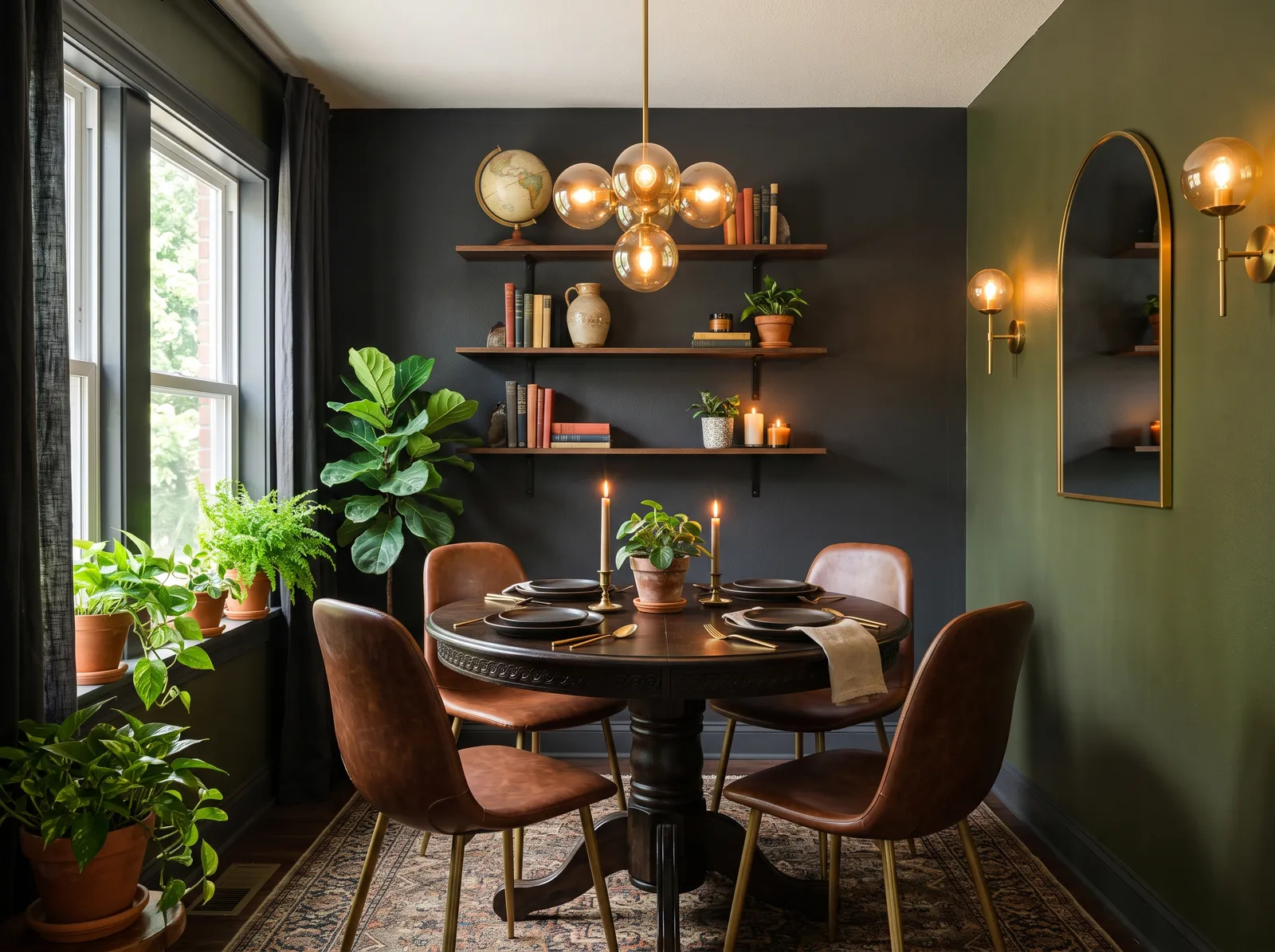
Deep olive walls and a charcoal accent wrap this cozy nook in moody, garden-like calm, glowing soft under warm amber light.
Deep olive is a dark, mossy green that wraps a small space like a cocoon. Here it covers the walls of a little dining nook, with a charcoal accent and warm clay chairs that glow against the green. The room feels moody, garden-like, and very cozy, especially under soft amber light. It works because a light ceiling keeps the dark walls from pressing down, so the nook feels snug instead of cramped. Best in a small room you actually want to feel enclosed and intimate.
SEE STORY TELLER ON YOUR WALLS →
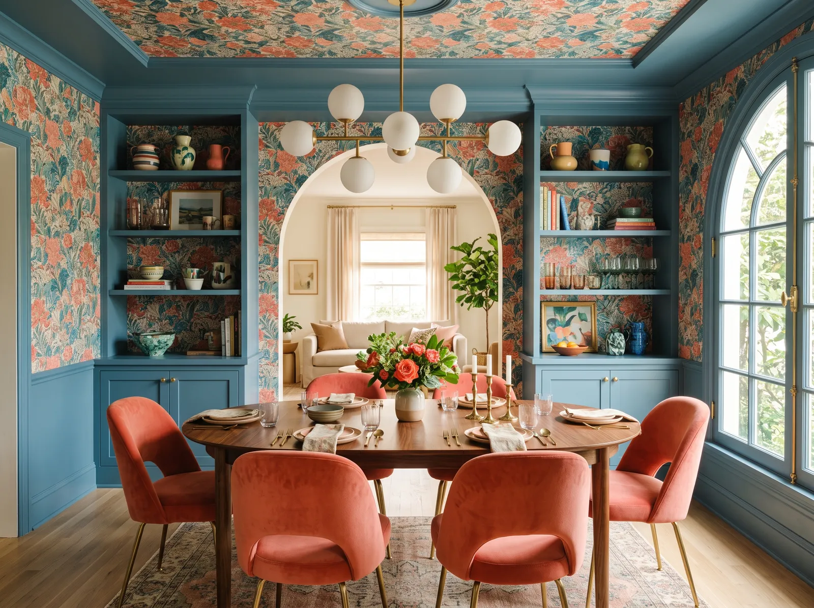
Dusty slate blue built-ins ground a lively, floral room, looking rich and confident next to plush coral velvet and warm brass.
Slate blue is a soft, dusty blue — calm and easy to live with. Here it covers the built-ins, grounding a bright, floral room, while warm coral chairs and accents bring it to life. The room feels cheerful and confident, but still grown-up. It works because blue and coral sit opposite each other, so the warm and cool play off each other and make the whole space feel lively. A wood table and cream curtains keep it from getting too busy. Pick this if you want color and energy without going loud.
SEE WINDSOR HAZE ON YOUR WALLS →Dining Room Wall Color Combinations
A wall color never works alone. These are the full schemes from the rooms above — the lead color first, then the supporting colors that make the photo work.
A soft, creamy greige wraps the walls in quiet warmth, so the oak table and candlelight feel cozy and gently lit.
TRY THIS PALETTE →Earthy terracotta walls glow against soft beige trim, giving this room a warm, retro feel that makes you want to linger over dinner.
TRY THIS PALETTE →Soft linen walls and a barely-there warm ceiling keep things calm, letting the walnut table and jute rug feel grounded and easy.
TRY THIS PALETTE →Gentle cream walls catch the afternoon light, a quiet backdrop that lets mismatched chairs and a big bunch of sunflowers shine.
TRY THIS PALETTE →A crisp white trim is the safest partner for any deep dining room color, and it keeps Hale Navy or Hunter Green from feeling too sealed-in. For a softer, more enveloping look, paint the trim the same color as the walls so the room reads as one quiet shell. A warm white ceiling usually beats stark white over a rich wall color.
Deep colors love wood. Burgundy and Oxblood flatter walnut and warm-toned floors, while Hague Blue and Eggplant pair well with brass or gold fixtures and lighting. If your floor is cool gray, a blue keeps the room harmonious; a warm wood floor opens the door to greens and reds.
Dining Room Color Ideas by Color
Set on a color family already? Each page has its own real rooms and picks.
Light or Dark Dining Room Colors?
Go Light (LRV 60+) If…
The room is small, faces north, or has to work at every hour. Light warm colors make it feel bigger and stay calm in evening light — the light you actually live in.
Go Dark (LRV Under 20) If…
You want the cocoon effect and the room has real daylight. Dark works best on one feature wall — or fully color-drenched in a large room with good windows.
Dining rooms are often used most in the evening, so judge any color under the light you will actually eat by. A color that looks heavy at noon can look perfect at 7 p.m. with the lamps on. Always tape a sample to the wall and check it at night, not just in daylight.
North-facing rooms get cool, flat light, so warm reds like Burgundy or a green like Hunter Green keep things from feeling cold. South and west rooms get warm light that makes deep blues like Hale Navy and Hague Blue look their richest. If the room is dim, lean into it with a saturated color rather than fighting it with a pale shade that just looks gray.
LRV, or light reflectance value, tells you how light or dark a color reads, from near 0 for black to near 100 for white. Dining rooms are one place where a low LRV is a feature, not a problem. A deep color in the 5 to 20 range, like Hale Navy, Oxblood, or Eggplant, makes the room feel intimate and dressed up.
If your dining room is small or short on windows and you still want warmth without going fully dark, look at mid-range colors instead. A lighter green or blue keeps the cozy feel while bouncing more light around the table.
See It. Love It.
Paint It.
Upload one photo of your dining room and try every color on this page on your own walls — in your own light, before you buy a drop of paint.

Hale NavyBeforeFinish And Sheen That Make Sense Here
For dining room walls, eggshell or satin is the sweet spot. It wipes clean when a glass tips or fingers touch the wall, but it does not throw harsh glare across a long wall the way a glossier finish would. Matte looks beautiful on deep colors but is harder to clean, so save it for rooms that see less traffic.
Use a higher sheen on the trim, baseboards, and any wainscoting, usually semi-gloss. That contrast in finish gives the room a crisp, finished edge and protects the surfaces most likely to get bumped by chairs.
Common Dining Room Color Mistakes
The biggest mistake is being too timid. People pick a pale neutral out of caution, then end up with a forgettable room that the bold dining table deserved better than. The dining room is the room to commit.
The second mistake is skipping the nighttime test. A deep color judged only in daylight can surprise you under warm bulbs. Also watch your finish: too glossy and a long wall turns into a mirror of glare, too flat and you cannot wipe off a splash from dinner.
Wall area, gallons, and a real price range for the dining room — walls, trim, and ceiling.
About Dining Room Paint Colors
A dining room is one of the few spaces where you can paint bold and not regret it. You don't live in it all day, so a deep, saturated color reads as dramatic instead of overwhelming. It is also a room built for evening light, candles, lamps, and a meal around a table, which means rich colors get to do their best work after dark.
That is why the dining room is where blues, greens, reds, purples, and even black come into play. Colors like Hale Navy, Hunter Green, Burgundy, Oxblood, Hague Blue, and Eggplant all suit this room because they wrap the table in something warm and intentional. Lighter neutrals work too, but the dining room is your best chance to commit to a color with real depth.
Every color shown here is mixed to order at the paint counter, so you are never locked into one brand. If you fall for a shade from one company but prefer another brand's paint, a store can cross-match it closely. Pick the color you love first, then choose where to buy it.
The Questions Everyone Asks
What color should I paint my dining room?
If you want one answer, start with the safe picks above — Hale Navy, Royal Orchard, Brick Red, Hague Blue. They read well in any light and survive furniture changes. Then check the light: strong afternoon sun wants a step cooler, a north-facing room wants a step warmer.
What is the best paint color for a dining room?
There is no single best, but deep, rich colors suit this room better than almost any other. Navy blues like Hale Navy and Hague Blue, greens like Hunter Green, and warm reds like Burgundy and Oxblood all create the cozy, dressed-up feel a dining room is made for. Since the room is mostly used in the evening, a saturated color usually beats a pale one.
Are dark colors a good idea in a dining room?
Yes, the dining room is one of the best places for a dark color. You do not spend all day in it, so a deep shade reads as dramatic and intimate rather than gloomy. Colors like Oxblood, Eggplant, or Hale Navy turn an ordinary room into something that feels special for dinner.
What sheen should I use on dining room walls?
Eggshell or satin is ideal. It cleans up after spills and fingerprints but does not throw harsh glare across the walls. Use semi-gloss on trim and baseboards for durability and a crisp edge.
How do I keep a dark dining room from feeling too closed in?
Use crisp white trim and a warm white ceiling to give the eye some relief, and make sure your lighting is warm and layered with lamps or a dimmer. If you still want it lighter, choose a mid-range color instead of a very low LRV one. Often, though, the cozy enclosed feel is exactly what works in a dining room.
Should I match my dining room color to my kitchen?
They should relate, not necessarily match. If the rooms are open to each other, pick colors that share an undertone so they flow. If the dining room is its own space, you are free to go bolder and darker than the kitchen.
Can I get the same color in a different paint brand?
Yes. Every color here is mixed to order at the paint counter, and stores can cross-match a shade closely from one brand to another. Choose the color you love first, then pick the brand or store you prefer to buy it from.
What flooring works with a deep dining room color?
Warm wood floors pair beautifully with reds and greens like Burgundy and Hunter Green. Cool gray floors sit more naturally with blues like Hague Blue and Hale Navy. Brass and gold fixtures flatter blues and purples like Eggplant.
What two-color combination works best in a dining room?
The reliable pattern is a quiet main color plus one deep accent on a single wall. Keep trim and ceiling in one warm white so the two colors are the only event in the room — the combination cards above show complete schemes from real rooms.
What colors make a dining room look bigger?
High-LRV, slightly warm colors — LRV 60–75 is the sweet spot. Paint the walls and trim close to the same light color so the corners blur, and keep the ceiling white. Stark cool white actually works against you; it creates hard shadows that show the room's edges.

Ask a Question