Bewitched
The oxblood-red near-black nobody's hyping, reviewed honestly: the light it needs to show its color, the trim mistake that ruins it, and what to pick instead.

Jessica has spec'd whites and neutrals for more than 300 rooms and keeps a sample wall of painted drawdowns in her studio. Every color review is checked against real reader rooms in the comments and re-tested when a formula changes. About the testing process →
- 1Redwood0
- 2Bewitched6
- 3Million Dollar Red13
- 4Cinnamon Slate19
The Fast Verdict
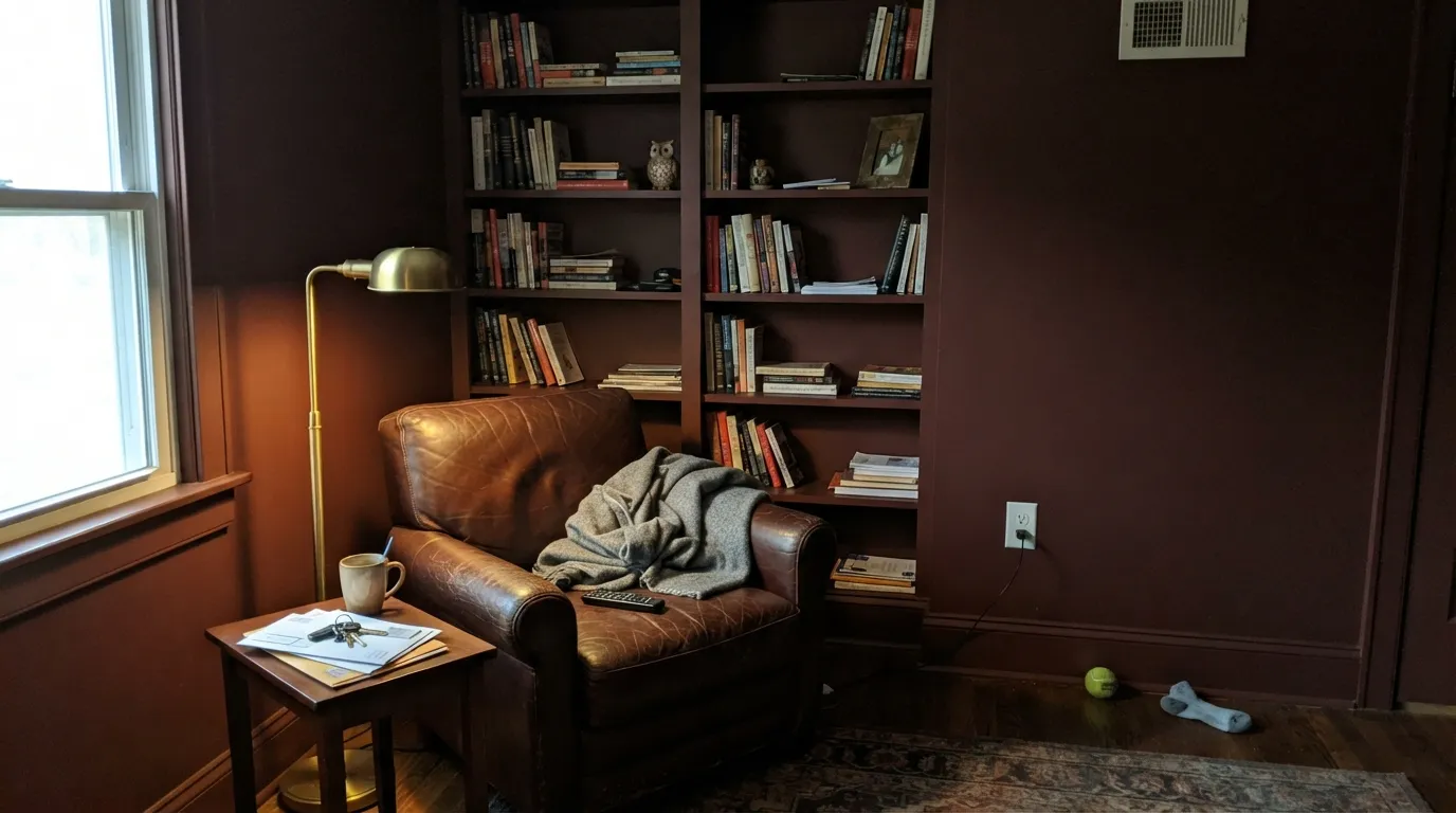
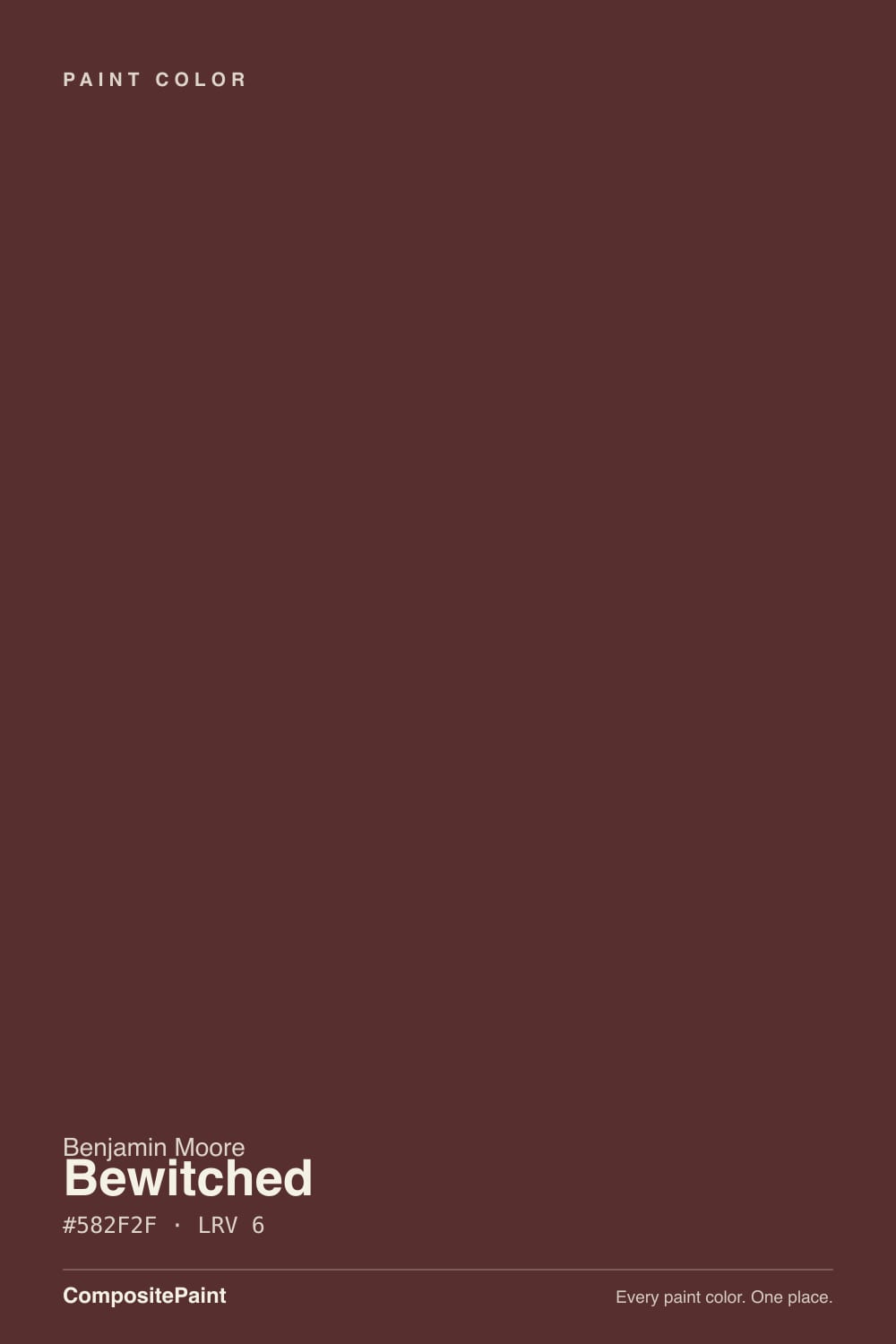
Bewitched is Benjamin Moore's quiet answer to a wine-red near-black: a deep, muted oxblood-brown that sits at LRV 6, right where Hale Navy and Wrought Iron live. It never had a Color-of-the-Year campaign and isn't chasing one — it just sits in the fan deck for the client who wants black-level drama with a red secret inside it. Give it real daylight or a warm lamp and the wine comes forward; leave it in a dim corner and it reads as plain, flat black. That trade is the whole review.
Library built-ins and paneled dens · powder rooms and small drenched spaces · front doors and shutters · anyone who wants black-level drama with a wine-red secret
Your room stays dim with no lamps · you want the color to read clearly at a glance from across a dark hallway · your trim is staying stark, cool white · you're shopping for a famous, Pinterest-viral color
- Genuine oxblood-red character, not another blue-black or violet-black in disguise
- Near-black drama at LRV 6 with a warm secret most true blacks don't have
- Hides scuffs and fingerprints the way any dark, low-LRV color does
- Distinctive enough that most guests won't name it on sight — it isn't the trend color everyone already owns
- Quietly underused, which means less risk of it feeling dated in five years
- Needs real daylight or warm lamps or it reads as plain flat black
- Cool, stark-white trim fights it instead of framing it
- Too intense for most people's idea of a whole-room, everyday neutral
- Hard to judge from a screen — photos flatten the red into black more than any light neutral would
What Color Is Bewitched, Really?
A deep, muted red-brown — oxblood, wine, brick, whatever word you reach for, the base is genuinely red, not purple or black. That matters because a lot of "moody" near-black paints are actually blue-blacks or violet-blacks in disguise; Bewitched is built on a warm red-brown mix, which is why it photographs one way in a listing photo and reads noticeably warmer in person. It hasn't had a viral moment and isn't part of a famous trend collection — it is the kind of color a designer specifies on purpose for a client who already knows they want deep red, not the color someone stumbles into off a Pinterest board.
At LRV 6 it sits in the same reflectance band as Wrought Iron and Hale Navy — genuinely near-black on a light meter. Put a chip of Wrought Iron (also LRV 6) next to it and the difference isn't brightness, it's temperature: Wrought Iron reads soft charcoal-black, Bewitched reads black with a wine core running through it. That core only shows up when light actually hits the wall. In a shadowed corner, both colors look the same: just dark.
Undertone in one line: warm oxblood red-brown, never purple, never true black. If your sample looks violet or blue-black, that's cool overhead light or a phone camera's white balance fighting you; if it looks like plain black paint, that's simply not enough light reaching the wall yet — before you write it off, try it under a warm lamp.
Where It Shines
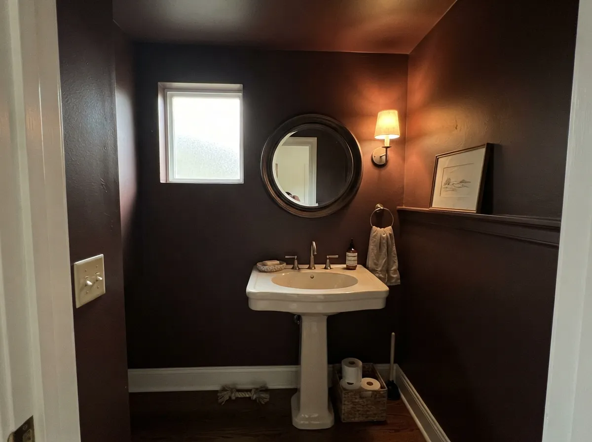
This is a color for rooms you light on purpose. Under a warm 2700K lamp or real daylight through a real window, the red comes forward and a wall of Bewitched reads rich and lacquer-like instead of flat — the exact library-and-leather mood it's chosen for. Its other natural home is the small, committed space: a powder room, a front door, a run of built-in bookshelves, where the color can be intense without asking the whole house to agree with it. Give it dark walnut, aged brass, and cognac leather and it looks expensive on purpose.
Where It Fails
Almost every disappointed story about Bewitched comes from one of three predictable setups, and none of them are the paint's fault — but if your room matches one, this isn't your color yet, or at least not without a plan.
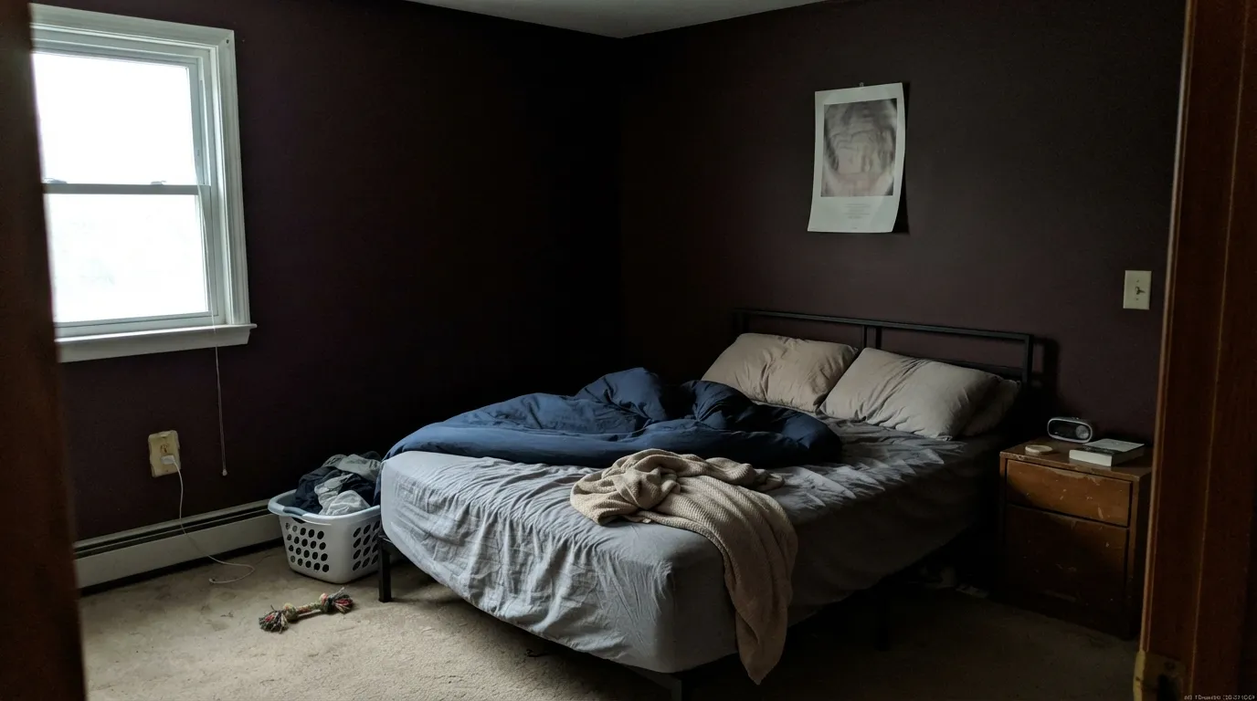
At LRV 6, Bewitched needs light bouncing off it to show the wine underneath. A north-facing room with no lamps on reads as flat, muddy near-black — readers describe it as "just looks like black paint," and technically, in that light, it does. Add a warm lamp or two before you decide the color failed you.
One common regret: walls in Bewitched, trim in a bright builder white. The cold trim fights the warm wall and the contrast reads harsh instead of rich — one homeowner online said exactly this after painting a bedroom. The fix is a warm white trim (White Dove, not Chantilly Lace) or, better, no contrast at all: trim in Bewitched too.
Drenching a small room can look stunning — but only with a big mirror, a pale rug, or real natural light to keep it from feeling like a box with the lid closed. Four dim walls of Bewitched and no relief is the setup behind the "I like the color but something feels off" posts.
Room by Room
Low, warm light flatters it, and it's built for exactly this kind of room: leather, walnut shelving, brass reading-lamp light. Eggshell or matte on the walls; keep the trim the same color for a cocoon effect rather than fighting it with white.
Small rooms take deep, saturated color well, and a fully drenched powder room in Bewitched with brass fixtures and a marble-look counter reads custom, not cave-like, because there's no adjoining room to negotiate with. Satin for the walls, semi-gloss for the door and trim.
The real online debate about Bewitched happens here: people love the color on the wall and then second-guess the white trim next to it. The fix that actually works — paint the trim and ceiling the same Bewitched, keep the furnishings and bedding light, and let the color read as one warm, dark envelope instead of a wall fighting its own trim.
On an island, a pantry door, or a run of lower cabinets under a lighter counter and warm-white uppers, it reads like a deliberate design choice. A full kitchen of Bewitched cabinetry is a serious commitment and needs strong task lighting to keep it from reading black at the counter.
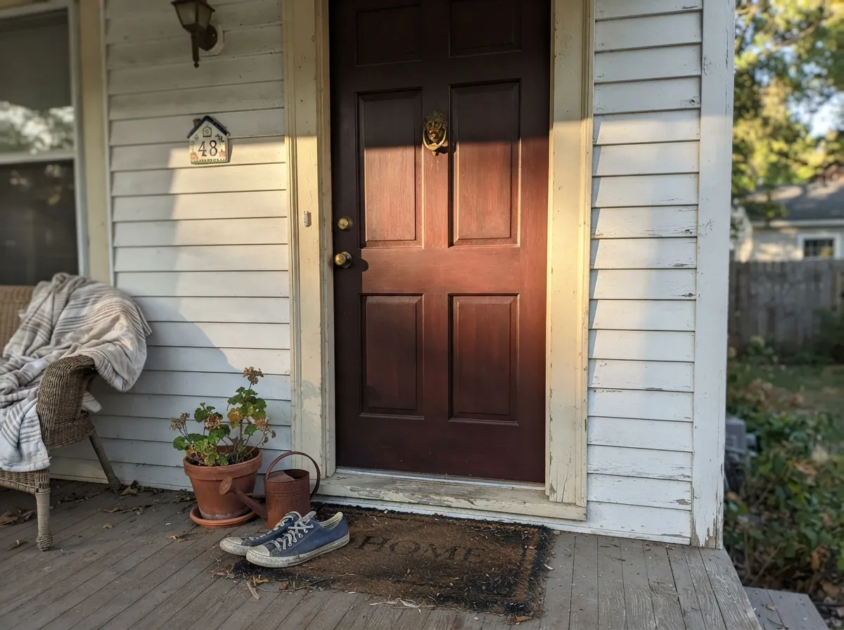
Direct sun on an exterior door shows the oxblood clearly, and it's a genuine alternative to a plain black door for houses that want depth with a little more personality. On a shaded, north-facing entry it will read closer to black — which some homeowners want and some don't, so look at the actual door at the actual time of day you'll see it most.
As a single wall behind a sofa or fireplace, with everything else in a warm neutral, it anchors the room without asking for a total commitment. As all four walls in a room with mixed daylight and gray-toned furniture, it fights harder to stay warm — the accent-wall version is the safer bet for most living rooms.
Your Light Is the Risk
2700K lamps pull the wine forward and the wall goes rich, almost lacquered. This is the light the color is bought for.
Cool, low daylight leaves it reading as plain near-black with no visible red. Fine if that's what you wanted; disappointing if you paid for oxblood.
On an exterior door or a sunlit wall, direct light shows the true red-brown clearly. Step into shade and the same surface reads several shades darker and blacker within a few feet.
2700K warm bulbs deepen the wine and make it glow after dark. Cool white LEDs flatten it toward a muddy blackish brown — swap the bulbs before you swap the paint.
Most complaints about Bewitched are a light mismatch. Upload a photo of your actual room and see it on your walls — then ask for the same wall in north light or evening lamps before you buy a single sample.
Need It From Another Brand?
Any paint counter can custom-tint Benjamin Moore CSP-450 directly. If you would rather stay in one brand's own deck, these are the closest stock matches, measured as ΔE2000. Under 2 is a difference you will not see on the wall.
| Brand | Closest color | ΔE | LRV | |
|---|---|---|---|---|
| Sherwin-Williams | Dark AuburnSW 6034 · Sherwin-Williams | 2.3 | 5 | Color page → |
| Behr | Mayan Red190F-7 · Behr | 2.1 | 5 | Color page → |
| Valspar | Pompeii RedM242 · Valspar | 3.0 | 4.9 | Color page → |
| Dutch Boy | Crimson Red302-7DB · Dutch Boy | 3.3 | 4 | Color page → |
| HGTV Home by Sherwin-Williams | Rouge RemixHGSW 3021 · HGTV Home by Sherwin-Williams | 2.3 | 5 | Color page → |
Similar Benjamin Moore Colors
The nearest shades to Bewitched within Benjamin Moore's own range, ranked by perceptual color distance — useful when you want the same look a touch lighter, darker, or warmer.
WCAG 2.1: AA is 4.5 : 1 for normal text, 3 : 1 for large text, AAA is 7 : 1.
Bewitched vs the Colors You're Also Considering
Every Bewitched sample board has the same rivals on it. The numbers show the real lightness gap — then it comes down to which risk you would rather live with.
Pick this if plain soft charcoal-black feels like it's missing something — Bewitched gives you the same darkness with a wine-red core.
Benjamin Moore 2124-10 · LRV 6Wrought IronPick this if you want the same near-black depth without committing to a visible color underneath it.
Pick this when you specifically want warm oxblood, not cool navy-black — the two behave almost identically in dim light and read completely differently in good light.
Benjamin Moore 2066-10 · LRV 6BluePick this for the same near-black, real-light-dependent drama, just in blue instead of red.
Pick this for warmth on a front door — Essex Green leans exterior-classic green-black, Bewitched leans wine-red.
Benjamin Moore PM-22 · LRV 4Essex GreenPick this for the same near-black jewel-tone move on an exterior door, in deep green instead of deep red.
Pick this for the near-black, small-dose drama Cavern Clay simply can't deliver at its lighter depth.
Sherwin-Williams SW 7701 · LRV 24Cavern ClayPick this if you want the same warm red-brown family but at a livable LRV 24 — it shows its color in ordinary light without needing lamps.
Raphael CC-2 at #583835 and LRV 7 is the nearest neighbor. It carries more green in the mix, so it reads browner and slightly dustier while Bewitched stays redder. Coffeehouse Chocolate CW-165 at #50382D and LRV 7 is clearly a chocolate rather than an oxblood. Cottage Red HC-184 at #662A25 and LRV 7 pushes the red much harder and looks like barn red in sun, where Bewitched stays restrained. Tudor Brown HC-185 at #4F3A30 and LRV 6 is the most neutral brown of the set. Across brands, Behr Mayan Red 190F-7 at deltaE 2.06, Sherwin-Williams Dark Auburn SW 6034 at 2.34, Valspar Pompeii Red M242 at 3.04, and Dutch Boy Crimson Red 302-7DB at 3.27 are all very close but worth sampling first. At this depth small differences hide on a chip and then show up across a whole wall.
Bewitched Coordinating Colors
The rule for coordinating with Bewitched: warm whites, not cool ones, and let the near-black family do the heavy lifting for contrast rather than reaching for stark white. It pairs comfortably with warm neutrals, other near-blacks, and one honest brown cousin for wood-adjacent trim and furniture.
An Honest, Unfamous Red
Bewitched has never had a Color-of-the-Year campaign, never gone viral on a renovation account, and isn't part of a headline trend collection — and that's a fair thing to know before you buy it. It sits quietly in Benjamin Moore's regular fan deck, the kind of color a paint counter pulls out when a client says "something like black, but with more personality" rather than the color that shows up unprompted on a mood board.
That obscurity cuts both ways. You won't find the flood of styled photos that a famous color like Hale Navy has, which makes it genuinely harder to preview online — the shade you see on a screen almost always reads darker and blacker than it will on your actual wall. But it also means you're unlikely to walk into someone else's identical living room, and it's not the kind of color that gets "discovered" and dated on a five-year clock the way a trend hue does.
Bewitched With Wood Tones and Floors
Dark walnut and espresso wood are the easy, obvious match — both sit in the same warm, deep register as the paint, so a built-in bookcase or a walnut desk against Bewitched walls reads like one considered palette rather than two separate decisions. Cognac and aged-leather furniture does the same job for upholstery, and aged or unlacquered brass hardware is the metal that keeps showing up in the rooms that work.
Pale, cool-toned wood — bleached oak, gray-washed floors — is the pairing that needs a test first. It's not an automatic clash the way a true green-red complement would be, but the coolness of the floor can make the wall's warmth work harder to read as red instead of black, especially without much natural light in the room. A warm rug between the two helps more than repainting ever would.
Three Ready Palettes Built on Bewitched
A color is never alone on the wall. These are complete combinations in the 60-30-10 pattern, with the reason each one holds together. Every one opens in the visualizer.
Painting the walls and trim the same Bewitched removes the cool-white-trim fight entirely; a warm White Dove ceiling keeps the room from feeling sealed shut. Kendall Charcoal on a shelf back gives depth without competing for the room's one dark note.
Try this palette in your roomA small room can take a full drench without feeling like a cave, and the cream vanity gives the eye one place to land. Wrought Iron on the door keeps the near-black family consistent instead of introducing a jarring bright white edge.
Try this palette in your roomRevere Pewter carries the room in ordinary daylight while Bewitched gets to be the one committed, lamp-lit moment — a fireplace wall or a built-in — instead of fighting for attention on all four walls. White Dove trim keeps the warm thread running through both colors.
Try this palette in your roomBewitched FAQ
Is Bewitched black or red?
Red-brown — genuinely oxblood, not a disguised black. At LRV 6 it's dark enough to read as near-black from across a room or in a photo, but up close in real light it's clearly warm wine-red, not the cooler true blacks like SW Tricorn Black. The confusion happens because most people only ever see it in a dim corner or a flattened phone photo.
What trim white goes with Bewitched walls?
A warm white — White Dove is the safe default, Swiss Coffee if you want it a shade creamier. A stark, cool-toned white trim is the single most common regret with this color; it makes the wall look harsh instead of rich. If you want zero risk, skip the contrast entirely and trim it in Bewitched too.
Is Bewitched too dark for a whole bedroom?
It can work, but only with a plan. The homeowners who end up unsure painted the walls Bewitched and kept bright white trim — the contrast reads unfinished. Painting the trim and ceiling the same color, and keeping bedding and furniture light, is the version that reads intentional instead of half-committed.
Does Bewitched work as a front door color?
Yes — it's a genuine alternative to a plain black door with more depth in direct sun. In full sun the red-brown shows clearly; on a shaded, north-facing entry it reads much closer to black. Look at your actual door at the time of day people actually see it before you commit.
How many coats does Bewitched need?
Two coats of the finish paint is standard over a primed or previously light-colored wall. Because it's this dark, use a gray- or deep-base tinted primer first if you're painting over a light color — skipping the primer is how you end up needing a third finish coat to get even coverage.
What's the difference between Bewitched and Wrought Iron or Hale Navy?
All three sit at the same LRV 6 near-black depth, so in dim light they can look similarly dark. The difference is the color underneath: Wrought Iron is a soft, warm-neutral black, Hale Navy is a true near-black navy, and Bewitched is the one with red running through it. Pick by the undertone you want visible once real light hits the wall.
Have you painted with Bewitched?
Rate it — one tap helps the next reader decide.
Ask a Question