Blue
Benjamin Moore's most saturated navy, reviewed honestly: the rooms where it looks like ink and velvet, the rooms where it just looks black, and what to paint instead.

Jessica has spec'd whites and neutrals for more than 300 rooms and keeps a sample wall of painted drawdowns in her studio. Every color review is checked against real reader rooms in the comments and re-tested when a formula changes. About the testing process →
- 1Blue6
- 2Waterloo13
- 3Charcoal Blue19
The Fast Verdict
Blue 2066-10 is the rare deep navy that stays blue instead of collapsing into charcoal. At LRV 6 it gives no light back, so it behaves like a material — velvet, ink, lacquer — rather than a wall color. In a room with real windows or good lamps that is exactly the drama people are paying for. In a dim room, or under the wrong bulbs, it is simply black with a purple edge, and it is unforgiving about touch-ups.
A study, library or dining room you want to feel enclosed · kitchen islands and cabinets in satin · front doors and shutters against a light body · anyone who wants navy that still reads blue, not gray
Your room faces north and stays dim · you want the room to feel bigger · you expect a soft traditional navy · you need to spot-touch scuffs later without repainting the wall
- Stays a real blue at near-black depth instead of going charcoal
- Reads as a material — velvet, ink, lacquer — not as a coat of color
- Huge, easy contrast with any white trim; the exact white barely matters
- Excellent on millwork, islands, built-ins and front doors in satin
- Turns a small windowless room into a deliberate cocoon
- Reads as flat black in dim or north-facing rooms
- The violet lean disappoints people expecting a traditional navy
- Touch-ups and lap marks flash; needs tinted primer and 2-3 coats
- Makes a room feel smaller and darker, permanently
What Color Is Blue, Really?
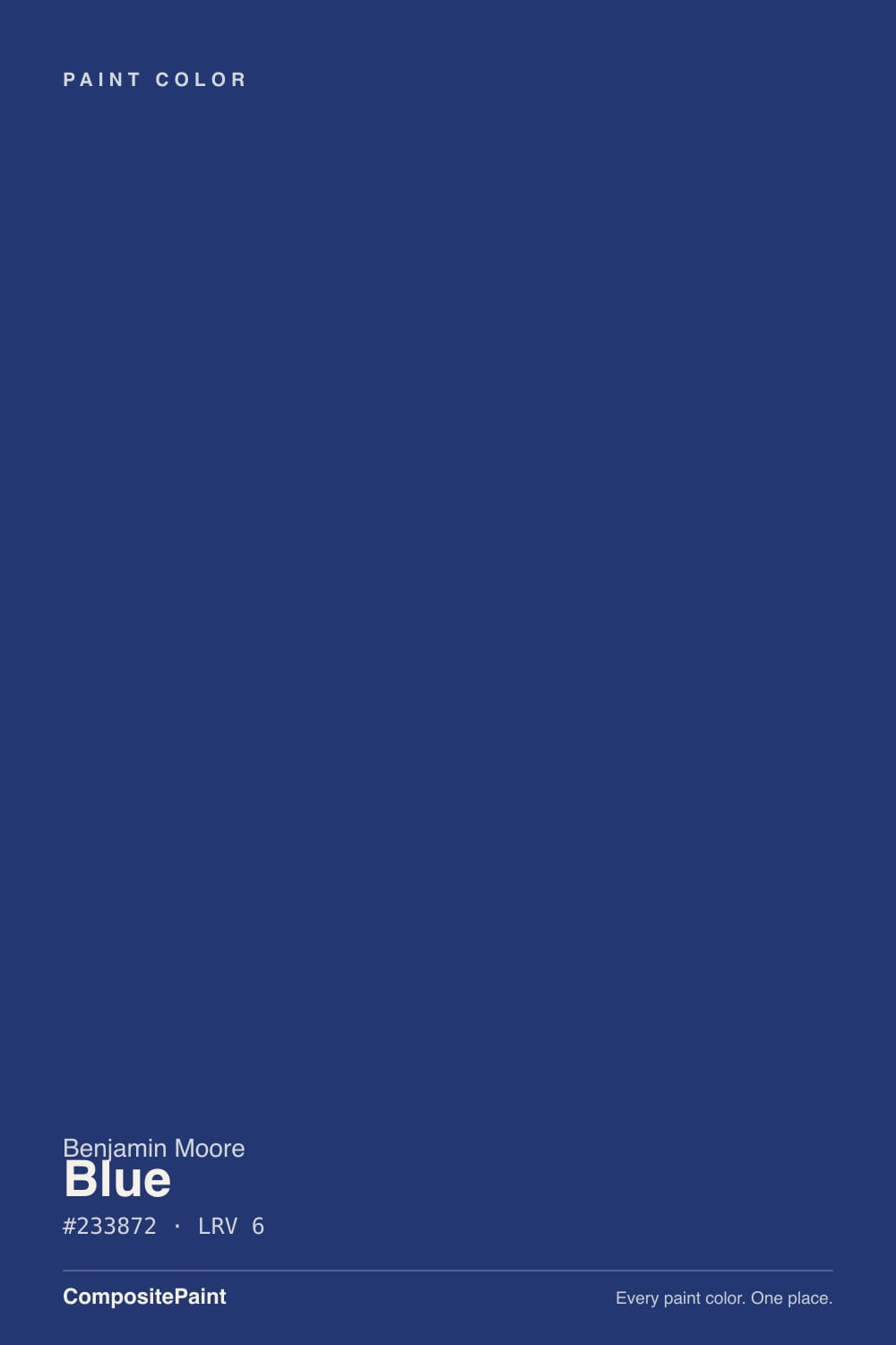
A true blue that happens to be almost black. Most deep navies on a fan deck are grayed down on purpose so they behave; this one is not. It runs about 53 percent saturation at LRV 6, which is a lot of pigment for a color that dark, and the hue sits at 224 degrees — just past pure blue, with a small pull toward violet. That combination is the whole personality: in direct light it is unmistakably blue, and it never goes soft charcoal the way Kendall Charcoal or a black-blue does.
LRV 6 is the part people underestimate. It means the wall reflects almost nothing back into the room, so whatever light you supply is all the room gets. Put it next to Hale Navy HC-154, the navy everyone knows: Hale Navy sits lighter and grayer and still reads as a color across a whole room, while Blue 2066-10 reads as a dark plane with blue showing only where light lands on it. Blue is richer. It is also roughly twice the commitment.
Undertone in one line: pure cool blue with a whisper of violet — no green, no gray softening it. If your sample looks purple, that is warm bulbs and the violet lean meeting; if it looks black, that is not the sample, that is your light level.
Where It Shines
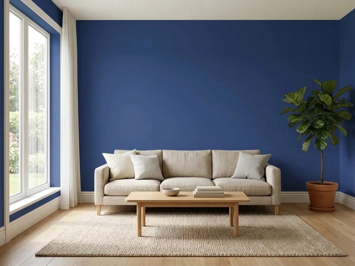
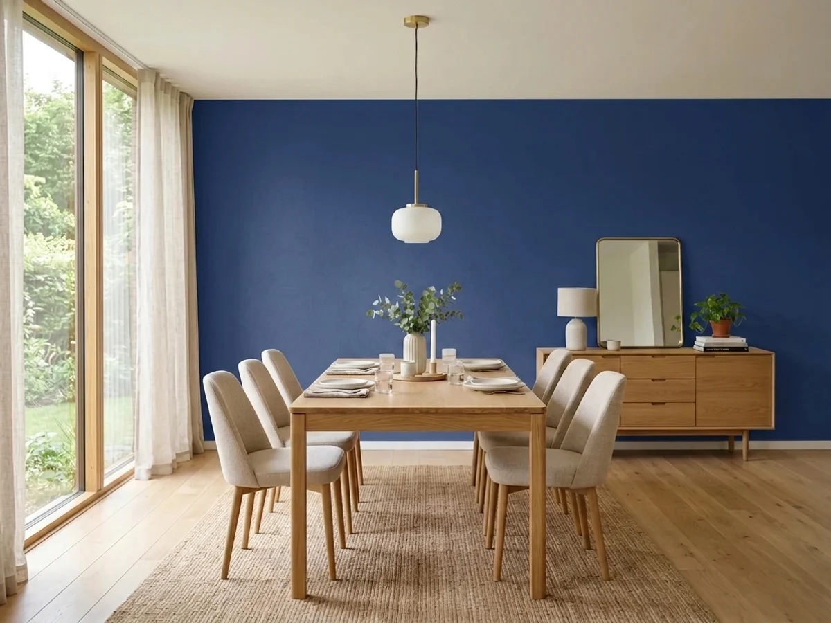
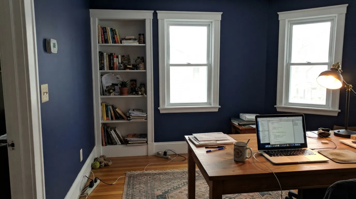
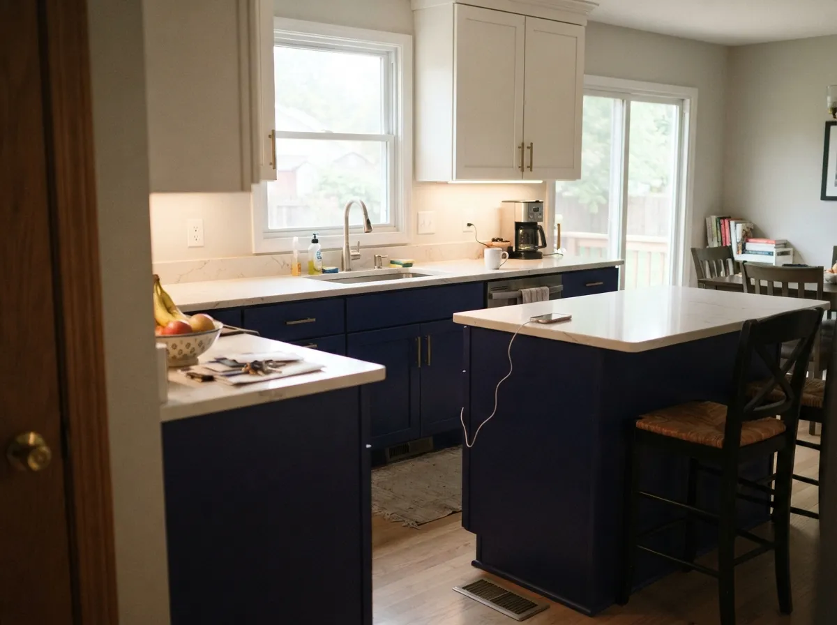
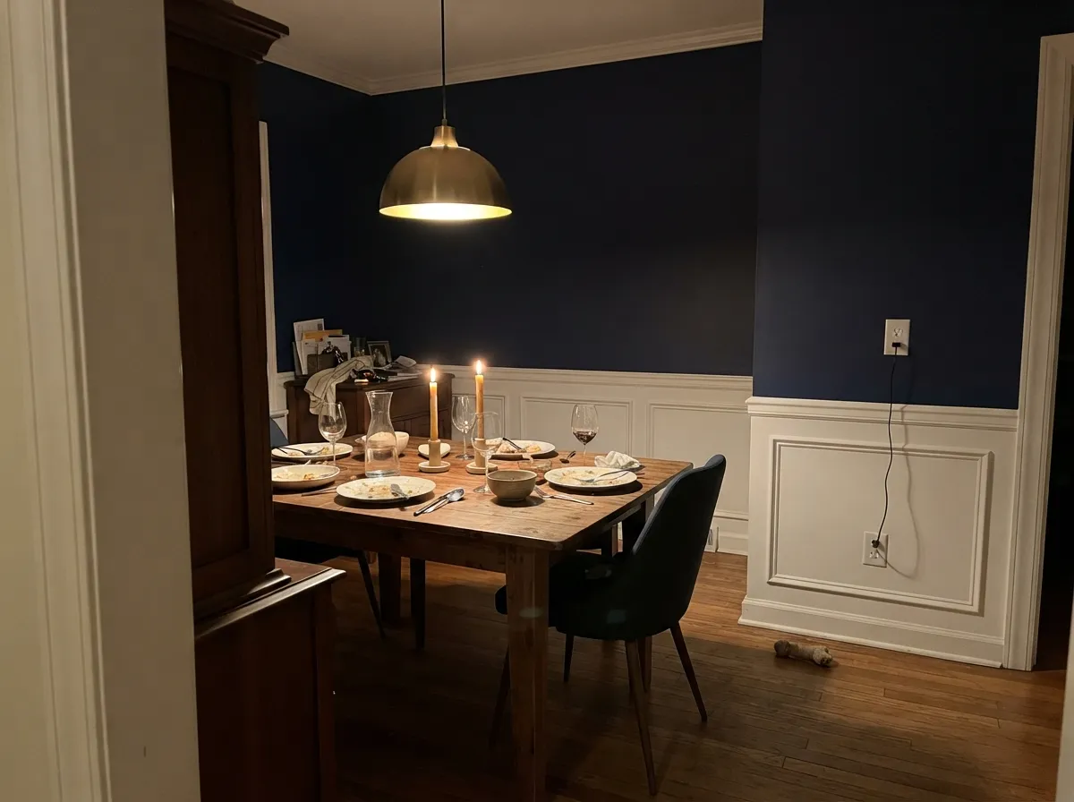
Give it a room you want to feel smaller and quieter — a study, a dining room, a library wall — and it does something a mid-tone cannot. These are the rooms it was made for: real light on the wall, a crisp white to push against, and warm wood or brass to take the chill off.
Where It Fails
The complaints about this color are remarkably consistent, and they are all versions of the same three problems. None of them are defects in the paint. But if your room matches one, three coats will not save it.
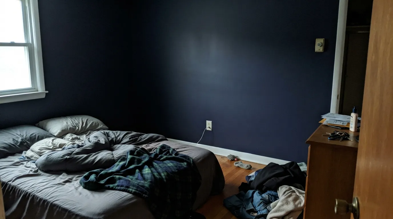
North light is flat and cool, and at LRV 6 there is nothing to reflect it. On an overcast day the walls read as plain black and the blue only appears in a narrow band near the window. People describe it as a black room they did not order. If you want navy that still reads blue in weak light, step up to Van Deusen Blue HC-156 at LRV 17, or Hale Navy HC-154 for something between the two.
That violet lean at 224 degrees is real, and it shows most under warm 2700K bulbs and next to grayer blues. Buyers expecting the traditional, slightly dusty navy of an old blazer see something more purple and more modern instead. For the traditional version pick Admiral Blue 2065-10 or Old Navy 2063-10 — both grayer, both less saturated, both quieter on the wall.
Deep saturated bases hide poorly and dry unevenly, so lap marks show, spot touch-ups flash a different sheen, and a flat finish burnishes shiny wherever it gets wiped. Plan on a gray-tinted primer, two to three finish coats, keeping a wet edge, and repainting corner to corner rather than dabbing. If a wall has to survive kids and dog paws, the grayer Hale Navy HC-154 forgives repairs noticeably better.
Room by Room
Small, enclosed, lamp-lit: everything that hurts this color elsewhere works here. Eggshell on the walls, trim in Chantilly Lace 2121-70 semi-gloss so the edges stay sharp. Aim a lamp or picture light at the wall instead of relying on a ceiling fixture.
It can be stunning across a big south or west-facing room, and grim in a north-facing one. Keep the ceiling and trim clearly light, add warm wood and brass, and use lamps at three points in the room. If your living room is the family's daytime room, this is the wrong place to test a color this dark.
A room used mostly after dark is the easiest possible assignment. Candles and warm bulbs bring the blue forward and the violet lean turns flattering rather than odd. Eggshell walls, White Dove OC-17 trim, brass or aged bronze fixtures.
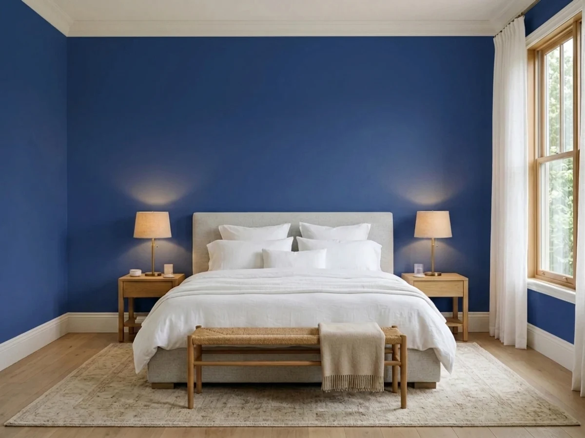
It makes a bedroom feel like a hotel room with the curtains half drawn — enclosed and quiet. Do not expect morning brightness; it will read near-black until the sun is on the glass. Pair with warm oak or walnut and Simply White 2143-70 trim.
This is where the saturation pays off, because satin or semi-gloss lets the surface catch light and the blue stays visible. Perimeter cabinets in White Dove OC-17, walls in Revere Pewter HC-172, brass hardware. Expect dust and toe scuffs to show on a dark door front more than on a white one.
Maximum contrast against a light body color, which is exactly the job. Semi-gloss holds up and keeps the blue readable in sun. Expect gradual fading over the years on a full-sun south exposure, as with any deep saturated color.
Your Light Is the Risk
Direct sun shows the blue clearly on every wall it reaches. This is the color at its best.
Cool, flat daylight has nothing to reflect. Overcast days read plain black. Test before you buy.
2700K lamps soften it toward ink; 3500-4000K keeps the blue crisp but cold. Aim light at the wall.
A powder room or media room with no daylight is fair game — you control the light entirely.
Most complaints about Blue are a light mismatch. Upload a photo of your actual room and see it on your walls — then ask for the same wall in north light or evening lamps before you buy a single sample.
Need It From Another Brand?
Any paint counter can custom-tint Benjamin Moore 2066-10 directly. If you would rather stay in one brand's own deck, these are the closest stock matches, measured as ΔE2000. Under 2 is a difference you will not see on the wall.
| Brand | Closest color | ΔE | LRV | |
|---|---|---|---|---|
| Behr | Night Watch610D-7 · Behr | 1.3 | 4 | Color page → |
| Valspar | Spirit Blue4011-9 · Valspar | 4.2 | 4 | Color page → |
| Dutch Boy | Anchor's Away140-7DB · Dutch Boy | 3.1 | 5 | Color page → |
| Dunn-Edwards | Emboldened BlueDEFD50 · Dunn-Edwards | 3.7 | 7 | Color page → |
| Hirshfield's | Newport IndigoH0061 · Hirshfield's | 3.2 | 5 | Color page → |
| Annie Sloan | Napoleonic BlueNAPOLEONIC BLUE · Annie Sloan | 4.9 | 5 | Color page → |
Similar Benjamin Moore Colors
The nearest shades to Blue within Benjamin Moore's own range, ranked by perceptual color distance — useful when you want the same look a touch lighter, darker, or warmer.
WCAG 2.1: AA is 4.5 : 1 for normal text, 3 : 1 for large text, AAA is 7 : 1.
Blue vs the Colors You're Also Considering
Every Blue sample board has the same rivals on it. The numbers show the real lightness gap — then it comes down to which risk you would rather live with.
Pick this for saturation — a navy that still reads blue at maximum depth.
Benjamin Moore HC-154 · LRV 6Hale NavyPick this for a lighter, grayer navy that survives weak light and touch-ups.
Pick this if you want pigment and a slight violet lift, not a black-navy.
Benjamin Moore 2065-10 · LRV 4Admiral BluePick this for the traditional, grayer navy with no purple in it.
Admiral Blue 2065-10 at LRV 4 is the darker neighbor. Its hex is #2B3762 against Blue at #233872, so Admiral Blue is grayer and less violet and reads as a more traditional navy, while Blue reads richer and more pigmented. Starry Night Blue 2067-20 at LRV 8 goes the other way, a little lighter and softer, useful when LRV 6 feels too heavy for the room.
Blue Grotto CC-964 shares the same LRV of 6, but at #353963 it is duller and more slate. Bold Blue 2064-10, also LRV 6 at #2B3558, is quieter still.
Across brands, Behr Night Watch 610D-7 at LRV 4 sits at deltaE 1.33, which is visually identical in normal room light. Dutch Boy Anchor's Away 140-7DB at 3.08, Hirshfield's Newport Indigo H0061 at 3.21, and Kompozit Frozen Blue 0606 at 3.41 are very close, but sample first. Dunn-Edwards Emboldened Blue DEFD50 at 3.72 and Valspar Spirit Blue 4011-9 at 4.22 are close but visibly different side by side.
Blue 2066-10 Coordinating Colors
Coordinating with a color this dark is mostly about restraint: pick one clean white, one warm mid-tone, and stop. Every other surface in the room should be lighter, because Blue is doing all the heavy lifting on its own. These are the partners that keep coming back:
Blue 2066-10 on Exteriors
Outside it behaves better than it does in a dim interior, because full daylight is the one thing it needs. On a front door or a set of shutters against a light body it gives the maximum contrast a facade can have, and the saturation keeps it from reading as a black door from the street. Semi-gloss is the right finish: it sheds water, wipes clean, and the shine keeps the blue visible on a gray day.
As a whole-house body color it works, but only with generous white trim. Chantilly Lace 2121-70 or White Dove OC-17 on the trim, and the roof color decides the rest — a gray or black roof is easy, a brown or terracotta roof will fight it. Expect gradual fading in full sun over the years, worst on the south and west elevations, and buy a little extra paint now for repairs later, because a fresh gallon of a deep color rarely matches a wall that has been weathering for five summers.
Blue 2066-10 on Cabinets and Built-Ins
Millwork is where this color makes the most sense, because a door front or a bookcase is small enough that near-black depth reads as luxury rather than as a dark room. On an island, on lower cabinets, on a library wall, or on panelling below a lighter upper wall, the paint stops looking like a wall color and starts looking like furniture. Satin or semi-gloss is not optional here — the sheen is what keeps the blue visible.
Two practical warnings. Use a real cabinet enamel, not wall paint, or the doors will stay soft and mark up in the first month. And accept that dark fronts show dust, water spots and knuckle marks more than white ones do, especially in a satin finish under downlights. A microfiber cloth once a week is the actual cost of a navy kitchen.
Three Ready Palettes Built on Blue
A color is never alone on the wall. These are complete combinations in the 60-30-10 pattern, with the reason each one holds together. Every one opens in the visualizer.
Blue takes the 60 percent, the cleanest white in the deck takes the trim, and the contrast does all the work with no third idea competing. Pale Oak in the hall means you step out of the dark room into something soft rather than into a second color argument.
Try this palette in your roomThe dark base cabinets ground the room while White Dove keeps the upper half light, so the kitchen never feels heavy. Revere Pewter's warm greige bridges the two and stops the navy from reading cold next to brass and oak.
Try this palette in your roomPainting the panelling the same blue as the wall turns the whole room into one surface, which is the point of a color this saturated. A warm ceiling in Muslin keeps the top of the room from feeling like a lid and softens the violet lean under evening bulbs.
Try this palette in your roomBlue FAQ
Does Blue 2066-10 look black?
Often, yes. At LRV 6 it reflects almost nothing, so in shadow and on overcast days it reads black, and the blue only shows where light hits directly, along a sheen, or on a raised panel edge. In direct sun or under a lamp aimed at the wall it is clearly blue. If you need blue to be obvious all day, this is the wrong depth.
Blue 2066-10 or Hale Navy?
Hale Navy HC-154 is the safer choice for a whole room: lighter, grayer, and it still reads as navy in average light. Blue 2066-10 is deeper and much more saturated, so it looks richer where there is light and blacker where there is not. For a north-facing room, take Hale Navy. For a study, island or front door you want to look like lacquer, take Blue.
Does it look purple?
A little, and some people notice it immediately. The hue sits at 224 degrees, just past pure blue toward violet, and warm 2700K bulbs bring that out. It shows most next to a grayer blue like Downpour Blue 2063-20. If any purple is a dealbreaker, pick Admiral Blue 2065-10 instead.
Is it good for kitchen cabinets?
Yes, and it is one of its best uses. Use satin or semi-gloss so the doors catch light and the blue stays visible instead of flattening to black, and use a cabinet-grade enamel rather than wall paint. Brass or aged bronze hardware warms it; chrome and nickel keep it cool and formal. Dust and scuffs show more on dark doors than on white ones.
How many coats does it take, and do I need primer?
Plan on a gray-tinted primer plus two to three finish coats. Deep saturated bases carry less hiding pigment, so one thin coat over a light wall will look blotchy and streaky. Keep a wet edge, roll the full wall in one pass, and do not stop mid-wall — the lap line will show.
What white trim goes with Blue 2066-10?
Almost any clean white works, because at LRV 6 the contrast is so large that small differences between whites vanish. Chantilly Lace 2121-70 keeps it crisp and modern; White Dove OC-17 softens the edge and warms the room slightly. The only real rule is that the trim must be clearly brighter than the wall.
Will it make my small room feel smaller?
Yes, and that is the correct expectation. It absorbs light rather than spreading it, so a small room in Blue feels enclosed and quiet. That is a feature in a powder room, media room or study, and a problem in a small bedroom you wanted to feel airy. Do not use it to fix a dark room — it will deepen the problem.
Have you painted with Blue?
Rate it — one tap helps the next reader decide.
Ask a Question