Waterloo
A deep slate-blue that photographs like navy and lives like gray, reviewed honestly: the light it needs, the room it goes near-black in, and what to pick instead.

Jessica has spec'd whites and neutrals for more than 300 rooms and keeps a sample wall of painted drawdowns in her studio. Every color review is checked against real reader rooms in the comments and re-tested when a formula changes. About the testing process →
- 1Anchors Aweigh3
- 2Hale Navy8
- 3Waterloo13
- 4Charcoal Blue19
- 5Resolute Blue40
The Fast Verdict
Waterloo is what happens when a navy gets talked out of being a navy. Sherwin-Williams starts from the same deep blue family as Naval, then grays it down until it reads more slate than sailor — a cool, smoky blue-gray at LRV 13 that can look nearly black in a dim corner and genuinely blue the moment real light hits it. It is not a famous color; it is a quiet, well-built one, the kind designers reach for on cabinets and doors when Naval feels too matchy and Hale Navy feels too soft. Give it light and something to bounce off of, and it earns the reach.
Kitchen or bath cabinets · a front door or shutters on a light-siding exterior · a moody home office or den with a real window · one deep accent wall in an otherwise bright room
The room has one small window and no lamp plan · you actually want true navy, not gray-blue · your countertops or floors are already cool gray · you are painting four walls in a windowless room
- A genuine blue-gray, not a navy pretending to be interesting
- Kitchen cabinets and front doors are both excellent, reliable uses
- Holds its color in real daylight better than it looks on a dark sample chip
- Pairs cleanly with both brass and matte black hardware
- A quieter, less matchy alternative to Naval or Hale Navy
- LRV 13 turns near-black in a small room with weak light
- Reads grayer and less "navy" than the name search suggests
- Direct, hot afternoon sun can wash it out through the brightest hours
- Whole-room use asks for more light planning than most buyers expect
What Color Is Waterloo, Really?
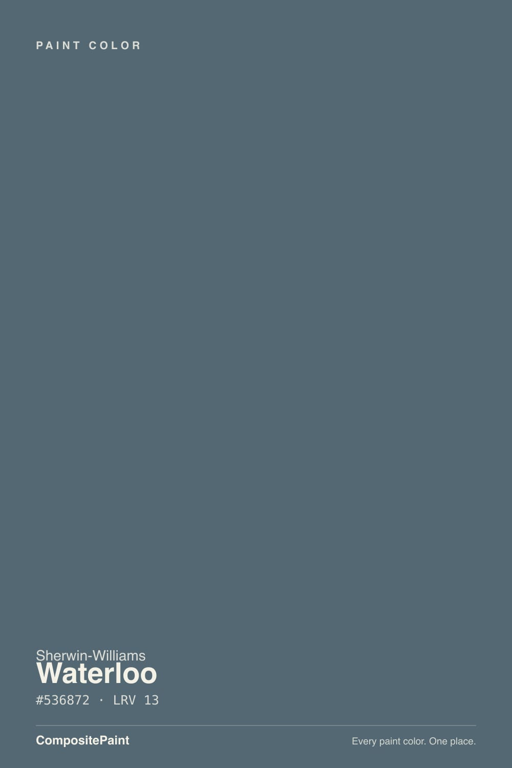
Waterloo sits in Sherwin-Williams' blue family a few steps grayer than its more famous sibling, Naval. Where Naval reads as an unmistakable navy in almost any light, Waterloo starts from the same rain-cloud blue and mixes in enough neutral gray that it can pass for charcoal on an overcast afternoon and for genuine blue the moment the sun clears. That instability is not a flaw — it is the whole personality. It is a color built to change with the room, not to hold one fixed note the way a truer navy does.
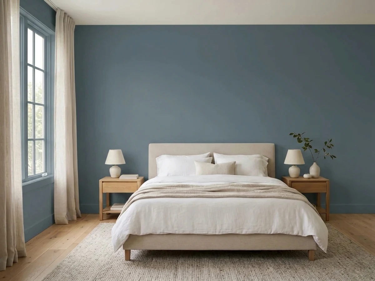
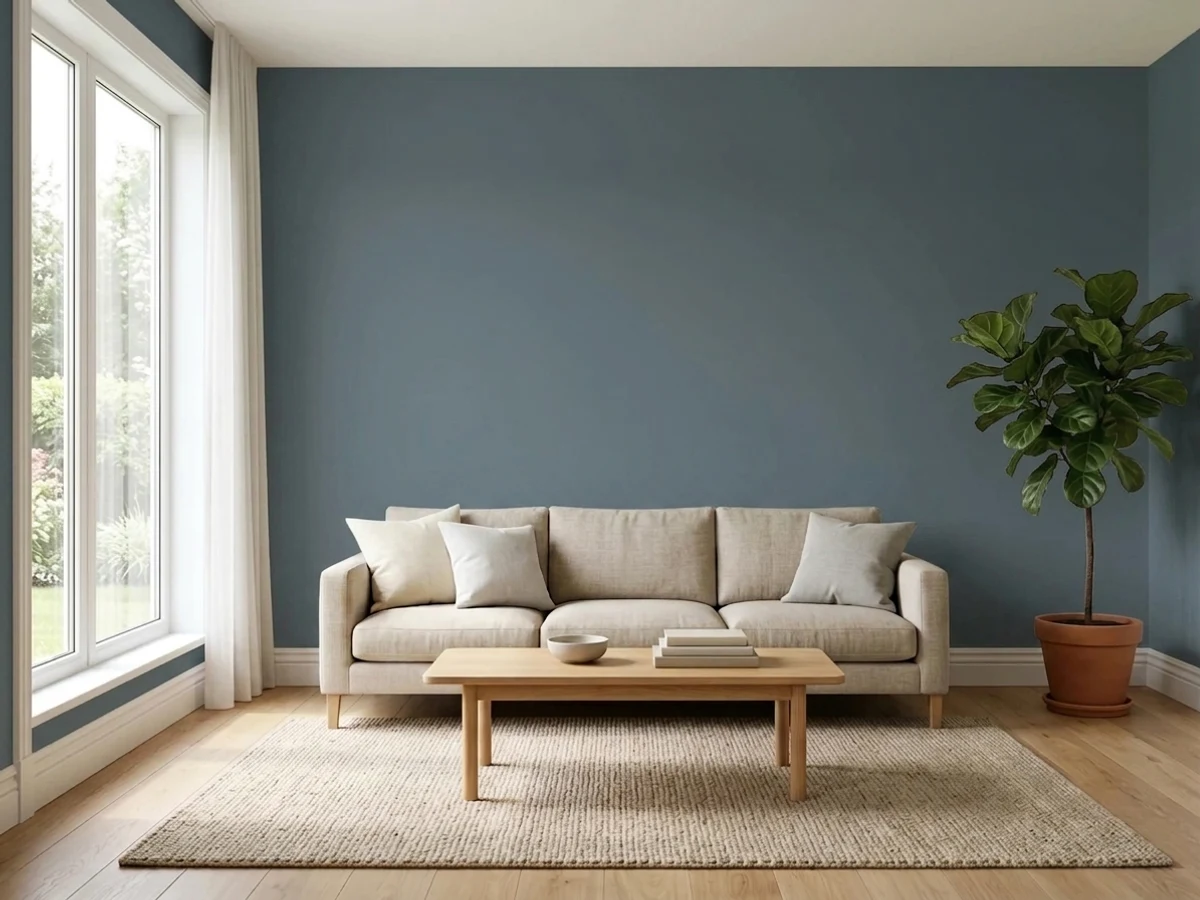
At LRV 13 it sits in the same dark band as Naval, Van Deusen Blue and Cyberspace — colors that all need real light in the room to read true rather than falling flat toward black. In a bright kitchen with white cabinets and daylight bouncing off them, Waterloo reads as a rich, confident slate blue. In a small room with one weak window, that same low LRV works against it: the color falls toward near-black and the room feels smaller, not moodier. This is the single biggest variable in how any review of Waterloo reads — the paint did not change, the light did.
Undertone in one line: blue-gray, cool, occasionally showing a whisper of green in strong daylight — never warm, never purple. If your sample looks nearly black, that is a light problem, not an undertone problem; move the chip to the brightest wall in the room before judging it.
Where It Shines
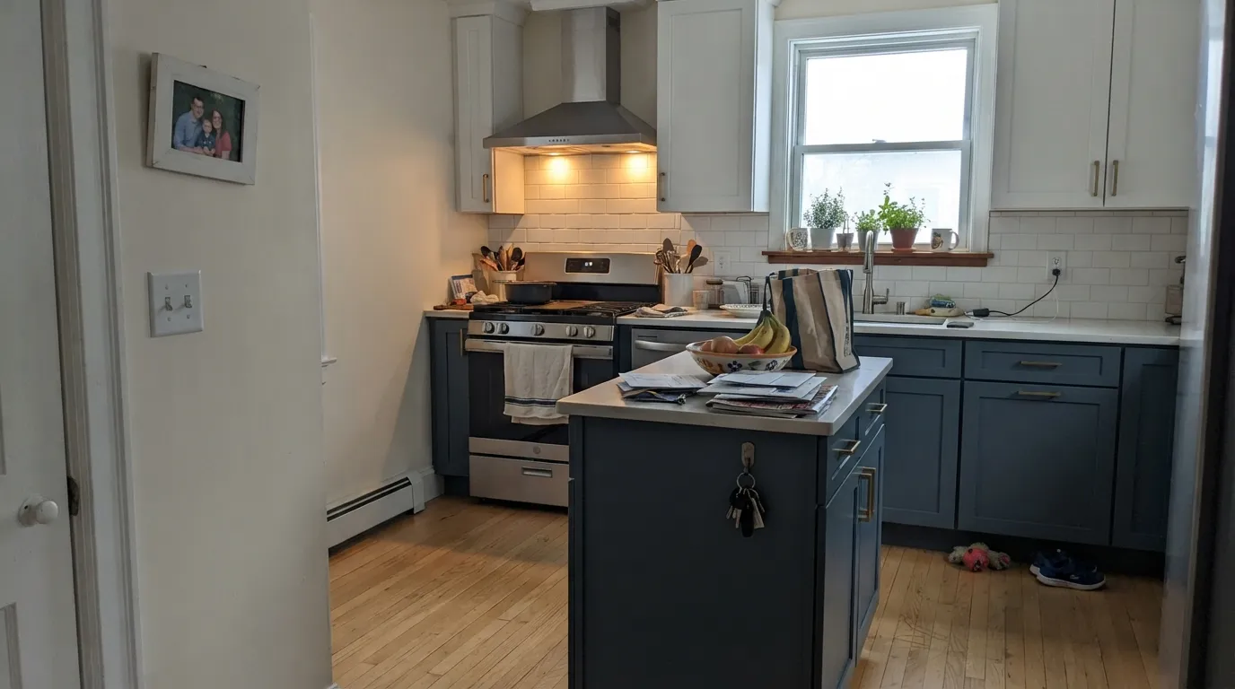
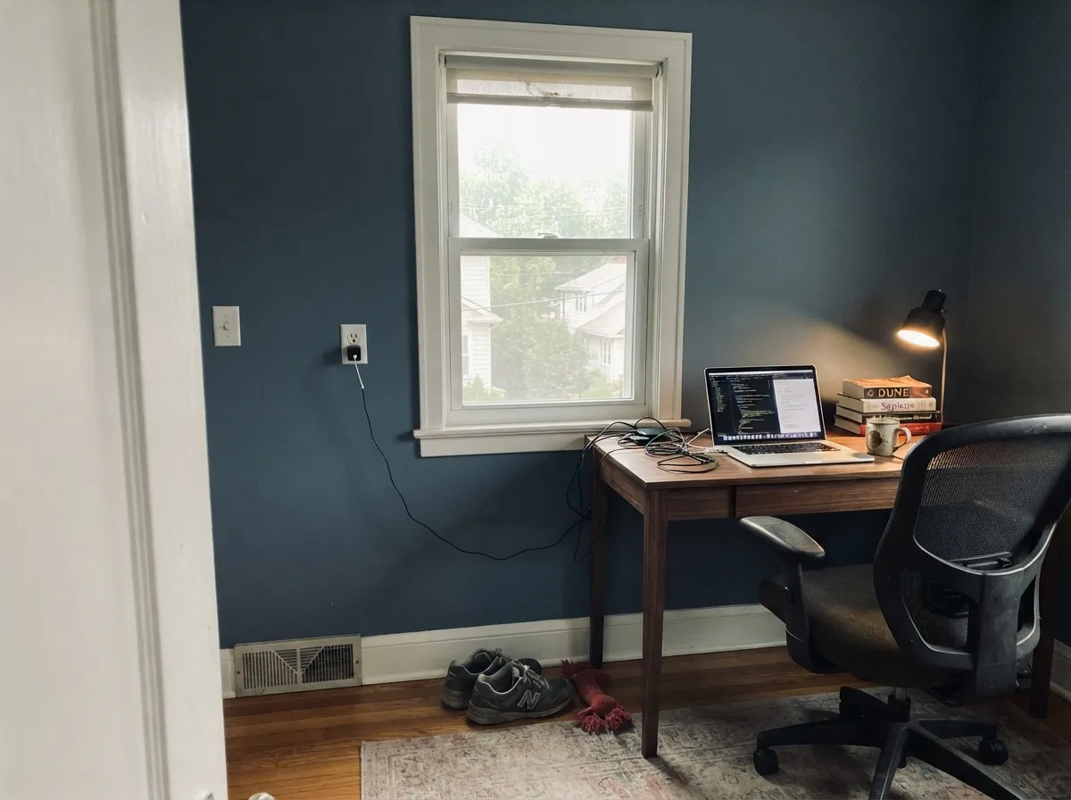
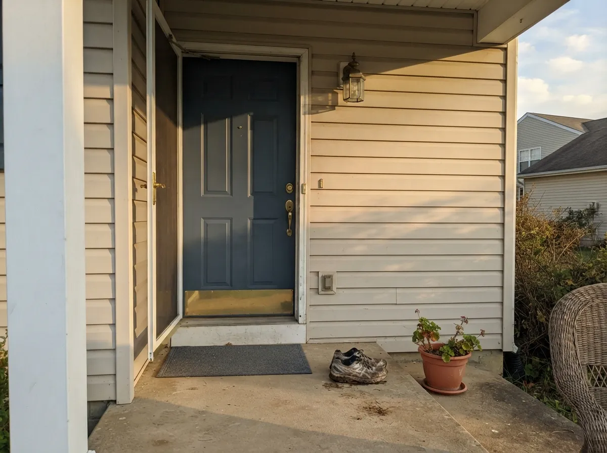
Waterloo's real home is a surface with light bouncing onto it, not away from it — a cabinet run under can lights, a front door under open sky, a den wall the afternoon sun actually reaches. Kitchens are where it earns its keep: painted lower cabinets or a full run under white uppers and a white backsplash reads coastal-modern rather than heavy, and the color holds its blue instead of sliding toward black the way it can on an unlit wall. Doors and shutters are its other strong suit — against a light-colored house it becomes the one confident dark note the whole exterior organizes around.
Where It Fails
Almost every disappointed Waterloo story comes down to one of three predictable mismatches, and none of them are the paint being unreliable — they are the paint being honest about a room it was never going to flatter.
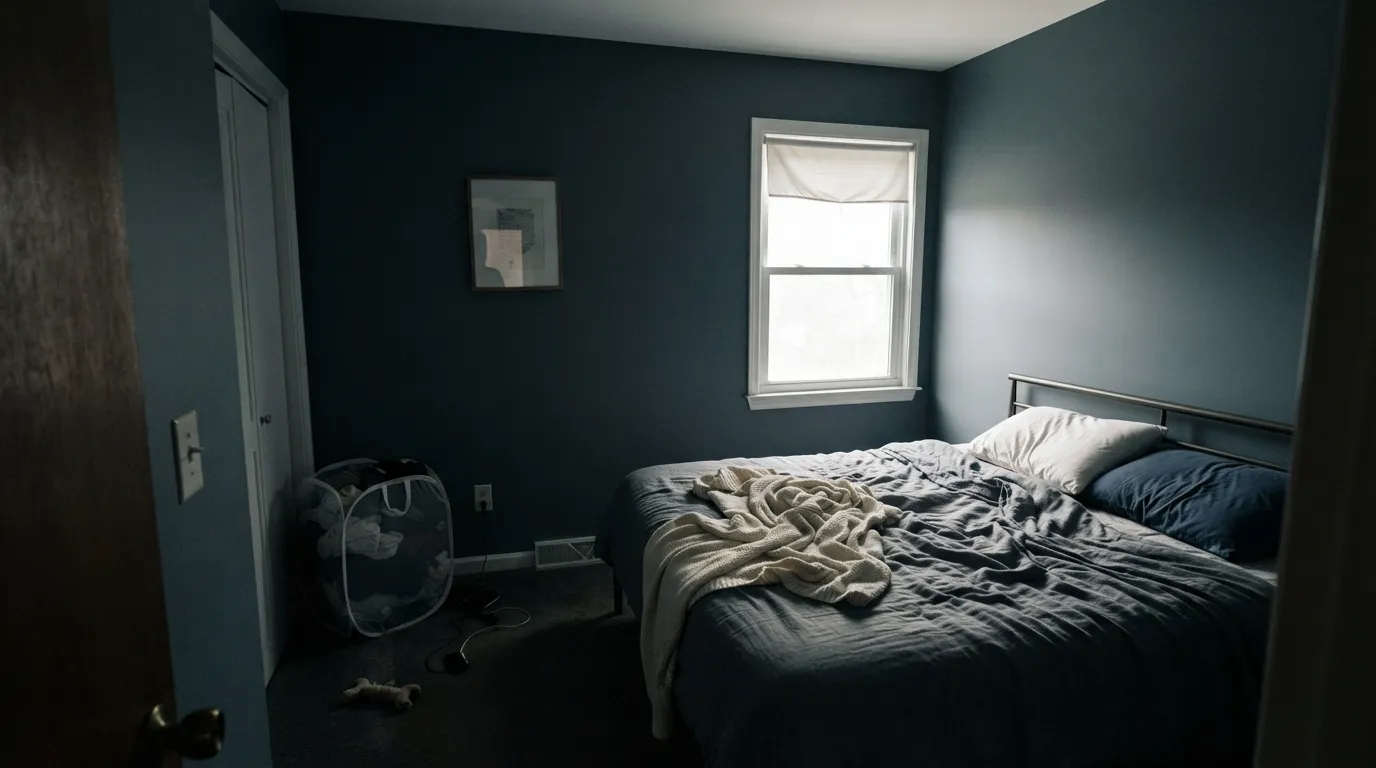
LRV 13 is already dark; take away the light and it drops further, toward a flat near-black that reads shrinking, not cozy. This is the single most common regret — a windowless powder room or a north-facing guest room where Waterloo looks great on the sample card and disappears on the wall. If the room only gets indirect or artificial light, go lighter — Boothbay Gray holds the same family at a livable LRV 36.
Waterloo is grayed down on purpose, and next to a true navy like Naval it looks almost slate by comparison. Buyers who picked it off a search for "navy paint" sometimes feel shortchanged when the color reads more gray-blue than blue-blue on the wall. If you want the color to announce itself as navy in any light, Naval is the more committed choice.
Direct sun does not deepen a dark cool color the way it deepens a warm one — it can bleach it. On a south- or west-facing exterior wall in full sun, Waterloo can wash out through the brightest hours and only come back to its true depth in shade or at dusk. It is not paint failure, but judging the color at noon on a sunny sample board will mislead you about how it looks the rest of the day.
Room by Room
Lower cabinets or an island in Waterloo under white uppers is the classic coastal-modern move, and can lights or under-cabinet lighting keep the blue from ever going flat. Satin or semi-gloss cabinet enamel; both brass and matte black hardware work.
A real window keeps it reading blue-gray rather than black, and by evening lamplight it turns properly moody without feeling like a cave. Eggshell for durability around a desk chair.
In a spacious bedroom with good daylight it is genuinely calming, not oppressive — the depth reads as restful rather than heavy. In a small or dim bedroom, it is the fastest way to make the room feel like it shrank overnight.
As a single accent wall against white tile and a white vanity it looks like a deliberate design choice; on all four walls of a small, poorly lit bath it turns into the near-black regret story above. Ventilation-rated satin or semi-gloss either way.
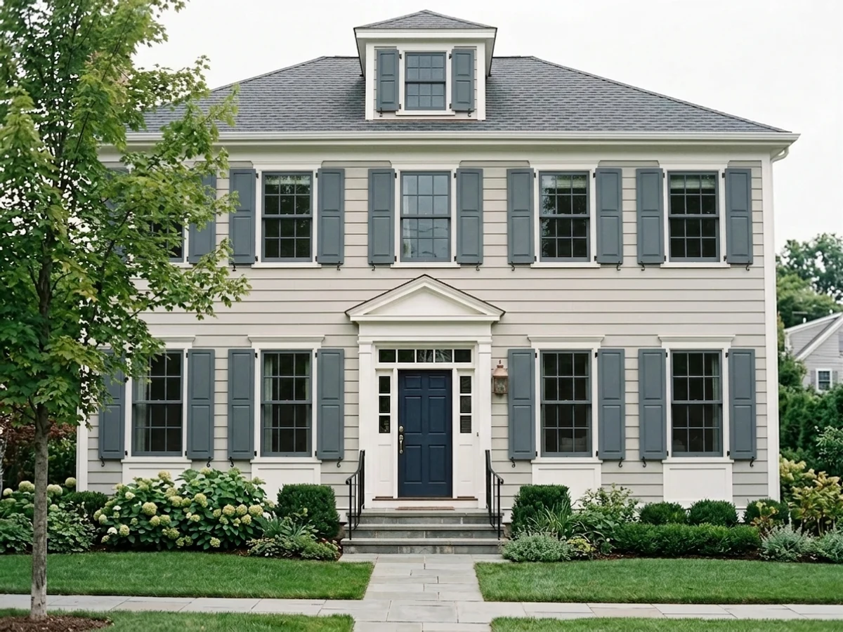
Against a white, greige, or light-gray house, a Waterloo door reads confident and current without the starkness of true black. It holds its color well outdoors as long as the door itself is not buried in deep shade all day.
Treated as a single fireplace or built-in wall with light trim and warm wood furniture, it grounds an otherwise bright room. As a whole-room color it demands more daylight and lamp planning than most living rooms are built to give it.
Your Light Is the Risk
A well-lit north or east room without direct glare is where Waterloo looks most like itself — a rich, true blue-gray, not black and not washed out.
Little natural light plus LRV 13 adds up to near-black. Fine if you want a cave; disappointing if you wanted a color.
Strong hot sun bleaches the depth out through midday, then it returns as the light softens toward evening. Judge it at more than one hour.
2700K bulbs push it toward a moody near-black; cooler LEDs keep the blue-gray clearer but flatter. Warm bulbs for cozy, cool bulbs for true color.
Most complaints about Waterloo are a light mismatch. Upload a photo of your actual room and see it on your walls — then ask for the same wall in north light or evening lamps before you buy a single sample.
Need It From Another Brand?
Any paint counter can custom-tint Sherwin-Williams SW 9141 directly. If you would rather stay in one brand's own deck, these are the closest stock matches, measured as ΔE2000. Under 2 is a difference you will not see on the wall.
| Brand | Closest color | ΔE | LRV | |
|---|---|---|---|---|
| Behr | Rush HourMQ5-25 · Behr | 0.5 | 13 | Color page → |
| Benjamin Moore | Nocturnal Gray2135-30 · Benjamin Moore | 2.3 | 14 | Color page → |
| Valspar | Smoky Pitch4007-4B · Valspar | 2.5 | 12.1 | Color page → |
| PPG / Glidden | Silent NightPPG1153-6 · PPG / Glidden | 0.8 | 13 | Color page → |
| Glidden | Silent NightPPG1153-6 · Glidden | 0.4 | 13 | Color page → |
| Dutch Boy | Grayed Navy431-5DB · Dutch Boy | 0.9 | 13 | Color page → |
Similar Sherwin-Williams Colors
The nearest shades to Waterloo within Sherwin-Williams's own range, ranked by perceptual color distance — useful when you want the same look a touch lighter, darker, or warmer.
WCAG 2.1: AA is 4.5 : 1 for normal text, 3 : 1 for large text, AAA is 7 : 1.
Waterloo vs the Colors You're Also Considering
Every Waterloo sample board has the same rivals on it. The numbers show the real lightness gap — then it comes down to which risk you would rather live with.
Pick this for the softer, less committal version — Waterloo's gray base is more forgiving next to both brass and matte black hardware.
Sherwin-Williams SW 6244 · LRV 4NavalPick this if you want a color that reads unmistakably navy in almost any light — Waterloo is grayer and quieter, and can be mistaken for charcoal in dim rooms.
Pick this for a cooler, more contemporary slate-blue instead of Hale Navy's warmer, softer navy.
Benjamin Moore HC-154 · LRV 6Hale NavyPick this for the most dependable navy in dim rooms — Hale Navy holds its blue where Waterloo can slide toward black.
Pick this for a touch more daylight-friendly depth — Waterloo's higher LRV holds detail Cyberspace can lose in a dim room.
Sherwin-Williams SW 7964 · LRV 7CyberspacePick this for an even darker, near-black take on the same slate-blue mood, if the room already has plenty of light to give it.
In the Sherwin-Williams deck, Needlepoint Navy SW 32 at LRV 13 (#546670) is the closest relative, a shade greener and flatter than Waterloo's #536872. Smoky Blue SW 7604 at LRV 15 (#596E79) is lighter and slightly more saturated, and Granite Peak SW 6250 at LRV 14 (#606B75) is grayer overall. Grays Harbor SW 6236 at LRV 12 (#596368) drops most of the blue for a dark gray, while Rookwood Sash Green SW 2810 at LRV 13 (#506A67) crosses into clear teal-green.
Across brands, Blue Mystery HGSW 3322 from HGTV Home by Sherwin-Williams shares the same hex. Glidden Silent Night PPG1153-6 is a deltaE of 0.37, Behr Rush Hour MQ5-25 is 0.47, and Dutch Boy Grayed Navy 431-5DB is 0.86. Benjamin Moore Nocturnal Gray 2135-30 at 2.31 and Valspar Smoky Pitch 4007-4B at 2.51 are very close, but sample first. Farrow & Ball Inchyra Blue No. 289 at 4.04 is close but visibly different side by side.
Waterloo Coordinating Colors
The rule for coordinating with Waterloo is light and neutral: it wants a bright, clean partner to bounce light back at it, and a near-black to echo its own depth without competing for undertone. It stays out of warm-beige territory entirely — beige and Waterloo's cool gray-blue do not share a temperature. These are the partners that keep showing up in rooms that work:
Waterloo on Exteriors
Outside is where Waterloo does its most reliable work, and the reason is simple: exterior doors and shutters get shade and reflected light in roughly equal measure through the day, which is exactly the condition this color needs to avoid going either black or washed-out. Against a white, light-gray, or greige house, a Waterloo front door reads as the single deliberate dark note the whole facade organizes around — more distinctive than a true black door, softer than a true navy one.
The one thing to check before committing outdoors is sun exposure: a door in full, unshaded afternoon sun will look a step lighter and grayer at 2pm than it does at 8am or in the evening, so look at a sample at more than one hour of the day before deciding you don't like it.
Waterloo With Wood Tones and Metals
Hardware and wood decide more of this color's personality than the paint itself does. Brass and unlacquered warm metals soften Waterloo's cool edge and read collected, almost nautical-antique; matte black hardware doubles down on the moodiness and reads more modern. Both are correct — it depends which direction you want the room to lean.
Wood is the easier call: white oak, driftwood-toned floors and pale ash all sit comfortably next to Waterloo because neither one is fighting for warmth. The floor that argues with it is a deep, red-orange traditional cherry or mahogany — the warmth and the cool blue-gray pull in opposite directions, and the wood usually reads muddier for the fight. Walnut sits in between and generally works if the room has enough light to keep both tones honest.
Three Ready Palettes Built on Waterloo
A color is never alone on the wall. These are complete combinations in the 60-30-10 pattern, with the reason each one holds together. Every one opens in the visualizer.
Alabaster keeps the upper cabinets and walls bouncing light back at the lower run, which is exactly what a dark, low-LRV color like Waterloo needs to read blue instead of black. Iron Ore on the hood or hardware echoes the same cool-neutral family without adding a second undertone to negotiate.
Try this palette in your roomPure White's neutral base doesn't fight Waterloo's cool undertone the way a warmer trim white can, and a real window is doing the heavy lifting this palette needs — this combination wants daylight, not a windowless room. Tricorn Black built-ins let the walls stay the lighter of the two darks instead of competing for attention.
Try this palette in your roomTwo whites at slightly different brightness keep the siding-to-trim handoff crisp without looking flat, and Waterloo gets exactly what it needs outdoors — a light house bouncing sun back at the one dark, confident note on the door.
Try this palette in your roomWaterloo FAQ
Is Waterloo navy or gray?
Neither one purely — it is a blue-gray built by graying down a navy base. In good light it reads clearly blue; in dim light or next to a true navy like Naval, it can look almost charcoal. If you searched for "navy" and want the color to commit to that, Naval or Hale Navy are the more literal choices.
Will it look black in my room?
Only if the room is already dark. At LRV 13 it needs real light to hold its blue-gray — a small room with one weak window is exactly where readers report it reading near-black. Test the sample on the wall that gets the most daylight, not the darkest corner.
What trim white goes with Waterloo?
A clean, slightly warm-neutral white keeps the contrast crisp without going stark — Sherwin-Williams Alabaster or Extra White both work well, and either reads better than a blue-leaning white, which fights Waterloo's own cool undertone.
Is it good for kitchen cabinets?
One of its best uses. Under white uppers with daylight or under-cabinet lighting it reads coastal-modern rather than heavy, and it takes both brass and matte black hardware well. Use a urethane-fortified cabinet enamel in satin or semi-gloss.
Does it work on an exterior door?
Yes — this is arguably its signature job. Against a light-colored house it becomes the one confident dark note, and it holds its color outdoors better than it does in a dim interior room, as long as the door is not in deep shade all day.
How does it compare to Naval or Hale Navy?
Naval is a truer, darker navy that reads navy in almost any light; Hale Navy is warmer and more forgiving in dim rooms. Waterloo sits between them in depth but reads grayer and cooler than both — pick it specifically because you want the gray, not despite it.
Have you painted with Waterloo?
Rate it — one tap helps the next reader decide.
Ask a Question