Resolute Blue
The Sherwin-Williams blue that refused to turn gray, reviewed honestly: where the saturation pays off, the light that flattens it, and the teal lean nobody warns you about.

Jessica has spec'd whites and neutrals for more than 300 rooms and keeps a sample wall of painted drawdowns in her studio. Every color review is checked against real reader rooms in the comments and re-tested when a formula changes. About the testing process →
- 1Waterloo13
- 2Charcoal Blue19
- 3Resolute Blue40
- 4Honolulu Blue62
- 5After Rain68
The Fast Verdict
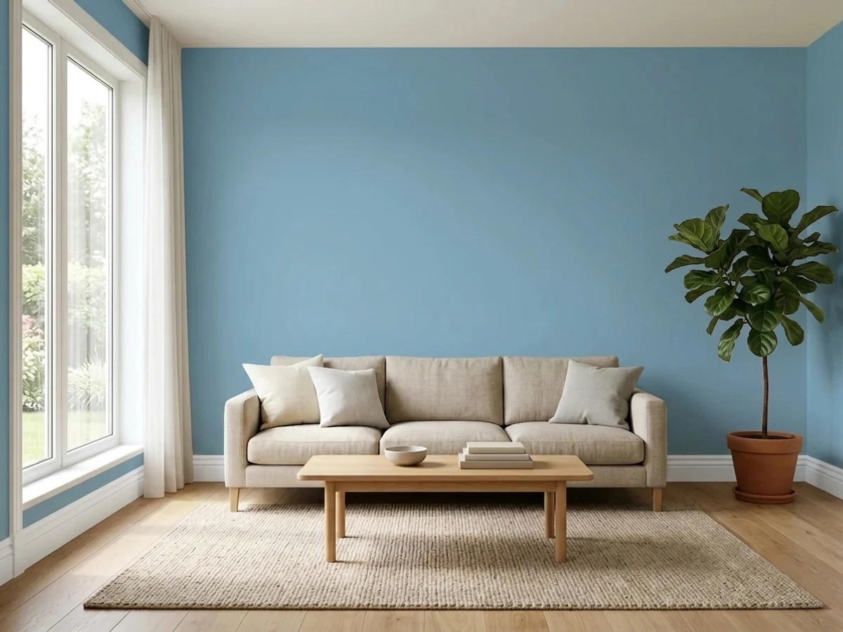
Resolute Blue is the color you land on after every soft blue-gray sample turned out to be gray. It is a genuine medium blue with a slight lean toward the teal side, saturated enough that nobody walks in and calls it a neutral, but grayed just enough that it never goes cartoon-bright. That makes it one of the best kids' and teen bedroom blues in the Sherwin-Williams deck — and a bad buy for anyone who wanted the walls to stay quiet.
Kids' and teen bedrooms that want real color · nurseries and playrooms · calm main bedrooms and guest rooms · bathrooms with white tile and chrome · home offices that need to look awake on camera
You actually wanted a soft blue-gray · the room faces north, runs dim, and has no lamps · your fabrics are royal blue or navy · you need the walls to stay in the background
- Actually blue — the rare mid-tone that does not collapse into gray
- Grown-up enough for a main bedroom, playful enough for a kid's room
- Ages well in a child's room: no repaint at the end of the pastel phase
- Beautiful in bathrooms against white tile, chrome and brass alike
- Muted enough that toys, art and colored bedding all sit calmly against it
- Not a blue-gray — buyers expecting a quiet neutral get a color
- LRV 40 goes heavy and cold in a dim north room
- The teal lean reads green next to royal blue or navy
- Full exterior sun washes the saturation right out of it
What Color Is Resolute Blue, Really?
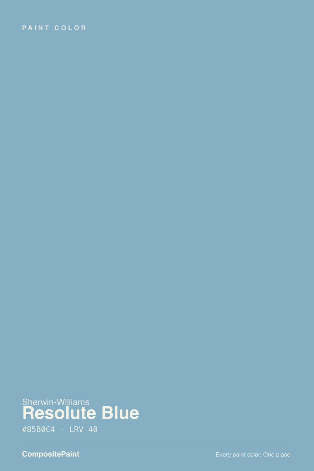
Read the numbers and this color stops being mysterious: hue 199 degrees, saturation 35 percent, LRV 40. That hue sits on the cyan side of blue — closer to clear pool water than to periwinkle — and 35 percent saturation is roughly double what Sherwin-Williams' famous blue-grays carry. Sleepy Blue, Windy Blue and Stardew are all grays that happen to lean blue. Resolute Blue is a blue that happens to be slightly grayed. On a two-inch chip that difference looks like nothing. On four walls it is the entire review.
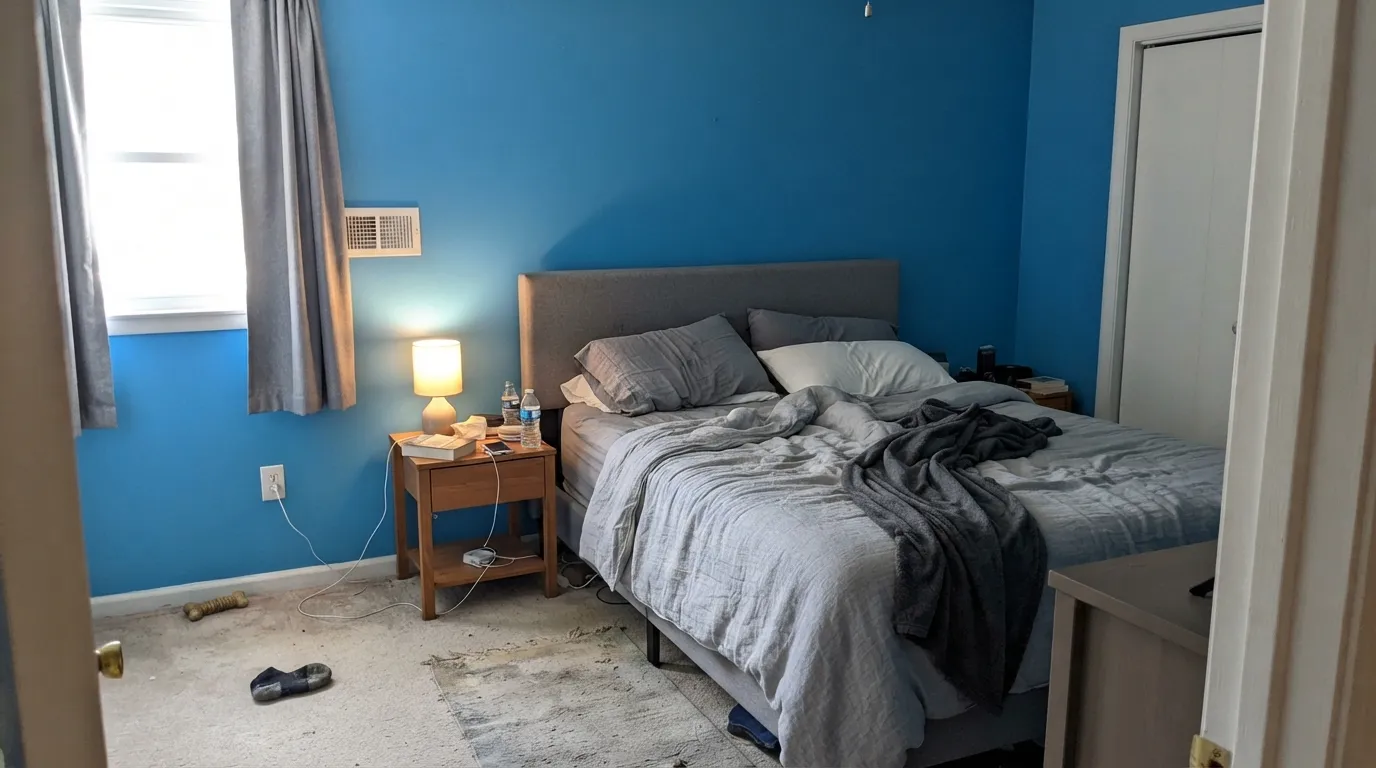
LRV 40 puts it squarely mid-tone, and mid-tone is the range where light stops being a detail and becomes the deciding factor. Anything under about 50 has to borrow brightness from the room; give it a decent window and Resolute Blue stays clear and buoyant, take the window away and it settles into a heavier, colder blue that can read almost slate. Plan for the wall to look a step deeper and noticeably more colorful than the chip — that gap is the number-one surprise people report, and it is normal for every saturated mid-tone.
Undertone in one line: blue first, a quiet pull toward teal second — never violet. If your sample looks green, something warm and yellow is sitting next to it. If it looks gray, your light is dim. Both are the same paint telling the truth about the room.
Where It Shines
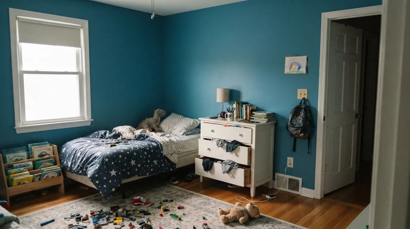
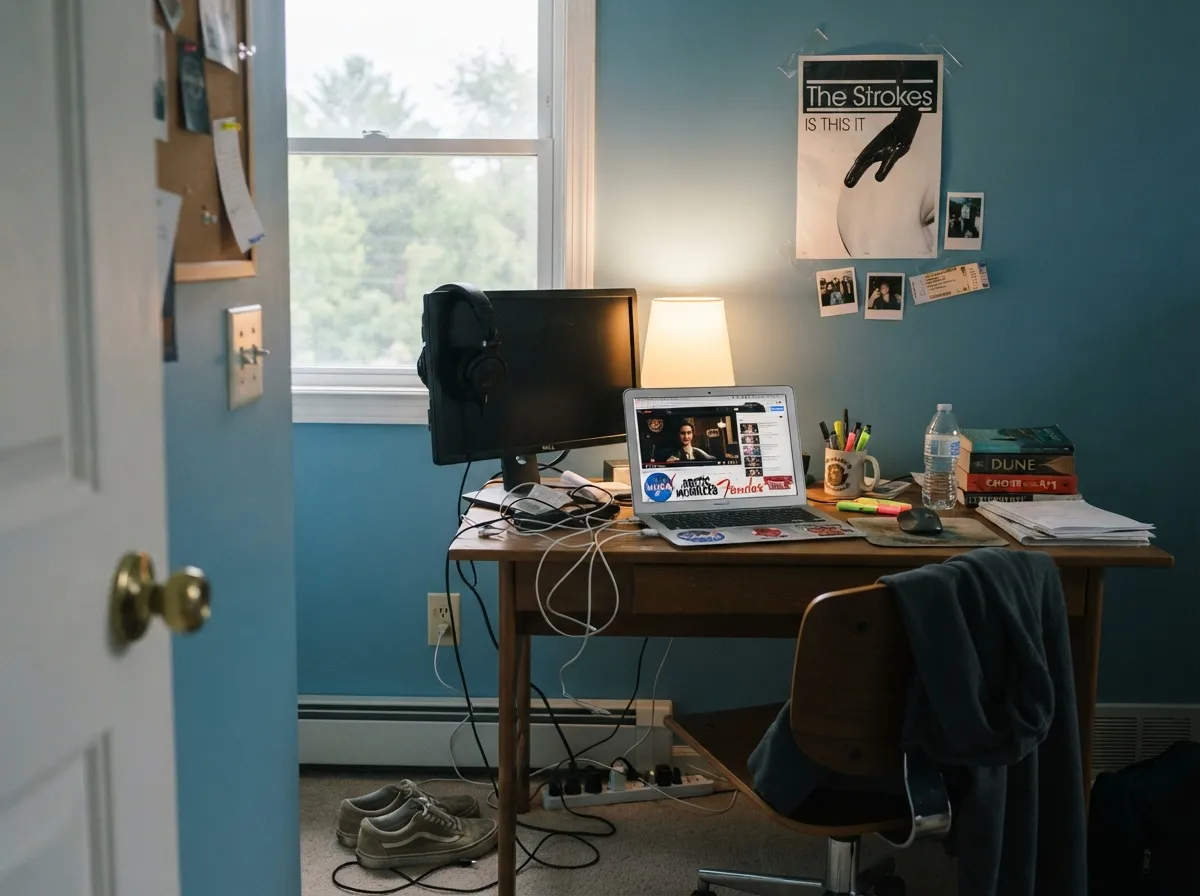
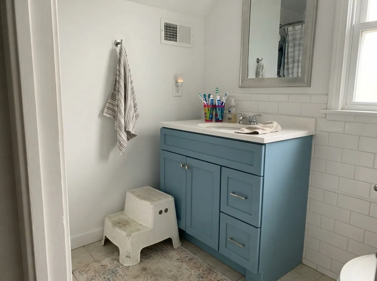
This color earns its keep in rooms that are allowed to have an opinion. A kid's bedroom is the obvious one: it is unmistakably blue without being a primary-color blue, so it survives the jump from age six to age sixteen without a repaint, and it takes white furniture, plain oak and a chaos of colored toys without fighting any of them. Its second home is the small wet room — a bathroom or powder room where white subway tile, chrome and a mirror do the brightening and the walls get to carry all the color.
Where It Fails
The complaints about Resolute Blue are remarkably consistent, and all three are predictable before you open the can. None of them are the paint failing — they are a mismatch between what the chip promised and what LRV 40 at 35 percent saturation actually does.
This is the big one. Shoppers work down the Sherwin-Williams blue racks, land on something that looks softly muted at chip size, and get a wall that reads as an actual blue — a color, not a neutral. If your reference photos are hushed gray-blue bedrooms, you want Sleepy Blue at LRV 41, which is nearly the same depth with half the color in it.
At LRV 40 the paint has no light of its own to give. Cool, flat north daylight drains the clarity and leaves a heavy, chilly blue that photographs as slate and feels cold to sit in. The fix is light — a window, two lamps, or a lighter blue. Sampling bigger will only confirm the problem.
The teal lean is invisible on its own and obvious next to a truer blue. Put a royal-blue duvet, a navy bunk bed or a cobalt rug in front of these walls and the paint immediately reads green by comparison. Choose the fabrics first, or keep the room's other blues in the same cyan family.
Room by Room
Real blue, zero baby-blue. It reads as a deliberate color rather than a nursery pastel, so it ages with the kid instead of getting outgrown. Satin finish for washability, white trim, and let the toys supply the loud colors.
Teens who want a colored room but reject anything cutesy tend to say yes to this one. In a playroom the muted side is an asset: primary-colored plastic looks intentional against it instead of clashing.
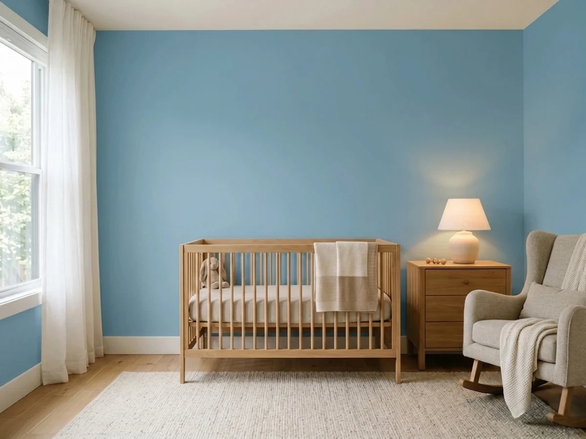
Calm and clean-feeling, and far more interesting than the usual pale nursery blue. In a bright room use all four walls; in a dim one keep it to the crib wall and let a soft white carry the rest.
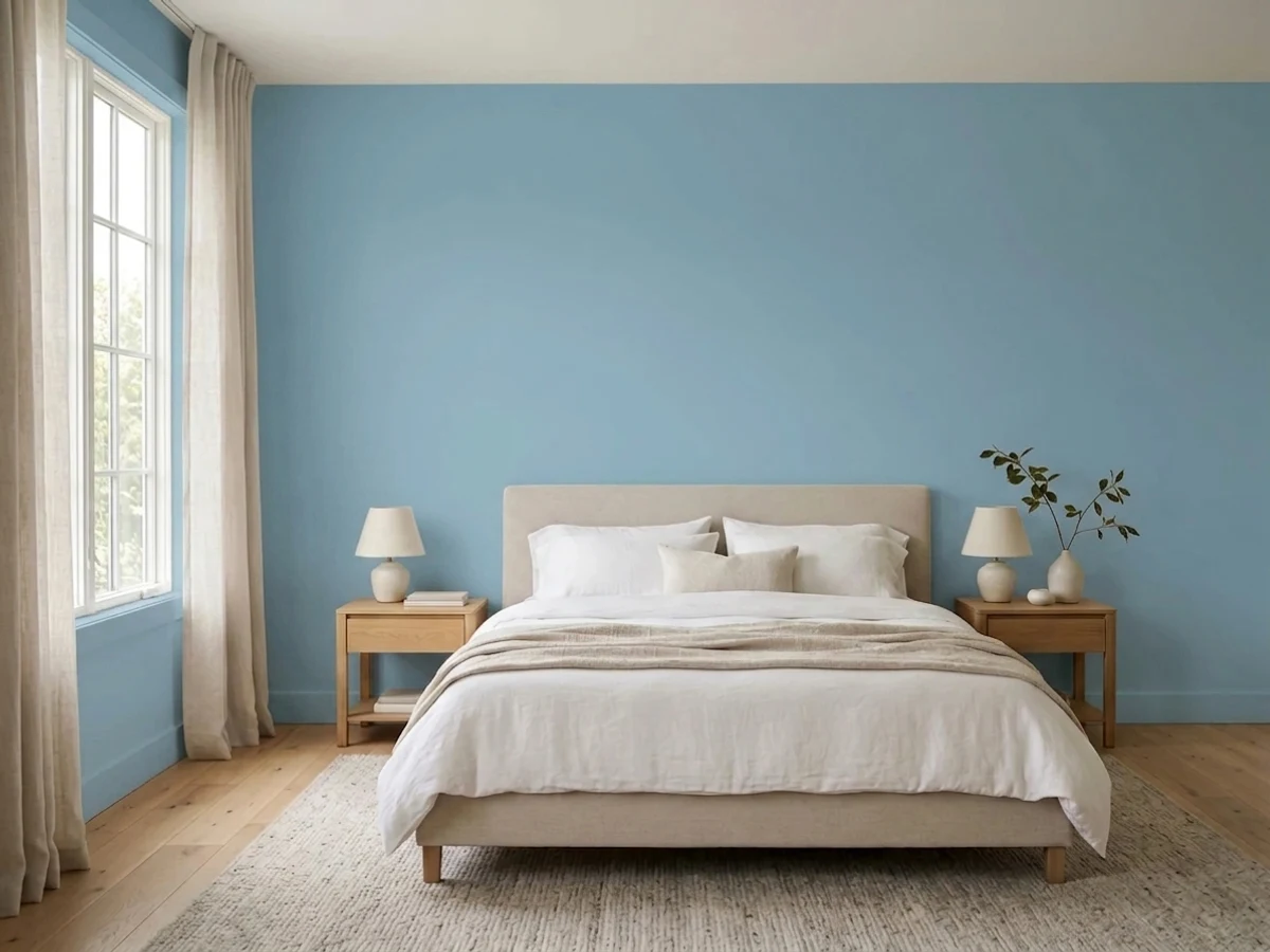
One of the easier grown-up blues to sleep in: cool, uncluttered, no green-gray murk. Eggshell walls, warm 3000K lamps, and white or cream bedding — beige bedding pulls yellow against it.
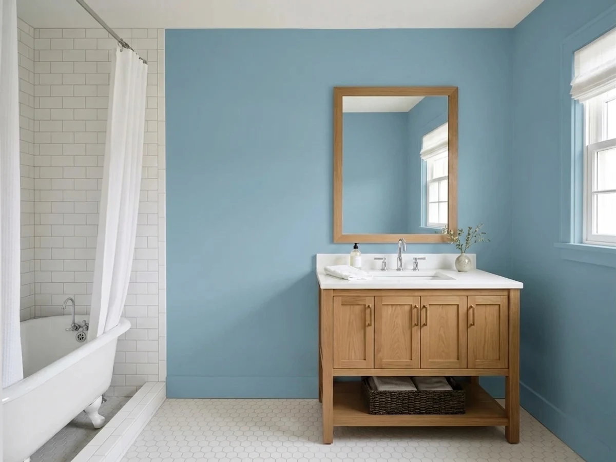
White tile, chrome and a mirror do the brightening, so the LRV 40 problem never appears. On a vanity in satin under a white counter it looks like a custom cabinet job for the price of a quart.
In an open plan it has to negotiate with every adjacent wall color and wood tone, which is a real commitment. Outside, full sun bleaches the saturation out of it; a shaded coastal front door is the exception that works.
Your Light Is the Risk
A south or big east window is where it looks like the chip promised: clear, clean and buoyant, with the gray reading as softness rather than dullness.
Cool flat daylight with no lamps drops it into heavy slate-blue territory. The color survives; the lightness does not. This is the room to sample before you buy.
East morning light gives the truest, crispest read of the day. By late afternoon warm west sun neutralizes some of the blue and the teal side steps forward for an hour.
2700K lamps mute it toward a soft gray-teal and take the crispness off; 4000K LEDs restore the clarity but push it cold and slightly clinical. 3000K is the honest middle for a bedroom.
Most complaints about Resolute Blue are a light mismatch. Upload a photo of your actual room and see it on your walls — then ask for the same wall in north light or evening lamps before you buy a single sample.
Need It From Another Brand?
Any paint counter can custom-tint Sherwin-Williams SW 6507 directly. If you would rather stay in one brand's own deck, these are the closest stock matches, measured as ΔE2000. Under 2 is a difference you will not see on the wall.
| Brand | Closest color | ΔE | LRV | |
|---|---|---|---|---|
| Behr | Sonata BlueBNC-08 · Behr | 1.7 | 41 | Color page → |
| Benjamin Moore | New Born's Eyes1663 · Benjamin Moore | 2.5 | 41 | Color page → |
| Valspar | Porcelain VaseV109-4 · Valspar | 4.7 | 37.7 | Color page → |
| PPG / Glidden | ArabellaPPG1157-4 · PPG / Glidden | 2.2 | 38 | Color page → |
| Glidden | Mayflower Blue70BG 41/201 · Glidden | 2.2 | 41 | Color page → |
| Dutch Boy | Nautic Blue236-4DB · Dutch Boy | 0.0 | 40 | Color page → |
Similar Sherwin-Williams Colors
The nearest shades to Resolute Blue within Sherwin-Williams's own range, ranked by perceptual color distance — useful when you want the same look a touch lighter, darker, or warmer.
WCAG 2.1: AA is 4.5 : 1 for normal text, 3 : 1 for large text, AAA is 7 : 1.
Resolute Blue vs the Colors You're Also Considering
Every Resolute Blue sample board has the same rivals on it. The numbers show the real lightness gap — then it comes down to which risk you would rather live with.
Pick this when the lighter version tested as too washed out to look like a decision.
Sherwin-Williams SW 6504 · LRV 51Sky HighPick this for the same hue eleven LRV points lighter — the safer choice for a dim room or a nursery.
Pick this when the quiet versions kept disappearing on your wall and you wanted the blue to show up.
Sherwin-Williams SW 6225 · LRV 41Sleepy BluePick this if you actually wanted a blue-gray — same depth, far less color, and it is more gray than its name admits.
Resolute Blue Coordinating Colors
The rule with Resolute Blue: clean whites, cool-leaning neutrals, and any other blue you add should come from the same cyan side of the family. Warm creams and yellow-beiges are the pairings that make it look green, and true royal blue is the one that makes it look green fastest. These are the partners that keep showing up in rooms that work:
Where Resolute Blue Sits on the Blue-Gray Spectrum
Almost every blue that went famous in the last decade got there by giving up saturation. Sleepy Blue, Windy Blue, Stardew — the whole popular tier of light and mid blues is really a set of grays with a blue tilt, and they got popular precisely because they behave like neutrals. Resolute Blue never joined that group. It kept enough color to be recognizable as blue from across a room, which is why it turns up on kids'-room lists far more often than on whole-house lists.
It also has a lighter relative worth knowing about: Sky High, three numbers up the same Sherwin-Williams family at LRV 51, is close in hue and much airier. That pairing is genuinely useful — same blue, two volumes, so a Sky High ceiling or hallway can open off a Resolute Blue bedroom without any hue shift to explain.
The practical read: if your Pinterest board is full of hushed, barely-there blue bedrooms, you are looking at the gray tier and Resolute Blue will surprise you. If the board is full of rooms where the blue is clearly the point, this is the tier you want.
Resolute Blue With Wood Tones, Floors and Kid-Room Furniture
White oak, pale ash and gray-washed floors are the easy wins — cool blue over cool-neutral wood is a combination that essentially cannot go wrong. Walnut works too, but it warms the room enough that the blue reads a shade quieter, which is fine in a main bedroom and slightly flat in a kid's room. Painted white furniture is the best of all: the plain white flat-pack dresser and bunk bed most kids' rooms already own look genuinely good against this blue.
The honest problem is orange, and honey oak floors and orange-stained trim are both orange. Orange sits directly opposite blue on the wheel, so the floor gets louder and the walls get colder, and each side keeps exaggerating the other. A big rug helps in a bedroom; a whole room of honey oak trim does not have a fix, and a warmer blue or a green is the better call there.
For hardware and metals: chrome, brushed nickel and matte black all read clean and modern against it. Unlacquered brass works but leans the whole room warm and coastal — a good look on a bathroom vanity, a less obvious one on a kid's bedroom door.
Three Ready Palettes Built on Resolute Blue
A color is never alone on the wall. These are complete combinations in the 60-30-10 pattern, with the reason each one holds together. Every one opens in the visualizer.
Two depths of blue with a clean white between them is what keeps a kid's room from looking themed. Naval at LRV 4 gives the room one anchor dark enough to read as a design choice, and Pure White trim keeps the whole thing crisp instead of hazy.
Try this palette in your roomThe vanity carries the color while Snowbound keeps the small room light, so LRV 40 never has to brighten anything. Iron Ore supplies one near-black note; chrome or brushed nickel hardware suits the cool blue better than warm brass here.
Try this palette in your roomRepose Gray leans cool enough that a cyan-side blue opening off it never looks like a mistake, and running one trim white through both halves makes the color change feel planned. This is the scheme for houses where only the bedrooms and the office get to have a color.
Try this palette in your roomResolute Blue FAQ
Is Resolute Blue too dark for a kid's room?
Not in a room with a window. LRV 40 is mid-tone, so it holds real color without closing the space in, and kids' rooms are usually small enough that four blue walls feel cozy rather than heavy. In a basement bedroom or a dim north-facing room, drop to a lighter blue or paint one wall instead of four.
Does Resolute Blue look green or teal?
It leans that way, but only when something tells it to. The hue sits at 199 degrees, on the cyan side of blue, which is invisible against white trim and obvious against a truer blue. Royal-blue bedding or a navy rug will make the walls read distinctly green — keep the room's other blues in the same family and the lean disappears.
What trim white goes with Resolute Blue?
A clean white, not a cream. Pure White at LRV 84 is the default and keeps the blue crisp; Snowbound at LRV 83 is the slightly softer option if a bright white feels harsh. Warm creamy whites turn the blue faintly green by contrast, which is the one trim mistake worth avoiding here.
Is Resolute Blue good for a nursery?
Yes, and it is a smarter nursery pick than most pale blues because you will not want to repaint it in three years. The caveat is light: in a bright nursery use all four walls, in a dim one keep it to the crib wall with a soft white elsewhere. Use a washable satin — nurseries become toddler rooms.
Resolute Blue or Sky High?
Same hue family, different volume. Sky High at LRV 51 is the airier, safer version — better for dim rooms, ceilings and nurseries. Resolute Blue at LRV 40 is the one that actually looks like a color decision. If your samples of the lighter blues kept vanishing into the wall, that is your answer.
Will it work in a north-facing room?
Only with help. North light is cool and flat, and it strips the buoyancy out of a mid-tone blue, leaving something closer to slate. Two lamps at 3000K and a white ceiling can rescue it; a north room with one small window and an overhead fixture cannot. Sample that exact room before committing.
Have you painted with Resolute Blue?
Rate it — one tap helps the next reader decide.
Ask a Question