Yarmouth Blue
Benjamin Moore's 1976 Historic Collection blue, reviewed honestly: the quiet slate-blue that holds its color when pale spa blues wash out, the light where it goes flat, and what to pick instead.

Jessica has spec'd whites and neutrals for more than 300 rooms and keeps a sample wall of painted drawdowns in her studio. Every color review is checked against real reader rooms in the comments and re-tested when a formula changes. About the testing process →
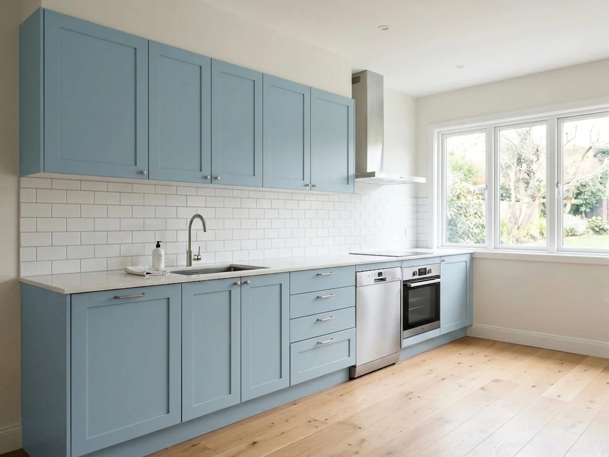
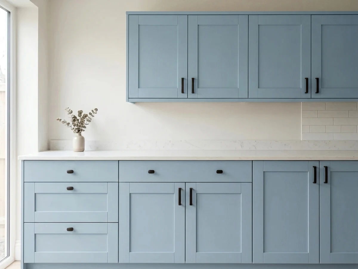
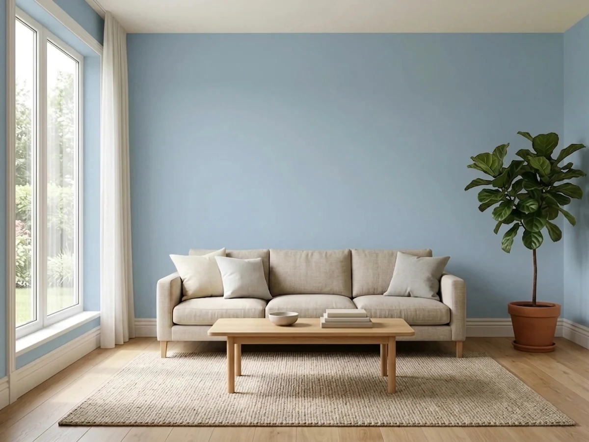
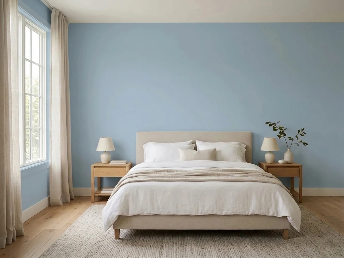
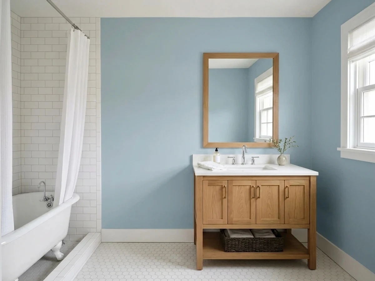
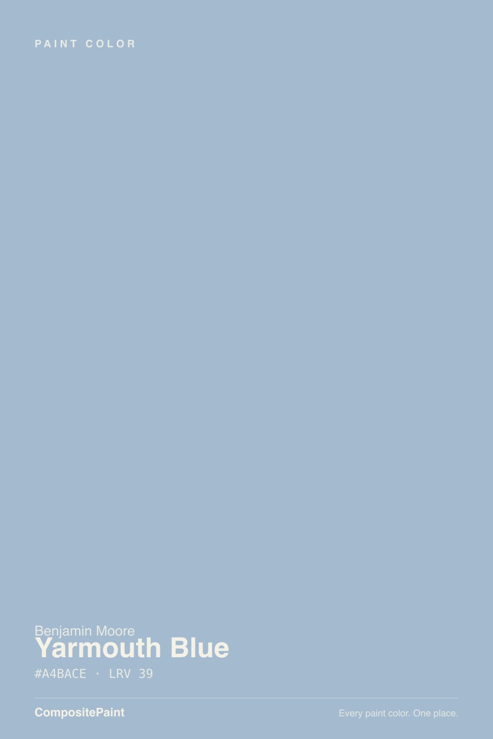
- 1Stardew43
- 2Quietude48
- 3Yarmouth Blue55
- 4Sea Salt63
- 5Wickham Gray68
The Fast Verdict
Yarmouth Blue is a fifty-year-old Benjamin Moore color that never went viral and doesn't need to. It's a genuine blue-gray — bluer than Boothbay Gray, quieter than Van Deusen — that holds its color through an ordinary overcast afternoon instead of washing pale like the spa blues everyone else is chasing. Give it white trim and a little wood and it reads coastal-colonial without trying; give it a dim room with no lamps and it goes flat fast.
Bedrooms and home offices that want calm, not drama · kitchens paired with white or navy cabinetry · front doors and shutters on a white or gray house · anyone who wants a blue that reads as a real color, not gray pretending
You want something instantly recognizable — this is nobody's Color of the Year · your room is dim, north-facing, and lamp-free · you're picturing the green-leaning spa aqua of Palladian Blue · your floors are honey oak and staying that way
- A genuine mid-depth blue that holds its color instead of washing pale
- Reads as blue first, not gray pretending to be blue
- Fifty years in the Benjamin Moore deck — proven, not trendy, ages well
- Pairs cleanly with white or navy kitchen cabinetry
- Calm enough for a bedroom, weighty enough for a front door
- Goes flat and murky in a dim north room without lamps
- Fights honey-oak floors and warm-toned wood trim
- Not the green-leaning spa blue some buyers expect from an aqua-adjacent hex
- Quiet reputation means fewer real-room photos to sample against before committing
What Color Is Yarmouth Blue, Really?
Yarmouth Blue is one of forty colors Benjamin Moore issued in 1976 as the Historic Collection, drawn from restoration research on real colonial and federal buildings for the U.S. bicentennial — which is a fancier way of saying this color has quietly sat in the fan deck for fifty years without a relaunch, a rename, or a Color of the Year moment. It has no viral room, no HGTV credit, no waitlist. What it has is a small, loyal following: homeowners who tried a sample, painted one room, and stayed for years.
At LRV 55, Yarmouth Blue sits at a genuine mid-depth — noticeably deeper than the pale spa blues (Palladian Blue, LRV 53) that dominate most blue-paint round-ups, and closer in weight to a true slate. That depth is the point: this is a blue you can actually read as blue from across a room, not a whisper of blue that goes white from six feet away. It holds its color through an ordinary overcast afternoon instead of washing out, which is rare for a color this quiet.
Undertone in one line: blue first, gray close behind, with just enough gray to keep it from ever turning nursery-sweet or beachy. Unlike Boothbay Gray, which most buyers mistake for a straight gray, Yarmouth Blue never lets you forget it's blue — the gray is there to calm it down, not to disguise it.
Where It Shines
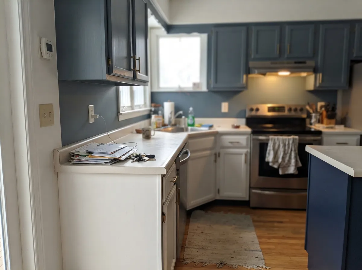
Give it white trim and a little wood, and it does the coastal-colonial thing without looking like a costume. Because it holds real color at LRV 55, it doesn't need bright light to read as intentional — an ordinary living room or den keeps its blue all day, not just at noon. It's a genuine kitchen option too: Benjamin Moore itself suggests it against white or navy cabinetry, and the mid-depth reads as a considered choice rather than a whim.
Where It Fails
The complaints about Yarmouth Blue are quieter than the color itself, mostly because so few people have painted a whole room in it to complain about. But the readers who do run into trouble hit one of three walls, and none of them are the paint's fault.
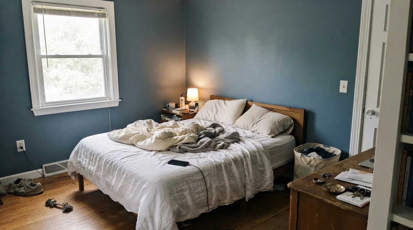
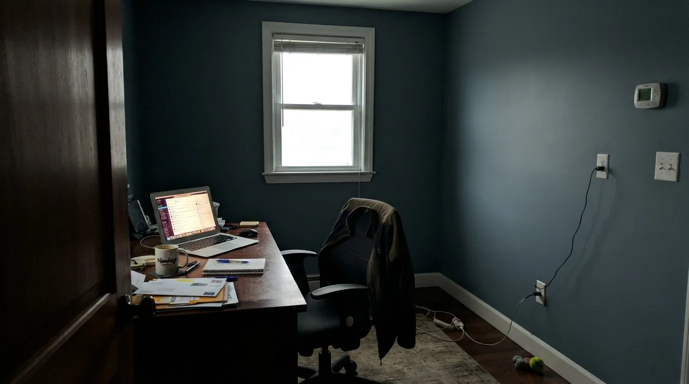
Cool, low daylight strips the last of the warmth out and the wall settles into a flat, slightly murky blue-gray — moody in a way that reads unfinished rather than intentional. The color did not fail; the light did. Add warm lamps or move it to a room with real daylight.
Yarmouth Blue and Palladian Blue get confused constantly, and they are not the same color. Palladian carries a real green lean and sits much paler at LRV 53; Yarmouth stays blue and sits deeper. If the green spa look is what you pictured, this is the wrong sample.
This is a cool color, and yellow-orange honey oak sits close to its visual opposite. Against a warm builder-oak floor the blue can look chalky and the wood can look muddier than it is. Neutral wood — white oak, walnut, black-stained floors — or a warm white trim like Cloud White bridges the gap; straight honey oak does not.
Room by Room
Holds its blue across the room in ordinary daylight, not just at noon. White Dove or Cloud White trim keeps the edges soft; eggshell on the walls, semi-gloss on the trim.
Benjamin Moore's own suggestion — white or navy cabinetry alongside it — works. As upper cabinets against a white lower run, or the reverse, it reads considered rather than trendy. Satin cabinet enamel.
Low light and warm 2700K lamps flatter it best. Matte or eggshell on the walls, cream or white bedding rather than beige, which fights the blue.
Pairs cleanly with a white tub, white cabinetry, and chrome or brushed nickel hardware. Satin holds up to steam and wipes clean.
A calm, unfussy backdrop that does not compete for attention on a video call or during focused work. Works especially well as the one blue room in an otherwise neutral house.
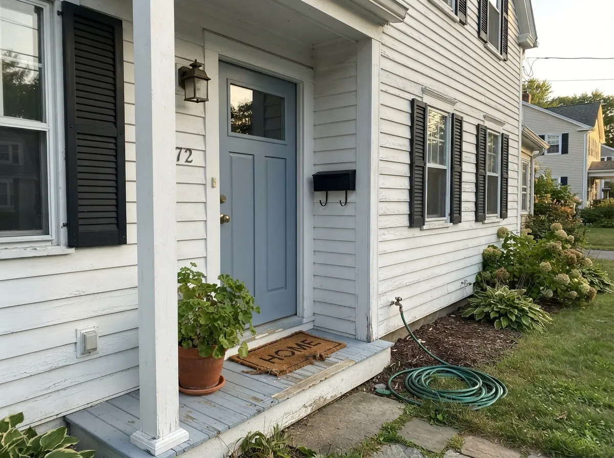
As siding it wants a crisp white trim and a dark door for contrast; as the door itself against white or pale-gray siding, it reads historic without effort. Full sun brightens it a step past its indoor read.
Your Light Is the Risk
South-facing or any strong ambient light keeps it a true, settled blue-gray all day — its most honest and most flattering read.
Cool, low daylight drains the blue toward a flat, slightly murky gray. Fine if you half-wanted gray; disappointing if you wanted blue.
Brighter and bluer at the sun hours, quieter and grayer once the light passes. The shift is gentle, not a different color.
2700K lamps mute the blue toward a soft, warm gray at night — cozy, but the blue recedes. Cool LEDs keep the blue awake but can tip it colder; most bedrooms do better with warm bulbs after dark.
Most complaints about Yarmouth Blue are a light mismatch. Upload a photo of your actual room and see it on your walls — then ask for the same wall in north light or evening lamps before you buy a single sample.
Need It From Another Brand?
Any paint counter can custom-tint Benjamin Moore HC-150 directly. If you would rather stay in one brand's own deck, these are the closest stock matches, measured as ΔE2000. Under 2 is a difference you will not see on the wall.
| Brand | Closest color | ΔE | LRV | |
|---|---|---|---|---|
| Sherwin-Williams | Billowy BreezeSW 9055 · Sherwin-Williams | 2.5 | 55 | Color page → |
| Behr | DayflowerMQ3-54 · Behr | 0.7 | 57 | Color page → |
| Valspar | Degas Blue8004-35B · Valspar | 1.5 | 56 | Color page → |
| PPG / Glidden | Misty SurfPPG1034-4 · PPG / Glidden | 0.5 | 55 | Color page → |
| Glidden | Misty SurfPPG1034-4 · Glidden | 0.0 | 55 | Color page → |
| Dutch Boy | Quiet Breeze428-3DB · Dutch Boy | 2.0 | 54 | Color page → |
Similar Benjamin Moore Colors
The nearest shades to Yarmouth Blue within Benjamin Moore's own range, ranked by perceptual color distance — useful when you want the same look a touch lighter, darker, or warmer.
WCAG 2.1: AA is 4.5 : 1 for normal text, 3 : 1 for large text, AAA is 7 : 1.
Yarmouth Blue vs the Colors You're Also Considering
Every Yarmouth Blue sample board has the same rivals on it. The numbers show the real lightness gap — then it comes down to which risk you would rather live with.
Pick this when you want people to actually call it blue, not gray, the first time they see it.
Benjamin Moore HC-165 · LRV 36Boothbay GrayPick this if you want the same mid-depth blue-gray but leaning gray more than blue by nature.
Pick this for a color that stays unmistakably blue and holds more weight in an ordinary room.
Benjamin Moore HC-144 · LRV 53Palladian BluePick this for a paler, greener spa-blue with real teal in it — Palladian trades depth for a beachier mood.
Within the brand, most of its close relatives are lighter. Sunrise 829 and Frozen Canal CC-908 sit at LRV 48, Northern Air CC-760 at 49 and Sapphire Ice 808 at 50, against Yarmouth Blue at LRV 39, so all of them return more light and read airier on a wall. November Skies 2128-50 at LRV 48 and hex #ACBAC8 is the grayest option if you want less blue.
Across brands, Dunn-Edwards Northern Pond DE5870 at deltaE 0.27 is effectively the same color. Behr Ridge View 610F-5 at 1.12, Glidden Heavenly Blue PPG1159-3 at 1.35, Farrow & Ball Lulworth Blue No. 89 at 1.82 and Valspar Glacier Mist 4005-3B at 1.91 are all visually identical in normal room light.
Sherwin-Williams Windy Blue SW 6240 at deltaE 3.17, Clare Cloud Watching at 2.99 and C2 Tidal C2-768 at 3.05 are very close but worth sampling first. Backdrop Lost in the 80s at 4.1 is close but visibly different side by side.
Yarmouth Blue Coordinating Colors
The rule for coordinating with Yarmouth Blue: white trim, near-black accents, and neutral wood — and give honey-toned anything a wide berth. It pairs cleanly with both crisp and soft whites, takes a near-black accent well, and sits easily next to other members of Benjamin Moore's Historic Collection. These are the partners that keep showing up in rooms that work:
Fifty Years Quiet: The Historic Collection Story
Yarmouth Blue is one of forty shades Benjamin Moore released in 1976 as the Historic Collection, developed from paint-research work on real colonial and federal-era buildings for the U.S. bicentennial. It was never built to trend — it was built to be accurate to a house that was already two hundred years old, which is a different design brief than most paint launches get.
That origin explains its reputation, or lack of one: no Color of the Year credit, no design-blog moment, no aggressive marketing push. What surfaces instead, on forums like Houzz, is the quieter kind of endorsement — homeowners who sampled it once, painted a living room, kept it for years, and eventually painted the den and the kitchen the same blue because it kept working. A color that earns repeat rooms without ever going viral is doing something right.
Yarmouth Blue With Wood Tones and Floors
White oak, walnut, and black-stained floors are the easy answers — all three sit neutral or cool enough that the blue reads clean and the wood reads intentional rather than fighting for attention. Black and brushed-nickel hardware both work; unlacquered brass gives it a slightly warmer, more traditional edge without clashing.
The one wood to test carefully is honey oak. Standard builder-grade orange-toned oak sits close to Yarmouth Blue's visual opposite, and the combination can leave the floor looking muddier and the wall looking chalkier than either does alone. A large rug breaks the contact in most rooms; refinishing to a cooler stain solves it for good.
Three Ready Palettes Built on Yarmouth Blue
A color is never alone on the wall. These are complete combinations in the 60-30-10 pattern, with the reason each one holds together. Every one opens in the visualizer.
White Dove trim keeps the blue from ever looking cold, and one near-black furniture note gives the calm room enough weight that it does not drift toward pastel. Warm 2700K lamps finish the mood at night.
Try this palette in your roomThe exact white-and-navy cabinetry pairing Benjamin Moore itself points to for this color. Yarmouth Blue on the uppers keeps the room from going too dark overhead, while Hale Navy on the island supplies the deep anchor the light blue needs.
Try this palette in your roomWhite siding lets the door carry all the color, and near-black shutters frame it the way colonial-era houses actually did — which is fitting, since this is the collection built from restoring them.
Try this palette in your roomYarmouth Blue FAQ
Is Yarmouth Blue more blue or more gray?
Blue, with gray riding along to calm it down rather than take over. At LRV 55 it holds a genuine mid-depth blue in ordinary light; only a dim, lamp-free north room pushes it toward flat gray.
What white trim goes with Yarmouth Blue?
White Dove or Cloud White for a soft, warm edge that keeps the blue from feeling cold; Simply White or Simply White-adjacent brighter whites if you want more contrast, especially outdoors.
Does it work in a north-facing room?
It can, but plan for warm lamps. North light is cool and low, and it pulls the blue toward a flatter, more muted gray. A room with real daylight from another exposure shows the color's actual character better.
Is Yarmouth Blue good for kitchen cabinets?
Yes — it is one of the color's strongest rooms. Benjamin Moore itself points to it with white or navy cabinetry, and the mid-depth blue reads as a deliberate design choice rather than a trend pick.
How is it different from Boothbay Gray or Palladian Blue?
Boothbay Gray sits at a similar depth but leans toward gray more readily; Yarmouth Blue holds its blue identity more consistently. Palladian Blue is paler and carries a real green undertone, closer to a spa aqua than a true blue.
Can I use Yarmouth Blue on an exterior?
Yes. It works as siding with crisp white trim and a dark door or shutters for contrast, and it works just as well the other way around — a Yarmouth Blue front door on a white or pale-gray house. Full sun reads it a step brighter than it does indoors.
Have you painted with Yarmouth Blue?
Rate it — one tap helps the next reader decide.
Ask a Question