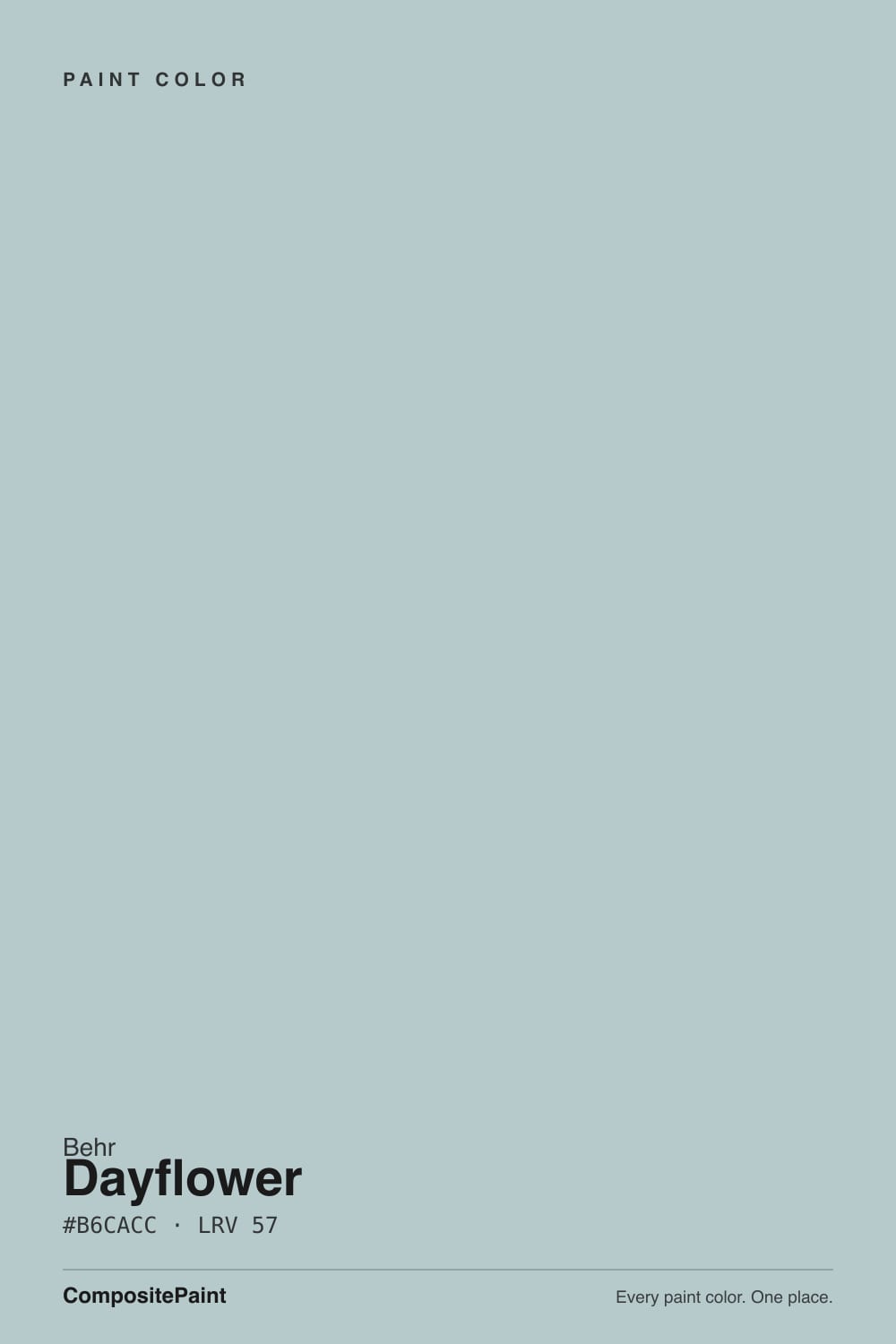
Dayflower
The light dusty blue-gray people put in sunny baths and bedrooms, reviewed honestly: the teal whisper, the living-room regret, and the light that turns it concrete.

Jessica has spec'd whites and neutrals for more than 300 rooms and keeps a sample wall of painted drawdowns in her studio. Every color review is checked against real reader rooms in the comments and re-tested when a formula changes. About the testing process →
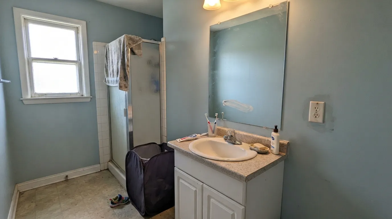
- 1Stardew43
- 2Quietude48
- 3Dayflower57
- 4Sea Salt63
- 5Wickham Gray68
The Fast Verdict
Dayflower is a light dusty blue-gray with a faint teal lean — dawn-colored, not robin's-egg, not spa green. At LRV 57 it stays airy on four walls in a bright bath or bedroom, then slips toward flat concrete-gray the minute the light dies. Behr made it January 2021 Color of the Month and sold it as a pastel that could update a beige house. That last part is how people get in trouble: it is a cool color. Use it where the sun already does the warming.
Sunlit bathrooms · bedrooms that get real daylight · powder rooms and vanities · a quiet home office · anyone who wants dusty blue-gray with a teal whisper, not spa green
You actually want gray · the room is dim, north, and lamp-poor · honey oak, leftover gold hardware, and builder beige · you wanted a living-room beige replacement or a kids-room robin's egg
- Light dusty blue-gray that stays airy instead of going icy or candy-blue
- Bathroom and sunlit-bedroom classic against white tile, linen, and crisp trim
- LRV 57 has presence without closing a small room in
- Faint teal lean is quieter than spa green and less sweet than robin's egg
- January 2021 Color of the Month — a real pastel, grayed enough to outlast the year
- Dim north light strips the blue and leaves a dingy concrete-gray
- Fights honey oak, gold hardware, cream trim, and leftover builder beige
- Too much color for an open living room used as a beige exit ramp
- Not gray, and not the kids-room robin's egg the wet chip can hint at
What Color Is Dayflower, Really?
A light dusty blue-gray with a real teal lean — cool, muted, and more dawn than robin's egg. Most pale blues on a chip go one of two ways on a wall: candy baby-blue, or icy violet. Dayflower ducks both. The green channel sits almost on top of the blue, so the undertone is cyan-teal rather than purple, and the gray is doing enough work that the wall can pass for a cool neutral until the sun hits it. That is why it can wrap a bathroom without looking themed, and why buyers hoping for a true gray — or a true blue — feel slightly shortchanged. The teal was always in there.
At LRV 57 it is a true light, not a wash and not a mid-tone. That number is the review. It sits almost level with SW Sleepy Blue (LRV 58) and a step under Palladian Blue (LRV 60) and SW Sea Salt (LRV 63), and a full step above Behr Shadow Blue (LRV 45). A paler dusty blue disappears in a bright bath; this one holds a soft, shaded color in daylight and then sinks toward gray once the sun leaves. Plan for the wall to look a step bluer and slightly more teal than the chip next to a south window, and a step grayer than the chip in ordinary indoor light. Sample at noon and at 7pm on the actual wall.
Undertone in one line: cool blue-gray first, a whisper of teal second — never purple, never a true gray, never spa sage. If your sample looks icy or baby-blue, the light is cold and bright with nothing warm in the room. If it looks like dingy concrete, the room is too dim. If it looks greener than you expected, look at the floor before you blame the gallon. All three versions are the same paint being honest about the room.
Where It Shines
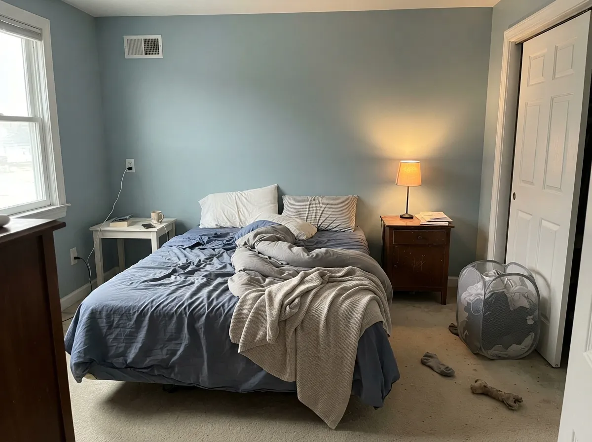
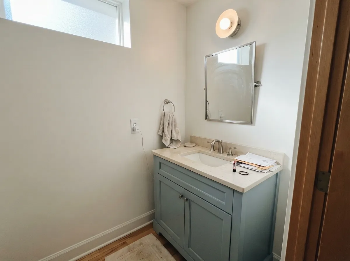
This color is built for rooms that already have water or morning light in the brief. Give it white tile, a crisp Polar Bear or Ultra Pure White trim, and a real window and it does the bathroom job light dusty blues get hired for: quiet, slightly coastal, not a theme. Its second home is the sunlit bedroom — linen, pale oak, 2700K lamps at night — where LRV 57 stays airy all day and only hushes after dark. A small office with a window is the third honest use: Behr put it there in 2021 for a reason. Keep yellow at arm's length and let the daylight do the warming.
Where It Fails
Almost every miss with Dayflower follows one of three scripts, and all three are visible before the first coat. None of them are the paint's fault — but if your room matches one, this is not your blue, and a bigger sample will only confirm it.
The airy dawn read is a daylight effect. Cool, low north light strips the blue and the teal and leaves a flat, slightly dirty gray — wet concrete, the version a Reddit thread compared to a jail wall. At LRV 57 there is bounce, but not enough to rescue a dark room with no lamps. Add a window or lamps in volume, or pick a near-white and stop asking a dusty blue to light the room.
The most-shared Dayflower story is a new homeowner who painted a beige living room and immediately posted a grave-mistake thread. Some readers saw Cape Cod; others saw a kids' room, a 1990s guest bath, or a color that would not warm anything up. On four walls of an open main floor this is clearly a color, not a backdrop, and it does not negotiate with leftover gold hardware or tan carpet. Bathrooms and bedrooms are the job. A whole living room is a commitment, not a beige exit ramp.
Yellow-orange sits across the wheel from this teal-leaning blue. Honey-oak floors, builder-beige carpet, and a creamy off-white trim all push the wall cooler and slightly greener while the wood goes more orange. Both sides lose. Pale oak, weathered gray wood, chrome or brushed nickel, and a crisp white — Polar Bear or Ultra Pure White on trim — are the company it was mixed for. Warm whites like White Dove make the blue look dingier, not softer.
Room by Room
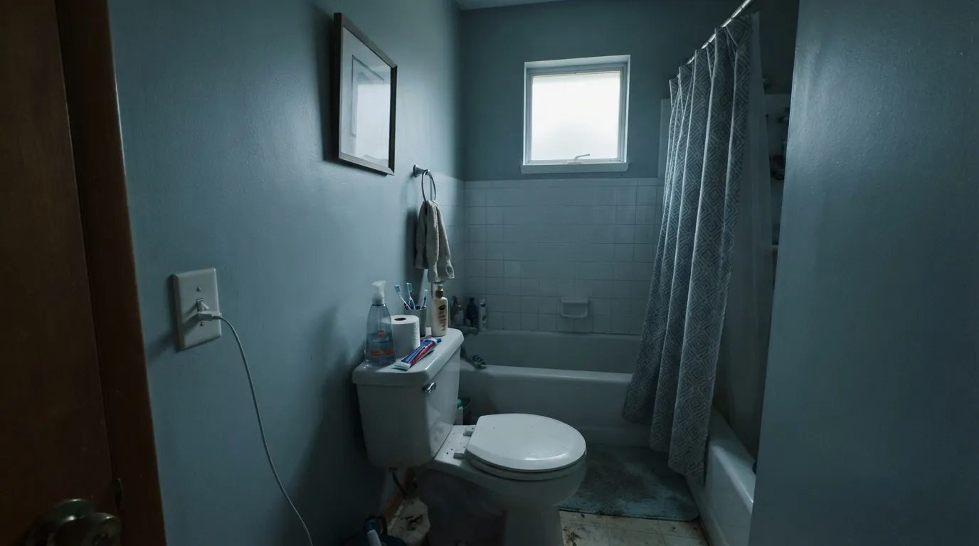
White subway, chrome or brushed nickel, a south or east window: this is the combination that makes the dusty dawn blue look intentional instead of leftover. Satin on the walls for steam. Cool gray tile is fine; warm cream tile argues. Sample above the actual tile before you commit. Behr itself lists it for bath walls and vanity bases, and that is the honest job.
In a morning-lit bedroom with linen, rattan, and pale oak it is a calm coastal wall, dusty rather than themed. In a dim suburban bedroom with beige carpet it goes gray and slightly tired. Eggshell, 2700K lamps at night, Polar Bear trim. Skip it if the only window faces north and you will not add lamps.
Small rooms take light color well because you never see a long wall of it. Drench the four walls, keep the ceiling Ultra Pure White, and the little room reads considered. Satin Dayflower on a vanity under a marble or quartz top and nickel pulls is the weekend project: Behr's own recipe was a crisp white field with this blue on the box. That is the grown-up extra if you do not want four walls of it.
Behr sold Dayflower as a quiet office color when it was January Color of the Month, and the brief still holds: a windowed desk wall in this dusty blue-gray stays calm without going spa-green. Pair the other walls with a soft white if you want, keep the bulbs at 3000K so the teal does not go mint, and skip it in a windowless den. This is one of the few light blues that still reads like work, not a nursery.
Dusty enough to grow past the ocean-theme years, blue enough that it still reads as a color, and gender-neutral in a way navy-and-anchors never is. Keep the ceiling bright so LRV 57 stays airy, and pair with cotton and pale wood, not cream. Satin so marks wipe.
From across an open plan this is clearly a color, not a backdrop, and it does not negotiate with greige kitchens or tan carpet. The seam looks like two houses. One Home Depot reviewer liked it in a kitchen and bath, and one Reddit kitchen used it with dark cabinets, but those are the exceptions. If you love it here, put it on one wall or the built-ins — not on the field of a family room you also have to sell someday. Full-sun exteriors wash it toward dusty gray from the curb; leave outdoor work to a deeper slate.
Your Light Is the Risk
Generous, slightly warm daylight pulls a dusty dawn blue — airy, faintly teal, not icy. This is the light the color was mixed for. Sample here first.
Cool gray daylight kills the blue and the teal and leaves a flat, slightly dirty gray. Fine if you half-wanted gray; disappointing if you wanted the airy bath read.
East rooms go cleaner and more clearly blue in the morning, quieter by lunch. West light warms the gray through the afternoon and lets the teal flash for an hour, then the blue softens as the sun drops. Same paint, two honest reads.
2700K bulbs pull the gray-teal forward and calm the blue — duskier, a little greener. Cool 4000K LEDs push it toward icy, slightly sterile baby-blue. Swap the bulbs before you blame the paint.
Most complaints about Dayflower are a light mismatch. Upload a photo of your actual room and see it on your walls — then ask for the same wall in north light or evening lamps before you buy a single sample.
Need It From Another Brand?
Any paint counter can custom-tint Behr MQ3-54 directly. If you would rather stay in one brand's own deck, these are the closest stock matches, measured as ΔE2000. Under 2 is a difference you will not see on the wall.
| Brand | Closest color | ΔE | LRV | |
|---|---|---|---|---|
| Sherwin-Williams | WaterySW 6478 · Sherwin-Williams | 3.0 | 57 | Color page → |
| Benjamin Moore | Yarmouth BlueHC-150 · Benjamin Moore | 0.7 | 55 | Color page → |
| Valspar | Degas Blue8004-35B · Valspar | 1.8 | 56 | Color page → |
| PPG / Glidden | Misty SurfPPG1034-4 · PPG / Glidden | 1.1 | 55 | Color page → |
| Glidden | Misty SurfPPG1034-4 · Glidden | 0.7 | 55 | Color page → |
| Dutch Boy | Fluttering Blue428-2DB · Dutch Boy | 2.0 | 58 | Color page → |
Similar Behr Colors
The nearest shades to Dayflower within Behr's own range, ranked by perceptual color distance — useful when you want the same look a touch lighter, darker, or warmer.
WCAG 2.1: AA is 4.5 : 1 for normal text, 3 : 1 for large text, AAA is 7 : 1.
Dayflower vs the Colors You're Also Considering
Every Dayflower sample board has the same rivals on it. The numbers show the real lightness gap — then it comes down to which risk you would rather live with.
Pick this when Sleepy Blue feels washed and you want the faint teal to actually show.
Sherwin-Williams SW 6225 · LRV 58Sleepy BluePick this if you want the same depth, grayer — more gray than the name admits, easier as a whole-room backdrop.
Pick this when you want dusty blue-gray with a teal whisper, not a green that flashes blue.
Sherwin-Williams SW 6204 · LRV 63Sea SaltPick this if you want the famous spa green-gray — beautiful when the light agrees with it, and greener than this chip.
Clear Pond PPU13-15 shares LRV 57 and a hex of #B4CCCD, so on a wall the two are interchangeable. Dusted Blue N470-2A at LRV 56 has less green in it and reads grayer. Soothing Spring HDC-CL-23 at LRV 58 tips green rather than blue, which shows up next to white tile. Floating Blue HDC-SM14-8 at LRV 55 is the one real step toward blue in this group.
Cross-brand, Diamond Vogel Restful Retreat 0497 at deltaE 0.57 and Benjamin Moore Yarmouth Blue HC-150 at deltaE 0.70 are matches for practical purposes, both at LRV 55. C2 Paint Harmonic C2-976 at deltaE 0.81 and Dunn-Edwards Berry Mojito DET565 at deltaE 1.00 are the same story. Valspar Degas Blue 8004-35B at deltaE 1.75 and Dutch Boy Fluttering Blue 428-2DB at deltaE 2.04 are visually identical to very close in normal room light. Sherwin-Williams Watery SW 6478 at deltaE 3.04 shares the same LRV of 57 but is very close rather than matched, so sample first.
Dayflower Coordinating Colors
The rule for coordinating with Dayflower: stay crisp and cool-adjacent, and keep yellow at arm's length. It wants a clean white, a paler or deeper dusty-blue neighbor, and metals that do not add orange. Cream, honey oak, leftover gold hardware, and a warm white like White Dove all pull it dingy. These are the partners that keep showing up in rooms that work:
January 2021: A Trend Pastel That Stayed Dusty
Dayflower is not a celebrity color and it has no famous-room claim worth repeating. What it does have is a date. Behr named it January 2021 Color of the Month and parked it in that year's Color Trends palette — the post-lockdown set of pastels Erika Woelfel, Behr's vice president of color, described as a way to update a neutral house. The brand pushed it for bedrooms, bathrooms, a windowed office, and even as a soft exterior alternative to white or gray.
Five years later the useful part is how grayed it is. Saturated 2021 pastels dated themselves; Dayflower was already a dusty blue-gray with a teal whisper, which is why it still works in a sunny bath and why it still fails as a beige-house living-room rescue. Shop it as a bathroom and bedroom color that happens to have a trend year on the resume, not as a whole-house pastel.
Dayflower With Wood Tones and Floors
This decision gets made at the floor, not the paint store. Pale white oak, weathered gray wood, and walnut are the color's best friends — the cool or red-brown depth makes the dusty blue read intentional. Gray LVP and cool stone are safe and push it slightly more gray-blue, which most bathroom people want. Cream tile and cream carpet are the quiet no: they make the wall look cooler and a little dirty.
The one honest clash is golden: honey oak floors, orange-stained trim, yellow-beige carpet, and the gold hardware that comes with a beige builder house. Yellow-orange sits opposite this teal-leaning blue on the wheel, so each side exaggerates the other — the floor reads more orange, the walls read more green-gray, and no amount of coats fixes geometry. If the golden floor is staying, put a large rug between it and this paint, or choose a warmer greige and keep the mood without the fight.
Metals are the easy part: chrome, brushed nickel, and matte black all work; polished unlacquered brass in volume is the one that leans orange against it. A little aged brass is fine. A whole vanity of shiny gold is not.
Three Ready Palettes Built on Dayflower
A color is never alone on the wall. These are complete combinations in the 60-30-10 pattern, with the reason each one holds together. Every one opens in the visualizer.
White tile plus a crisp everyday white on the trim is what keeps a light dusty blue from reading dingy. Polar Bear is Behr's dependable trim white — not a creamy stand-in — and Ultra Pure White on the ceiling gives LRV 57 somewhere to bounce. Chrome and pale wood do the rest.
Try this palette in your roomSleepy Blue is the same-depth, grayer cousin, so a bedroom in Dayflower handing off to a Sleepy Blue hall reads like the same house getting quieter, not a color change. Polar Bear ties both back to a clean edge. Pale oak and linen do the rest.
Try this palette in your roomBehr's own bath recipe was a crisp white field with Dayflower on the vanity. Polar Bear keeps the little room airy; Hale Navy — the safest navy, as long as the room has light — gives one dark note so the scheme reads deliberate. Nickel hardware and a pale stone top finish the argument.
Try this palette in your roomDayflower FAQ
Is Dayflower more blue or more gray?
Blue-gray first, teal second — and the room decides the split. In south daylight it is clearly a dusty dawn blue. In a dim north room the gray wins and it looks slightly dingy. If you need it to stay gray on purpose, this is the wrong color; look at Sleepy Blue instead.
What trim white goes with Dayflower?
A crisp, clean white — Polar Bear or Ultra Pure White in the Behr deck. Creamy off-whites and White Dove (a warm white) make the wall look cooler and slightly dingy. Semi-gloss on the trim, eggshell or satin on the walls.
Is it good for a bathroom?
It is the room the color was waiting for. Dusty enough to feel still instead of sweet, light enough at LRV 57 not to close a small bath in, and quiet against white tile and chrome. Use satin, keep the ceiling bright, and sample above the actual tile — cream tile is the one that argues.
Does Dayflower work with oak floors?
Depends on the oak. Pale white oak, weathered gray wood, and walnut are fine. Honey oak and orange builder stain are the clash: the floor goes hotter, the wall goes greener, and no extra coat fixes complementary colors. A large rug is a bandage. If the golden floor is staying, pick a warmer color.
How is it different from Sleepy Blue and Shadow Blue?
Sleepy Blue (SW 6225, LRV 58) is the same-depth cousin that is more gray than the name admits — easier as a whole-room backdrop. Shadow Blue (N480-3, LRV 45) is a step deeper and dustier, the granite-blue for laundries and darker baths. Dayflower sits between them in spirit: as light as Sleepy Blue, with more teal in it than either.
Will it work in a living room?
Usually no. On four walls of an open main floor it is clearly a color, not a beige replacement, and the most-shared owner story is a living-room regret. A closed, sunlit sitting room with pale oak and no leftover gold hardware can carry it. An open plan next to a greige kitchen cannot. Sample a big board and live with it for a weekend before you commit the field.
Have you painted with Dayflower?
Rate it — one tap helps the next reader decide.
Ask a Question