Sleepy Blue
The blue-gray that plays it quiet, reviewed honestly: the light where it turns coastal, the light where it goes flat, and what to pick instead.

Jessica has spec'd whites and neutrals for more than 300 rooms and keeps a sample wall of painted drawdowns in her studio. Every color review is checked against real reader rooms in the comments and re-tested when a formula changes. About the testing process →
- 1Stardew43
- 2Quietude48
- 3Sleepy Blue58
- 4Sea Salt63
- 5Wickham Gray68
The Fast Verdict
Sleepy Blue is a cool blue-gray with a green undertone doing most of the work — which is why it reads more like a calm gray than a real blue on most walls. In good daylight it turns genuinely watery and coastal; under cool bulbs or in a dim room it flattens toward plain gray with the blue barely hanging on. It never asks for much attention, and that restraint is the whole appeal — just don't buy it expecting a true sky blue.
Bedrooms and primary baths · calm home offices and dens · coastal or modern-farmhouse exteriors · anyone who wants blue in the room without committing to blue
You want a true, saturated blue · your room is dim and north-facing with no lamps · your floors are honey oak or golden builder trim · you need the exact same color to read identically in every room
- Genuinely calming without reading babyish or flat — the gray keeps it grown-up
- Turns watery and coastal in real daylight, the effect most buyers are chasing
- LRV 58 holds actual color instead of washing pale in a big room
- Works in bedrooms, baths, exteriors and cabinets without feeling out of place in any of them
- Part of a real named family (Languid Blue, Meditative, Refuge) if you want to go a step deeper without guessing
- Reads more gray-green than true blue — a letdown if blue was the whole point
- North light and cool LEDs flatten it toward plain, slightly silvery gray
- Fights honey oak and yellow-beige the way any blue-family color does
- Shifts noticeably room to room — sample big before painting a whole open floor plan
What Color Is Sleepy Blue, Really?
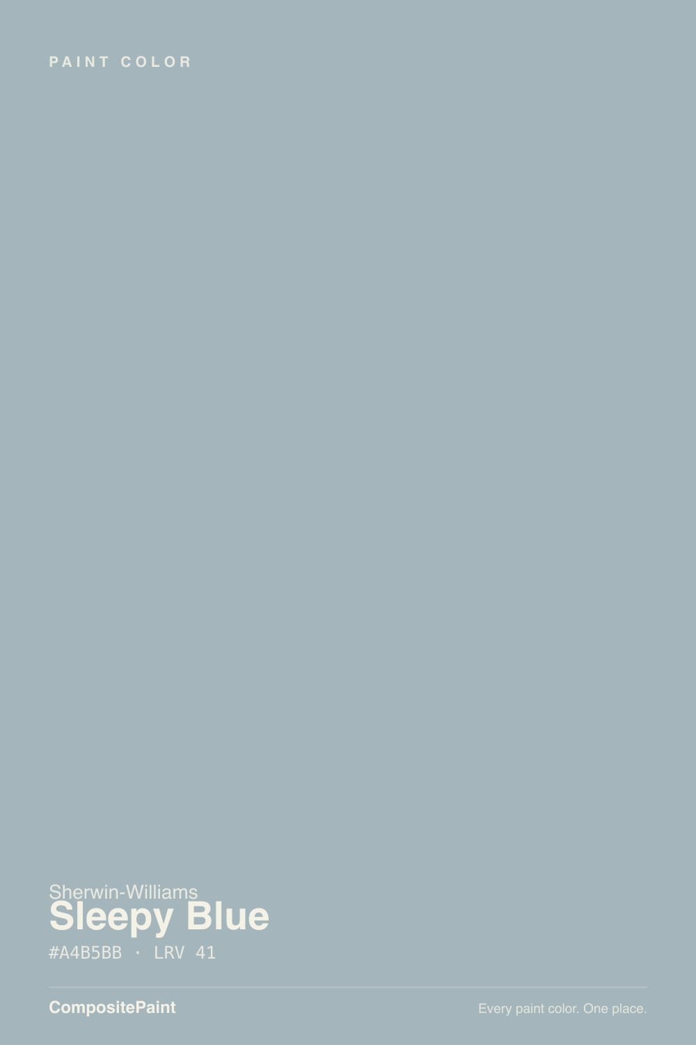
A cool blue-gray built on a gray base with a green undertone doing the quiet persuading and blue arriving third. That order matters: our own deck files Sleepy Blue in the Gray family, not Blue, and on the wall that classification is honest — most rooms read it as a soft, sophisticated gray with a blue-green cast, not as "blue" in the crayon-box sense. Sherwin-Williams built it as the lightest member of a small monochromatic family (Sleepy Blue, then Languid Blue, Meditative, and Refuge going progressively deeper), which tells you what kind of color this is: a steady, deliberately quiet workhorse, not a Color of the Year swing.
At LRV 58 it sits right at the edge of mid-tone — light enough to keep a room open, deep enough to hold real color instead of washing out like a pale wash blue would. That depth is what makes the shift so noticeable: in strong, direct daylight the green undertone lifts and the color reads distinctly watery and coastal; in flat or cool light the green recedes and gray takes over, leaving a color that photographs almost silvery. Neither version is wrong — it is the same paint answering the light honestly.
Undertone in one line: gray first, green second, blue a distant third. If your sample reads almost pure gray, that is cool or north light doing it; if it reads faintly teal or watery, that is strong daylight pulling the green forward. Both are the paint being consistent, not inconsistent.
Where It Shines
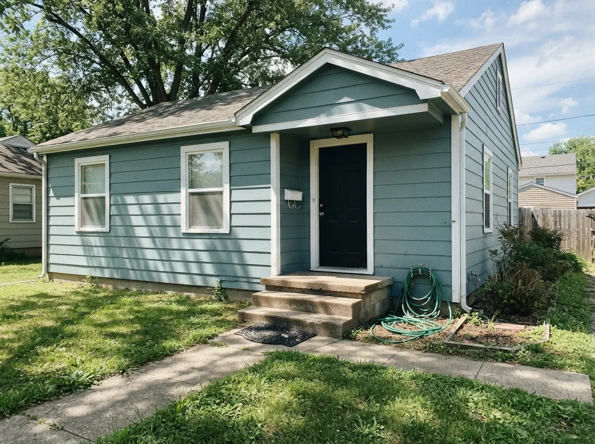
Give it real daylight and it earns the "coastal" label design blogs reach for — the green-gray undertone lifts into something genuinely watery, the kind of color that makes a bedroom feel like a quiet hotel room. Its second home is the exterior: on siding, with white trim and a dark door, it reads modern-farmhouse-by-the-water without the upkeep of an actual navy. It is a color built to be lived with, not photographed once and forgotten.
Where It Fails
Almost every disappointed review of Sleepy Blue traces back to one of three mismatches, and all three are predictable before the first coat. None of them are the paint's fault — but if your room matches one, this is not your color, and a bigger sample will only confirm it.
North-facing rooms and cool 4000K-plus LEDs strip the green out and leave a flat, slightly silvery gray with almost no blue left to see. Readers who loved the chip in the store report a color that looks nothing like blue at home. The fix is cheap: swap to 2700K warm bulbs before you blame the paint.
This is a gray-green-blue in that order, not a saturated sky blue, and even our own deck sorts it with the grays. If you pointed at a paint chip because you wanted unmistakable blue on the wall, this color will read too quiet. Look at something with real chroma instead, like Behr Adirondack Blue.
Yellow-orange is blue's complement, so golden oak floors, orange-toned trim and builder-beige carpet all fight it — the floor looks more orange, the wall looks more washed-out gray. Sleepy Blue wants walnut, espresso, white oak, or a big rug between it and anything golden.
Room by Room
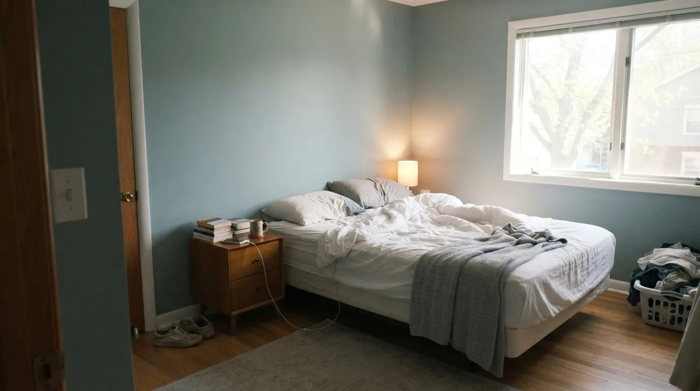
This is the room Sherwin-Williams built the color for and the reviews agree: calm, quiet, restful under warm lamplight. Eggshell walls, white or cream bedding, warm wood furniture. Skip cool white LEDs on the nightstand lamps.
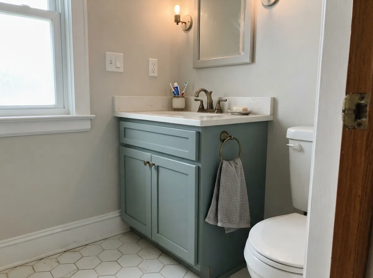
Against white or cream stone and brass fixtures it stays soft and spa-like. Against cold gray tile it can look washed-out — pair warm, not cool, in a small room where light bounces around fast.
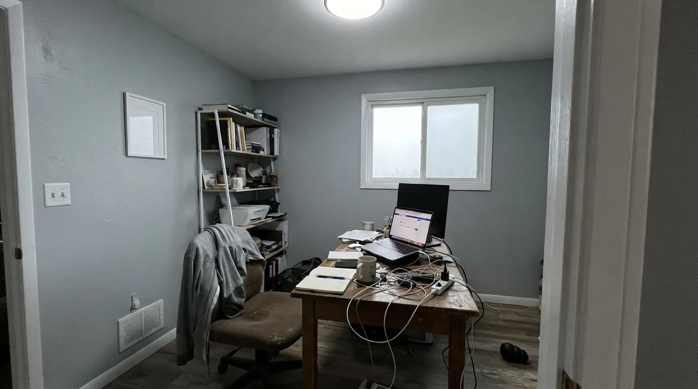
A calm, focused backdrop for video calls and reading. The one trap is a cool-white desk lamp aimed straight at the wall, which flattens the color exactly the way north light does.
On an island or a run of lower cabinets under white walls, with black or brass hardware, it reads deliberate and current. A full kitchen of it is a bigger, riskier bet — sample it under your actual under-cabinet lighting first.
Works well in a room that gets steady daylight all day. In an open floor plan that swings from bright kitchen light to a dim, lamp-only sitting area, the color will visibly shift zone to zone — plan for that instead of being surprised by it.
On siding it holds up well in full sun and leans coastal or modern-farmhouse with white trim and a black or navy door. The shaded, north side of the house will read noticeably grayer than the sunny south side — walk the whole exterior with a sample before committing.
Your Light Is the Risk
Direct, strong daylight is the most balanced read: the green lifts, the blue shows, and the color looks genuinely watery and coastal.
Cool, indirect daylight strips the green out and leaves a flat, slightly silvery gray with the blue barely visible. Test here first.
Morning east light pulls the green forward for a coastal look; afternoon west light warms it and pushes the gray forward instead. It changes through the day more than most neutrals.
2700K warm bulbs pull the gray forward and make it feel intimate and quiet. Cool 4000K-plus LEDs push it crisper and colder — swap the bulb before you swap the paint.
Most complaints about Sleepy Blue are a light mismatch. Upload a photo of your actual room and see it on your walls — then ask for the same wall in north light or evening lamps before you buy a single sample.
Need It From Another Brand?
Any paint counter can custom-tint Sherwin-Williams SW 6225 directly. If you would rather stay in one brand's own deck, these are the closest stock matches, measured as ΔE2000. Under 2 is a difference you will not see on the wall.
| Brand | Closest color | ΔE | LRV | |
|---|---|---|---|---|
| Behr | Urban RaincoatN440-2 · Behr | 2.0 | 58 | Color page → |
| Benjamin Moore | Gentle Gray1626 · Benjamin Moore | 2.0 | 57 | Color page → |
| Valspar | Milky Way8004-37B · Valspar | 1.1 | 58 | Color page → |
| PPG / Glidden | Babbling BrookPPG1144-3 · PPG / Glidden | 2.7 | 59 | Color page → |
| Glidden | Silver Blue Sea30BG 56/045 · Glidden | 2.3 | 56 | Color page → |
| Dutch Boy | Resting Pose431-1DB · Dutch Boy | 0.0 | 58 | Color page → |
Similar Sherwin-Williams Colors
The nearest shades to Sleepy Blue within Sherwin-Williams's own range, ranked by perceptual color distance — useful when you want the same look a touch lighter, darker, or warmer.
WCAG 2.1: AA is 4.5 : 1 for normal text, 3 : 1 for large text, AAA is 7 : 1.
Sleepy Blue vs the Colors You're Also Considering
Every Sleepy Blue sample board has the same rivals on it. The numbers show the real lightness gap — then it comes down to which risk you would rather live with.
Pick this when you want the gray to lead and the green-blue to stay in the background.
Sherwin-Williams SW 6211 · LRV 47RainwashedPick this for more green and less gray — Rainwashed commits harder to the watery, coastal end of the same family.
Pick this for the Sherwin-Williams match and the wider, named monochromatic family behind it.
Benjamin Moore 1634 · LRV 45Santorini BluePick this if you want a Benjamin Moore option at almost the same depth — it only fully commits to blue in real daylight, same as Sleepy Blue.
Languid Blue SW 6226 at LRV 46 is the next step up on the same strip, lighter and airier, and the better pick for a small or north-facing room. Dockside Blue SW 7601 at LRV 43 is very near in both lightness and hue, so the two are hard to tell apart on a chip. Stardew SW 9138 at LRV 43 gives up more of the blue and reads grayer, which suits people who found Sleepy Blue too blue on the wall.
Across brands, Backdrop Underdog BD-UD shares the same hex and a deltaE of 0, so it is a direct match. Benjamin Moore Santorini Blue 1634 at 0.5, Dutch Boy Tempest Wind 431-2DB at 0.86, and HGTV Home by Sherwin-Williams Falkland Blue HGSW 3316 at 0.86 are all effectively the same color. Behr Bay View ECC-22-2 at 1.44 and Dunn-Edwards Marine Layer DET599 at 1.95 are visually identical in normal room light, while Portola Paints Costa at 3.77 and Farrow and Ball Lulworth Blue No. 89 at 4.99 are close but visibly different side by side.
Sleepy Blue Coordinating Colors
The rule for coordinating with Sleepy Blue: crisp cool-leaning whites, near-black accents, and other members of the gray-green-blue family — and keep it away from anything warm-yellow. These are the partners that keep showing up in rooms that work:
A Quiet Color From a Quiet Family
Sleepy Blue has never been a Color of the Year and no viral room has made it famous — and that is a fair, honest description of what it is: a steady, well-behaved workhorse rather than a headline color. Sherwin-Williams built it as the lightest member of a small monochromatic family that runs Sleepy Blue, Languid Blue, Meditative, and Refuge, each step going progressively deeper. Buy Sleepy Blue for the lightest read of the family; step down the list if you want the same character with more weight.
That obscurity is part of why it works: it was never overexposed the way a Color-of-the-Year winner gets overexposed, so it still reads calm and a little unexpected rather than familiar. It is the color you reach for when you want blue in the room without anyone immediately clocking it as "a blue room."
Sleepy Blue With Wood Tones and Floors
This decision gets made at the floor. Walnut, espresso, and other dark, red-brown woods make Sleepy Blue look deliberate and grounded — the depth of the wood balances the depth of the paint. Pale white oak and gray-washed floors are safe and lean the room coastal-modern.
The honest no is golden: honey oak floors, orange-stained trim, yellow-beige carpet. Blue and orange sit opposite each other on the color wheel, so each side pushes the other further — the floor reads more orange, the wall reads more washed-out and gray. If the golden floor isn't going anywhere, a large rug between it and the paint helps more than any amount of extra coats will.
Metals lean easy: brushed nickel, matte black, and aged brass all sit comfortably against it; very shiny polished chrome can read a touch cold next to the green undertone.
Three Ready Palettes Built on Sleepy Blue
A color is never alone on the wall. These are complete combinations in the 60-30-10 pattern, with the reason each one holds together. Every one opens in the visualizer.
White trim keeps the blue-gray from reading dark or dingy, and one near-black accent — a bed frame, a door, a lamp base — gives the eye a place to land so the room doesn't go flat and monochrome.
Try this palette in your roomFull sun brings out the coastal green-blue in the siding, warm-white trim keeps it from reading cold, and a near-black door supplies the one high-contrast note the look needs. Walk the shaded side of the house with a sample first — it reads noticeably grayer there.
Try this palette in your roomComfort Gray and Sleepy Blue share the same gray-green backbone at a similar depth, so a hallway can hand off from one to the other without feeling like a different house. Pure White trim runs through both rooms as the connective thread.
Try this palette in your roomSleepy Blue FAQ
Is Sleepy Blue actually blue or is it gray?
Mostly gray, with green second and blue arriving a distant third. Our own color deck files it under Gray, not Blue, and that matches how it reads on most walls — a soft blue-gray rather than a true blue. Strong daylight pulls the blue-green forward; cool or dim light lets the gray take over completely.
What trim white goes with Sleepy Blue?
A clean, slightly cool white like Pure White or Alabaster keeps the blue-gray looking crisp. A very warm, creamy white can make it look muddier than it is. Semi-gloss trim, eggshell walls.
Is it a good bedroom color?
Yes — it's arguably the color's best use. It calms down under warm 2700K lamplight and rarely feels cold, as long as the room gets some real daylight during the day. A dim, north-facing bedroom with only cool bulbs is the one setup that disappoints.
Does Sleepy Blue work on exteriors?
Yes, genuinely well — it's a common coastal and modern-farmhouse siding color. Full sun brings the blue-green forward; the shaded side of a house will read noticeably grayer. Pair with white trim and a dark door or shutters.
Does it clash with honey oak floors?
Often, yes. Yellow-orange is blue's complement on the color wheel, so golden oak floors and orange-toned trim fight it — the floor looks more orange, the wall looks more washed-out. Walnut, espresso, and pale white oak all work far better.
Is Sleepy Blue a trendy color that will date fast?
No — it has never been a Color of the Year and isn't chasing a moment. It's the lightest member of a small, deliberately quiet Sherwin-Williams family (Languid Blue, Meditative, Refuge go progressively darker), built as a steady seller rather than a trend piece. That's lower repaint risk than a saturated trend blue, though any blue-gray reads more "of its era" than a true neutral.
Have you painted with Sleepy Blue?
Rate it — one tap helps the next reader decide.
Ask a Question