Comfort Gray
The green-gray Sherwin-Williams sibling everyone overlooks for Sea Salt and Agreeable Gray, reviewed honestly: where the sage shows, the light that flattens it, and what to pick instead.

Jessica has spec'd whites and neutrals for more than 300 rooms and keeps a sample wall of painted drawdowns in her studio. Every color review is checked against real reader rooms in the comments and re-tested when a formula changes. About the testing process →
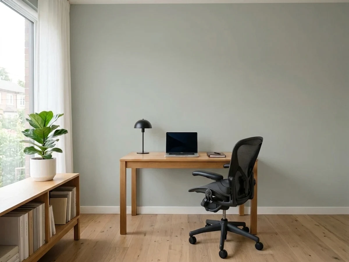
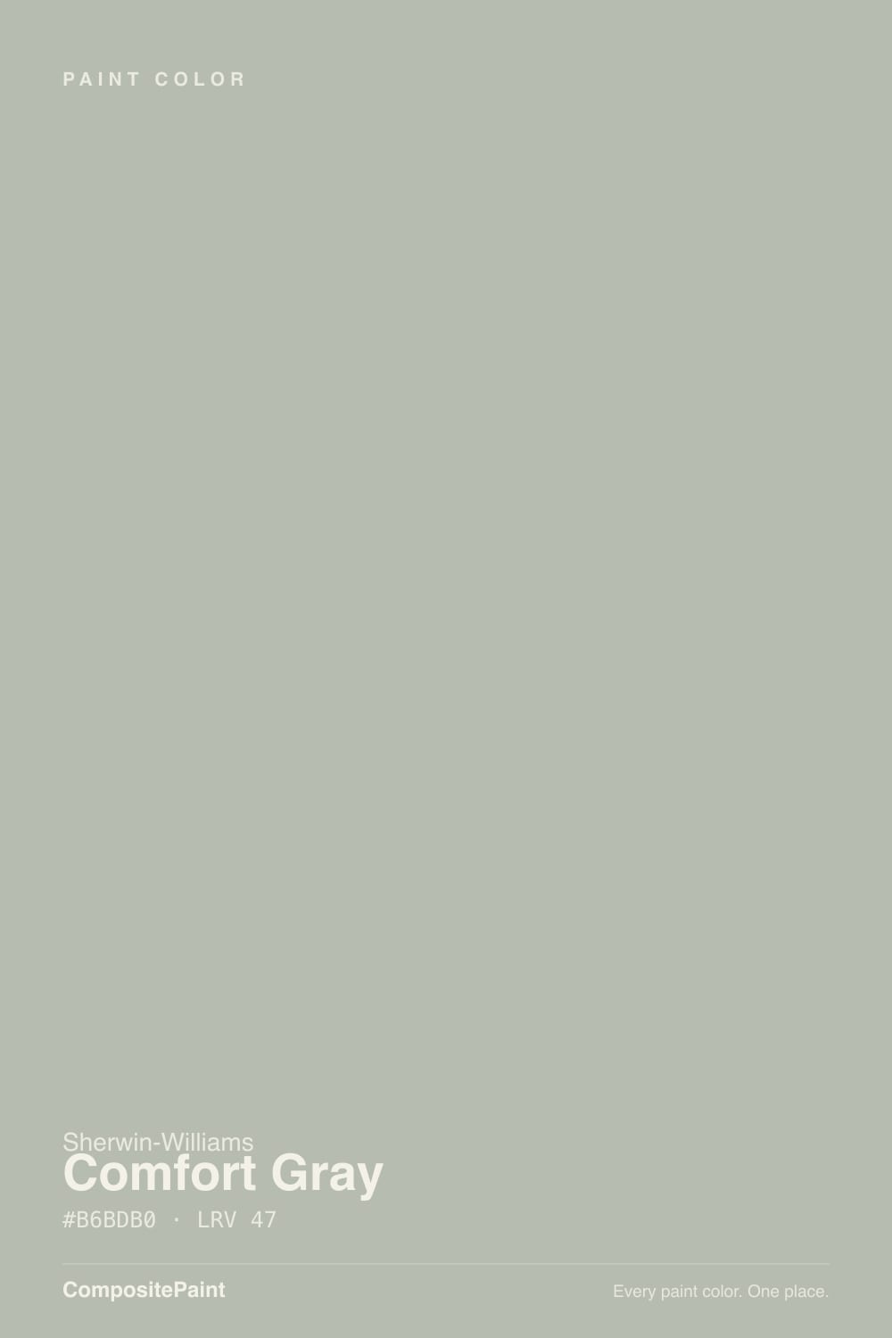
- 1Stardew43
- 2Quietude48
- 3Comfort Gray54
- 4Sea Salt63
- 5Wickham Gray68
The Fast Verdict
Comfort Gray is the sibling in Sherwin-Williams' famous green-gray family that never got the spotlight — Sea Salt got the Pinterest boards, Comfort Gray got the actual siding orders. It sits at LRV 54, a true middle gray-green: pale enough to read calm, dark enough to hold its color instead of washing out. Renovators reach for it constantly on exteriors because it does the modern-farmhouse job — soft, not stark, organic enough against black windows — without demanding the daring commitment of Retreat or Rosemary. Indoors it plays the same quiet role: genuinely good, rarely showy, occasionally mistaken for plain gray until real sun hits it.
Exterior siding on a modern-farmhouse or craftsman house · living rooms and dens with real daylight · anyone who wants a gray-green without committing to full sage · pairing with black windows, white trim, or stone
You want a color people recognize on sight · your room is dim and north-facing · your fixed materials are cool blue-gray stone or tile · you want zero green, ever
- A green-gray with real body — holds its color instead of washing pale
- The go-to exterior gray-green for modern-farmhouse and craftsman renovations
- Pairs effortlessly with black windows, white trim, and warm wood
- Reads sophisticated without asking anyone to commit to full sage
- Shares Rainwashed's exact LRV but reads calmer, greener, less watery-blue
- Not a true gray — the green shows in strong sun whether you want it or not
- Goes flat and muddy in a dim north room, same as its whole family
- Clashes with cool blue-gray stone, tile, and roofing
- Overshadowed by Sea Salt and Agreeable Gray — fewer real-room photos to compare against
What Color Is Comfort Gray, Really?
Comfort Gray belongs to the same Sherwin-Williams family as Sea Salt, Oyster Bay, Rainwashed, Quietude, and Retreat — the green-gray strip that quietly became one of the most-used color groups in the deck over the last decade, mostly through exterior renovations rather than magazine spreads. Sea Salt (LRV 63) is the palest and the famous one; Retreat (LRV 21) and Rosemary sit at the deep, committed end. Comfort Gray lands dead center at LRV 54 — heavier and more grounded than its airy family reputation would suggest, and it shares that exact LRV with Rainwashed, though the two read differently: Rainwashed leans blue-green and watery, Comfort Gray leans plainer and greener, closer to a soft khaki-gray.
At LRV 54 it holds real pigment instead of washing pale the way Sea Salt does, which is exactly why it works on exteriors — siding needs a color with enough body to survive full sun and still look intentional, and Comfort Gray has it. Indoors, that same mid-depth means it reads as an actual wall color rather than a barely-there tint, closer in weight to Mindful Gray or Anew Gray than to a pale spa neutral. Push it into strong, direct light and the green surfaces plainly; pull it into flat overcast or dim interior light and it settles back toward a soft, slightly muted gray.
Undertone in one line: green-gray, leaning warm, never blue. If it looks flat and khaki-brown, the light reaching it is too warm and too dim; if it looks distinctly sage, that is strong daylight doing its normal job, not a bad batch.
Where It Shines
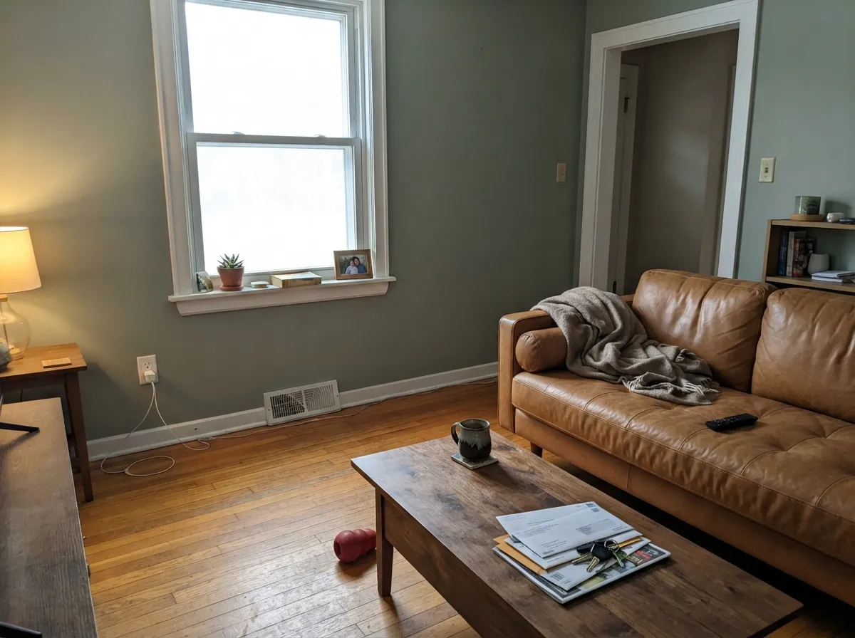
Its real home is outside. Comfort Gray shows up again and again on renovated and new-build houses paired with black windows, white trim, and either board-and-batten or lap siding — the modern-farmhouse formula practically depends on a color exactly this soft and exactly this green. Indoors, give it a living room or den with genuine daylight and it does the same quiet job: a wall color that reads sophisticated and grounded without anyone quite being able to name it on sight.

Where It Fails
Almost every complaint about Comfort Gray comes down to one of three mismatches, and all three are predictable before the first gallon goes on.
Without real daylight reaching the wall, the green retreats and the sage warmth goes with it, leaving a flat, slightly muddy khaki-gray that reads tired rather than calm. Every color in this family falls into this trap — Oyster Bay and Rainwashed do it too. Warm 2700K lamps help; a genuinely dark room needs a different color.
Comfort Gray is a green-gray, not a gray-gray — the green is mild but real, and strong sun brings it forward every time. If you want a neutral gray with zero color lean, this will read "off" to you; try Dorian Gray or Anew Gray instead, both true warm grays with no green in them.
The warm green undertone fights cool blue-gray materials — a common exterior mismatch when a stone foundation or a blue-gray roof is already on the house before the siding color gets picked. Test a large sample against the actual stone before ordering five gallons.

Room by Room
The reason this color exists in most people's minds. With white or black trim, black windows, and either lap siding or board-and-batten, Comfort Gray reads as the calm, current, slightly organic gray-green that dominates renovation-show exteriors. Use a low-sheen exterior finish and test a full sample board on the actual siding, facing your actual sun, before ordering.
With a south- or east-facing window it settles into a genuinely sophisticated soft green-gray that pairs easily with walnut, leather, and black metal fixtures. Eggshell for durability against furniture scuffs.
Calming rather than moody. Keep the bulbs at 2700K; under cold LEDs in a dim bedroom it drifts toward flat and a little sad.
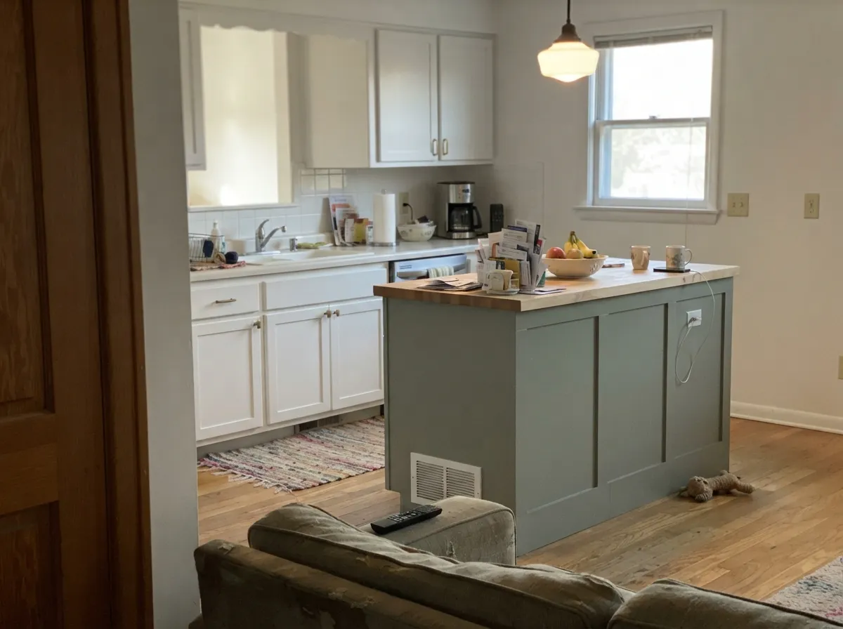
On an island under white perimeter cabinets it reads current without being trendy-loud. Satin cabinet enamel; both brass and black hardware work with it.
With warm-toned tile or wood vanities it is lovely. Against cool blue-gray marble or tile it turns argumentative — sample it on the actual wall next to the actual stone first.
A grounded, focus-friendly color that reads well on video calls in daylight and goes a touch flat under fluorescent overheads — swap to a warm desk lamp if that is your setup.
Your Light Is the Risk
Overcast skies or a window with real exposure keep it balanced — soft gray-green, no mud, no yellow flash. Its most flattering light.
Without real daylight reaching the wall, the green drains out and it settles into a flat, muddy khaki-gray. Readers describe this as "looks nothing like the swatch."
Strong west or south sun pushes the green forward, sometimes toward a soft olive on exteriors. Expected, not a defect — walk the house at different hours before choosing trim.
2700K bulbs keep it warm and gray-green; cool white LEDs flatten it toward a plain, slightly cold gray. Match your bulbs to the mood you want.
Most complaints about Comfort Gray are a light mismatch. Upload a photo of your actual room and see it on your walls — then ask for the same wall in north light or evening lamps before you buy a single sample.
Need It From Another Brand?
Any paint counter can custom-tint Sherwin-Williams SW 6205 directly. If you would rather stay in one brand's own deck, these are the closest stock matches, measured as ΔE2000. Under 2 is a difference you will not see on the wall.
| Brand | Closest color | ΔE | LRV | |
|---|---|---|---|---|
| Behr | Silver SageUL210-8 · Behr | 1.5 | 53 | Color page → |
| Benjamin Moore | TranquilityAF-490 · Benjamin Moore | 1.3 | 53 | Color page → |
| Valspar | SleepyT678 · Valspar | 1.0 | 52.9 | Color page → |
| PPG / Glidden | Felted WoolPPG0997-2 · PPG / Glidden | 1.9 | 55 | Color page → |
| Glidden | Jade Frost50GY 53/033 · Glidden | 2.1 | 53 | Color page → |
| Dutch Boy | Frosted Olive425-2DB · Dutch Boy | 1.6 | 52 | Color page → |
Similar Sherwin-Williams Colors
The nearest shades to Comfort Gray within Sherwin-Williams's own range, ranked by perceptual color distance — useful when you want the same look a touch lighter, darker, or warmer.
WCAG 2.1: AA is 4.5 : 1 for normal text, 3 : 1 for large text, AAA is 7 : 1.
Comfort Gray vs the Colors You're Also Considering
Every Comfort Gray sample board has the same rivals on it. The numbers show the real lightness gap — then it comes down to which risk you would rather live with.
Pick this for a color with actual body that holds up on exterior siding in full sun.
Sherwin-Williams SW 6204 · LRV 63Sea SaltPick this for the paler, more famous version of the same family — the one everyone has seen on Pinterest.
Side-by-side comparison →Pick this for the calmer, less blue, more classically "gray" version at the identical LRV.
Sherwin-Williams SW 6211 · LRV 47RainwashedPick this if you want the same depth but leaning blue-green and watery instead of gray-green.
Side-by-side comparison →The most common comparison is Sea Salt (SW 6204), LRV 63. Sea Salt is markedly lighter and a bit more blue-green, so it reads airy and beachy. Comfort Gray, at LRV 47, is deeper and greener, so it feels grounded and more saturated on the wall. Choose Sea Salt for small or dim rooms you want to keep light, and Comfort Gray when you want more presence and depth.
Rainwashed (SW 6211) sits at the same LRV of 47 but carries more blue, landing it in teal territory. If your space reads too green with Comfort Gray, Rainwashed shifts the same lightness toward a cooler, more aqua feel.
Within the green-gray family, Soft Sage (SW 9647) at LRV 50 is slightly lighter and a touch grayer, a good pick if Comfort Gray feels a shade too deep or too green for your light.
Comfort Gray Coordinating Colors
The rule for coordinating with Comfort Gray is the same one that governs its whole family: keep warm, organic materials close, and keep true cool-blue ones at a distance. It pairs effortlessly with crisp whites, near-black trim, and warm wood — and it argues with cool blue-gray stone. These are the partners that show up again and again, on siding and on walls:
Comfort Gray on Exteriors
This is where the color actually earns its keep. Comfort Gray is a fixture of the modern-farmhouse and craftsman renovation look — lap siding or board-and-batten in this soft gray-green, white trim, black windows, a dark front door. It reads current without leaning on any one trend hard enough to date quickly, which is why renovators keep reaching for it years after the peak of the farmhouse moment.
Full sun reads it greener and a shade brighter than the chip suggests; the shaded side of the same house will look noticeably grayer and flatter. Walk the whole exterior with a sample board before ordering, and expect the north wall and the south wall of the same house to look almost like two different colors on a cloudy versus sunny day — that is normal for a color this light-reactive, not a bad can of paint.
Comfort Gray With Wood Tones and Floors
Walnut, white oak, and mid-brown stained floors all sit easily against Comfort Gray — the wood's warmth balances the green without a fight. Black metal window frames, black hardware, and matte black light fixtures are its other natural partner; the near-black note is what keeps the gray-green from feeling soft to the point of sleepy.
The one floor that needs a sample first is bright orange-red honey oak. The wood's strong warmth does not clash outright, but it can make Comfort Gray's green undertone read slightly more sour by contrast than it does against a neutral or cool-toned floor. A large area rug or a runner between the two usually settles the argument.
Three Ready Palettes Built on Comfort Gray
A color is never alone on the wall. These are complete combinations in the 60-30-10 pattern, with the reason each one holds together. Every one opens in the visualizer.
Extra White trim keeps the siding from reading dull, and Iron Ore on the door supplies the single dark, near-black note this exterior formula depends on — the combination behind most of the black-window farmhouse renovations you have scrolled past.
Try this palette in your roomAlabaster keeps the room bright without the harsh edge a stark white would add against a green-gray wall, and Kendall Charcoal's warm dark grounds the room the way a fireplace surround should — the whole scheme stays on the same warm-neutral side of the wheel.
Try this palette in your roomAgreeable Gray carries the room while a single Comfort Gray accent wall adds the organic green note without committing all four walls to it; White Dove trim keeps the warm-neutral thread going instead of cutting it with a cold white.
Try this palette in your roomComfort Gray FAQ
Is Comfort Gray more gray or more green?
Green-gray, genuinely both — it is not a trick of the name. In flat or dim light it reads as a soft warm gray; in real daylight, especially direct sun, the green comes forward and is unmistakable. If you want zero green, this is not your color.
Is Comfort Gray good for exterior siding?
It is one of the most-used colors for exactly this — the classic modern-farmhouse gray-green paired with white trim and black windows. Test a real sample board on the actual siding, facing the actual sun exposure, before ordering; the color shifts noticeably between the shaded and sunlit walls of the same house.
What trim goes with Comfort Gray?
White — Extra White or Pure White for crisp modern contrast, Alabaster if you want it softer. On exteriors, black or near-black (Iron Ore, Tricorn Black) on the door and window frames is the pairing that shows up again and again.
How is Comfort Gray different from Sea Salt or Rainwashed?
All three belong to Sherwin-Williams' green-gray family, but they sit at different depths and leans. Sea Salt (LRV 63) is the pale, famous one. Rainwashed shares Comfort Gray's exact LRV 54 but leans blue-green and reads watery; Comfort Gray leans more gray, with the green as an undertone rather than the headline.
Does it work with wood floors?
Yes with most tones — walnut, white oak, and mid-brown oak all sit comfortably against it. The one caution is very orange, red-toned honey oak, which can make the green in the wall look slightly more sour by contrast; a warm rug bridges the gap.
Can I use it inside, or is it really just an exterior color?
It works indoors too — living rooms and dens with real daylight are its best interior rooms — but it is genuinely more famous, and more tested, as a siding color than a wall color. Expect fewer real interior room photos to compare against than a color like Agreeable Gray.
Have you painted with Comfort Gray?
Rate it — one tap helps the next reader decide.
Ask a Question