Tranquility
The quiet gray-green nobody hypes, reviewed honestly: the light where it turns spa-green, the light where it goes flat, and what to pick instead.

Jessica has spec'd whites and neutrals for more than 300 rooms and keeps a sample wall of painted drawdowns in her studio. Every color review is checked against real reader rooms in the comments and re-tested when a formula changes. About the testing process →
- 1Stardew43
- 2Quietude48
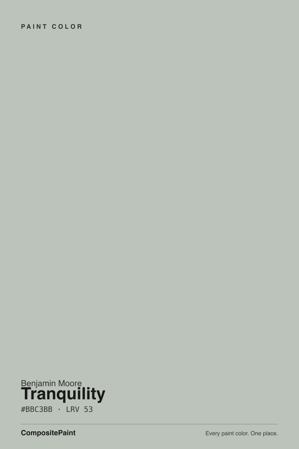
- 3Tranquility53
- 4Sea Salt63
- 5Wickham Gray68
The Fast Verdict
Tranquility is a low-drama gray-green from Benjamin Moore's Affinity collection — the curated "colors that already go together" line, not a Color of the Year pick and not a color with a viral moment behind it. That is the honest selling point: it is built to be easy, not to be noticed. In good daylight the green steps forward and it reads like a soft spa color; in dim light it steps back into a plain pale gray. Buy it knowing which room you have, and it is a genuinely dependable, quietly pretty color with almost no drama.
Bathrooms and powder rooms · calm bedrooms · kitchens with warm wood and a white trim · anyone who wants a hint of color without committing to "the green room"
You want a color guests immediately name · your room is dim and north-facing with no lamps · your floors are honey-orange oak or cherry · you want a true, unambiguous gray
- A genuine hint of green without committing to "the green room"
- Same LRV as Palladian Blue — enough depth to feel intentional, not washed out
- Hides bathroom water spots and kitchen smudges better than a bright white
- Coordinates easily — it is built from a collection designed to match itself
- No trend timestamp — not a Color of the Year, so it will not date that way
- Goes flat and plain-gray in dim, north-facing rooms
- Reads more green than "gray" buyers often expect
- Can tip clinical next to a stark cool white trim
- Fights honey-orange oak and cherry wood tones
What Color Is Tranquility, Really?
A pale, desaturated gray-green with no drama and no headline. Benjamin Moore filed it in the Affinity collection — a curated set of colors organized so any two in the same family already coordinate — which is a designer's tool, not a marketing campaign. Tranquility has never been a Color of the Year and has no viral Instagram moment; it is the kind of color a paint consultant quietly recommends when a client wants "a little color, nothing loud." An honestly unglamorous background is not a strike against it — it is exactly what the color is for.
At LRV 53 — the same reflectance as Palladian Blue (LRV 53) — it sits in the middle depth band: neither a pale wash nor a committed mid-tone. Put it next to Gray Owl (LRV 65) and Tranquility reads noticeably deeper and greener; put it next to Beach Glass (LRV 41) and Tranquility looks like the paler, quieter cousin. That middle position is the whole personality: enough color to feel intentional, not so much that it reads as "the green room."
Undertone in one line: green first, gray second, and never truly blue — despite how often it gets lumped in with blue-grays online. In bright daylight the green comes forward and it can look genuinely spa-like; in a dim or north-facing room it settles back into a quiet, slightly botanical pale gray. If your sample looks flatly gray on the wall, that is low light doing its job, not a mismatched can.
Where It Shines
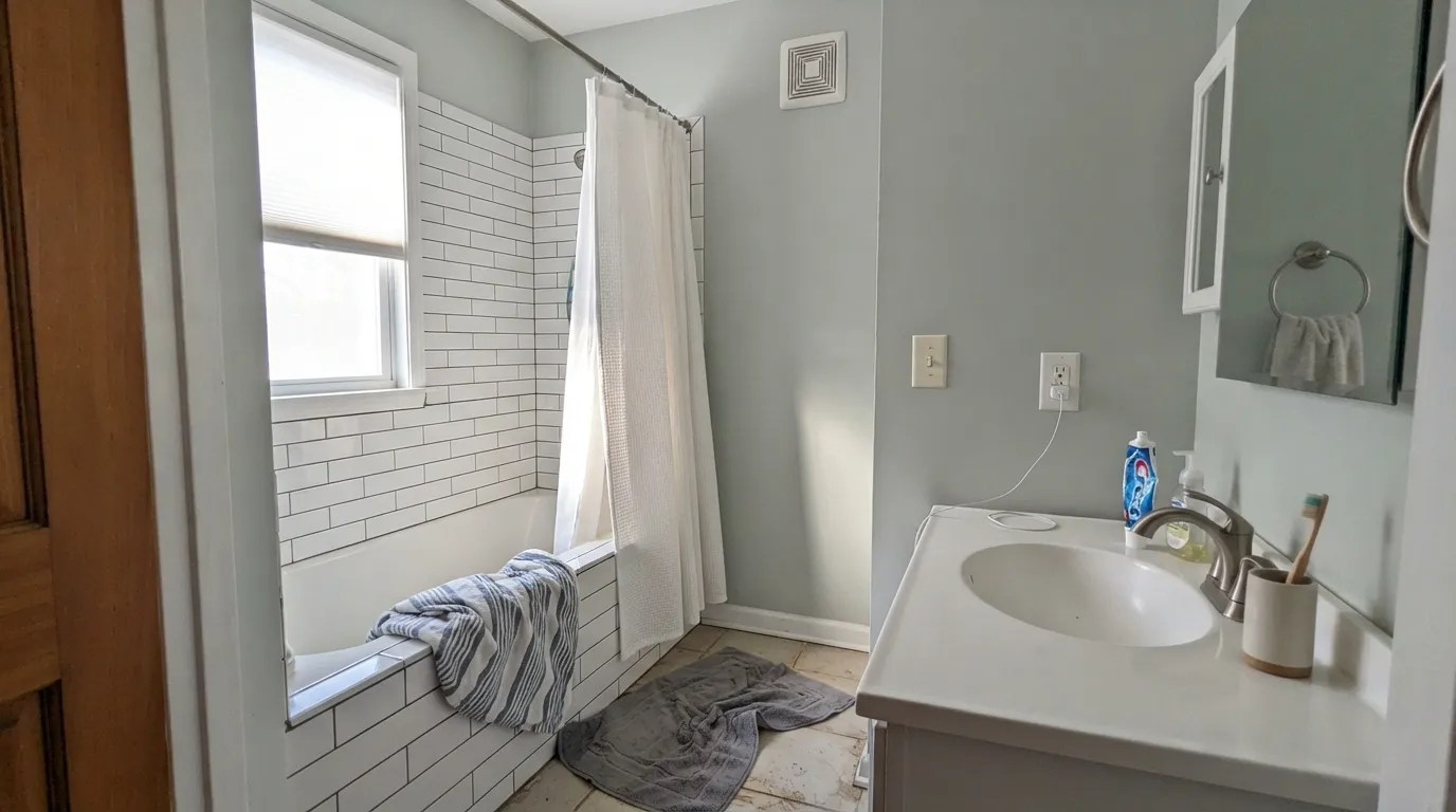
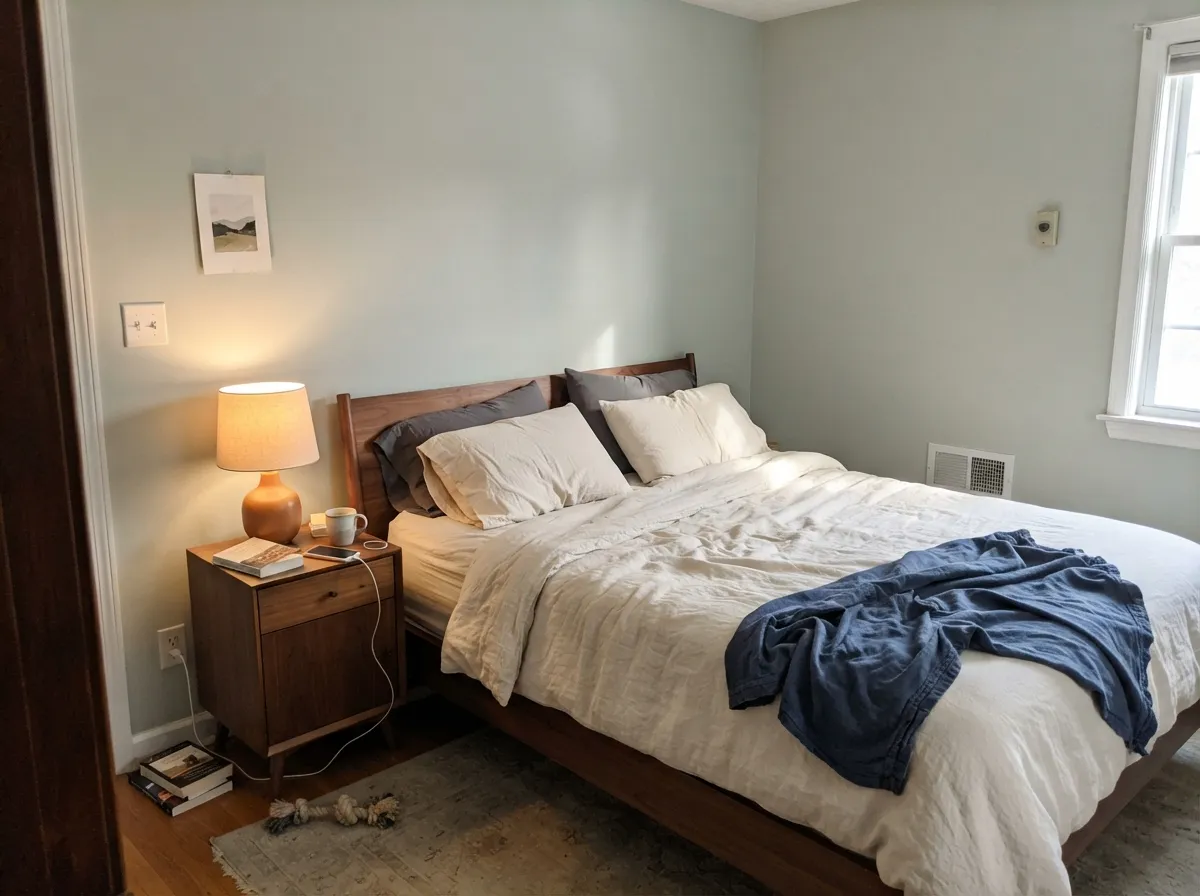
Give it real daylight and it earns the "spa" comparisons reviewers reach for — the green is soft enough to read as calm rather than a decorating statement. Bathrooms are its best room: at this depth it hides water spots and toothpaste smudges better than a bright white, and it pairs naturally with white tile, brushed nickel or brass, and a plain white vanity top. Bedrooms are its second home, especially with warm mid-tone wood and cream linens — restful without going cold.
Where It Fails
Almost every disappointed review of Tranquility comes from one of three mismatches, and all three are predictable before the first coat. None of them are the paint failing — but if your room or your expectations match one of these, sample it big before you commit to four walls.
Cool, low daylight mutes the green almost completely and leaves a flat, slightly cold pale gray with a faint botanical cast — pleasant on its own, but not the spa-green color the can promised. Add warm lamps or accept the quieter gray it becomes.
In real daylight the green is not subtle — it shows on every wall, and buyers who picked this expecting a neutral gray are often surprised by the second coat. If gray is the actual goal, this is the wrong can; look at Gray Owl instead and let the green stay a hint, not a headline.
Two pale, desaturated neutrals sitting together can tip from "spa" to "waiting room." A crisp cool white like Chantilly Lace pushes Tranquility toward clinical; a warm white like White Dove keeps the pairing soft and grounds the green instead of fighting it.
Room by Room
The green reads genuinely spa-like against white tile and warm metal fixtures, and the mid-depth hides water spots better than a bright white would. Satin or semi-gloss for the moisture; warm-white trim keeps it from going clinical.
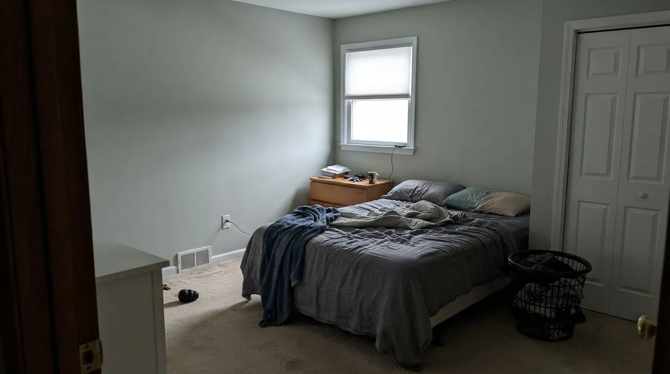
Calm without being cold, especially with a walnut or oak bed frame and cream bedding. Matte or eggshell hides texture and softens the green further. Skip it in a north-facing bedroom that never gets lamps on.
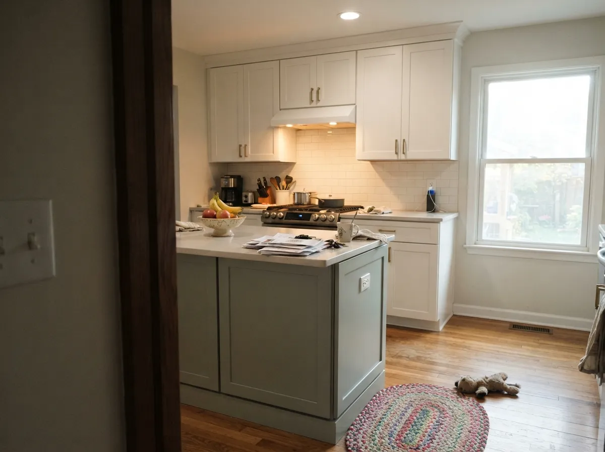
On an island or lower cabinets under a white-trimmed upper it is a genuinely calm, unusual choice with brass or nickel hardware. A full kitchen of it is a bigger bet — test against your counters and floor first.
In a bright, south- or west-facing room it works as a whole-wall color that still feels neutral enough for art and furniture to lead. In a dim room it just reads as an unremarkable gray — not wrong, just not the reason you bought this can.
Quiet and easy to work in front of all day; it does not compete with monitors or shelves the way a bolder green would. Pairs well with black hardware and warm wood desks.
Full outdoor sun and shifting weather exaggerate the gray-versus-green ambiguity into inconsistency house to house. It reads fine on a single shaded feature — a front door or shutters — but is not a color built for four exterior walls.
Your Light Is the Risk
The green comes all the way forward and the color reads soft, spa-like and clearly intentional — the look the can promises.
The green drains out almost completely, leaving a flat, slightly cold pale gray. Fine if you half-wanted gray; disappointing if you bought it for the green.
Greener and warmer at the sun hours, quieter and grayer once the direct light passes. The shift is gentle, not a color change.
2700K lamps warm it and soften the green toward a cozy sage-gray. Cool white LEDs flatten it back toward clinical gray — swap the bulb before you swap the paint.
Most complaints about Tranquility are a light mismatch. Upload a photo of your actual room and see it on your walls — then ask for the same wall in north light or evening lamps before you buy a single sample.
Need It From Another Brand?
Any paint counter can custom-tint Benjamin Moore AF-490 directly. If you would rather stay in one brand's own deck, these are the closest stock matches, measured as ΔE2000. Under 2 is a difference you will not see on the wall.
| Brand | Closest color | ΔE | LRV | |
|---|---|---|---|---|
| Sherwin-Williams | Comfort GraySW 6205 · Sherwin-Williams | 1.3 | 54 | Color page → |
| Behr | Silver SageUL210-8 · Behr | 2.7 | 53 | Color page → |
| Valspar | SleepyT678 · Valspar | 1.8 | 52.9 | Color page → |
| PPG / Glidden | BalsamPPG1128-4 · PPG / Glidden | 2.6 | 54 | Color page → |
| Glidden | BalsamPPG1128-4 · Glidden | 2.3 | 54 | Color page → |
| Dutch Boy | Frosted Olive425-2DB · Dutch Boy | 2.4 | 52 | Color page → |
Similar Benjamin Moore Colors
The nearest shades to Tranquility within Benjamin Moore's own range, ranked by perceptual color distance — useful when you want the same look a touch lighter, darker, or warmer.
WCAG 2.1: AA is 4.5 : 1 for normal text, 3 : 1 for large text, AAA is 7 : 1.
Tranquility vs the Colors You're Also Considering
Every Tranquility sample board has the same rivals on it. The numbers show the real lightness gap — then it comes down to which risk you would rather live with.
Pick this if you want the quieter option — Tranquility can pass for a plain wall color in a way Palladian Blue never quite does.
Benjamin Moore HC-144 · LRV 53Palladian BluePick this if you want the green to be the whole point — Palladian Blue owns it, and reads unmistakably "spa," not "neutral."
Pick this if that turquoise flash worries you — Tranquility stays a steadier green-gray and never tips that far toward blue.
Benjamin Moore 1563 · LRV 50Quiet MomentsPick this for a slightly cooler, more watery cousin — Quiet Moments leans blue-green and can flash turquoise in strong light.
Pick this for real depth and an honest green cast — Gray Owl is paler and more likely to disappoint buyers who wanted color.
Benjamin Moore OC-52 · LRV 65Gray OwlPick this for less commitment — lighter at LRV 65, and reads closer to a true gray than a green.
Pick this for something lighter and quieter that can double as a whole-house neutral, not only a spa accent.
Benjamin Moore 1564 · LRV 41Beach GlassPick this for a deeper, more obviously blue-green spa color at LRV 41 — more saturated, less likely to read as "just a neutral."
Picnic Basket CSP-730 carries the same hex, #BBC3BB, and the same LRV of 53, so on a wall the two are the same color under different collection names. Gray Wisp CC-670 at #BFC6BB and LRV 55 is the lighter, slightly airier version, while Silver Song 1557 at #C2C3B9 trades some of the green for yellow.
Cross-brand, Dunn-Edwards Ashwood DE6290 is the closest at a deltaE of 0.54, a genuine match. Diamond Vogel Ice Flow 0448 at 1.25, Sherwin-Williams Comfort Gray SW 6205 at 1.34, Rodda Ice Breaker R067 at 1.34, Behr Rhino 710E-3 at 1.49, and Valspar Sleepy T678 at 1.75 are all visually identical in normal room light.
From there the gaps open. Glidden Balsam PPG1128-4 at 2.26 and Dutch Boy Frosted Olive 425-2DB at 2.44 are very close but worth sampling. Farrow and Ball Mizzle No. 266 at 3.19 and Annie Sloan Paris Grey at 3.25 are close but visibly different side by side, both leaning drier and more olive.
Tranquility Coordinating Colors
The rule for coordinating with Tranquility: warm whites over cool ones, mid-tone woods over strongly orange ones, and one confident dark note to keep the pale green-gray from reading washed out. These are the partners that keep it feeling calm instead of flat:
Tranquility and the Affinity Collection
Tranquility comes from Benjamin Moore's Affinity collection, a curated set of colors organized into families specifically so that colors within a group already coordinate — a decorating shortcut more than a design statement. It is worth saying plainly: this is not a Color of the Year, it has no famous designer moment, and it has not gone viral. That honesty matters, because it sets the right expectation — this is a dependable, easy-to-live-with color, not a conversation piece.
What that quiet history buys you is low trend risk. A color that was never a headline cannot go out of style the way a headline color can; it simply keeps doing its one job — a soft wash of green-gray calm — in whichever room needs it, for as long as you own the house.
Tranquility With Wood Tones and Floors
Mid-tone woods are the easy answer: white oak, walnut, and most maple sit comfortably next to Tranquility because neither the wood nor the paint is fighting for attention. The color is cool-leaning enough that it does not amplify orange in the way a warm beige would, which is part of why it works so well against honey-toned cabinetry in small doses.
The one real clash is strongly orange or red-toned wood at scale — wall-to-wall honey oak flooring or cherry trim. Green and red-orange sit close to opposite on the color wheel, so a whole room of that pairing can look slightly muddy on both sides. It is not usually a dealbreaker in a bathroom or bedroom with limited wood, but sample big before committing an entire honey-oak floored room to it.
Three Ready Palettes Built on Tranquility
A color is never alone on the wall. These are complete combinations in the 60-30-10 pattern, with the reason each one holds together. Every one opens in the visualizer.
White Dove keeps the green grounded instead of clinical, and Kendall Charcoal supplies one dark note so the room reads finished, not just pale. This is the pairing that earns Tranquility the "spa" comparisons.
Try this palette in your roomPale Oak is warm and light enough not to fight the green next door, so the handoff between rooms stays soft. Hale Navy gives the scheme one confident dark note without competing with Tranquility's quiet color.
Try this palette in your roomGray Owl is lighter and quieter, so the trim recedes instead of competing with the wall's green. Chelsea Gray adds one deeper, warmer note that keeps the tonal scheme from feeling washed out.
Try this palette in your roomTranquility FAQ
Is Tranquility gray or green?
Both, depending on the light. In real daylight the green is clearly visible — not subtle. In a dim or north-facing room it settles back into a plain pale gray with only a faint botanical hint. If you want a true, colorless gray, this is not it.
Is it a trendy or famous color?
No, and that is part of the appeal. It is part of Benjamin Moore's Affinity collection — a curated set of coordinating colors — not a Color of the Year pick and not a color with a viral moment behind it. It is a quiet, dependable workhorse, not a headline.
What is the best room for Tranquility?
A bathroom or powder room with white tile and warm metal fixtures. At LRV 53 it hides water spots better than a bright white, and the green reads genuinely spa-like once real light or a warm lamp hits it.
What trim white goes with Tranquility walls?
A warm white — White Dove is the safe default. A stark, cool white like Chantilly Lace can push the pairing toward clinical instead of calm. Semi-gloss trim, eggshell walls.
Does it work with honey oak or warm wood floors?
Mid-tone woods like oak and walnut are fine partners. The one real clash is strongly orange honey oak or cherry — the warm red-orange in the wood fights the green in the paint, and both sides can look slightly off. Test a large sample above the actual floor first.
How many coats does it need?
Two coats over any light existing color is standard. Over a dark or saturated previous color, prime first — chasing coverage with three coats of a mid-tone color is the expensive way to learn this.
Have you painted with Tranquility?
Rate it — one tap helps the next reader decide.
Ask a Question