Gray Owl
America's default light gray, reviewed honestly: where it stays calm, the rooms where it turns green or blue, and what to paint instead.

Jessica has spec'd whites and neutrals for more than 300 rooms and keeps a sample wall of painted drawdowns in her studio. Every color review is checked against real reader rooms in the comments and re-tested when a formula changes. About the testing process →
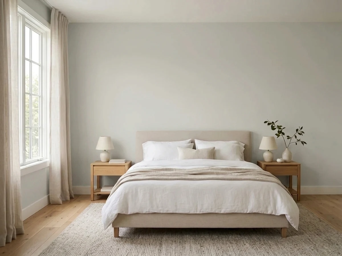
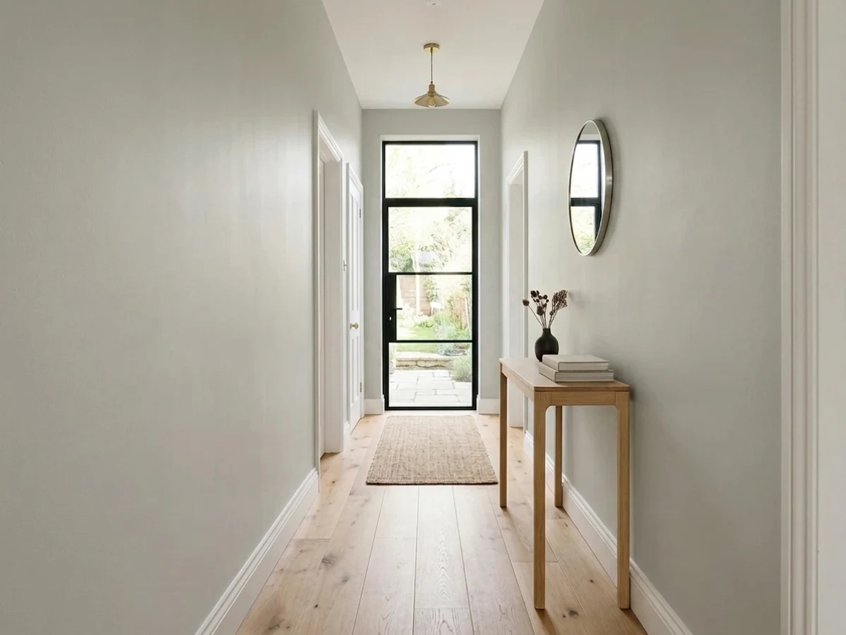
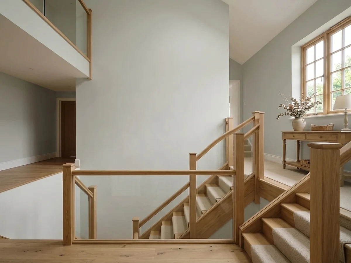
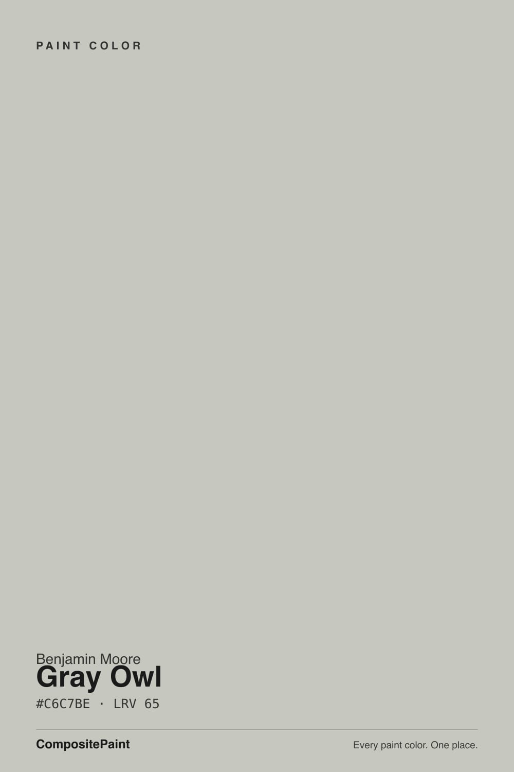
- 1Stardew43
- 2Palladian Blue60
- 3Gray Owl65
- 4Glass Slipper70
- 5Spring Thaw83
The Fast Verdict
Gray Owl is the gray people land on when true gray felt too cold and greige felt too beige. At LRV 65 it keeps a room bright, and with almost no color in it, it never shouts. That is also the catch — there is so little pigment to hold the color steady that the room decides what you get: soft sage in strong afternoon sun, a cool blue-gray on a dark day. Sample it on two walls with different light, or you will be repainting one of them.
Whole-house walls where one gray has to work everywhere · rooms with steady, even daylight · dark hallways and small rooms that need to feel bigger · anyone who tried a true gray and found it cold
Your room is dim and faces north · you have green-toned floors, tile or quartz · you want a gray that obviously reads gray · your trim is bright white and you want real contrast
- LRV 65 keeps dark hallways and small rooms feeling open
- Reads gray without the cold blue of a true gray
- Sits comfortably next to oak, walnut, rattan and brass
- Quiet enough to carry a whole floor without fighting art or rugs
- Two coats over most existing light colors — cheap to live with
- Flashes soft sage in strong afternoon sun and next to green flooring or tile
- Drifts cool and faintly blue in dim north-facing rooms
- Almost no contrast against bright white trim — can read like a dirty white
- Looks different on nearly every wall, so one sample board is never enough
What Color Is Gray Owl, Really?
A very light gray with a grayed-out yellow-green lean — and the lean is the whole story. At about 7 percent saturation there is barely any color in the can, so Gray Owl has almost nothing holding it in place. Give it strong sun and it tips toward soft sage. Give it a gray, overcast north window and the warmth vanishes and it drifts blue. The two most common complaints about this color, "it looks green" and "it looks blue," are both true, in the same house, on different walls.
At LRV 65 it reflects a lot of light, which is why it became a whole-house default. Put it next to Repose Gray SW 7015 at LRV 58 and Gray Owl is clearly the lighter, airier one — Repose looks a shade heavier and slightly taupe. Go the other way and stand it next to Classic Gray OC-23 at LRV 74 and Gray Owl suddenly looks like a real gray instead of an off-white. That middle position is exactly what people want from it, and exactly why it is so easy to get wrong.
Undertone in one line: a light gray with a soft yellow-green lean — sage in bright sun, cool blue-gray in low light, never beige and never pink.
Where It Shines
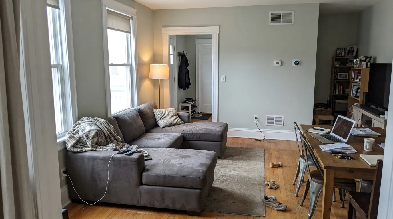
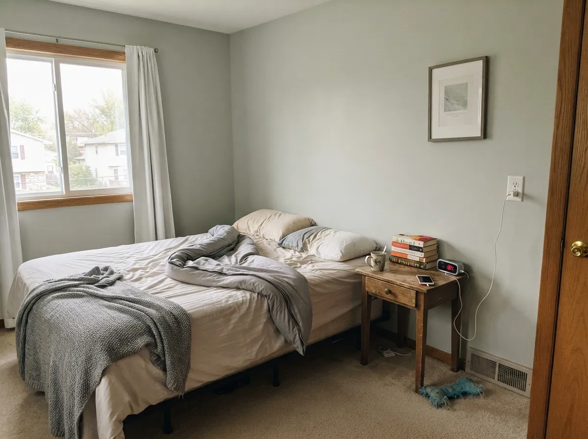
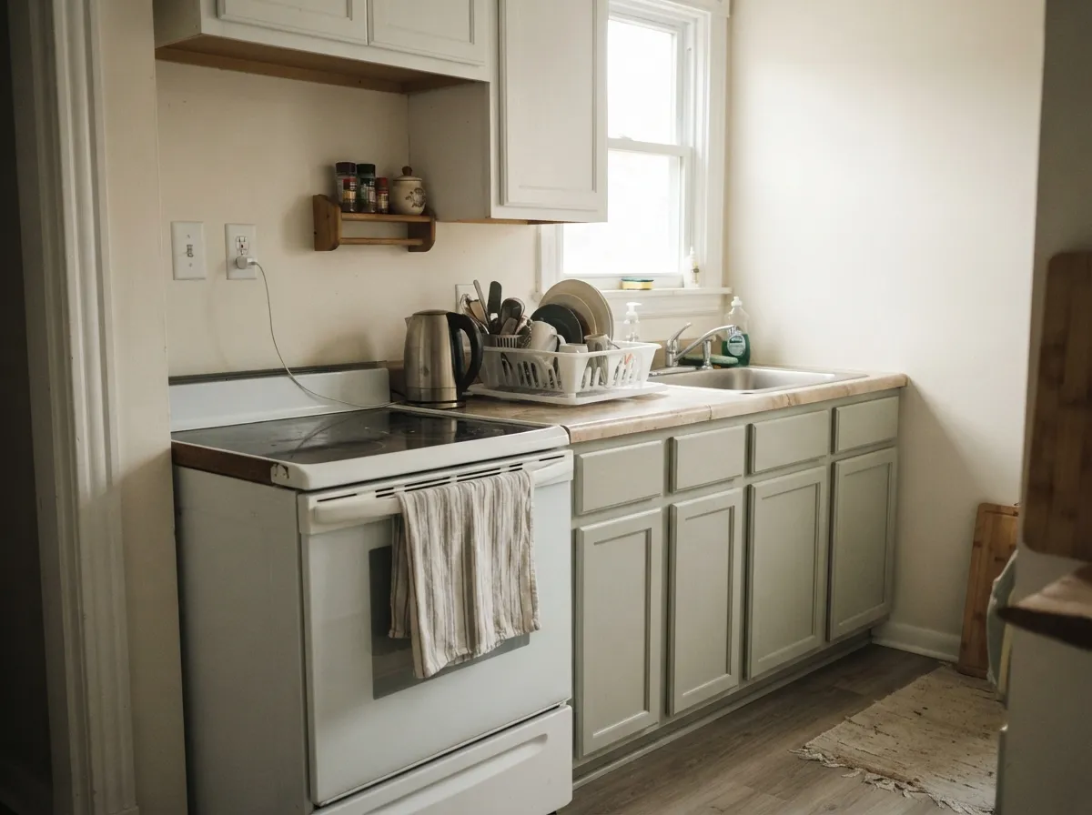
Give it even daylight, warm wood and a crisp white trim and Gray Owl is genuinely hard to beat. It is a whole-floor color: light enough to open up a dark hallway, quiet enough that art, rugs and furniture do the talking, and warm enough that oak floors never look orange next to it.
Where It Fails
The bad reviews for Gray Owl are all the same three stories, and none of them are about bad paint. They are about a color with almost no pigment being asked to hold its own in light that overwhelms it. If your room matches one of these, more coats will not fix it.
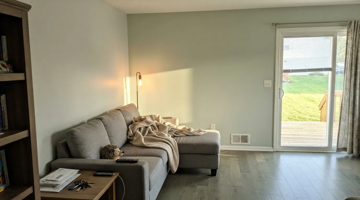
This is the number one complaint by a wide margin. Late sun, a green-gray plank floor, sage tile, or green-veined quartz — any of them pulls the yellow-green lean forward and the wall reads soft sage instead of gray. If your room has green in it already, pick Repose Gray SW 7015, which leans slightly taupe and has no green to give.
Cool north light strips out what little warmth Gray Owl has and leaves a thin blue-gray that people describe as looking like a light blue nursery. It is not the paint failing, it is the paint having nothing left to work with. Go warmer and use Edgecomb Gray HC-173, or commit to 2700K bulbs everywhere in that room.
At LRV 65 with no saturation, Gray Owl beside a brilliant white can stop looking like a color at all and start looking like a white that needs washing. If you want the gray to actually read gray against crisp trim, step down to Stonington Gray HC-170 at LRV 59 or Coventry Gray HC-169 at LRV 48.
Room by Room
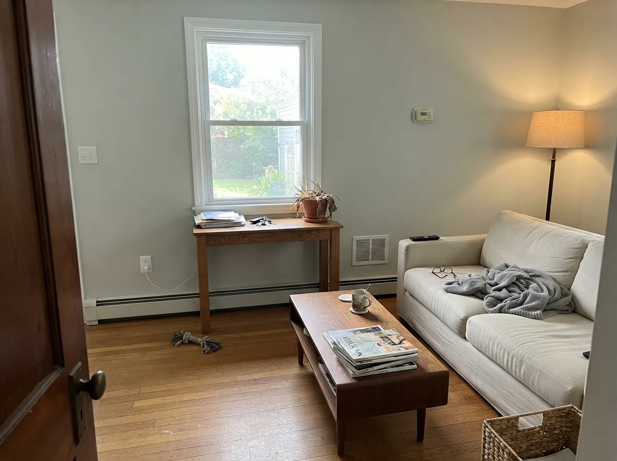
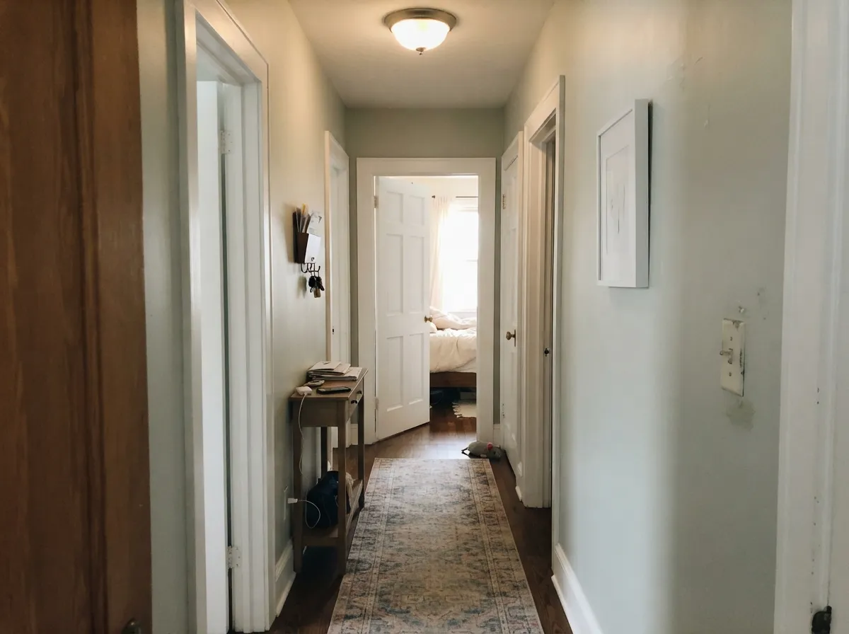
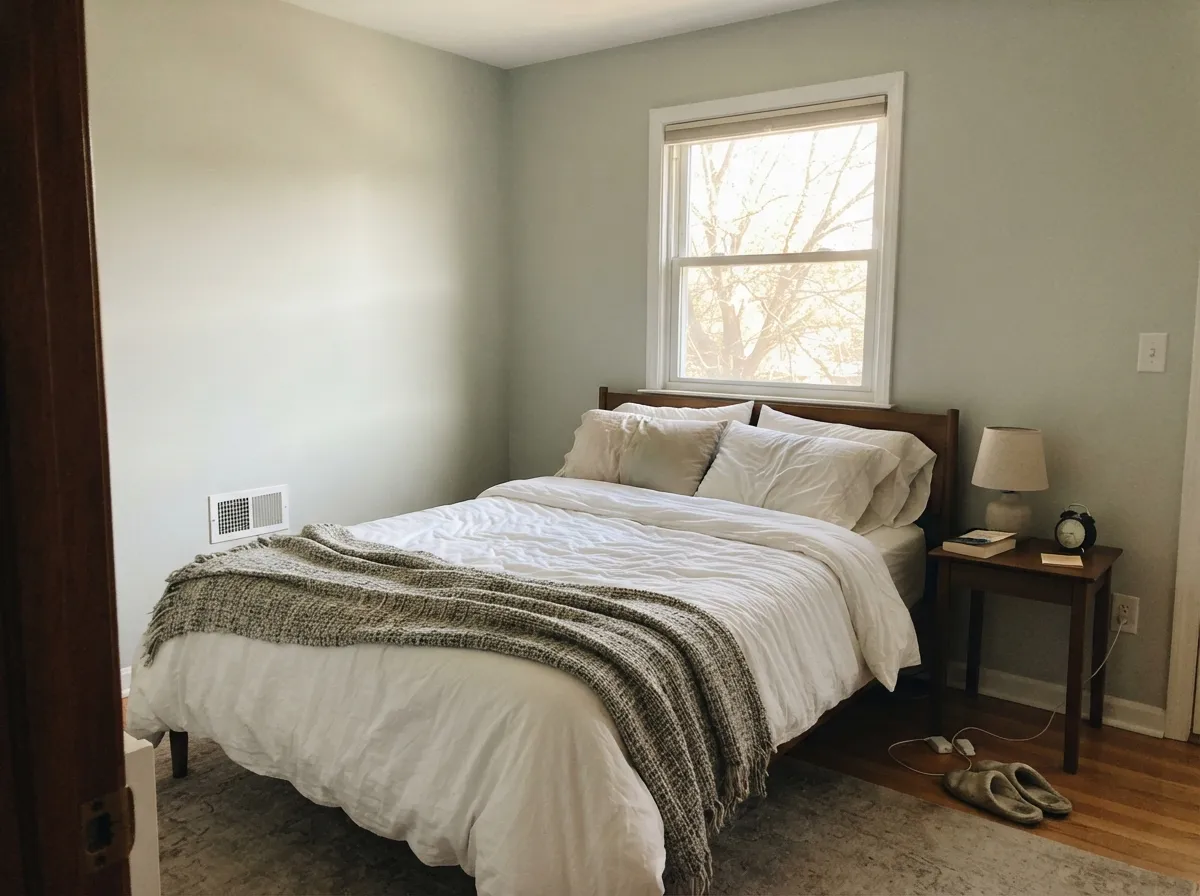
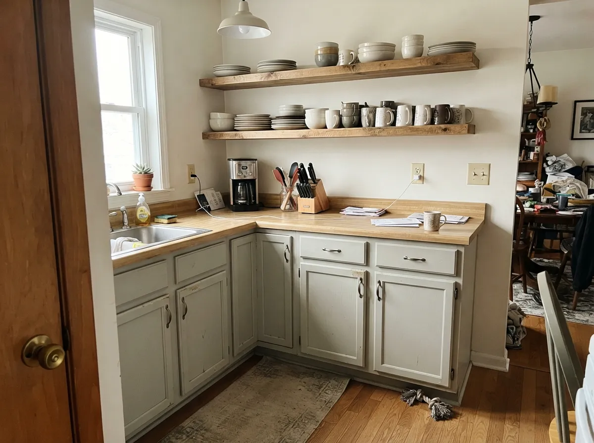
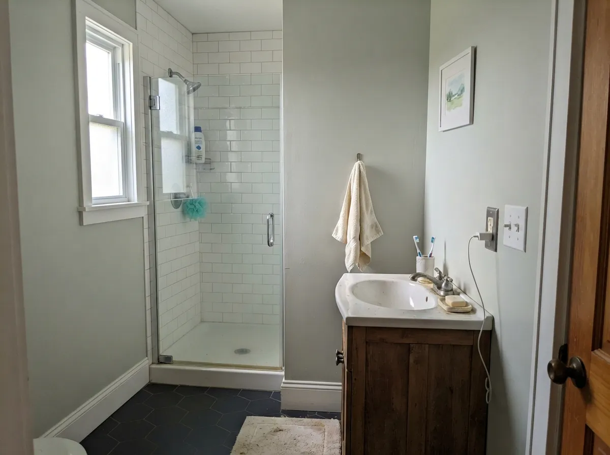
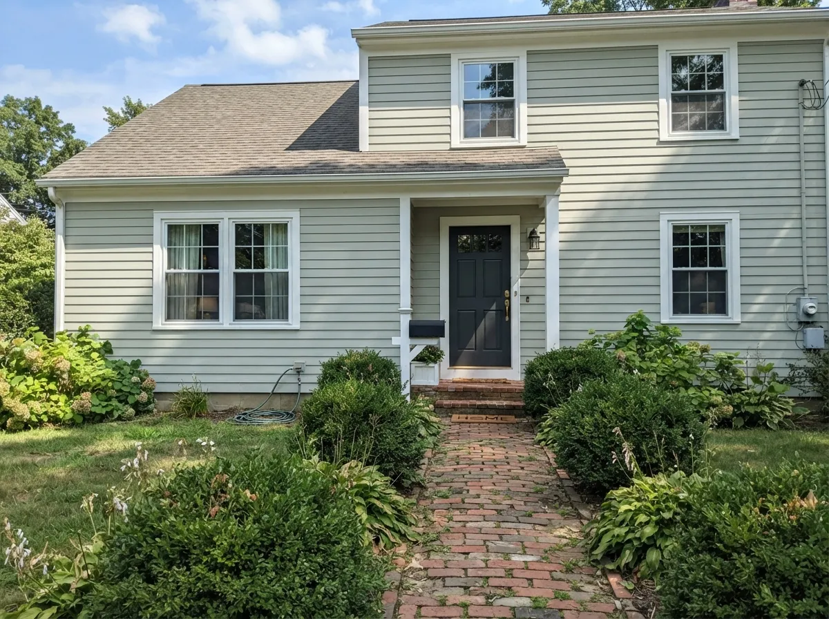
Your Light Is the Risk
Warm at the sun hours, settles to a quiet neutral gray after. Its sweet spot.
Direct warm sun brings the yellow-green forward. Lovely as soft sage — a problem if you wanted gray.
Cool daylight strips the warmth out and leaves a thin blue-gray. The most regretted room.
2700K lamps: creamier, slightly greener. 3500-4000K: crisp, clean gray. Change bulbs before you change paint.
Most complaints about Gray Owl are a light mismatch. Upload a photo of your actual room and see it on your walls — then ask for the same wall in north light or evening lamps before you buy a single sample.
Need It From Another Brand?
Any paint counter can custom-tint Benjamin Moore 2137-60 directly. If you would rather stay in one brand's own deck, these are the closest stock matches, measured as ΔE2000. Under 2 is a difference you will not see on the wall.
| Brand | Closest color | ΔE | LRV | |
|---|---|---|---|---|
| Sherwin-Williams | Crushed IceSW 7647 · Sherwin-Williams | 2.2 | 66 | Color page → |
| Behr | EonN370-2 · Behr | 1.2 | 65 | Color page → |
| Valspar | Tempered Gray4004-1A · Valspar | 1.7 | 64.9 | Color page → |
| PPG / Glidden | Wright Cloud WhiteFLLW961 · PPG / Glidden | 2.4 | 65 | Color page → |
| Glidden | Afraid Of The DarkPPG0994-1 · Glidden | 1.0 | 66 | Color page → |
| Dutch Boy | White Rapids425-1DB · Dutch Boy | 2.0 | 63 | Color page → |
Similar Benjamin Moore Colors
The nearest shades to Gray Owl within Benjamin Moore's own range, ranked by perceptual color distance — useful when you want the same look a touch lighter, darker, or warmer.
WCAG 2.1: AA is 4.5 : 1 for normal text, 3 : 1 for large text, AAA is 7 : 1.
Gray Owl vs the Colors You're Also Considering
Every Gray Owl sample board has the same rivals on it. The numbers show the real lightness gap — then it comes down to which risk you would rather live with.
Pick this when you want a real gray, not a warm off-white.
Benjamin Moore OC-23 · LRV 74Classic GrayPick this for dim rooms where Gray Owl turns cold and blue.
Side-by-side comparison →Pick this when the room is dark and needs every bit of light back.
Benjamin Moore HC-170 · LRV 59Stonington GrayPick this when you want the gray to be obvious against white trim.
Side-by-side comparison →Sherwin-Williams Repose Gray SW 7015 at LRV 58 is the usual comparison. At #CCC9C0 it is warmer and leans slightly taupe-purple, while Gray Owl at #C6C7BE leans yellow-green. Repose Gray also sits lower in lightness, so it feels a shade heavier on a wall.
Classic Gray OC-23 at LRV 74 is much lighter and more of an off-white than a gray. Choose it when Gray Owl looks too gray for a small or dark room. Stonington Gray HC-170 at LRV 59 goes the other way, deeper and cooler, with a clearer blue-gray character.
Across brands, Diamond Vogel Rippled Rock 0580 at deltaE 0.25, Kompozit and Hirshfield's Rippled Rock 0580 at 0.5, and HGTV Home by Sherwin-Williams Play It Cool HGSW 3277 at 0.74 are effectively the same color. Sherwin-Williams Antimony SW 9552 at 0.98 and Valspar Notre Dame 5006-1B at 1.2 are visually identical in normal room light. Behr Traditional Gray PPF-29 at 1.61 and Dunn-Edwards Dolphin Tales DET600 at 2.09 are very close, but sample first.
Gray Owl Coordinating Colors
Gray Owl needs partners more than most colors, because on its own it has no contrast to give. The rule: one clearly brighter white so it reads as a color, and one clearly darker note so the room does not go flat. Stay away from cool blue-grays as partners — they push Gray Owl blue — and treat green partners as a deliberate choice, not an accident. These are the pairings that keep coming back:
Gray Owl on Cabinets and Islands
Painted cabinets are the second-most-asked question about this color, and the answer is yes with one condition: give it something to push against. Gray Owl in satin on cabinet doors is soft, easy to live with, and much better at hiding hand marks around the handles than any white. What it cannot do is create its own contrast. Gray Owl lowers, white uppers and a white quartz counter is the combination people regret — the difference is small enough that the kitchen just looks slightly unwashed rather than two-tone.
The fix is a real dark note somewhere. Kendall Charcoal HC-166 on the island, black hardware, or a walnut open shelf all give the eye somewhere to land, and Gray Owl then reads as the calm choice it is. Check the countertop before you order paint: green-veined quartz and green-gray granite will pull the sage right out of the doors, and cabinet doors sit at eye level where you cannot ignore it. Order two sample doors and live with them for a week under your actual kitchen lights.
Gray Owl With Floors, Carpet and Wood Tones
Wood is the easy part. Red oak, white oak, honey oak, walnut and rattan all sit well against Gray Owl, because the paint has just enough warmth to stop the wood looking orange without turning beige itself. Builder-grade orange oak floors are one of the best reasons to use this color — it calms them down rather than shouting at them.
Flooring is where it goes wrong. Green-toned gray LVP, the plank that looks slightly olive in the box, is the single worst partner for Gray Owl; the two greens find each other and the walls read sage. Cool blue-gray LVP does the opposite and drags the walls blue. Carpet follows the same rule — a soft warm gray or greige is safe, a blue-gray carpet is not. If your floor is already down, hold a large sample board flat against it in the middle of the day before you buy a gallon, because the floor will decide this color more than the paint chip will.
Three Ready Palettes Built on Gray Owl
A color is never alone on the wall. These are complete combinations in the 60-30-10 pattern, with the reason each one holds together. Every one opens in the visualizer.
Gray Owl carries every wall, Chantilly Lace gives the clean edge that stops it reading as a dirty white, and the navy door is the single dark note the whole scheme leans on. Keep the trim white in every room or the flow breaks.
Try this palette in your roomCabinets are the biggest surface in a kitchen, so Gray Owl is the 60 percent here and White Dove walls keep the room warm behind it. The charcoal island supplies the contrast Gray Owl cannot give on its own and stops the whole kitchen going flat.
Try this palette in your roomFull sun lifts Gray Owl a step lighter outside, so the trim white has to be bright to still register — Simply White does that. Essex Green is the dark anchor, and because it is a true deep green it makes Gray Owl's own green lean look intentional instead of accidental.
Try this palette in your roomGray Owl FAQ
Why does my Gray Owl look blue?
Because there is almost no color in it to begin with. In cool north light or under an overcast sky, the small amount of warmth burns off and what is left reads as a thin blue-gray. Warm 2700K bulbs pull it back in the evening. If the room is dim all day, Edgecomb Gray HC-173 is the safer swap.
Gray Owl or Repose Gray?
Repose Gray SW 7015 sits at LRV 58 and leans slightly taupe. Gray Owl is lighter at LRV 65 and leans yellow-green. Pick Repose if your room has green flooring or green stone, or if you want a bit more weight on the wall; pick Gray Owl if Repose looks muddy to you or the room needs more light back.
Gray Owl or Classic Gray?
Classic Gray OC-23 at LRV 74 is really a warm off-white — next to it Gray Owl is clearly gray. Use Classic Gray in a dark room or when you want soft and barely-there. Use Gray Owl when you want someone walking in to say gray.
What ceiling color goes with Gray Owl walls?
Flat white is the easy answer: Chantilly Lace 2121-70 if your trim is a crisp white, White Dove OC-17 if the trim is warm. The other option that works well is Gray Owl mixed at half strength on the ceiling, which keeps the plane soft with no hard line. Avoid leftover builder ceiling white — it adds a third white to the room and all three will argue.
What flooring and carpet go with Gray Owl?
Warm oak, white oak and walnut all work, because the paint's warmth meets theirs halfway. For carpet, choose a soft warm gray or a greige, never a blue-gray — the walls will follow the carpet blue. The one combination to avoid is green-toned gray LVP, which pulls the sage out of the walls within a day.
Does Gray Owl work on a house exterior?
Yes, as a light body color. Full sun brightens it a full step and the soft warmth shows more outside than in, so it reads gentle rather than steel gray. Give it white trim and a dark door — Essex Green HC-188 or Wrought Iron 2124-10. If you want obvious gray from the street, Stonington Gray HC-170 holds its color better in sunlight.
Is Gray Owl still in style?
Cold builder gray everywhere is finished, but light grays with warmth in them are not, and Gray Owl survived the shift for that reason. With wood, cream, brass and real color it still looks current. With gray-washed floors and gray furniture it will date the room fast.
Have you painted with Gray Owl?
Rate it — one tap helps the next reader decide.
Ask a Question