Stonington Gray
The true gray everyone means when they say "not greige" — reviewed honestly: where it stays a calm silvery gray, the light that turns it slate-blue, and how it stacks up against Repose Gray and Classic Gray.

Jessica has spec'd whites and neutrals for more than 300 rooms and keeps a sample wall of painted drawdowns in her studio. Every color review is checked against real reader rooms in the comments and re-tested when a formula changes. About the testing process →
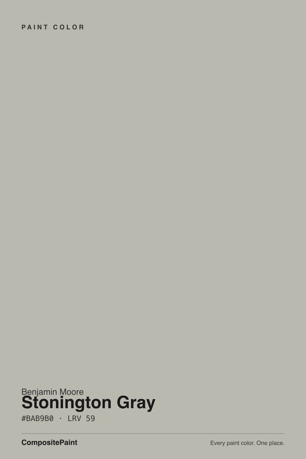
- 1Stardew43
- 2Quietude48
- 3Stonington Gray59
- 4Gray Owl65
- 5Glass Slipper70
The Fast Verdict
Stonington Gray is the color people mean when they ask for "an actual gray, not another greige." Benjamin Moore calls it an all-purpose silvery gray, and that is exactly right in good light — cool, mineral, a little nautical.
The catch is the same thing that makes it interesting: a real blue undertone that stays quiet in daylight and steps forward the moment the light turns cold. It has earned its spot as one of the most-searched colors in the BM deck for being a dependable true gray in the right room, not for being foolproof everywhere.
Exterior siding and shutters · rooms with real south or west daylight · anyone who wants gray without a hint of beige · coastal, modern-farmhouse and transitional houses
Your room is dim and north-facing · your floors and trim run warm honey oak · you actually wanted a greige, not a gray · your fixtures and stone are warm brass and gold-flecked granite
- A true gray, not a greige in disguise — reads gray in every can and every light
- One of Benjamin Moore's most dependable exterior colors, especially with white trim
- Holds a calm, mineral character next to cool marble, chrome and stone
- Mid-tone LRV 59 works as whole-house walls or as a darker accent
- Decades of proven use in the Historical Collection — not a trend color that will date
- Blue undertone intensifies noticeably in north or overcast light
- Fights honey oak floors and warm brass the way most true grays do
- Can read cold and flat without a warm trim white or warm bulbs to balance it
- Disappoints buyers who actually wanted a warmer greige like Revere Pewter
What Color Is Stonington Gray, Really?
A true gray with a blue undertone that never fully disappears — and a faint green ghost that shows up in shade and shadow. Benjamin Moore's own description, "all-purpose silvery gray," is unusually accurate: unlike its warmer HC-deck cousins (Revere Pewter, Edgecomb Gray), Stonington Gray does not lean beige or tan under any light. It reads as gray in the paint can, gray on the swatch, and gray on the wall. That consistency is the whole reason it became a Benjamin Moore staple rather than a passing trend color.
It belongs to the Historical Collection's HC gray run: Wickham Gray (HC-171, LRV 68) sits a step lighter and softer, Coventry Gray (HC-169) and Chelsea Gray (HC-168) sit darker and moodier, and Stonington Gray (HC-170, LRV 59) holds the middle — light enough for whole-house walls, with enough depth to read as a real color choice rather than an off-white. At LRV 59 it is a genuine mid-tone: not the pale ghost-gray of Classic Gray, not the charcoal of Kendall Charcoal, just a confident medium gray.
Undertone in one line: blue first, a whisper of green in shade — never warm, never beige. If your sample looks silvery and calm, that is bright or south light doing what the paint does best. If it looks distinctly slate-blue or cold, that is north light or an overcast sky pulling the blue forward — the paint is not misbehaving, it is just being an honest true gray.
Where It Shines
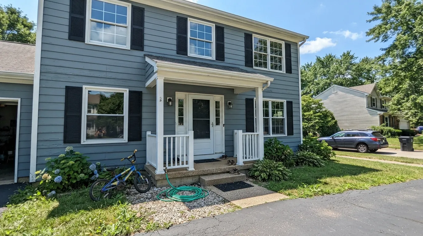
Give it real daylight and it is one of the most dependable true grays Benjamin Moore makes. Exteriors are its signature job: siding in Stonington Gray with white trim and black shutters is a modern-farmhouse formula repeated on entire subdivisions for a reason, and outdoors the color shifts gently through the day — a faint blue tint in morning light, a clean true gray at midday, a cozier cast once the sun angles low — without ever losing its gray identity. Indoors, a south- or west-facing room with real daylight lets it settle into the calm, sophisticated silvery gray the marketing photos promise, and it is genuinely at home next to cool marble, chrome, and brushed nickel.
Where It Fails
Almost every disappointed review of Stonington Gray comes from one of three mismatches, and all three are predictable before the first coat goes on. None of them are the paint misbehaving — but if your room fits one of these, sample big before you commit.
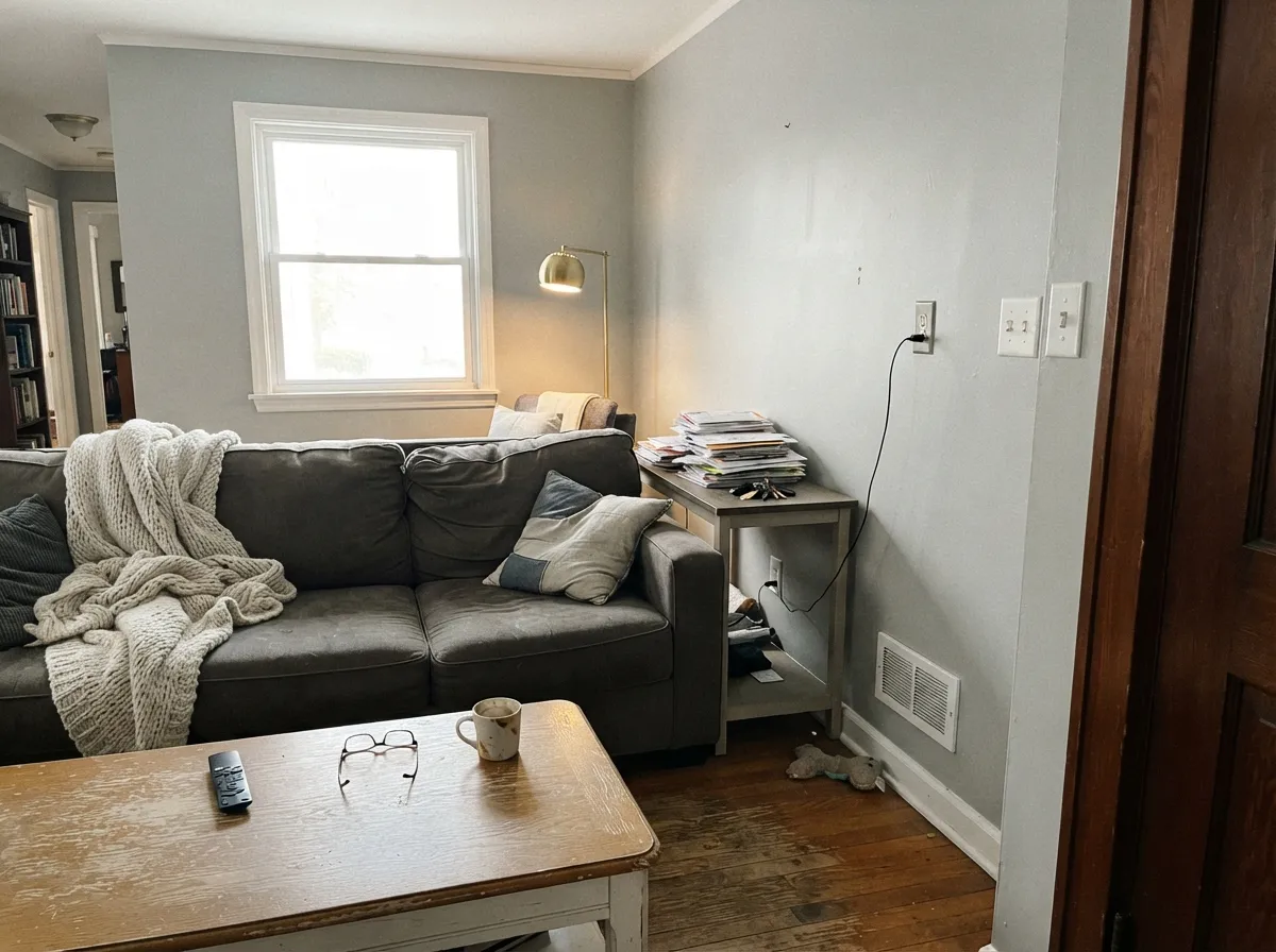
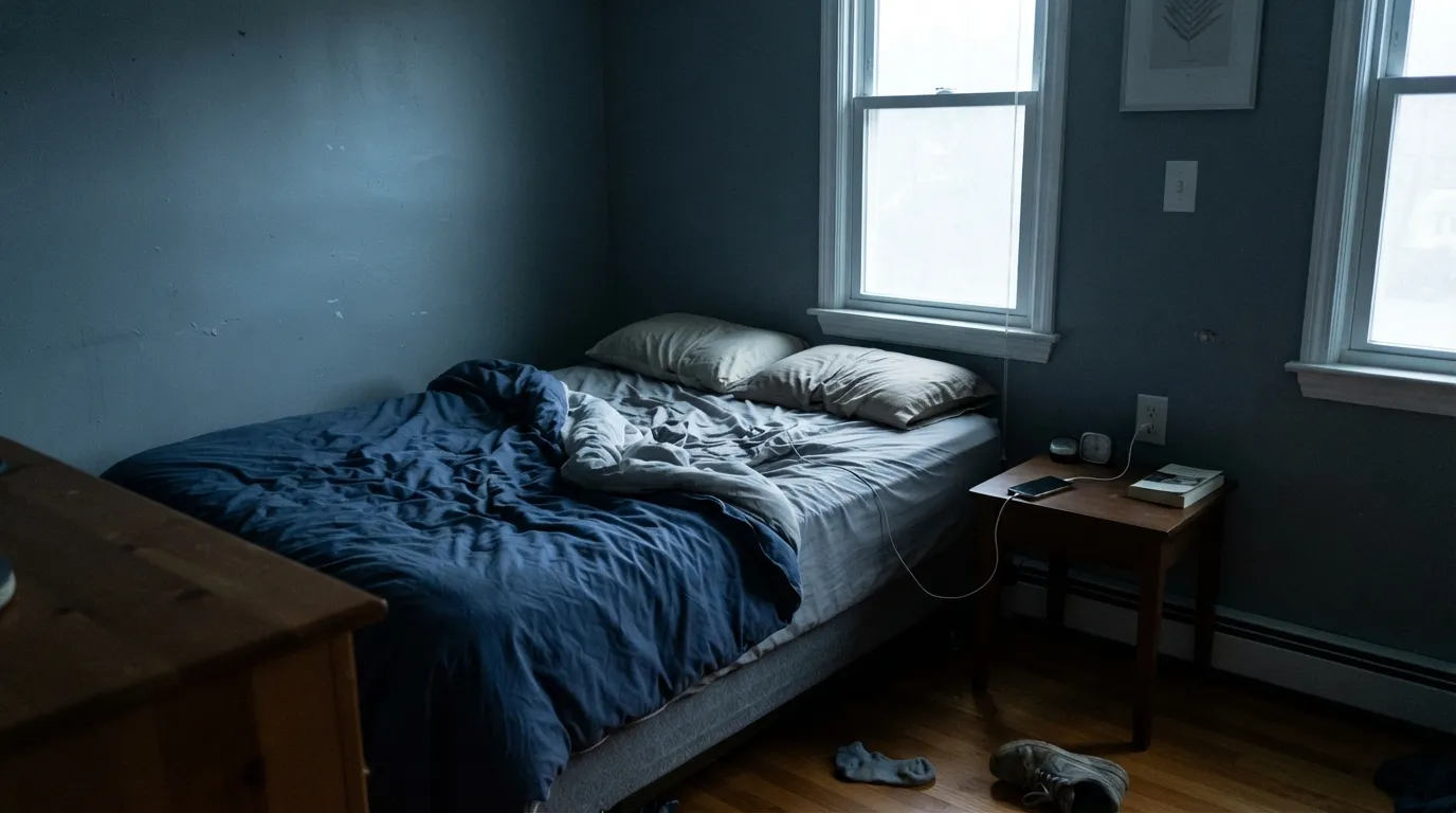
North light is cool and blue to begin with, and it pushes Stonington Gray's own blue undertone forward instead of letting it settle. Readers who loved the color in a sunny sample chip report walls that read distinctly slate-blue and cold once the whole room is painted. The color did not change; the light exposed what was already there. Test a large sample on the actual wall, at the actual time of day, before painting the room.
Cool blue-gray and warm honey-orange wood sit on opposite sides of the color wheel, and each makes the other look worse: the floor reads more orange, the wall reads more blue and flat. Stonington Gray wants white oak, walnut, gray-washed floors, or painted trim — not builder-grade honey oak.
This is the single most common mismatch in the reviews: buyers expecting something closer to Revere Pewter or Repose Gray get a cooler, more mineral color than they pictured. Stonington Gray is a true gray on purpose. If you want warmth folded in, this is the wrong can — look at Repose Gray or Edgecomb Gray instead.
Room by Room
The color's signature job. With white trim (Chantilly Lace or Simply White) and black or charcoal shutters it is a modern-farmhouse classic, and the daily light shift — soft blue in the morning, clean gray at midday, cozier by evening — reads as depth, not inconsistency. Satin or flat exterior finish; walk the whole house with a sample before ordering gallons, since the north side reads noticeably cooler than the south.
South- or west-facing rooms let it settle into a calm, sophisticated silvery gray that flatters a gray or navy sofa and cool metals. Pair with White Dove trim, not a stark bright white, to keep the room from feeling clinical. Skip it in a dim north-facing living room unless you are ready to lean into the coolness on purpose.
On an island or full cabinet run it looks sharp against white quartz, marble, or gray-veined stone and chrome hardware. It fights warm butcher block and gold-flecked granite the same way it fights honey oak floors — check your counters before your cabinets.
In a south- or west-facing bedroom it is restful without going flat. In a north-facing bedroom it can read cold and moody by afternoon; warm 2700K lamps and cream or ivory bedding pull the temperature back up if you want the color without the chill.
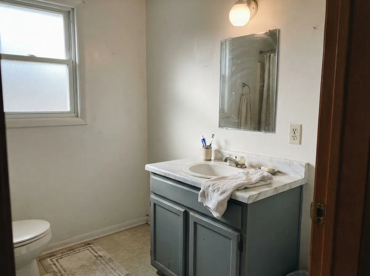
Cool marble or marble-look tile, chrome or brushed-nickel fixtures, a white vanity top: this is the room where Stonington Gray's blue undertone stops being a risk and starts being the point. Satin on cabinetry and trim.
Against a lighter siding or wall color, Stonington Gray works just as well as the darker accent — shutters, a front door, garage doors — as it does carrying a whole facade. Semi-gloss holds up to weather and reads crisper than flat.
Your Light Is the Risk
The blue calms into a clean, confident silvery gray. This is the light the official swatch photos are shot in.
Cool, blue-toned daylight pushes Stonington Gray's own blue forward — walls can read distinctly slate-blue and cold. Test a big sample first.
A soft blue tint in morning or evening light, a truer gray at midday. Outdoors this reads as pleasant depth through the day.
2700K bulbs warm it just enough to feel cozy rather than cold. Cool white LEDs push it further blue — swap bulbs before you second-guess the paint.
Most complaints about Stonington Gray are a light mismatch. Upload a photo of your actual room and see it on your walls — then ask for the same wall in north light or evening lamps before you buy a single sample.
Need It From Another Brand?
Any paint counter can custom-tint Benjamin Moore HC-170 directly. If you would rather stay in one brand's own deck, these are the closest stock matches, measured as ΔE2000. Under 2 is a difference you will not see on the wall.
| Brand | Closest color | ΔE | LRV | |
|---|---|---|---|---|
| Sherwin-Williams | Silver StrandSW 7057 · Sherwin-Williams | 1.2 | 59 | Color page → |
| Behr | Paving StonesPPF-16 · Behr | 1.0 | 60 | Color page → |
| Valspar | Filtered Shade4003-1B · Valspar | 1.8 | 58.4 | Color page → |
| PPG / Glidden | Pittsburgh GrayPPG0994-2 · PPG / Glidden | 1.6 | 59 | Color page → |
| Glidden | Pittsburgh GrayPPG0994-2 · Glidden | 1.6 | 59 | Color page → |
| Dutch Boy | Moon Beam438-2DB · Dutch Boy | 1.6 | 60 | Color page → |
Similar Benjamin Moore Colors
The nearest shades to Stonington Gray within Benjamin Moore's own range, ranked by perceptual color distance — useful when you want the same look a touch lighter, darker, or warmer.
WCAG 2.1: AA is 4.5 : 1 for normal text, 3 : 1 for large text, AAA is 7 : 1.
Stonington Gray vs the Colors You're Also Considering
Every Stonington Gray sample board has the same rivals on it. The numbers show the real lightness gap — then it comes down to which risk you would rather live with.
Pick this if you want a true gray with no beige hiding in it — Stonington stays cooler and more mineral at the same LRV.
Sherwin-Williams SW 7015 · LRV 58Repose GrayPick this if you actually want a greige — it carries real warmth and beige alongside the gray, and reads far more transitional.
Side-by-side comparison →Pick this when you want real color depth and presence, not a whisper of gray on an off-white.
Benjamin Moore OC-23 · LRV 74Classic GrayPick this for a much lighter, warmer near-white gray that behaves almost like a soft white on the wall.
The most common cross-shop is Repose Gray (SW 7015), at LRV 58. The two are almost identical in lightness, but Repose reads as a slightly warmer greige while Stonington Gray stays a cleaner, cooler gray. Choose Stonington when you want the color to hold gray in bright light; choose Repose if you want a hint more warmth.
Within Benjamin Moore, Gray Owl (OC-52), at LRV 65, is the lighter, airier option that can flash a cool green or blue in some light. Stonington Gray is a touch deeper and more consistently gray, so it is the safer pick if you want less color shift.
Colored Coventry Gray (HC-169), at LRV 41, is the darker relative in the same family. Use it when you want noticeably more depth and contrast on walls or cabinets, and use Stonington Gray when you want the room to stay light and open.
Stonington Gray Coordinating Colors
The rule for coordinating with Stonington Gray is to stay on the cool side, or bring warmth in deliberately rather than by accident. It pairs cleanly with crisp whites, near-blacks, and other cool blues, and it needs a genuinely warm partner — cream, not beige — if the room is going to feel balanced rather than cold. These are the partners that keep showing up in rooms that work:
The HC Gray Ladder: Stonington's Family
Stonington Gray does not stand alone — it is one rung in Benjamin Moore's Historical Collection gray run, a set of colors developed together and numbered consecutively (HC-168 through HC-171) so they read as siblings rather than coincidences. Wickham Gray (HC-171) sits lighter and airier at LRV 68, the choice when a room needs the family's cool character without much depth. Coventry Gray (HC-169) and Chelsea Gray (HC-168) sit darker and warmer-leaning, with Chelsea in particular reading as a moody, almost driftwood gray once it darkens past LRV 22.
The practical upside: because these colors were built together, they layer cleanly in one house without a separate color-matching exercise. A common combination is Stonington Gray on the exterior with Chelsea Gray on a front door or shutters, or Wickham Gray on an interior ceiling under Stonington Gray walls — the family relationship does the coordinating work for you.
Stonington Gray With Wood Tones and Floors
This decision gets made at the floor, not the paint store. White oak, gray-washed wood, walnut and weathered cedar all sit comfortably next to Stonington Gray because none of them are fighting its cool undertone — if anything, gray-washed floors intensify the coastal effect in a good way.
The one honest no is honey oak: the orange-leaning, high-gloss builder floor common in 1990s and early-2000s houses. Blue-gray and honey-orange sit close to opposite ends of the color wheel, so painting the walls Stonington Gray over honey oak makes the floor look more orange and the walls look flatter and colder at the same time. Refinishing or a large area rug fixes the clash faster than any amount of sampling; if the floor is staying as-is, a warmer BM gray like Revere Pewter will fight it far less.
Metals follow the same logic: chrome, brushed nickel and matte black all read sharp against Stonington Gray, while unlacquered or polished brass can look slightly dull by comparison — not a clash, just a quieter pairing than it gets with warmer neutrals.
Three Ready Palettes Built on Stonington Gray
A color is never alone on the wall. These are complete combinations in the 60-30-10 pattern, with the reason each one holds together. Every one opens in the visualizer.
The formula repeated on modern-farmhouse builds nationwide: a bright, clean white keeps the trim crisp against the blue-gray siding, and Wrought Iron supplies one confident dark note without going flat black. Nothing here fights Stonington Gray's cool undertone — it all leans the same direction.
Try this palette in your roomInstead of fighting Stonington Gray's blue undertone, this scheme leans into it: Van Deusen Blue shares the same cool family so nothing clashes, and White Dove's warmth keeps the room from tipping cold. A classic coastal or New England living room combination.
Try this palette in your roomSwiss Coffee's cream keeps the room from reading cold, so the island can carry the full cool-gray statement without the kitchen feeling clinical. Kendall Charcoal grounds the scheme with a near-black that shares the same neutral temperature instead of competing with it.
Try this palette in your roomStonington Gray FAQ
Is Stonington Gray warm or cool?
Cool — it is a true gray with a blue undertone and a faint green ghost in shade, never a warm greige. In bright or south light it calms to a soft silvery gray; in north or overcast light the blue steps forward and it reads distinctly cooler.
What is the difference between Stonington Gray and Repose Gray?
They sit at almost the same LRV (59 vs 58) but are built differently: Repose Gray is a greige with real beige and purple-blue warmth folded in, which is why it reads more transitional. Stonington Gray is a true gray with no beige hiding underneath — cooler, more mineral, and less forgiving in dim north light.
What is the difference between Stonington Gray and Classic Gray?
Depth. Classic Gray sits at LRV 74, much closer to a soft off-white, and reads warmer and lighter on the wall. Stonington Gray at LRV 59 is a genuine mid-tone gray with real presence — pick Classic Gray for a whisper of color, Stonington Gray when you want the gray to actually show.
What trim color goes with Stonington Gray?
A clean bright white — Chantilly Lace or Simply White — is the classic exterior pairing and keeps the blue-gray reading crisp. Indoors, White Dove softens the contrast slightly if you want less edge. Avoid warm ivory trims, which make the gray look dingy by comparison.
Does Stonington Gray work well on exteriors?
Yes — it is one of Benjamin Moore's most popular and most-searched exterior grays, especially with white trim and black or charcoal shutters. It shifts gently through the day (softer blue in morning light, truer gray at midday) without losing its identity. Sample all four sides of the house before ordering, since the north-facing wall will read noticeably cooler.
Is Stonington Gray part of a family of colors?
Yes — it sits in Benjamin Moore's Historical Collection HC gray run, between the lighter Wickham Gray (HC-171) above it and the darker Coventry Gray (HC-169) and Chelsea Gray (HC-168) below it. All four share the same cool-to-moody gray character at different depths, which makes it easy to layer them in one house.
Have you painted with Stonington Gray?
Rate it — one tap helps the next reader decide.
Ask a Question