Benjamin Moore Stonington GrayvsBenjamin Moore Coventry Gray
Why this comparison: Same BM gray family with Coventry one step darker — strip neighbors homeowners struggle to split. Stonington Gray and Coventry Gray are very close (ΔE 4.48). The difference shows up most in side-by-side comparison and under specific light.

Built from our full reviews of both colors — same measured data, same real-room photos. About the testing process →
The Numbers
Stonington Gray is meaningfully lighter (LRV 59 vs 48). On a wall, Stonington Gray reads light, airy; Coventry Gray reads mid-tone.
What Each Color Really Is
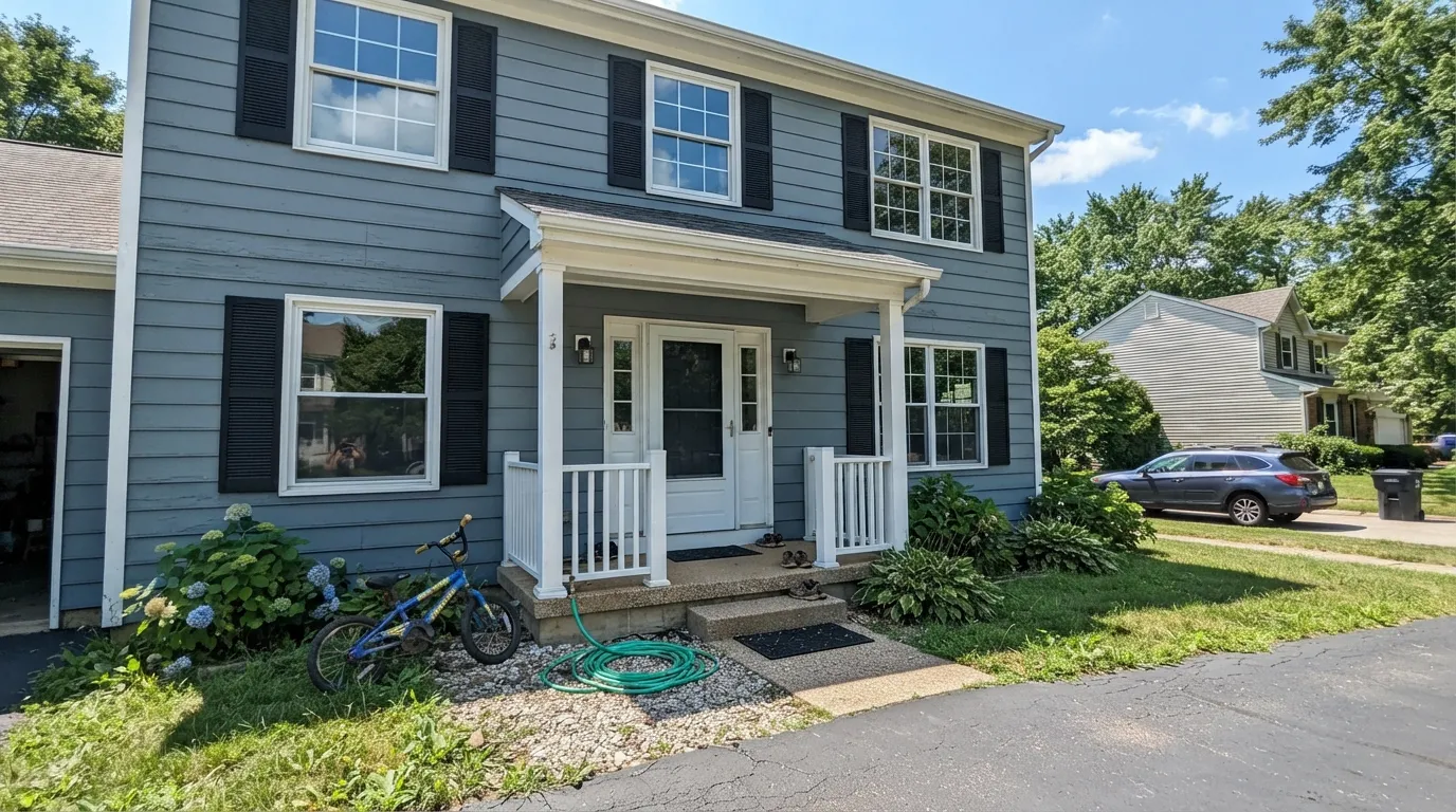
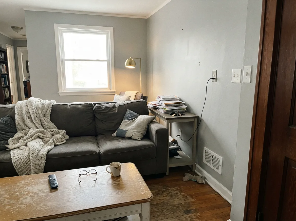
A true gray with a blue undertone that never fully disappears — and a faint green ghost that shows up in shade and shadow. Benjamin Moore's own description, "all-purpose silvery gray," is unusually accurate: unlike its warmer HC-deck cousins (Revere Pewter, Edgecomb Gray), Stonington Gray does not lean beige or tan under any light. It reads as gray in the paint can, gray on the swatch, and gray on the wall. That consistency is the whole reason it became a Benjamin Moore staple rather than a passing trend color.
It belongs to the Historical Collection's HC gray run: Wickham Gray (HC-171, LRV 68) sits a step lighter and softer, Coventry Gray (HC-169) and Chelsea Gray (HC-168) sit darker and moodier, and Stonington Gray (HC-170, LRV 59) holds the middle — light enough for whole-house walls, with enough depth to read as a real color choice rather than an off-white. At LRV 59 it is a genuine mid-tone: not the pale ghost-gray of Classic Gray, not the charcoal of Kendall Charcoal, just a confident medium gray.
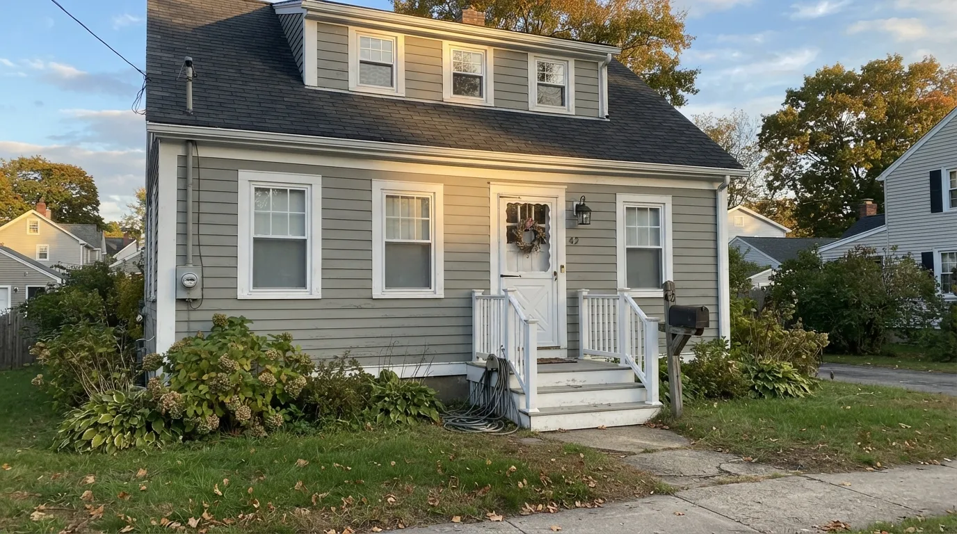
Coventry Gray lives in Benjamin Moore's Historical Colors collection, which tells you something before you even open the can: this is not a color chasing a trend cycle or a Color of the Year headline. It has sat in the deck for decades as a quiet builder default for colonial, craftsman and modern-farmhouse exteriors, and it is still there because it works, not because it went viral. BM's own copy calls it "a steadfast medium gray with relatively neutral undertones" — dependable, unremarkable, safe.
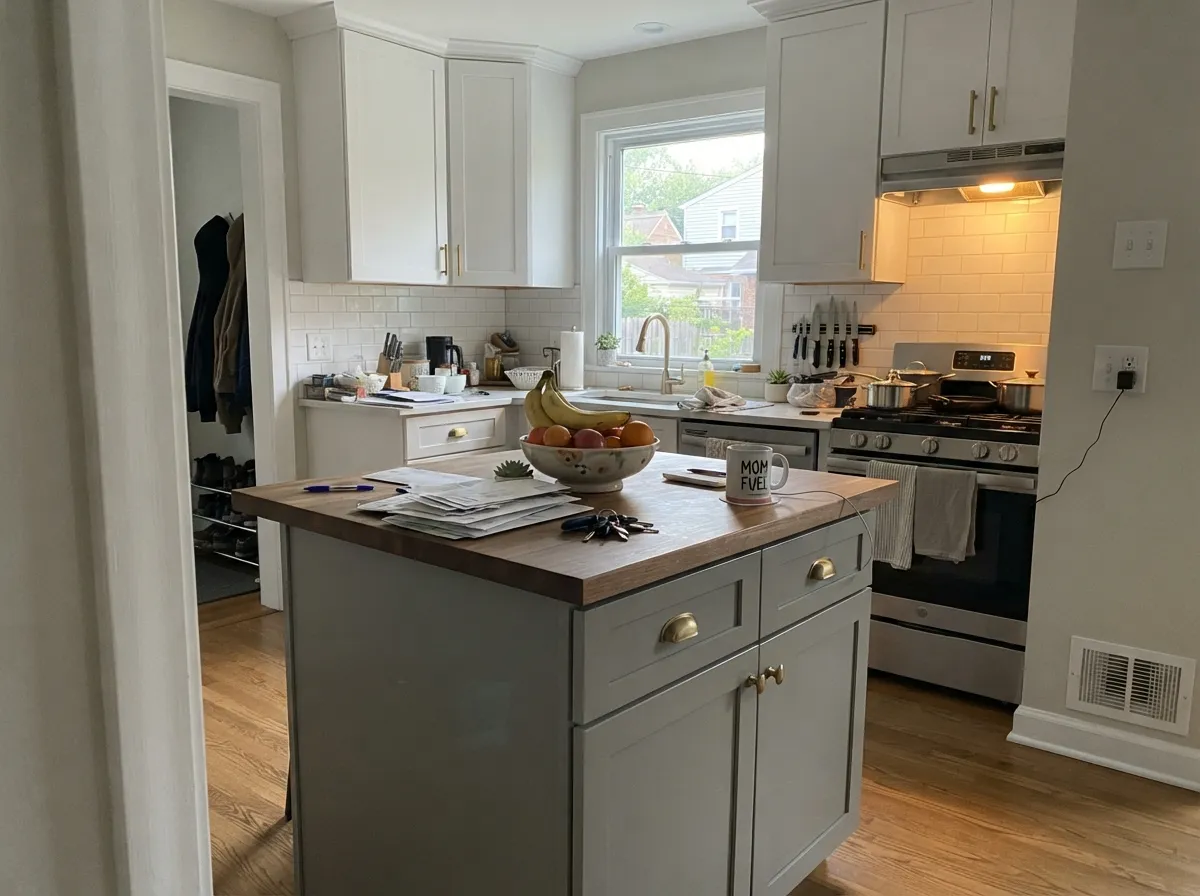
Homeowners and design writers who have actually lived with it tell a more complicated story. Kylie M Interiors describes it as "a stormy gray with sneaky undertones" — fractionally warm on paper but reading cool the moment it goes up, with a small amount of blue or occasionally green surfacing depending on the light. Reddit threads echo the same pattern: one painter reported the color "looked truly gray with a very little hint of blue" on the fan deck, then came back "more blue than expected" once the wall was actually painted. At LRV 48 it is a genuine mid-tone — deeper than a light greige, lighter than a true charcoal — with enough depth to hold that undertone rather than wash it out.
Specs Side by Side
| Spec | Stonington Gray | Coventry Gray |
|---|---|---|
| Brand | Benjamin Moore | Benjamin Moore |
| SKU | HC-170 | HC-169 |
| Hex | #CACBC5 | #B8BAB6 |
| RGB | 202, 203, 197 | 184, 186, 182 |
| LRV | 59 | 48 |
| Undertone | yellow / warm | true neutral |
| Family | Gray | Gray |
How Light Changes Them
The blue calms into a clean, confident silvery gray. This is the light the official swatch photos are shot in.
Cool, blue-toned daylight pushes Stonington Gray's own blue forward — walls can read distinctly slate-blue and cold. Test a big sample first.
A soft blue tint in morning or evening light, a truer gray at midday. Outdoors this reads as pleasant depth through the day.
2700K bulbs warm it just enough to feel cozy rather than cold. Cool white LEDs push it further blue — swap bulbs before you second-guess the paint.
Real afternoon sun settles the undertone and it reads as the composed storm-gray it's known for. The condition it was made to be judged in.
Flat, indirect light is exactly where the cool-blue lean comes forward and owners start describing it as "too blue." Sample big before committing.
Calmer and more neutral at midday sun, cooler and flatter in the low, indirect light of early morning or late afternoon on an east/west exposure.
Warm 2700K lamps pull it toward a settled charcoal-gray at night. Cool white LEDs push the blue right back to the surface — swap the bulbs first.
Both Colors in Real Rooms
Photos from our full reviews — the same rooms and captions, so you can judge each color where it actually lives, not on a chip.
When to Pick Which
Exterior siding and shutters · rooms with real south or west daylight · anyone who wants gray without a hint of beige · coastal, modern-farmhouse and transitional houses
Your room is dim and north-facing · your floors and trim run warm honey oak · you actually wanted a greige, not a gray · your fixtures and stone are warm brass and gold-flecked granite
Colonial, craftsman and modern-farmhouse exteriors · kitchen islands and cabinets under white perimeter cabinetry · accent walls with real south or west light · anyone who wants a gray with some weight, not a pale wash
Your exterior or room faces north with little direct sun · your roof or brick already reads warm-toned · you want a guaranteed zero-undertone-risk gray · your trim or cabinets are a warm cream rather than a true white
No comparison page can see your light. Upload one photo of your room and try both colors on the same walls, seconds apart.
Stonington Gray vs Coventry Gray FAQ
Which is lighter, Stonington Gray or Coventry Gray?
Stonington Gray is lighter: LRV 59 vs 48. Stonington Gray is meaningfully lighter (LRV 59 vs 48). On a wall, Stonington Gray reads light, airy; Coventry Gray reads mid-tone.
Which is warmer, Stonington Gray or Coventry Gray?
Stonington Gray is the warmer of the two (yellow / warm); Coventry Gray reads true neutral.
How similar are Stonington Gray and Coventry Gray?
Stonington Gray and Coventry Gray are very close (ΔE 4.48). The difference shows up most in side-by-side comparison and under specific light. The only reliable test is seeing both in your own room and light — a side-by-side on a screen or chip flattens the difference.
Can I use Stonington Gray and Coventry Gray together in one house?
Not in the same room, and be careful in the same house. At ΔE 4.48 they are so close that two walls in each will read as a tinting mistake, not a design choice. Pick one, or keep them on different floors where they are never seen together.
Ask a Question