Coventry Gray
The blue-leaning gray builders reach for on colonial and farmhouse exteriors, reviewed honestly: the light that turns it storm-blue, the rooms where it just works, and what to pick instead.

Jessica has spec'd whites and neutrals for more than 300 rooms and keeps a sample wall of painted drawdowns in her studio. Every color review is checked against real reader rooms in the comments and re-tested when a formula changes. About the testing process →
The Fast Verdict
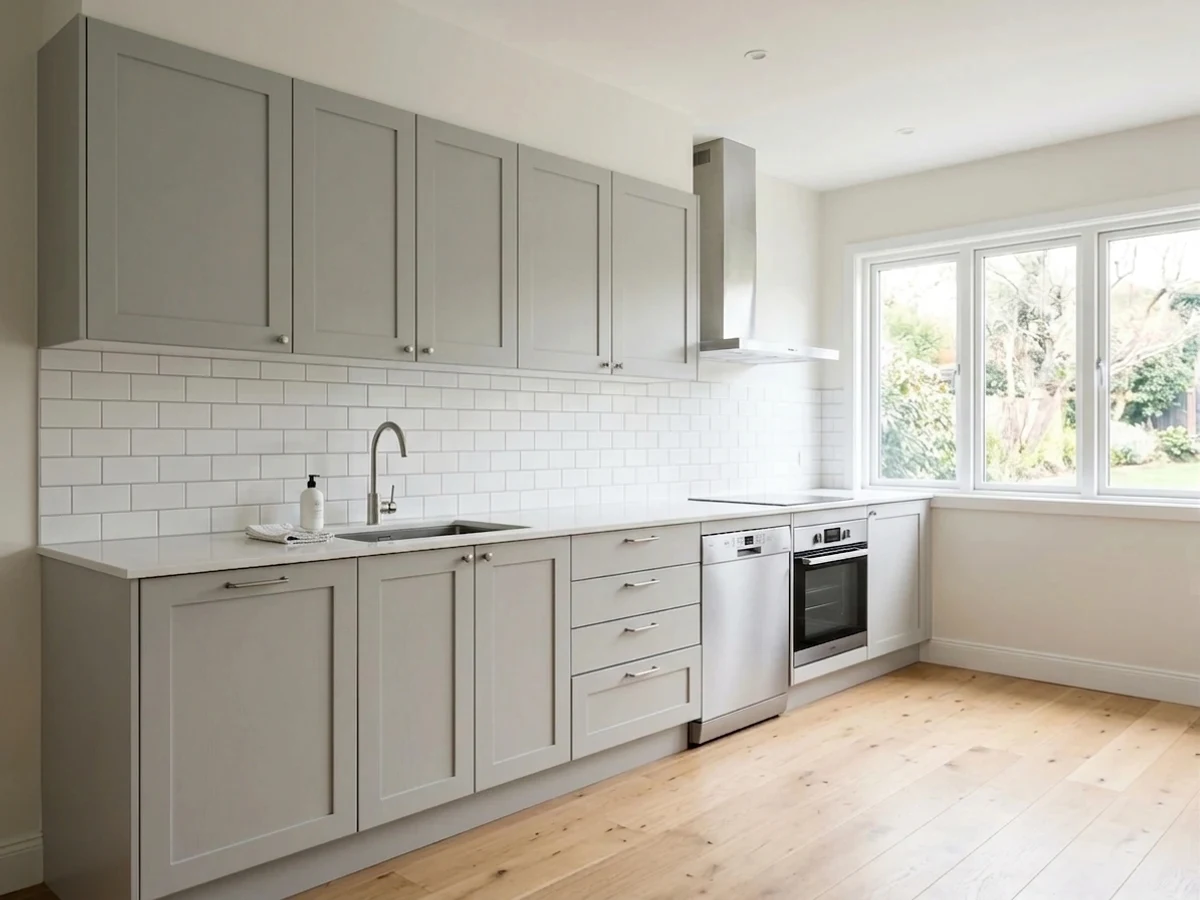
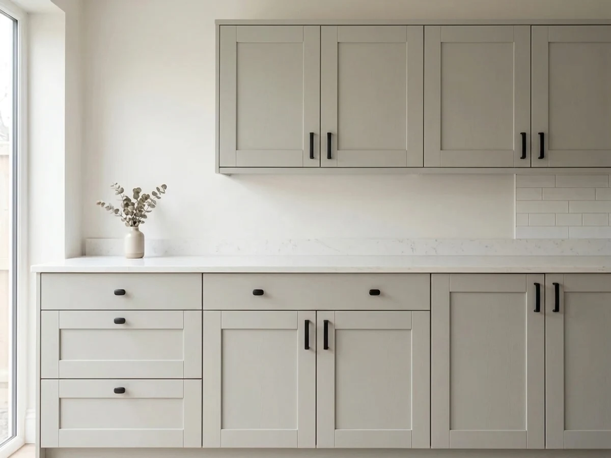
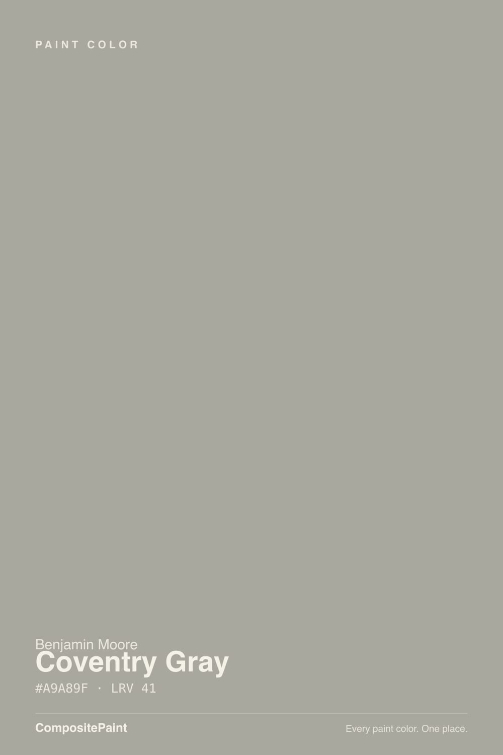
Coventry Gray is Benjamin Moore's own words: "a steadfast medium gray with relatively neutral undertones." Real houses tell a slightly different story. Give it real sun and it reads exactly as advertised — a composed, storm-cloud gray that has quietly anchored colonial and craftsman exteriors for decades. Give it flat or north light and the undertone owners keep reporting shows up: a cool blue lean, occasionally a flash of green, never quite the settled neutral the name promises.
Colonial, craftsman and modern-farmhouse exteriors · kitchen islands and cabinets under white perimeter cabinetry · accent walls with real south or west light · anyone who wants a gray with some weight, not a pale wash
Your exterior or room faces north with little direct sun · your roof or brick already reads warm-toned · you want a guaranteed zero-undertone-risk gray · your trim or cabinets are a warm cream rather than a true white
- A true, sophisticated gray outdoors — decades-proven, not a trend chaser
- A builder and designer default for colonial, craftsman and modern-farmhouse exteriors
- Handsome on kitchen islands and cabinets against true-white perimeter cabinetry
- Deep enough (LRV 48) to hold its color and mood in strong sun
- A Historical Colors classic that isn't trying to go viral
- Undertone drifts cool-blue, occasionally green, depending on light — inconsistent reports across owners
- Goes flat and cold in north-facing or shaded rooms
- Clashes with warm cream or ivory trim and cabinets
- Can read distinctly blue against a warm-toned roof or brick outside — test before committing
What Color Is Coventry Gray, Really?
Coventry Gray lives in Benjamin Moore's Historical Colors collection, which tells you something before you even open the can: this is not a color chasing a trend cycle or a Color of the Year headline. It has sat in the deck for decades as a quiet builder default for colonial, craftsman and modern-farmhouse exteriors, and it is still there because it works, not because it went viral. BM's own copy calls it "a steadfast medium gray with relatively neutral undertones" — dependable, unremarkable, safe.
Homeowners and design writers who have actually lived with it tell a more complicated story. Kylie M Interiors describes it as "a stormy gray with sneaky undertones" — fractionally warm on paper but reading cool the moment it goes up, with a small amount of blue or occasionally green surfacing depending on the light. Reddit threads echo the same pattern: one painter reported the color "looked truly gray with a very little hint of blue" on the fan deck, then came back "more blue than expected" once the wall was actually painted. At LRV 48 it is a genuine mid-tone — deeper than a light greige, lighter than a true charcoal — with enough depth to hold that undertone rather than wash it out.
Undertone in one line: relatively neutral gray with a real cool-blue lean, and an occasional flash of green in certain light. If your sample reads distinctly blue outdoors, that is not a bad batch — it is the color doing what owners consistently report it does in flat or north-facing light.
Where It Shines
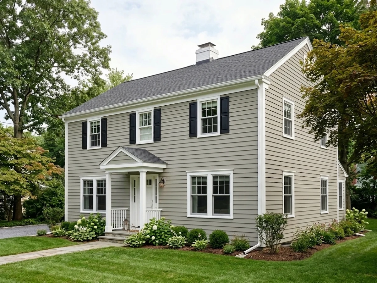
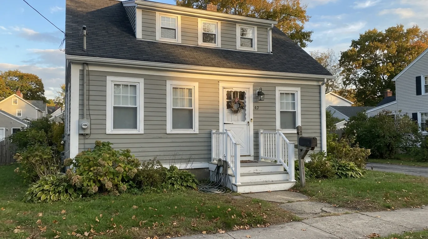
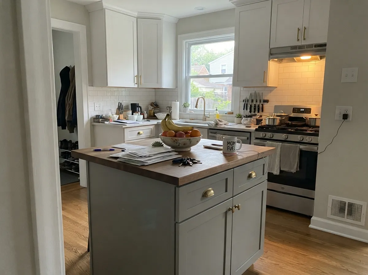
Real, direct sun is what settles the undertone question in Coventry Gray's favor. In south- or west-facing light it balances out and reads as the composed, sophisticated storm-gray that has made it a go-to exterior color for colonial, craftsman and modern-farmhouse homes for years — the kind of pick that shows up in gallery after gallery without anyone hyping it. Its second home is smaller-scale: a kitchen island under white perimeter cabinets, or a single accent wall, where its depth and quiet mood read as a deliberate design choice rather than a whole-house commitment.
Where It Fails
Almost every disappointed report about Coventry Gray traces back to one of three predictable situations. None of them are the paint failing — they are the color's honest reaction to light and neighboring color it was never going to hide from.
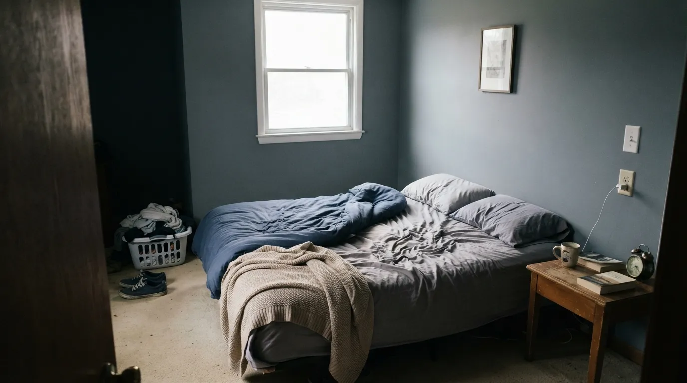
North light and flat, indirect exposure are exactly where the blue comes forward and the color goes cold — Kylie M Interiors calls out "flat eastern afternoon or western morning light" specifically as the setting where Coventry Gray's storminess leaves it "a little lacking." If your space runs cool and dim, sample first or step toward a calmer neutral like Stonington Gray.
Coventry Gray needs a true white to play off of. Against a warm cream, its cool lean gets exaggerated — reviewers note it "comes up pretty cold against the yellow hue" when paired with warm-toned cabinetry. Use White Dove or Chantilly Lace, not an ivory or antique white, for trim and neighboring cabinets.
Outdoors, the color has no controlled lighting to hide behind. Homeowners comparing siding options have specifically flagged Coventry Gray "reading baby blue outside" against certain roof colors — usually a warm brown or red-brown roof pushing the siding cooler by contrast. Test the largest sample you can find against your actual roof and brick before ordering gallons.
Room by Room
With real sun and a roof/brick that doesn't fight it, Coventry Gray is a decades-proven colonial and craftsman exterior color. Satin or low-sheen finish; White Dove or Chantilly Lace trim keeps it from reading cold.
Under true-white perimeter cabinets it reads sophisticated, not gray-and-gloomy. Satin cabinet enamel; keep the surrounding whites true, never cream, for the same reason trim needs a true white.
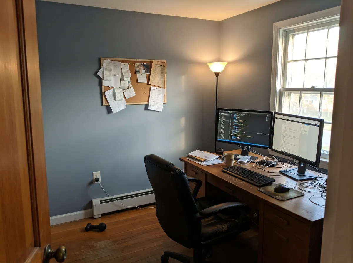
In a south- or west-lit room it lands as a confident storm-gray statement wall. Check the exposure before committing — this is not a color to guess at from the chip alone.
Same rules as an accent wall: real daylight settles the undertone, flat or indirect light lets the blue take over. Worth a big sample taped up through a full day before painting.
South or west exposure with warm lamps at night: calm and grounded. North-facing and dim: expect the flat, cool read that shows up in the complaint threads.
Because the undertone shifts with light direction, a whole open floor plan can show two or three different versions of the same gray room to room. Better as an intentional accent than a default whole-house wash.
Your Light Is the Risk
Real afternoon sun settles the undertone and it reads as the composed storm-gray it's known for. The condition it was made to be judged in.
Flat, indirect light is exactly where the cool-blue lean comes forward and owners start describing it as "too blue." Sample big before committing.
Calmer and more neutral at midday sun, cooler and flatter in the low, indirect light of early morning or late afternoon on an east/west exposure.
Warm 2700K lamps pull it toward a settled charcoal-gray at night. Cool white LEDs push the blue right back to the surface — swap the bulbs first.
Most complaints about Coventry Gray are a light mismatch. Upload a photo of your actual room and see it on your walls — then ask for the same wall in north light or evening lamps before you buy a single sample.
Need It From Another Brand?
Any paint counter can custom-tint Benjamin Moore HC-169 directly. If you would rather stay in one brand's own deck, these are the closest stock matches, measured as ΔE2000. Under 2 is a difference you will not see on the wall.
| Brand | Closest color | ΔE | LRV | |
|---|---|---|---|---|
| Sherwin-Williams | March WindSW 7668 · Sherwin-Williams | 1.8 | 49 | Color page → |
| Behr | Classic SilverPPU18-11 · Behr | 1.0 | 48 | Color page → |
| Valspar | Granite Dust5006-1C · Valspar | 1.5 | 48.1 | Color page → |
| PPG / Glidden | Pigeon FeatherPPG0995-4 · PPG / Glidden | 1.3 | 48 | Color page → |
| Glidden | Fresh GranitePPG0997-3 · Glidden | 1.0 | 49 | Color page → |
| Dutch Boy | Fair-Minded Gray438-3DB · Dutch Boy | 0.5 | 49 | Color page → |
Similar Benjamin Moore Colors
The nearest shades to Coventry Gray within Benjamin Moore's own range, ranked by perceptual color distance — useful when you want the same look a touch lighter, darker, or warmer.
WCAG 2.1: AA is 4.5 : 1 for normal text, 3 : 1 for large text, AAA is 7 : 1.
Coventry Gray vs the Colors You're Also Considering
Every Coventry Gray sample board has the same rivals on it. The numbers show the real lightness gap — then it comes down to which risk you would rather live with.
Pick this for the deeper, moodier presence Stonington Gray's lighter LRV can't reach — Coventry Gray holds its color where Stonington fades toward pale.
Benjamin Moore HC-170 · LRV 59Stonington GrayPick this if you want a true gray that stays put in any light — Stonington Gray is the calmer, more consistent version, without Coventry Gray's blue flash.
Side-by-side comparison →Pick this for the cooler, more classically "gray" read — Chelsea Gray leans warm and reads noticeably darker.
Benjamin Moore HC-168 · LRV 22Chelsea GrayPick this for a deeper charcoal-greige on the same island or exterior job — warmer and browner, with none of the blue risk.
Pick this for the deeper, more saturated blue-gray — Light French Gray is lighter and quieter by comparison.
Sherwin-Williams SW 55 · LRV 53Light French GrayPick this if you work in Sherwin-Williams and want the truest gray in that deck — it flashes violet in cool light rather than blue.
The comparison people make most is with Stonington Gray HC-170. Stonington sits at LRV 59 against Coventry's 41, so it is a full step lighter, reading as a pale gray that keeps small rooms bright. Coventry Gray is the same idea with more weight; choose it when Stonington washes out in a sun-filled room or when you want visible contrast with white trim. Many homes use both: Stonington in halls and bedrooms, Coventry in the dining room or office.
Within the brand, Platinum Gray HC-179 at LRV 40 is nearly the same depth but a touch greener and cooler on the wall, a subtle difference you will only catch side by side. Sabre Gray 1482 at LRV 38 runs slightly darker and leans a bit more green, which suits rooms with lots of natural material like stone or slate. If you want the most middle-of-the-road option of the three, Coventry Gray is it.
Coventry Gray Coordinating Colors
The rule for coordinating with Coventry Gray: keep trim and neighboring whites true, not warm-cream, and don't be afraid of a confident dark accent — its own reserve pairs well with near-black shutters and doors. These are the partners that show up again and again in exteriors and kitchens that work:
Coventry Gray's Quiet Reputation: A Historical Colors Staple, Not a Trend
Coventry Gray lives in Benjamin Moore's Historical Colors collection, and it has never chased Color of the Year status — it hasn't needed to. It has been a builder and designer default for colonial, craftsman and modern-farmhouse exteriors for years, the kind of color that shows up in gallery after gallery without anyone hyping it, next to a listing that just says "exterior body: Coventry Gray" and moves on.
Its online reputation is honest rather than glamorous. Design writers describe it as a "stormy gray with sneaky undertones," and homeowner threads confirm the same pattern over and over: someone samples it expecting a settled neutral, then reports back that the wall or the siding "looked truly gray... but more blue than expected" once it actually went up. That is not a defect so much as the color's whole personality — steady in name, quietly cool-leaning in practice.
Coventry Gray With Brick, Stone and Roof Color
Exterior use is where Coventry Gray earns its keep, and also where the undertone question matters most, because outdoors you can't control the light the way you can indoors with lamps and paint sheen. With cool-toned roofing — charcoal or slate-gray asphalt — and stone or brick that reads gray or brown-neutral, the blue lean recedes and the house looks composed and put-together.
Warm-toned roofing is the situation to sample first. Homeowners comparing siding options have specifically reported Coventry Gray reading distinctly blue against a warm brown or red-brown roof, even when it looked neutral on the fan deck. Brick is usually forgiving unless it's a strongly orange or red brick, which will push the gray cooler by contrast. Bring the largest sample board you can find outside and hold it next to your actual roof and brick — not just the siding — before ordering gallons.
Three Ready Palettes Built on Coventry Gray
A color is never alone on the wall. These are complete combinations in the 60-30-10 pattern, with the reason each one holds together. Every one opens in the visualizer.
The pairing Benjamin Moore's own exterior galleries keep repeating: a warm true-white trim keeps Coventry Gray from reading cold, and Kendall Charcoal gives the one confident dark note without going stark black.
Try this palette in your roomCrisp Chantilly Lace perimeter cabinets keep Coventry Gray's cool lean from taking over the room; a Wrought Iron pantry door adds one grounding near-black note that brass or black hardware can pick up.
Try this palette in your roomPale Oak's warm neutral keeps the rest of the room from feeling cold, so a single Coventry Gray wall reads as an intentional accent instead of the whole room's mood. White Dove overhead keeps the ceiling soft.
Try this palette in your roomCoventry Gray FAQ
Is Coventry Gray a true gray or does it lean blue?
Benjamin Moore calls it relatively neutral, but real rooms tell a cooler story: it carries a genuine blue lean, with an occasional flash of green, that comes forward in flat or indirect light. In strong direct sun it settles down and reads as a true, composed gray. If you want zero undertone risk, Stonington Gray is the calmer choice.
Is Coventry Gray a good exterior color?
Yes — it's one of Benjamin Moore's most-used exterior grays for colonial, craftsman and modern-farmhouse homes. It needs real sun and the right roof and brick to look its best; a warm-toned roof can push it toward looking too blue, so test a large sample against your actual roof before ordering gallons.
What trim color goes with Coventry Gray?
A true white — White Dove or Chantilly Lace — not a warm cream or ivory. Coventry Gray's cool lean gets exaggerated next to warm whites, which is one of the most common pairing mistakes with this color.
Does it work on kitchen cabinets or an island?
Yes, especially on an island under true-white perimeter cabinets — it's one of its most reliable second jobs. Use satin or semi-gloss cabinet enamel, and keep the surrounding cabinetry a true white rather than cream for the same reason trim needs one.
How dark is Coventry Gray really?
At LRV 48 it's a genuine mid-tone — noticeably deeper than light greiges like Repose Gray or Agreeable Gray, and lighter than a true charcoal like Kendall Charcoal. Expect a wall or exterior that reads clearly gray, not a pale wash.
Is Coventry Gray good for a north-facing room?
Proceed carefully. North light and flat, indirect exposure are exactly where owners report the color going cold and distinctly blue. Sample a large board on the actual wall through a full day before committing a whole room.
Have you painted with Coventry Gray?
Rate it — one tap helps the next reader decide.
Ask a Question