Metropolitan
Benjamin Moore's 2019 Color of the Year, reviewed honestly: the rare gray with no undertone surprise, the depth buyers keep underestimating, and what to pick instead.

Jessica has spec'd whites and neutrals for more than 300 rooms and keeps a sample wall of painted drawdowns in her studio. Every color review is checked against real reader rooms in the comments and re-tested when a formula changes. About the testing process →
The Fast Verdict
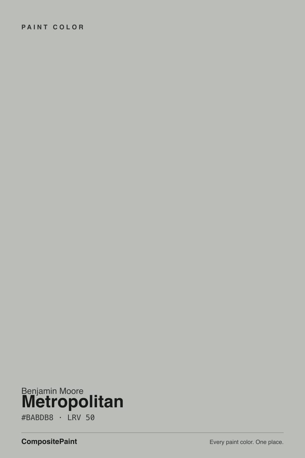
Metropolitan is the gray you pick when you are tired of grays that turn out to be something else. Measured, its color content is almost nothing — a faint green-yellow lean and nothing more — so it does not flash violet, does not go beige, does not surprise you in month three.
The catch is depth: at LRV 50 this is a genuine mid-tone, and the chip in the store looks a full step lighter than four walls of it will.
Bedrooms, closets and offices that get real light · kitchen cabinets and islands · anyone burned by a gray that turned violet or beige · modern rooms with white trim and black metal
The room is dim or north-facing with no lamps · you actually wanted a light gray · your floors are honey oak · the whole house runs on cool 4000K LEDs
- A near-true gray — no violet flash, no beige drift
- Chrome, nickel and matte black hardware all work against it
- Mid-tone depth hides scuffs and handprints on cabinets and closets
- Does not fight cool stone, quartz or white tile
- Famous enough to be easy to match, quiet enough to age well
- Reads a full step darker than the chip suggests
- No warmth in reserve — dim rooms turn it to wet concrete
- Clashes with honey oak and golden builder finishes
- Cool 4000K LEDs push it noticeably blue at night
What Color Is Metropolitan, Really?
A mid-tone gray with almost no color in it — and that emptiness is the entire product. Measured on the Munsell system Metropolitan sits in the green-yellow family at a chroma of roughly 0.3, which is about as close to zero as a commercial paint color gets. In plain language: there is a faint green tilt keeping it from reading icy, and beyond that there is nothing for your room to grab and exaggerate. That is why it does not do the violet flash that catches out Repose Gray owners and does not slide into greige the way Agreeable Gray does in warm light.
Benjamin Moore named it Color of the Year for 2019 and filed it in the Affinity collection, its harmony-engineered deck. The COTY announcement landed badly with the design press — this was the peak of gray fatigue, and reviewers called it unassuming, a supporting player, about as non-controversial as a color can be. They were right about the timing and wrong about the paint. Seven years on, the loud 2019 alternatives look dated and Metropolitan still looks like a wall.
Undertone in one line: a faint green-gray, never violet, never beige. If your sample reads distinctly blue, the room is dim or the bulbs are cool; if it reads slightly green, that is the real color showing up in good daylight. Both readings are the same paint being honest about your light.
Where It Shines
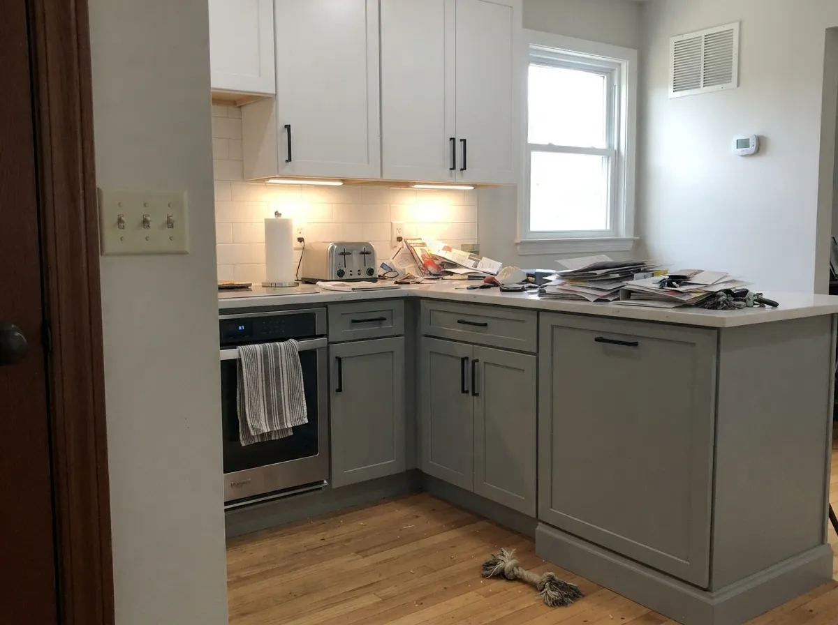
Give it real light and it does the one thing most grays cannot: it stays the color you chose. That makes it the safe pick for rooms where a surprise undertone would be expensive — a whole bedroom, a run of kitchen cabinets, a closet full of built-ins. It is also unusually good company for hardware. Chrome, brushed nickel and matte black all sit cleanly against it, which is not true of warm grays, and a mid gray at LRV 50 hides fingerprints and shoe scuffs that a light gray would broadcast.
Where It Fails
The complaints about Metropolitan are remarkably consistent, and none of them are about undertones — which tells you the paint is doing its job. All three are about depth and light, and all three are predictable before you open the can.
This is the number-one surprise. On a small chip under store lighting it passes for light; at LRV 50 it is a true mid-tone, and four walls read a full step darker than the sample did. If the plan in your head was airy, you want Stonington Gray at LRV 59 instead — same honest gray, meaningfully lighter.
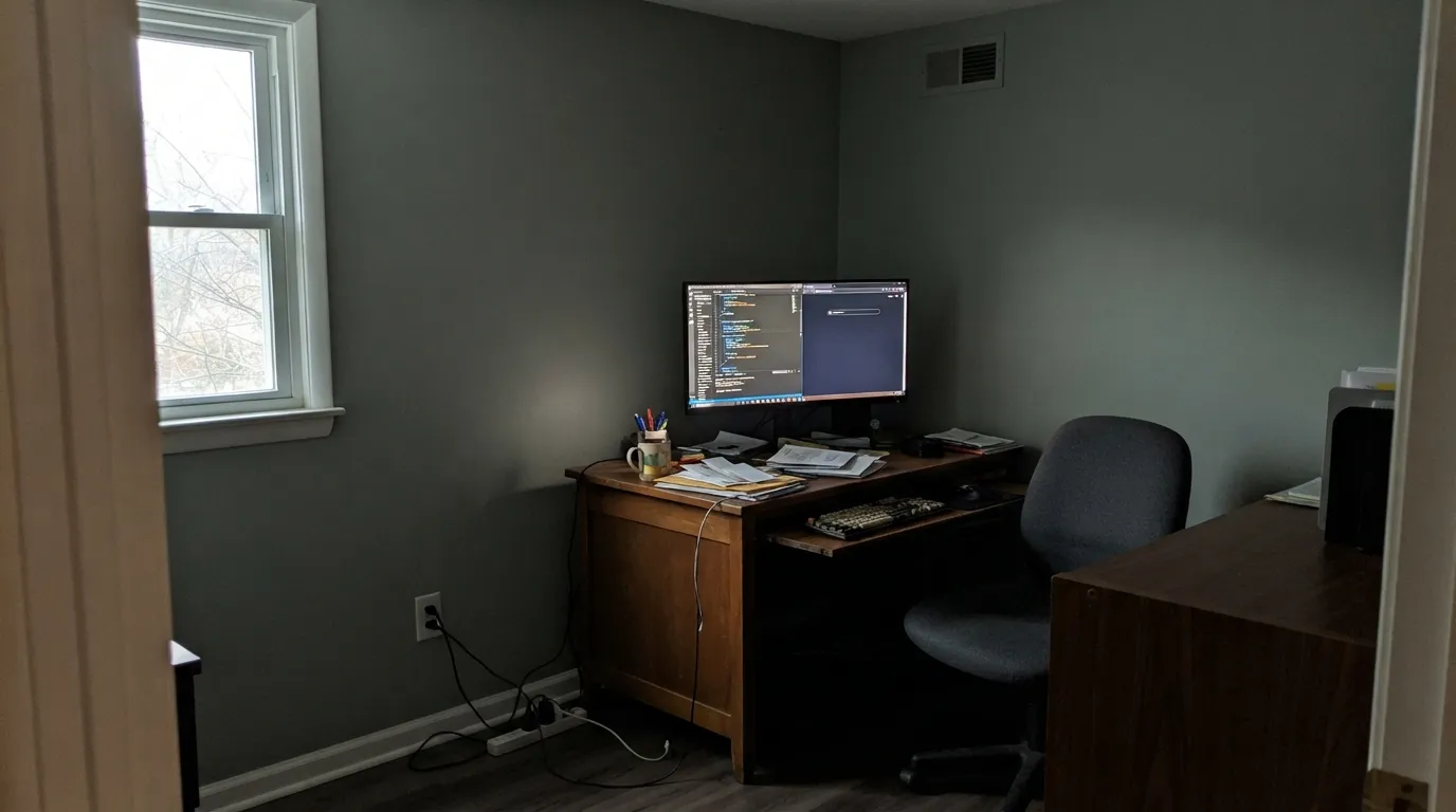
Low chroma is a blessing in good light and a problem in bad light. A greige has warmth to fall back on when the sun goes; Metropolitan has nothing in reserve, so a dim north room flattens it to wet concrete. Readers describe it as cold and dead. Add lamps or pick a warmer neutral — this color cannot rescue a dark room.
A neutral gray sits directly opposite orange, so builder honey oak, orange-stained trim and golden beige carpet all push each other. The floor goes more orange and the walls go dingy against it. Walnut, white oak and gray-washed floors are fine; with wall-to-wall honey oak, choose a greige and stop fighting the floor.
Room by Room
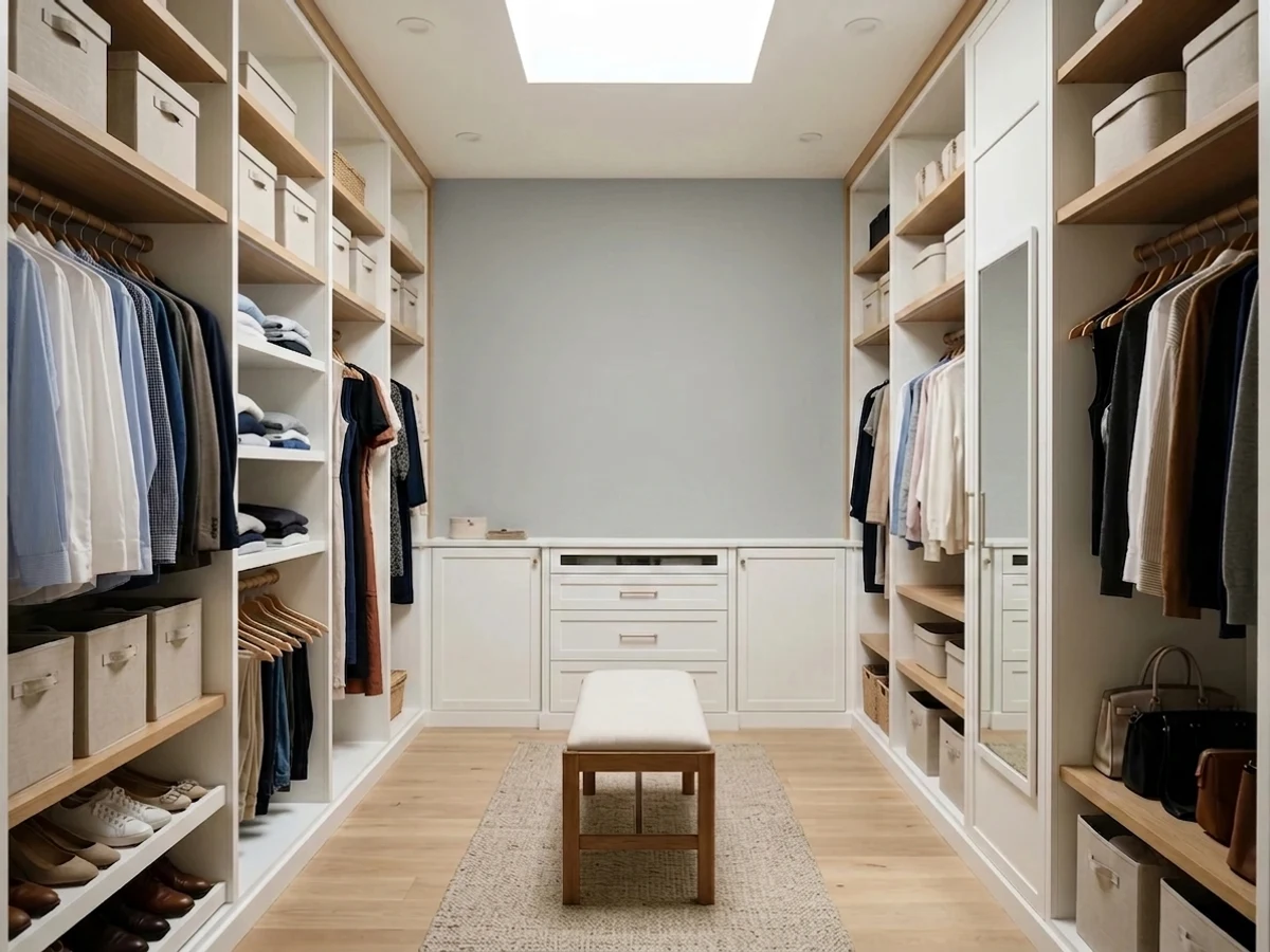
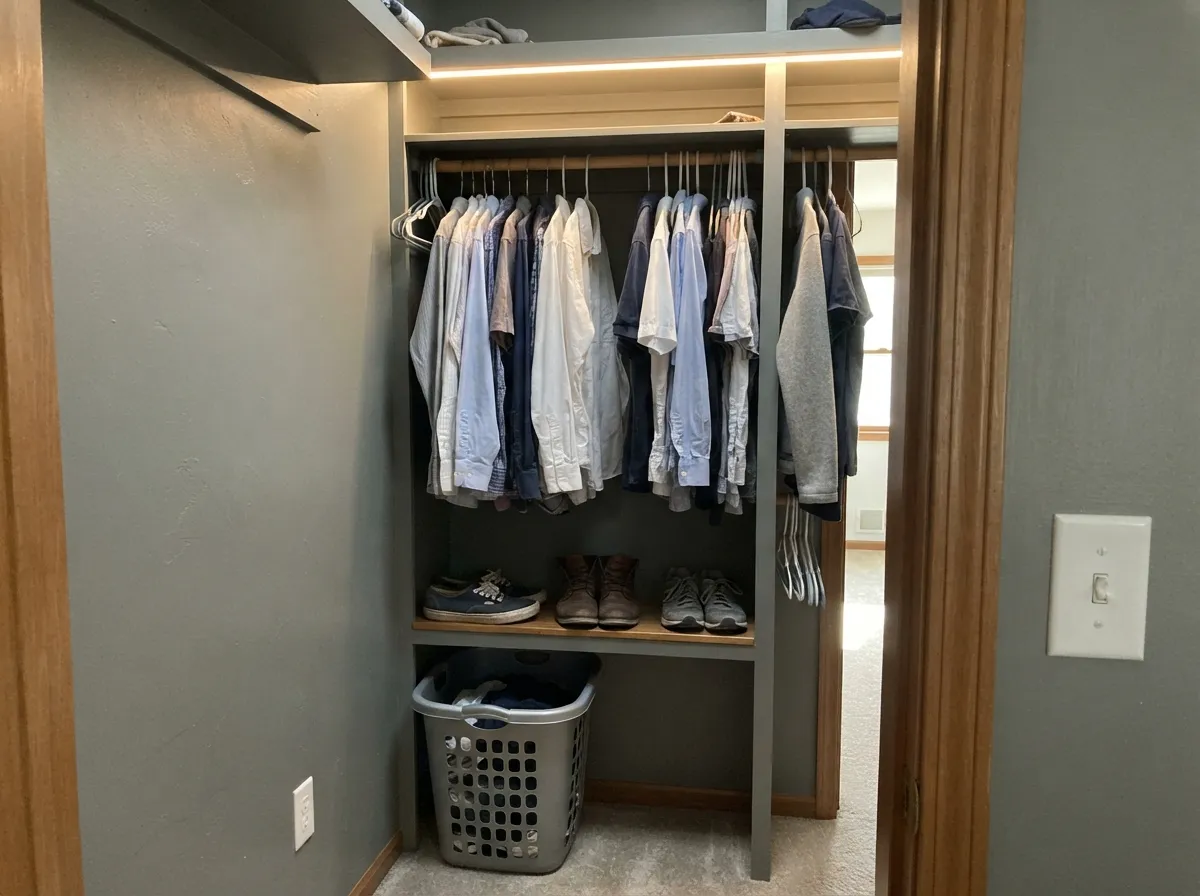
A mid gray on closet walls and built-ins is the trick that makes a hallway closet look custom: clothes read as clothes instead of visual noise, and the depth hides shoe scuffs along the baseboard. Satin on the built-ins, and put real light in there — a windowless closet on one dim bulb is exactly where this color falls flat.
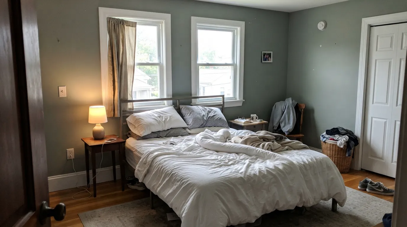
Calm without being cold, and low enough in chroma that bedding, wood and art all read true against it. Eggshell walls, crisp white trim, 2700K bulbs. In a north-facing bedroom that never gets sun, step lighter or step warmer.
This is where the neutrality pays. Metropolitan cabinets do not argue with quartz, they take chrome, nickel or matte black hardware equally, and a mid gray hides the daily handprints around the pulls. Satin urethane-fortified cabinet enamel; lowers in gray with white uppers is the safest version.
In a room with real windows it is a genuinely good backdrop for art and wood. In a closed, north-facing living room it goes flat and takes the room with it. Test a large sample on the darkest wall, not the sunniest one.
Excellent with white tile, marble and chrome, and one of the few grays that does not fight cool stone. Watch the vanity bulbs: cool LEDs over the mirror will push the walls distinctly blue after dark.
Full sun lightens it and brings the green forward, so a whole house in Metropolitan can look slightly washed unless you frame it with a genuinely dark trim. It works, but Platinum Gray at LRV 40 holds up better outdoors. Keep this one inside unless you have seen it on a facade you like.
Your Light Is the Risk
The faint green lean surfaces just enough to keep it from going icy. This is the read the color was designed for.
Nothing warm to fall back on. Cool grey daylight flattens it to wet concrete and the room feels colder than it is.
Cool and faintly blue in the morning, softly green-gray by late afternoon. A gentle swing — low chroma keeps it small.
2700K lamps settle it into a soft putty gray. 4000K LEDs turn it hard and blue — bulb choice matters more here than paint.
Most complaints about Metropolitan are a light mismatch. Upload a photo of your actual room and see it on your walls — then ask for the same wall in north light or evening lamps before you buy a single sample.
Need It From Another Brand?
Any paint counter can custom-tint Benjamin Moore AF-690 directly. If you would rather stay in one brand's own deck, these are the closest stock matches, measured as ΔE2000. Under 2 is a difference you will not see on the wall.
| Brand | Closest color | ΔE | LRV | |
|---|---|---|---|---|
| Sherwin-Williams | ArgosSW 7065 · Sherwin-Williams | 1.5 | 51 | Color page → |
| Behr | Quiet TimeT18-19 · Behr | 0.7 | 50 | Color page → |
| Valspar | Adieu8004-34C · Valspar | 3.2 | 52 | Color page → |
| PPG / Glidden | Half DomePPG0994-3 · PPG / Glidden | 1.2 | 50 | Color page → |
| Glidden | SolsticePPG1010-3 · Glidden | 0.0 | 50 | Color page → |
| Dutch Boy | Fair-Minded Gray438-3DB · Dutch Boy | 1.4 | 49 | Color page → |
Similar Benjamin Moore Colors
The nearest shades to Metropolitan within Benjamin Moore's own range, ranked by perceptual color distance — useful when you want the same look a touch lighter, darker, or warmer.
WCAG 2.1: AA is 4.5 : 1 for normal text, 3 : 1 for large text, AAA is 7 : 1.
Metropolitan vs the Colors You're Also Considering
Every Metropolitan sample board has the same rivals on it. The numbers show the real lightness gap — then it comes down to which risk you would rather live with.
Pick this when you want the gray to be a color in the room, not just a lighter wall.
Benjamin Moore HC-170 · LRV 59Stonington GrayPick this if you wanted light — same refusal to turn greige, nine LRV points brighter, and the safer bet in a dim room.
Pick this if you want the neutrality without the blue streak Coventry never quite admits to.
Benjamin Moore HC-169 · LRV 41Coventry GrayPick this for real weight — cabinets, islands and studies that should read deliberately gray.
Metropolitan Coordinating Colors
Coordinating with Metropolitan is easier than with most grays for one reason: there is almost no undertone to accommodate. It sits comfortably beside crisp whites, other honest grays, and deep anchors — and it stays out of the way of whatever wood and metal you already own. These are the partners that keep showing up in rooms that work:
The Color of the Year Nobody Cheered For
Benjamin Moore named Metropolitan its Color of the Year for 2019, and the design press was unimpressed. The announcement landed at the exact moment the industry had decided it was done with gray, and the reviews said so: unassuming, a supporting player, about as non-controversial as a color can be, one designer simply writing that she was bored. Other brands were putting out corals and blues that year. Benjamin Moore put out a gray with almost no color in it, and the room read that as a lack of nerve.
The criticism was about timing, not about the paint. A Color of the Year is a marketing event, and a quiet near-neutral makes a terrible headline — but it makes a very good wall. The bolder 2019 picks now date a room to the year they were announced. Metropolitan does not, because there is nothing in it to date. Its home in the Affinity collection is the tell: that deck was built so any two colors in it sit together, and Metropolitan is the piece the rest of the collection leans against.
The practical takeaway for a buyer in 2026: pick this color for what it does in your room, not because it once won a title, and ignore both the hype and the backlash. It is a well-built neutral gray with one demand — give it light.
Metropolitan With Wood Tones, Floors and Metals
Wood is where a gray either works or does not, and Metropolitan is fussier than a greige. Walnut and espresso are excellent — the dark red-brown gives the wall something to be quiet against. Pale white oak and gray-washed floors are the easy modern pairing and probably its best-looking combination. Cool gray LVP, which makes warm whites look yellow, is completely safe here.
The honest no is golden. Builder honey oak floors, orange-stained trim, and yellow-beige carpet all sit opposite a neutral gray on the wheel, so each side pushes the other: the floor looks more orange, the walls look dingier. A large rug helps in a bedroom; it does not help in a hallway or a kitchen. If the honey oak is staying, this is not the color, and no sheen or second coat will change that.
Metals are the easy part, and one of the real reasons to choose it. Polished chrome, brushed nickel, matte black and stainless all read cleanly against Metropolitan, which is not true of warm grays, where chrome goes cold and blue. Unlacquered brass is the only one worth testing first — it looks handsome but pulls the wall a shade cooler by contrast.
Three Ready Palettes Built on Metropolitan
A color is never alone on the wall. These are complete combinations in the 60-30-10 pattern, with the reason each one holds together. Every one opens in the visualizer.
Mid gray on the walls and shelving lets clothing read as the color in the room. Chantilly Lace overhead keeps a windowless space from closing in — a creamy white would yellow under LED strip lighting — and the charcoal drawer bank gives the eye somewhere to land.
Try this palette in your roomA three-step ladder from near-white to mid gray reads intentional rather than two-toned. Silver Satin is quiet enough that the cabinets stay the event, and Chantilly Lace uppers keep the ceiling line from dropping in a kitchen with standard-height cabinets.
Try this palette in your roomMetropolitan's faint green tilt is what makes a muted sage the natural accent instead of a random pop — the two share a family, so the room reads tonal. Silver Satin trim softens the edge where a bright white would cut the wall into panels.
Try this palette in your roomMetropolitan FAQ
Is Metropolitan warm or cool?
Cool-neutral, but barely either. Its measured color content is close to zero with a faint green-yellow tilt, so it reads cool next to a beige and neutral next to a blue. In good daylight the green keeps it from feeling icy; in dim or cool-LED light it drifts cooler and can look faintly blue.
Is Metropolitan too dark for a small room or a closet?
It is darker than most people expect — LRV 50 is a true mid-tone — but small rooms are not the problem, dim rooms are. A small closet with good LED lighting looks custom and expensive in Metropolitan. A small closet on one weak bulb looks like a basement. Fix the light before you judge the color.
What trim white goes with Metropolitan?
A crisp neutral white. Chantilly Lace is the sharpest partner and Silver Satin is the softer one if you want less contrast. Creamy whites like White Dove are the common mistake: against a near-neutral gray, the cream reads as a yellow line around the room rather than as warmth.
Does Metropolitan look blue or green on the wall?
Both, mildly, depending on the light — and it is the same paint. Bright daylight brings out the faint green; dim rooms and cool bulbs pull it toward blue-gray. What it does not do is flash violet or slide into greige, which is exactly why designers keep reaching for it after a bad experience with another gray.
Can I use it on kitchen cabinets?
Yes — this is one of its strongest uses. It does not fight quartz or marble, it takes chrome, nickel and matte black hardware equally well, and mid-tone depth hides the handprints that show on a light gray. Use a satin urethane-fortified cabinet enamel, and lowers-in-gray with white uppers is the lower-risk version.
Is gray dated — will I regret this in five years?
Trend gray dated; this one is a different thing. The 2010s grays that look tired now were mostly blue-grays and cool greiges with enough color in them to timestamp a room. Metropolitan is near-neutral, which is what lets it sit behind whatever furniture and wood you own next. It is a low-drama repaint risk, closer to a white than to an accent color.
Have you painted with Metropolitan?
Rate it — one tap helps the next reader decide.
Ask a Question