Beach Glass
The blue-green-gray chameleon everyone wants for a spa bathroom, reviewed honestly: how hard it swings between blue, green and gray — and the light that turns it into neither.

Jessica has spec'd whites and neutrals for more than 300 rooms and keeps a sample wall of painted drawdowns in her studio. Every color review is checked against real reader rooms in the comments and re-tested when a formula changes. About the testing process →
The Fast Verdict
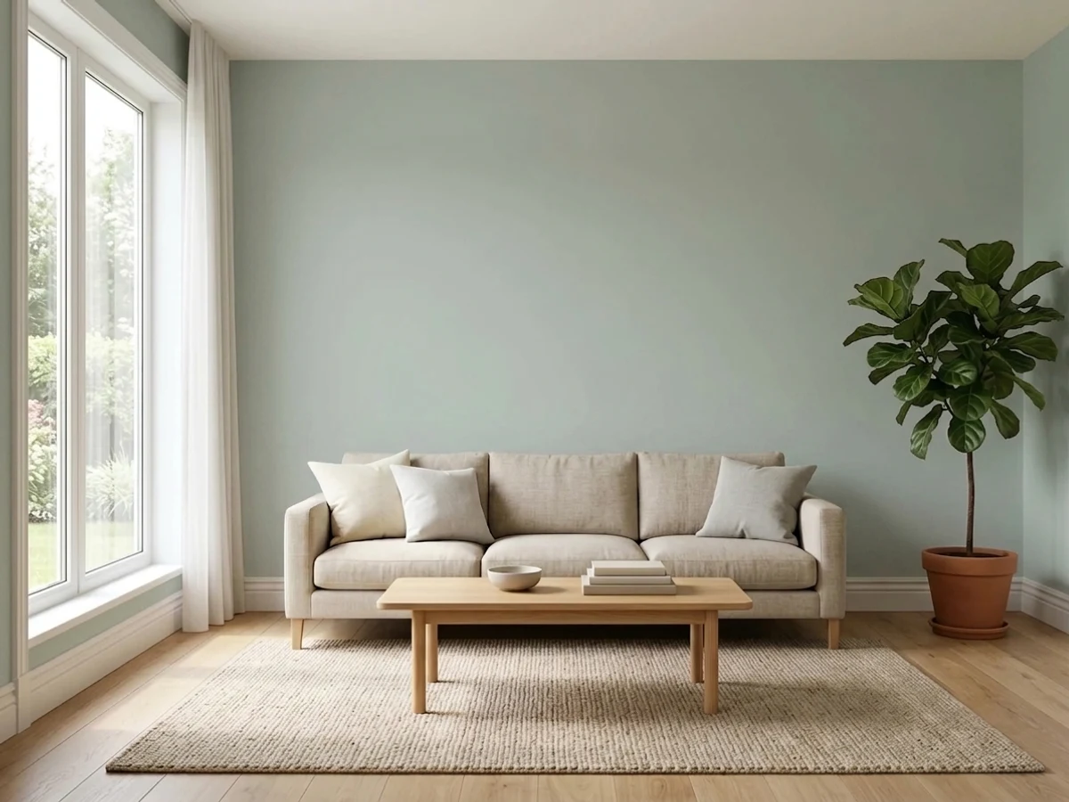
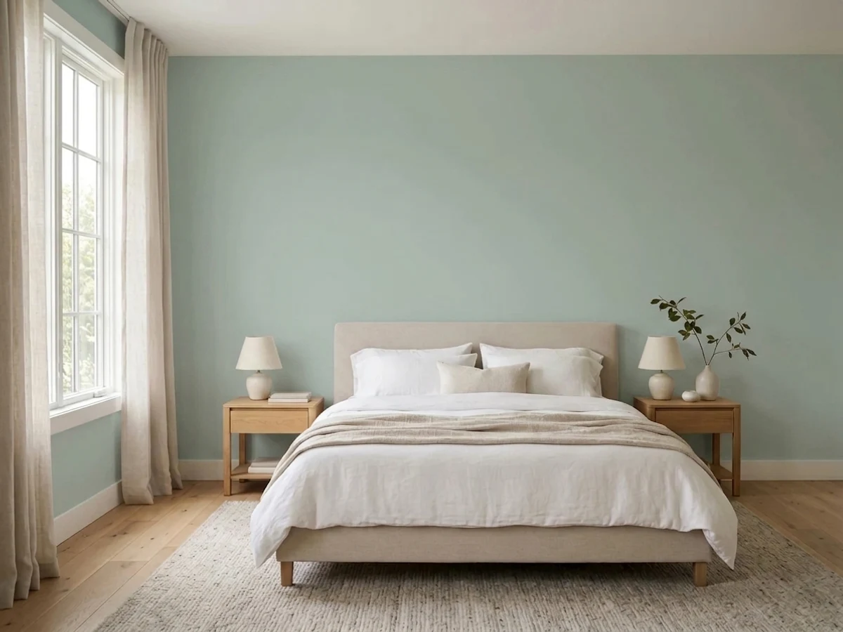
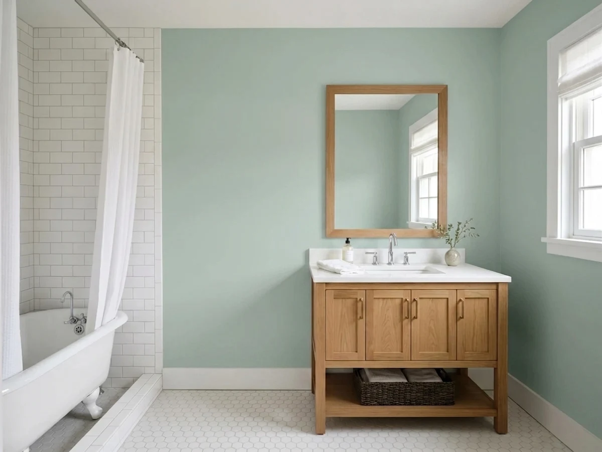
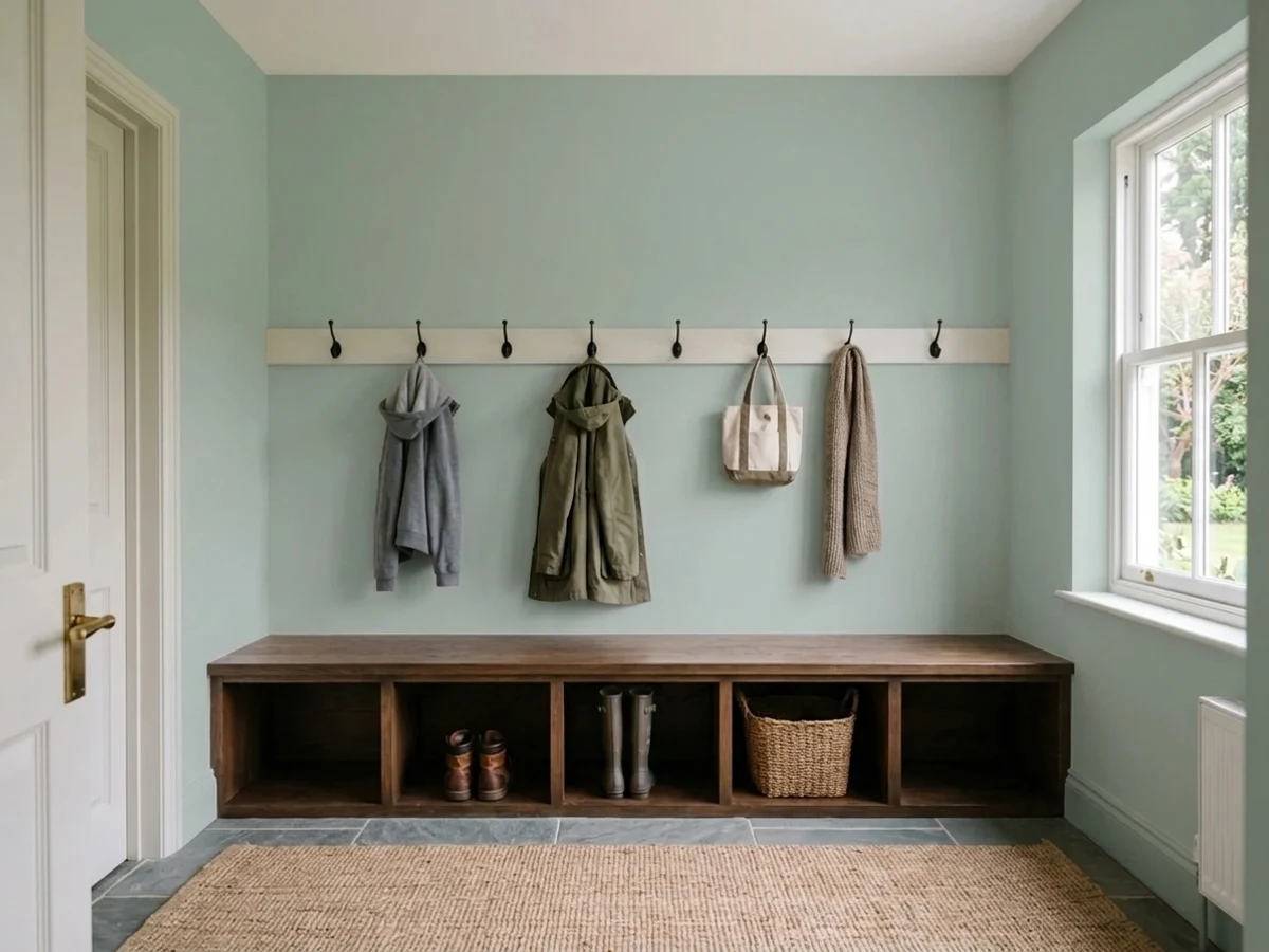
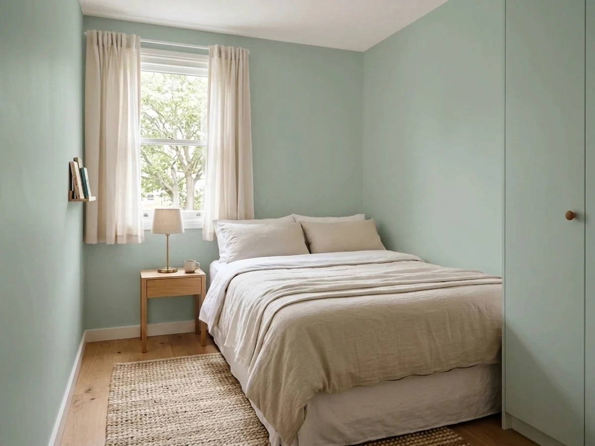
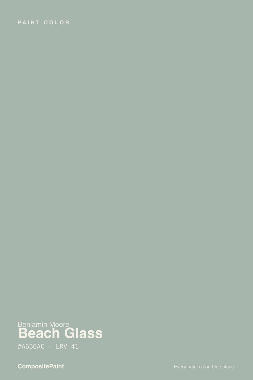
Beach Glass is Benjamin Moore's most-requested spa color for a reason: it is blue, green and gray all at once, and depending on the light in your room it will commit to one of the three and quietly drop the other two. Benjamin Moore files it under blue. Most owners see green by afternoon. On a dim wall it can look like neither — just a soft gray that has people checking the can to make sure the store mixed it right. That instability is the whole appeal and the whole risk.
Bathrooms with real daylight · primary bedrooms that want spa-calm, not sleepy · coastal and cottage interiors · a kitchen island or accent wall next to honey oak
Your room is dim and north-facing with no lamp plan · you want the exact same blue-green in every room of the house · your wood is cherry or red oak · you need a color that photographs the same twice
- Genuinely three colors in one — blue, green and gray, depending on the room's light
- Deep enough (LRV 50) to hold its color in strong sun, unlike paler seafoam picks
- The go-to spa bathroom color for a reason — tile, chrome and daylight love it
- Flatters honey oak and golden wood instead of fighting it
- Reads sophisticated and muted, not themed "beach house"
- Chameleon behavior means two rooms in the same house can look like two different colors
- Goes flat gray in dim, north-facing rooms with no warm light
- Clashes with cherry and red oak — the undertone is the wrong temperature for red wood
- Flat sheen genuinely dulls it; picking the wrong finish is a common regret
What Color Is Beach Glass, Really?
Beach Glass is built on the same trick as every good chameleon color: three pigments close enough in strength that none of them wins outright. Benjamin Moore itself classifies it in the blue family, but open any few reviews and you will find people calling it green, gray, seafoam, celadon, and "the color I can't describe to my painter." All of them are right in their own room. The undertone runs blue-green with a real gray backbone — enough gray that it never reads candy-coastal, and enough color that it never reads like a plain warm-gray neutral either.
At LRV 50 it sits solidly in mid-tone territory — noticeably deeper than the pale seafoam most people picture when they hear "beach glass." That depth is doing real work: a paler blue-green washes out in strong sun, but Beach Glass holds its color and its identity in a bright bathroom or a west-facing bedroom. It also means the color has enough body to shift meaningfully with the light instead of just getting lighter or darker — which is exactly the reputation it has built.
Undertone in one line: blue-green with gray underneath, and which one leads depends entirely on your light. Cooler, north-facing daylight pulls the blue forward; warm afternoon sun and incandescent lamps pull the green forward; a dim room with no warm light source can flatten both and leave a soft, slightly sad gray. None of those readings is wrong — that is the color being honest about the room it is in, and it is also the single biggest source of "this isn't what I ordered" complaints.
Where It Shines
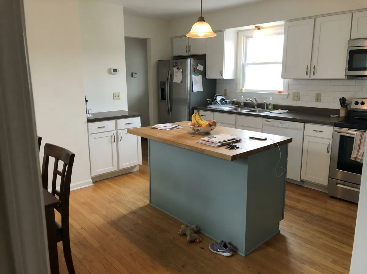
Give it real daylight and it becomes the spa color people request by name. Bathrooms are its signature job — with white subway tile, chrome or brushed-nickel fixtures and a bright window, Beach Glass reads exactly like the calming, breezy blue-green everyone pictures. Bedrooms are its second home for the same reason: enough color to feel intentional, quiet enough to still be a bedroom. And unlike a lot of trend blue-greens, it genuinely likes honey and golden oak — the warm wood pulls the green side forward and the pairing reads collected, not staged.
Where It Fails
Almost every disappointed review of Beach Glass comes down to one of three predictable situations, and none of them are the paint failing — they are the paint being exactly what a chameleon color is supposed to be, in a room that didn't set it up to succeed.
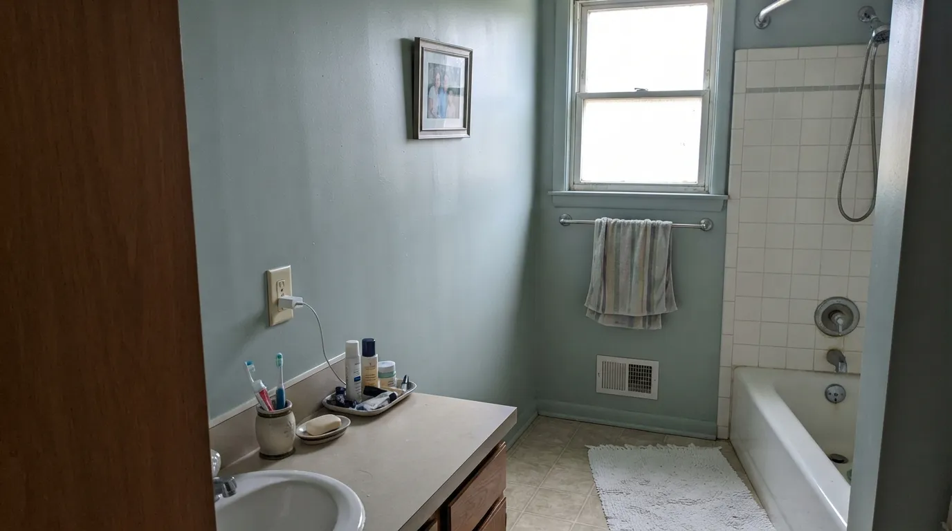
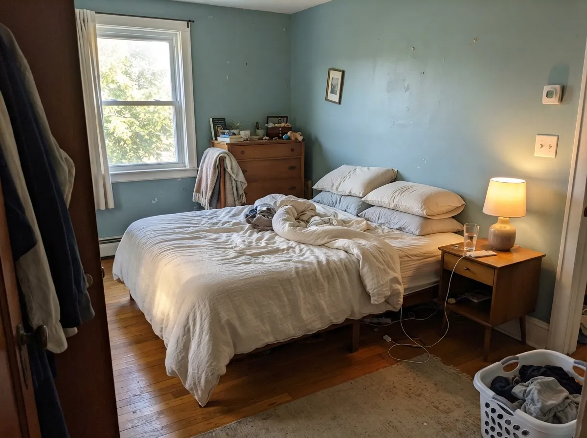
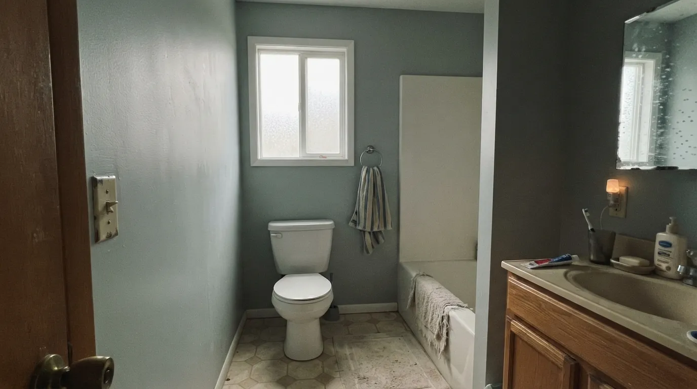
Beach Glass needs some real light to hold its blue-green identity. In a dim, north-facing bathroom or hallway with no warm lamp on, the color settles into the gray underneath and loses the "spa blue-green" most people bought it for. It isn't broken — it's the same paint with the color turned down. Add warm lamps, or size up to a brighter pick like Quiet Moments.
The most common regret isn't disliking the color — it's painting two rooms with different light and getting two different colors. Blue in the north-facing bath, green in the west-facing bedroom, and a homeowner convinced the store mis-mixed a can. Sample a full board in each room before committing to a whole-house Beach Glass plan; the paint is consistent, the light in your house is not.
Beach Glass's undertone is exactly the temperature that fights red-leaning wood. Cherry cabinets, red oak floors and orange-red trim pull the color toward a muddy, faded-teal cast that flatters neither the wood nor the paint. Honey oak and golden pine are fine; anything with a visible red cast needs a different color or a lot of white space between them.
Room by Room
Bright window, white tile, chrome or brushed nickel: this is the room Beach Glass was made for. Skip flat sheen — it dulls the blue-green and flattens the depth that makes the color work. Satin or eggshell holds up to moisture and keeps the color reading the way it does on the chip.
Enough color to feel finished, quiet enough to still relax in. Pairs easily with white or cream bedding and warm wood furniture; skip cool gray bedding, which pushes the walls toward flat gray instead of blue-green.
On an island under white perimeter cabinets, or as a hutch color, it is a genuinely popular coastal-kitchen move — especially with honey oak floors. A full kitchen of Beach Glass cabinets is a bigger bet and needs consistent, bright light on all four walls to avoid a patchy blue-green-gray read.
In a bright, open main floor it reads as a sophisticated, muted color rather than a beach theme. In a closed, dim living room it drifts toward flat gray and loses the reason you picked it — check the room's actual daylight hours before committing the whole space.
Full sun reads it a touch more blue-green and less gray than indoors. White trim keeps it airy and coastal; dark green or navy shutters add contrast without fighting the color's own blue-green lean.
In a small room it delivers the spa mood without betting the whole house on a chameleon color. Good place to test how your specific light treats it before scaling up to a bedroom or open living space.
Your Light Is the Risk
The blue-green-gray balance holds true here — this is the read on the paint chip and the read most owners fall in love with.
The color drops toward plain gray and loses the blue-green most people paid for. Test with the room's actual evening light, not just a daytime glance.
The blue side comes forward — closer to a soft slate-blue than a green. Expect this in north-facing bedrooms and baths.
The green comes forward and the color warms — most owners describe this as the room "coming alive" at golden hour.
Most complaints about Beach Glass are a light mismatch. Upload a photo of your actual room and see it on your walls — then ask for the same wall in north light or evening lamps before you buy a single sample.
Need It From Another Brand?
Any paint counter can custom-tint Benjamin Moore 1564 directly. If you would rather stay in one brand's own deck, these are the closest stock matches, measured as ΔE2000. Under 2 is a difference you will not see on the wall.
| Brand | Closest color | ΔE | LRV | |
|---|---|---|---|---|
| Sherwin-Williams | Monorail SilverSW 7663 · Sherwin-Williams | 4.0 | 50 | Color page → |
| Behr | DewHDC-NT-25 · Behr | 0.8 | 50 | Color page → |
| Valspar | Adieu8004-34C · Valspar | 1.1 | 52 | Color page → |
| PPG / Glidden | SolsticePPG1010-3 · PPG / Glidden | 3.7 | 50 | Color page → |
| Glidden | SolsticePPG1010-3 · Glidden | 3.6 | 50 | Color page → |
| Dutch Boy | Silvered Sage427-3DB · Dutch Boy | 1.6 | 52 | Color page → |
Similar Benjamin Moore Colors
The nearest shades to Beach Glass within Benjamin Moore's own range, ranked by perceptual color distance — useful when you want the same look a touch lighter, darker, or warmer.
WCAG 2.1: AA is 4.5 : 1 for normal text, 3 : 1 for large text, AAA is 7 : 1.
Beach Glass vs the Colors You're Also Considering
Every Beach Glass sample board has the same rivals on it. The numbers show the real lightness gap — then it comes down to which risk you would rather live with.
Pick this when you want more depth — Beach Glass holds its color in strong sun where Sea Salt can wash out.
Sherwin-Williams SW 6204 · LRV 63Sea SaltPick this for the lighter, brighter, greener sister — Sea Salt sits paler and leans green where Beach Glass leans blue.
Pick this for more presence and more of the blue-to-green shift through the day.
Benjamin Moore 1563 · LRV 50Quiet MomentsPick this for BM's own paler, cooler cousin — a step lighter and less likely to darken an already-dim room.
Pick this for the gray-green camouflage that goes with almost any wood or stone; Palladian Blue is louder and more definitely blue.
Benjamin Moore HC-144 · LRV 53Palladian BluePick this if you actually want blue and nothing else — Palladian Blue commits, Beach Glass keeps changing its mind.
Raindance (1572), LRV 43, is the closest sibling. It is a touch lighter and slightly less green, so it reads a bit more gray on the wall. If your room runs dim, Raindance keeps things marginally brighter; if you specifically want the sea-glass green effect, Beach Glass delivers more of it.
Silver Mink (1586), LRV 43, shifts the balance toward blue-gray. Side by side, Beach Glass is clearly the greener of the two, while Silver Mink leans cooler and more silvery. Choose Silver Mink for a steel-and-chrome modern bath, Beach Glass for a softer coastal or spa feel.
Boothbay Gray (HC-165), LRV 43, is the most gray-blue of the three, with the green almost gone. It behaves like a classic coastal gray. If you keep second-guessing whether you want green at all, Boothbay Gray is the no-green fallback; Beach Glass is the commit-to-green choice.
Beach Glass Coordinating Colors
Beach Glass pairs easiest with crisp or warm whites, honey wood, chrome or brushed nickel, and one grounding dark note — and it gets along with its own blue-green-gray relatives better than almost anything else in the deck. Keep red-toned wood and busy warm beige at a distance; everything below is a combination that shows up again and again in real rooms:
The Chameleon Reputation: Why Beach Glass Never Reads the Same Twice
Beach Glass has become one of Benjamin Moore's most-requested spa colors, and its own fan base is what generates most of its bad reviews. Search "Beach Glass" and you'll find it described as a soft blue, a muted seafoam green, a warm gray, and "impossible to photograph" — often by four different people describing the same can in four different rooms. Benjamin Moore itself lists it under blue, but the pigment mix is close enough to balanced that ordinary daylight shifts, north light, and even the temperature of a light bulb are enough to tip it one way or another.
This is not a flaw specific to Beach Glass — every low-chroma blue-green-gray does this to some degree, Sea Salt and Quiet Moments included — but Beach Glass's LRV 50 depth makes the swing more visible than it is in paler versions, because there is more actual pigment on the wall to shift. The honest advice, repeated across nearly every real review, is the same: sample a full board in the specific room and specific light it will live in, not just on the countertop under a store's fluorescent light. A can that reads perfectly blue in the paint aisle can turn convincingly green by the time it dries on a west-facing bedroom wall.
Beach Glass With Wood Tones and Floors
Wood is where this color earns its favorite-pairing reputation. Honey oak, golden pine and warm butcher block all pull the green side of Beach Glass forward, and the combination reads current and collected rather than like a themed beach house — this is one of the few modern blue-greens that genuinely likes builder-grade honey oak instead of fighting it.
The pairing to avoid is red-leaning wood: cherry cabinets, red oak floors, mahogany trim. The warm-red undertone sits at the wrong temperature against Beach Glass's cool blue-green-gray, and together they can both look muddy and faded rather than either color reading clean. Walnut and espresso tones sit neutral enough to be safe; pale white oak and gray-washed floors are also safe, if slightly less flattering than true honey oak.
Three Ready Palettes Built on Beach Glass
A color is never alone on the wall. These are complete combinations in the 60-30-10 pattern, with the reason each one holds together. Every one opens in the visualizer.
White keeps the small room bright enough for Beach Glass to hold its blue-green instead of sliding into gray, and one black frame gives the palette a single grounding note against all that softness — the combination behind most of the spa-bathroom photos everyone is chasing.
Try this palette in your roomTonal layering inside the same blue-green-gray family reads as one calm color story instead of a mismatch — Quiet Moments is lighter and cooler, so it works as the accent without competing with the main wall.
Try this palette in your roomCream perimeter cabinets keep the kitchen light enough for the island color to read blue-green instead of gray, and one black metal note on the hardware and pendant ties the room together without adding a second wall color.
Try this palette in your roomBeach Glass FAQ
Is Beach Glass blue or green?
Both, and which one you see depends on your room. Benjamin Moore files it in the blue family, and cooler daylight brings that blue forward. But warm afternoon sun and lamplight pull the green side forward, which is why so many owners describe it differently from the person down the street with the same can. It is genuinely a blue-green with gray underneath — not a color that's secretly one or the other.
Will Beach Glass look gray in my bathroom?
It can, if the bathroom is dim and north-facing with no warm light source — the gray base takes over and the blue-green fades. With a real window and white tile it reads as a clear spa blue-green. If your bathroom is small and windowless, test a sample under your actual vanity lighting before committing; the same paint reads very differently under cool LED versus warm bulbs.
What's the difference between Beach Glass and Sea Salt?
Depth and lean. Sea Salt is lighter and leans a bit more green; Beach Glass is a shade deeper and leans a bit more blue-and-gray. In a very bright room, Sea Salt can wash out toward pale gray, where Beach Glass holds its color better. Pick Sea Salt for an airier, softer feel; pick Beach Glass when you want the color to stay visible in strong sun.
How is it different from Quiet Moments?
They're close family — both blue-green-grays from Benjamin Moore — but Quiet Moments is lighter and cooler, while Beach Glass sits a step deeper and warms up more under afternoon light. If your room is already bright, Quiet Moments won't darken it as much. If you want more presence and don't mind a bit more shift through the day, Beach Glass is the one.
Does it work with honey oak floors or cabinets?
Yes — this is one of its best pairings. Golden and honey-toned wood brings out the green side of Beach Glass and the combination reads collected and current rather than dated. The wood tone to avoid is cherry or red oak; the red undertone fights Beach Glass's cooler lean and can push both toward a muddy look.
What finish should I use in a bathroom?
Satin or eggshell, never flat. Flat sheen dulls the blue-green and flattens the depth that makes this color work in the first place, and it won't hold up to bathroom moisture. Satin or eggshell keeps the color reading like the chip and wipes clean around the sink and shower.
Have you painted with Beach Glass?
Rate it — one tap helps the next reader decide.
Ask a Question