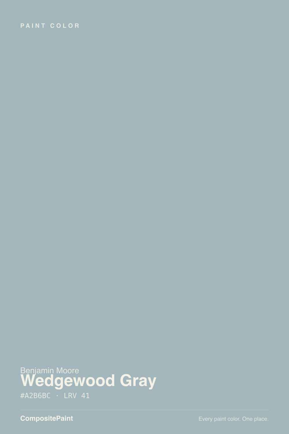
Wedgewood Gray
The blue-green-gray kitchen designers reach for again and again, reviewed honestly: the exact light where it turns coastal, the light where it goes flat, and what to pick instead.

Jessica has spec'd whites and neutrals for more than 300 rooms and keeps a sample wall of painted drawdowns in her studio. Every color review is checked against real reader rooms in the comments and re-tested when a formula changes. About the testing process →
- 1Adirondack Blue22
- 2Van Courtland Blue31
- 3Wedgewood Gray50
- 4Refresh59
- 5Meander Blue66
The Fast Verdict
Wedgewood Gray is what a "breezy blue-gray" actually looks like once the green comes out to play. It splits the difference between blue and green so evenly that in a dim room it can read as a plain, dependable gray, and in real daylight it blooms into a soft coastal teal-gray. Benjamin Moore has carried it for decades in the Historical Colors line, and kitchen designers keep specifying it on islands and front doors without much marketing push — that quiet, unglamorous reliability is the whole story.
Kitchen islands and cabinets · front doors and shutters with brass hardware · coastal-leaning bedrooms and bathrooms with real daylight · anyone who wants blue-green without committing to teal
You want an unmistakable true gray · your kitchen or bath is north-facing with little daylight · your floors are honey-orange oak · you're judging it off a two-inch chip instead of a full sample board
- A genuine blue-green-gray — coastal without tipping into teal
- One of BM's most reliable kitchen-island and front-door colors, decade after decade
- Loves brass hardware, white marble or quartz, and oak, pine or maple floors
- Deep enough (LRV 50) to read as real color, not a washed-out tint
- Benjamin Moore's own marketing shows it working — no guessing on the siding-plus-blue-door pairing
- Not a true gray — the green-blue shows clearly once it's on cabinets or four walls
- Goes flat and plain-slate in north light or a dim room
- Fights warm honey-orange oak and yellow-toned quartz
- Small chips read grayer than the finished room — a two-inch sample undersells it
What Color Is Wedgewood Gray, Really?
A blue-green with the saturation turned way down and a name borrowed from English Wedgwood pottery. Benjamin Moore files it under Historical Colors (the "HC" prefix), the same decades-old family as Hale Navy and Chelsea Gray — formulas the paint counter has never needed to relaunch or promote, because kitchen designers keep specifying them anyway. It shows up constantly as an island color and a front-door color, almost never as a headline trend pick. This is a workhorse, not a moment.
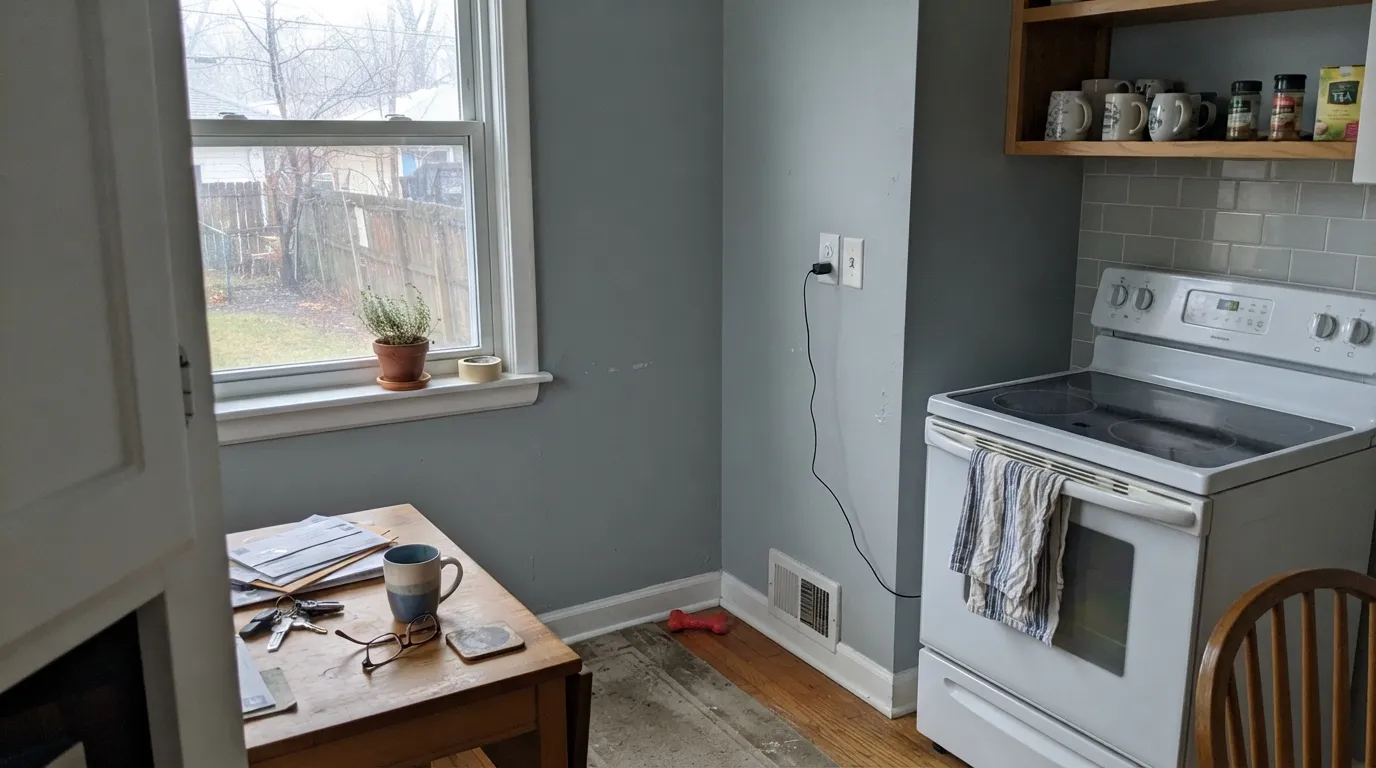
At LRV 50 it carries real depth — enough to read as color, not a tint, but not so dark it swallows a small room. Put it next to a true neutral gray and the green shows; put it next to a saturated teal and the gray shows. That in-between quality is the whole appeal for a coastal look that never quite commits to "beach house blue." On a kitchen island under a window it settles into a soft, breezy blue-green; move the same paint into a windowless mudroom and it goes noticeably flatter and closer to plain slate.
Undertone in one line: blue-green with the grey turned up — never purple, never a cold, pure navy-blue. If your sample looks flat and plain gray, that's dim or cool light draining the color out, not a different paint; if it looks distinctly teal, that's warm sun bringing the green forward. Both are the same paint being honest about the room — exactly the pattern owners describe when a small chip reads gray in a dim kitchen but blooms blue-green once it's up on the whole island in real daylight.
Where It Shines
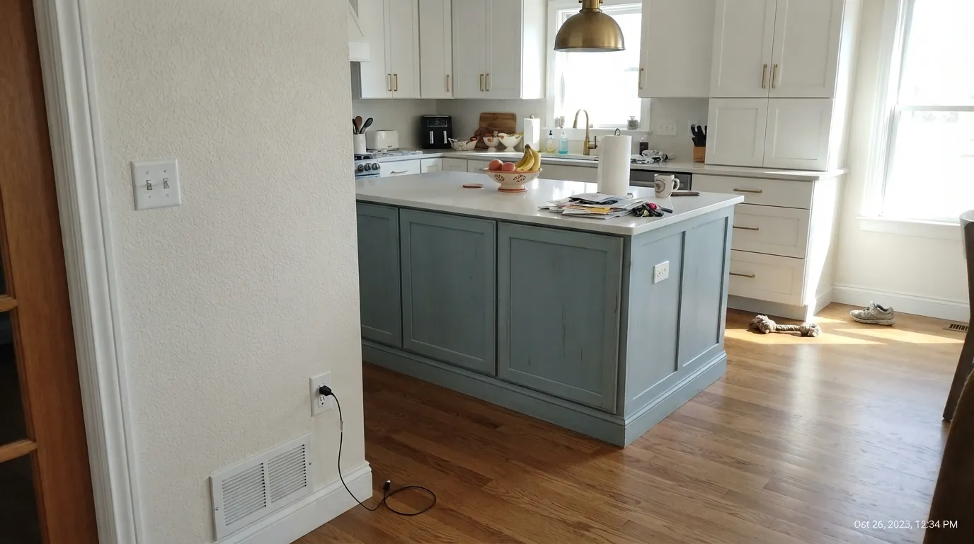
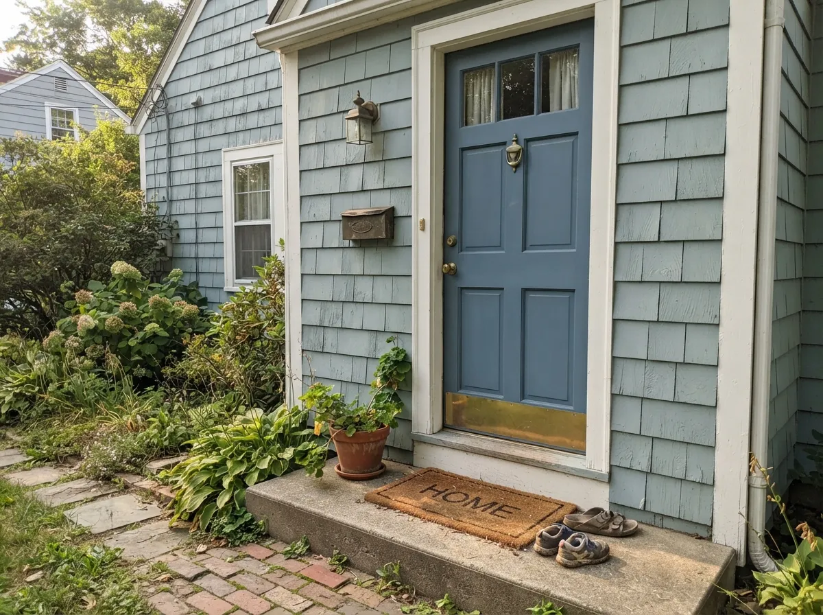
Give it real south or west daylight, brass hardware and white marble or quartz, and it earns its reputation as one of the deck's most dependable coastal colors. Kitchen islands are its most common job by a wide margin — paired with lighter perimeter cabinets, it reads custom without betting the whole kitchen on color. Front doors and shutters are its second home; Benjamin Moore's own marketing has paired it with a deeper blue door, and that pairing shows up on real houses constantly.
Where It Fails
Almost every letdown story about Wedgewood Gray traces back to one of three predictable situations. None of them are the paint's fault — but if your room matches one, sampling bigger will only confirm the problem, not fix it.
North light is cool and indirect — it drains the green out of Wedgewood Gray and leaves a flatter, plainer slate gray-blue. Owners who sample it in a dim kitchen report it reading "too gray," wanting more of the blue-green punch the chip promised in the store. The color didn't change; the light did. Test a large board under your actual kitchen's daylight, and add warm 2700K bulbs if the room stays dim.
This is a cool blue-green, and warm golden wood or yellow-flecked stone fights it: the floor reads more orange, the wall reads muddier, and neither side wins. Wedgewood Gray wants oak, pine or maple with a neutral cast, and white marble or quartz — not honey tones.
Because it hedges so evenly between blue, green and gray, a two-inch paint chip under store fluorescents genuinely undersells this color. It needs a big sample board taped up in the actual room, at different times of day, before you order gallons — the finished wall reliably reads more colorful than the chip did.
Room by Room
Its most common job by far: an island or a full run of lower cabinets, paired with white perimeter cabinets, brass hardware and white marble or quartz. Oak, pine and maple floors all flatter it. Satin or semi-gloss cabinet enamel, and a big sample board under the actual kitchen light before committing — small chips in dim kitchens famously read grayer than the finished room.
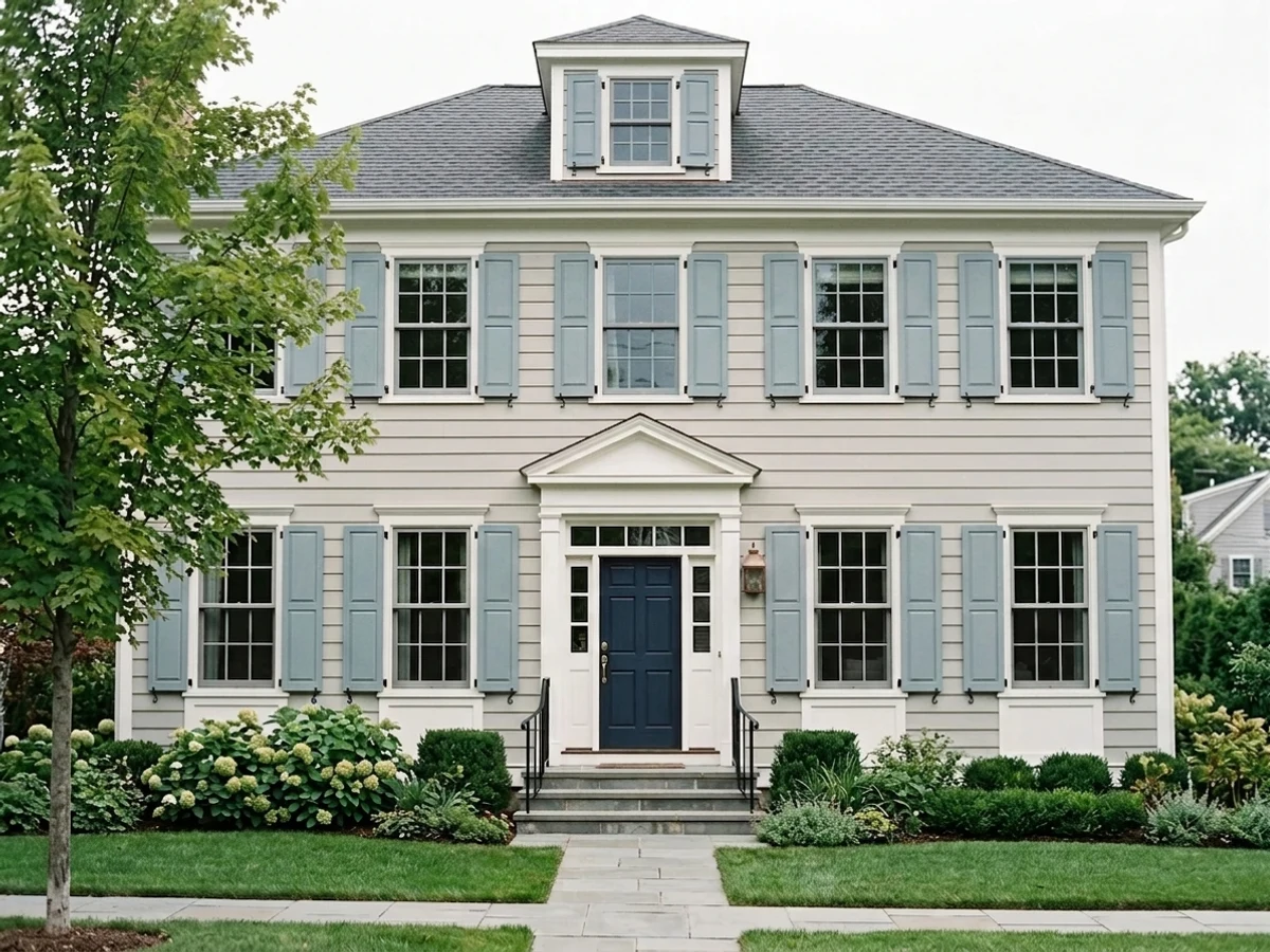
One of the more common Benjamin Moore front-door picks, and Benjamin Moore's own marketing has paired it exactly this way: Wedgewood Gray siding with a deeper Van Courtland Blue door. Brass hardware and a light-colored house body are its best company here.
A genuine coastal-cottage classic on cedar shingle or clapboard, especially with crisp white trim. Full sun brings the blue-green forward; a shaded north wall of the same house will read noticeably grayer than the sunny side — walk the whole exterior with a sample before ordering gallons.
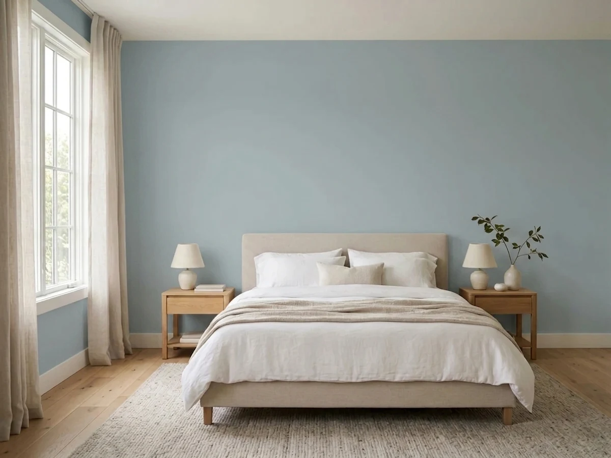
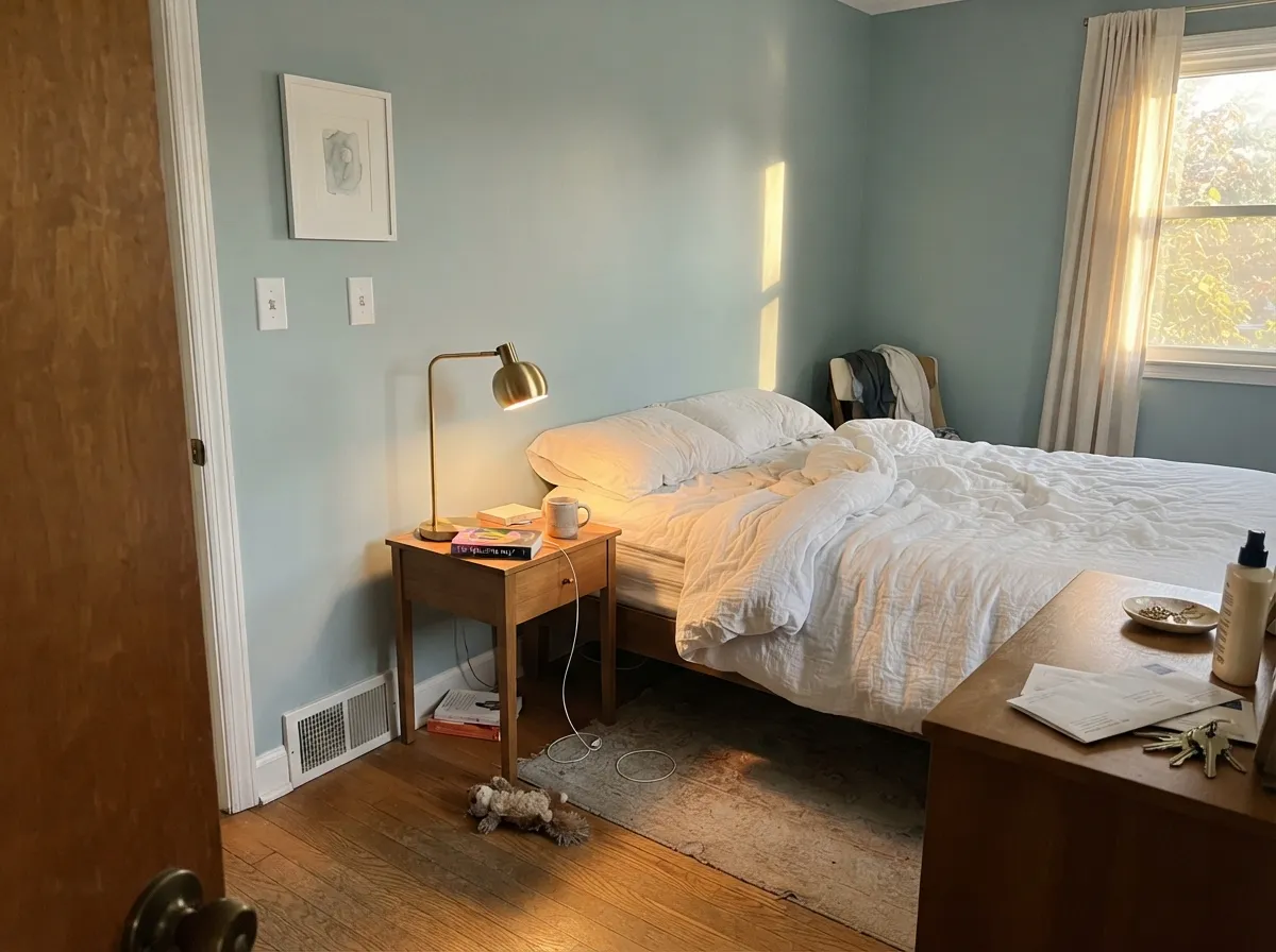
Crisp white linens, brass lamps and real south or west daylight give it the coastal, restful mood the name promises. A north-facing bedroom with small windows is the one place it disappoints — it settles into a flatter, colder slate that owners describe as "just gray," not the airy blue-green they sampled.
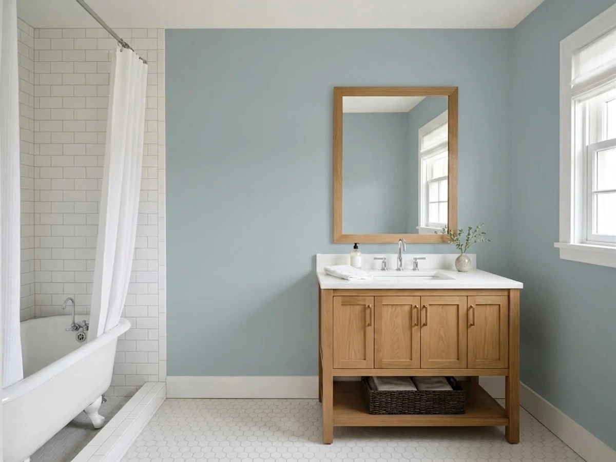
White marble or quartz vanities and cool-toned tile are natural partners. Warm beige tile or a honey-toned wood vanity fights it — the wood pushes orange, the wall pushes gray-blue, and neither wins.
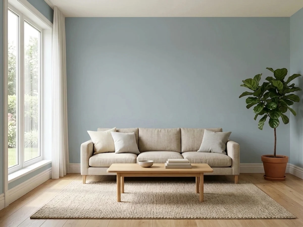
With genuine south or west sun it's a calm, sophisticated wall color that reads as real color without shouting. In a dim or north-facing living room, budget for warm lamps and 2700K bulbs, or the room can feel closer to plain slate than the coastal look you sampled.
Your Light Is the Risk
Real sun brings the green forward and the color settles into its coastal blue-teal — the read every kitchen-island photo promises.
Cool, indirect light drains the green and leaves a flatter, plainer slate gray-blue. The "too gray in my kitchen" complaint traces straight back to this.
Cooler and more blue under morning east light, warmer and more green-teal as the sun swings west. Expect the wall to look like two different paints in one day.
2700K bulbs pull it toward a warm, muted teal. Cool white LEDs flatten it back toward plain gray — swap the bulb before you second-guess the paint.
Most complaints about Wedgewood Gray are a light mismatch. Upload a photo of your actual room and see it on your walls — then ask for the same wall in north light or evening lamps before you buy a single sample.
Need It From Another Brand?
Any paint counter can custom-tint Benjamin Moore HC-146 directly. If you would rather stay in one brand's own deck, these are the closest stock matches, measured as ΔE2000. Under 2 is a difference you will not see on the wall.
| Brand | Closest color | ΔE | LRV | |
|---|---|---|---|---|
| Sherwin-Williams | RainSW 6219 · Sherwin-Williams | 1.5 | 49 | Color page → |
| Behr | Morning ParlorHDC-CL-15G · Behr | 0.7 | 50 | Color page → |
| Valspar | Jolene8004-35C · Valspar | 2.1 | 48 | Color page → |
| PPG / Glidden | Blue WillowPPG1145-4 · PPG / Glidden | 1.1 | 47 | Color page → |
| Glidden | Blue WillowPPG1145-4 · Glidden | 1.2 | 47 | Color page → |
| Dutch Boy | Rainwash331-3DB · Dutch Boy | 1.9 | 48 | Color page → |
Similar Benjamin Moore Colors
The nearest shades to Wedgewood Gray within Benjamin Moore's own range, ranked by perceptual color distance — useful when you want the same look a touch lighter, darker, or warmer.
WCAG 2.1: AA is 4.5 : 1 for normal text, 3 : 1 for large text, AAA is 7 : 1.
Wedgewood Gray vs the Colors You're Also Considering
Every Wedgewood Gray sample board has the same rivals on it. The numbers show the real lightness gap — then it comes down to which risk you would rather live with.
Pick this for the breezier, more clearly blue-green read Wedgewood Gray gives you.
Benjamin Moore HC-165 · LRV 36Boothbay GrayPick this if you want the same coastal depth to read more solidly gray-blue, with less green whisper — most buyers who see it already think it's plain gray.
Pick this when you want real, visible color depth at LRV 50, not just a hint of it.
Benjamin Moore HC-147 · LRV 61Woodlawn BluePick this for a much paler, airier version of the same historic blue-green family — a whisper of color instead of a wall of it.
Pick this if the Historical Colors pedigree and the well-known number matter to you.
Benjamin Moore CSP-595 · LRV 43French ToilePick this if your painter doesn't stock Benjamin Moore's Historical Colors line — this mainstream number is nearly identical.
Pick this for the gray-green balance instead of straight blue, and the wider Benjamin Moore dealer availability.
Sherwin-Williams SW 6239 · LRV 39UpwardPick this if your contractor only works in Sherwin-Williams — Upward reads more purely blue, with a similar north-light trap.
Buxton Blue (HC-149) at LRV 45 is Wedgewood Gray's closest sibling in the Historical Collection. It is slightly lighter and reads a touch more clearly blue-green, so choose it when you want a bit more air and a hair more color. Wedgewood Gray is the more restrained, grayer of the two.
Santorini Blue (1634) at LRV 45 is also lighter and leans a little cleaner and cooler. In a dim bath it can feel more openly blue, while Wedgewood Gray stays quieter and more gray in the same light.
Exhale (AF-515) at LRV 46 is another close, slightly lighter blue-gray with a soft feel. If your room is on the dark side and you want to keep some depth, Wedgewood Gray at LRV 41 is the better pick; if you want the walls to feel lighter and more open, the LRV 45 to 46 options edge ahead.
Wedgewood Gray Coordinating Colors
The rule for coordinating with Wedgewood Gray: stay on the cool side and let brass do the warming. It pairs naturally with warm and crisp whites alike, loves a deeper blue for doors and accents, and sits comfortably next to its own paler and more-gray Historical Colors siblings. These are the partners that keep showing up in rooms that work:
A Kitchen-Island Workhorse, Not a Trend Color
Wedgewood Gray has never had a Color of the Year moment, and that is basically the point. Benjamin Moore files it in the Historical Colors collection — decades-old formulas the company has never needed to relaunch or rebrand — alongside names like Hale Navy and Chelsea Gray. Its fame, such as it is, comes from design bloggers and kitchen photographers who keep reaching for it on islands and front doors, not from a marketing campaign.
That workhorse status shows up in how it actually gets used: almost always as an accent — an island, a door, a run of shutters — paired with a lighter, more neutral perimeter, rather than committing an entire open-plan house to it the way a true neutral like White Dove gets used. It is a color designers spec with confidence because it has been doing the same quiet job well since long before "coastal grandmillennial" had a name.
Wedgewood Gray With Wood Tones and Floors
Light to mid wood is this color's best friend: oak, pine and maple all sit comfortably next to it because neither the wood nor the paint fights for dominance. White marble and quartz counters are the classic kitchen pairing, and unlacquered or antique brass hardware is close to mandatory — it's the one warm note the whole cool palette is built around.
The one flooring that argues with it is honey-orange oak or a yellow-toned quartz. The warm floor pushes toward orange next to a cool blue-green wall, and the wall can start to look muddier rather than more balanced. If the floor is staying and it leans golden, keep Wedgewood Gray to a single accent — an island, a door — rather than the whole kitchen.
Three Ready Palettes Built on Wedgewood Gray
A color is never alone on the wall. These are complete combinations in the 60-30-10 pattern, with the reason each one holds together. Every one opens in the visualizer.
Two depths of the same Historical Colors blue-green family keep the pantry door from looking like a mismatched afterthought, while White Dove's warmth on the perimeter cabinets lets the island stay the room's one statement of color.
Try this palette in your roomA navy accent gives the airy blue-green somewhere to land instead of floating; both colors need real light to perform, so keep the room bright by day and lamp-lit by night.
Try this palette in your roomThis is close to the exact pairing Benjamin Moore has shown in its own marketing: Wedgewood Gray siding, a crisp white trim, and a deeper Van Courtland Blue door for the one saturated note the scheme needs.
Try this palette in your roomWedgewood Gray FAQ
Is Wedgewood Gray more blue or more green?
Both, deliberately. Benjamin Moore built it as a blue-green with the saturation turned way down, so it reads as a soft coastal gray-blue in most light and a touch more teal-green when real sun hits it. It never reads purple and never reads a cold, pure navy-blue.
What is Wedgewood Gray's LRV?
41 — a genuine mid-tone. Light enough to read as color rather than a dark accent, deep enough that it doesn't wash out to a pale tint the way many "spa blue" colors do.
Does Wedgewood Gray work in a north-facing room?
Carefully. North light is cool and indirect, and it drains the green out of Wedgewood Gray, leaving a flatter, plainer slate gray-blue that some owners describe as just gray, not the coastal color they sampled. It's not a failure of the paint — south- or west-facing rooms are where it earns its reputation. If north-facing is all you have, sample a large board and expect a cooler, quieter result.
What door or trim color goes with Wedgewood Gray siding?
Benjamin Moore's own marketing pairs Wedgewood Gray siding with a Van Courtland Blue front door and light trim — a deeper, more clearly blue accent against the softer blue-green body. For interior trim, a warm white like White Dove keeps things soft; Chantilly Lace gives a crisper, cooler edge.
Is it good for a kitchen island?
It's arguably Wedgewood Gray's single most common job. With white perimeter cabinets, brass hardware, white marble or quartz, and oak, pine or maple floors, it's one of the most dependable blue-green island colors in the BM deck. Use a satin or semi-gloss cabinet enamel, and sample it under your kitchen's actual light before committing — small chips notoriously read grayer than the finished island.
How is Wedgewood Gray different from Boothbay Gray or French Toile?
Close enough that people confuse them on a chip rack. Boothbay Gray sits a step more solidly gray-blue with less green whisper; French Toile is close to an identical twin under a less recognized number. If you already love the Wedgewood Gray look but your painter doesn't stock Benjamin Moore's Historical Colors line, French Toile gets you there.
Have you painted with Wedgewood Gray?
Rate it — one tap helps the next reader decide.
Ask a Question