Boothbay Gray
The coastal blue-gray everyone calls a gray, reviewed honestly: how blue it really goes, the rooms where it drains flat, and what to pick instead.

Jessica has spec'd whites and neutrals for more than 300 rooms and keeps a sample wall of painted drawdowns in her studio. Every color review is checked against real reader rooms in the comments and re-tested when a formula changes. About the testing process →
- 1Kendall Charcoal15
- 2Retreat21
- 3Boothbay Gray43
- 4Upward57
- 5Sea Salt63
The Fast Verdict
Boothbay Gray is the color people choose off a chip labeled gray and end up living with as a soft slate blue. That is not a defect — it is why the color has lasted. At LRV 43 it has real depth, it flatters white trim and warm wood, and it is one of the safest blue-grays on siding. Just go in knowing you are buying blue, and sample it in the dim corner of the room, not by the window.
Bedrooms with real daylight · exterior siding with white trim · kitchen islands and built-ins · anyone who finds plain gray dead
You actually want a neutral gray · the room is dim and north-facing · your carpet or counters are warm beige · your trim is a cream white
- Reads calm and coastal without ever becoming a real blue
- Mid-tone depth makes white trim and white bedding look crisp
- One of the safest blue-grays on exterior siding — holds up in full sun
- Muted enough to work on cabinets and built-ins for years
- Loves nickel, matte black, oak and walnut equally
- Almost everyone underestimates how blue it goes on four walls
- Drains to a flat, cold gray in dim north rooms and under cool LEDs
- Fights warm beige carpet, tan granite and orange-toned oak floors
- Too deep to carry dark hallways or basements
What Color Is Boothbay Gray, Really?
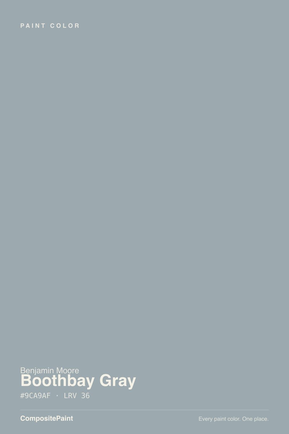
A muted blue with a quiet green pull behind it — and the chip does not tell you that. On a 2-inch sample Boothbay Gray looks like a calm gray with a hint of something. Rolled across four walls it multiplies, and the blue steps forward until most people describe the finished room as soft slate blue, not gray. The green sitting behind the blue is what keeps it from going icy or tipping lavender the way cleaner blue-grays do. That is the whole reason this color has stayed in Benjamin Moore's Historical collection instead of dating like the flat grays around it.
At LRV 43 it reflects about a third of the light in the room, so it is a genuine mid-tone with weight. Put it beside Edgecomb Gray HC-173 at LRV 63 and the gap is obvious: Edgecomb bounces nearly twice the light and reads as a backdrop, while Boothbay Gray reads as a decision. It is dark enough to make white bedding and white trim look crisp, and dark enough that a room with one small window will feel noticeably closed in.
Undertone in one line: muted blue with green underneath — never purple, never warm. If your sample looks flat and colorless, that is a dim room or a cool LED bulb draining it, not the paint.
Where It Shines
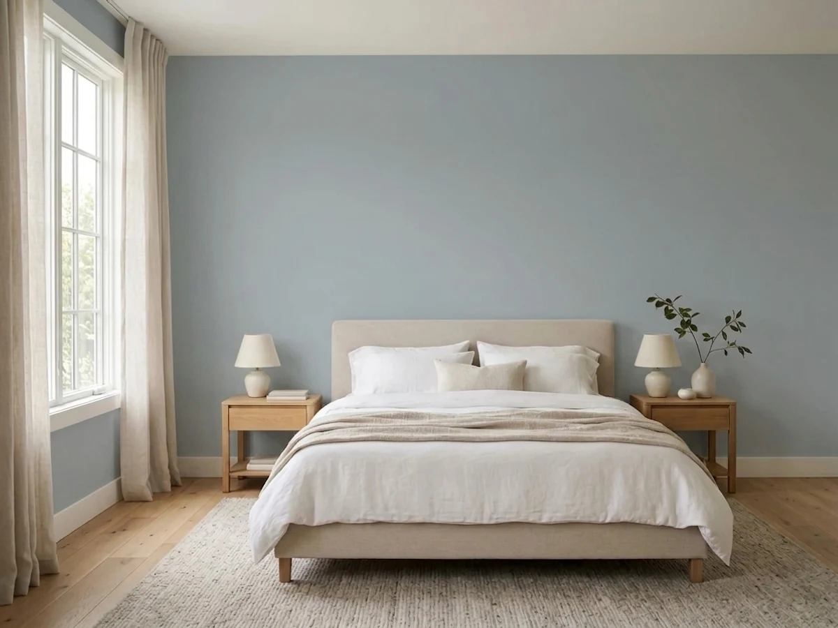
Give it daylight and white trim and it does exactly what the name promises — fog over water, calm without being colorless. Bedrooms are its signature room, and outside it is one of the most reliable blue-grays on siding, where full sun lifts it a step and keeps it from ever looking heavy.
Where It Fails
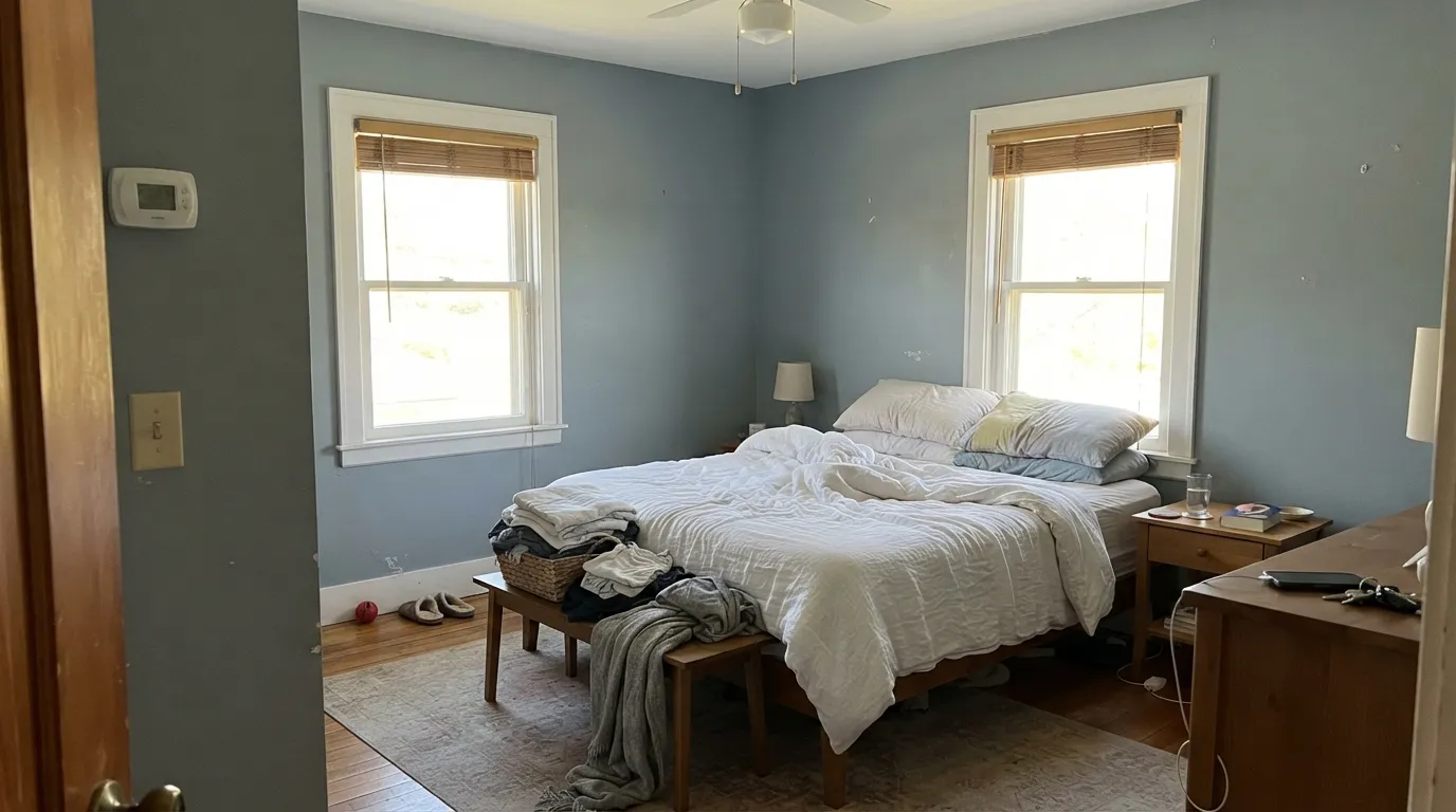
The bad reviews for Boothbay Gray fall into three buckets, and every one of them is predictable before you open the can. Two are expectation problems, one is a light problem. If your room matches any of them, a second coat will not save it.
This is the number one complaint, by a wide margin. The chip reads gray, the wall reads blue — surface area and daylight both push the color forward. If you want the neutral version of this idea, Silver Spring 2120-50 at LRV 40 is silvery gray with only a hint of blue.
Cool light plus low light is the one combination that kills it. The blue drains out and what is left is a flat, cold gray that people call institutional. Basements, windowless hallways and interior baths are the worst cases. Go lighter and greener with Palladian Blue HC-144 at LRV 53, or change bulbs to 2700K before you change paint.
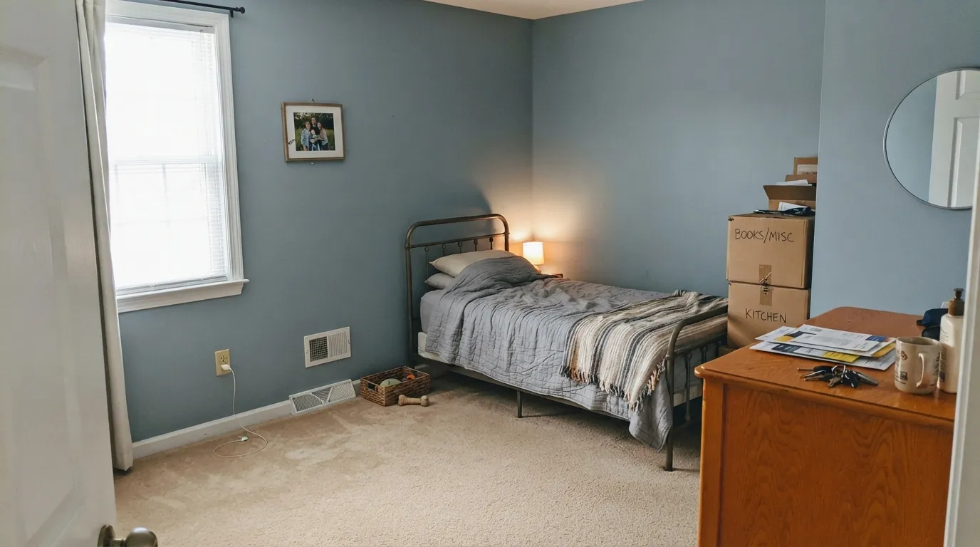
Cool blue and warm beige make each other look worse: the carpet goes pink, the wall goes icy, and the room reads like two schemes arguing. If the flooring and counters are staying, use a warm neutral like Revere Pewter HC-172 instead and save Boothbay Gray for a room you are redoing.
Room by Room
The muted blue reads restful, and LRV 43 gives enough depth that white bedding and White Dove OC-17 trim look crisp instead of washed out. Eggshell on walls. If the bedroom faces north and stays dim, sample the darkest corner first.
Full sun lifts it a step, so it stays fresh where deeper grays go heavy, and it does not chalk out the way pale grays do. Pair with Chantilly Lace OC-65 trim and a Hale Navy HC-154 or Newburyport Blue HC-155 door. Low-lustre finish on siding.
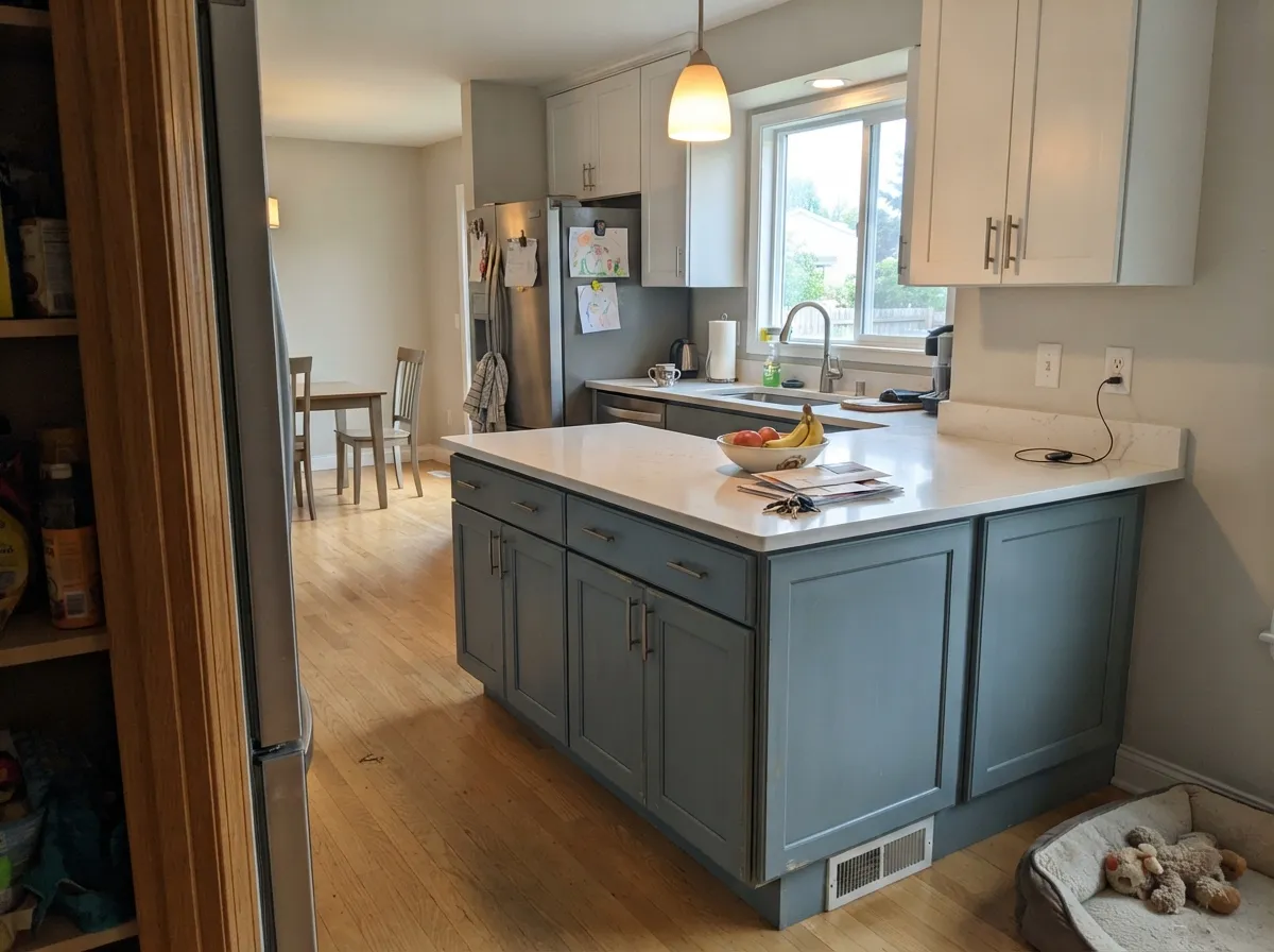
This is coastal color without committing to navy, and it is forgiving of fingerprints in a way white cabinets are not. Satin, in a urethane cabinet enamel. Brushed nickel or matte black hardware; keep countertops white, gray or honed black rather than tan granite.
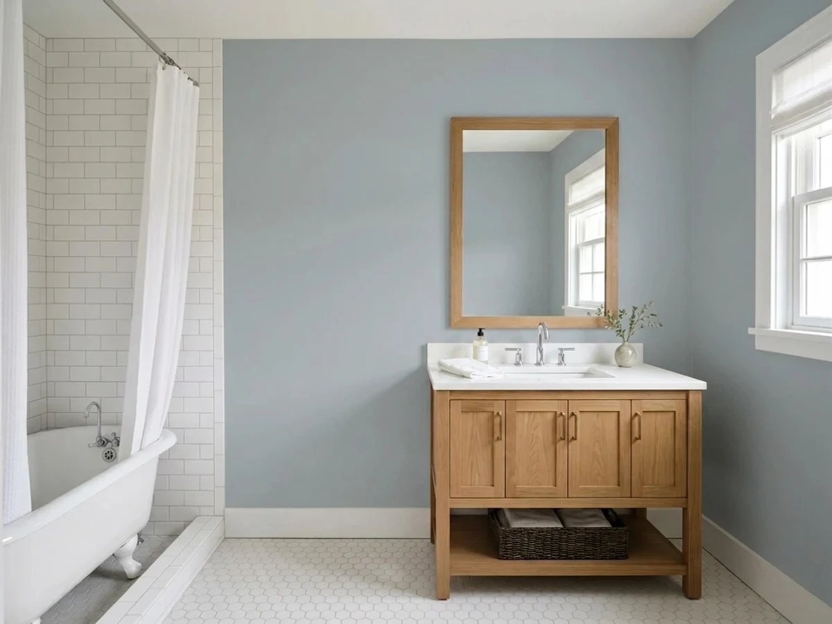
It flatters chrome, nickel and white tile, and it makes a plain builder bath look considered. Watch the vanity top: a cream or beige quartz will fight it. In a windowless powder room it goes flat and cold — pick something lighter.
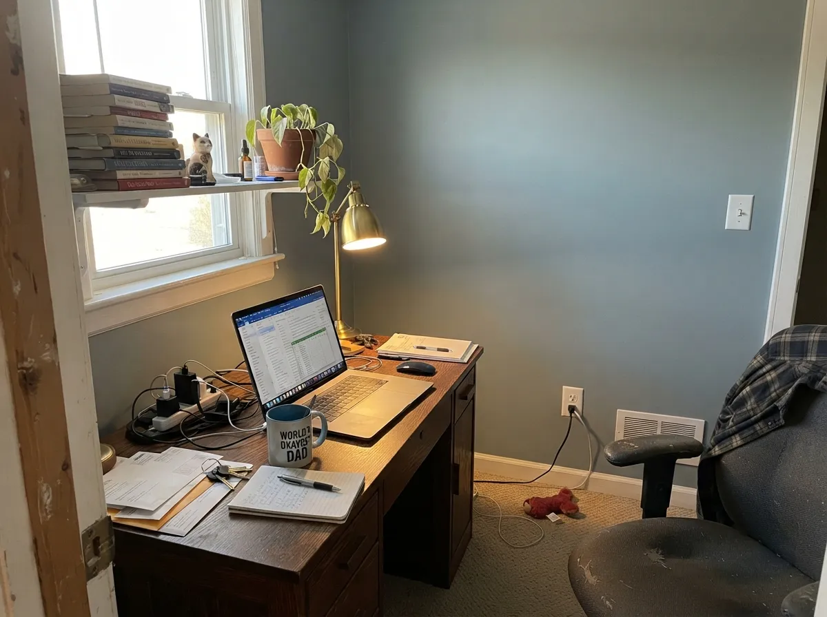
The mid-tone depth cuts screen glare and reads focused rather than sleepy. Eggshell, with White Dove OC-17 shelving so books and papers stand off the wall. Skip it if your only lighting is a 5000K overhead.
At LRV 43 with no daylight there is nothing for the blue to work with, and the walls read gray and grim. Take it up to Palladian Blue HC-144 or Edgecomb Gray HC-173 and keep Boothbay Gray for the rooms with windows.
Your Light Is the Risk
Warm daylight lifts it and the green side surfaces — the breezy, seaglass version everyone wants.
Cool light pulls it grayer and moodier. Beautiful in a bright north room, drab in a dim one.
2700K lamps soften it toward gray-green and cozy. 4000K LEDs flatten it — swap bulbs, not paint.
On siding it reads a full step lighter and fresher than the chip. Judge exterior samples at noon, not indoors.
Most complaints about Boothbay Gray are a light mismatch. Upload a photo of your actual room and see it on your walls — then ask for the same wall in north light or evening lamps before you buy a single sample.
Need It From Another Brand?
Any paint counter can custom-tint Benjamin Moore HC-165 directly. If you would rather stay in one brand's own deck, these are the closest stock matches, measured as ΔE2000. Under 2 is a difference you will not see on the wall.
| Brand | Closest color | ΔE | LRV | |
|---|---|---|---|---|
| Sherwin-Williams | Mineral DepositSW 7652 · Sherwin-Williams | 1.6 | 43 | Color page → |
| Behr | Flint Smoke730F-4 · Behr | 0.9 | 43 | Color page → |
| Valspar | Wheels Up!V117-2 · Valspar | 1.4 | 44.7 | Color page → |
| PPG / Glidden | Mirror MirrorPPG1039-3 · PPG / Glidden | 2.2 | 43 | Color page → |
| Glidden | Mirror MirrorPPG1039-3 · Glidden | 2.2 | 43 | Color page → |
| Dutch Boy | Zippered Gray435-3DB · Dutch Boy | 3.4 | 44 | Color page → |
Similar Benjamin Moore Colors
The nearest shades to Boothbay Gray within Benjamin Moore's own range, ranked by perceptual color distance — useful when you want the same look a touch lighter, darker, or warmer.
WCAG 2.1: AA is 4.5 : 1 for normal text, 3 : 1 for large text, AAA is 7 : 1.
Boothbay Gray vs the Colors You're Also Considering
Every Boothbay Gray sample board has the same rivals on it. The numbers show the real lightness gap — then it comes down to which risk you would rather live with.
Pick this for more depth and a softer, foggier blue on the wall.
Benjamin Moore HC-169 · LRV 41Coventry GrayPick this for a lighter, cleaner blue-gray in a room with less light.
Pick this when you want the color to actually register on the wall.
Benjamin Moore 1563 · LRV 50Quiet MomentsPick this for a lighter, greener spa blue in a small bathroom.
Benjamin Moore has a cluster of blue-grays near this color, and the differences are real but subtle. Pilgrim Haze 2132-50, at LRV 38, is a touch lighter and slightly less saturated, so it reads a little grayer and quieter on the wall. Choose Pilgrim Haze for a dimmer room where Boothbay Gray might feel heavy, and Boothbay Gray when you want the blue to actually register.
New Hope Gray 2130-50, LRV 39, shifts the balance toward true blue with less of the green cast. In warm afternoon light it stays bluer where Boothbay Gray drifts toward gray-green. If you love the periwinkle side of blue-gray, New Hope Gray favors you; if you want the seaglass side, stay with Boothbay Gray.
Silver Spring 2120-50, LRV 40, is the most neutral of the three, a lighter silvery gray with only a hint of blue. It suits people who want almost no color; Boothbay Gray suits people who want the color to be the point.
Boothbay Gray Coordinating Colors
The rule with Boothbay Gray is to stay cool or stay clean. Crisp whites, deeper blues and true grays all sit comfortably beside it; warm creams, tans and pinky-beiges do not, because the blue turns them muddy and they turn the blue icy. The exception is wood — oak and walnut are warm, but their texture reads as material rather than color, so they warm the scheme without arguing with it.
These are the partners that show up again and again in real Boothbay Gray rooms, from trim to doors to the room next door:
Boothbay Gray on Exteriors
Outside is where this color is hardest to get wrong. Daylight is stronger and more even than anything indoors, so the siding reads a step lighter and fresher than the chip, and the blue that surprises people on interior walls looks intentional on a whole facade. It also sits at a useful depth: light enough that a house does not look somber on a gray day, dark enough that white trim reads as trim instead of disappearing.
Trim decides the personality. Chantilly Lace OC-65 gives the sharp, coastal-cottage version; White Dove OC-17 softens it toward traditional. For contrast, shutters or a garage door in Kendall Charcoal HC-166 or Wrought Iron 2124-10 frame the siding without adding a third color, and a Newburyport Blue HC-155 or Hale Navy HC-154 front door keeps the whole thing inside one family. Two warnings: paint a full board and look at it on both the sunny and shaded sides of the house, because the north elevation runs noticeably grayer, and skip beige or tan stone accents — they are the fastest way to make good siding look wrong.
Boothbay Gray With Wood Tones and Floors
Flooring is where most Boothbay Gray plans quietly fail, so check this before you buy paint. Orange-toned builder oak, honey-stained pine and tan LVP all push the blue forward hard — the wall gets bluer and cooler, the floor gets more orange, and the room ends up looking like a before photo. It is not always fatal in a bedroom where rugs cover most of the floor, but in an open kitchen with wall-to-wall oak it is a real problem.
What does work: white oak with a natural or gray-washed finish, walnut, painted floors, and cool-toned tile. Walnut is the best of them, because it is warm without being orange and its depth answers the wall's depth. If you are stuck with orange oak and still want this color, keep Boothbay Gray on cabinets, an island or built-ins rather than on the walls, and let a light warm neutral such as Edgecomb Gray HC-173 take the wall space.
Three Ready Palettes Built on Boothbay Gray
A color is never alone on the wall. These are complete combinations in the 60-30-10 pattern, with the reason each one holds together. Every one opens in the visualizer.
Boothbay Gray takes the 60 percent, White Dove's soft warmth keeps the trim from turning the room icy, and Hale Navy supplies the single dark note in the same blue family. Everything stays in one temperature, so the room quiets down at night instead of going gray.
Try this palette in your roomOutdoors the siding is the 60 percent and needs the crispest white you can get, which is why Chantilly Lace beats a creamy trim here. Newburyport Blue is deep enough to read almost black from the street and blue up close.
Try this palette in your roomEdgecomb Gray at LRV 63 carries the open rooms as the light 60 percent, so the blue-gray can be the 30 percent that lands on the island and built-ins. Its warmth balances Boothbay Gray's coolness without either one looking like a mistake.
Try this palette in your roomBoothbay Gray FAQ
Is Boothbay Gray blue or gray?
Blue, once it is on the wall. On the chip it passes for gray, but four walls and daylight bring the blue forward, and most people end up calling the finished room soft slate blue. There is a green pull underneath that keeps it muted, so it never looks like a kid's bedroom blue.
Is it warm or cool?
Cool, all day. The undertone is blue with a slight green cast and there is no warmth in it to fall back on. That is why it fights beige carpet and cream trim, and why it looks its best against white, nickel and cool stone.
What trim white goes with it?
White Dove OC-17 for interiors — LRV 85 gives clean contrast against Boothbay Gray's 36, and its softness keeps the pairing from feeling clinical. Outside, or if you want a sharper modern edge, use Chantilly Lace OC-65 at LRV 92. Avoid cream trim; it makes the wall look cold and the trim look dirty.
Is it good for kitchen cabinets?
Yes, and it is one of the easier colors to live with there. It reads coastal without the drama of navy, and the mid-tone depth hides handprints that white cabinets broadcast. Use a satin urethane cabinet enamel and keep the counters white, gray or honed black — tan granite will fight it.
How is it different from Coventry Gray?
Coventry Gray HC-169 is lighter and reads cleaner and more openly blue. Boothbay Gray is deeper and foggier, with that green pull behind the blue that softens it. Choose Coventry Gray for a room short on light, and Boothbay Gray when you want the color to have weight.
Will it work on my exterior?
It is one of the most dependable blue-grays for siding. Full sun lifts it a step, so what looks mid-tone on the chip reads fresh on a whole house, and it holds its color rather than washing out. Pair it with white trim and a dark blue or black door, and always judge your exterior sample outdoors at midday.
Have you painted with Boothbay Gray?
Rate it — one tap helps the next reader decide.
Ask a Question