Raindance
A steely green-gray Benjamin Moore just pulled into its 2026 Color Trends palette, reviewed honestly: the light where it glows, the light where it goes flat, and what to pick instead.

Jessica has spec'd whites and neutrals for more than 300 rooms and keeps a sample wall of painted drawdowns in her studio. Every color review is checked against real reader rooms in the comments and re-tested when a formula changes. About the testing process →
- 1Kendall Charcoal15
- 2Retreat21
- 3Raindance43
- 4Upward57
- 5Sea Salt63
The Fast Verdict
Raindance is a color built to dodge the question “is that gray or green?” — and dodge it well. Gray does most of the talking, a steely green-blue whispers underneath, and the balance holds up in good daylight without tipping fully into either camp. It has quietly sat in Benjamin Moore’s Classics collection for years and just got pulled back into the spotlight as part of the 2026 Color Trends palette — not a flashy reinvention, just a genuinely useful color getting its due. Give it real light and warm-toned company and it looks expensive; starve it of light and it goes concrete.
Living rooms and bedrooms with real daylight · kitchen islands and cabinets in a transitional or coastal kitchen · exteriors, in Regal Select · anyone who likes sage but wants less green and more gray
You want an obviously green sage, not a gray with green in it · your room is north-facing and dim · your floors and trim are heavy honey oak · you already own Benjamin Moore Pearl — this is close enough to be the same decision twice
- Splits the difference between gray and sage without landing awkwardly on either
- Reads mineral and expensive in real daylight, not flat or boring
- Rated for exterior use in Regal Select — a genuine whole-house option
- Deep enough (LRV 43) to feel like a real color decision, not an off-white
- A Classics-collection color with real staying power, freshly featured in the 2026 Color Trends palette
- Goes flat, sad concrete-gray in dim or north-facing rooms
- Fights honey oak floors and warm brass instead of flattering them
- Close enough to Benjamin Moore Pearl that picking between them barely matters
- Not a clear-cut color — buyers wanting an obvious gray or an obvious sage end up disappointed
What Color Is Raindance, Really?
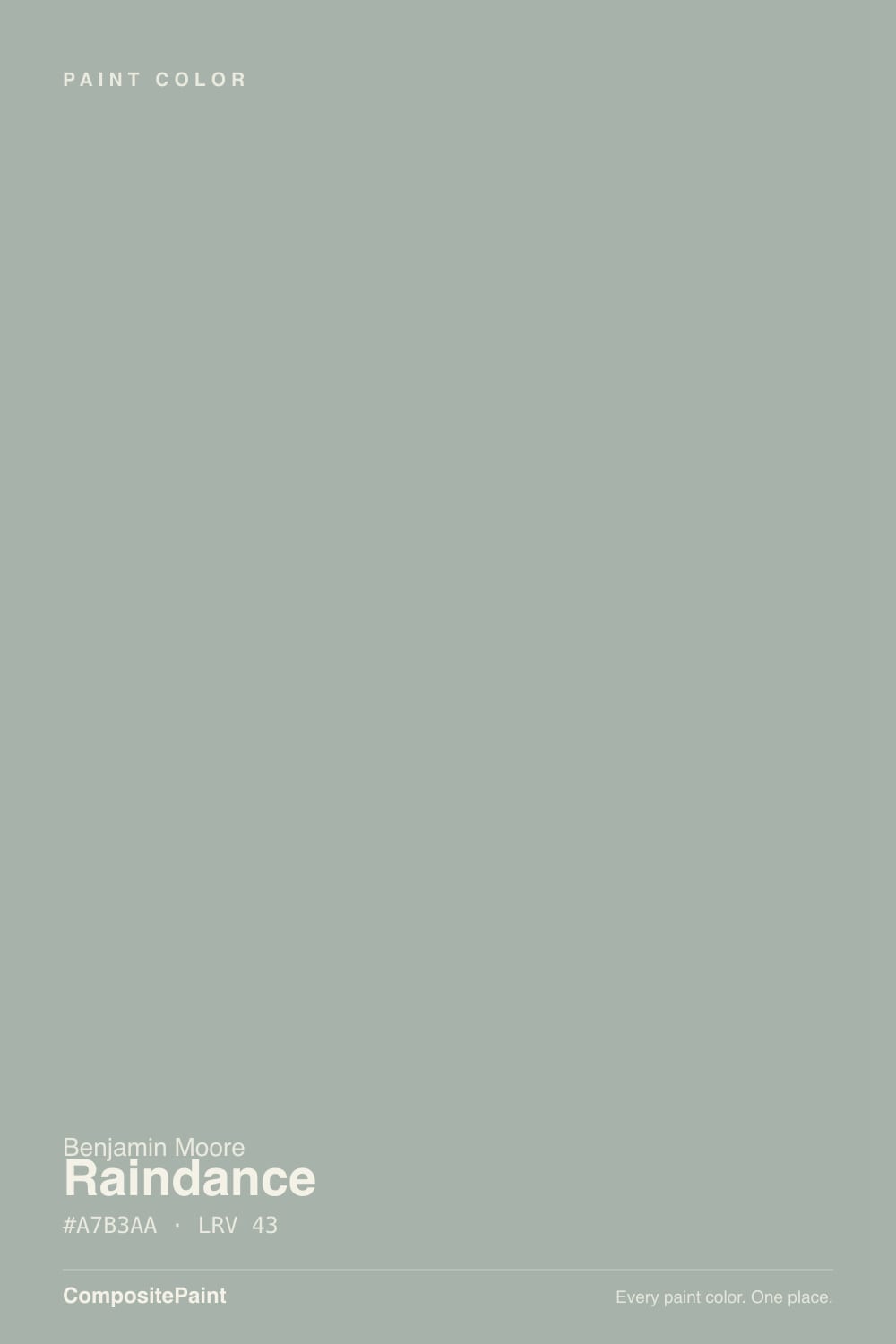
Raindance is a gray-dominant color with a steely green undertone and a whisper of blue underneath — Benjamin Moore’s own copy calls it a steely green with easygoing gray undertones, and that order of operations is right: the gray leads, the green follows a step behind. It sits in the Classics collection, which means it predates any current moment, but Benjamin Moore folded it into the 2026 Color Trends palette this year alongside cousins like Castle Walls and Misted Green — proof the deck has plenty of good colors that never needed a Color of the Year headline to earn a place in a real house.
At LRV 43 it holds a genuine mid-tone depth — light enough to keep a room from feeling closed in, dark enough to actually read as color rather than an off-white with an attitude. That depth is also why it shifts so much with the light: complex and layered in strong daylight, flat and grayed-out the moment the light goes cool or dim. It has a close relative worth knowing about before you order a sample: Benjamin Moore Pearl (CW-640) is close enough in hex and LRV that most eyes won’t tell the two apart on a wall — if a painter or a swatch app hands you Pearl instead of Raindance, you likely won’t notice the swap.
Undertone in one line: gray first, steely green-blue second — never yellow, never warm. If your sample reads like plain flat gray with no color at all, that is cool or overcast light stripping the green out — not a different can of paint.
Where It Shines
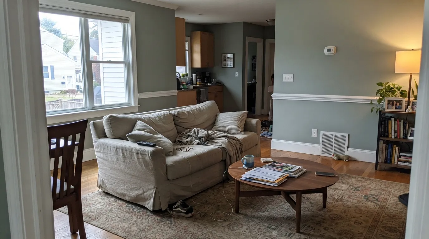
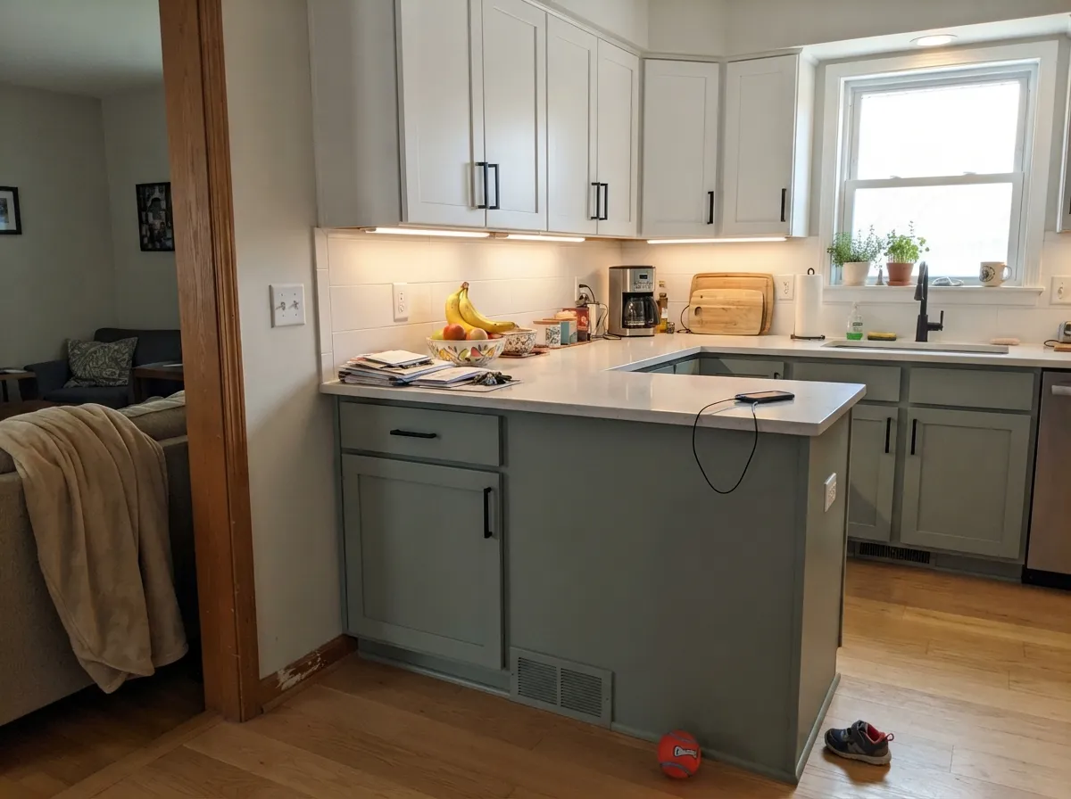
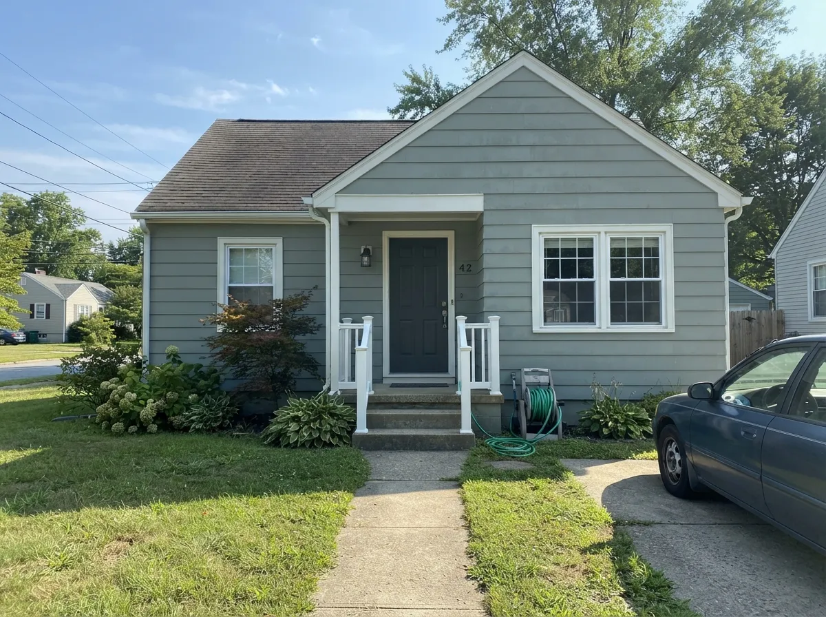
Give it real daylight and it earns the “steely” half of its own description — a mineral, stone-like quality that reads calm rather than boring. It is happiest in transitional and coastal-leaning rooms, next to warm whites, brass, and natural wood that isn’t too orange. On a kitchen island or a bathroom vanity it looks like a deliberate, slightly unusual choice rather than “just another sage.” Benjamin Moore also rates it for exterior work in Regal Select, and a house wearing it in full sun reads as a confident, quiet gray-green rather than a bold color statement.
Where It Fails
Almost every disappointed review of a chameleon color like this comes from one of three predictable situations. None of them are the paint’s fault — but if your room matches one, sample big before you commit.
Cool, low light drains the green out and leaves a flat, slightly sad concrete-gray with none of the “steely” character the name promises. This is the single most common regret with grayed-out chameleon colors, and Raindance is no exception — test the sample on the actual wall, not propped against a window.
Golden wood and brass-heavy warm rooms fight a gray-green instead of complementing it — the green looks slightly sickly next to strong yellow-orange, and the wood looks duller next to the green. Walnut, white oak, and matte black hardware are much better company than honey oak and shiny brass.
Raindance is deliberately in-between — not gray enough to read as a true gray, not green enough to read as a true sage. Buyers hoping for one or the other end up unhappy with the compromise. If you want a color that reads unmistakably sage, look at October Mist instead; if you want it unmistakably gray, Stonington Gray is the safer bet.
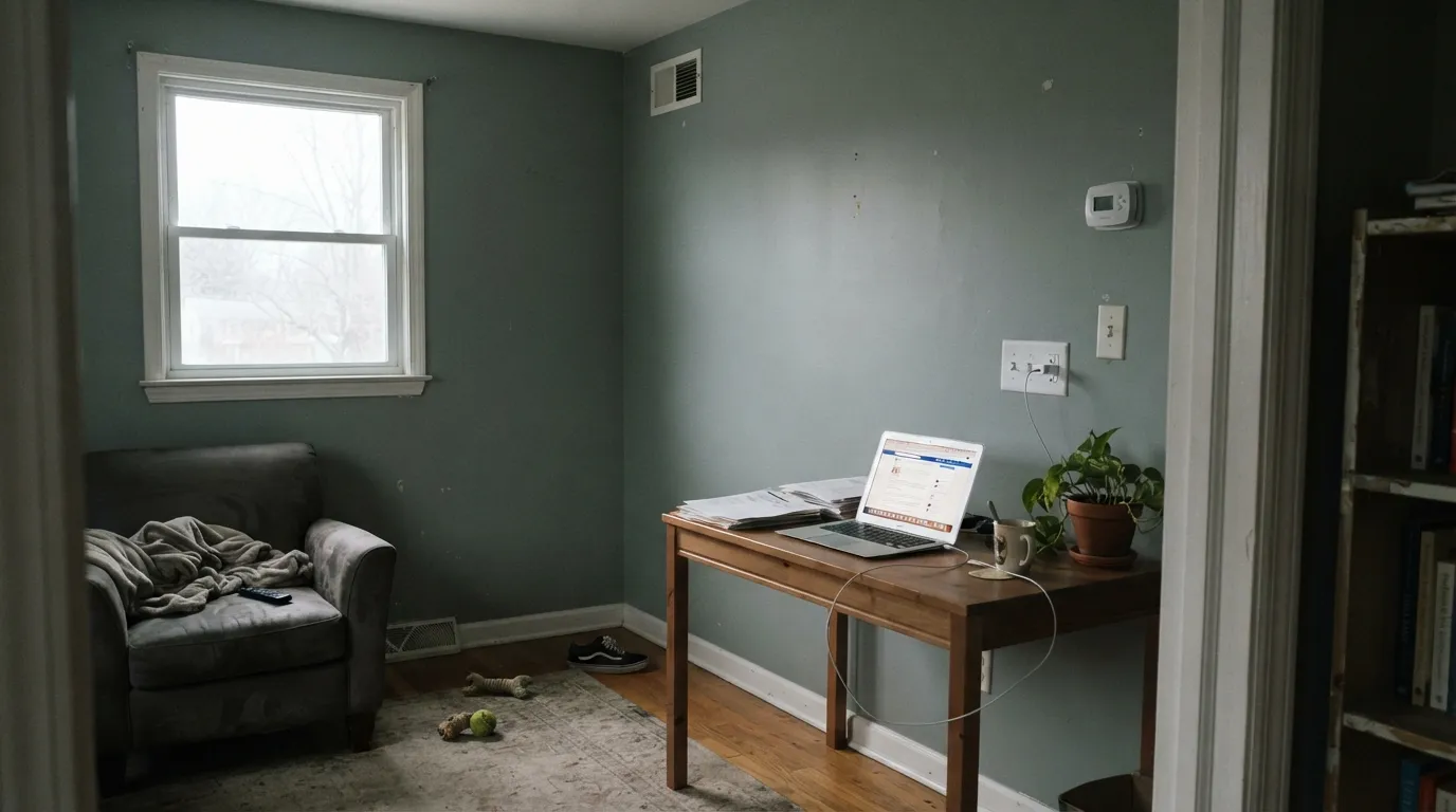
Room by Room
In a room with real daylight it reads as a sophisticated, mineral gray-green that makes white trim and walnut furniture look considered. Eggshell finish; keep the trim a warm white, not a stark one.
On an island or lower cabinets under white uppers it is a genuine transitional-kitchen option: quiet enough to not date the room, unusual enough to not look like every other gray kitchen. Satin cabinet enamel.
Softer and less committed than a true sage or navy bedroom, which is the appeal for readers who want calm without drama. Pairs well with cream bedding and warm brass sconces; skip cool white LED bulbs.
A natural for a vanity or a powder room with marble or quartz that has any gray in it. It leans cooler here than the living-room description suggests if the room has little daylight — add a warm sconce.
Benjamin Moore rates it for Regal Select exterior, and it reads as a confident, quiet gray-green body color in full sun. Pair with a warm white trim and a near-black door or shutters for contrast.
In a room without much natural light this is the riskiest room on the list — the color needs daylight to show its green side. If the room stays dim, treat this as a firm skip and pick a true gray instead.
Your Light Is the Risk
The steely green-blue comes forward and the gray grounds it — the color at its most “expensive.” East or south rooms with good natural light are the safe bet.
Cool gray daylight strips the green and leaves a flat, slightly sad concrete tone. If your room is dim most of the day, sample before you commit.
Cooler and grayer at midday, a touch greener and warmer as the light lowers in the afternoon. The swing is gentle, not dramatic.
2700K bulbs bring out the green-gray warmth and keep it from reading cold. Cool LEDs push it back toward flat gray — the easy fix is the bulb, not the paint.
Most complaints about Raindance are a light mismatch. Upload a photo of your actual room and see it on your walls — then ask for the same wall in north light or evening lamps before you buy a single sample.
Need It From Another Brand?
Any paint counter can custom-tint Benjamin Moore 1572 directly. If you would rather stay in one brand's own deck, these are the closest stock matches, measured as ΔE2000. Under 2 is a difference you will not see on the wall.
| Brand | Closest color | ΔE | LRV | |
|---|---|---|---|---|
| Sherwin-Williams | Forever GreenSW 9653 · Sherwin-Williams | 1.9 | 44 | Color page → |
| Behr | AquatonePMD-100 · Behr | 1.8 | 44 | Color page → |
| Valspar | Gray EmbraceV099-3 · Valspar | 1.9 | 45.8 | Color page → |
| PPG / Glidden | Dusty AquaPPG10-29 · PPG / Glidden | 2.8 | 44 | Color page → |
| Glidden | Dusty AquaPPG10-29 · Glidden | 2.7 | 44 | Color page → |
| Dutch Boy | Woodsy Gray425-3DB · Dutch Boy | 3.4 | 43 | Color page → |
Similar Benjamin Moore Colors
The nearest shades to Raindance within Benjamin Moore's own range, ranked by perceptual color distance — useful when you want the same look a touch lighter, darker, or warmer.
WCAG 2.1: AA is 4.5 : 1 for normal text, 3 : 1 for large text, AAA is 7 : 1.
Raindance vs the Colors You're Also Considering
Every Raindance sample board has the same rivals on it. The numbers show the real lightness gap — then it comes down to which risk you would rather live with.
Pick this for the name that actually has 2026 trend-palette momentum behind it.
Benjamin Moore CW-640 · LRV 43PearlPick this if a store hands you this instead of Raindance — it’s close enough that most rooms won’t show the difference.
Pick this for more gray and less blue — steadier, less prone to reading turquoise.
Benjamin Moore 1564 · LRV 41Beach GlassPick this for more blue-green and less gray — the classic spa-bathroom chameleon.
Boothbay Gray HC-165 shares the LRV of 43 but its hex #AAB2B0 carries more blue, so it reads as a blue-gray where Raindance at #A7B3AA reads as a green-gray. Garden Path 466 at #A7B4A2 and LRV 43 drops the blue and gains green, giving a clearer sage. Sage Wisdom CSP-775 at #A9B5A5 and LRV 44 sits between the two and is a touch warmer. Pearl CW-640 at #A7B0A9 and LRV 43 is effectively the same color on a wall. Across brands, Gaelic Garden 0463, sold by Kompozit, Hirshfield's, and Diamond Vogel, is a true match at deltaE 0.87 to 1.12, and Behr Aquatone PMD-100 at 1.84 and Sherwin-Williams Forever Green SW 9653 at 1.86 are visually identical in normal room light. Glidden Dusty Aqua PPG10-29 at 2.69 is very close but worth sampling. Dunn-Edwards Misty Seascape DEGR75 at 3.55 and Farrow & Ball Blue Gray No. 91 at 3.81 are close but visibly different side by side.
Raindance Coordinating Colors
The coordinating rule for Raindance is simple: warm whites over stark ones, and natural wood over anything gold-toned and shiny. It pairs cleanly with warm neutrals, takes a single near-black note well without needing a second accent color, and sits close enough to its own near-twin that the two are worth knowing about together. These are the partners that keep showing up in rooms that work:
Why Raindance Is Suddenly Back in the Conversation
Raindance has lived in Benjamin Moore’s Classics collection for years without much fanfare — a quiet steely green-gray next to louder, more marketed neighbors. In 2026 Benjamin Moore folded it into its Color Trends palette alongside close relatives like Castle Walls and Misted Green, which is less a rebrand than a spotlight: the same paint, the same can, just getting mentioned in the same breath as the year’s featured colors.
That is a genuinely different story than a Color of the Year pick built around one hero color. Nobody is claiming Raindance is 2026’s defining shade, and it shouldn’t be sold that way — it is an honest, well-made gray-green getting a second look as designers lean into mineral, stone-like neutrals and rediscover a color that was quietly good the whole time.
Raindance With Wood Tones and Floors
Walnut, white oak, and gray-washed floors are the easiest partners — their cooler or neutral undertone doesn’t fight the green-gray, and the color reads calm rather than competing with the wood.
Honey oak and anything gold-toned is the real caution. Yellow-orange sits close to this color’s complement, so a strong honey floor pulls the green forward in an unflattering way and can make both the floor and the wall look slightly off. It isn’t a hard no — a large neutral rug breaks the contact — but sample a big swatch above the actual floor before committing to four walls.
Three Ready Palettes Built on Raindance
A color is never alone on the wall. These are complete combinations in the 60-30-10 pattern, with the reason each one holds together. Every one opens in the visualizer.
White Dove keeps the trim warm instead of stark, which is exactly what this color needs to avoid reading flat; Wrought Iron gives one soft near-black note without pulling the room cold.
Try this palette in your roomChantilly Lace keeps the uppers bright and clean so the island can carry the color; a near-black third note keeps the palette from feeling too soft or sleepy.
Try this palette in your roomSuper White trim keeps the gray-green from reading heavy against the house; Kendall Charcoal on the door and shutters gives the facade one confident dark note without going full black.
Try this palette in your roomRaindance FAQ
Is Raindance green or gray?
Both, in that order — gray leads, a steely green-blue undertone follows. In cool light it can pass for plain gray; in good daylight the green comes forward. If you need a definite answer, decide which side you’d rather it lean and pick a less ambiguous color instead — this one is deliberately in-between.
Is it warm or cool?
Cool-leaning, though not icy. The gray base keeps it from reading as a warm color in any light, and dim or north-facing rooms push it further cool. Pair it with warm whites and wood rather than crisp bright whites to keep the room from feeling cold.
What is the difference between Raindance and Benjamin Moore Pearl?
On paper, almost nothing — the hex values and LRV are close enough that most rooms won’t show a visible difference. The practical reason to pick Raindance over Pearl right now is that it is the one Benjamin Moore is actively featuring in the 2026 Color Trends palette; otherwise, treat them as interchangeable.
Can I use it on kitchen cabinets?
Yes — it works especially well on an island or lower cabinets under white upper cabinets, which keeps the kitchen from feeling like a single block of color. Satin or semi-gloss cabinet enamel; avoid it as the only color in a small, dim kitchen.
Does it work on exteriors?
Yes — Benjamin Moore sells it in Regal Select exterior finishes, and it reads as a confident, quiet gray-green body color in full sun. Pair with a warm white trim and a near-black door or shutters rather than a stark white, which can make the body color look washed out by comparison.
What trim white goes with Raindance?
A warm white like White Dove keeps the pairing soft; if you want more contrast, Super White on trim only — not walls — reads crisp without fighting the color. Avoid a cold, blue-white trim; it pushes Raindance toward flat gray.
Have you painted with Raindance?
Rate it — one tap helps the next reader decide.
Ask a Question