Pearl
The Williamsburg green-gray reviewed honestly: why the "grayish blue" name misleads people, the rooms where it goes flat, and what to paint instead.

Jessica has spec'd whites and neutrals for more than 300 rooms and keeps a sample wall of painted drawdowns in her studio. Every color review is checked against real reader rooms in the comments and re-tested when a formula changes. About the testing process →
- 1Kendall Charcoal15
- 2Retreat21
- 3Pearl43
- 4Upward57
- 5Sea Salt63
The Fast Verdict
Pearl is the color you pick when a plain gray feels cold and a sage feels like too much. It is easy to live with, it flatters wood and brass, and it never shouts.
The catch is that the green only appears when the light is warm — in a dim north room it collapses into a plain, slightly dull gray and takes light out of the space. Give it real daylight, wood tones, and a clean white trim and it looks like a color someone chose on purpose.
Rooms with real daylight, especially south or west · bedrooms and offices you want calm · base cabinets and built-ins with wood counters · quiet siding on a wooded or coastal lot
Your room faces north and stays dim · you actually want a blue-gray · your counters or floors are cool blue-gray · the room is small with one small window
- Reads as a real color without ever getting loud
- Mid depth flatters oak, walnut, and unlacquered brass
- So desaturated it does not fight tile, stone, or fabric
- Works equally well on walls, cabinets, built-ins, and siding
- Hides scuffs and hand marks better than any light neutral
- Goes flat and plain gray in dim north light
- The name promises blue and the wall delivers green
- At LRV 43 it pulls light out of a small room
- Turns visibly green next to cool marble or blue-gray floors
What Color Is Pearl, Really?
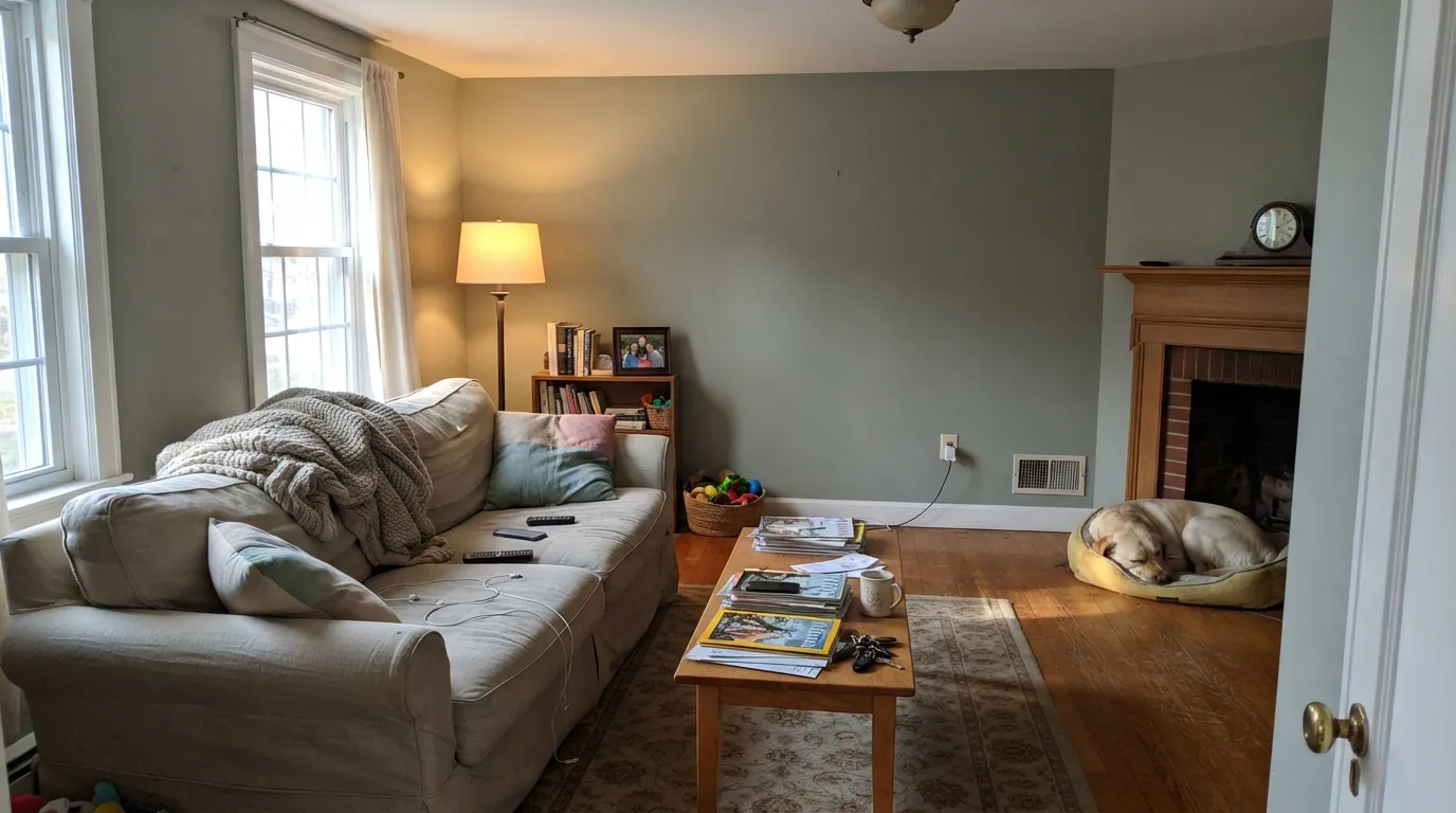
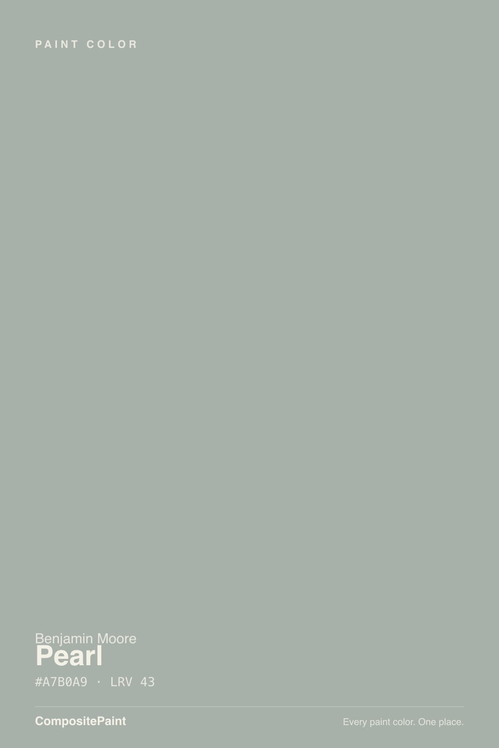
Benjamin Moore's own description calls Pearl "a light and lustrous shade of grayish blue." The numbers disagree. The hue sits at 133 degrees, which is the green half of the wheel, and the saturation is only about 5 percent — barely any color at all. What lands on the wall is a mid-tone gray with a faint green breath in it, closer to a sage leaf under cloud than to anything blue. It is a Williamsburg collection color pulled from 18th century wallpaper, and it behaves like one: quiet, slightly old, never bright.
LRV 43 is the part people underestimate. That is a true mid-tone — it sends back less than half the light that hits it. Put Pearl next to Sea Salt SW 6204 (LRV 63), the soft green-gray most people picture when they say "spa color," and Pearl is two clear steps darker. On four walls that depth is a good thing: it reads as a real color instead of a wash. In a room with one small window it is a problem, because the walls quietly take light out of the room and a second coat will not give it back.
Undertone in one line: gray first, green second, blue almost never. If your sample looks blue, that is cool north daylight or a blue-gray floor pushing it — not the paint.
Where It Shines
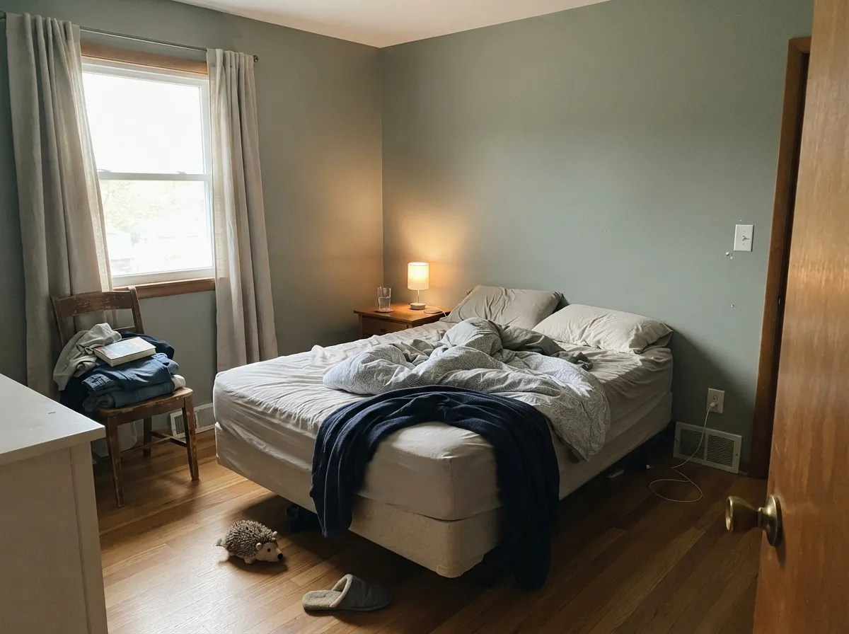
Pearl is at its best where daylight lasts most of the day and there is wood in the room. Living rooms, bedrooms, and offices with south or west windows let the green step forward just enough to look deliberate, and on cabinets and built-ins it does the thing a white cannot — stay quiet while still being a color.
Where It Fails
The complaints about Pearl are consistent, and they all trace back to one fact: this is a low-saturation mid-tone, so the room decides what it becomes. Three situations turn it against you, and all three are predictable before you buy a gallon.
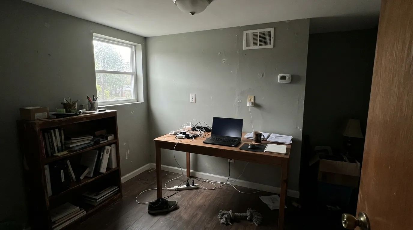
North light is cool and flat. It cancels the small amount of green and leaves a plain gray with a dull cast, and at LRV 43 the room itself reads noticeably darker. If you want the same family with more light left in the room, step up to Gray Wisp CC-670 at LRV 55.
The name and the "grayish blue" description set people up for a soft blue room, and then the green wins on the wall — hardest to miss in late-day west sun. If blue is what you actually wanted at this depth, Boothbay Gray HC-165 sits at the same LRV 43 and genuinely reads blue.
Carrara-type marble, blue-gray LVP, and cool porcelain tile all sit on the opposite side of neutral. Against them Pearl stops looking balanced and reads clearly green, sometimes faintly olive. Mount Saint Anne CC-710 is one LRV point away and leans blue, so it settles down next to that flooring instead of arguing with it.
Room by Room
With south or west windows it is calm without turning cold, and it makes oak and walnut look richer than a plain gray does. Eggshell on the walls, White Wisp OC-54 on trim in semi-gloss. In a north-facing living room, add real lamps or pick something lighter.
At LRV 43 it drops low and soft at night, which is exactly what most people want in a bedroom. Warm 2700K bulbs bring the green gently forward. Keep bedding and trim on the warm side — Harwood Putty CW-5 — or the room tips chilly.
The mid depth cuts screen glare and reads well behind you on video calls. Built-in shelves in the same color, satin, make the wall look deeper. Brass or aged bronze hardware keeps the whole thing from feeling clinical.
Against plain white tile and chrome it reads clean and slightly spa-like. Against cool gray marble it turns green, so hold the sample on the actual stone first. Use a scrubbable matte or satin, not flat.
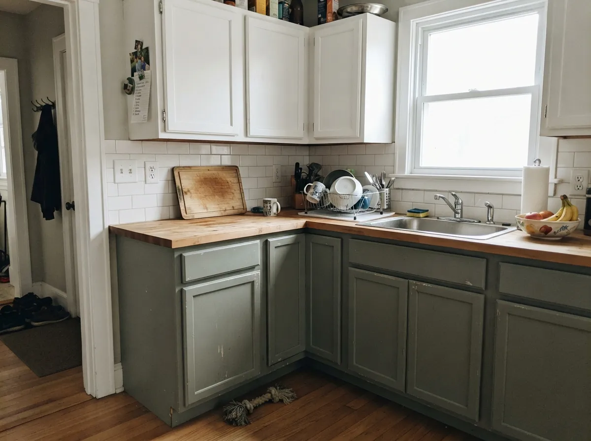
Satin on base cabinets with white uppers and a butcher block or walnut counter is the reliable version. It hides hand marks around handles far better than a white. Skip it on every cabinet in a kitchen with one small window — the room gets heavy fast.
On wooded and coastal lots the green tone agrees with what is already around the house, and full sun reads it about a step lighter than it looks indoors. Pair with White Wisp OC-54 trim and a Lampblack CW-695 door.
Your Light Is the Risk
Cool flat daylight cancels the green and leaves a dull gray. The room reads dimmer too. Test it with the lamps off.
Warm steady light lifts the green just enough. This is where Pearl looks chosen instead of default.
Late sun pushes the green forward and it can read almost sage for an hour. Most people like that hour.
2700K lamps soften it and keep the green alive. 4000K LEDs strip it back to gray — change bulbs, not paint.
Most complaints about Pearl are a light mismatch. Upload a photo of your actual room and see it on your walls — then ask for the same wall in north light or evening lamps before you buy a single sample.
Need It From Another Brand?
Any paint counter can custom-tint Benjamin Moore CW-640 directly. If you would rather stay in one brand's own deck, these are the closest stock matches, measured as ΔE2000. Under 2 is a difference you will not see on the wall.
| Brand | Closest color | ΔE | LRV | |
|---|---|---|---|---|
| Sherwin-Williams | Mineral DepositSW 7652 · Sherwin-Williams | 2.5 | 43 | Color page → |
| Behr | Garden VistaN430-3 · Behr | 3.5 | 42 | Color page → |
| Valspar | Dream Weaver8004-33D · Valspar | 2.2 | 41 | Color page → |
| PPG / Glidden | Light DrizzlePPG1033-4 · PPG / Glidden | 1.9 | 41 | Color page → |
| Glidden | Light DrizzlePPG1033-4 · Glidden | 1.3 | 41 | Color page → |
| Dutch Boy | Woodsy Gray425-3DB · Dutch Boy | 2.5 | 43 | Color page → |
Similar Benjamin Moore Colors
The nearest shades to Pearl within Benjamin Moore's own range, ranked by perceptual color distance — useful when you want the same look a touch lighter, darker, or warmer.
WCAG 2.1: AA is 4.5 : 1 for normal text, 3 : 1 for large text, AAA is 7 : 1.
Pearl vs the Colors You're Also Considering
Every Pearl sample board has the same rivals on it. The numbers show the real lightness gap — then it comes down to which risk you would rather live with.
Pick this for the green lean, with wood floors and warm stone in the room.
Benjamin Moore HC-165 · LRV 36Boothbay GrayPick this for a true blue-gray at the same depth — it stays blue.
Pick this when the room is warm and you want the greener half.
Benjamin Moore 1565 · LRV 16Mount Saint AnnePick this when cool marble or blue-gray flooring makes Pearl look olive.
Inside Benjamin Moore the neighbors are extremely close. Raindance 1572 and CC-680 both carry the hex #A7B3AA at LRV 43, which is a hair greener than Pearl's #A7B0A9. Mount Saint Anne 1565 and CC-710 sit at #A3B0AE and LRV 42, slightly darker and pushed toward blue. Silver Mink 1586 at #A7B2B0 and Boothbay Gray HC-165 at #AAB2B0, both LRV 43, are the coolest of the group and read closer to a blue-gray than a green-gray. On a wall these differences are small, so sample rather than guess.
Across brands, Glidden Light Drizzle PPG1033-4 at LRV 41 has a deltaE of 1.29 and Dunn-Edwards Silver Screen DET591 at LRV 41 is 1.66, so both are visually identical to Pearl in normal room light. Kompozit Gaelic Garden 0463 at LRV 43 is 2.19, Sherwin-Williams Mineral Deposit SW 7652 at LRV 43 is 2.53 and Behr Frozen Pond PPU12-09 at LRV 44 is 2.61, all very close but worth sampling first. Farrow and Ball Pond Green No. G7 at LRV 41 is 3.82, close but visibly different side by side.
Pearl Coordinating Colors
The rule with Pearl is to decide the temperature of your whites first, because the whites control how much green you see. A cool, clean white keeps Pearl crisp and slightly modern; a warm off-white softens it and sends the room traditional. Both are correct — but mixing them in one room is what makes Pearl look muddy.
For the second and third colors, skip the near neighbors. Raindance CC-680 and Silver Mink 1586 sit within a point of Pearl's LRV, so pairing them gives you no visible step at all. Go clearly lighter or clearly darker. These are the partners that actually read:
Pearl on Cabinets and Built-Ins
Cabinets are where Pearl earns the most. On a wall the green can vanish in bad light; on a cabinet door it is surrounded by wood, stone, and metal that give it something to react against, so it holds its character all day. Base cabinets in satin with white uppers is the safest layout — it keeps the upper half of the kitchen bright while the color does its work at eye level and below.
Hardware decides the direction. Brass, bronze, and copper pull the warm side of the green forward and make the kitchen feel older and softer. Chrome and polished nickel go the other way and leave Pearl cool and tailored. The same logic covers bathroom vanities, mudroom lockers, and bookcases — and on a built-in bookcase, painting the back panel the same Pearl instead of a white makes the whole unit read deeper. Use a urethane-fortified cabinet enamel; a wall paint will not survive door edges.
The Lighter and Darker Steps of Pearl
If Pearl is right in feel but wrong in depth, the family has clear rungs. Going up, Gray Wisp CC-670 at LRV 55 is the same idea with twelve more points of light — this is the fix for north rooms and small bedrooms. Sea Haze 2137-50 at LRV 45 is the warmer near-twin, only two points lighter but noticeably softer and less cool, and it is the better pick over yellow-toned oak floors.
Going down, Templeton Gray HC-161 at LRV 24 is Pearl with the volume turned up — still green-gray, dark enough for a dining room or a paneled office. Knoxville Gray HC-160 at LRV 16 is the deepest useful step and the one to use for an island, a front door, or a library where you want the room to close in on purpose. Any of these three stacked with Pearl gives you a real, visible ladder instead of the near-miss you get from Raindance or Silver Mink.
Three Ready Palettes Built on Pearl
A color is never alone on the wall. These are complete combinations in the 60-30-10 pattern, with the reason each one holds together. Every one opens in the visualizer.
These are Benjamin Moore's own partners for Pearl, and the reason they work is spacing: LRV 78 above, 43 in the middle, 22 below, so every plane separates cleanly. White Wisp is cool enough to keep the green honest instead of pushing it toward beige.
Try this palette in your roomHarwood Putty is a warm off-white at LRV 83, so the walls carry the light and the cabinets carry the color — the classic 60-30 split for a kitchen. Knoxville Gray is the same green-gray family four steps darker, which makes the island read as one deep note rather than a second color.
Try this palette in your roomWhite Dove is the warm version of the trim decision — it softens Pearl's coolness and keeps a bedroom from feeling like an office. Cushing Green supplies the 10 percent, deep enough at LRV 18 to anchor the room while sharing Pearl's green base.
Try this palette in your roomPearl FAQ
Is Pearl green or blue?
Green, faintly — even though Benjamin Moore's own description says grayish blue. The hue reads at 133 degrees, which is the green side of the wheel, but saturation is only about 5 percent, so the green is a lean rather than a statement. A small chip usually looks like plain gray; a full wall shows the green. Next to anything warm it looks cooler, and next to a real sage it collapses back into gray.
Is Pearl too dark for a small room?
It can be. At LRV 43 it reflects less than half the light in the room, so a small bedroom or a windowless powder room will feel closed in. In a small room with good daylight it is fine and actually looks deliberate. If you want the same color with more light, Gray Wisp CC-670 at LRV 55 is the step up.
What white trim goes with Pearl?
White Wisp OC-54 is the cleanest answer — it is one of Benjamin Moore's own coordinates for Pearl and keeps the edges crisp. For a softer, more traditional room use Harwood Putty CW-5 or White Dove OC-17, which warm the green slightly. Do not paint trim in Pearl itself; at this depth the room needs a lighter frame to look finished.
Pearl or Boothbay Gray?
Same depth, different temperature. Both sit at LRV 43, but Boothbay Gray HC-165 leans blue and Pearl leans green. If your tile, counters, or floors are cool blue-gray, Boothbay matches them; if the room has wood, brass, and warm stone, Pearl sits better. Sample both on the same wall — on a chip they look nearly identical.
Does Pearl work on kitchen cabinets?
Yes, and it is one of its strongest uses. Satin on base cabinets with white uppers and a wood counter is the version that always works. It hides knuckle marks around handles better than any white, and brass or aged bronze pulls give it the warmth the color needs.
Will Pearl look sage?
Only in strong warm light. In a west-facing room in late afternoon, or under 2700K bulbs, the green comes forward and people start calling it sage. For most of the day it is a gray. If you want an actual green at this depth, Nantucket Gray HC-111 at LRV 40 has real green-khaki in it and holds that color all day.
Does Pearl work on exteriors?
Yes. On siding and shingles it looks settled on wooded and coastal lots, where the green tone agrees with the trees and the water light. Full sun reads it about a step lighter than it looks inside, so it will not feel as heavy outdoors. Walk the sample to the shaded north side of the house before committing — that face will read grayer all year.
Have you painted with Pearl?
Rate it — one tap helps the next reader decide.
Ask a Question