Upward
Sherwin-Williams' 2024 Color of the Year, reviewed honestly: the light it was built for, the one where it turns lavender, and what to pick instead.

Jessica has spec'd whites and neutrals for more than 300 rooms and keeps a sample wall of painted drawdowns in her studio. Every color review is checked against real reader rooms in the comments and re-tested when a formula changes. About the testing process →
- 1Stardew43
- 2Quietude48
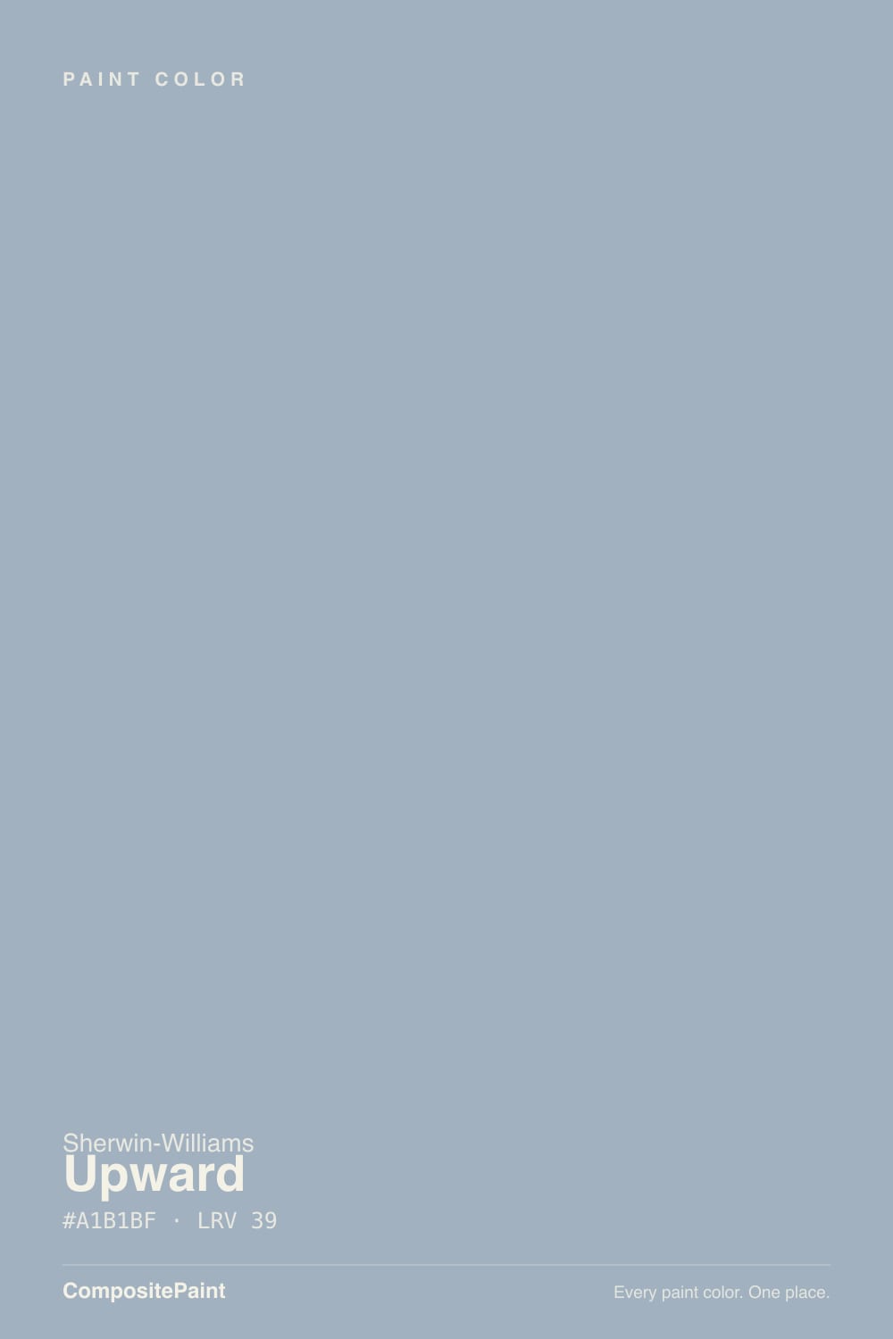
- 3Upward57
- 4Sea Salt63
- 5Wickham Gray68
The Fast Verdict
Upward is Sherwin-Williams' answer to the question every soft blue eventually gets asked: can it read grown-up instead of nursery? At LRV 57, with enough gray mixed into the blue to keep it from going pastel, the answer is mostly yes — which is exactly why SW named it 2024 Color of the Year. It is a genuinely versatile blue-gray for small, closed rooms: cabinets, powder rooms, nurseries, offices. The same gray base that keeps it sophisticated will occasionally slide toward violet when the light turns cool, and it is too much color to run through an open floor plan the way a true neutral would.
Kitchen cabinets with white counters and brass · powder rooms and small closed living rooms · nurseries that need blue without the baby-blue label · guest bedrooms and home offices
You want one color flowing through an open-concept main floor · your room faces north and stays dim · you're chasing a true, no-violet blue · your floors are yellow-heavy golden oak
- A genuinely versatile blue-gray that avoids the baby-blue trap
- 2024 Color of the Year pedigree, still one of SW's most-used soft blues
- Reads custom on cabinets with white counters, oak, and brass
- Nursery-safe without leaning pastel or gender-coded
- Cleaner and less green than Sea Salt or Rainwashed when a true blue-gray is the goal
- Too much color to run through an open floor plan
- Turns lavender-gray in north light or on overcast days
- Cool LED bulbs flatten it into plain gray at night
- Yellow-heavy golden oak fights it more than lighter woods do
What Color Is Upward, Really?
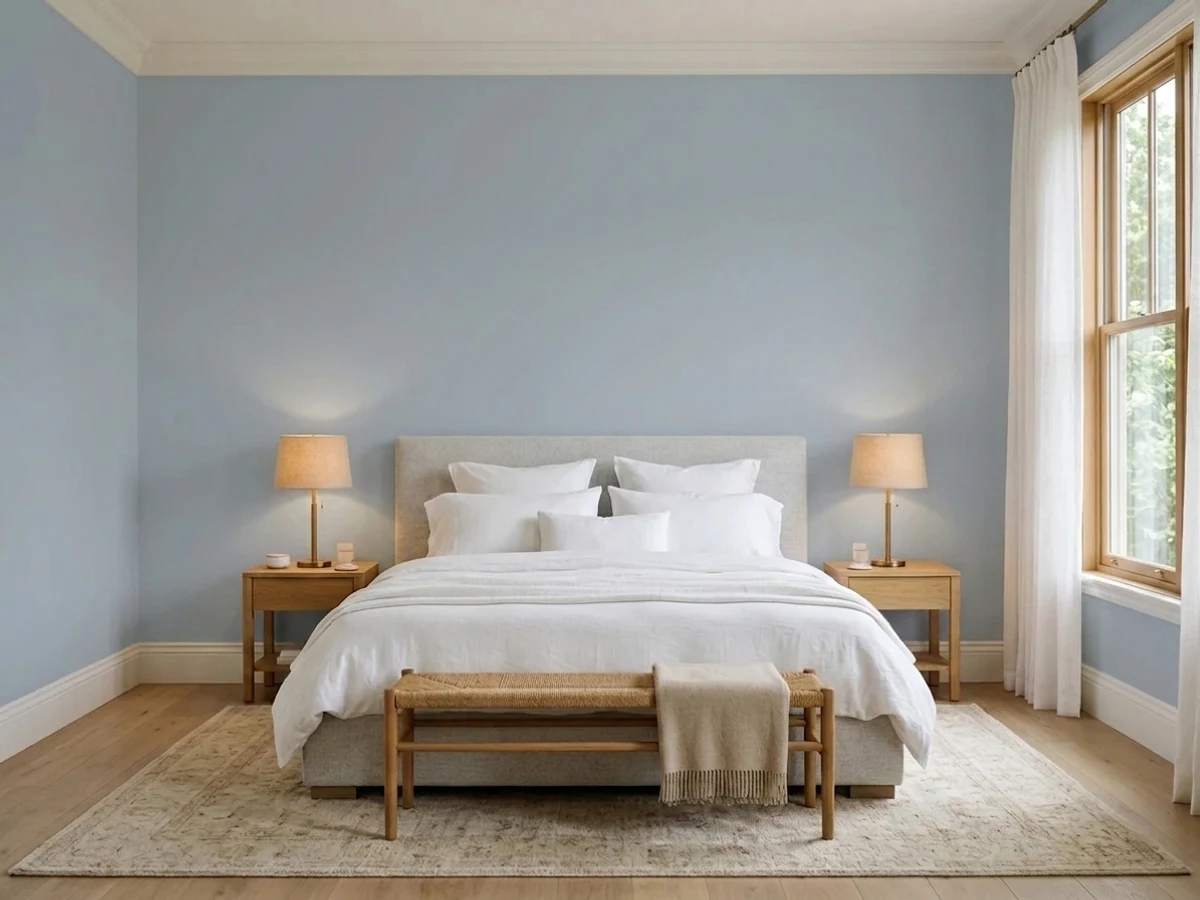
A light, airy blue with enough gray folded in to temper it — that gray is the whole reason Upward won Color of the Year instead of staying just another pretty blue. Straight pale blues read as nursery or coastal-cute; Upward's gray base pulls it toward something calmer and more architectural, which is why it shows up on kitchen cabinets and in dens as often as bedrooms. It sits in the same soft-blue-gray family that has been trending since Sea Salt and Rainwashed went mainstream, but it reads cleaner and less green than either of them.
At LRV 57 it is a medium-light color, not a pale wash. Set it next to Sea Salt (LRV 63) or Rainwashed (LRV 59) and Upward is the closest of the three to a true blue-gray — the others carry more green. That extra weight compared to a pastel is what lets it hold its color on cabinets and in small rooms without washing out, while still bouncing enough light to keep a powder room from feeling closed-in.
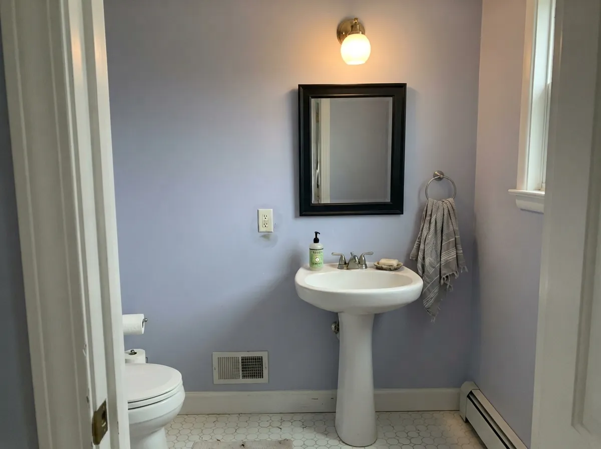
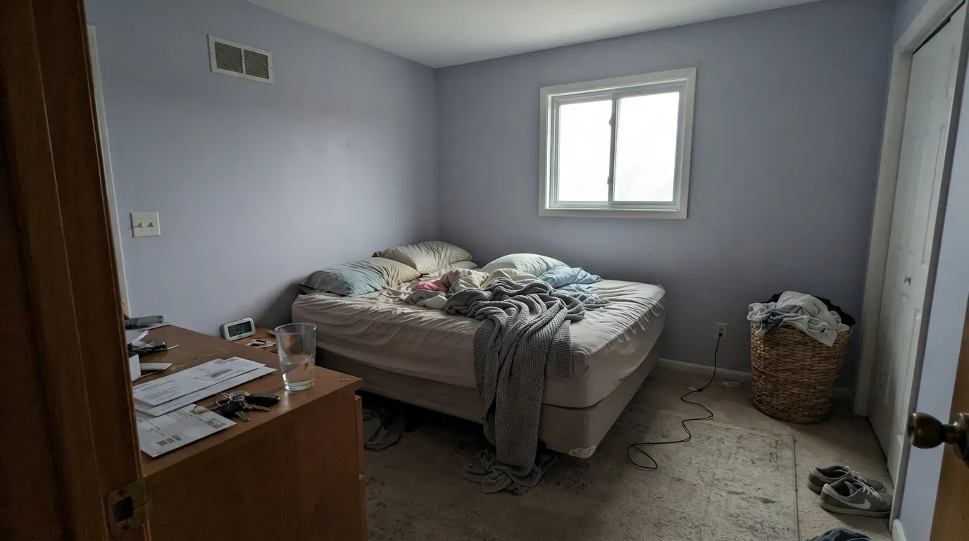
Undertone in one line: blue-gray with a whisper of violet, not green. In bright, direct daylight the blue reads clean and calm; in north or east light, on an overcast day, or in a dim room with no lamps, the violet comes forward and the wall can look lavender-gray instead of blue-gray. That shift is the single most consistent thing paint reviewers and owners report about this color — plan for it before you commit to four walls.
Where It Shines
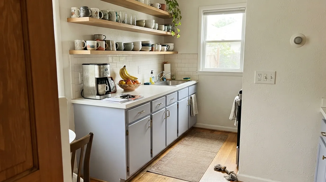
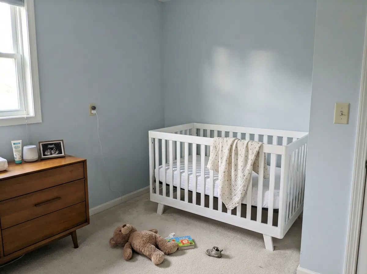
Give it good daylight, white or cream trim, and a room small enough to hold color, and Upward is one of the most-liked blues Sherwin-Williams sells. Cabinets are its breakout role — paired with white countertops, oak or walnut, and brass hardware it reads custom and current, which is why it shows up constantly in kitchen-cabinet galleries. Powder rooms, nurseries, and closed dens are its other strong suit: rooms sized to be finished by one color, where the blue can be the whole point instead of one note in a long open-concept run.
Where It Fails
Almost every disappointed review of Upward comes back to one of three situations, and all three are predictable before the first coat goes on. None of them are a defect in the paint — but if your room matches one, this color needs a plan, not just a sample chip.
This is the famous one. Cool daylight pulls the violet forward and the wall can read as a flat, slightly dingy lavender-gray instead of the blue you tested. It is not a different can of paint — it is the same undertone reacting to cooler light. Add warm 2700K lamps or test on the actual wall, at the actual time of day, before you paint the whole room.
Upward is a color, not a neutral, and it is genuinely too much personality to run continuously through a kitchen, living room, and hallway the way a greige can. Owners who tried it whole-house report the blue starts to feel busy by the third room. Keep it to one space and let a true neutral carry the connecting rooms.
Warm 2700K bulbs keep Upward reading as a soft blue-gray after dark. Cool-white or daylight LEDs flatten it — the blue drains out and the wall just looks plain gray, losing the exact quality you picked it for. Swap the bulbs before you swap the paint.
Room by Room
Calm and restful with warm lamps at night; eggshell hides texture without going flat. Give it real daylight during the day or the violet will show by afternoon.
The gray undertone is exactly what keeps it from reading as a pastel nursery blue — it works for a gender-neutral room that still needs to feel calm. Pair with a warm white trim to balance the cool base.
The most-photographed use of this color. White or light stone counters, brass or matte-black hardware, and white oak or walnut cabinetry all flatter it. Satin cabinet enamel; test against your actual counter sample, since cool quartz can push it toward violet.
A powder room is the ideal size for Upward: enough color to feel designed, small enough that the north-light risk is easy to manage with one good fixture. In a larger bathroom with cool tile, sample first.
Works beautifully as its own space with a door that shuts. Avoid it as the connecting color between an open kitchen and living area — that is where the "too much blue" complaints come from.
Not a whole-house exterior color. As a front door or shutter accent on a white or light-gray house it reads crisp and current; across full siding, strong sun can gray it out and it loses the character that makes it worth choosing.
Your Light Is the Risk
The blue reads clean and calm, gray doing its job without any violet drift. The most reliable light for this color.
The violet in the undertone comes forward and the wall can look flat, dingy lavender-gray. Test on the real wall before committing.
Warms slightly through golden hour, cools back toward violet in the low, shaded hours on either end of the day.
2700K lamps keep it a soft blue-gray after dark. Cool-white LEDs flatten it toward plain gray — swap bulbs, not paint.
Most complaints about Upward are a light mismatch. Upload a photo of your actual room and see it on your walls — then ask for the same wall in north light or evening lamps before you buy a single sample.
Need It From Another Brand?
Any paint counter can custom-tint Sherwin-Williams SW 6239 directly. If you would rather stay in one brand's own deck, these are the closest stock matches, measured as ΔE2000. Under 2 is a difference you will not see on the wall.
| Brand | Closest color | ΔE | LRV | |
|---|---|---|---|---|
| Behr | Alice WhiteMQ3-58 · Behr | 1.2 | 58 | Color page → |
| Benjamin Moore | Iced Slate2130-60 · Benjamin Moore | 0.5 | 58 | Color page → |
| Valspar | Milky Way8004-37B · Valspar | 3.0 | 58 | Color page → |
| PPG / Glidden | Northern ExposurePPG1165-3 · PPG / Glidden | 4.1 | 56 | Color page → |
| Glidden | Mild Wind Blue70BG 56/061 · Glidden | 1.1 | 56 | Color page → |
| Dutch Boy | Legacy340-2DB · Dutch Boy | 1.1 | 56 | Color page → |
Similar Sherwin-Williams Colors
The nearest shades to Upward within Sherwin-Williams's own range, ranked by perceptual color distance — useful when you want the same look a touch lighter, darker, or warmer.
WCAG 2.1: AA is 4.5 : 1 for normal text, 3 : 1 for large text, AAA is 7 : 1.
Upward vs the Colors You're Also Considering
Every Upward sample board has the same rivals on it. The numbers show the real lightness gap — then it comes down to which risk you would rather live with.
Pick this for the cleaner, more clearly blue read with less green in it.
Sherwin-Williams SW 6204 · LRV 63Sea SaltPick this if you want the greener, more coastal version of this same soft, gray-based mood.
Pick this when you want blue to actually read as blue, not green.
Sherwin-Williams SW 6211 · LRV 59RainwashedPick this for a more saturated green-blue with a stronger coastal pull.
Most of the near neighbors are lighter. Dockside Blue SW 7601 at LRV 43, Respite SW 6514 at LRV 43, and Faded Flaxflower SW 9146 at LRV 44 all sit a few points above Upward's 39, so each gives back more light while holding a similar dusty blue. Stardew SW 9138 at LRV 43 is the grayest of the group and the one to pick if you want the blue barely there.
Across brands, C2 Paint Stockholm C2-750 at LRV 41 is an exact color match on the numbers. Glidden Peace PPG10-28 at LRV 43 and Behr Rainy Sidewalk HDC-CT-24 at LRV 42 are both visually identical in normal room light. Farrow & Ball Lulworth Blue No. 89 at LRV 45 is very close, so sample it first. Benjamin Moore Slate Blue 1648 at LRV 43 is close but visibly different side by side.
Upward Coordinating Colors
The rule for coordinating with Upward: warm whites to balance the cool base, a near-black for one crisp anchor, and its greener blue-gray cousins when you want variation without clashing. These are the partners that keep showing up in the rooms that work:
Why a 2024 Color of the Year Became a One-Room Favorite
Sherwin-Williams named Upward its 2024 Color of the Year, part of a run of soft, gray-leaning blues and greens — Sea Salt and Rainwashed came before it — that moved paint away from stark gray without going back to saturated color. Upward's job in that lineup was to be the cleanest, most clearly blue member of the family, less green than its coastal cousins.
What actually happened once real buyers used it is a narrower, more specific success: it became a cabinet color and a small-room color more than a whole-house one. The same restraint that made it a safe pick for a jury of color experts is what makes it feel like too much personality spread across an open floor plan — it is a color with a point of view, not a neutral wearing a blue coat.
Upward With Wood Tones and Floors
Light, neutral oak — white oak, driftwood oak — is the safest and most flattering floor under Upward; the cool gray-blue and the pale, neutral wood share the same quiet register, and neither fights the other. Dark walnut is the other strong pairing: the contrast is real, but it reads deliberate rather than clashing, and it is a common choice under Upward cabinets specifically for that reason.
The floor to test carefully is a very yellow golden oak. A warmer, more orange-leaning honey oak can still work as a traditional-leaning contrast, but a floor with a strong yellow cast will fight Upward's cool base more than it complements it — sample a large piece of the actual floor next to the paint before committing a whole room.
Three Ready Palettes Built on Upward
A color is never alone on the wall. These are complete combinations in the 60-30-10 pattern, with the reason each one holds together. Every one opens in the visualizer.
Pure White keeps the room bright enough that Upward's blue reads clean instead of muddy, and one dose of Iron Ore on the island or hardware gives the kitchen a grounding dark note so the pale cabinet color doesn't float.
Try this palette in your roomWhite Dove's warmth on the trim balances Upward's cool base instead of fighting it, which keeps a small room from feeling cold. Tricorn Black on the mirror frame and fixtures gives the room one crisp, deliberate dark note.
Try this palette in your roomAlabaster's warmth at the trim line keeps the room from reading cold, and Worldly Gray in the hallway sits at the same LRV as Upward so the handoff between rooms is seamless instead of jarring.
Try this palette in your roomUpward FAQ
Is Upward blue or gray?
Both, in that order — it is built as a blue with enough gray mixed in to temper it, not a gray with a blue tint. In bright daylight the blue is clearly the dominant note; in dim or north light, the gray (and a hint of violet) can take over and it reads closer to a soft lavender-gray.
Why does it look purple in my room?
Upward carries a whisper of violet in its undertone, and cool, north-facing or overcast light brings that forward. It is the single most common surprise reported about this color. Warm 2700K lamps and a south- or west-facing wall keep it reading blue instead.
Is it good for kitchen cabinets?
Yes — it's one of the most popular current cabinet colors in the SW deck. It pairs especially well with white or light stone counters, brass or matte-black hardware, and white oak or walnut. Very yellow golden-oak floors are the one pairing to test carefully first.
Can I use it as a whole-house color?
Not recommended. Upward reads as a genuine color choice, not a neutral, and running it through an open kitchen-to-living-room floor plan tends to feel busy by the third room. It is strongest as the star of one closed space — a powder room, a nursery, a den, a set of cabinets.
What trim white goes with Upward walls?
A warm white — White Dove or Alabaster — balances the cool blue base better than a stark, blue-leaning white would. If the room already gets plenty of warm light, a brighter neutral white like Pure White also works.
Is Upward good for a nursery?
Yes, and it's a common choice specifically because the gray keeps it out of pastel baby-blue territory — it works for a gender-neutral room that still reads calm rather than sweet. Watch the same north-light caveat as any other room.
Have you painted with Upward?
Rate it — one tap helps the next reader decide.
Ask a Question