Gray Screen
The cool gray with no warmth hiding in it, reviewed honestly: where it reads clean and modern, the light that turns it dingy, and what to pick instead.

Jessica has spec'd whites and neutrals for more than 300 rooms and keeps a sample wall of painted drawdowns in her studio. Every color review is checked against real reader rooms in the comments and re-tested when a formula changes. About the testing process →
- 1Stardew43
- 2Quietude48
- 3Gray Screen59
- 4Gray Owl65
- 5Glass Slipper70
The Fast Verdict
Gray Screen is gray without the apology — no beige hiding underneath, no greige safety net, just a light cool gray with a faint blue-green edge. That honesty is the whole review. In a bright room with white trim it looks crisp and expensive; in a dim one it has nothing warm to fall back on and goes flat and dingy. Buy it because you want gray, not because you want a neutral that behaves like beige.
Bright rooms with white trim, cool tile or quartz · closets, laundry rooms and mudrooms lit by LED · modern houses going gray on purpose · anyone whose last greige turned pink or lavender
The room is dim and north-facing · your trim is a cream white or your floors are honey oak · you actually wanted greige · the whole house runs on warm 2700K bulbs and nothing else
- Actually stays gray — no beige, violet or pink surprise
- Light enough (LRV 59) for windowless closets and small baths
- Loves cool finishes: quartz, marble, chrome, stainless, matte black
- Hides scuffs and hand marks far better than a white wall
- One of the few wall colors that looks good under cooler LED bulbs
- Goes flat and dingy in dim or north-facing rooms
- Reads cold next to cream trim, honey oak or warm tile
- No warm base to rescue it when the light is bad
- Disappoints anyone who meant greige when they said gray
What Color Is Gray Screen, Really?
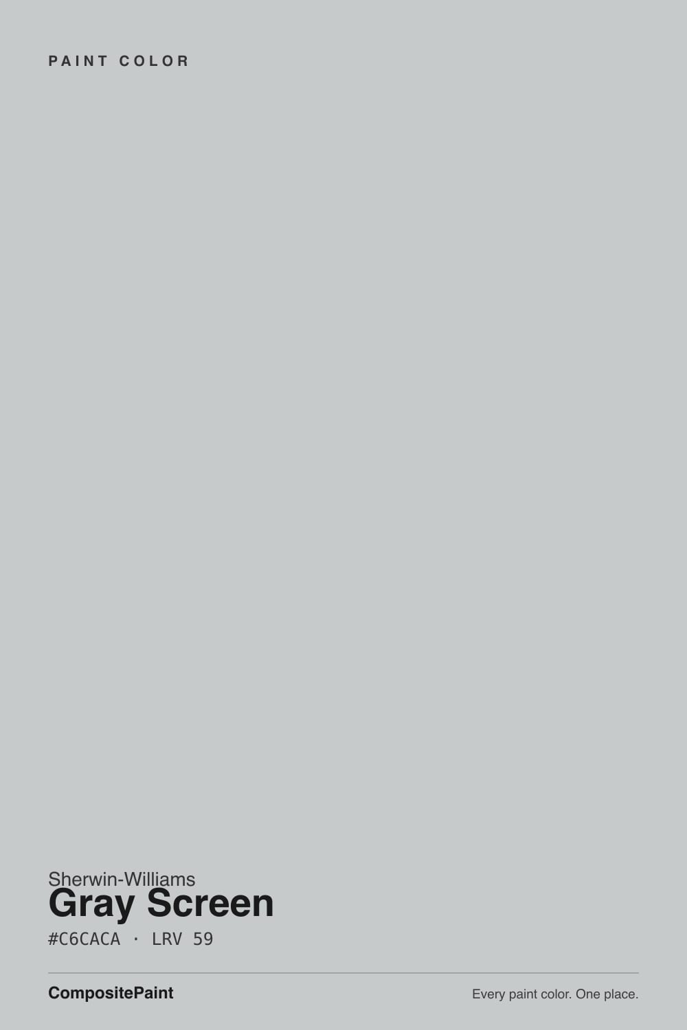
A light, genuinely cool gray — and the pigment math says so. Its RGB reads 198 red, 202 green, 202 blue: red is the lowest channel, and green and blue land dead even. That is the technical signature of a cyan-leaning gray with essentially no yellow or red in it. Most colors sold as gray are quietly built on a beige or violet base so they play nice in bad light; Gray Screen is not. Sherwin-Williams files it under neutrals, and on the chip it looks like the plainest color in the fan deck. On four walls it is cooler than the chip suggests.
At LRV 59 it sits right in the busiest part of the deck — the same brightness band as Passive (LRV 60) and Repose Gray (LRV 58). Brightness is not what separates them; temperature is. Repose leans warm and can flash violet, Passive sits close to true neutral, and Gray Screen is the cool one of the three. That LRV keeps a small room from feeling closed in, which is why it survives in windowless spaces that a deeper gray would crush — as long as the fixtures are decent.
Undertone in one line: cool, with a whisper of blue-green — never beige, never violet. If your sample reads icy blue, that is a north window or a 5000K bulb amplifying what is already there; if it reads almost white, your room is very bright and the gray is behaving exactly as designed.
Where It Shines
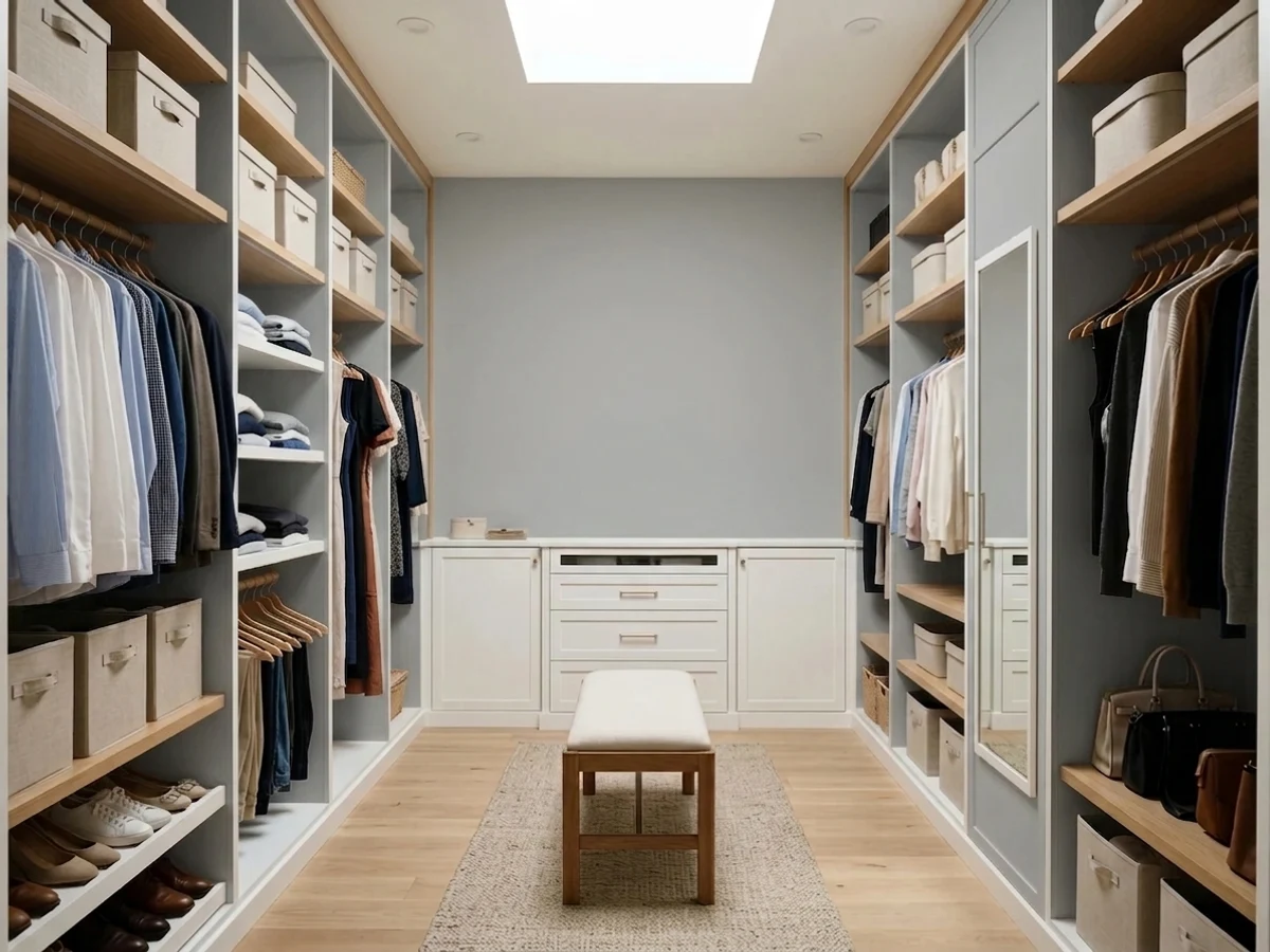
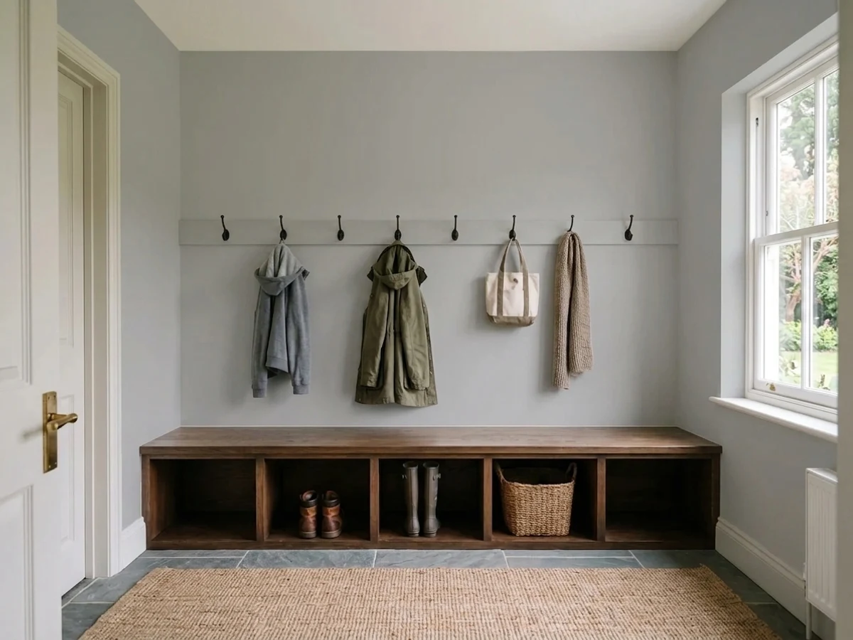
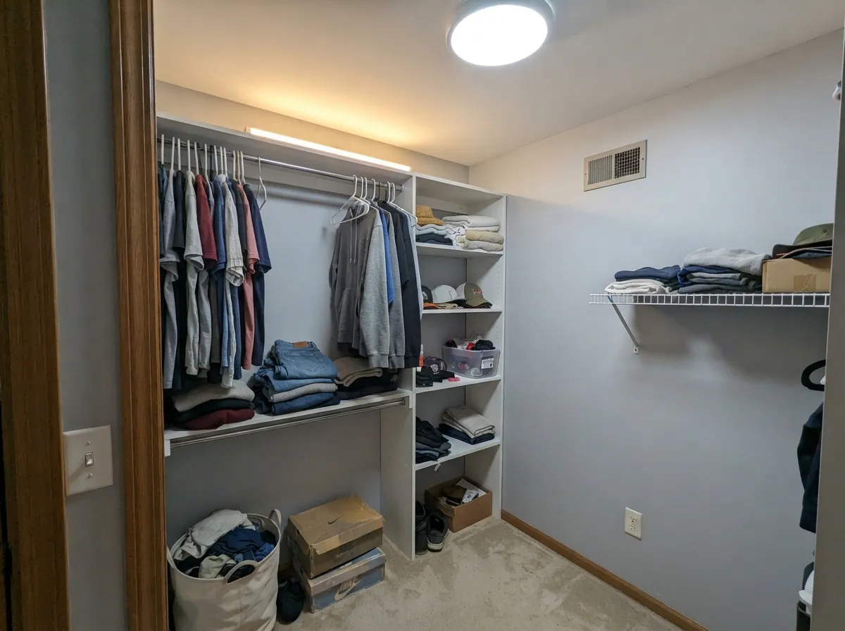
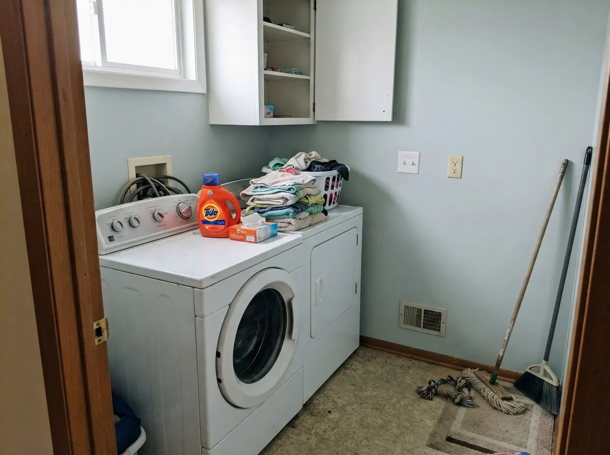
Give it light and crisp white trim and it does the one thing greige cannot: it stays gray. Nothing tips warm at four in the afternoon, nothing goes pink under a north window, and it never argues with cool quartz, marble, chrome or stainless. Its second home is the utility room nobody photographs — closets, laundry rooms, mudrooms — where the lighting is bright LED, the walls take scuffs, and a cool gray at LRV 59 reads clean and organized where a warm neutral reads dingy.
Where It Fails
Nearly every regret story about Gray Screen follows one of three scripts, and all three are predictable before you open the can. None of them are the paint's fault — but if your room matches one, this is the wrong gray, and a second coat will only make it more so.
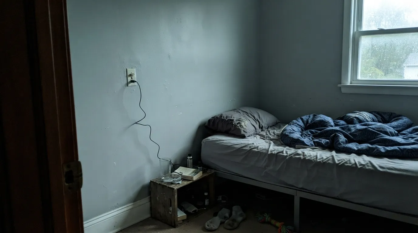
This is the big one. Warm-based grays borrow their warmth to stay likeable in bad light; Gray Screen has none to borrow. In a dark north room or a basement corner it stops looking crisp and starts looking like unfinished concrete — owners use the words dingy and dirty. Add light or pick a warmer gray; there is no third option.
Put a cool gray next to a warm cream white and both lose: the trim reads yellowed, the wall reads bluish and grubby. Same story with honey oak floors and orange-stained trim. Gray Screen needs a clean, cool white beside it — Extra White or Pure White — and floors that are white oak, gray-washed, walnut or tile.
Half the bad reviews are a vocabulary problem. People who describe their dream color as warm gray, cozy gray or gray that goes with everything are describing greige, and they end up staring at a cool wall wondering why the room feels cold. If that is you, Repose Gray or Agreeable Gray is what you were picturing.
Room by Room
Closets run on bright LED, which is the exact light this color wants, and at LRV 59 it stays light enough that a windowless walk-in never feels boxed in. Against white melamine shelving and hanging clothes it reads clean and sorted rather than builder-blank. Satin so a sleeve or a suitcase wipes off.
The practical case: it hides scuffs and hand marks that a white wall broadcasts, and it will not go yellow above a dryer the way a warm neutral does. Pairs naturally with white cabinets, stainless, and a dark lower cabinet or bench. Satin or semi-gloss on anything that gets touched.
This is a color that finally makes sense of gray-veined quartz, white subway tile, chrome and polished nickel — all the cool finishes that make warm greiges look muddy. Skip it if your vanity is honey oak or your tile is a warm travertine; the temperature clash is immediate.
A neutral, non-distracting backdrop that reads calm on camera and does not throw a color cast onto your face the way a beige or a green does. Bonus: it takes cooler 3500K to 4000K task lighting without turning muddy, which is unusual.
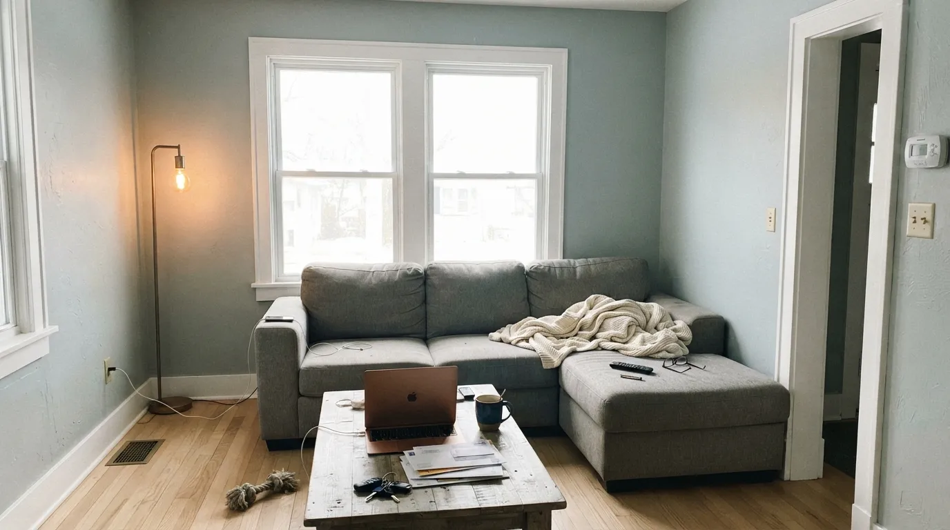
In a room with big windows and white trim it is a genuinely good modern living-room gray. In a room with one small window it is the color people repaint after a winter. Be honest about the window count before you commit four walls of it, and plan on lamps.
Outside is the one place its weakness disappears: full sun gives it all the light it could ever want, and it holds gray instead of going tan the way warm-based body colors do. Keep the trim contrast strong — white trim alone on a light gray body washes out from the curb, so add black or charcoal at the windows, door or shutters.
Your Light Is the Risk
A room with big windows reads it crisp and clean, blue-green kept to a whisper. This is the light it was built for.
Cool grey daylight with no punch behind it leaves a flat, chilly, slightly dirty wall. The dingy complaints all start here.
Cool and clean in the morning; low west sun warms it to nearly a soft neutral for an hour, then it snaps back to gray.
Warm 2700K lamps mute it toward drab putty. Rare advice, but true here: go 3000K to 4000K and it stays clean.
Most complaints about Gray Screen are a light mismatch. Upload a photo of your actual room and see it on your walls — then ask for the same wall in north light or evening lamps before you buy a single sample.
Need It From Another Brand?
Any paint counter can custom-tint Sherwin-Williams SW 7071 directly. If you would rather stay in one brand's own deck, these are the closest stock matches, measured as ΔE2000. Under 2 is a difference you will not see on the wall.
| Brand | Closest color | ΔE | LRV | |
|---|---|---|---|---|
| Behr | Burnished MetalUL260-17 · Behr | 0.6 | 59 | Color page → |
| Benjamin Moore | Pelican Gray1612 · Benjamin Moore | 0.7 | 59 | Color page → |
| Valspar | Gray Morn8006-11B · Valspar | 2.0 | 59 | Color page → |
| PPG / Glidden | Pittsburgh GrayPPG0994-2 · PPG / Glidden | 1.6 | 59 | Color page → |
| Glidden | Pittsburgh GrayPPG0994-2 · Glidden | 1.6 | 59 | Color page → |
| Dutch Boy | Silvery Gray436-2DB · Dutch Boy | 0.6 | 59 | Color page → |
Similar Sherwin-Williams Colors
The nearest shades to Gray Screen within Sherwin-Williams's own range, ranked by perceptual color distance — useful when you want the same look a touch lighter, darker, or warmer.
WCAG 2.1: AA is 4.5 : 1 for normal text, 3 : 1 for large text, AAA is 7 : 1.
Gray Screen vs the Colors You're Also Considering
Every Gray Screen sample board has the same rivals on it. The numbers show the real lightness gap — then it comes down to which risk you would rather live with.
Pick this when you want the cooler read — Gray Screen keeps a faint blue-green edge Passive does not have.
Sherwin-Williams SW 7064 · LRV 60PassivePick this if you want the same brightness sitting closer to a true, dead-neutral gray.
Pick this if Repose went lavender on you in north light — there is no violet in Gray Screen to expose.
Sherwin-Williams SW 7015 · LRV 58Repose GrayPick this if you actually wanted a warm, forgiving greige that plays nice with oak and cream.
Unique Gray SW 6260 and Zircon SW 7667 both share an LRV of 59, but their hex values, #CBC9C9 and #CAC9C6, carry more warmth, so they read slightly softer than Gray Screen's cooler #C6CACA. Passive SW 7064 at LRV 60 is the well-known cool alternative and leans a touch bluer. Tinsmith SW 7657 at LRV 57 is marginally deeper and greener.
Across brands the matches are very close. HGTV Home by Sherwin-Williams Gray Screen HGSW 1467 shares the identical hex and LRV, a measured difference of 0. Dutch Boy Silvery Gray 436-2DB at LRV 59 measures 0.61, Behr Burnished Metal UL260-17 at LRV 59 measures 0.64, and Benjamin Moore Pelican Gray 1612 at LRV 59 measures 0.65, all effectively the same color. Valspar Gray Morn 8006-11B at LRV 59 measures 2.03, very close but sample first. Farrow and Ball Calluna No. 270 at LRV 58 measures 4.96, close but visibly different side by side.
Gray Screen Coordinating Colors
The rule for coordinating with Gray Screen is the mirror image of the greige rule: stay on the cool side of the fence. It looks right beside clean whites, other cool grays, navy and near-black, and it looks wrong beside cream, tan and anything with a yellow base. These are the partners that keep showing up in rooms that work:
The Home-Theater Story Behind the Name
Gray Screen has a second life almost no designer knows about. For years, DIY home-theater builders on AV forums have used SW 7071 to paint their own projector screens, and the threads about it run to multiple pages. The reason is technical: a projector screen has to be neutral, because any warm or cool bias in the paint tints every image thrown onto it. Builders peg Gray Screen at roughly N8 on the neutral gray scale and report that it holds tonal balance and contrast well, with the usual caveat that a big screen and a dim projector can end up too dark.
That community verdict is the most useful fact in this whole review, and it explains the wall behavior perfectly. Gray Screen is popular with those builders precisely because it does not have the hidden warmth that almost every fashionable gray carries. It is close to pigment-neutral. That neutrality is what makes it look clean and modern in a bright room — and what leaves it with nothing to fall back on when the light goes away.
One thing not to do: do not paint an actual media room in it. LRV 59 walls bounce light straight back at the screen and wash out the picture. Screen paint and room paint are opposite jobs — theater walls want something dark like Iron Ore or Peppercorn.
Gray Screen With Wood Tones, Floors and Metals
This decision is made at the floor. White oak, gray-washed wood, cool LVP, porcelain tile, polished concrete and walnut all sit comfortably with Gray Screen — the wall and the floor agree on temperature, and the room reads deliberate. Cream or gray carpet is fine. So is a stained concrete basement floor, provided the room has light.
The honest no is golden: honey oak floors, orange-stained oak trim, yellow-beige carpet, warm travertine. Yellow-orange is the opposite side of the wheel from this color's blue-green lean, so each side exaggerates the other — the floor gets more orange, the wall gets more blue, and both look cheaper than they are. If the golden floor is staying, put a large cool rug between them or pick a warm greige and stop fighting the room.
Metals are easy and they matter here. Chrome, polished nickel, stainless and matte black all belong with it. Unlacquered brass and aged bronze are the two that look out of place — beautiful metals, wrong temperature. If your fixtures are brass and you are not replacing them, this is a sign to pick a warmer gray.
Three Ready Palettes Built on Gray Screen
A color is never alone on the wall. These are complete combinations in the 60-30-10 pattern, with the reason each one holds together. Every one opens in the visualizer.
Extra White is the crisp, cool trim white that makes Gray Screen read its truest — a cream white here would make both look wrong. Iron Ore on the door gives the little room one dark anchor so it feels designed rather than utilitarian, and it matches black rails and hardware.
Try this palette in your roomPure White is the softest trim white that still reads clean beside a cool gray, so the edges stay crisp without going clinical. Naval is the classic partner — both sit on the cool side of the wheel, so the deep blue grounds the room instead of fighting the walls. Chrome or matte black hardware, not brass.
Try this palette in your roomThree values of the same idea: light walls, white uppers, dark lowers where the dirt actually lands. Peppercorn takes its cue from the room around it, so beside Gray Screen it settles into a cool charcoal rather than a brown one, and the whole room still reads clean at nine at night under LED.
Try this palette in your roomGray Screen FAQ
Is Gray Screen warm or cool?
Cool, clearly. Its green and blue channels are equal and its red channel is lower, which means a faint blue-green cast and no yellow or violet base at all. That is unusual — most popular grays are quietly warm. It is why the color looks so clean in a bright room and so bleak in a dark one.
Does Gray Screen look blue on the wall?
Sometimes, and it depends entirely on your light. In bright, balanced daylight it reads as a plain cool gray. In a north-facing room, under 5000K bulbs, or next to warm cream trim, the blue-green comes forward and people call it icy. Sample a big board on the wall you actually plan to paint and look at it at night too.
What trim white goes with Gray Screen?
A clean, cool white — Extra White for the crispest contrast, Pure White for a slightly softer edge. Do not use a cream or warm white like Swiss Coffee; the temperature gap makes the trim look yellowed and the wall look grubby. Semi-gloss trim, eggshell walls.
Is Gray Screen good for a bedroom?
It can be, but it is not the easy answer. Bedrooms are used at night under warm lamps, and warm bulbs flatten this color toward drab putty gray — the opposite of the crisp look you sampled at noon. If the bedroom has big windows and you like a cool, hotel-modern feel, go ahead. If it is dim or you love warm lighting, a greige will treat you better.
Gray Screen or Repose Gray?
They are almost identical in brightness — LRV 59 versus 58 — so this is purely a temperature decision. Repose Gray is the warm greige that flatters oak and cream but can flash violet in cool north light. Gray Screen is the true cool gray that never flashes anything but needs light to look good. Pick by your floors: warm wood favors Repose, white oak and tile favor Gray Screen.
Why do home-theater builders use this color?
Because it is one of the most genuinely neutral grays available off the shelf, DIY projector-screen builders on AV forums have used it for years as a screen paint — a neutral gray does not tint the projected image the way a warm gray does. That is a useful clue for homeowners too: the reason it works on a screen is exactly the reason it can read cold on four walls. Note the walls of a real theater room want something much darker; see the section above.
Have you painted with Gray Screen?
Rate it — one tap helps the next reader decide.
Ask a Question