North Star
The blue-gray everyone calls a chameleon, reviewed honestly: the light where it turns a real soft blue, the light where it goes flat gray, and what to pick instead.

Jessica has spec'd whites and neutrals for more than 300 rooms and keeps a sample wall of painted drawdowns in her studio. Every color review is checked against real reader rooms in the comments and re-tested when a formula changes. About the testing process →
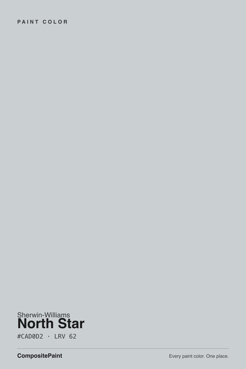
- 1Stardew43
- 2Upward57
- 3North Star62
- 4Wickham Gray68
- 5Spring Thaw83
The Fast Verdict
North Star is Sherwin-Williams' answer to "I want blue, but not too much blue": a pale blue-gray at LRV 62 that reads a soft, clear sky-blue in strong daylight and settles into a quiet slate gray the moment the light softens. That shift is not a defect — it is the entire personality of the color, and owners who understand it going in tend to love it. The ones who expected one fixed color, wall to wall, all day, are the ones who write the confused reviews.
Bedrooms and bathrooms that want calm without going full gray · kitchens with white cabinets and brass or nickel hardware · anyone who likes the idea of blue but isn't ready to commit to it · rooms that get real daylight from more than one direction
You need the wall to read one describable color all day · your room only gets weak north light and no lamps · you're picking for a fast resale and want a color nobody has to think about · you already own a green-leaning chameleon gray and want something genuinely different, not a cousin
- Genuinely soft, calming blue-gray that never tips into candy or nursery-blue
- LRV 62 keeps a room bright without going stark white
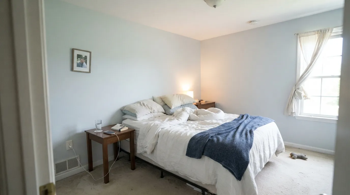
- Bathrooms and bedrooms: reads spa-calm, not cold, when there's real light
- Plays cleanly with brass, nickel, white oak and white cabinetry
- Shifts through the day instead of sitting flat — most owners who know this going in call it a feature
- The chameleon shift is exactly what some buyers hate — the same wall reads two different colors
- Goes flat, cold gray in dim north rooms under cool LED bulbs
- Clashes with honey oak and other golden-toned wood
- Harder to describe consistently than a committed color — a real friction point for resale
What Color Is North Star, Really?
A pale, cool blue-gray built so the two halves of its name are both true at once. Sherwin-Williams' own file describes it as a light airy blue with slate gray undertones, and that is the honest split: enough blue pigment to read as color, enough gray weight to pull it back from looking like a nursery or a beach-house cliché. It sits in the same family lane as Sea Salt and Silver Strand — pale colors built to move with the room instead of staying fixed — but North Star leans distinctly bluer than either when the light is generous.
At LRV 62 it reflects most of the light that hits it, which is exactly why the shift is so visible: there simply isn't enough pigment mass to anchor the color the way a deeper family member like Cadet (LRV 31) does. Cadet reads as a genuine blue in almost any light because it has the depth to hold its ground. North Star doesn't have that luxury — bright, direct daylight pushes the blue forward, and soft, indirect, or warm-tinted light lets the gray underneath take over. Neither read is wrong; they're both the paint doing exactly what a pale, cool pigment does.
Undertone in one line: blue when the light is strong and neutral or cool, gray when the light is soft or warm-tinted — never green, never purple. If a wall reads seafoam or teal, that's reflected light bouncing off plants or green textiles nearby, not the paint; if it reads flat and cold, that's a dim room asking for warmer bulbs.
Where It Shines
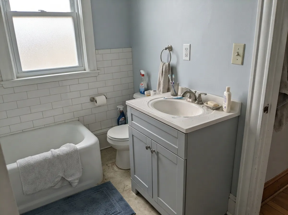
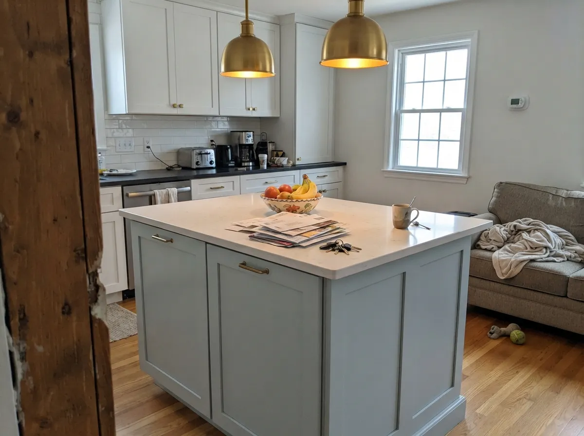
Give it daylight and it earns the hype. Bedrooms and bathrooms are its natural home — the pale blue reads spa-calm rather than baby-blue, and at LRV 62 a small bathroom stays bright instead of going cave-like the way a deeper blue would. Its second life is on kitchen islands and accent walls next to white perimeter cabinets, where the cool undertone plays cleanly against warm brass or nickel hardware without either fighting the other.
Where It Fails
Almost every disappointed review of North Star traces back to one of three situations, and all three are predictable before the first coat goes on. None of them are the paint failing — they're a mismatch between what the room offers and what this particular color needs to perform.
This is the single most common complaint, and it isn't really about the paint — it's about expectations. North Star is built to shift: blue by the window, grayer in the far corner, bluer at 2pm than at 7am. If you need a wall that photographs the same in every listing photo, this chameleon behavior will frustrate you no matter how well it's applied. Sample it in your actual room, in the corner farthest from the window, before you commit.
Take away strong daylight and North Star loses its case for blue entirely — the gray underneath wins, and cool LED bulbs push it further toward flat, slightly cold concrete. Readers in weak-light rooms describe it as "just gray" or "kind of dingy," which is a fair description of what a pale cool pigment does with no light to work with. Warm 2700K bulbs recover some of the softness; they don't recover the blue.
Orange-leaning wood sits almost opposite a cool blue-gray on the color wheel, and the two amplify each other's worst side: the floor looks more orange, the wall looks murkier and grayer instead of clean. White oak, gray-washed floors, walnut and espresso are all safe; a room wrapped in honey oak trim and cabinetry is the one situation where this color consistently disappoints.
Room by Room
Calm without being cold, especially under warm lamps at night. Eggshell hides texture and keeps the color from looking chalky; pair with a crisp white trim so the pale blue has an edge to read against.
LRV 62 keeps a small windowless bathroom from feeling dark, and the cool undertone reads genuinely spa-like against white tile and nickel or chrome fixtures. Satin or semi-gloss for the moisture; it wipes clean easily.
On an island or a single accent wall under white perimeter cabinets it is a modern classic — brass and nickel hardware both look good against it. A full kitchen of North Star cabinets is a bigger, riskier bet than most reviewers expect going in.
Reads calm and focused in an office, soft and gender-neutral in a nursery. The same chameleon behavior applies: check the room at the hours you'll actually use it, not just at noon when you're sampling.
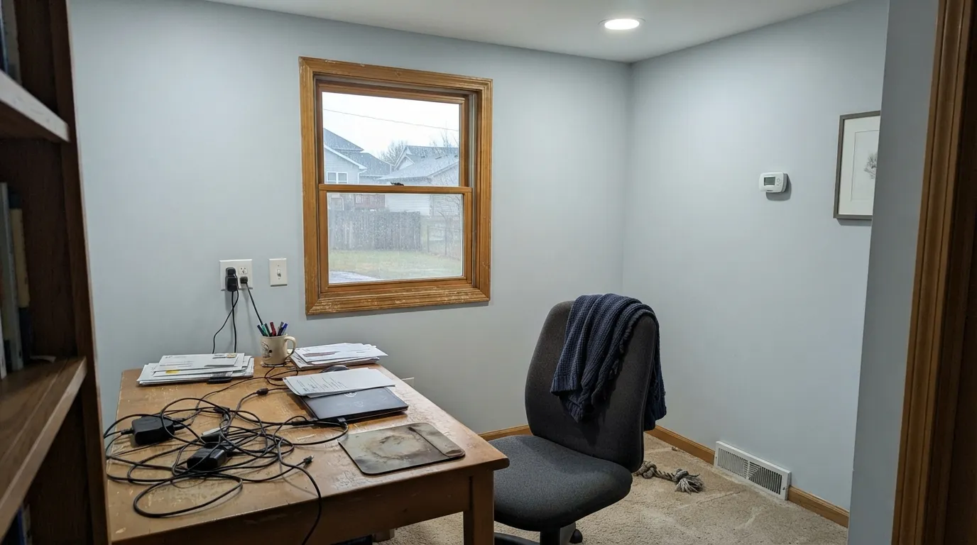
With daylight coming from more than one direction it is genuinely striking, moving through blue and gray across the day. With a single weak exposure, the far end of an open room can read a visibly different color than the end by the window — test both ends before painting the whole floor.
Full outdoor sun reads it brighter and more clearly blue than any interior swatch suggests — closer to a soft coastal sky-blue. Classic with white trim; walk the house at different times of day before committing, since the north and south elevations will show more contrast in this color than in a plain gray.
Your Light Is the Risk
South or east midday light with no direct glare: the blue comes forward and reads fresh, clean, coastal. The case for buying it.
The blue recedes almost entirely and the gray underneath takes over — flat, slightly cold. Warm bulbs help; they don't fully fix it.
Clearly blue at midday under full sun, quieter and grayer as the light softens toward evening. Most owners describe this as the whole point.
2700K warm bulbs suppress the blue and pull it toward a soft warm gray. Cool white LEDs keep more blue but read crisper, less cozy.
Most complaints about North Star are a light mismatch. Upload a photo of your actual room and see it on your walls — then ask for the same wall in north light or evening lamps before you buy a single sample.
Need It From Another Brand?
Any paint counter can custom-tint Sherwin-Williams SW 6246 directly. If you would rather stay in one brand's own deck, these are the closest stock matches, measured as ΔE2000. Under 2 is a difference you will not see on the wall.
| Brand | Closest color | ΔE | LRV | |
|---|---|---|---|---|
| Behr | Foggy MornPPF-17 · Behr | 2.2 | 62 | Color page → |
| Benjamin Moore | Sidewalk Gray2133-60 · Benjamin Moore | 1.5 | 61 | Color page → |
| Valspar | Highlights8006-8A · Valspar | 1.0 | 62 | Color page → |
| PPG / Glidden | Winter ChillPPG1036-2 · PPG / Glidden | 1.9 | 62 | Color page → |
| Glidden | Ghost WhispererPPG1039-1 · Glidden | 1.6 | 63 | Color page → |
| Dutch Boy | Silver Shores430-2DB · Dutch Boy | 2.0 | 63 | Color page → |
Similar Sherwin-Williams Colors
The nearest shades to North Star within Sherwin-Williams's own range, ranked by perceptual color distance — useful when you want the same look a touch lighter, darker, or warmer.
WCAG 2.1: AA is 4.5 : 1 for normal text, 3 : 1 for large text, AAA is 7 : 1.
North Star vs the Colors You're Also Considering
Every North Star sample board has the same rivals on it. The numbers show the real lightness gap — then it comes down to which risk you would rather live with.
Pick this for a cleaner, more clearly blue chameleon with no green in the mix.
Sherwin-Williams SW 6204 · LRV 63Sea SaltPick this if you want the chameleon effect with a green lean instead of blue — Sea Salt drifts toward sage as often as gray.
Pick this when a plain safe greige feels like it has no personality and you want the room to do something.
Sherwin-Williams SW 7015 · LRV 58Repose GrayPick this if you actually want a warm-neutral gray that doesn't chase the light toward blue at all.
Inside the Sherwin-Williams deck, Misty SW 6232 at #CDD2D2 and LRV 64 is slightly lighter and less blue. Lullaby SW 9136 at #CBD4D4 and LRV 65 is lighter again and a touch greener. Evening Shadow SW 7662 at #C9CCCD and LRV 60 is the deeper, more neutral version. Tradewind SW 6218 at #C2CFCF and LRV 61 is clearly more blue-green. Touch of Grey SW 9549 at #D1CFCA and Big Chill SW 7648 at #D0CEC9, both at LRV 62, share the lightness but lean warm instead of cool.
Across brands, the HGTV Home by Sherwin-Williams line carries North Star as HGSW 3367 at a deltaE of 0. Rodda Still Pool R091 at 0.53 and Dunn-Edwards Salina Springs DEC794 at 0.97 are the same color in practice.
Valspar Highlights 8006-8A at 1.0, Benjamin Moore Sidewalk Gray 2133-60 at 1.47, and Glidden Ghost Whisperer PPG1039-1 at 1.63 are visually identical in normal room light. Behr Foggy Morn PPF-17 at 2.16 and Farrow and Ball Skylight No. 205 at 2.18 are very close but worth sampling first.
North Star Coordinating Colors
The rule for coordinating with North Star: keep trim pale and quiet, and give the room at least one committed dark note so the chameleon undertone has something fixed to play against. It pairs cleanly with white oak, brass and nickel, and it layers naturally with deeper members of its own cool family. These are the partners that keep showing up in rooms that work:
The Pale Chameleon: Why North Star Behaves Like This
North Star belongs to a small family of pale, light-dependent colors — Sea Salt, Silver Strand, and North Star among them — built with just enough pigment to carry a real undertone and not so much that the color can anchor itself against changing light. At LRV 62 there simply isn't enough mass to hold one fixed identity the way a deeper color like Cadet (LRV 31) does; ambient light gets the deciding vote instead.
That trade-off is exactly why these colors built such a following over the past several years: a fixed pale blue can feel juvenile, and a fixed pale gray can feel flat, but a color that quietly moves between the two reads as sophisticated rather than indecisive — as long as the owner knows to expect the movement. Sherwin-Williams markets North Star straightforwardly as a light airy blue with slate gray undertones, which undersells the chameleon behavior a little; the paint itself is more honest about it than the marketing copy.
North Star With Wood Tones and Floors
White oak — natural, whitewashed or gray-washed — is the safest floor partner by a wide margin; the cool, quiet wood tone lets the blue-gray read clean without a fight. Walnut and espresso are almost as good, adding enough depth and warmth to ground the pale wall without clashing.
The one flooring or trim choice to avoid is anything genuinely honey-orange: builder-grade golden oak, orange-toned trim, or a warm butterscotch stain. Cool blue and warm orange sit close to opposite each other on the color wheel, and in a room with both, the floor reads more orange than it would alone and the wall reads muddier and grayer than it would alone. If the honey oak floor is staying put, a large area rug does more good here than in almost any other pairing problem on this site.
Three Ready Palettes Built on North Star
A color is never alone on the wall. These are complete combinations in the 60-30-10 pattern, with the reason each one holds together. Every one opens in the visualizer.
A pale chameleon color needs one fixed dark note to keep the room from feeling washed out — Naval, a genuine committed navy, supplies it. Pure White trim keeps a crisp edge so North Star doesn't drift into looking merely dull on a gray day.
Try this palette in your roomAlabaster's warmth stays quiet enough that it doesn't argue with North Star's cool undertone — both are pale, so neither one wins outright. Iron Ore on a single door gives the kitchen the one dark anchor a two-pale-color scheme otherwise lacks.
Try this palette in your roomExtra White trim gives the pale blue-gray the crisp contrast it needs to read fresh rather than washed out. A small dose of Cadet in a niche or on one wall deepens the same family so the room reads deliberate, not accidental.
Try this palette in your roomNorth Star FAQ
Is North Star blue or gray?
Both, honestly — that's the whole point of the color. In strong daylight it reads as a clear pale blue; in soft or dim light the gray underneath takes over. Sherwin-Williams' own file calls it a light airy blue with slate gray undertones, which is an accurate description of a color built to move rather than sit still.
What trim white goes with North Star?
Pure White or Alabaster for a soft, blended look; Extra White if you want the crispest possible contrast against the blue-gray. All three are safe — none of them fight the cool undertone the way a cream or ivory trim would.
Is it good for a bathroom?
One of its best rooms. LRV 62 keeps a small bathroom bright, and the cool undertone reads genuinely spa-like next to white tile and nickel or chrome fixtures. Satin or semi-gloss for the humidity.
Will it look too blue or too gray in my room?
Depends entirely on your light. Rooms with strong, direct daylight from the south or east will show real blue; rooms that only get soft, indirect, or north light will lean gray. Sample it in the actual corner of the room you're worried about, not just by the window, and check it again in the evening under your real bulbs.
Does North Star work with honey oak floors?
Not well. Orange-leaning wood sits almost opposite a cool blue-gray on the color wheel, so the two amplify each other's worst side instead of complementing it. White oak, gray-washed floors, walnut and espresso are all safe pairings; a room full of honey oak is the one situation where this color reliably disappoints.
Can I use it on an exterior?
Yes — full outdoor sun reads it brighter and more clearly blue than any interior sample suggests, closer to a soft coastal sky-blue, and it's a classic pairing with white trim. Walk the house at different times of day first, since north- and south-facing elevations will show more contrast in this color than in a plain gray.
Have you painted with North Star?
Rate it — one tap helps the next reader decide.
Ask a Question