Wickham Gray
The blue-green chameleon gray from BM's Historical Colors line, reviewed honestly: the light where it turns silvery-blue, the light where it goes flat, and what to pick if you actually want more blue.

Jessica has spec'd whites and neutrals for more than 300 rooms and keeps a sample wall of painted drawdowns in her studio. Every color review is checked against real reader rooms in the comments and re-tested when a formula changes. About the testing process →
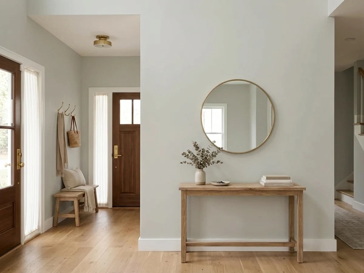
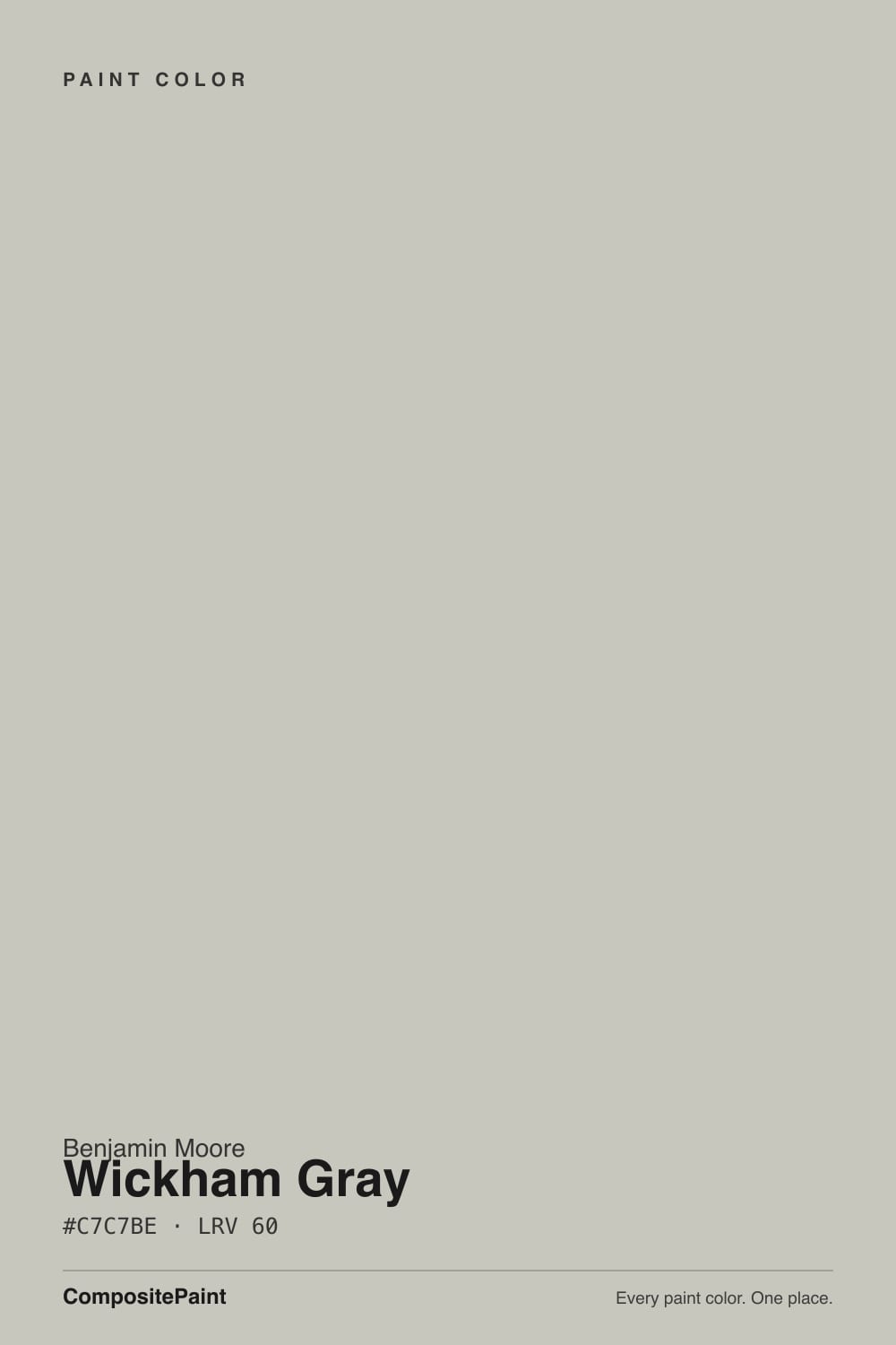
- 1Stardew43
- 2Sea Salt63
- 3Wickham Gray68
- 4Spring Thaw83
The Fast Verdict
Wickham Gray is a light, cool gray with a genuine blue-green undertone — silvery in the right light, unmistakably chameleon in every other kind. Part of Benjamin Moore's Historical Colors collection, it has none of Agreeable Gray's fame and none of its warmth: this is the pick for readers who specifically want a cooler gray and are willing to manage the light it needs to prove it.
Bright bathrooms with white tile and chrome or nickel · coastal and modern-farmhouse kitchens with white quartz · anyone who tried a warm greige and it read too tan · whole-house cool neutral in a sunny house
Your room is dim or north-facing with no supplement · your sofa or counters run warm gray-brown · you want a guaranteed blue, not a gray that occasionally leans blue · you already own a warm greige you're happy with
- A genuinely cool gray in a market full of warm greiges
- Silvery blue-green shimmer in real daylight, especially bathrooms
- Reads as a real color choice at LRV 68, not a near-white
- Pairs cleanly with white tile, marble, chrome and nickel
- Part of a stable, decades-old collection — not a trend color that will date
- Goes flat, drab gray in dim or north-facing rooms
- Some owners see more green than expected in shaded daylight
- Fights warm gray-brown upholstery and honey oak trim
- Reads gray more often than blue — disappointing if you wanted a clear blue
What Color Is Wickham Gray, Really?
A pale, cool gray built on a blue-green base — the HC prefix in its code places it in Benjamin Moore's Historical Colors collection, the palette drawn from old New England building colors, and Wickham Gray reads exactly like that pedigree: quiet, a little formal, never trendy. Where a greige like Agreeable Gray or Repose Gray warms a room, Wickham Gray does the opposite — it is one of the few light grays in the deck that stays honestly cool instead of drifting beige the moment the light dims.
Our deck lists it at LRV 68, a genuine mid-light gray rather than a near-white. That depth is what makes the color visible: put it next to something paler and lighter, like Chantilly Lace at LRV 92, and Wickham Gray clearly shows its silvery body instead of washing out. It holds enough tone to read as a real color choice on a whole-house wall, not just an off-white with a name.
Undertone in one line: cool blue-green, never warm. In bright light the blue comes forward and the color reads crisp and silvery; in shade or overcast daylight the green ghost surfaces and it can look distinctly green rather than gray; in a genuinely dim room with no lamps, both retreat and it flattens to plain, slightly drab gray. All three are the same paint being honest about the light — not three different colors.
Where It Shines
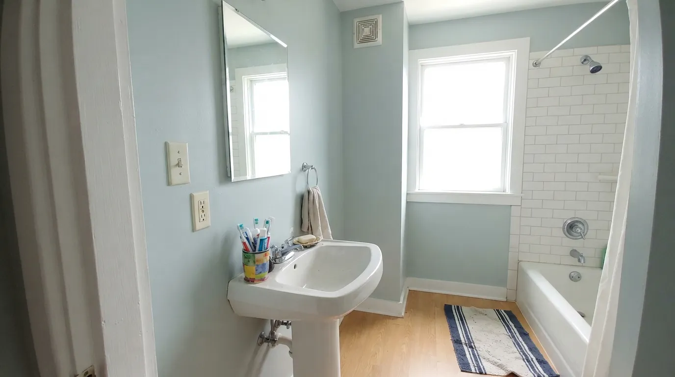
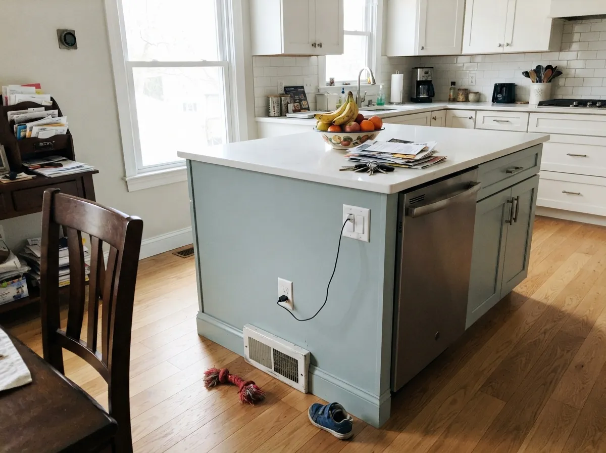
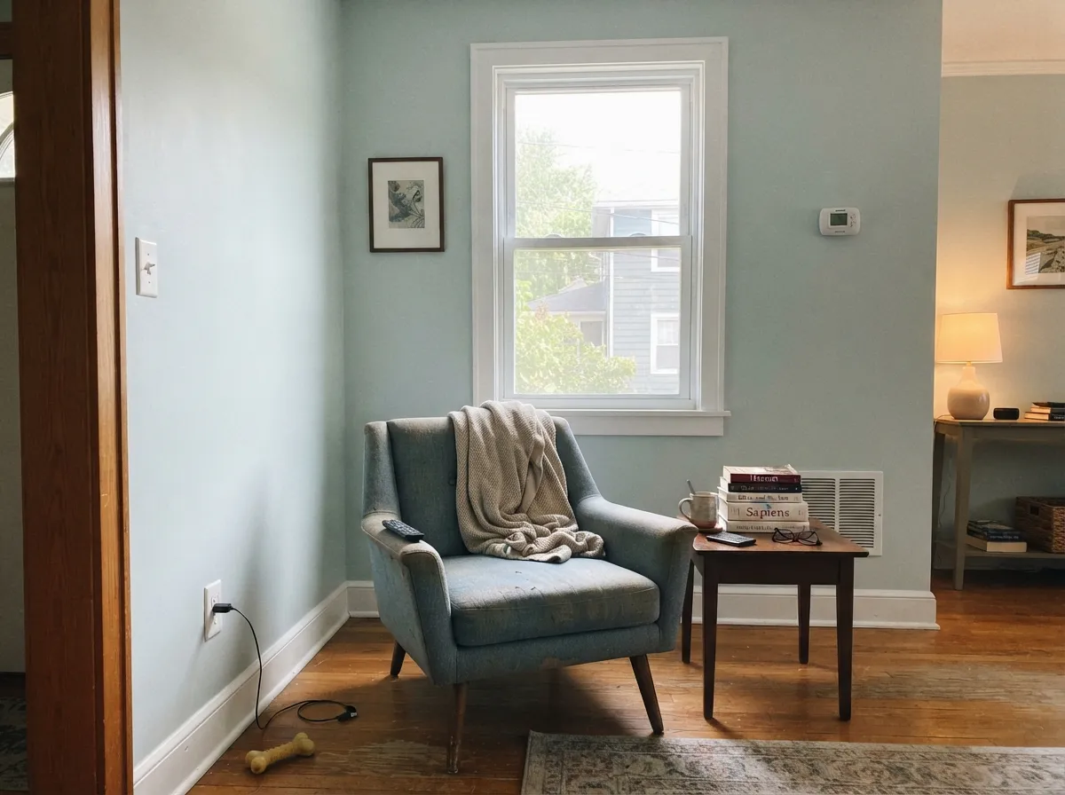
Give it a room with real daylight — south or east exposure, or a bathroom with a big window — and Wickham Gray earns its reputation as the internet's go-to "cooler alternative" gray. Chrome and nickel hardware, white subway tile, marble and white quartz all sit at the same cool temperature and let the blue-green come through cleanly. It is also the color forum threads reach for specifically because it isn't warm: readers who found Agreeable Gray or Revere Pewter too tan land on Wickham Gray next.
Where It Fails
Almost every disappointed review of Wickham Gray comes from one of three predictable situations, and none of them are the paint's fault — they are the same undertone behaving exactly as it should in the wrong conditions.
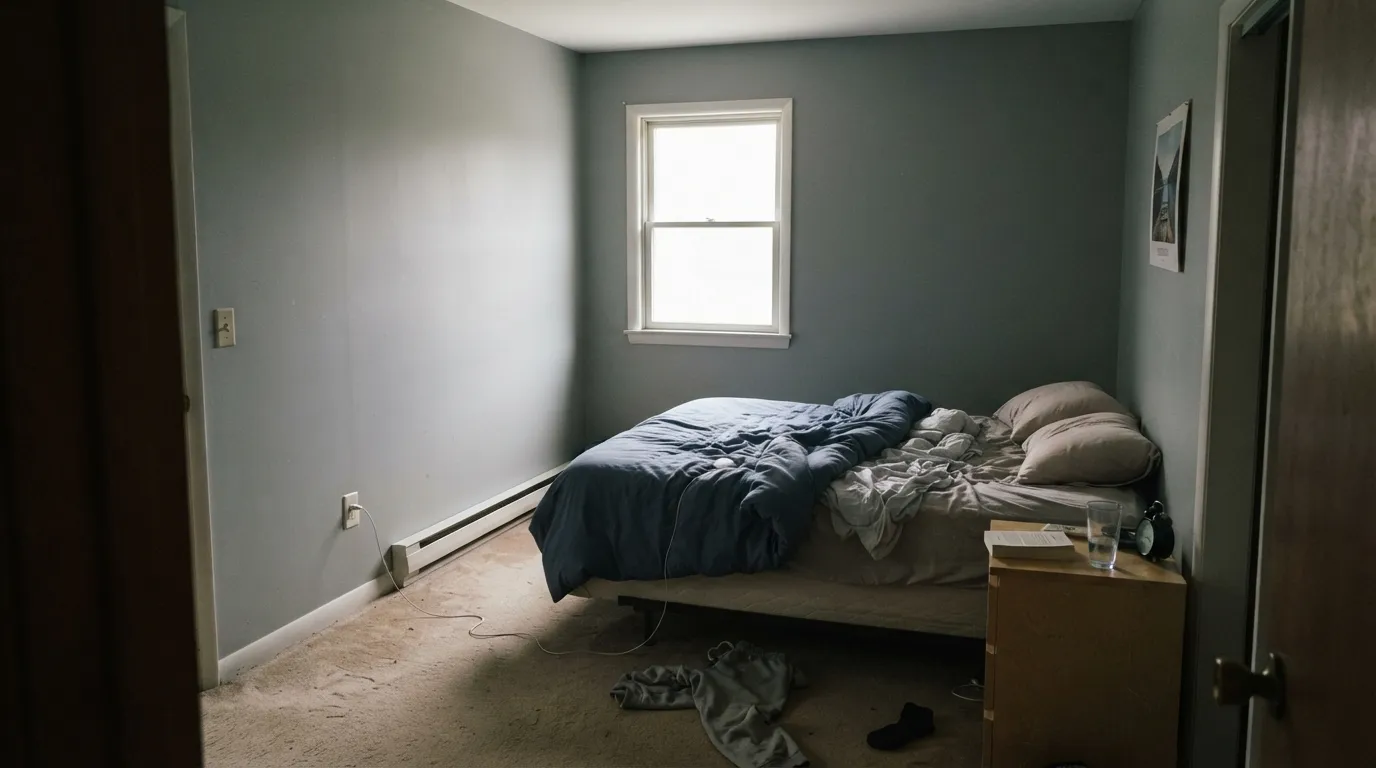
Without real daylight, the blue-green base has nothing to reflect and the color goes flat, drab gray — the exact "too grey" complaint that shows up in Houzz threads. This is the same trade every cool light gray makes; the fix is warm lamp light in the evening and accepting the color will read quieter on cloudy days, not a different paint.
A gray-brown sofa, creamy-veined countertops, or honey oak trim all sit on the warm side of the wheel, and Wickham Gray's cool base fights them instead of blending. Owners with warm gray upholstery specifically report the mismatch. Test the sample next to your actual furniture and counters before committing, not just on a bare wall.
Some buyers pick Wickham Gray expecting a clearly blue wall and get a gray that only flashes blue in strong light — the same Houzz thread that asks for "a bluer alternative" after living with it. If you want blue every hour of the day, this color's occasional gray moments will read as a letdown, not a feature.
Room by Room
With a window, white subway tile and chrome or nickel fixtures, this is the color's natural habitat — spa-clean and quietly coastal. Eggshell or satin for the moisture. Skip it in a windowless powder room without a strong fixture light.
Against white quartz and stainless steel it reads modern-coastal and clean. Pair with pewter or nickel hardware rather than warm brass, which fights the cool undertone instead of complementing it. Satin cabinet enamel wipes clean.
A sunny south or east room lets the blue-green show and stay lively through the day. Avoid it with a warm-toned gray-brown sectional; a true-gray or blue sofa will agree with it far better.
In a bright room it stays a calm, cool gray day and night. In a dim bedroom, warm 2700K lamps will mute the blue-green toward plain soft gray — pleasant, but not the color you sampled in daylight. Decide which version you actually want before painting.
On siding it reads crisp and weathered-shingle appropriate, especially with white trim. Full sun brings out more blue than the interior chip suggests — sample on the actual house before committing to all four sides.
Works as a quiet backdrop for a formal dining room or entry when the trim stays a true or cool white. A warm cream trim will make the walls look colder by contrast — keep the whole room on one temperature.
Your Light Is the Risk
The blue-green comes forward and the color reads crisp and silvery all day — the light every bathroom and kitchen photo of this color was taken in.
Without real daylight the undertone has nothing to reflect and the wall goes flat, slightly drab gray. Test with a large sample before painting a dark room.
The blue backs off and a green ghost surfaces — some owners describe the same wall as gray in the morning and faintly green by afternoon shade.
Warm 2700K lamps mute the cool undertone toward soft plain gray. Cool white LEDs keep the blue-green alive after dark but can feel clinical — pick based on which version you want at night.
Most complaints about Wickham Gray are a light mismatch. Upload a photo of your actual room and see it on your walls — then ask for the same wall in north light or evening lamps before you buy a single sample.
Need It From Another Brand?
Any paint counter can custom-tint Benjamin Moore HC-171 directly. If you would rather stay in one brand's own deck, these are the closest stock matches, measured as ΔE2000. Under 2 is a difference you will not see on the wall.
| Brand | Closest color | ΔE | LRV | |
|---|---|---|---|---|
| Sherwin-Williams | Olympus WhiteSW 6253 · Sherwin-Williams | 2.5 | 68 | Color page → |
| Behr | Misty CoastPPU25-13 · Behr | 0.2 | 68 | Color page → |
| Valspar | Polar Star4005-1A · Valspar | 2.7 | 67.1 | Color page → |
| PPG / Glidden | FogPPG1010-2 · PPG / Glidden | 0.9 | 67 | Color page → |
| Glidden | FogPPG1010-2 · Glidden | 1.6 | 68 | Color page → |
| Dutch Boy | Whistler428-1DB · Dutch Boy | 2.2 | 68 | Color page → |
Similar Benjamin Moore Colors
The nearest shades to Wickham Gray within Benjamin Moore's own range, ranked by perceptual color distance — useful when you want the same look a touch lighter, darker, or warmer.
WCAG 2.1: AA is 4.5 : 1 for normal text, 3 : 1 for large text, AAA is 7 : 1.
Wickham Gray vs the Colors You're Also Considering
Every Wickham Gray sample board has the same rivals on it. The numbers show the real lightness gap — then it comes down to which risk you would rather live with.
Pick this for the lighter, brighter version of the same cool family — Wickham Gray stays airy where Stonington gets moody.
Benjamin Moore HC-170 · LRV 59Stonington GrayPick this for a deeper, stormier gray from the same Historical Colors family — more presence, less airy.
Pick this when you want the cooler, slightly more formal read of an almost-twin color.
Benjamin Moore OC-52 · LRV 65Gray OwlPick this if you want the same near-identical hex with a softer, more casual, greener personality — the beach-house version.
Pick this when Repose Gray tested too warm-leaning for what you wanted — Wickham Gray is the honestly cool alternative.
Sherwin-Williams SW 7015 · LRV 58Repose GrayPick this if your room runs cold already and you want a light gray with a warm base instead of a cool one.
Pick this for a lighter wall that only leans blue in good light, rather than committing to blue all day.
Benjamin Moore HC-165 · LRV 36Boothbay GrayPick this if Wickham Gray's occasional blue flash wasn't enough — this is the deeper, unmistakably blue-gray from the same collection.
Silver Chain 1472, LRV 57, is very close in lightness but leans cooler and cleaner. If Wickham Gray feels a hair too warm or greenish in your light, Silver Chain reads as a truer, more silvery gray. Choose it when you want gray to stay gray.
Brushed Aluminum 1485, LRV 56, sits at nearly the same value but carries a slightly stronger warm, almost khaki lean. It feels a touch more greige than Wickham Gray and works well in warmer, sunnier rooms where you want the softness pushed a little further.
London Fog 1541, LRV 57, is another close light neutral with a gentle warm-gray character. The practical differences among these four are small; the deciding factor is your room's exposure and the whites and floors you pair them with, so sample the finalists side by side before choosing.
Wickham Gray Coordinating Colors
The rule for coordinating with Wickham Gray is the opposite of most popular grays: stay cool. It pairs cleanly with true and neutral whites, deeper blue-grays from its own Historical Colors family, and near-blacks — and it argues with anything built on a yellow or red base. These are the partners that keep it looking intentional rather than accidental:
A Quiet Member of a Historic Collection, Not a Headline Color
Wickham Gray has no Color of the Year moment and no viral room behind it — and that is an honest part of its story, not a mark against it. It belongs to Benjamin Moore's Historical Colors collection, the HC-prefixed palette built from paint documented on old New England houses, alongside Stonington Gray and Hale Navy. These are working colors with decades of use behind them, not colors invented for a trend cycle.
Its actual reputation online is narrower and more useful than fame: it is the color forum threads specifically ask for when a warm greige like Agreeable Gray tested too tan for a cool-leaning room. That is a real, repeatable niche — a genuinely cool light gray in a market saturated with warm ones — and it is worth choosing Wickham Gray for exactly that reason, not because it is famous.
Wickham Gray With Wood Tones and Floors
White oak and gray-washed wood are the safest floors under Wickham Gray — both sit at a neutral-to-cool temperature and let the blue-green read clean rather than fighting it. Walnut and espresso work too, as a grounding dark note rather than a competing undertone.
Honey oak and other orange-leaning wood are the one real clash. The warm floor and the cool wall pull against each other, and neither side looks its best — owners in warm-floored houses report the walls reading slightly cold or the floor reading slightly more orange than usual. A large area rug breaks up the contrast if the floor is staying; otherwise, a warmer greige will get along with that floor better than Wickham Gray ever will.
Three Ready Palettes Built on Wickham Gray
A color is never alone on the wall. These are complete combinations in the 60-30-10 pattern, with the reason each one holds together. Every one opens in the visualizer.
Two depths of the same cool blue-green family bracketed by a crisp, cool white — Chantilly Lace's neutral-white temperature never fights Wickham Gray's blue-green the way a creamy trim white would. Chrome or nickel fixtures finish the look.
Try this palette in your roomA no-opinion white on the walls lets the cool blue-green island carry the color, while Wrought Iron hardware and lighting supply the one dark, near-black note the scheme needs. Stainless appliances and white quartz keep every surface on the same cool temperature.
Try this palette in your roomWickham Gray and Gray Owl sit almost on top of each other in hex value but read differently room to room — more formal-cool in the main living space, softer and greener in the bedroom — so the house flows without repeating one flat color. Chantilly Lace trim keeps every room on the same cool temperature.
Try this palette in your roomWickham Gray FAQ
Is Wickham Gray warm or cool?
Cool — a genuine blue-green undertone, not a greige. That is its whole reason to exist next to warmer grays like Agreeable Gray or Repose Gray. In dim light it can look plain gray rather than blue, but it never tips warm or beige.
Is Wickham Gray more blue or more green?
Both, depending on the light — blue in bright direct daylight, a soft green ghost in shade or overcast conditions, and closer to plain gray in a dim room. If you want a color that reads blue every hour of the day, look at Boothbay Gray instead.
What is Benjamin Moore's Historical Colors collection?
The HC-prefixed colors in the Benjamin Moore deck, drawn from paint colors documented on old New England buildings. Wickham Gray shares that lineage with Stonington Gray and Hale Navy — it is a quiet, decades-old shade, not a recent trend color, which is part of why it has never dated.
What paint colors pair well with Wickham Gray?
Cool, true whites — Chantilly Lace is the safest trim choice, since a creamy warm white will make Wickham Gray's blue-green look colder by contrast. Chrome or nickel hardware over brass, and white or gray-washed floors over honey oak.
Does Wickham Gray work with honey oak floors?
Not well. Honey oak sits on the warm side of the wheel and Wickham Gray's cool blue-green base argues with it — both sides end up looking slightly off. White oak, gray-washed wood, or a neutral rug between the two solves it.
Is Wickham Gray a good exterior color?
Yes, especially on coastal and farmhouse-style siding with white trim. Full sun pulls more blue out of it than an indoor sample suggests, so test a large sample on the actual house — north and south walls will read noticeably different depths of the same color.
Have you painted with Wickham Gray?
Rate it — one tap helps the next reader decide.
Ask a Question